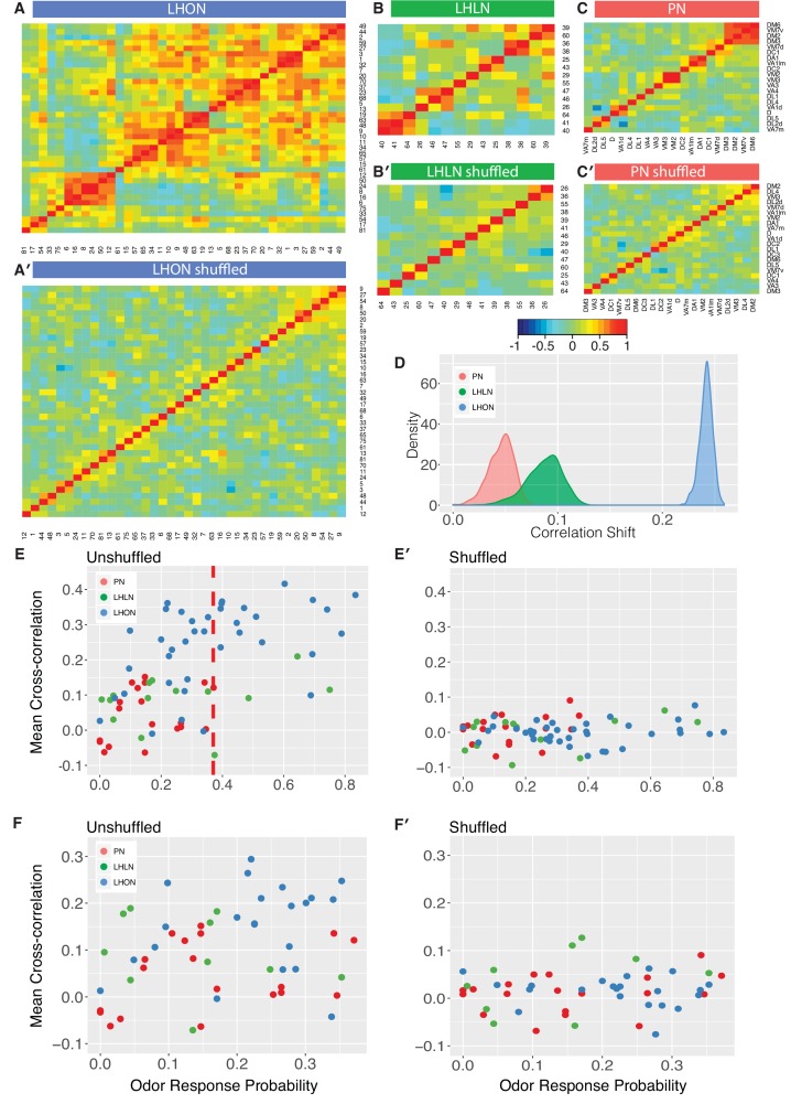
Figure 8. Comparing odor coding of LHNs with their inputs.
(A–C) Aggregated correlation heatmaps for LHONs, LHLNs, and PNs generated by calculating a mean odor response profile for each cell type and then computing the correlation matrix across all cell types. (A’–C’) Aggregated correlation heatmaps calculated after shuffling odor labels. For comparison all six heatmaps share the same color scale. (D) Histogram of mean correlation shift by randomizing the odor labels (n = 1000 replicates). (E, E’) For each cell type the mean cross-correlation against all other cell types was plotted against the proportion of significant odor responses of that cell type, either with or without shuffling of odor labels. (F, F’) As for E but only including correlation between sparse cell types (left to the red line in E indicating p(response)¡0.36, the highest odor response probability for PNs). Note that F and F’ are not just a subset of E and E’ as we recalculated the mean cross-correlation after selecting the sparsest LHON and LHLN cell types. Altogether the figure shows that the higher cross-correlation in LHON responses is due to LHONs sampling of odor space less homogeneously than PNs and not because of increased tuning breadth of LHONs or the increased number of LHON classes.

