Abstract
Recent OPTN proposals to address geographic disparity in liver allocation have involved circular boundaries: the policy selected 12/17 allocated to 150-mile circles in addition to DSAs/regions, and the policy selected 12/18 allocates to 150-mile circles eliminating DSA/region boundaries. However, methods to reduce geographic disparity remain controversial, within the OPTN and the transplant community. To inform ongoing discussions, we studied center-level supply/demand ratios using SRTR data (07/2013–06/2017) for 27,334 transplanted deceased donor livers and 44,652 incident waitlist candidates. Supply was the number of donors from an allocation unit (DSA or circle), allocated proportionally (by waitlist size) to the centers drawing on these donors. We measured geographic disparity as variance in log-transformed supply/demand ratio, comparing allocation based on DSAs, fixed-distance circles (150- or 400-mile radius), and fixed-population (12- or 50-million) circles. The recently proposed 150-mile radius circles (variance=0.11, p=0.9) or 12-million-population circles (variance=0.08, p=0.1) did not reduce geographic disparity compared to DSA-based allocation (variance=0.11). However, geographic disparity decreased substantially to 0.02 in both larger fixed-distance (400-mile, p<0.001) and larger fixed-population (50-million, p<0.001) circles (p=0.9 comparing fixed-distance and fixed-population). For allocation circles to reduce geographic disparities, they must be larger than a 150-mile radius; additionally, fixed-population circles are not superior to fixed-distance circles.
INTRODUCTION
Although the Model for End-stage Liver Disease (MELD) based allocation system prioritizes the sickest patients, geographic disparities in organ supply and demand mean that the sickest patients are frequently not at the top of the priority list when an organ becomes available (1–6). Geographic disparity can be illustrated by the large range in median allocation MELD scores in different donor service areas (DSAs), from 20 in Indianapolis, Indiana, to 39 in Los Angeles, California (7), by the variability in liver transplant rates (8), and by the wide DSA variation in liver supply/demand ratios and mortality rates (1, 9, 10).
To address these disparities, the Organ Procurement and Transplantation Network (OPTN) approved policy changes in December 2017 that included: adding to the region a 150-mile circle surrounding the donor hospital, lowering the MELD threshold for regional sharing to 32, and adding proximity points to MELD for candidates within the DSA or within 150 nautical miles of the donor hospital (11, 12). However, before the December 2017 changes were implemented, the OPTN board decided that organ allocation policies must respect new geographical frameworks, which allow circular allocation and which disallow the use of DSA and region boundaries (13, 14). The liver committee wanted to test allocation circles based on population density, but the short timeline for policy change did not allow that (15). The liver committee, after a very close vote, advocated a broader 2-circle distribution policy that treated candidates from MELD 15 up to MELD 31 with identical priority, but in December 2018 the board selected a different policy, acuity circles, to share at several MELD tiers across 150-mile, 250-mile, and 500-mile circles, eliminating DSA or region boundaries (16, 17). None of the aforementioned changes to liver allocation have been implemented. The goal of our study is to inform this ongoing discussion, and it remains possible that more changes to policy are forthcoming.
Fixed-distance circular areas might or might not reduce geographic disparities in transplantation. First, size matters: the smaller the circles, the less likely organs will reach the highest MELD candidates in the country. With a US surface area of 3.8 million square miles divided across 58 DSAs, the average radius of each DSA is 144 miles; therefore, circles larger than 150 miles might be needed to improve on current geographic disparities. Second, fixed-distance circles will have different effects on centers based on each center’s physical location (in coastal versus land-locked cities, near oceans or national borders, in densely versus sparsely populated areas), so fixed-population circles might be more equitable than fixed-distance circles.
To examine the feasibility of reducing geographic disparities through use of circular allocation boundaries, we used national transplant registry and ZIP code data to compare supply/demand variance between DSA-based allocation to smaller versus larger fixed-distance circles (150- or 400-mile radius) and comparably-drawn smaller versus larger fixed-population circles (12- or 50-million-population).
METHODS
Data source
This study used data from the Scientific Registry of Transplant Recipients (SRTR) external release made available in March 2018. The SRTR data system includes data on all donors, waitlisted candidates, and transplant recipients in the US submitted by members of the Organ Procurement and Transplantation Network (OPTN) and has been described elsewhere (18). The Health Resources and Services Administration, United States Department of Health and Human Services provides oversight to the activities of the OPTN and SRTR contractors.
Study population
We studied 27,334 transplanted deceased liver donors and 44,652 waitlist candidates who first achieved an allocation MELD/PELD ≥15 during the study period (i.e. incident candidates), from 142 liver transplant centers from 7/2013–06/2017, after excluding donors and waitlist candidates from Hawaii and Puerto Rico. We did not include candidates who were already listed and achieved an allocation MELD/PELD ≥15 before the study period (i.e. prevalent candidates).
Fixed-distance and fixed-population circles
The distance between transplant center and each ZIP code was calculated in Python 3.6.1 using Python’s geopy module (version 1.11.0) and Vincenity distance. ZIP code longitude, latitude, and population data were taken from U.S. Census Bureau 2015 Gazetteer Files and U.S. Census Bureau 2015 American Community Survey 5 Year Estimates. ZIP codes were sorted by their centroid distance to transplant center. All ZIP codes with distances less than or equal to the specified fixed radius (150 or 400 miles) were added to the fixed-distance circle around the transplant center. The population within each ZIP code was added to fixed-population circle, in order of their distance from the transplant center, until the population within the circle became greater than or equal to the specified fixed-population (12 or 50 million). Populations of 12 million and 50 million were chosen to designate areas with populations comparable to the average population within fixed-radius circles of 150 and 400 miles, respectively.
Supply/demand ratio under current DSA allocation
We calculated the supply/demand ratio for each of the 50 DSAs with a liver transplant center. For each DSA, we calculated the number of deceased donor livers recovered in the study period from all ZIP codes within the DSA (∑ ZIPdonors). Six DSAs do not have a liver transplant center, so supply from these DSAs was distributed according to the number of deceased donor livers from these DSAs that were transplanted in each of the other 50 DSAs during the study period (∑DSAdonors). The supply for each of the 50 DSAs with a transplant center was the sum of these numbers (supplyDSA = ∑ ZIPdonors + ∑DSAdonors). Demand was the number of active waitlist candidates from all transplant centers within that particular DSA (demandDSA= ∑txcandidates) who first achieved MELD ≥15 during the study period. Supply/demand ratios for each DSA were calculated by dividing the supply by the demand for that particular DSA (SDDSA= supplyDSA/demandDSA).
Supply/demand ratio under fixed-distance and fixed-population circles
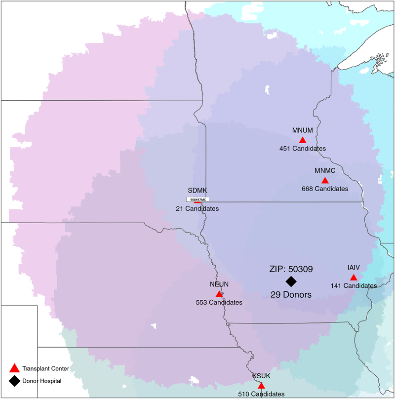
Supply for each transplant center was a proportionally allocated fraction of the estimated number of deceased donor livers from all ZIP codes (ZIPdonors) within that transplant center’s circle. Because the circles overlap, multiple transplant centers might have a claim to donor livers from each ZIP code, so we allocated each ZIP code’s supply as proportional to length of the overlapping centers’ waitlists. First, we added the number of waitlist candidates from all transplant centers who claim donor livers for each ZIP code (∑txcandidates), and calculated the fractional claim on donor organs for each transplant center by dividing that center’s waitlist size by ∑txcandidates from each ZIP code that the center could claim (txcandidates/∑txcandidates). Then, we estimated the number of deceased donor livers for a transplant center from that particular ZIP code. For example, 29 deceased donor livers were recovered from ZIP code 50309, and the ZIP code was in the overlapping circles of 6 transplant centers with waitlist size of 21, 451, 668, 553, 141, 510 (Figure 1). We added the numbers of waitlist candidates from these 6 transplant centers (∑txcandidates= 2344). Then, we calculated the fractional claim on donor organs for each transplant center: SDMK (21/2344), MNUM (451/2344), MNMC (668/2344), IAIV (141/2344), NEUN (553/2344), and KSUK (510/2344). Third, we estimated the number of deceased donor livers for each transplant center from ZIP code 50309 for transplant center SDMK (21*29/2344), MNUM (451*29/2344), MNMC (668*29/2344), IAIV (141*29/2344), NEUN (553*29/2344) and KSUK (510*29/2344) (Figure 1). The tranplant center’s supply was the sum of proportionally allocated deceased donor livers from all ZIP codes within the transplant center’s circle. Some ZIP codes did not fall under any circle. We distributed those donors among the transplant centers within same DSA proportionally according to the centers’ waitlist size. Demand was the number of active waitlist candidates from all transplant centers within the particular fixed-distance or fixed-population circle who first achieved MELD ≥15 during the study period period. The supply/demand ratio for each transplant center was calculated by dividing the supply by the demand for that particular transplant center.
Figure 1.
Fixed-distance circles surrounding each transplant center (red triangles) and donor hospital (black triangle) showing the weighted portion of donor liver supply from the donor hospital based the transplant center waitlist size (demand).
Statistical analysis
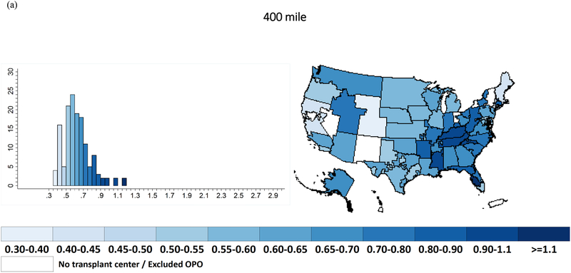
We used skewness and the kurtosis test to check the normality of the supply/demand ratios distribution. Since the distribution of supply/demand ratios was skewed, we log-transformed the supply/demand ratios for subsequent analyses. The variance ratio test was used to test whether the variance of transplant center log supply/demand ratios was different when comparing DSAs, fixed-distance circles, and fixed-population circles. Additionally, we conducted modified Leven’s test (based on median for skewed data) to test whether the variance of transplant center supply/demand ratios was different when comparing DSAs, fixed-distance circles, and fixed-population circles. All statistical tests were two-sided, and a p-value of ≤0.05 was considered statistically significant. We used a histogram to show the distribution of supply/demand ratio under DSAs, fixed-distance circles, and fixed-population circles. We plotted the average supply/demand ratios for the transplant centers in 50 DSAs under fixed-distance and fixed-population circles in color-scaled maps using R version 3.0.1. Darker colors represented higher supply/demand ratio, while lighter colors represented lower supply/demand ratio. All other statistical analyses were performed using Stata 14.2/SE for Linux (Stata Corp., College Station, TX).
Sensitivity analysis
To check whether variation in listing practices for low-MELD candidates distorted our measure of demand, we ran the supply/demand analyses with two other measures of demand, first considering only waitlist candidates who first achieved an allocation MELD/PELD ≥20 during the study period, and second considering only waitlist candidates who first achieved an allocation MELD/PELD ≥22 during the study period. Additionally, we estimated the national supply/demand ratio with no geographic restriction.
RESULTS
Study population
Among the 27,334 deceased liver donors, the median (interquartile range [IQR]) age was 38 (25–53), 65.3% were Caucasian, and 40% were female. Among the 44,652 active incident waitlist candidates who first achieved a MELD ≥15 during the study period, the median (IQR) age at listing was 57 (48–62), 68.87% were Caucasian, 36.85% were female, 3.63% were status 1 candidates, and the median (IQR) MELD score was 18 (13–25) at registration. Additionally, 27.3% had alcoholic cirrhosis, 24% had Hepatitis C virus, 20.6% had hepatocellular carcinoma, and 15.8% had non-alcoholic steatohepatitis as the indication for liver transplant.
Fixed-distance and fixed-population circles
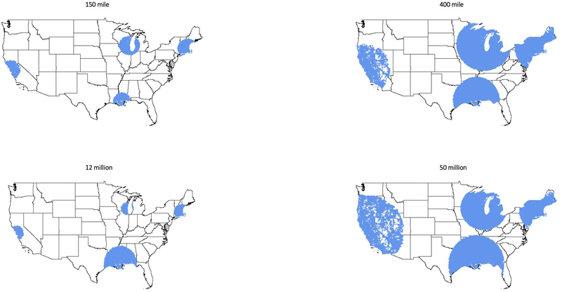
The population sizes (median [IQR], millions) within the small 150-mile and large 400-miles fixed-distance circles were 11.49 (6.32–18.88) million and 50.00 (32.76–71.48) million. The circle radius sizes (median [IQR], miles) for the small 12-milllion and large 50-million fixed-population circles were 155 (97–218) miles and 404 (305–590) miles. Fixed-population circles in the Northeast were generally smaller than in the Midwest or West coast (Figure 2).
Figure 2.
Fixed-distance (150-mile, 400-mile) and fixed-population (12-million, 50-million) circles around transplant centers CAPC (Stanford), MABI (Beth Israel), LATU (Tulane), WICH (University of Wisconsin).
Supply/demand ratio in DSAs
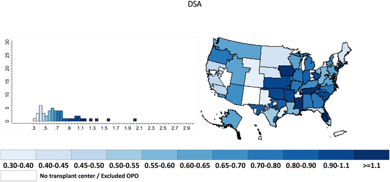
Within the 50 DSAs that have liver transplant programs, with historically proportional allocation of the supply from the remaining DSAs, the median (IQR) supply/demand ratio was 0.66 (0.48–0.87) with a range of 0.34–2.03 (Table 1) (Figure 3). The calculated variance in supply/demand ratio was 0.11 (Table 1).
Table 1.
Supply/demand ratios between each sharing area and current donor service area (DSA) allocation.
| Range | Median (IQR) | Mean (SD) | Variance | p-value* | Leven’s test | |
|---|---|---|---|---|---|---|
| DSA | 0.34–2.03 | 0.66 (0.48 – 0.87) | 0.74 (0.34) | 0.11 | - | |
| 150 mile | 0.33–2.87 | 0.61 (0.48 – 0.74) | 0.66 (0.33) | 0.11 | 0.2 | 0.2 |
| 400 mile | 0.39–1.09 | 0.61 (0.54 – 0.69) | 0.62 (0.12) | 0.02 | <0.001 | <0.001 |
| 12 million | 0.27–2.14 | 0.59 (0.47 – 0.83) | 0.67 (0.28) | 0.08 | 0.5 | 0.3 |
| 50 million | 0.43–1.01 | 0.61 (0.51 – 0.65) | 0.62 (0.14) | 0.02 | <0.001 | <0.001 |
comparision to DSA
Figure 3.
Supply/demand ratio under current donor service area (DSA) allocation.
Supply/demand ratio under fixed-distance and fixed-population circle
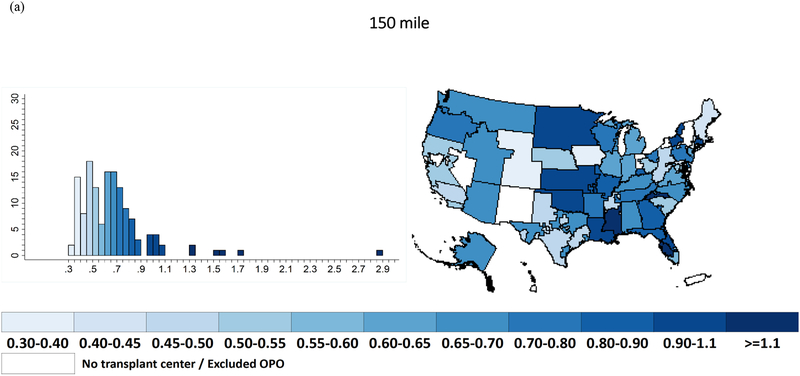
With a 150-mile fixed-distance circle, the median (IQR) supply/demand ratio was 0.61 (0.48–0.74) with a range of 0.33–2.87 (Table 1) (Figure 4a). With a 400-mile fixed radius circle, the median (IQR) supply/demand ratio was 0.61 (0.54–0.69) with a range of 0.39–1.09 (Table 1) (Figure 5a). The calculated variances in supply/demand ratio for 150-mile and 400-mile circles were 0.11 and 0.02 (Table 1).
Figure 4.
Supply/demand ratio for (a) 150-mile fixed-distance and (b) 12-million fixed-population circle.
Figure 5.
Supply/demand ratio within (a) 400-mile fixed-distance and (b) 50-million fixed-population circles.
With 12-million fixed-population circles, the median (IQR) supply/demand ratio was 0.59 (0.47–0.83) with a range of 0.27–2.14 (Table 1) (Figure 4b). With 50-million fixed-population circles, the median (IQR) supply/demand ratio was 0.61 (0.51–0.65) with a range of 0.43–1.01 (Table 1) (Figure 5b). The caculated variances in supply/demand ratio for 12-million-population and 50-million-population circles were 0.08 and 0.02 (Table 1).
Comparision of supply/demand ratios
The 150-mile fixed-distance circles did not significantly reduce variance in supply/demand ratios compared to DSAs (0.11 vs. 0.11, p=0.2) (Table 1). Additionally, 12-million-population circles did not significantly reduce the variance in supply/demand ratios compared to DSAs (0.08 vs. 0.11, p=0.5) (Table 1). However, 400-mile fixed-distance circles and 50-million-population circles substantially reduced the variance in supply/demand ratio compared to DSAs (400-mile: 0.02 vs. 0.11, p<0.001; 50-million: 0.02 vs. 0.11, p<0.001) (Table 1).
The variance in supply/demand ratio was significantly lower for the 400-mile circle compared to that of the 150-mile circle (0.02 vs. 0.11, p<0.001). Similarly, the variance in supply/demand ratio was significantly lower for the 50-million-population circle compared to that of the 12-million-population circle (0.02 vs. 0.08, p<0.001).
Comparing the ‘smaller’ circles, the variance in supply/demand ratio was not significantly lower for the 12-million-population circle compared to the 150-mile circle (0.08 vs. 0.11, p=0.3). Comparing the ‘larger’ circles, the variance between the 50-million-population and 400-mile circles was also similar (0.02 vs. 0.02, p=0.9).
Sensitivity analyses
Including only active incident waitlist candidates with MELD/PELD ≥20, inferences did not change. We found no significant reduction of variances in supply/demand ratios for 150-mile (p=0.1) and 12-million-population (p=0.3) circles compared to DSA. Similar to our main results, the 400-mile circle (p<0.001) and 50-million-population (p<0.001) circles significantly reduce the variance in supply/demand ratios compared to DSAs. The variance in supply/demand ratio was significantly lower for ‘smaller’ circles compared to ‘larger’ circles (150-mile vs. 400-mile p<0.001; 12-million-population vs. 50-million-population p<0.001). Comparing the ‘smaller’ and ‘larger’ circles, the variances were similar (150-mile vs. 12-million-population p=0.4; 400-mile vs. 50-million-population p=0.9). Including active incident waitlist candidates with MELD/PELD ≥22, there was also no change in our conclusions. If livers were distributed nationally, the supply/demand ratio would be 0.61 everywhere; there would be no variation in this availability metric across transplant centers.
DISCUSSION
In this national study of geographic disparities in liver supply/demand, we found large variance in the supply/demand ratio between DSAs (variance=0.11). Geographic disparities with 150-mile fixed-distance circles, as recently proposed by the OPTN liver committee, were no better than the currently existing geographic disparities within DSAs (variance=0.11, p=0.2). Geographic disparities with 12-million-population circles (variance=0.08, p=0.5) were also no better than disparities within DSAs. Only larger circles sufficed to significantly reduce variation in supply/demand ratios: 400-mile fixed-distance circles (variance=0.02, p<0.001) or 50-million-population circles (variance=0.02, p<0.001) yielded substantially more equitable supply/demand ratios than DSAs or smaller circles.
Our finding of a wide range and large variance in the liver supply/demand ratios across DSAs is consistent with many previous reports of geographic disparities in liver allocation in the United States, including a previous report that showed the large national variation in DSA liver supply/demand has not improved since implementation of MELD and that unequal liver supply/demand led to higher waitlist mortality (10).
One strength of this study is the inclusion of a large national cohort using SRTR and ZIP code data to analyze the liver supply/demand ratio within various circular areas that might be used for liver allocation. To isolate the direct impact of sharing circles, our approach considered the supply/demand ratio at a single geographical level. As such, we did not model the changing MELD scores over time of individual candidates, nor the random arrival times of each organ, nor the specific MELD level at which different allocation areas would be enforced. So that our metrics and conclusions would be independent of the above stochastic processes, we did not use variation in MELD at transplant to measure geographic disparity (19). Instead, the range of supply/demand ratios within boundaries is an intuitive indicator of whether using those boundaries in allocation would be likely to result in geographic disparity (9). Also, our measure of demand comprises patients who are waitlisted, but there are documented geographic disparities in listing (20). Disparities in listing are troubling and should be addressed, but not by allocation policy: only listed patients can receive transplants, and therefore the available supply can only be distributed among the listed patients. Because the OPTN proposed circular allocation, we did not address other allocation approaches that might reduce geographic disparity (21–24). We did not correct demand to account for patients who travel to areas with greater organ supply (5, 6, 25) and our findings are orthogonal to the multifactorial causes of or explanations for geographic disparity (20, 26–29). Of course, in parallel with efforts to distribute currently available organs in the most geographically equitable manner to patients in need of them, we always encourage continued efforts to increase supply by increasing deceased donation (30, 31), improving OPO performance, and improving marginal organ utilization by transplant centers (32). Increased competition with larger circles might lead to more people being waitlisted (33); however, previous studies have shown that increased transplant center competition was associated with increased offer acceptance (34). Further, higher utilization of increased risk livers was seen in centers with longer waitlists, higher proportion of higher MELD candidates, higher transplant volume, and in more competitive DSAs (32).
We have demonstrated that 150-mile radius fixed-distance allocation circles will not reduce disparity in supply/demand ratio, compared with the disparity in supply/demand ratio within DSAs. Also, using comparably-drawn fixed-population circles is no more effective at reducing disparity than using fixed-distance circles. However, using larger 400-mile radius or 50-million-population circles would reduce geographic disparity. If, as suggested by the recent report of the OPTN’s Ad Hoc Geography Committee (11), DSA boundaries are unacceptable in organ allocation because of the disparity in supply/demand ratios that these boundaries create, then neither should very small circular geographic boundaries be acceptable in allocation. Neither fixed-distance nor fixed-population circular sharing areas will reduce geographic disparity in liver supply/demand ratios unless these areas are quite large, larger than many proposed circles for liver allocation. Just as broader sharing does not always guarantee reduced geographic disparity (3), neither does sharing within circular-shaped units guarantee a reduction in geographic disparity; instead, the devil is in the details of the particular circles constructed.
ACKNOWLEDGEMENTS
The data reported here have been supplied by the Hennepin Healthcare Research Institute (HHRI) as the contractor for the Scientific Registry of Transplant Recipients (SRTR). The interpretation and reporting of these data are the responsibility of the authors and in no way should be seen as an official policy of or interpretation by the SRTR, OPTN/UNOS, or the US Government. Funding for this study was provided by the National Institute of Diabetes and Digestive and Kidney Disease and the National Institute on Aging: grant numbers F32AG053025 (PI: Christine Haugen), K24DK101828 (PI: Dorry Segev), and R01DK111233 (PI: Dorry Segev).
Abbreviations:
- DSA
donor service area
- HRSA
Health Resources and Services Administration
- IQR
interquartile range
- MELD
Model for End-stage Liver Disease
- OPTN
Organ Procurement and Transplantation Network
- SRTR
Scientific Registry of Transplant Recipients
Footnotes
Disclosure
Authors have no conflict of interest to report as described by American Journal of Transplantation.
Data Availability Statement
The data that support these findings are available from the Scientific Registry of Transplant Recipients March 2018 external release.
REFERENCES
- 1.Yeh H, Smoot E, Schoenfeld DA, Markmann JF. Geographic inequity in access to livers for transplantation. Transplantation 2011;91(4):479–486. [DOI] [PMC free article] [PubMed] [Google Scholar]
- 2.Massie AB, Caffo B, Gentry SE, Hall EC, Axelrod DA, Lentine KL et al. MELD Exceptions and Rates of Waiting List Outcomes. Am J Transplant 2011;11(11):2362–2371. [DOI] [PMC free article] [PubMed] [Google Scholar]
- 3.Gentry SE, Massie AB, Cheek SW, Lentine KL, Chow EH, Wickliffe CE et al. Addressing geographic disparities in liver transplantation through redistricting. Am J Transplant 2013;13(8):2052–2058. [DOI] [PMC free article] [PubMed] [Google Scholar]
- 4.Croome KP, Lee DD, Burns JM, Keaveny AP, Taner CB. Intraregional model for end-stage liver disease score variation in liver transplantation: Disparity in our own backyard. Liver transplantation: official publication of the American Association for the Study of Liver Diseases and the International Liver Transplantation Society 2018;24(4):488–496. [DOI] [PubMed] [Google Scholar]
- 5.Dzebisashvili N, Massie AB, Lentine KL, Schnitzler MA, Segev D, Tuttle-Newhall J et al. Following the organ supply: assessing the benefit of inter-DSA travel in liver transplantation. Transplantation 2013;95(2):361–371. [DOI] [PubMed] [Google Scholar]
- 6.Vagefi PA, Feng S, Dodge JL, Markmann JF, Roberts JP. Multiple listings as a reflection of geographic disparity in liver transplantation. J Am Coll Surg 2014;219(3):496–504. [DOI] [PMC free article] [PubMed] [Google Scholar]
- 7.Kim WR, Lake JR, Smith JM, Schladt DP, Skeans MA, Harper AM et al. OPTN/SRTR 2016 Annual Data Report: Liver. Am J Transplant 2018;18 Suppl 1:172–253. [DOI] [PubMed] [Google Scholar]
- 8.Mary G Bowring SZ, Chow Eric KH, Massie Allan B, Rashikh Choudhury, Corey Wickliffe, Segev Dorry L, Gentry Sommer E. Geographic disparity in deceased-donor liver transplant rates and discard following Share 35. Under review. 2018. [DOI] [PMC free article] [PubMed] [Google Scholar]
- 9.Parikh ND, Marrero WJ, Sonnenday CJ, Lok AS, Hutton DW, Lavieri MS. Population-Based Analysis and Projections of Liver Supply Under Redistricting. Transplantation 2017;101(9):2048–2055. [DOI] [PubMed] [Google Scholar]
- 10.Rana A, Kaplan B, Riaz IB, Porubsky M, Habib S, Rilo H et al. Geographic inequities in liver allograft supply and demand: does it affect patient outcomes? Transplantation 2015;99(3):515–520. [DOI] [PubMed] [Google Scholar]
- 11.OPTN Proposal Overview: Enhancing Liver Distribution. 2017; Available from: https://optn.transplant.hrsa.gov/governance/public-comment/enhancing-liver-distribution/
- 12.Kalra A, Biggins SW. New paradigms for organ allocation and distribution in liver transplantation. Curr Opin Gastroenterol 2018;34(3):123–131. [DOI] [PubMed] [Google Scholar]
- 13.OPTN Reply to George Sigounas. 2018. [cited 2018 August 13]; Available from: https://optn.transplant.hrsa.gov/media/2587/optn-memorandum-to-hrsa_20180813.pdf
- 14.OPTN Frameworks for Organ Distribution, Public Comment Proposal. 2018; Available from: https://optn.transplant.hrsa.gov/media/2565/geography_publiccomment_201808.pdf
- 15.OPTN/UNOS BOARD OF DIRECTORS MEETING: Eliminate the use of DSAs and Regions in Liver Distribution. 2018; Available from: https://optn.transplant.hrsa.gov/media/2767/board_liver_discussion_transcript_201812.pdf
- 16., OPTN. Liver and Intestine Distribution Using Distance from Donor Hospital. 2018; Available from: https://optn.transplant.hrsa.gov/media/2687/20181008_liver_publiccomment.pdf
- 17.Washburn K, Pomfret E, Roberts J. Liver allocation and distribution: possible next steps. Liver Transpl 2011;17(9):1005–1012. [DOI] [PubMed] [Google Scholar]
- 18.Massie AB, Kucirka LM, Segev DL. Big data in organ transplantation: registries and administrative claims. Am J Transplant 2014;14(8):1723–1730. [DOI] [PMC free article] [PubMed] [Google Scholar]
- 19.Reed A, Chapman WC, Knechtle S, Chavin K, Gilroy R, Klintmalm GB. Equalizing MELD Scores Over Broad Geographies Is Not the Most Efficacious Way to Allocate a Scarce Resource in a Value-based Environment. Ann Surg 2015;262(2):220–223. [DOI] [PubMed] [Google Scholar]
- 20.Goldberg DS, French B, Sahota G, Wallace AE, Lewis JD, Halpern SD. Use of Population-based Data to Demonstrate How Waitlist-based Metrics Overestimate Geographic Disparities in Access to Liver Transplant Care. Am J Transplant 2016;16(10):2903–2911. [DOI] [PMC free article] [PubMed] [Google Scholar]
- 21.Mehrotra S, Kilambi V, Bui K, Gilroy R, Alexopoulos SP, Goldberg DS et al. A Concentric Neighborhood Solution to Disparity in Liver Access That Contains Current UNOS Districts. Transplantation 2018;102(2):255–278. [DOI] [PubMed] [Google Scholar]
- 22.Snyder JJ, Salkowski N, Wey A, Pyke J, Israni AK, Kasiske BL. Organ distribution without geographic boundaries: A possible framework for organ allocation. Am J Transplant 2018. [DOI] [PubMed] [Google Scholar]
- 23.Ye F, Sheng Q, Feurer ID, Zhao Z, Fan R, Teng J et al. Directed solutions to address differences in access to liver transplantation. Am J Transplant 2018. [DOI] [PubMed] [Google Scholar]
- 24.Gentry S, Chow E, Massie AB, Segev D. Gerrymandering for justice: redistricting U.S. liver allocation. Interfaces 2015;45(5):462–480. [DOI] [PMC free article] [PubMed] [Google Scholar]
- 25.Kohn R, Kratz JR, Markmann JF, Vagefi PA. The migrated liver transplantation candidate: insight into geographic disparities in liver distribution. J Am Coll Surg 2014;218(6):1113–1118. [DOI] [PubMed] [Google Scholar]
- 26.Washburn K, Harper A, Baker T, Edwards E. Changes in Liver Acceptance Patterns After Implementation of Share 35. Liver Transpl 2015. [DOI] [PubMed] [Google Scholar]
- 27.Goldberg DS, Levine M, Karp S, Gilroy R, Abt PL. Share 35 changes in center-level liver acceptance practices. Liver Transpl 2017;23(5):604–613. [DOI] [PMC free article] [PubMed] [Google Scholar]
- 28.Gentry SE, Chow EK, Massie A, Luo X, Zaun D, Snyder JJ et al. Liver sharing and organ procurement organization performance. Liver transplantation: official publication of the American Association for the Study of Liver Diseases and the International Liver Transplantation Society 2015;21(3):293–299. [DOI] [PMC free article] [PubMed] [Google Scholar]
- 29.Ladin K, Zhang G, Hanto DW. Geographic Disparities in Liver Availability: Accidents of Geography, or Consequences of Poor Social Policy? Am J Transplant 2017;17(9):2277–2284. [DOI] [PubMed] [Google Scholar]
- 30.Goldberg D, Kallan MJ, Fu L, Ciccarone M, Ramirez J, Rosenberg P et al. Changing Metrics of Organ Procurement Organization Performance in Order to Increase Organ Donation Rates in the United States. Am J Transplant 2017;17(12):3183–3192. [DOI] [PubMed] [Google Scholar]
- 31.Klassen DK, Edwards LB, Stewart DE, Glazier AK, Orlowski JP, Berg CL. The OPTN Deceased Donor Potential Study: Implications for Policy and Practice. Am J Transplant 2016;16(6):1707–1714. [DOI] [PubMed] [Google Scholar]
- 32.Garonzik-Wang JM, James NT, Arendonk KJV, Gupta N, Orandi BJ, Hall EC et al. The aggressive phenotype revisited: utilization of higher-risk liver allografts. Am J Transplant 2013;13(4):936–942. [DOI] [PubMed] [Google Scholar]
- 33.Cho PS, Saidi RF, Cutie CJ, Ko DS. Competitive Market Analysis of Transplant Centers and Discrepancy of Wait-Listing of Recipients for Kidney Transplantation. Int J Organ Transplant Med 2015;6(4):141–149. [PMC free article] [PubMed] [Google Scholar]
- 34.Goldberg DS, French B, Lewis JD, Scott FI, Mamtani R, Gilroy R et al. Liver transplant center variability in accepting organ offers and its impact on patient survival. Journal of hepatology 2016;64(4):843–851. [DOI] [PMC free article] [PubMed] [Google Scholar]


