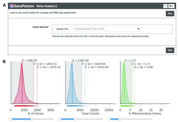
Figure 1. Cell quality metrics.
( A) The “Setup Analysis” function is presented using the GenePattern UI Builder. ( B) The quality metric distributions are shown as kernel density estimation fitted curves. The values of the mean, 3 standard deviations (SDs) above the mean and 4 SDs above the mean are indicated to help identify outlier cells with abnormally large metric values. Interactive sliders under each plot allow the user to see how many cells are included under a threshold.

