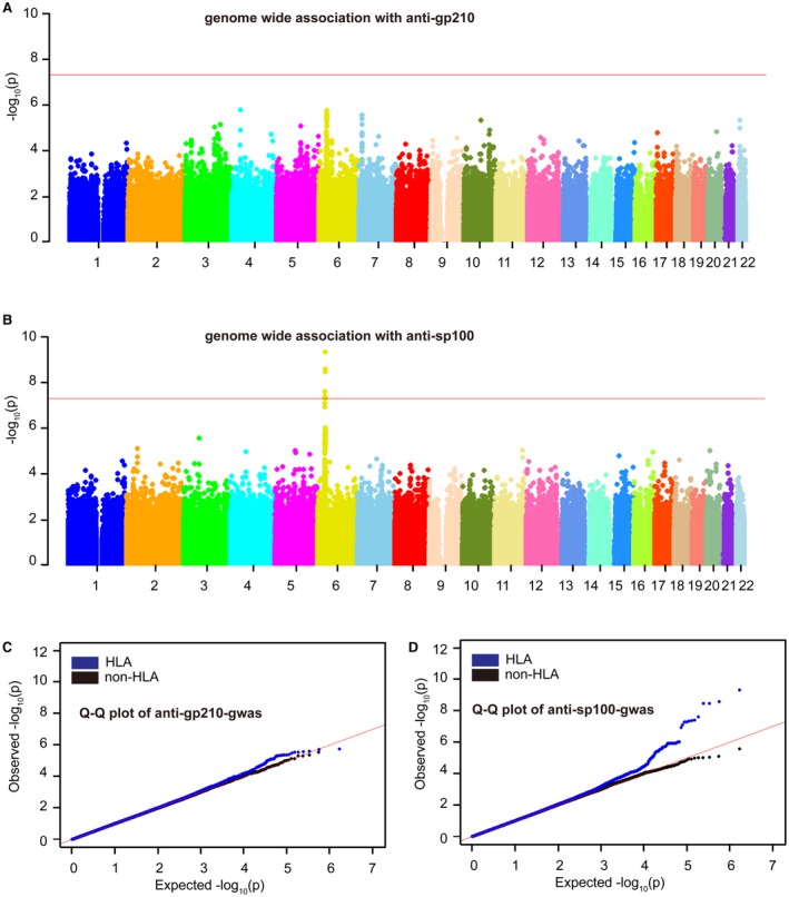
Figure 1.

Manhattan and Q‐Q plots of anti‐gp210 and anti‐sp100 GWA results. (A) Manhattan plot of anti‐gp210‐GWA results; (B) Manhattan plot of anti‐sp100 GWA results; (C) Q‐Q plot of anti‐gp210‐GWA results; (D) Q‐Q plot of anti‐sp100 GWA results. (A,B) The horizontal axis shows genomic position, and the vertical axis shows the −log P values for association. The horizontal red line (P = 5 × 10⁻⁸) was set as the GWA significance threshold. (C,D) The red line is for null expectation, and the plot in blue is for P values including HLA SNPs, whereas the plot in black is for the P value after excluding SNPs in the MHC region.
