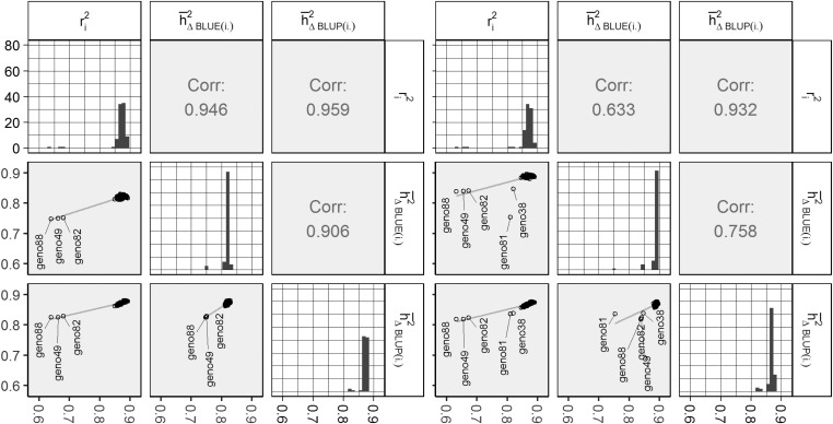
Figure 2.
Summary plot for genotype-wise heritability estimates for example 3 (left) and example 4 (right). Plots on the bottom left show scatter plots with simple linear regression lines and genotype-labels for outlying estimates. The plots on the diagonal show histograms for the respective column. The upper right corner displays the Pearson correlation estimate. BLUE, best linear unbiased estimation; BLUP, best linear unbiased prediction; Corr, correlation.

