Abstract
Introduction
Structural equation modeling (SEM) is a multivariate data analytic technique used in many domains of addictive behaviors research. SEM results are usually summarized and communicated through statistical tables and path diagrams, which emphasize path coefficients and global fit without showing specific quantitative values of data points that underlie the model results. Data visualization methods are often absent in SEM research, which may limit the quality and impact of SEM research by reducing data transparency, obscuring unexpected data anomalies and unmodeled heterogeneity, and inhibiting the communication of SEM research findings to research stakeholders who do not have advanced statistical training in SEM.
Methods and Results
In this report, we show how data visualization methods can address these limitations and improve the quality of SEM-based addictive behaviors research. We first introduce SEM and data visualization methodologies and differentiate data visualizations from model visualizations that are commonly used in SEM, such as path diagrams. We then discuss ways researchers may utilize data visualization in SEM research, including by obtaining estimates of latent variables and by visualizing multivariate relations in two-dimensional figures. R syntax is provided to help others generate data visualizations for several types of effects commonly modeled in SEM, including correlation, regression, moderation, and simple mediation.
Discussion:
The techniques outlined here may help spur the use of data visualization in SEM-based addictive behaviors research. Using data visualization in SEM may enhance methodological transparency and improve communication of research findings.
Keywords: applied data analysis, data visualization, latent variable modeling, mediation, moderation, structural equation model
Latent variable modeling – including structural equation modeling (SEM; Bollen, 1989) – is a common analytic technique in addictive behaviors research. SEM has many notable strengths, including the capacity to model error-free latent constructs based on observable indicators, work with multivariate and longitudinal data, and test mediation and moderation effects.
In this paper we argue that SEM can be further strengthened by another methodology that is often absent in the current practice of SEM: data visualization, which encompasses a broad set of techniques for representing data values and other information graphically (Few, 2009; Tufte, 1983). Data visualizations may illustrate model-derived statistical estimates (e.g., means displayed in bar graphs), disaggregated data points (e.g., numeric values of individual data points in a scatterplot), or combinations of model-derived and disaggregated data (e.g., individual data points in a scatterplot with an overlaid regression line). In this paper, we will focus specifically on data visualizations of disaggregated data focusing on structural relationships between latent variables1. Importantly, we differentiate data visualizations (which illustrate the data that generates the model parameter estimates), from model visualizations, such as SEM path diagrams, which graphically represent a theorized causal model in symbolic form (e.g., using ovals, rectangles, and arrows) without showing individual data values. We will show how data visualization can improve the quality and impact of research that uses SEM by facilitating easier interpretation and communication of SEM results, increasing data transparency, and helping researchers diagnose and address unexpected anomalies and heterogeneity of effects in their data. For brevity, we will not review basic SEM-related concepts, and refer readers to existing introductions to SEM (e.g., Lei & Wu, 2007; Streiner, 2006).
SEM and Data Visualization: A Rare Combination
Although data visualization can be utilized in a variety of statistical modeling approaches, its use is particularly rare in SEM research. For example, we identified a total of 37 peer-reviewed studies with abstracts, keywords, and/or titles containing the phrase “structural equation model”2 that were published in 2015 or 2016 in five leading addiction research journals (Addiction, Addictive Behaviors, Alcoholism: Clinical and Experimental Research, Journal of Studies on Alcohol and Drugs, Psychology of Addictive Behaviors). The total number of tables, path diagrams, and data visualizations in these articles is displayed in Figure 1. Tables and path diagrams were by far the most common means for presenting findings. Data visualizations were only used in a minority of instances, and all visualizations displayed aggregated values or model-derived parameter estimates (e.g., values of regression coefficients). None illustrated the values of individual, disaggregated data points. Though only representing a small snapshot of applied SEM research, this survey of SEM practices highlights the common approach of presenting applied SEM findings via summary fit statistics without illustrating individual data points that underlie the models.
Figure 1. Methods for displaying data in addiction-related SEM articles.
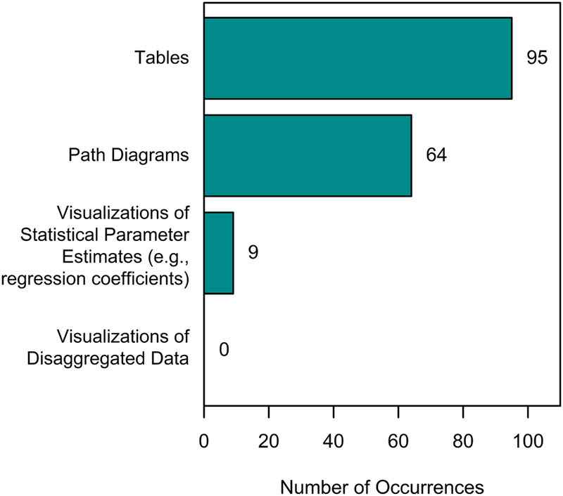
Caption: This graph illustrates the number of occurrences across articles, including multiple occurrences of the same type within the same article; therefore, the number of occurrences may exceed the 37 articles that were studied. [Color imagine online only]
Unique aspects of SEM require special considerations for generating data visualizations, which may contribute to the limited frequency of data visualization with the methodology. For example, applied SEM typically prioritizes overall model fit and path coefficient estimates more than individual data points. Additionally, obtaining the specific values of latent variables requires additional steps in most SEM software packages. The multivariate relations tested in many SEM models also requires additional considerations because many data visualization methods are designed for illustrating associations between only two variables. We address these issues in more detail below.
Advantages of SEM Data Visualization
Embracing data visualization could create opportunities to enhance the impact and quality of SEM research. First, it may improve the clarity of communication to key stakeholders – clinicians, patients, administrators, payers, and other researchers – who may benefit from understanding addictive behaviors research but often lack the advanced statistical training required to understand SEM-specific terminology (e.g., “factor loading”, “path coefficient”), SEM path diagram symbols (e.g., arrows, rectangles, ovals), or SEM results tables (Tay, Parrigon, Huang, & LeBreton, 2016; Tukey & Wilk, 1966).
Data visualization may also increase data transparency (Tay et al., 2016), which may enhance the credibility and replicability of research findings (Cumming, 2014; McCabe et al., 2018). For example, viewing full distributions of data that underlie statistical results can reveal unexpected anomalies and opportunities to glean insights from additional unmodeled effects. This can help detect outliers, heterogeneity of variance, unexpected distribution shapes, nonlinear relations, and other issues that may not be apparent from summary statistics alone (Anscombe, 1973; Tukey & Wilk, 1966; Tufte, 1983). In addition, data visualization can illustrate the precision and accuracy of a model (i.e., how well a model fits the data).
Data visualization also helps emphasize the heterogeneity of experiences across individuals who participate in research. Rather than relegating unmodeled variability as error variance, such variability is explicitly highlighted in data visualization. In contrast, emphasizing summary statistics (e.g., average effects across a sample) may unintentionally communicate model results as clear-cut and composed of homogeneous effects that are experienced uniformly across different individuals.
Bridging the Gap: Bringing Data Visualization to SEM
In the following sections, we will discuss two specific issues that may make data visualization less immediately intuitive in SEM-based research, along with practical ways these issues can be addressed. These issues include (1) accessing latent variable values to create visualizations of disaggregated data points and (2) visualizing multivariate relationships within the constraints of two-dimensional spaces. R syntax for all data visualizations and simulations are provided in supplemental materials.
Issue #1: Visualizing Latent Variables
Latent variables are, by definition, “hidden” and not directly observable. Thus, a preliminary task in visualizing SEM data involves visualizing central model characteristics that are inherently unobservable. Although latent variables cannot be directly observed, estimates of latent variable values (also called factor scores) can usually be obtained in SEM software, including Mplus (see “fscores” command, Muthén & Muthén, 2017), Stata (“predict latent”, StataCorp, 2017), R (“lavPredict” in lavaan package, Rosseel, 2012), and AMOS (“Data Imputation”, Arbuckle, 2012). Factor scores provide estimated values of a person’s relative standing on a latent variable, which can be imported into data visualization software (e.g., R, Excel, Tableau) and graphed with methods used for visualizing directly observable data, such as scatterplots, histograms, and line graphs.
Of note, these factor scores are not identical to latent variable themselves, and different estimation algorithms can produce different factor score values (e.g., Bartlett, 1937; Thomson, 1934; Thurstone, 1935). This is because estimating factor scores in SEM introduces model indeterminacy, or systems of equations with more unknown parameters than information that can be used to solve them. Factor score values are thus composed of both a determinate component (i.e., part of the estimate that is constant across estimation algorithms) and an indeterminate component (i.e., part of the estimate that may vary across estimation algorithms). Factor scores are therefore imperfectly correlated with the latent variables themselves, and visualizations of factor scores will not perfectly represent the actual latent variables (see Devlieger & Rosseel, 2017). The exact degree of indeterminacy in the factor scores cannot be known, but we direct readers to Grice (2001) for more information on gauging the range of indeterminacy.
To demonstrate how visualizations can improve the interpretation of latent variable models, three visualizations of factor scores are illustrated in Figure 2, each showing hypothetical relations between latent craving (X) and latent drinking (Y) derived from different simulated data sets of observed variables (x1-x4 and y1-y4). Each simulated data set yields the same correlation between latent variables (r=0.65) but different substantive interpretations. In panel A the correlation is linear, in panel B it is curvilinear (small correlation when craving is low, large correlation when craving is high), and in panel C it is discontinuous (few people reporting “average” levels of craving). These differences are not evident from the corresponding path diagrams or model fit indices alone, and as shown in the right-hand panels, all models had good fit and similar factor loadings, residual errors, and model-fit statistics. Relying only on tables and path diagram summaries could easily lead to identical interpretations across the three data sets. In contrast, the use of data visualization highlights the differences in underlying data patterns (Anscombe, 1973) and may help with exploring alternative, nonlinear relationships between craving and drinking (see supplemental materials for examples of alternative model parameterizations of these data).
Figure 2. Three different factor score patterns are illustrated via scatterplots (left column) despite having similar model fit indices, path coefficients, and latent variable correlation estimates (right column).
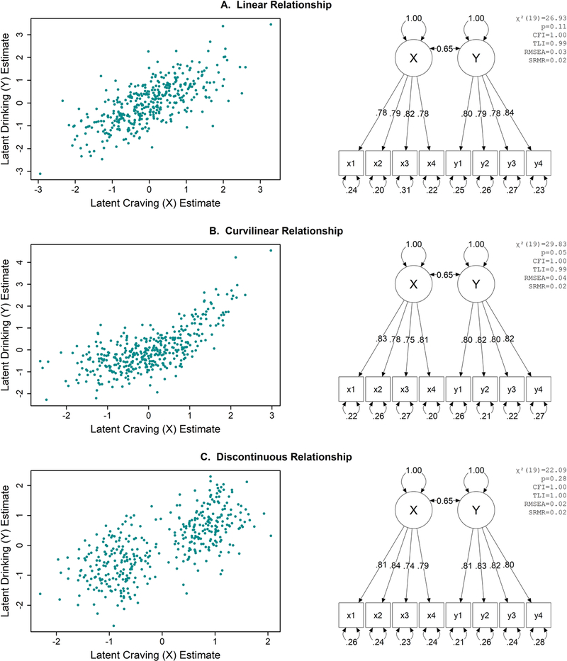
[Color imagine online only] Caption: Data are simulated for this example. All path coefficients are statistically significant. CFI=comparative fit index, TLI=Tucker-Lewis Index, RMSEA=root mean square error of approximation, SRMR=standardized root mean residual.
Issue #2: Visualizing Multivariate Relationships in Two-Dimensional Space
A second visualization challenge is that SEM commonly tests multidimensional relationships that must be visually represented on flat, two dimensional surfaces (e.g., journal pages, computer screens). There are numerous techniques for visualizing multivariate data (e.g., Few, 2009), which we cannot review in full here. Instead, we focus on visualizations for two types of multivariate effects common to addictive behaviors research: moderation and mediation.
Visualizing moderation.
We first consider a hypothetical moderation scenario testing whether the strength of the association between alcohol craving (X) and drinking (Y) varies based on a third variable reflecting mindfulness (Z; e.g., Enkema & Bowen, 2017; Ostafin & Marlatt, 2008; Tapper, 2018; Witkiewtiz et al., 2014). In a linear regression framework, this could be tested using the equation:
| (Equation 1) |
In Equation 1, is the expected value of Y and B0-B3 are regression coefficient estimates for the intercept, the main effects of craving (X) and mindfulness (Z), and the craving × mindfulness (XZ) interaction. This moderation effect could be tested in an SEM framework as shown in the path diagram of Figure 3, where latent drinking (Y) is predicted by latent craving (X), latent mindfulness (Z), and the latent interaction of craving and mindfulness (XZ) derived using the unconstrained product indicator approach (Marsh, Wen, & Hau, 2004)3 in which the mean-centered products of x1-x4 and z1-z4 serve as indicators of the latent interaction XZ. The path diagram in Figure 3 shows that craving and mindfulness have positive and negative path coefficients predicting drinking, respectively, which are qualified by a negative path coefficient for the craving × mindfulness interaction. The combined effects of these relations can be difficult to ascertain from path coefficient values alone (Dawson, 2014; Preacher, Curran, & Bauer, 2006). In the data visualization in Figure 3, we use small multiples (i.e., subsets of data laid out across multiple plots; Tufte, 1983) to illustrate this interaction by relating craving and drinking (x and y axes, respectively) across levels of mindfulness. Each plot shows a subset of participants in one of the four quartiles of the latent mindfulness estimates (e.g., participants in the first graph fall between the minimum value and 25th percentile of latent mindfulness estimates), illustrating a strong correlation between craving and drinking at lower levels of mindfulness and a weaker correlation at higher levels of mindfulness. The individual data points further illustrate an unmodeled restriction in the variability of craving and drinking at the highest levels of mindfulness, which would not be detected from summary model output alone (McCabe et al., 2018). This could be probed further to evaluate a potentially unmodeled insight, for example, that mindfulness may reduce the variability in craving and drinking in addition to moderating their relationship.
Figure 3. Latent variable moderation analysis visualized using small multiples of scatter plots. [Color imagine online only].
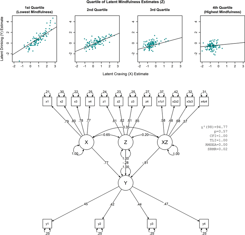
Caption: Scatter plots (top) show latent estimates of X and Y graphed across quartiles of moderator variable Z. The corresponding path diagram is also shown (bottom). Data are simulated for this example. All path coefficients are statistically significant (see supplemental R syntax). See Figure 2 caption for explanation of model fit statistic abbreviations.
An alternative visualization of the same data in Figure 4 is shown in Figure 5. Instead of using small multiples, the color and size of each data point encodes the corresponding quartile for the estimated values of latent mindfulness. This approach may be useful in cases where multiple plots are undesirable or when it is useful to show all data sets within a single plotting area. Research on visual perception can help inform choices in graphing multivariate data to prioritize faster, less effortful, and more accurate visual perception of the variables that should be most accurately perceived by the viewer (Cleveland & McGill, 1985; Few, 2009; Ware, 2004). For example, small differences in x- and y-axis positions can quickly and accurately be perceived with little effort, but small differences in size or color are more difficult to perceive and more prone to erroneous interpretation. Thus, one may prioritize the x- and y-axes for displaying data values that are most important or should be perceived the most quickly, accurately, or precisely, while using other features (e.g., color, size, shape) to encode values that have secondary importance or that can be perceived more slowly, less accurately, or with less precision without significant detriment.
Figure 4. Latent variable moderation analysis visualized using scatter plot with moderator values encoded by size and color. Differences in x- and y-axis position can be perceived quickly, accurately, and precisely, but differences in color and size are typically perceived more slowly and with less accuracy and precision. [Color imagine online only].
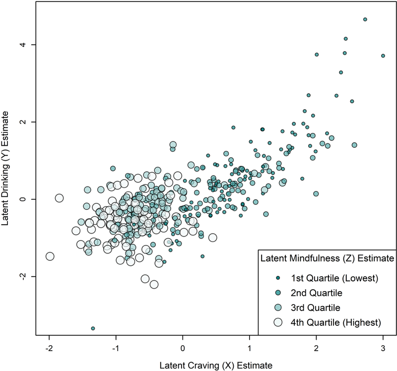
Caption: Data are simulated for this example and are identical to those modeled in Figure 3.
Figure 5. Latent variable mediation analysis visualized using mediation effect plot described by Fritz and Mackinnon (2008). [Color imagine online only].
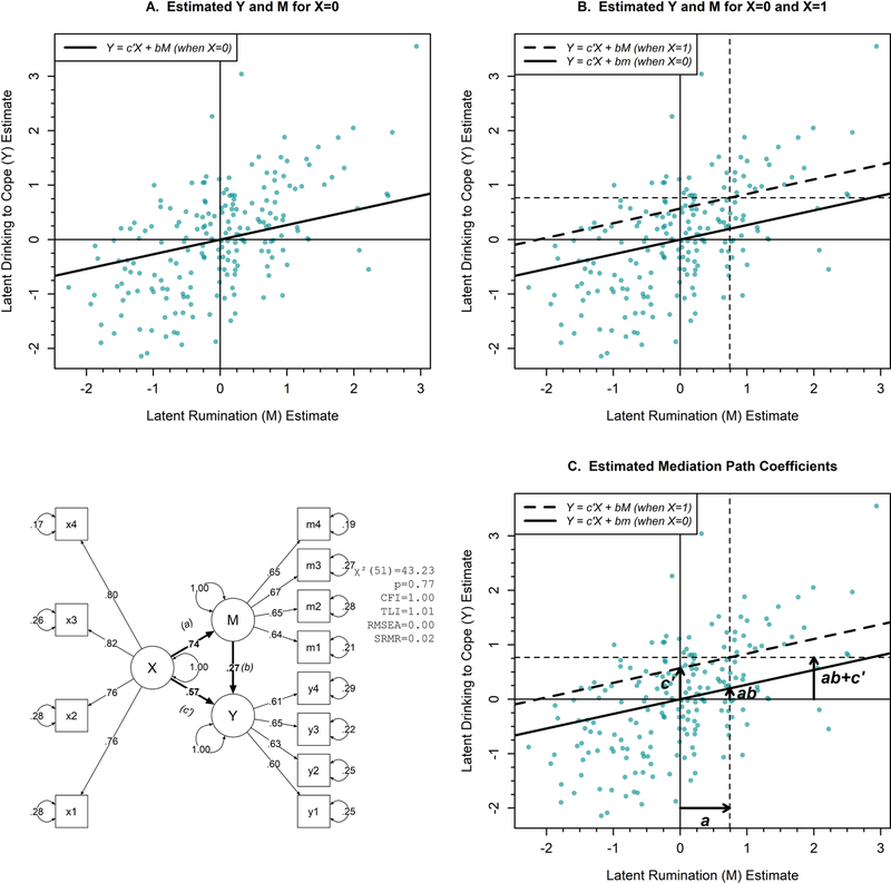
Caption: Structural relations underlying mediation analysis are displayed in bold on the path diagram. Data are simulated for this example. All path coefficients are statistically significant. Circumflexes (“hats”) are not included in the regression equations for simplicity. See Figure 2 caption for explanation of model fit statistic abbreviations.
Visualizing mediation.
Compared to moderation, methods for visualizing mediation have been explored less extensively. Before discussing visualization methods, we will briefly review the principles of statistical mediation with an emphasis on interpretation of mediation path coefficients (see Hayes, 2009; MacKinnon, Fairchild, & Fritz, 2007 for more in-depth introductions).
Consider a hypothetical simple mediation model in which the relation between depressive symptoms (X) and drinking motives (Y) is partially attributed to the intermediate variable ruminative thinking (M; e.g., Bravo et al., 2018). That is, having more depressive symptoms increases ruminative thinking, which in turn increases coping-based drinking motives. In a linear regression framework, this could be expressed by the following equations:
| (Equation 2) |
| (Equation 3) |
| (Equation 4) |
Mediation effects are commonly described by the values of the regression coefficients, a, b, c, c’, and the ab product. In our hypothetical example, a represents the expected difference in ruminative thinking (M) for a one-unit increase in depression (X). b represents the expected difference in drinking to cope (Y) for a one-unit difference in ruminative thinking (M) when depression (X) is held constant. c represents the expected difference in drinking to cope (Y) for a one-unit difference in depression (X) when ruminative thinking (M) is not included in the model – that is, the total effect of depression on drinking to cope (in a simple mediation model, total effect c = ab + c’). c’ represents the expected difference in drinking to cope (Y) for a one-unit difference in depression (X) when ruminative thinking (M) is held constant – that is, the direct effect of depression on drinking to cope that is not mediated by ruminative thinking. The ab product indicates the expected difference in drinking to cope (Y) for a one-unit difference in depression (X) that can be attributed to changes in ruminative thinking (M) – that is, the indirect effect of depression on drinking to cope that acts through ruminative thinking. Coefficients B0-B2 are model intercept terms.
A similar mediation model can be tested in an SEM framework where X, M, and Y are latent variables (see Figure 5 path diagram) with a, b, and c’ estimated from the structural paths between them (see bold arrows Figure 5 path diagram). The latent variable intercepts can be omitted (i.e., set to zero), removing the B0-B2 coefficients from the equations above, and the latent variable total variances can be fixed to 1, allowing the relations expressed in the structural path coefficients to be interpreted in terms of standard deviation (SD) units (e.g., the a coefficient represents the expected difference in M, in SD units, based on a one SD difference in X).
The data visualizations in Figure 5 show the mediation effect using methods described by Fritz and Mackinnon (2008). The visualization is built up sequentially across three panels (A, B, and C) to help explain its interpretation here, with each new panel adding information to help illustrate the mediation path coefficients a, b, and c’. Panel A shows the estimated values of latent variables M and Y (x- and y-axes) with solid vertical and horizontal lines at M=0 and Y=0, respectively, which correspond to the mean values of those latent variables. A diagonal regression line also illustrates the predicted value of Y in Equation 2 across values of M when X is held constant at 0. Panel B adds additional dashed lines, including a vertical line at the estimated value of M from Equation 3 that is obtained when X=1; a dashed horizontal line at the estimated value of Y from Equation 4 when X=1; and a dashed diagonal line at the predicted values of Y in Equation 2 across values of M when X is held constant at 1.
Panel C adds arrows between these lines to illustrate the mediation path coefficient values within the graphing area. The two vertical lines reflect the estimated difference in M when X is 0 versus 1, and the difference between these lines equals the value of a (i.e., the predicted difference in M based on a one-unit change in X). The slopes of the diagonal lines reflect the value of b (i.e., the predicted change in Y based on a one-unit change in M, holding X constant). The two horizontal lines reflect the estimated difference in Y when X is 0 versus 1, and the difference between these lines equals the value of c (i.e., the total effect, or expected change in Y given a one-unit change in X, which is equivalent to ab+c’). The distance between the two horizontal lines is further segmented into two components based on where they intersect the diagonal regression lines, one reflecting c’ (i.e., the direct effect, or expected change in Y based on a one-unit change in X, holding M constant) and one reflecting ab (i.e., the indirect effect, or expected change in Y that acts through M based on a one-unit change in X). For example, using the path coefficient values shown in the path diagram of Figure 5, a 1-unit (1-SD) increase in depression would be expected to increase rumination by 0.74 SD (a) and increase drinking to cope by a total effect of 0.77 SD (ab+c’). That total effect can be attributed to a direct effect where a 1-SD change in depression increases drinking to cope by 0.57 SD (c’) and an indirect effect via ruminative thinking that further increases drinking to cope by 0.20 (ab).
The final visualization in Figure 5 (panel C) emphasizes path coefficient values more than the disaggregated data points and does not show any disaggregated data for the X variable. The approach may therefore be most useful for illustrating model-implied effects, including the decomposition of total effect into direct and indirect effects, which are often of substantive interest to researchers. However, the interpretation of path coefficients may not be intuitive to stakeholders unfamiliar with mediation analysis, and the graph does not directly illustrate the sequence of causal relations often implied in mediation analysis (i.e., X causes M, M causes Y).
Figure 6 provides an alternative illustration of the same data from Figure 5. The center of the figure shows a path diagram illustrating of the mediational model (with indicator variables and variances omitted from the diagram). Each effect in the path diagram is annotated with a scatterplot showing the relation between latent variables using disaggregated factor scores. The slopes of the overlaid regression lines are equal to their corresponding mediation path coefficients (a, b, c, and c’) estimated in the structural model. Unlike Figure 5, Figure 6 does not illustrate the decomposition of the total effect into direct and indirect effects. However, Figure 6 shows data for all the latent variables, highlights the sequential relations implied in the mediation analysis, and can be extended to illustrate models with any number of mediators. Thus, both methods could be useful for illustrating mediational relations, each having different emphases and providing different information.
Figure 6. Alternative visualization of latent variable mediation. [Color imagine online only].
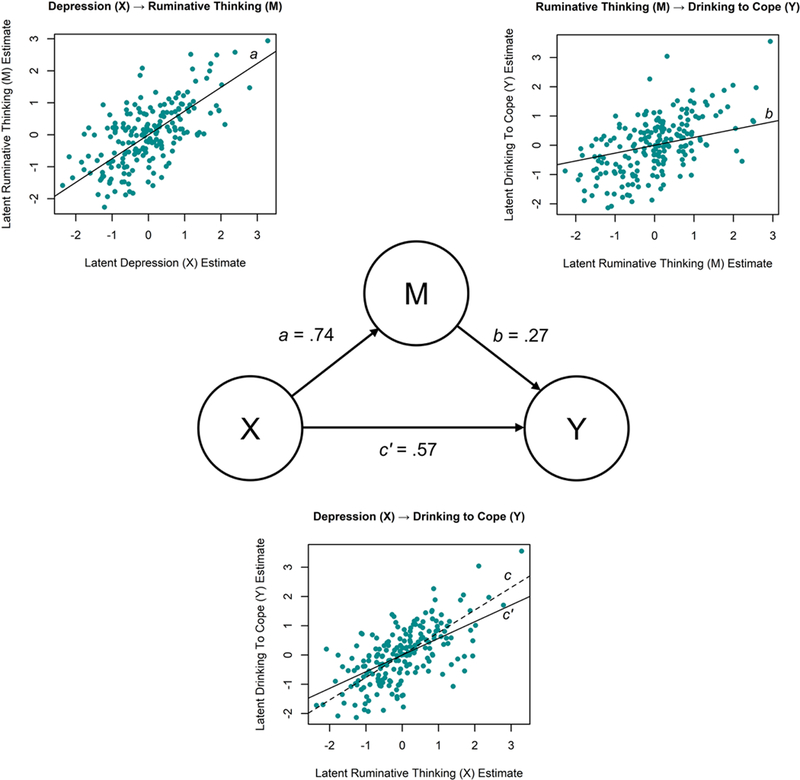
Caption: The slopes of the regression lines correspond to the a, b, c, and c’ coefficient in Equations 2–4. Data values are identical to those modeled in Figure 5.
Discussion and Conclusion
Data visualization can complement and enhance the impact and quality of SEM-based research in addictive behaviors. We have outlined specific techniques that may help researchers utilize data visualization in SEM-based research. As the complexity of statistical analyses grows, we hope that addictive behaviors researchers also embrace data visualization to improve data transparency, visualize modeled and unmodeled effects, and facilitate communication to research stakeholders. This discussion may serve as a stepping stone for bridging the gap between SEM and data visualization. Future work may also empirically test whether and how specific visualization methods may enhance communication of research findings or detection of unexpected effects in data to key research stakeholders.
With that great statistical power comes a great statistical responsibility. The increasing complexity of statistical modeling makes it more essential to confirm that our results are trustworthy, to improve our methodological transparency, and to convey research findings in ways that are digestible for the stakeholders who benefit from addictive behaviors research. Visualization helps us work toward meeting these responsibilities and therefore is an increasingly critical aspect of our scientific process.
Supplementary Material
Highlights.
Data visualization is rarely used in SEM-based addictive behaviors research
We discuss challenges, benefits, and approaches for visualizing SEM data
Visualization may improve research transparency and communication to stakeholders
“One great virtue of good graphical representation is that it can serve to display clearly and effectively a message carried by quantities whose calculation or observation is far from simple.” - Tukey and Wilk (1966/1986, p. 568)
Acknowledgments
Role of Funding Sources
This study was funded by the National Institute on Alcoholism and Alcohol Abuse (NIAAA) awards K01AA024796 and K02AA023814 and by National Institute on Drug Abuse (NIDA) grant F31DA040376. The content is solely the responsibility of the authors and does not necessarily represent the official views of NIAAA, NIDA, or the National Institutes of Health, and these institutes had no role in the study design, data analysis, interpretation, writing of the manuscript, or the decision to submit the paper for publication.
This study was funded by the National Institute on Alcoholism and Alcohol Abuse (NIAAA) awards K01AA024796 and K02AA023814 and by National Institute on Drug Abuse (NIDA) grant F31DA040376. Dr. Atkins is a co-founder with equity stake in a technology company, Lyssn.io. The content is solely the responsibility of the authors and does not necessarily represent the official views of NIAAA, NIDA, or the National Institutes of Health. All authors contributed to the study design, manuscript revision, idea generation, and approval of the final manuscript. Dr. Hallgren wrote the first draft of the manuscript and conducted the statistical analyses. The authors wish to thank Andrew Littlefield for his thoughtful feedback on a draft manuscript.
Footnotes
Publisher's Disclaimer: This is a PDF file of an unedited manuscript that has been accepted for publication. As a service to our customers we are providing this early version of the manuscript. The manuscript will undergo copyediting, typesetting, and review of the resulting proof before it is published in its final citable form. Please note that during the production process errors may be discovered which could affect the content, and all legal disclaimers that apply to the journal pertain.
Availability of Syntax
Supplemental files provide R syntax (R Core Team, 2017) to simulate data, conduct SEM analyses (Rosseel, 2012), generate path diagrams (Eskamp, 2017), and create the data visualizations shown here.
Conflict of Interest
Dr. Atkins is a co-founder with equity stake in a technology company, Lyssn.io. The other authors declare that they have no conflicts of interest.
For discussions of data visualizations of measurement models (i.e., relationships between latent variables and their corresponding indicators), we refer readers to the item response theory literature (e.g., DeMars, 2010)
Search was conducted using PsycINFO and included search terms for “structural equation model”, “structural equation models”, and “structural equation modeling”. This examination was notably non-comprehensive (e.g., did not include articles that used SEM without mentioning it in the abstract or articles that described SEM by other terms, e.g., latent growth curve model); however, we believe it is reflective of the general literature of applied SEM studies.
This is one of several ways to test latent interactions; see Marsh, Wen, Nagengast, & Hau (2012) for more discussion.
References
- Arbuckle JL (2012). IBM SPSS Amos 21 User’s Guide Chicago: IBM SPSS. [Google Scholar]
- Anscombe FJ (1973). Graphs in statistical analysis. The American Statistician, 27(1), 17–21. [Google Scholar]
- Bartlett MS (1937). The statistical conception of mental factors. British Journal of Psychology, 28, 97–104. [Google Scholar]
- Bravo AJ, Pilatti A, Pearson MR, Mezquita L, Ibáñez MI, & Ortet G (2018). Depressive symptoms, ruminative thinking, drinking motives, and alcohol outcomes: A multiple mediation model among college students in three countries. Addictive Behaviors: 76, 319–327. [DOI] [PubMed] [Google Scholar]
- Bollen KA (1989). Structural equations with latent variables New York: Wiley. [Google Scholar]
- Cleveland WS, & McGill R (1985). Graphical perception and graphical methods for analyzing scientific data. Science, 229(4716), 828–833. [DOI] [PubMed] [Google Scholar]
- Cumming G (2014). The new statistics: Why and how. Psychological science, 25(1), 7–29. [DOI] [PubMed] [Google Scholar]
- Dawson JF (2014). Moderation in management research: What, why, when, and how. Journal of Business and Psychology, 29(1), 1–19. [Google Scholar]
- DeMars C (2010). Item response theory New York: Oxford University Press. [Google Scholar]
- Devlieger I, & Rosseel Y (2017). Factor score path analysis. Methodology, 13(suppl.), 31–38. [Google Scholar]
- Enkema MC, & Bowen S (2017). Mindfulness practice moderates the relationship between craving nd substance use in a clinical sample. Drug and Alcohol Dependence, 179, 1–7. [DOI] [PubMed] [Google Scholar]
- Eskamp S (2017). semPlot: Path diagrams and visual analysis of various SEM packages’ output. Version 1.1, retrieved from January 15, 2018 from https://CRAN.R-project.org/package=semPlot.
- Few SC (2009). Now you see it Analytics Press: Oakland, CA. [Google Scholar]
- Grice JW (2001). Computing and evaluating factor scores. Psychological Methods, 6(4), 430–450. [PubMed] [Google Scholar]
- Hayes AF (2009). Beyond Baron and Kenny: Statistical mediation analysis in the new millennium. Communication Monographs, 76(4), 408–420. [Google Scholar]
- Lei PW, & Wu Q (2007). Introduction to structural equation modeling: Issues and practical considerations. Educational Measurement: Issues and Practice, 26(3), 33–43. [Google Scholar]
- MacKinnon DP, Fairchild AJ, & Fritz MS (2007). Mediation analysis. Annual Review of Psychology, 58, 593–614. [DOI] [PMC free article] [PubMed] [Google Scholar]
- Marsh HW, Wen Z, & Hau KT (2004). Structural equation models of latent interactions: Evaluation of alternative estimation strategies and indicator construction. Psychological Methods, 9(3), 275–300. [DOI] [PubMed] [Google Scholar]
- Marsh HW, Wen Z, Nagengast B, & Hau K-T (2012). Structural equation models of latent interaction. In Hoyle RH (Ed.), Handbook of structural equation modeling (pp. 436–458). New York: Guilford Press. [Google Scholar]
- McCabe CJ, Kim DS, & King KM (2018). Improving present practices in the visual display of interactions. Advances in Methods and Practices in Psychological Science, 1(2), 147–165. [DOI] [PMC free article] [PubMed] [Google Scholar]
- Muthén LK, & Muthén BO (2017). Mplus User’s Guide (8th ed.). Los Angeles, CA: Muthén & Muthén. [Google Scholar]
- Ostafin BD, & Marlatt GA (2008). Surfing the urge: Experiential acceptance moderates the relation between automatic alcohol motivation and hazardous drinking. Journal of Social and Clinical Psychology, 27(4), 404–418. [Google Scholar]
- Preacher KJ, Curran PJ, & Bauer DJ (2006). Computational tools for probing interactions in multiple linear regression, multilevel modeling, and latent curve analysis. Journal of Educational and Behavioral Statistics, 31(3), 437–448. [Google Scholar]
- R Core Team. M (2017). A Language and Environment for Statistical Computing. Version 3.4.2 Available from https://www.R-project.org/
- Rosseel Y (2012). An R package for structural equation modeling. Journal of Statistical Software, 48(2), 1–36. http://www.jstatsoft.org/v48/i02/ [Google Scholar]
- StataCorp (2017). Stata 15 Structural Equation Modeling Reference Manual College Station, TX: Stata Press. [Google Scholar]
- Streiner DL (2006). Building a better model: An introduction to structural equation modelling. Research Methods in Psychiatry, 51(5), 317–324. [DOI] [PubMed] [Google Scholar]
- Tapper K (2018). Mindfulness and craving: Effects and mechanisms. Clinical Psychology Review, 59, 101–117. [DOI] [PubMed] [Google Scholar]
- Tay L, Parrigon S, Huang Q, & LeBreton JM (2016). Graphical descriptives: A way to improve data transparency and methodological rigor in psychology. Perspectives in Psychological Science, 11(5), 692–701. [DOI] [PubMed] [Google Scholar]
- Thomson GH (1935). The definition and measurement of g (general intelligence). Journal of Educational Psychology, 26 (241–262). [Google Scholar]
- Thurstone LL (1935). The vectors of mind Chicago, IL: University of Chicago Press. [Google Scholar]
- Tukey JW & Wilk MB (1986). Data analysis and statistics: An expository overview. In Jones LV (Ed.), The collected works of John W. Tukey (pp. 549–578). Monterey, CA: Wadsworth & Brooks; (Original work published 1966) [Google Scholar]
- Tufte ER (1983). The visual display of quantitative information Graphics Press: Cheshire, CT. [Google Scholar]
- Ware C (2004). Information visualization: perception for deign (2nd ed.). Morgan Kaufmann Publishers: San Francisco. [Google Scholar]
- Witkiewitz K, Bowen S, Harrop EN, Douglas H, Enkema M, & Sedgwick C (2014). Mindfulness-based treatment to prevent addictive behavior relapse: Theoretical models and hypothesized mechanisms of change. Substance Use & Misuse, 49, 513–524. [DOI] [PMC free article] [PubMed] [Google Scholar]
Associated Data
This section collects any data citations, data availability statements, or supplementary materials included in this article.


