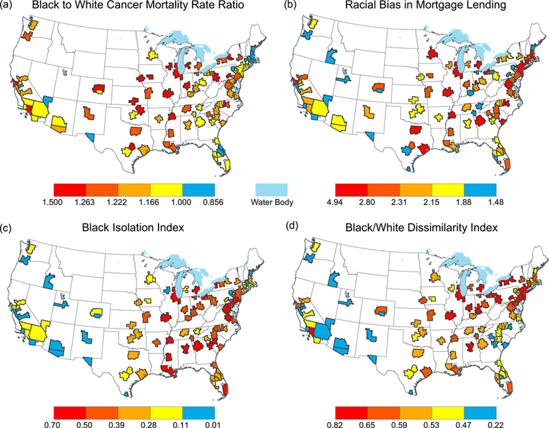
Figure 1. Geographic variation in structural racism and Black-to-White cancer mortality disparities across US metropolitan areas.

Shown are the spatial distributions of (panel a) cancer mortality disparities and three measures of structural racism in housing: (panel b) Racial Bias in Mortgage Lending, (panel c) Black isolation, and (panel d) dissimilarity. Category breaks on all maps represent quantiles, such that one fifth of the metropolitan areas shown are represented by each color. However, to enhance interpretation, the lowest category (blue) for mortality disparities is adjusted such that blue areas represent places where Blacks have equal or lower mortality than Whites. In contrast, metropolitan areas where Blacks have higher mortality rates than Whites are shown in shades of red and yellow, with the darkest red indicating the largest disparity between Blacks and Whites. Of the 100 largest US metropolitan areas, information was available for all metropolitan areas for structural racism measures, and for all but 3 for mortality.
