

Abstract
The increasing complexity of biological data along with the need to communicate results requires visualization. It requires more training and support though to help scientists create efficient visual representations of their work.

Subject Categories: S&S: Careers & Training, Methods & Resources, S&S: Ethics
Picture a visual interface for exploring phosphatases. A search tool lets you select a phosphatase and a substrate. The display allows you to toggle between interactive and multiscale views of the phosphatase structure, its hydrophobicity, electrostatic nature, active site conformation, and other attributes, and how these change upon substrate binding. Along with structural alterations, the application shows possible downstream events, such as the activation or inactivation of signaling pathways or transcriptional regulation of specific genes. Visual interfaces like these can lead to an intuitive understanding of how different proteins work, and, in this case, provide clarity into the functional consequences of a phosphatase binding to one substrate versus another. The relationship between structure and function can be shown clearly in such an interface, by allowing the user to focus in on an active site, for instance, to see subtle changes in structure. This type of application might provide users with the ability to predict behaviors of newly discovered proteins, simulate changes in its structure upon substrate binding, and suggest appropriate experiments to test its function. This is the power of visualization.
Building effective interfaces and visualization tools for biologists is therefore not a straightforward task and requires many iterations of design and development.
Yet, biological systems are chaotic and complex with interactions that span different size and time scales. In a series of presentations “Media for Thinking the Unthinkable”, Bret Victor, a computer scientist and interface designer, argues that dynamic representations and new media are needed in order to explore and understand such complex data efficiently. Building effective interfaces and visualization tools for biologists is therefore not a straightforward task and requires many iterations of design and development. In order to get the most out of these new media, however, we must make an effort to better support visual literacy within the research community.
Visualization lays the foundation for new modes of thought and dissemination of scientific ideas and information.
Why visualize?
Visualizations are often an effective way to document and share scientific discoveries, thereby contributing to the larger pool of scientific knowledge. The structure of DNA by Francis Crick and James Watson is a fine example. If Crick's wife, Odile, had not drawn a visual representation of the DNA structure for the 1953 research paper, it would have been more difficult for readers to appreciate its structure. It was also through the visualization and manipulation of a physical cardboard model that James Watson had a serendipitous insight into the structural details of DNA.
Visualization lays the foundation for new modes of thought and dissemination of scientific ideas and information 1. It is a common universal language that breaks through language barriers, allowing for more effective and efficient science communication. Information scientist, Marilyn Ostergren 1, in her fascinating dissertation on “How scientists develop competence in visual communication”, looks into the benefits that visualization confers on both user and viewer, and broadly categorizes them into four themes. First, it enables comprehension by providing access to complex information, both spatial and non‐spatial. Second, it enhances cognition by provoking and developing visual thinking, allowing access to a deeper mode of thought. Third, it facilitates communication by disseminating information, persuading the viewer, and prompting further discourse. Lastly, visuals improve the memorability of the depicted information compared with verbal representations.
Visualization bridges the scales from the atomic and molecular levels, to that of cells, tissues and whole organisms.
Deriving from Ostergren's 1 study, visual perception, working memory, and long‐term memory are the three major components of processing visual information. An ideal visualization maximizes reliance on visual perception. It is important to have easily discriminable elements, reveal relationships between those elements, and guide attention or flow through them with a visual hierarchy. Load on the working memory is minimized by avoiding clutter, information deluge, redundancy, and integrating pertinent text and images. Information stored in the long‐term memory is optimized by building on existing knowledge and conventions. An aesthetic appeal increases and maintains attention and interest. In a nutshell, a compelling visualization makes efficacious use of cognitive resources.
Visualization is fundamental
Extracting meaning from complex and high‐density data often requires automated analysis and visualization to reveal hidden and meaningful patterns in abstract data. In genomics, for instance, interactive interfaces allow users to browse genomes, compare genomic sequences, examine RNA sequences, and analyze gene expression data 2. New applications are also being built to address specific and often complex issues, such as understanding how the location of genes within a three‐dimensional and folded chromosome influences gene activity. Caltech brought together a group of design and computer science students over a summer to address this challenge. They developed a software prototype called 3D Genome Interface or Gin that allows researchers to visualize the 3D structure of the genome, navigate, and view metadata for specific genes of interest. Users of this prototype are finding it transformative to be able to compare genome structures and gene expression data among different cell types and believe this will provide tremendous insight into how various folding patterns can affect gene transcription, cell behavior, and disease susceptibility.
Animations can be used to effectively describe complex molecular processes that may be difficult to illustrate using other means…
Visualizations play a key role in numerous biological fields. Structural biologists use visualizations to understand and describe protein structure and function. Visualizations of metabolic reactions, post‐translational modifications, and protein–protein interactions help organize thousands of chemical events. Visualizations are aiding understanding of relationships between organisms and their evolution 2. This is just a glimpse into the myriad ways in which visualization is being utilized in the life sciences. An enlightening review by O'Donoghue et al 2, in the Annual Review of Biomedical Data Science, captures more in detail.
Despite the capabilities of digital publishing, many journals have retained their print‐based nature, where multimedia content is supplied as supplementary information…
Microscopy has been one of the oldest and most predominant methods to visualize biological phenomena and diagnose diseases. Recent advances enable biologists to image tissues, cells, and cellular structures in vivo, in real time and in 3D to gain insights into morphology and function 2. New visualization endeavors built on imaging data, such as the Allen Cell Explorer (Fig 1), will allow cell biologists to delve deeper into the architecture, composition, and dynamics of normal and diseased cells, potentially informing research and diagnosis. Visualization bridges the scales from the atomic and molecular levels, to that of cells, tissues, and whole organisms. The integration of these disparate data allows scientists to view these systems as a seamless whole and can greatly reduce the cognitive load while understanding multiscale biology.
Figure 1. Analysis using Allen Cell Explorer.
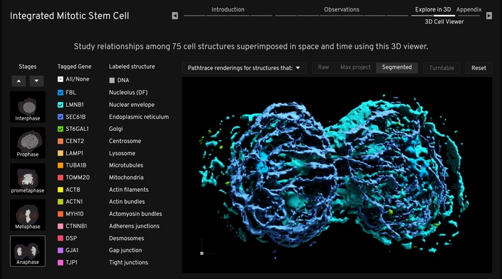
Snapshot of the 3D viewer of the integrated mitotic stem cell, showing renderings of cellular structures (nucleolus, nuclear envelope, ER, and Golgi) that disassemble and compartmentalize during mitosis. The 3D viewer can be used to study relationships between 75 cellular structures.
Virtual realities
Looking ahead, augmented reality (AR) and virtual reality (VR) will have a tremendous impact on scientific visualization, and have already shown immense value to clinicians, neuroscientists, psychologists, biologists, and other researchers 3. AR and VR are more intuitive to use than flat 2D screens for viewing complex 3D structures, and thereby provide a quicker path to insights 4. In addition to the multiple‐user features for collaborative visualization, the VR environment may soon be able to support real‐time transfer of data. In terms of application, scientists are employing AR devices (for example, Microsoft HoloLens) to get an enhanced and interactive view of protein structures and computed tomography scans 4. VMD and ChimeraX support an immersive environment to analyze protein structures and 3D microscopy data (Fig 2). VR allows for easy and intuitive movement through a protein structure from any position with better depth perception, a feature that can be especially useful when fixing side‐chain placement. Future developments may enable the user to perform more complex visual manipulations of structural data without leaving the visual arena. The technology will easily further advance to enable faster rendering of complex and large structures, and support visualization of high‐resolution dynamic simulations. Moving from atomic and molecular structure to cellular structure, ConfocalVR allows researchers to immerse themselves in 3D reconstructions built from confocal microscopy image stacks to visualize cellular architecture, volume, and protein distribution within a cell 4. Similarly, a team in Australia working on global virtual environments for interactive and intuitive exploration of scientific phenomena developed a VR model of a breast cancer cell from serial block‐face scanning electron microscopy images.
Figure 2. Using VR to explore protein structures.
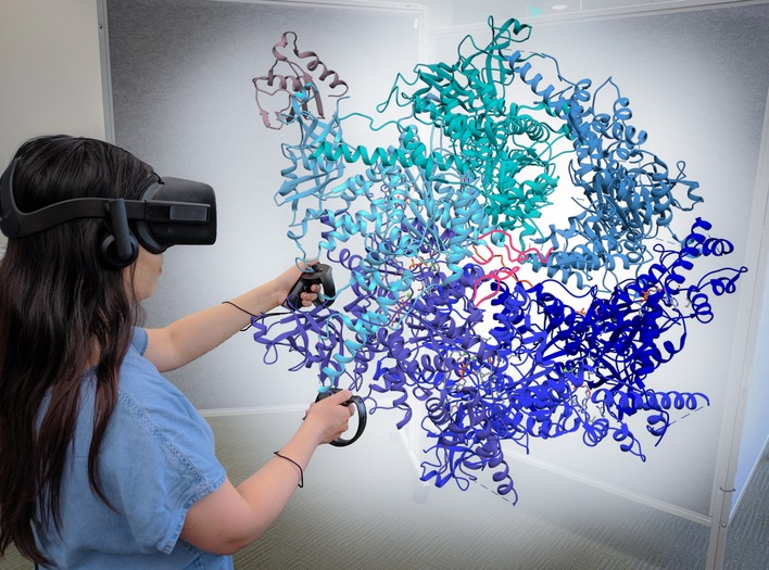
Protein structures can be viewed, handled, and manipulated in a very intuitive way [PDB ID: 6OPC (https://www.rcsb.org/structure/6OPC) in the image].
Since visualization is fundamental, basic instruction in building and interpreting visualizations will put students on a faster track to visualization fluency.
Such endeavors bring to life microscopic environments for researchers, simulate reality, and inform better questions in basic and translational biomedical research. For instance, Interactome CAVE (iCAVE), an open‐source tool for visualizing complex, large, and multi‐layered networks in 3D for use on desktop, stereoscopic and immersive platforms, addresses the drawbacks of many existing tools used in network exploration. It is not limited by the number of molecules or interactions that can be displayed, provides magnification, a wide field of view, and is highly intuitive for networks with or without 3D localizations. These and many more projects such as Juicebox VR, AR Sandbox, Google AR microscope, and InViewR are providing us with novel applications to view and interact with scientific data in more intuitive and engaging formats 4. In addition, Springer Nature has initiated mixed-reality Hackathon events to innovate on ways to visualize and interact with scientific data and scholarly publications 4. A great resource to look forward to will be the papers on VR and AR applications in science and engineering in the upcoming special issue from the IEEE computer society to be published in mid‐2020.
Visualization in science communication
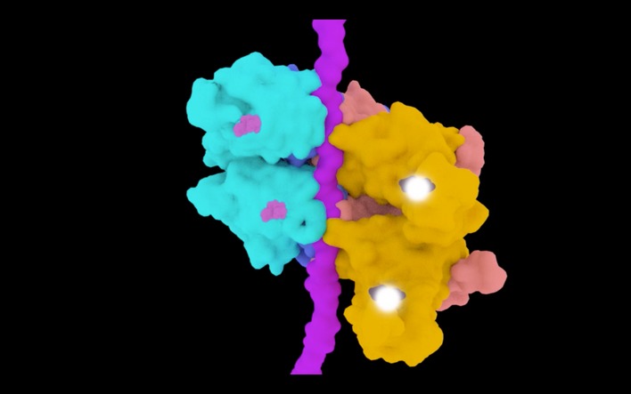
Scientists typically create static figures and illustrations to communicate their ideas and insights, and, when crafted thoughtfully, often succeed at conveying the author's mental model. Figures and illustrations for publications must clearly describe models and processes to broad audiences and ideally should tell a clear story along with context 5. Animations can be used to effectively describe complex molecular processes that may be difficult to illustrate using other means, such as the molecular details of the HIV infection cycle (Fig 3). Generally, animation and videos can efficiently communicate dynamic and temporal information, such as a sequence of events, conformational changes, movement or motion of entities, and their interactions within a system 5, 6, 7. For example, the hand-over-hand mechanism (Fig 4) of substrate translocation by Cdc48 segregase via ATP hydrolysis becomes more apparent for the reader when presented in an animated format. Such movies can also be used to highlight subtle visual differences that would be difficult to detect using static figures 6.
Figure 3. Snapshot from HIV animation.
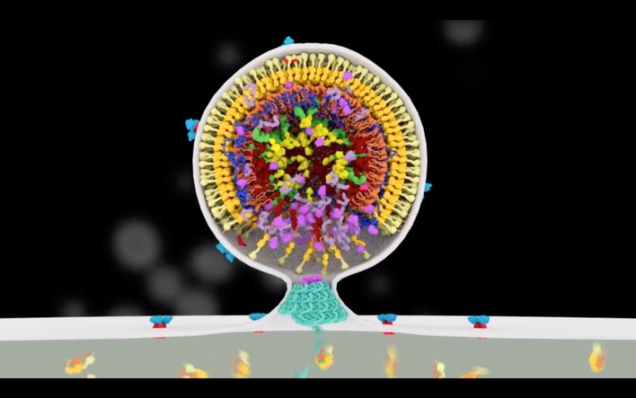
A still image from a scene visualizing the HIV budding process, built using currently available research data (http://scienceofhiv.org).
Figure 4. Snapshot from animation visualizing the hand‐over‐hand mechanism of substrate processing by the Cdc48‐Shp1 complex 11 .
Animations are particularly powerful for communicating to scientists from diverse disciplines, students, and the public by distilling complex concepts into a clear, accessible story. The HIV animation mentioned earlier has been understood by disparate audiences including patients; such visual experiences can have an impact on a viewer's outlook toward diseases and influence their decision‐making. Since the visualizations accurately portray molecular events, structural biologists can use the same 3D animation to communicate their findings with biochemists, molecular biologists, virologists, or clinicians and promote cross‐disciplinary collaboration. Visuals can drive scientists to understand and develop interest in unrelated or unfamiliar topics, stimulating creativity, and cross‐pollination of ideas. In a classroom setting, the HIV animation can enable biology students to gain knowledge, develop a mental model for the processes involved in viral infection and fuel curiosity. Visuals also help to eliminate discipline‐specific jargon and enhance the quality of dialogue between scientists and the general audience. Increasingly, researchers are looking to communicate more broadly via social media and other non‐traditional formats of communication; visually arresting illustrations and animations on such platforms can improve visibility and public engagement.
In the present era of digital publishing, most scientists consume scientific information on electronic devices. Despite the capabilities of digital publishing, many journals have retained their print‐based nature, where multimedia content is supplied as supplementary information that is often inconvenient to access. With the availability of technologies that embed interactive and animated content within a PDF document 5, 6, 8, HTML5 6, and other formats, we look forward to platforms where all content—text, visuals, data, metadata, simulations, videos, code, hypertext links, and other elements—is provided in a cohesive and interactive interface, allowing for a more productive and enjoyable reading experience. To get a good sense of what is on the horizon, we highlight Distill, a new platform to publish machine‐learning research, and Chapters 2 and 3 from Bret Victor's worrydream.com, where he discusses intuitive media for reducing abstractions.
Yet, a trend toward utilization of visualization technologies in scientific publishing is evident. The Journal of Visual Experiments (JoVE) exclusively publishes scientific protocols in video format 6. Interactive Science Publishing (ISP) is a software that allows readers to visualize and analyze original 2D and 3D image datasets submitted with papers 6. The Networked Digital Library of Theses and Dissertations (NDLTD) explores innovative digital dissertations that incorporate new media. Cell Press and Elsevier introduced graphical abstracts as a preview into the article's key findings. A few journals accept video abstracts and video reviews 9. Although not prevalent, a few journals support interactive PDFs 6, 8. Weissgerber et al 10 and others have demonstrated the potential of interactive figures in publications in inviting further exploration. These figures allow the viewers to explore and sometimes travel through the data, going back and forth in time or space to better understand research findings.
AR‐based presentations are also gradually becoming more prevalent with poster presentations and other handouts. AR technology could also be applicable to scientific publications as well: For example, viewing text or a figure on an AR‐enabled device could prompt a display of accompanying 3D time‐lapse microscopy videos or animated content, allowing readers to explore text and visual information in a seamless way.
Are we prepared for a visual future?
As free and low‐cost visualization tools become available, more scientists are using them to find meaning in and communicate their data. In research and teaching, however, there is little to no emphasis on developing visualization skills, and therefore, many scientists are not comfortable with their abilities in creating coherent visuals. Indeed, visualizations need to be carefully designed to achieve their goal, particularly when it is based on dense, interconnected, multivariate, and multi‐dimensional data. Although our visual system is capable of managing incredibly dense visualizations 2, there are many examples where visualizations have gone wrong, leading to an overwhelmed viewer. Take for example, the dense hairball illustrations are commonly used to visualize protein or network interactions. As these networks become more complex, the visualizations can lead to confusion and misinterpretations. Scientists should therefore not feel confined to one type of representation and must consider the most effective one that best represents their data. Having multiple representations of the same dataset could also yield different insights. Furthermore, creating visuals for outreach and education is challenging and often requires different approaches.
Training for competency in visualization techniques is largely lacking in biology curricula. Most students independently figure out how to create visuals by need, often copying and editing existing illustrations. Learning by doing is probably a great way of educating oneself, and in a few cases helps to acquire good visualization skills based on the student's initiative, inquisitiveness, prior exposure to design or cognitive psychology, and ability to distinguish between good and bad visuals. However, examples of substandard visualizations are abundant—which could potentially lead to misinterpretation 2. Learning by doing without any expert intervention could lead to perpetuation of poor design practices, and peers and advisors often cannot issue adequate feedback 1.
Since visualization is fundamental, basic instruction in building and interpreting visualizations will put students on a faster track to visualization fluency. Ostergren's 1 study showed that an approach grounded in a combination of psychology, design, and common sense is effective for gaining competence. She demonstrated that scientific visualization courses have provided students with design awareness, design process strategies, approach for reducing complexity, and guidance and critique from expert instructors and peers 1. Such instruction on visualization can be integrated with courses on scientific writing that are commonly offered as part of the graduate school curriculum or stand‐alone shorter courses that focus specifically on visualization.
We have developed an online module on visual communication as part of a comprehensive course on scientific communication. This course is being put together by a team at Northwestern University as part of the Integrated Data‐Driven Discovery in Earth and Astrophysical Sciences (IDEAS) Research Traineeship program supported by the NSF and would become freely available in 2020. A few years ago, we designed and held a full‐semester credited course on 3D animation for visualization of scientific research at the University of Utah. In addition, regular workshops from design specialists can reinforce good design practices and provide hands‐on exposure, and could be held as part of larger conferences and meetings. In‐house visualization specialists and design service centers in academia are on the rise and can be a valuable source for seeking professional advice—for example, MBI Science Communications Unit at NUS. Finally, visualization and supercomputing centers at your local university or institute can likely provide expertise, useful tools, and computing power that may be relevant to your research—for example, CIBC and NCSA VI-BIO.
A lack of funding
Although funding opportunities that focus solely on visualization projects are relatively few, scientists are steadily including funding for visualizations within larger grant proposals. For example, two NIH‐funded research consortia focusing on HIV‐related structural biology (CHEETAH, based at the University of Utah, and HIVE, based at the Scripps Institute) have dedicated a portion of their resources toward the visual communication of their research. Such inclusive grants foster strong collaboration between researchers and visualization experts, leading to improved scientific understanding and communication. We encourage scientific societies, foundations, and other groups to further supply leverage by mobilizing funds toward visualization efforts, providing training and organizational resources, access to experts, and additional workshop opportunities.
Fortunately, there is an abundance of online resources to explore and self‐train: Helpful resources for biomedical researchers are the Nature Methods Points of View article series that was started in 2013 and an iBiology talk about Visual Communication in Biology. Conferences such as Visualizing Biological Data (VIZBI), Biological Visualization (BiVi), BioVis, and the GRC on Visualization in Science and Education provide a forum where biomedical scientists, programmers, designers, artists, animators, communicators, educators, and bioinformaticians can discuss visualization practices. BiVi, the Broad Institute, and BioVis Explorer provide comprehensive catalogs on biomedical data visualization tools. BioJS is an open‐source library that offers a repository of JavaScript tools that can be used to visualize different types of biological data. Likewise, Phinch is an open‐source software that can help visualize and explore biological datasets. The NIH also extends library support for Tableau, to create interactive data visualizations. CellPAINT, Illustrate, and BioRender can help create appropriate and aesthetic scientific illustrations.
Scientists need to harness the power of new technologies and available expertise to explore and express their research better…
In a recent review paper on data visualization in the biomedical sciences, O'Donoghue 2 discusses how existing visualization methods are underutilized by scientists. In order to better make sense of the vast and growing amount of data biologists are collecting, we, as a field, need to enhance our visualization capabilities. Scientists need to harness the power of new technologies and available expertise to explore and express their research better and perhaps save some time, effort, and money in the process.
Acknowledgements
Special thanks to Jonathan Valiente, Heidi L. Schubert, and Grace I‐Hsuan Hsu for their critical reading and discussion of the article.
EMBO Reports (2019) 20: e49347
References
- 1. Ostergren M (2013) How scientists develop competence in visual communication. PhD Dissertation. UW‐Information School; [Google Scholar]
- 2. O'Donoghue SI, Baldi BF, Clark SJ, Darling AE, Hogan JM, Kaur S, Maier‐Hein L, McCarthy DJ, Moore WJ, Stenau E et al (2018) Visualization of biomedical data. Annu Rev Biomed Data Sci 1: 275–304 [Google Scholar]
- 3. Cipresso P, Giglioli IAC, Raya MA, Riva G (2018) The past, present, and future of virtual and augmented reality research: a network and cluster analysis of the literature. Front Psychol 9: 2086 [DOI] [PMC free article] [PubMed] [Google Scholar]
- 4. Mathews D (2018) Science goes virtual. Toolbox. Nature 557: 127–128 [DOI] [PubMed] [Google Scholar]
- 5. Iwasa JH (2010) Animating the model figure. Trends Cell Biol 20: 699–704 [DOI] [PubMed] [Google Scholar]
- 6. Grossman T, Chevalier F, Kazi RH (2015) Your paper is dead! Bringing life to research articles with animated figures. 461–470
- 7. Iwasa JH (2015) Bringing macromolecular machinery to life using 3D animation. Curr Opin Struct Biol 31: 84–88 [DOI] [PubMed] [Google Scholar]
- 8. Ruthensteiner B, Hess M (2008) Embedding 3D models of biological specimens in PDF publications. Microsc Res Tech 71: 778–786 [DOI] [PubMed] [Google Scholar]
- 9. Nikolian VC, Ibrahim AM (2017) What does the future hold for scientific journals? Visual abstracts and other tools for communicating research. Clin Colon Rectal Surg 30: 252–258 [DOI] [PMC free article] [PubMed] [Google Scholar]
- 10. Weissgerber TL, Garovic VD, Savic M, Winham SJ, Milic NM (2016) From static to interactive: transforming data visualization to improve transparency. PLoS Biol 14: e1002484 [DOI] [PMC free article] [PubMed] [Google Scholar]
- 11. Cooney I, Han H, Stewart MG, Carson RH, Hansen DT, Iwasa JH, Price JC, Hill CP, Shen PS (2019) Structure of the Cdc48 segregase in the act of unfolding an authentic substrate. Science 365: 502‐505 [DOI] [PMC free article] [PubMed] [Google Scholar]