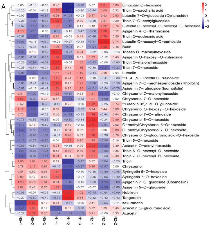
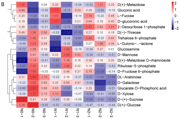
Figure 3.
(A) Heat map of flavone metabolites of goji berry; (B) heat map of polysaccharide of goji berry. There is one column for each sample and one row for each metabolite. The abundance of each metabolite is represented by a bar with a specific color. The upregulated and downregulated metabolites are expressed in different shades of red and blue, respectively. As abundance increases, the color of the bar changes from blue to red. When the abundance value is 0, the color of the bar is white, as shown in the upper right-hand bar.


