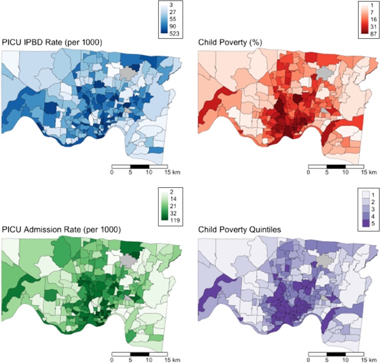
FIGURE 3.
Maps of Greater Cincinnati demonstrating PICU bed-day (upper left), child poverty (upper right), and PICU admission rates (lower left) of census tracts. Shades correspond to the rank, rather than the absolute number, of each continuous variable. Poverty quintiles (lower right) range from Quintile 1 (lowest poverty; lightest shade) to Quintile 5 (highest poverty; darkest shade).

