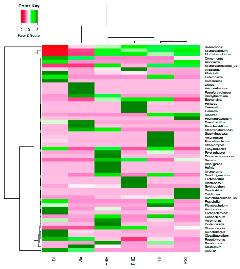
Figure 3.
Heat map showing top 20 genera in the influent and effluent samples. The 20 dominant genera in each sample were selected and compared with their abundances (percentages) in other samples. The color intensity (log scale) in each panel shows the percentage of a genus in a sample, referring to a key.

