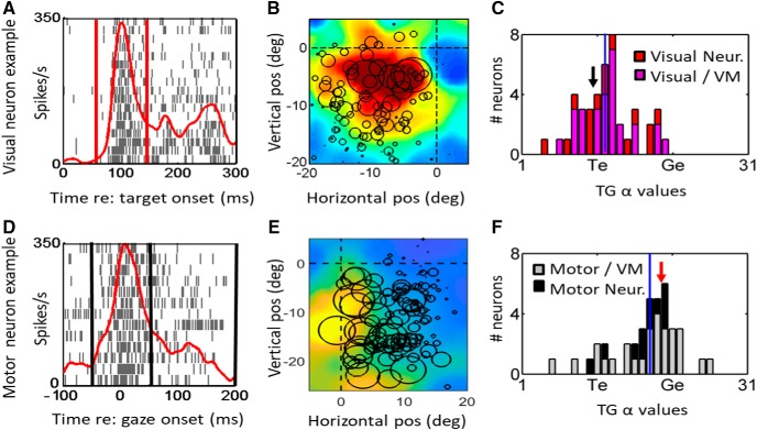
Figure 3.
Shift of spatial representation from near Te in the target-aligned fixed window analysis (top row, A–C) toward Ge in saccade-aligned fixed window analysis (bottom row, D, E) of reactive task data. Each row shows the raster/spike density plot (left column) and best fit RF (middle column) for an example neuron, followed the distribution of T-G α values of full population (right column). The rasters (A, D) show spike trains and spike density plots for the top 10% trials toward the hot spot of the neuron. The center of circles in the RF plots (B, E) represent the location best fit along the TG continuum in eye frame of reference and the diameter of circles are proportional to the firing rate of the neuron for that given trial. The heat map in the background indicates the RF fit to that data in this coordinate system. For the visual response population (C) both visual (red bars) and visual activity of VM neurons (pink bars) are included. For the motor response population (F), the motor activity of VM neurons (gray bars) and motor neurons (black bars) are shown. The red/black vertical lines in the raster plots (A, D) represent the fixed visual/motor temporal windows, respectively. The black vertical lines in the histogram plots (C, F) represent the median T-G α values and the location of T-G value for the representative example is indicated by the red arrow. The cluster of the distribution of visual fits (C) is closer to Te, whereas the cluster of motor fits (F) is closer to Ge. Note that the shift from the mean T-G values in the visual activity histogram (C; mean = 12.2) is significantly different (unpaired two-tailed t test, p = 0.0001) from the mean in the motor activity T-G histogram (F) mean (17.4).

