Abstract
Objective
The study sought to design symptom reports of longitudinal patient-reported outcomes data that are understandable and meaningful to end users.
Materials and Methods
We completed a 2-phase iterative design and evaluation process. In phase I, we developed symptom reports and refined them according to expert input. End users then completed a survey containing demographics, a measure of health literacy, and items to assess visualization preferences and comprehension of reports. We then collected participants’ perspectives on reports through semistructured interviews and modified them accordingly. In phase II, refined reports were evaluated in a survey that included demographics, validated measures of health and graph literacy, and items to assess preferences and comprehension of reports. Surveys were administered using a think-aloud protocol.
Results
Fifty-five English- and Spanish-speaking end users, 89.1% of whom had limited health literacy, participated. In phase I, experts recommended improvements and 20 end users evaluated reports. From the feedback received, we added emojis, changed date and font formats, and simplified the y-axis scale of reports. In phase II, 35 end users evaluated refined designs, of whom 94.3% preferred reports with emojis, the favorite being a bar graph combined with emojis, which also promoted comprehension. In both phases, participants literally interpreted reports and provided suggestions for future visualizations.
Conclusions
A bar graph combined with emojis was participants’ preferred format and the one that promoted comprehension. Target end users must be included in visualization design to identify literal interpretations of images and ensure final products are meaningful.
Keywords: Information visualization, mobile health, nursing informatics, health literacy, graph literacy
INTRODUCTION
Approximately half of adults in the United States are living with at least 1 chronic illness, of which many are associated with adverse symptoms.1,2 These symptoms may be disease-related,3 treatment related,4 or as in the case of those living with human immunodeficiency virus (HIV), related to both.5–7 Developing new and better ways to monitor and manage symptoms is vital to improve quality of life for those with chronic conditions. In response, the National Institutes of Health launched PROMIS (Patient-Reported Outcomes Measurement Information System) with the goal of creating, validating, and disseminating publicly available instruments to measure patient-reported outcomes (PROs).8 The resulting PROMIS measures have led to improvements in patient-provider interactions and better health outcomes.9–12
PROs enable patients to report various aspects of their health, which can help direct care.13–19 For example, PROs can capture data on patients’ symptom experience, functional status, and health-related quality of life, among other indicators of well-being not generally identified with traditional medical testing.11,20,21 When clinicians systematically collect PROs, it can aid in detection and management of conditions,13,14 improve satisfaction with care,15 and more closely align providers’ and patients’ understanding of a patient’s clinical reality.12,16,17,21–23 The effective collection and use of PROs may be particularly useful for persons living with HIV (PLWH), as active engagement with healthcare providers can lead to improved self-management, including better treatment adherence.24,25
To effectively use PROs, patients and clinicians need a way to report and track them.26,27 This is challenging, as approximately 88% of the U.S. population is estimated to have less than proficient health literacy,28 which may influence individuals’ ability to effectively monitor PROs over time. Disadvantaged populations, particularly minorities or PLWH, our study population, are more likely to have low health literacy, which can lead to difficulty interpreting health information29,30 and understanding concepts that require numerical interpretations, such as PROs.31,32 To help patients report, monitor, and track PROs, systems must be designed so those with low health literacy can effectively use them.33 Much of the literature regarding visualization design for individuals with low health literacy has focused on how to communicate and assess risks,31,34–37 but little is known regarding how to present longitudinal data to persons with limited health literacy.
Therefore, the purpose of this study was to design symptom reports that display a longitudinal PRO, symptom severity, in a way that is understandable and meaningful to end users of a mobile health (mHealth) app. Our research questions were the following: (1) what is the preferred format to display longitudinal self-reported outcome data to end users? and (2) what components of visualization design should be considered and incorporated when target end users are likely to have low health literacy?
MATERIALS AND METHODS
Study context
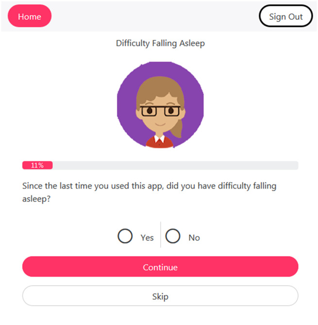
This study is part of a larger project to develop a mHealth app to support symptom self-management in PLWH with HIV-associated non–acquired immunodeficiency syndrome (HANA) conditions.38 Different from other available HIV-related apps, the video information provider (VIP)-HANA app offers video-based strategies to help PLWH self-manage the symptoms associated with HIV and HANA conditions. While completing sessions in the app, users indicate which of 28 different symptoms they experience (Figure 1) and rate how much they bother them. They then receive self-care strategies associated with their symptoms through a video that includes text.6 Following each app session, end users can review the self-care strategies they received and view reports of their self-reported symptom severity over time.
Figure 1.
Example screen from video information provider human immunodeficiency virus–associated non–acquired immunodeficiency syndrome (VIP-HANA) app asking if an end user has experienced a specific symptom.
Study design
We conducted a 2-phase, iterative design and evaluation process (Figure 2). In phase I, we developed initial reports from recommendations in the literature, refined them based on suggestions obtained from visualization experts, and then evaluated them with target end users of the VIP-HANA app. We then incorporated participants’ suggestions into the symptom report designs before phase II. To enable a more diverse and comprehensive evaluation of reports and enhance generalizability of findings, we expanded inclusion criteria to include Spanish speakers and added a measure of graph literacy into phase II. We also modified data collection methods to minimize missing data, a problem identified in the first phase. This 2-phase process that included diverse target end users enabled us to iteratively design and rigorously evaluate symptom reports.
Figure 2.
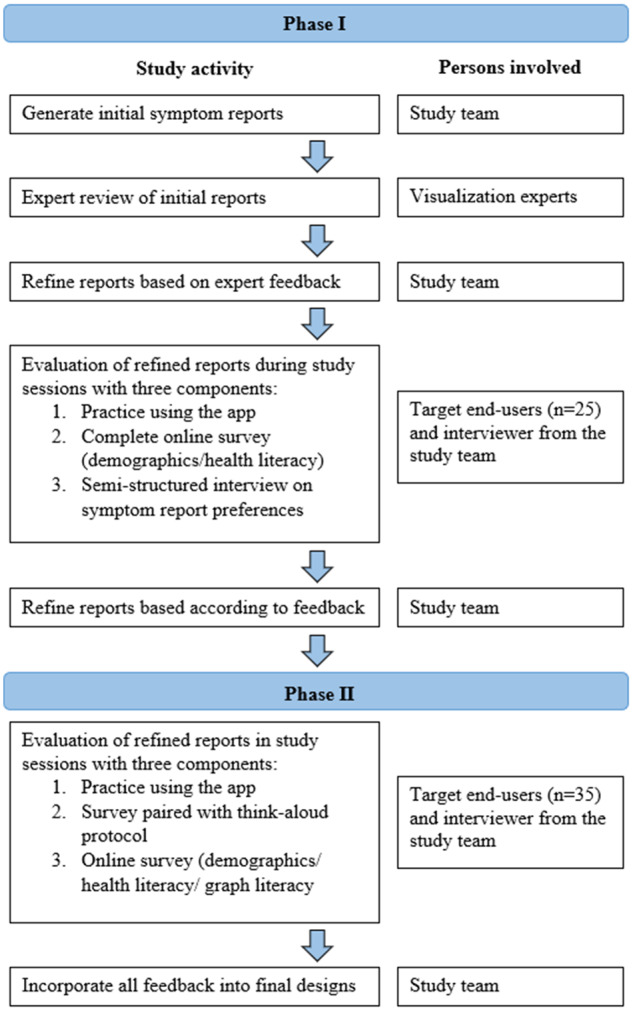
Summary of 2-phase method to design and evaluate symptom reports.
Ethical review
Columbia University’s institutional review board approved study activities and participants provided written informed consent at enrollment.
Study setting and participants
Study sessions for phase I and II took place in a private office at the Columbia University School of Nursing. We recruited participants from a database consisting of individuals who called in response to flyers and online postings for numerous research studies. We screened potential participants for eligibility over the phone. Inclusion criteria were adults (≥18 years of age) living with HIV who were English speakers (for phase 1), had a diagnosis of at least 1 of 9 HANA conditions available in the VIP-HANA app, had experienced at least 3 of 28 HIV-related symptoms during the past 7 days, and were mentally aware (minimum score of 24 of 30 on the short version of the Mini-Mental State Examination).39 Exclusion criteria were current enrollment in another mobile app study for PLWH as this might affect participants’ ability to interact with the VIP-HANA app and current pregnancy, as symptoms related to pregnancy could confound the HIV/HANA symptom experience. For phase II, we expanded eligibility criteria to include Spanish speakers. Participants from phase I were not eligible to participate in phase II.
Symptom report development
Initial symptom reports were based on graphical formats that display categorical, time series data.40,41 Experts in informatics and visualization reviewed initial designs during a roundtable discussion in a Visualization Studio hosted through the Precision in Symptom Self-Management Center (P30 NR016587). Experts’ comments were incorporated and 6 formats were evaluated in phase I: (1) traditional line graph, (2) line graph with the area under the line shaded in, (3) traditional bar graph, (4) bar graph combined with line graph, (5) scatter plot, and (6) sparklines.
Phase I: data collection
App use
Following informed consent, a study team member explained the app to participants who then completed a list of tasks in the app to acquire familiarity with its purpose and main functions.
Online survey
After using the app, participants completed an online survey through Qualtrics software that included demographic questions and assessed health literacy with the Newest Vital Sign, a practical, validated, and widely used 6-question instrument to quickly measure health literacy in Spanish and English.42–45 The survey also contained symptom report designs with related multiple-choice questions to assess design preferences. Comprehension of reports was ascertained with questions developed for the symptom reports in this study and included questions such as, “Did you have more problems staying asleep on April 15th or on May 5th?” or, “On what day did you not experience depression?” Participants indicated preferences by picking between 2 reports or between 2 date formats such as, 04/15/17 or April 15th.
Semistructured interviews
Following survey completion, study team members interviewed participants to assess preferences of symptom report designs, discuss their understanding of reports and willingness to use symptom reports with their provider, and solicit suggestions for refinement. Questions were designed to help participants share their thoughts on reports and how to improve them. Examples included, “What is the first thing that comes to mind when you look at this report?” or, “How can we modify this report to better meet the needs of app users and their health care providers?” Semistructured interviews were audio-recorded and transcribed.
Phase II: data collection
Participants completed interviews consisting of a survey paired with a think-aloud protocol in which a study team member asked participants to speak aloud their thoughts as they completed survey questions and interpreted reports.46 Survey questions were in multiple-choice format to quantitatively assess participants’ format preferences and their comprehension of the data displayed (See online supplement for complete phase II survey). Sessions were audio-recorded and study team members entered participants’ responses to multiple-choice questions into Qualtrics as they spoke. Additionally, we included open-ended questions to qualitatively assess participants’ reasoning for choices made. For example, after a comprehension question, participants were asked, “what part of the graph were you looking at when you selected those answers?” Open-ended questions to encourage participants to discuss positive and negative aspects of reports were also included. For example, “can you please tell me what you like the most about this report? And, what do you like the least about it?” Once the think-aloud protocol and survey portion was complete, audio recordings were stopped and participants were asked to independently complete demographic questions, Newest Vital Sign,42 and a validated measure of graph literacy, available in English and in Spanish, that included 13 questions on graphical displays (scores ≥9 indicate high graph literacy).44,47
Data analysis
For both phases, descriptive statistics of demographics and analyses of quantitative data were calculated with STATA MP 14 (StataCorp, College Station, TX). Then, consistent with the directed content analysis qualitative method,48,49 transcripts were reviewed by a bilingual co-author (SS) to extract key points and suggestions related to each report format. A second bilingual co-author (TP) confirmed key points and independently reviewed transcripts to ensure that nothing was missing. Representative quotes of key findings were selected by the study team and, if needed, Spanish quotes were translated into English for this article by (SS) and confirmed by (TP). Data were collected until saturation was reached, or when no new data emerged from transcripts.50,51
RESULTS
Demographic characteristics
Demographics characteristics of participants from phases I and II are in Table 1.
Table 1.
Demographic characteristics of phase I and II participants (n = 55)
| Age, years a | 55.4 ± 7.5 |
| Sex | |
| Male | 20 (36.4) |
| Female | 35 (63.6) |
| Race a | |
| African American/black | 34 (63.0) |
| Hispanic/Latino | 13 (24.1) |
| White | 4 (7.4) |
| Other | 3 (5.6) |
| Ethnicity | |
| Hispanic/Latino | 20 (36.4) |
| Language of testing session c | |
| English | 45 (81.8) |
| Spanish | 10 (18.2) |
| Educational attainment | |
| Less than high school | 22 (40.0) |
| Completed high school | 22 (40.0) |
| More than high school | 11 (20.0) |
| Has a healthcare provider in charge of overall HIV care | |
| Yes | 52 (94.5) |
| No | 3 (5.5) |
| Health literacy | |
| Likely limited | 49 (89.1) |
| Adequate | 6 (10.9) |
| Graph literacy b | |
| Likely limited | 32 (91) |
| Adequate | 3 (9) |
Values are mean ± SD or n (%).
HIV: human immunodeficiency virus.
One participant declined to answer.
Only administered in phase II (n = 35).
Spanish was only an option in phase II.
Phase I
Expert suggestions to revise initial symptom reports
Expert recommended maximizing the use of space and enhancing or modifying aesthetic details (eg font, image size, color). Experts also suggested including sparklines as a report format that would be particularly useful to target end users, as they simply convey large amounts of information.
Online survey
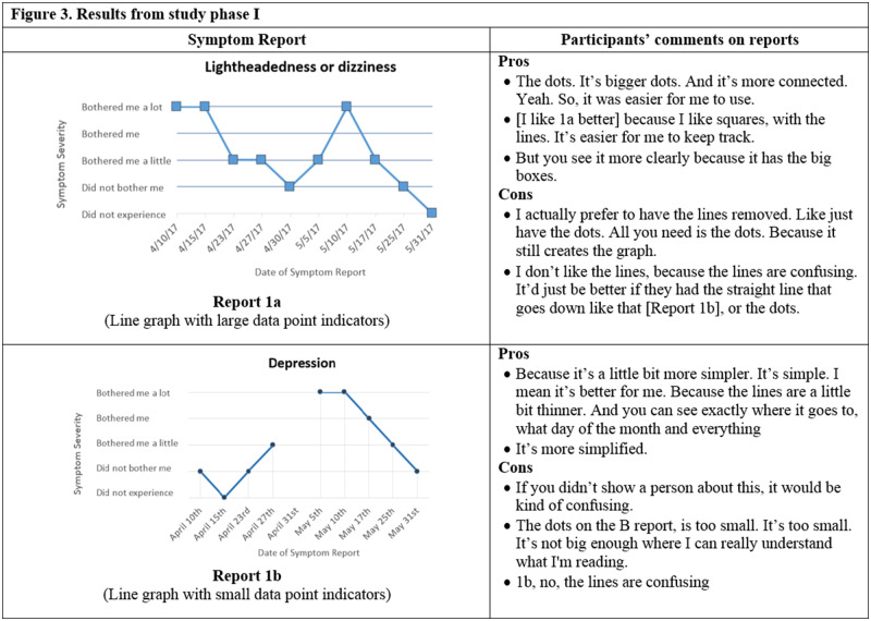
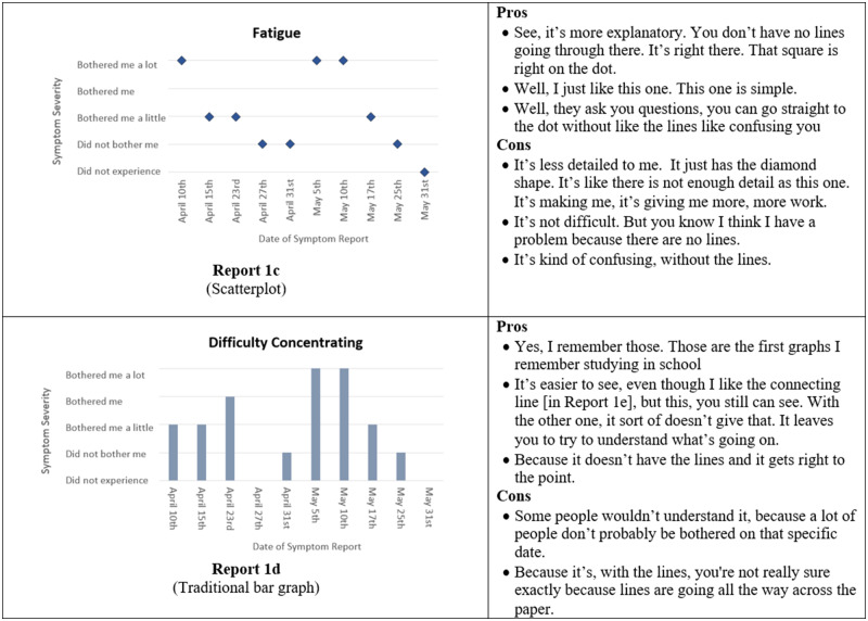
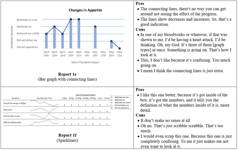
Several participants did not respond to all questions in the online survey. When given a choice between a bar and a line graph, 13 of 19 participants preferred the bar graph (Figure 3, Report 1d) to the line graph (Figure 3, Report 1a). In a separate question, 9 of 16 participants indicated that bar graphs were easier to understand. When asked to select their preferred report out of all the available formats, a traditional bar graph such as in Figure 3 (Report 1d) was preferred by 7 of 14 participants, while 3 of 14 preferred the line graph, and <3 participants selected the remaining formats. For comprehension questions, 10 of 19 participants correctly answered the question associated with the bar combined with a line graph (Figure 3, Report 1e), 11 of 19 correctly identified their symptom severity with the line graph, 14 of 19 correctly interpreted the scatterplot, and 6 of 19 correctly answered the comprehension question related to sparklines (Figure 3, Report 1f).
Figure 3.
Symptom report formats assessed in phase I (Reports 1a-f) and a selection of participants' comments corresponding to each format.
Semistructured interviews
Phase I interviews lasted an average of 7 minutes and 32 seconds (range: 4 minutes, 55 seconds to 11 minutes, 50 seconds). Participants provided feedback and suggested refinements to symptom reports (Figure 3), indicating several pros and cons of each format. Overall, the pros focused on the characteristics that made reports easier to read while cons were related to items that confused images. Most comments received were regarding size (font size and size of graphical components), simplicity of report formats, and appeal of symptom reports.
Size of fonts and graphical components
Participants emphasized the importance of large features within reports, such as connection points or font sizes. For example, one participant commented, “make the writing bigger, because I can’t see good.” Then, regarding the connection points between segments of a line graph (Figure 3, Report 1a), one participant commented, “the dots. It’s bigger dots. And it’s more connected. Yeah. So, it was easier for me to use.”
Simplicity of report formats
Participants generally preferred simple, straightforward reports. As one participant commented, “I think I go for simplicity because of the diversity. Like people now, in this day and age, you have people that are old Hispanic that don’t speak English and have very little education. They just, you need simplicity for that.” However, participants also indicated that you need enough detail to be able to interpret reports. For example, one participant commented on the scatterplot, “it’s less detailed to me. It just has the diamond shape. It’s like there is not enough detail.”
Appeal of symptom reports
An additional recommendation was to make designs more “fun” and appealing by putting in “emojis” with sad or happy faces to indicate symptom severity. A few participants had trouble with the bothersomeness scale on the y-axis, and one participant asked, “what is the difference between did not experience and did not bother me?” Most participants preferred dates written out, and one participant explained, “like April, how many numbers that is? You got to count by hands and figure it out, you know, because not everybody is smart like that.”
Preferred symptom report format
Different from responses provided in the online surveys, in semistructured interviews, when given the option to choose their “favorite” format of all available formats, 7 of 20 participants selected a traditional bar graph (Figure 3, Report 1d), 4 of 20 participants selected the bar graph connected with lines (Figure 3, Report 1e), and the remaining formats were preferred by <3 participants each.
Willingness to share reports with healthcare provider
During interviews, 14 participants indicated they would share reports with their provider, 4 were uncertain, and 2 reported they would not use them with their provider and provided simple explanations such as, “it [the report] would be helpful for me, but I wouldn’t give it to the doc.”
Modifications to initial designs from phase I results
Based on participants’ feedback from phase I, we made the following changes to symptom reports in preparation for phase II:
Add emoji faces based on the Wong-Baker FACES Pain Rating Scale52
Provide dates in a written-out, as opposed to numeric, format
Increase font size
Remove the sparklines report format
Remove the “did not experience” option from the bothersomeness scale
Phase II
Responses from think-aloud protocol
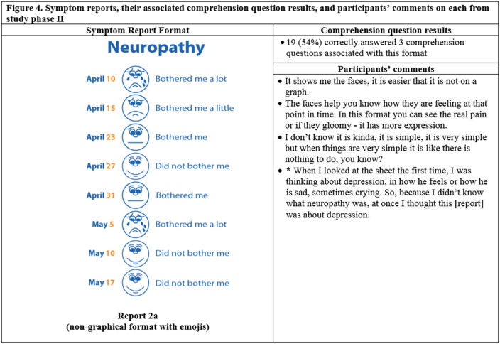
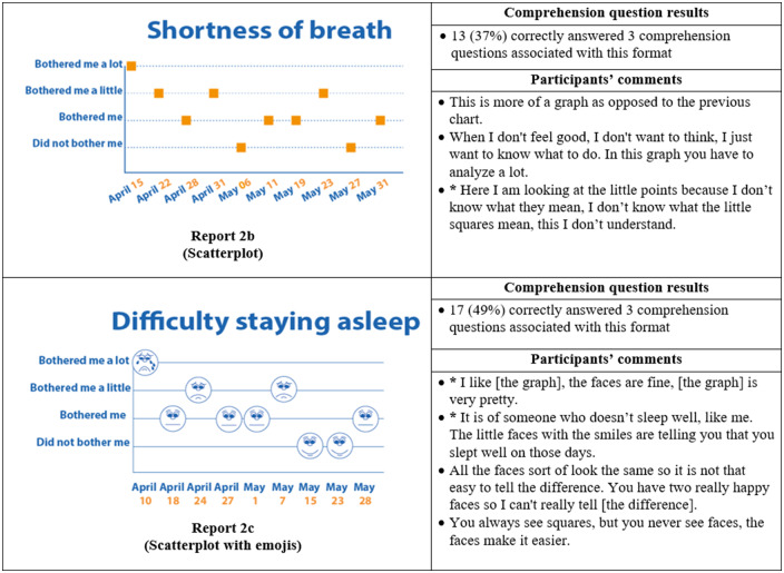
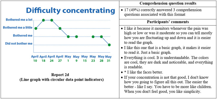
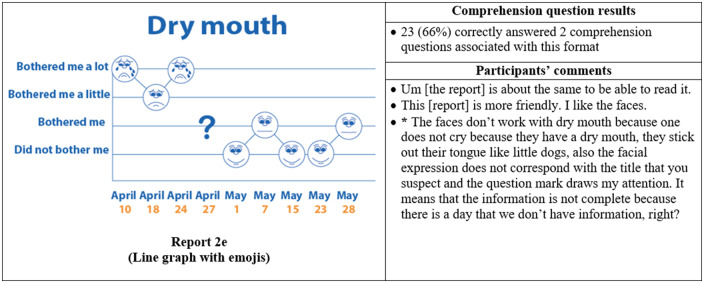
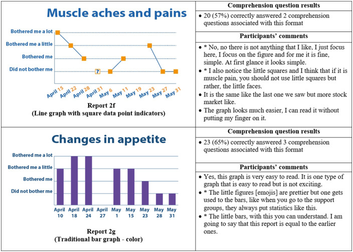
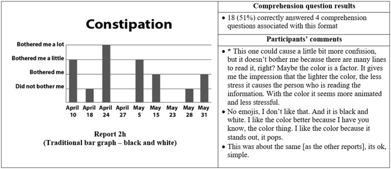
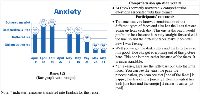
Thirty-five participants completed phase II interviews, which consisted of surveys paired with a think-aloud protocol. Interviews lasted an average of 26 minutes and 56 seconds (range: 15 minutes, 35 seconds to 37 minutes, 13 seconds). Generally, participants expressed reports were simple and easy to read (Figure 4) and indicated emojis facilitated comprehension. One participant commented, “the faces help you along, it helps to let people know how they feel.” Another said, “I guess the faces do matter because if it is bothering you a lot you, see how sad it is?… and for the ‘it did not bother me,’ you know you’re smiling.” Multiple participants disliked the more traditional graphical formats. One said, “it [traditional line graph] looks like I am on the stock market - because of the circles, the lines.” Participants recommended bright colors and suggested focusing on the meaning of the colors. For example, use green or blue for days with less symptom severity because “green and blue are supposed to be more pleasant colors.”
Figure 4.
Symptom reports assessed in phase II (reports 2a-i), their associated comprehension question results, and a selection of participants' comments on each. An asterisk indicates that the response was translated into English for this article.
Participants interpreted reports, and emojis, very literally, which led to occasional confusion. For instance, on the neuropathy report, a participant interpreted, “I was thinking about depression, in how he feels or how he is sad, sometimes crying. So, because I didn’t know what neuropathy was, at once I though this [report] was about depression.” Similarly, another participant indicated the emojis did not accurately represent the intended symptom. She commented, “the faces do not work with dry mouth because one doesn’t cry from having a dry mouth; they stick out their tongue like a dog.”
Responses to multiple-choice questions
Almost all participants (33 of 35) selected a report containing emojis as their preferred format. The most preferred was the bar graph combined with emojis, indicated by 14 of 35 participants (Figure 4, Report 2i), which was also the format with the highest level of comprehension, as 24 of 35 of participants correctly answered all 4 of the associated comprehension questions (Figure 4). The second most preferred was the nongraphical emoji format (12 of 35 participants) (Figure 4, Report 2a), for which 19 of 35 of participants correctly answered the associated 3 comprehension questions. Participants also demonstrated high comprehension of the traditional bar graph (Figure 4, Report 2g), with 23 of 35 able to correctly answer all 3 associated comprehension questions. However, only 1 participant preferred this format.
Willingness to share reports with healthcare provider
All phase II participants said that they would share symptom reports with their provider. Some reasons were, “because it gives him [the doctor] a look on how you was feeling that day, because sometimes we forget things so we have a senior moment and this right here [the symptom report] tells it all on paper,” or “I think it might give them greater clarity in terms of what they are dealing with and them being knowledgeable about what they are prescribing and which medications are likely to have greater side effects correlating to what you are reporting.”
Language, health literacy, graph literacy, level of education, and overall scores on comprehension questions
Of the phase II participants, 20 of 35 had less than a high school education, 30 of 35 had low health literacy, and 32 of 35 had low graph literacy (Table 2). None of health literacy, graph literacy, and level of education were significantly associated with participants’ ability to correctly answer comprehension questions in Fisher's exact tests (data not displayed). The proportion of individuals with low health literacy who received a high overall score (>24) on comprehension questions (11 of 30 participants) was almost the same as the proportion (12 of 30 participants) that received a low overall score (≤ 19). One participant with high health literacy received a low overall score on comprehension questions. All participants with high graph literacy received a high overall score on comprehension questions, but 12 of 32 participants with low graph literacy also received a high overall score. Level of education was more consistent with expected outcomes, as 10 of 15 of those individuals with low health literacy who received a high overall score (>24) on comprehension, with some college or more education, received high overall scores, while 10 of 20 of those with a high school education or less education received low overall scores. However, 5 of 20 participants with high school or less education received a high overall score, while 3 of 15 of those with some college or more education received a low overall score.
Table 2.
Phase II participants’ total score on comprehension questions (27 points possible) stratified by language, health literacy, graph literacy, and education
| Language |
Health literacy |
Graph literacy |
Education |
|||||
|---|---|---|---|---|---|---|---|---|
| Score | English (n = 25) | Spanish (n = 10) | Low (n = 30) | High (n = 5) | Low (n = 32) | High (n = 3) | High school or less (n = 20) | Some college or more (n = 15) |
| ≤ 24 | 13 (52) | 2 (20) | 11 (36.7) | 4 (80) | 12 (37.5) | 3 (100) | 5 (25) | 10 (66.7) |
| 20-23 | 5 (20) | 2 (20) | 7 (23.3) | 0 (0) | 7 (21.9) | 0 (0) | 5 (25) | 2 (13.3) |
| ≤19 | 7 (28) | 6 (60) | 12 (40) | 1 (20) | 13 (40.6) | 0 (0) | 10 (50) | 3 (20) |
Values are n (%). P values are not displayed because there were no significant correlations according to Fisher's exact tests.
DISCUSSION
We sought to design symptom reports of longitudinal PRO data that would be understandable and meaningful to end users. Participants overwhelmingly preferred formats that included emojis. The format preferred by the largest number of participants was a bar graph that incorporated emojis, which was also the easiest format for participants to interpret. However, other reports, such as the one lacking a graphical format (Figure 4, Report 2a), were preferred by many participants. Participants also provided contrasting comments on each report indicating there is not a “one size fits all” format for visualizing longitudinal PRO data. However, our findings are consistent with much of the literature regarding preferred visualizations,53–55 which indicates that although there is not one format that “works” for everyone, there are formats that can be used to reach many end users.
Notably, participants offered very literal interpretations of reports, which has important implications for future design and data collection. First, because of this literal interpretation, reports that are tailored to each symptom will be more meaningful to end users. For instance, we used the same crying emoji to represent “bothered me a lot” for all reports. So, even when a report was titled, “anxiety,” participants still interpreted the report to say that they were very sad or depressed. Future designs should be customized (in this case, to each symptom) and could go even further by allowing end users to select their preferred format. Much has already been done to tailor the content of mHealth apps to end users,56–58 but further exploration of methods to customize displays, especially in more cost-effective ways, is warranted. Second, literal interpretation led to confusion with the bothersomeness scale on the y-axis. We recommend 3 straightforward interpretations—“did not bother me,” “bothered me a little,” and “bothered me a lot”—as this removes the possible redundancy between “did not experience” and “did not bother me,” as identified by participants. Third, participants were unable to consider reports as a representation of someone else’s symptoms and only considered reports as their own, even if they had never reported their symptom severity in the app. Therefore, developing visualizations tailored to each end user’s experience will facilitate data collection.
Emojis and other visual technologies have become widespread in social media, which may enhance end users’ affinity to them as an appealing and useful tool. As one participant said, “The faces - they are cool, like emojis. That is the wave now, that is how people text. People don't even use words no more, just the emojis. It is the new language.” Other mHealth studies have begun to include emojis in user interfaces with promising results; but, there is limited evaluation of their ability to promote comprehension,59–62 and one study found emojis were neither preferred nor promoted comprehension.63 Beyond emojis, additional design considerations recommended by participants, consistent with the literature, are to use simple images that incorporate large fonts and bright meaningful colors.64–68 Another contrast between our findings and the literature is that many studies have found discrepancies between the formats participants prefer and those that support comprehension,55,69,70 while our study shows that participants favored the format that was the easiest for them to interpret. Regardless of design preferences, for visualizations to be effective, they must promote learning and comprehension among target end users.71,72 Thus, striking a balance between sufficient visual appeal to promote uptake while presenting relevant information clearly and with sufficient detail to promote comprehension is a design challenge that may be met by including end users in the design process and rigorously evaluating final products.
Health literacy, graph literacy, and educational attainment were not good indicators of participants’ ability to interpret reports. This is consistent with other studies showing more education does not necessarily equate with increased numeracy or ability to interpret graphs.53,69,73 Thus, end user comprehension of visualizations will depend on the images used as well as how and to whom they are presented .53,63 As is shown in the literature and in this study, incorporating participatory methods in visualization design can allow for simultaneous comprehension testing and increases understanding and eventual uptake of the final product,74,75 especially among users with low health, or graph, literacy.76
An important finding from this research is that experts and end users may have divergent opinions of optimal design, as experts were confident that sparklines would be a preferred format and participants found them to be intimidating and prohibitive. This is consistent with the literature,77 and seems obvious, but it is critical to emphasize that despite best intentions, experts may not be able to anticipate end users’ preferences. This reaffirms that target end users of visualizations must be included in the design process to reduce, or eliminate, discrepancies between experts and end users.78–81
There were limitations to this study. We recruited participants who indicated interest in future research and therefore may be more engaged in care and more knowledge of their health.82,83 Also, despite attempts to make the research setting comfortable and accommodating, social desirability bias may have influenced responses.84 In phase I, participants did not complete several survey questions. We modified the methods for phase II to reduce the amount of missing data. Additionally, our participants were older (average age of 55.4 years), likely because this age group is more prone to HIV- and HANA-related symptoms, one of our inclusion criteria. Older age may influence the way individuals interact with digital technology and limits generalizability of findings to those with similar ages. Regardless of limitations, we explored English- and Spanish-speaking PLWH perceptions of symptom report formats that display longitudinal PROs and provide recommendations so future visualizations may more effectively provide information to this, and similar, populations.
CONCLUSION
A bar graph that incorporated emojis was the preferred format to represent symptom severity over time, and compared with other formats, facilitated comprehension of the displayed data. Results assert target end users of visualizations must be included during the design process to uncover potential literal interpretations of images, ensure comprehension, and reduce gaps between experts’ and end users’ perceptions. Findings will be useful to healthcare providers, researchers, and organizations developing visualizations for use with end users who have low health literacy.
FUNDING
This work was supported by National Institute of Nursing Research of the National Institutes of Health grant number R01 NR015737, PI: Rebecca Schnall. SS was supported by 2 mechanisms during this research (T32 NR007969 and K99 NR017829) both funded by the National Institute of Nursing Research of the National Institutes of Health. The content is solely the responsibility of the authors and does not necessarily represent the official views of the National Institutes of Health.
AUTHOR CONTRIBUTIONS
SS was directly involved in the conception and design of this work, oversaw data acquisition, conducted the analyses, and generated the subsequent interpretation. She also drafted and revised the work, approved, and submitted the final version. TP substantially contributed to the conception and design of the work, data collection, and analysis. She also revised the work for intellectual content and approved the final version for submission. RS substantially contributed to the conception and design of this work, data analyses, and final interpretations. She additionally contributed substantially to the writing and revising of the article, including intellectual content and approved this final version for submission. All authors agree to be accountable for all aspects of the work in ensuring that questions related to the accuracy or integrity of any part of the work are appropriately investigated and resolved.
CONFLICT OF INTEREST STATEMENT
None declared.
Supplementary Material
REFERENCES
- 1.National Institute of Nursing Research. Spotlight on Symptom Management Research. 2017. https://www.ninr.nih.gov/researchandfunding/symptommanagement. Accessed January 12, 2018.
- 2. Bauer UE, Briss PA, Goodman RA, et al. Prevention of chronic disease in the 21st century: elimination of the leading preventable causes of premature death and disability in the USA. Lancet 2014; 384 (9937): 45–52. [DOI] [PubMed] [Google Scholar]
- 3. Theander K, Hasselgren M, Luhr K, et al. Symptoms and impact of symptoms on function and health in patients with chronic obstructive pulmonary disease and chronic heart failure in primary health care. Int J Chron Obstruct Pulmon Dis 2014; 9: 785–94. [DOI] [PMC free article] [PubMed] [Google Scholar]
- 4. Campbell G, Hagan T, Gilbertson-White S, et al. Cancer and treatment-related symptoms are associated with mobility disability in women with ovarian cancer: a cross-sectional study. Gynecol Oncol 2016; 143 (3): 578–83. [DOI] [PMC free article] [PubMed] [Google Scholar]
- 5. Eller L, Bunch E, Wantland D, et al. Prevalence, correlates, and self-management of HIV-related depressive symptoms. AIDS Care 2010; 22 (9): 1159–70. [DOI] [PubMed] [Google Scholar]
- 6. Iribarren S, Siegel K, Hirshfield S, et al. Self-management strategies for coping with adverse symptoms in persons living with HIV with HIV associated non-AIDS conditions. AIDS Behav 2018; 22 (1): 297–307. [DOI] [PMC free article] [PubMed] [Google Scholar]
- 7. Schnall R, Siegel K, Jia H, et al. Racial and socioeconomic disparities in the symptom profile of persons living with HIV. AIDS Care 2018; 30 (6): 774–83. [DOI] [PMC free article] [PubMed] [Google Scholar]
- 8. Cella D, Yount S, Rothrock N, et al. The Patient-Reported Outcomes Measurement Information System (PROMIS): progress of an NIH roadmap cooperative group during its first two years. Med Care 2007; 45(5 Suppl 1): S3.. [DOI] [PMC free article] [PubMed] [Google Scholar]
- 9. Chen J, Ou L, Hollis SJ.. A systematic review of the impact of routine collection of patient reported outcome measures on patients, providers and health organisations in an oncologic setting. BMC Health Serv Res 2013; 13 (1): 211.. [DOI] [PMC free article] [PubMed] [Google Scholar]
- 10. Snyder CF, Aaronson NK, Choucair AK, et al. Implementing patient-reported outcomes assessment in clinical practice: a review of the options and considerations. Qual Life Res 2012; 21 (8): 1305–14. [DOI] [PubMed] [Google Scholar]
- 11. Broderick J, DeWit EM, Rothrock N, et al. Advances in patient-reported outcomes: the NIH PROMIS® measures. EGEMS (Wash DC) 2013; 1 (1): 1015.. [DOI] [PMC free article] [PubMed] [Google Scholar]
- 12. Bartlett SJ, Witter J, Cella D, et al. Montreal Accord on Patient-Reported Outcomes (PROs) use series-Paper 6: creating national initiatives to support development and use-the PROMIS example. J Clin Epidemiol 2017; 89: 148–53.. [DOI] [PubMed] [Google Scholar]
- 13. Wagner EH, Austin BT, Davis C, et al. Improving chronic illness care: translating evidence into action. Health Aff 2001; 20 (6): 64–78. [DOI] [PubMed] [Google Scholar]
- 14. Wagner EH, Austin BT, Von Korff M.. Organizing care for patients with chronic illness. Milbank Q 1996; 74 (4): 511–44. [PubMed] [Google Scholar]
- 15. Marshall S, Haywood K, Fitzpatrick R.. Impact of patient‐reported outcome measures on routine practice: a structured review. J Eval Clin Pract 2006; 12 (5): 559–68. [DOI] [PubMed] [Google Scholar]
- 16. Dobscha S, Gerrity M, Ward M.. Effectiveness of an intervention to improve primary care provider recognition of depression. Eff Clin Pract 2001; 4 (4): 163–71. [PubMed] [Google Scholar]
- 17. Taenzer P, Bultz BD, Carlson LE, et al. Impact of computerized quality of life screening on physician behaviour and patient satisfaction in lung cancer outpatients. Psycho-Oncol 2000; 9 (3): 203–13. [DOI] [PubMed] [Google Scholar]
- 18. Spiegel BM. Patient-reported outcomes in gastroenterology: clinical and research applications. J Neurogastroenterol Motil 2013; 19 (2): 137.. [DOI] [PMC free article] [PubMed] [Google Scholar]
- 19. Lavallee DC, Chenok KE, Love RM, et al. Incorporating patient-reported outcomes into health care to engage patients and enhance care. Health Aff 2016; 35 (4): 575–82. [DOI] [PubMed] [Google Scholar]
- 20. Black N. Patient reported outcome measures could help transform healthcare. Br Med J 2013; 346: f167. [DOI] [PubMed] [Google Scholar]
- 21. Velikova G, Booth L, Smith AB, et al. Measuring quality of life in routine oncology practice improves communication and patient well-being: a randomized controlled trial. J Clin Oncol 2004; 22 (4): 714–24. [DOI] [PubMed] [Google Scholar]
- 22. Nelson EC, Eftimovska E, Lind C, et al. Patient reported outcome measures in practice. BMJ 2015; 350: g7818. [DOI] [PubMed] [Google Scholar]
- 23. Brown R, Butow P, Dunn S, et al. Promoting patient participation and shortening cancer consultations: a randomised trial. Br J Cancer 2001; 85 (9): 1273–9.. [DOI] [PMC free article] [PubMed] [Google Scholar]
- 24. Chen W-T, Wantland D, Reid P, et al. Engagement with health care providers affects self-efficacy, self-esteem, medication adherence and quality of life in people living with HIV. J AIDS Clin Res 2013; 4 (11): 256. [DOI] [PMC free article] [PubMed] [Google Scholar]
- 25. Bakken S, Holzemer WL, Brown M-A, et al. Relationships between perception of engagement with health care provider and demographic characteristics, health status, and adherence to therapeutic regimen in persons with HIV/AIDS. AIDS Patient Care STDS 2000; 14 (4): 189–97. [DOI] [PubMed] [Google Scholar]
- 26. Klasnja P, Pratt W.. Healthcare in the pocket: mapping the space of mobile-phone health interventions. J Biomed Inform 2012; 45 (1): 184–98. [DOI] [PMC free article] [PubMed] [Google Scholar]
- 27. Snyder CF, Smith KC, Bantug ET, et al. What do these scores mean? Presenting patient‐reported outcomes data to patients and clinicians to improve interpretability. Cancer 2017; 123 (10): 1848–59. [DOI] [PMC free article] [PubMed] [Google Scholar]
- 28.U.S. Department of Health and Human Services. America's Health Literacy: Why We Need Accessible Health Information. 2008. https://health.gov/communication/literacy/issuebrief/. Accessed November 15, 2017.
- 29. Wawrzyniak AJ, Ownby RL, McCoy K, et al. Health literacy: impact on the health of HIV-infected individuals. Curr HIV/AIDS Rep 2013; 10 (4): 295–304. [DOI] [PMC free article] [PubMed] [Google Scholar]
- 30. Zhang N, Terry A, McHorney C.. Impact of health literacy on medication adherence a systematic review and meta-analysis. Ann Pharmacother 2014; 48 (6): 741–51. [DOI] [PubMed] [Google Scholar]
- 31. Garcia-Retamero R, Okan Y, Cokely ET.. Using visual aids to improve communication of risks about health: a review. Sci World J 2012; 2012: 562637.. [DOI] [PMC free article] [PubMed] [Google Scholar]
- 32. Apter AJ, Paasche-Orlow MK, Remillard JT, et al. Numeracy and communication with patients: they are counting on us. J Gen Intern Med 2008; 23 (12): 2117–24. [DOI] [PMC free article] [PubMed] [Google Scholar]
- 33. Broderick J, Devine T, Langhans E, Lemerise AJ, Lier S, Harris L.. Designing Health Literate Mobile Apps. Washington, DC: Institute of Medicine of the National Academies; 2014. [Google Scholar]
- 34. Hess R, Visschers VH, Siegrist M.. Risk communication with pictographs: the role of numeracy and graph processing. Judgm Decis Mak 2011; 6 (3): 263–74. [Google Scholar]
- 35. Hess R, Visschers VH, Siegrist M, et al. How do people perceive graphical risk communication? The role of subjective numeracy. J Risk Res 2011; 14 (1): 47–61. [Google Scholar]
- 36. Trevena LJ, Zikmund-Fisher BJ, Edwards A, et al. Presenting quantitative information about decision outcomes: a risk communication primer for patient decision aid developers. BMC Med Inform Decis Mak 2013; 13 (S2): S7. [DOI] [PMC free article] [PubMed] [Google Scholar]
- 37. McCaffery KJ, Dixon A, Hayen A, et al. The influence of graphic display format on the interpretations of quantitative risk information among adults with lower education and literacy: a randomized experimental study. Med Decis Making 2012; 32 (4): 532–44. [DOI] [PubMed] [Google Scholar]
- 38. Schnall R, Liu J, Mohr DC, et al. , Multi-modal methodology for adapting digital health tools to new populations: adaptation of the video information provider (VIP) for persons living with HIV with HIV associated non-AIDS (HANA) conditions. Stud Health Technol Inform 2019; 264: 1347–51. [DOI] [PMC free article] [PubMed] [Google Scholar]
- 39. Folstein M, Folstein S, McHugh P.. Mini-mental state”: a practical method for grading the cognitive state of patients for the clinician. J Psychiatry Res 1975; 12 (3): 189–98. [DOI] [PubMed] [Google Scholar]
- 40. Yau N. Visualize This: The FlowingData Guide to Design, Visualization, and Statistics. London, United Kingdom: Wiley; 2011. [Google Scholar]
- 41.Data Visualization Project. Data Vizualization Project. 2017. http://datavizproject.com/# Accessed January 12, 2018.
- 42. Weiss BD, Mays MZ, Martz W, et al. Quick assessment of literacy in primary care: The Newest Vital Sign. Ann Fam Med 2005; 3 (6): 514–22. [DOI] [PMC free article] [PubMed] [Google Scholar]
- 43. Duell P, Wright D, Renzaho AM, et al. Optimal health literacy measurement for the clinical setting: a systematic review. Patient Educ Couns 2015; 98 (11): 1295–307. [DOI] [PubMed] [Google Scholar]
- 44. Osborn CY, Weiss BD, Davis TC, et al. Measuring adult literacy in health care: performance of the Newest Vital Sign. Am J Health Behav 2007; 31 (Suppl 1): S36–S46. [DOI] [PubMed] [Google Scholar]
- 45. Stonbraker S, Schnall R, Larson E.. Tools to measure health literacy among Spanish speakers: an integrative review of the literature. Patient Educ Couns 2015; 98 (12): 1513–23. [DOI] [PMC free article] [PubMed] [Google Scholar]
- 46. Zhao T, McDonald S, Edwards HM.. The impact of two different think-aloud instructions in a usability test: a case of just following orders? Behav Inf Technol 2014; 33 (2): 163–83. [Google Scholar]
- 47. Galesic M, Garcia-Retamero R.. Graph literacy: a cross-cultural comparison. Med Decis Making 2011; 31 (3): 444–57. [DOI] [PubMed] [Google Scholar]
- 48. Hsieh H-F, Shannon SE.. Three approaches to qualitative content analysis. Qual Health Res 2005; 15 (9): 1277–88. [DOI] [PubMed] [Google Scholar]
- 49. Vaismoradi M, Turunen H, Bondas T.. Content analysis and thematic analysis: implications for conducting a qualitative descriptive study. Nurs Health Sci 2013; 15 (3): 398–405. [DOI] [PubMed] [Google Scholar]
- 50. Fusch PI, Ness LR.. Are we there yet? Data saturation in qualitative research. Qual Rep 2015; 20 (9): 1408–16. [Google Scholar]
- 51. Guest G, Bunce A, Johnson L.. How many interviews are enough? An experiment with data saturation and variability. Field Methods 2006; 18 (1): 59–82. [Google Scholar]
- 52. Wong DL, Baker CM.. Smiling face as anchor for pain intensity scales. Pain 2001; 89 (2): 295–7. [DOI] [PubMed] [Google Scholar]
- 53. Nayak JG, Hartzler AL, Macleod LC, et al. Relevance of graph literacy in the development of patient-centered communication tools. Patient Educ Couns 2016; 99 (3): 448–54. [DOI] [PubMed] [Google Scholar]
- 54. Ghosh K, Crawford BJ, Pruthi S, et al. Frequency format diagram and probability chart for breast cancer risk communication: a prospective, randomized trial. BMC Womens Health 2008; 8 (1): 18. [DOI] [PMC free article] [PubMed] [Google Scholar]
- 55. Bantug ET, Coles T, Smith KC, et al. Graphical displays of patient-reported outcomes (PRO) for use in clinical practice: What makes a pro picture worth a thousand words? Patient Educ Couns 2016; 99 (4): 483–90. [DOI] [PubMed] [Google Scholar]
- 56. Vashist S, Schneider E, Luong J.. Commercial smartphone-based devices and smart applications for personalized healthcare monitoring and management. Diagnostics (Basel) 2014; 4 (3): 104–28.. [DOI] [PMC free article] [PubMed] [Google Scholar]
- 57. Voncken-Brewster V, Tange H, Moser A, et al. Integrating a tailored e-health self-management application for chronic obstructive pulmonary disease patients into primary care: a pilot study. BMC Fam Pract 2014; 15 (1): 4. [DOI] [PMC free article] [PubMed] [Google Scholar]
- 58. Milward J, Khadjesari Z, Fincham-Campbell S, et al. User preferences for content, features, and style for an app to reduce harmful drinking in young adults: analysis of user feedback in app stores and focus group interviews. JMIR Mhealth Uhealth 2016; 4 (2): e47.. [DOI] [PMC free article] [PubMed] [Google Scholar]
- 59. Holtz BE, Murray KM, Hershey DD, et al. Developing a patient-centered mHealth app: a tool for adolescents with type 1 diabetes and their parents. JMIR Mhealth Uhealth 2017; 5 (4): e53.. [DOI] [PMC free article] [PubMed] [Google Scholar]
- 60. Sage A, Roberts C, Geryk L, et al. A self-regulation theory–based asthma management mobile app for adolescents: a usability assessment. JMIR Hum Factors 2017; 4 (1): e5.. [DOI] [PMC free article] [PubMed] [Google Scholar]
- 61. Edridge C, Edbrooke-Childs J, Martin K, et al. Power Up: Patient and public involvement in developing a shared decision-making app for mental health. J Health Des 2018; 3 (1): 63–74. [Google Scholar]
- 62. Thompson CA, Yost KJ, Bartz A, et al. , Patient-reported outcomes, emoji, and activity measured on the Apple Watch in cancer patients. J Clin Oncol 2018; 36 (Suppl 15): 6501. [Google Scholar]
- 63. Izard J, Hartzler A, Avery DI, et al. User-centered design of quality of life reports for clinical care of patients with prostate cancer. Surgery 2014; 155 (5): 789–96. [DOI] [PMC free article] [PubMed] [Google Scholar]
- 64. Zapata BC, Fernández-Alemán JL, Idri A, et al. Empirical studies on usability of mHealth apps: a systematic literature review. J Med Syst 2015; 39 (2): 1.. [DOI] [PubMed] [Google Scholar]
- 65. Ben-Zeev D, Kaiser SM, Brenner CJ, et al. Development and usability testing of FOCUS: a smartphone system for self-management of schizophrenia. Psychiatr Rehabil J 2013; 36 (4): 289–96.. [DOI] [PMC free article] [PubMed] [Google Scholar]
- 66. Mirkovic J, Kaufman DR, Ruland CM.. Supporting cancer patients in illness management: usability evaluation of a mobile app. JMIR Mhealth Uhealth 2014; 2 (3): e33.. [DOI] [PMC free article] [PubMed] [Google Scholar]
- 67. Schnall R, Okoniewski A, Tiase V, et al. Using text messaging to assess adolescents' health information needs: an ecological momentary assessment. J Med Internet Res 2013; 15 (3): e54. [DOI] [PMC free article] [PubMed] [Google Scholar]
- 68. Khan K, Donthula S.. Investigating motivational and usability issues of mHealth wellness apps for improved user experience In: Third International Congress on Information and Communication Technology. Berlin, Germany: Springer; 2019: 573–87. [Google Scholar]
- 69. Brown SM, Culver JO, Osann KE, et al. Health literacy, numeracy, and interpretation of graphical breast cancer risk estimates. Patient Educ Couns 2011; 83 (1): 92–8. [DOI] [PMC free article] [PubMed] [Google Scholar]
- 70. Nelson W, Reyna VF, Fagerlin A, et al. Clinical implications of numeracy: theory and practice. Ann Behav Med 2008; 35 (3): 261–74. [DOI] [PMC free article] [PubMed] [Google Scholar]
- 71. Winn WD. A theoretical framework for research on learning from graphics. Int J Educ Res 1990; 14 (6): 553–64. [Google Scholar]
- 72. Moody D, What makes a good diagram? Improving the cognitive effectiveness of diagrams in IS development In: Wojtkowski W, Wojtkowski, WG, Zupancic J, Magyar G, Knapp G. eds. Advances in Information Systems Development: New Methods and Practice for the Networked Society. Boston, MA: Springer; 2007: 481–92. [Google Scholar]
- 73. Lipkus IM, Samsa G, Rimer BK.. General performance on a numeracy scale among highly educated samples. Med Decis Making 2001; 21 (1): 37–44. [DOI] [PubMed] [Google Scholar]
- 74. van Beusekom MM, Kerkhoven AH, Bos MJ, et al. The extent and effects of patient involvement in pictogram design for written drug information: a short systematic review. Drug Discov Today 2018; 23 (6): 1312–18. [DOI] [PubMed] [Google Scholar]
- 75. Skeels MM, Pratt W.. Participatory design with health consumers. AMIA Annu Symp Proc 2008; 2008: 1136. [PubMed] [Google Scholar]
- 76. Ruiz JG, Andrade AD, Hogue C, et al. The association of graph literacy with use of and skills using an online personal health record in outpatient veterans. J Health Commun 2016; 21 (Suppl 2): 83–90. [DOI] [PubMed] [Google Scholar]
- 77. Cho H, Powell D, Pichon A, et al. A mobile health intervention for HIV prevention among racially and ethnically diverse young men: usability evaluation. JMIR Mhealth Uhealth 2018; 6 (9): e11450.. [DOI] [PMC free article] [PubMed] [Google Scholar]
- 78. Unertl KM, Schaefbauer CL, Campbell TR, et al. Integrating community-based participatory research and informatics approaches to improve the engagement and health of underserved populations. J Am Med Inform Assoc 2016: 23 (1): 60–73. [DOI] [PMC free article] [PubMed] [Google Scholar]
- 79. Lucero R, Sheehan B, Yen P, et al. Identifying consumer’s needs of health information technology through an innovative participatory design approach among English-and Spanish-speaking urban older adults. Appl Clin Inform 2014; 5 (4): 943–57. [DOI] [PMC free article] [PubMed] [Google Scholar]
- 80. Baldwin JL, Singh H, Sittig DF, et al. Patient portals and health apps: pitfalls, promises, and what one might learn from the other. Healthcare 2017; 5 (3): 81–5. [DOI] [PMC free article] [PubMed] [Google Scholar]
- 81. Sarkar U, Gourley GI, Lyles CR, et al. Usability of commercially available mobile applications for diverse patients. J Gen Intern Med 2016; 31 (12): 1417–26. [DOI] [PMC free article] [PubMed] [Google Scholar]
- 82. Floyd T, Patel S, Weiss E, et al. Beliefs about participating in research among a sample of minority persons living with HIV/AIDS in New York City. AIDS Patient Care STDS 2010; 24 (6): 373–80. [DOI] [PMC free article] [PubMed] [Google Scholar]
- 83. George S, Duran N, Norris K.. A systematic review of barriers and facilitators to minority research participation among African Americans, Latinos, Asian Americans, and Pacific Islanders. Am J Public Health 2014; 104 (2): e16–31. [DOI] [PMC free article] [PubMed] [Google Scholar]
- 84. Bowling A. Mode of questionnaire administration can have serious effects on data quality. J Public Health 2005; 27 (3): 281–91. [DOI] [PubMed] [Google Scholar]
Associated Data
This section collects any data citations, data availability statements, or supplementary materials included in this article.


