. 2020 Apr 21;9:e54074. doi: 10.7554/eLife.54074

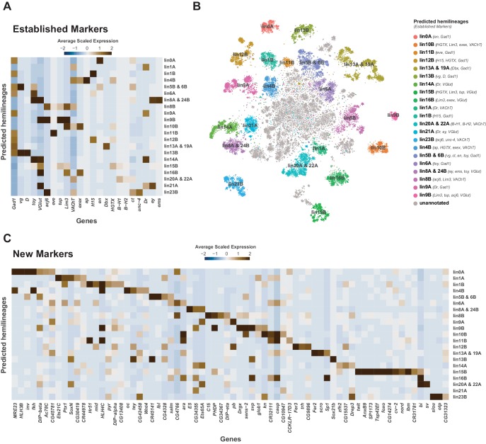
Figure 4. Cellular identities defined by developmental lineages.

(A) Heatmap of the mean scaled log-normalized expression of established lineage markers genes (bottom) within predicated neuroblast hemilineage (right). (B) t-SNE plot of neuronal cells highlighting predicted hemilineages based on the expression of established hemilineage marker genes (shown beside list of predicted hemilineages on the right). (C) Heatmap of the mean scaled log-normalized expression of potential new hemilineage markers genes (bottom) within predicated neuroblast hemilineage (right). Full list of predicted hemilineage markers can be found in Figure 4—source data 1.

Figure 4—source data 1. List of marker genes for predicated hemilineages shown in Figure 4B.
Table showing the average log-fold change (>0.5) values of hemilineage-discriminative marker genes, including adjusted p-values (<0.05). pct.1 is the proportion of cells that express the gene within the predicated hemilineage, pct.2 is the proportion of cells that express the gene outside of the predicted hemilineage.

Figure 4.

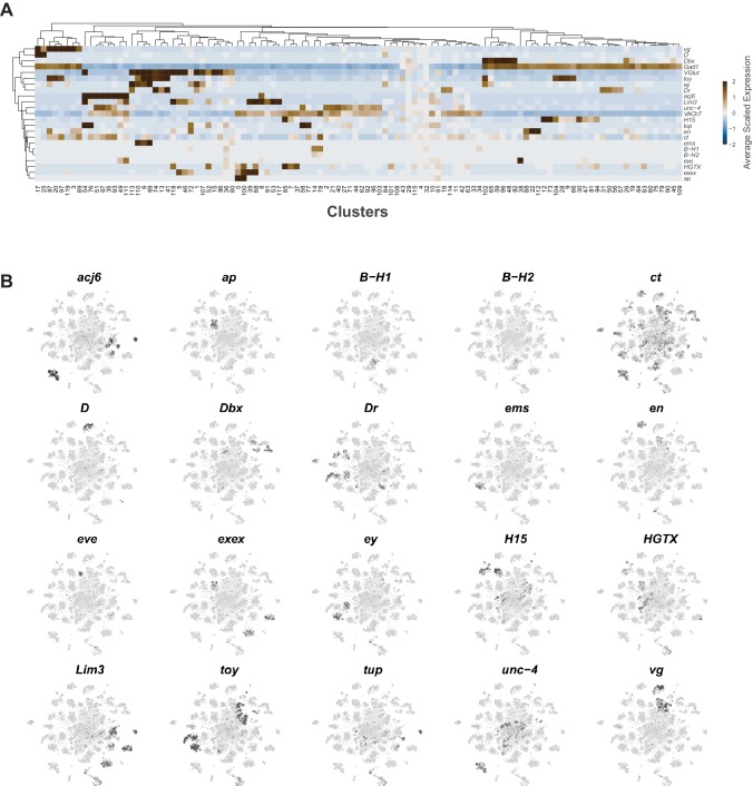
Figure 4—figure supplement 1. Neuroblast lineage marker gene expression in the VNC.

Figure 4—figure supplement 1.

(A) Heatmap of the mean scaled log-normalized expression, by cluster (bottom), of the neuroblast hemilineage and FA-neurotransmitter markers (right). Dendrograms represent hierarchical clustering. (B) t-SNE plots of the neuroblast lineage marker gene expression, shown in black, intensity is proportional to the log-normalized expression levels.
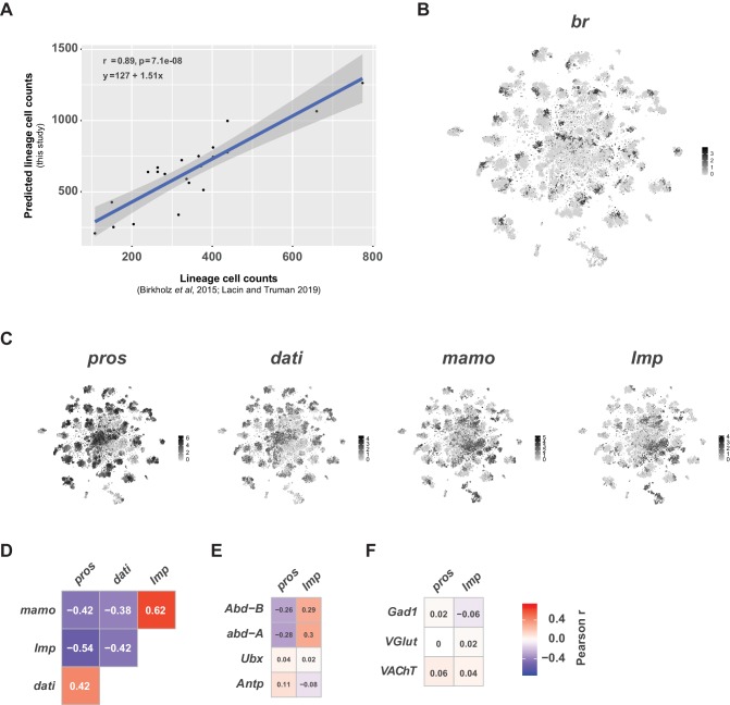
Figure 4—figure supplement 2. Neurodevelopment gene expression.

Figure 4—figure supplement 2.

(A) Scatter plot of hemilineage cell counts from thoracic neuromeres (calculated from Birkholz et al., 2015 and Lacin et al., 2019) compared to cell counts from predicted hemilineage identity in this single-cell data set (used pros+, abd-A-, Abd-B- cells to approximate postembryonic, thoracic hemilineages). Each dot represents a hemilineage (or group of hemilineages). The regression line (blue line) and 95% confidence interval (grey bar) are shown. Pearson’s correlation coefficient (r), p-value (p) and equation of the regression line appear in the upper left corner. (B) t-SNE plot of br expression showing regional expression in clusters throughout the VNC. Expression shown in black, intensity is proportional to the log-normalized expression levels. (C) t-SNE plots of pros, dati, mamo, and Imp in the VNC. Expression shown in black, intensity is proportional to the log-normalized expression levels. (D) Heatmaps showing Pearson correlations coefficients (in text) of expression for pros, dati, mamo, and Imp in single cells. (E) Heatmaps showing Pearson correlations coefficients (in text) of expression for pros and Imp with the Hox genes Abd-B, abd-A, Ubx, and Antp in single cells. (F) Heatmaps showing Pearson correlations coefficients (in text) of expression for pros and Imp with fast-acting neurotransmitter markers Gad1, VGlut, and VAChT in single cells. (D–F) All heatmaps share the same scale and consistent patterns of correlation were seen at the cluster-level and between replicates (data not shown).