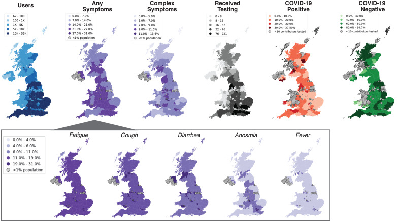
Fig. 2. COVID Symptom Study use, reported symptoms, and testing results according to geographic location in the United Kingdom.
Between 24 and 29 March 2020, more than 1.6 million unique individuals downloaded the application and shared clinical and demographic information, as well as daily symptoms and high-intensity occupational exposures (blue map). Population density of those presenting with any symptoms (left purple map) varied according to region, with widespread reports of fatigue, cough, and diarrhea, followed by anosmia and, relatively infrequently, fever (inset). Examination of individuals who reported complex symptoms (right purple map), defined as having cough or fever and at least one other symptom (diarrhea, anosmia, or fever), reveals areas that potentially need more testing. For the subset of the population that received a COVID-19 test (black map), areas with larger proportions of positive tests (orange map) appear to coincide with areas in which high proportions of the population reported complex symptoms. By contrast, some areas with low prevalence of complex symptoms have received higher rates of testing and, consequently, more negative tests (green map). This example of real-time visualization of data captured by the COVID Symptom Study may help public health and government officials reallocate resources, identify areas with unmet testing needs, and detect emerging hotspots.

