The emergence of coronavirus disease 2019 (COVID-19) has interrupted daily life in a truly unprecedented way. The virus has highlighted weaknesses in our healthcare system and has drawn attention to many important issues, not the least of these is how we manage and visualize geographic information. To keep decision makers and the public up to date, news outlets and organizations have created visualizations to facilitate a rapid understanding of the emerging trends. Owing to the highly contagious nature and increasing expansion of the disease over large areas, maps are a popular choice. With the advent of geographic information systems, and particularly web mapping, it is more accessible than ever for individuals with little to no formal training to make and distribute maps.1 , 2 Although this technology has revolutionized cartography, unfortunately, it has led to the creation of less than perfect maps that are accidentally or intentionally misleading.2
Many COVID-19 maps created so far are choropleth maps, which are a form of statistical map that uses intensity of color to correspond to data intensity within enumeration units.3 , 4 The basic principles for their creation require normalized data (e.g., employment rate) rather than absolute data (e.g., total population). Cartographers base this criterion on the fact that the difference in enumeration unit size can alter how a spatial distribution appears. Thus, an underlying principle in choropleth mapping is to normalize data before any attempt to symbolize it.[3], [4], [5] When appropriately used, a choropleth map is an excellent choice to reveal regional patterns associated with the pandemic. In the maps produced of COVID-19, however, these principals are not always followed.
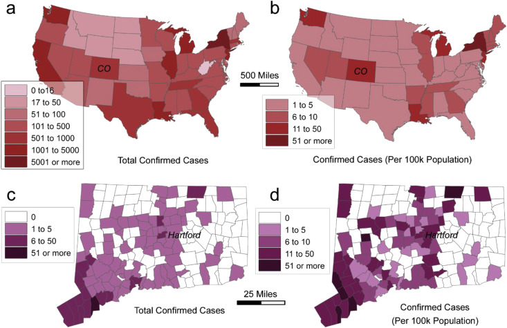
To illustrate this issue, we created a series of maps that demonstrate the importance of data normalization (Fig. 1 ). We adapted Fig. 1a from the daily COVID-19 update on the Centers for Disease Control and Prevention (CDC) website.6 The map colors in Fig. 1a represent the total cases of infection. This symbolization, while not conforming to cartographic principles, may obfuscate the severity of the outbreak. To elaborate further, we have created another map of COVID-19 infections per 100,000 people with four classes (Fig. 1b). The new map identifies Colorado as having a significantly higher rate of cases than that of California. Because of the fewer total cases and a relatively small population in Colorado, the CDC map understates the impact of COVID-19.
Fig. 1.
COVID-19 cases: (a) total confirmed cases by US state (b) cases per 100,000 population by US state, (c) total confirmed cases by Connecticut town, and (d) cases per 100,000 residents by Connecticut town. Data were derived from the CDC and Connecticut Department of Public Health for March 23, 2020. CDC = Centers for Disease Control and Prevention; COVID-19 = coronavirus disease 2019.
The federal government is not alone in this miscommunication. Fig. 1c is a reproduction of the COVID-19 map showing the total infections by town published by the state of Connecticut.7 The map shows the majority of the cases are in the southwest portion of the state. Similar to the map in Fig. 1a, this map is somewhat inaccurate because it does not normalize the cases based on population. To demonstrate, in Fig. 1d, we have created another map showing COVID-19 cases per 100,000 people in the state of Connecticut, and a new pattern emerges. In this map, several towns with relatively small populations near the state capital, the city of Hartford, show an alarming rate of the outbreak.
Nowadays, communication of health information at all levels of society relies heavily on web-based maps. Although web mapping facilitates the delivery of rapidly emerging public health data, the individuals tasked with creating these maps do not necessarily have professional cartographic training. Thus, a certain degree of skepticism should be maintained, even for maps published by a reputable source. As society continues to combat COVID-19, we hope this note may facilitate proper use of web mapping tools and can help uncover information gaps where health policymakers should not overlook.
References
- 1.Fu P., Sun J. 1st ed. ESRI Press; 2011. Web GIS: principles and applications. [Google Scholar]
- 2.Monmonier M.S. 3rd ed. The University of Chicago Press; 2018. How to lie with maps. [Google Scholar]
- 3.Dent B.D. 2nd ed. W.C. Brown; 1990. Cartography: thematic map design. [Google Scholar]
- 4.Tobler W.R. Choropleth maps without class intervals? Geogr Anal. 1973;5(3):262–265. doi: 10.1111/j.1538-4632.1973.tb01012.x. [DOI] [Google Scholar]
- 5.Jenks G.F., Caspall F.C. Error on choroplethic maps: definition, measurement, reduction. Ann Assoc Am Geogr. 1971;61(2):217–244. doi: 10.1111/j.1467-8306.1971.tb00779.x. [DOI] [Google Scholar]
- 6.Centers for Disease Control and Prevention . 2020. Cases in U.S. | CDC. Coronavirus disease 2019 (COVID-19)https://www.cdc.gov/coronavirus/2019-ncov/cases-updates/cases-in-us.html [Google Scholar]
- 7.Connecticut Department of Public Health . 2020. COVID-19 update March 23; p. 2020.https://portal.ct.gov/-/media/Coronavirus/CTDPHCOVID19summary3232020.pdf?la=en [Google Scholar]


