Abstract
Complex systems have characteristics that give rise to the emergence of rare and extreme events. This paper addresses an example of such type of crisis, namely the spread of the new Coronavirus disease 2019 (COVID-19). The study deals with the statistical comparison and visualization of country-based real-data for the period December 31, 2019, up to April 12, 2020, and does not intend to address the medical treatment of the disease. Two distinct approaches are considered, the description of the number of infected people across time by means of heuristic models fitting the real-world data, and the comparison of countries based on hierarchical clustering and multidimensional scaling. The computational and mathematical modeling lead to the emergence of patterns, highlighting similarities and differences between the countries, pointing toward the main characteristics of the complex dynamics.
Keywords: Coronavirus disease 2019, Extreme events, Regression, Multidimensional scaling, Hierarchical clustering, Complex systems
Introduction
Many complex systems generate outputs that are characterized by a frequency-size power law behavior over several orders of magnitude [1, 2]. The power laws have been associated with scale-invariance, self-similarity, and fractality and are consistent with self-organized criticallity, that is a process in which a system, by itself, converges to a state characterized by a coherent global pattern, created by local interactions between low-level elements [3, 4].
The power laws are characterized by heavy-tails, giving non-negligible probability to large events. However, some extreme events, labeled ‘dragon kings’, while predictable, cannot be foreseen by the extrapolation of power law distributions [5, 6]. ‘Dragon kings’ may be associated with positive feedback, bifurcations, and regime changes in out-of-equilibrium complex systems. ‘Dragon kings’ are often discussed in contrast with ‘black swans’, which denote unpredictable catastrophic rare events [7]. These outliers are pervasive in many areas, namely economy, finance, earth sciences, and biology.
The recent Coronavirus disease 2019 (COVID-19) outbreak is an example of an extreme event. We must highlight that the occurrence of a rare event and the actual description of its evolution are, however, distinct matters. This paper attempts to understand the dynamics of the spreading across different countries of COVID-19, but not the prediction of its outbreak or conclusion.
The first case of COVID-19 [8–10] was officially reported in China on December 31, 2019, in Wuhan of Hubei province. At an early stage, the Chinese authorities seemed not to give importance to the problem. However, with the rapid emergence of new cases, the attitude changed dramatically. The Chinese government took a series of strong measures to contain the disease and gave the world an example of commitment and effectiveness. The growth rate of new cases of COVID-19 in China has slowed significantly, and the situation appears to be under control at the moment of writing this paper [11, 12].
In the meantime, new cases have been emerging in many countries. In particular, the rapid evolution in Iran, South Korea, Italy and Spain became the most dramatic cases. COVID-19 was gradually reaching all continents, with cases confirmed all over the world, while having ‘alarming levels of inaction’ by some countries, in the words of the director of the World Health Organization (WHO).
More recently, by March 11, 2020, WHO officially declared the COVID-19 a global pandemic, just when the number of known cases reached approximately 121,000 and caused 4300 deaths, and after the cases outside of China spread by a factor of 13 and the number of countries affected tripled in just two weeks.
Panic begins to spread in some populations [13], fueled by the massive and speculative news broadcast by the media and social networks. World governments have taken drastic measures, such as closing schools, entertainment venues and restaurants, and the movement of people has slowed dramatically, in parallel with thousands of canceled flights [14]. The tourism sector and commercial flights are the most affected and the world seems to be heading towards an economic recession, with the GDP of some countries being able to drop double-digit figures.
No one can say whether the measures being taken are sufficient [15], or what the evolution of the pandemic will be, but this appears to be the public health crisis of a generation. However, we cannot forget that, for example, the H1N1 flu of 2009 caused between 151,000 and 575,000 deaths worldwide [16]. The COVID-19 has still a long way to go to reach the H1N1 levels. The world faced other flu pandemic crises in the past [17] and the scientific knowledge has never been so well prepared as today to give appropriate answers to health crises.
The analysis of the evolution of the confirmed cases versus time has considerable interest from the point of view of delivering good information to health organizations and to the general public. Several statistics have been presented, adopting different forms for organizing and visualizing the data. However, a comprehensive representation of the COVID-19 spreading dynamics across different countries is still missing.
In epidemiology, mathematical modeling plays an important role in understanding the mechanisms that govern the transmission of contagious diseases. The work by Kermack and McKendrick [18] formulated the general theory of susceptible–infected–recovered (SIR). A SIR model involves a system of coupled equations relating the numbers of susceptible, infected and recovered people over time, and computes the theoretical number of infected people in a closed population. Many variations of the original SIR model were proposed, such as the susceptible–infectious–susceptible (SIS) and the susceptible–exposed–infectious–recovered (SEIR), based on ordinary [19], stochastic [20] and fractional order [21, 22] differential equations. These recent versions were adopted for studying the spread of distinct infectious diseases [23, 24], including the COVID-19 [25]. However, the main concern of such approach is the model validation, since it requires to compare the results with real data. Contrary to model-driven, data-driven approaches rely on data series for deriving adequate fitting functions. These heuristic models describe well one stage of the epidemic, but fail when the disease evolves toward a different phase. We must also note that the heuristic model is useless in the initial epidemic phase, due to insufficient data [26, 27].
The paper addresses the statistical comparison and visualization of COVID-19 country reported cases in the period December 31, 2019, up to April 12, 2020. The study does not aim to be a contribution tailored for medical treatment or prevention of the disease. Therefore, in a first phase, we adopt a nonlinear least-squares technique to determine possible candidate heuristic models for describing the data regarding COVID-19 infections. In a second phase, we use distinct metrics for processing the data both in the time and frequency domains. The information is visualized using hierarchical clustering (HC) and multidimensional scaling (MDS) for comparing the COVID-19 evolution in the different countries. The HC and MDS generate loci of points in 2- and 3-dimensional spaces representing the number of infections for each country. The positioning and the patterns formed by the points lead to direct interpretations of the results. The study is data-driven, and the models are applicable only at some stages of the outbreak and when enough data points are available.
In this line of thought, the paper is organized as follows. In Sect. 2 we introduce the dataset adopted in the follow-up. In Sect. 3 we analyze the data by means of regression modeling. In Sect. 4 we compare and visualize the COVID-19 spreading data in various countries. In Sect. 5, we discuss the possibility of foreseeing the future evolution. Finally, in Sect. 6 we discuss the results and summarize the main conclusions.
The dataset
The COVID-19 data are made available by the European Centre for Disease Prevention and Control (https://www.ecdc.europa.eu/en). The dataset is provided in Excel format, containing the number of infected and the number of deaths for each country, on a daily basis. Data for the period from December 31, 2019, up to April 12, 2020, were collected for analysis. This period of time will be denoted as henceforth.
Figure 1 depicts a geographic map where the colormap is proportional to the number of days elapsed since the occurrence of the first case in each country. We verify that the COVID-19 is particularly severe in the northern hemisphere and, thus, seems not to follow the same pattern of other serious diseases that affected mainly the underdeveloped countries. Therefore, some possible synchronization between countries, or, even, the emergence of new waves of spread in the future are still unclear and techniques such as the Kuramoto model [28] for assessing that hypothesis should be considered.
Fig. 1.
Geographic map of the COVID-19 spread for 165 countries. The color map is proportional to the number of days elapsed since the occurrence of the first case for each country for the period of time
Let denote the time series of confirmed COVID-19 daily infections for the ith country, , where represents time with one day resolution, within the time interval . Therefore, the signals evolve in discrete times, t, and can be interpreted as one manifestation of a complex system.
For the sake of statistical significance and accuracy of the mathematical tools used for processing the data, we just consider the countries with time series comprising at least 30 days with new infections, which yields the number listed in Table 1.
Table 1.
List of 79 countries with time series comprising at least 30 days with new infections during the period
| i | Country | Acronym | i | Country | Acronym | i | Country | Acronym |
|---|---|---|---|---|---|---|---|---|
| 1 | Albania | AL | 28 | Hungary | HU | 55 | Philippines | PH |
| 2 | Algeria | DZ | 29 | Iceland | IS | 56 | Poland | PL |
| 3 | Argentina | AR | 30 | India | IO | 57 | Portugal | PT |
| 4 | Armenia | AM | 31 | Indonesia | ID | 58 | Qatar | QA |
| 5 | Australia | AU | 32 | Iran | IR | 59 | Romania | RO |
| 6 | Austria | AT | 33 | Iraq | IQ | 60 | Russia | RU |
| 7 | Azerbaijan | BH | 34 | Ireland | IE | 61 | San Marino | SM |
| 8 | Bahrain | BE | 35 | Israel | IL | 62 | Saudi Arabia | SA |
| 9 | Belgium | BR | 36 | Italy | IT | 63 | Senegal | SN |
| 10 | Brazil | BN | 37 | Japan | JP | 64 | Serbia | RS |
| 11 | Bulgaria | BG | 38 | Kuwait | KW | 65 | Singapore | SG |
| 12 | Canada | CA | 39 | Latvia | LV | 66 | Slovakia | SK |
| 13 | Chile | CL | 40 | Lebanon | LB | 67 | Slovenia | SI |
| 14 | China | CN | 41 | Luxembourg | LU | 68 | South Africa | ZA |
| 15 | Colombia | CO | 42 | Malaysia | MY | 69 | South Korea | KR |
| 16 | Costa Rica | CR | 43 | Malta | MT | 70 | Spain | ES |
| 17 | Croatia | HR | 44 | Mexico | MX | 71 | Sweden | SE |
| 18 | Czechia | CZ | 45 | Moldova | MD | 72 | Switzerland | CH |
| 19 | Denmark | DK | 46 | Morocco | MA | 73 | Taiwan | TW |
| 20 | Ecuador | EC | 47 | Netherlands | NL | 74 | Thailand | TH |
| 21 | Egypt | EG | 48 | New Zealand | NZ | 75 | Tunisia | TN |
| 22 | Estonia | EE | 49 | Norway | NO | 76 | United Arab Emirates | AE |
| 23 | Finland | FI | 50 | Oman | OM | 77 | UK | GB |
| 24 | France | FR | 51 | Pakistan | PK | 78 | USA | US |
| 25 | Georgia | GE | 52 | Palestine | PS | 79 | Vietnam | VN |
| 26 | Germany | DE | 53 | Panama | PA | |||
| 27 | Greece | GR | 54 | Peru | PE |
For characterizing the evolution of daily infections per country, we calculate the log return:
| 1 |
and we approximate the histogram of by a symmetric -stable distribution [29].
We recall that a probability distribution (PD) (and the corresponding random variable ) is said to be ‘stable’ if a linear combination of 2 independent random variables with such PD has also an identical PD, up to the scale and location parameters, c and , respectively [29, 30]. A given family of stable distributions is often called Lévy alpha-stable distribution, after Paul Lévy [31]. The Lévy, Gaussian and Cauchy PD of a random variable are particular cases of the -stable distribution family with the parameter value and 2, respectively [32]. The -stable distribution is a four parameter family of distributions and is (usually) denoted by . The first parameter is of particular relevance and describes the tail of the distribution. We have for the stability (or characteristic exponent), representing the skewness, standing for the scale, and for location parameters. With exception of the cases when and , we have that for the asymptotic behavior is described by [33, 34]:
| 2 |
where denotes the Gamma function. We verify the presence of the so-called heavy or fat tails that cause the variance to be infinite for .
Figure 2 depicts the histogram and the -stable approximation for China, , in the period . Twelve bins were considered for having statistical significance. In this case, we have approximately , that is, corresponding to an extremely small value, which entails a huge probability for extreme values of the return. The alternative of an asymmetrical PD was tested, but the resulting improvement was minor and by consequence merely the symmetrical version is depicted for the sake of simplifying.
Fig. 2.
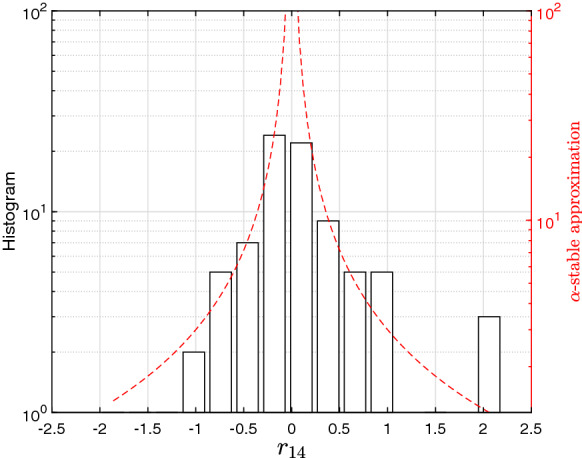
The histogram of the the log returns , , and -stable approximation, with tail characteristic exponent , for China during the period
Regression models for describing the spread of COVID-19
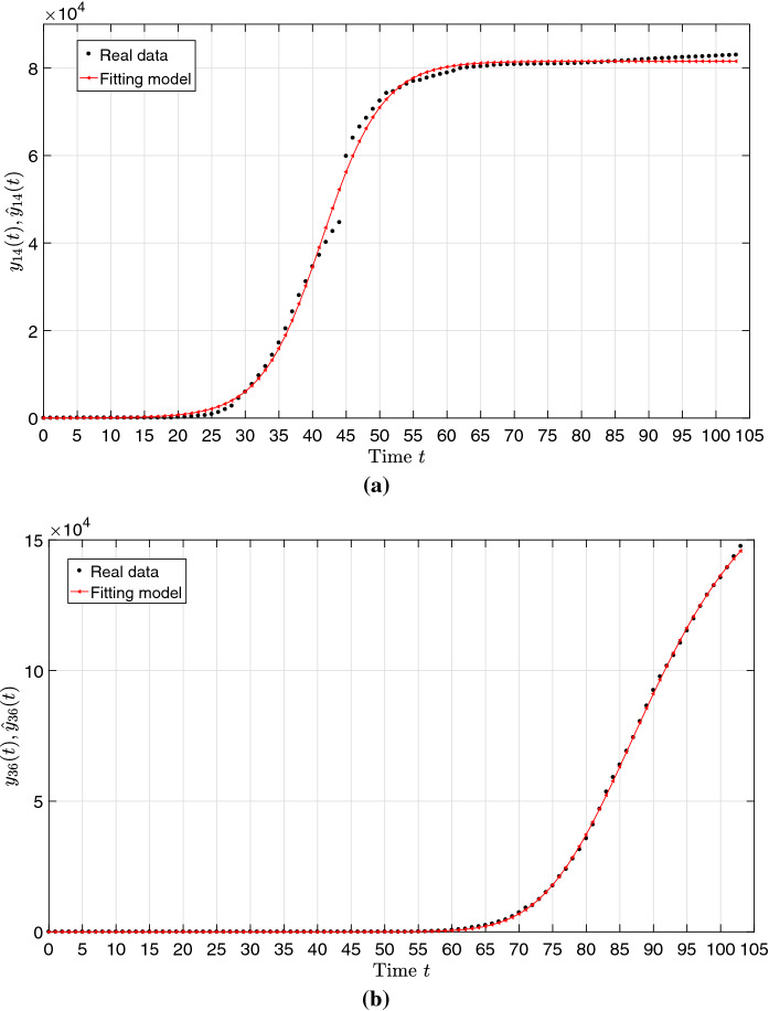
Let represent the time series of cumulative number of infections of , that is . We adopt the nonlinear least-squares [35, 36] to examine the behavior of for a variety of functions. We selected the ‘Logistic’ and ‘Richards’ models:
| 3 |
| 4 |
for approximating the data of China () and Italy (), respectively, where are parameters adjusted by means of a nonlinear least square fit numerical algorithm.
These models were selected from a large number of heuristic functions simply because they (i) adjust adequately to real data, and (ii) involve a limited number of parameters. Therefore, no special biological meaning was intended when using such functions.
Figure 3 illustrates the data time series, and and the corresponding approximations and for the parameters and , respectively.
Fig. 3.
The time series of the cumulative number of infections and the model approximations and during the period for: a China; b Italy
We verify a good fit in both cases, with coefficient of determination , but a single model with limited number of parameters is not able to fit well the time series for all countries. Obviously, we can adopt other models involving a larger number of parameters for achieving a better fitting to a given . Nonetheless, only analytical expressions requiring a limited set of parameters are of relevance [37]; otherwise, their comparison and interpretation becomes unclear. On the other hand, the use of distinct models for different countries lack generality when comparing results.
Global comparison of the COVID-19 spreading
We now analyze the COVID-19 spreading data of countries both in the time and frequency domains. In the time domain, we compare the pair (i, j) of countries by the corresponding time series of the cumulative number of infections , , with . In the frequency domain, the pairs of countries are compared by the daily number of infections , where , , denotes the Fourier transform, represents the angular frequency and .
We adopt the Canberra distance to measure the dissimilarity between pairs (i, j) for the time and frequency domains:
| 5 |
| 6 |
that is, distances based on the variables and , respectively, where and denote the real and imaginary parts. The Canberra distance has the relevant property of being relatively insensitive to the simultaneous presence of large and small values.
Obviously, other distances are possible [38] and several of them were also tested. However, further distances are not included herein for sake of parsimony, since and illustrate adequately the proposed concepts.
Hierarchichal clustering and visualization of COVID-19
For visualizing the relationships between the 79 countries, we first adopt the HC computational approach. The HC is a technique that groups similar objects [39]. Given M objects in a q-dimensional real-valued space and a dissimilarity metric, a -dimensional matrix, , with for and , , of object to object dissimilarities is determined [40]. The HC generates a structure of object clusters, using as input, that is represented graphically either by a hierarchical tree or a dendrogram. We have two alternatives to generate a hierarchy of clusters, namely the agglomerative and divisive clustering iterative techniques. In the first, each object starts in its own cluster and the successive iterations merge the pair of most similar clusters until there is a single cluster. In the second technique all objects start in one cluster and, during the iterations, the ‘outsiders’ are removed from the least cohesive cluster, until each object is in a separate cluster. In both cases the HC requires a linkage criterion, that is a function of the distances between pairs of items, for quantifying the dissimilarity between clusters. Metrics such as the maximum, minimum and average linkages are often used. The distance between two objects and , in the clusters R and S, respectively, can be assessed by means of several metrics such as the average-linkage given by [41]:
| 7 |
For assessing the clustering quality, the index cc is mostly used [42]. Let us consider that the original object is described by a HC representation . Additionally, let x(i, j) and t(i, j) stand for the the distances between the and original observations and the HC points and , respectively. If we have and , where denotes average, then cc is given by:
| 8 |
The closer the value of cc is to 1, the better the clustering reflects the original data. The results are represented in a Shepard chart that compares the original and the cophenetic distances. The closer to the 45 degree line the points, the better the obtained clustering. For example, in MATLAB, the cophenetic correlation coefficient can be obtained by means of the command cophenet.
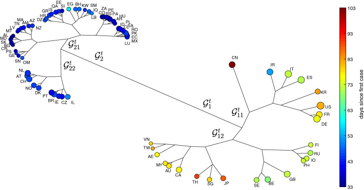
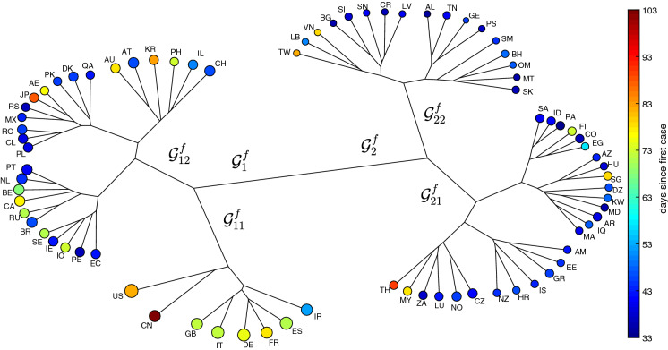
Herein, the agglomerative clustering and average-linkage method are adopted for visualizing the two resulting matrices of item-to-item distances based on Eqs. (5) and (6), respectively [43]. Figures 4 and 5 depict the HC trees for and , respectively, during the period . The size of the ‘leafs’ is proportional to the logarithm of the total number of infections at time T (i.e., ) and the color is proportional to the time of appearance of the first case in each country up to T. We verify, in both cases, the emergence of 2 clusters. For the we have and . For we have and .
Fig. 4.
The HC tree for the 79 countries using the item-to-item dissimilarities in the time-domain during the period time . The size of the ‘leafs’ is proportional to the logarithm of the total number of infections and the color is proportional to the time elapsed since the first reported case in each country up to T
Fig. 5.
The HC tree for the 79 countries using the item-to-item dissimilarities in the frequency-domain during the period of time . The size of the ‘leafs’ is proportional to the logarithm of the total number of infections and the color is proportional to the time elapsed since the first reported case in each country up to T
In Fig. 4, we see a clear position of China followed by the sub-cluster formed by Iran, Italy, Spain, Korea, United States, France and Germany. On the other hand, the tree based on the frequency response gives more importance to a sub-cluster formed by the United States and China, followed by a second group including United Kingdom, Italy, Germany, France, Spain, and Iran. Moreover, the second tree separates better those countries with a smaller impact from the virus spread. In Fig. 4, the countries with a smaller (larger) number of occurrences and a smaller (larger) number of days since the first case are to the left (right). In Fig. 5, the distribution for smaller (medium/larger) values is located on the right (left/middle bottom) sides.
Figure 6 represents the Shepard plot for assessing the HC tree for the 74 countries and the item-to-item dissimilarities . The chart reflects an accurate clustering of the original data. For the index , the Shepard plot is identical to the one in Fig. 6 and, therefore, is not presented.
Fig. 6.
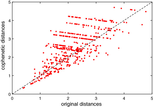
Shepard plot for the HC cophenetic distances obtained with . The cophenetic correlation coefficient is
Multidimensional scaling and visualization of the COVID-19 dataset
The MDS is a computational technique for clustering and visualizing multidimensional data [44]. As for the HC, the input of the MDS numerical scheme is the matrix , , of object to object dissimilarities. The main idea of the MDS is to have points for representing objects in a d-dim space, with , while trying to reproduce the original dissimilarities, . Subsequently, the MDS evaluates distinct configurations for optimizing a given fit function. The result of successive numerical iterations is a set of point coordinates (and, therefore, a symmetric matrix of the reproduced dissimilarities) approximating . A fit function used frequently is the raw stress , where stands for some type of linear or nonlinear transformation.
We have several variants of the MDS, such as the metric, non-metric and generalized MDS. In the case of the metric MDS, the iterative algorithm minimizes the stress cost function . We can have for example the residual sum of squares:
| 9 |
The Sammon criterion can be also adopted
| 10 |
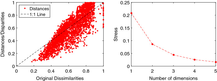
The MATLAB command cmdscale and stress criterion Sammon were adopted. The interpretation of the MDS locus is based on the patterns of points. Similar (dissimilar) objects are represented by points that are close to (far from) each other. Therefore, the information retrieval is not based on the point coordinates, nor the shape of the clusters. This means that it is possible to magnify, translate and rotate the MDS locus. The axes of the MDS plot have neither units nor a special physical meaning. The quality of the MDS can be assessed through the stress and Shepard diagrams. The stress chart represents versus d. The plot is monotonically decreasing and choosing a given value of d is a compromise between obtaining low values of and d. The values or are usually adopted, because they allow a direct representation. The Shepard diagram compares and for a given value of d. A narrow scatter represents a good fit between and .
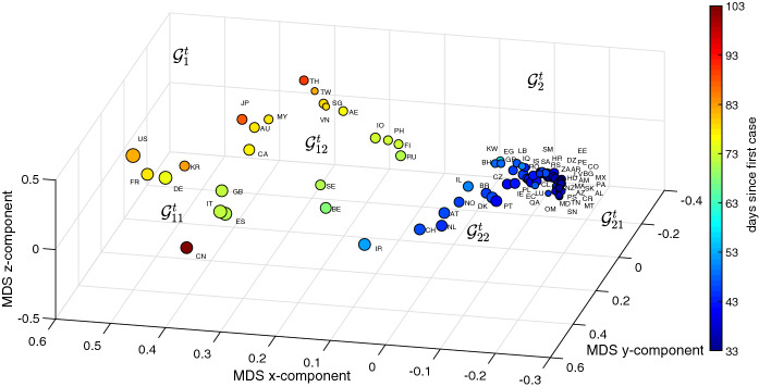
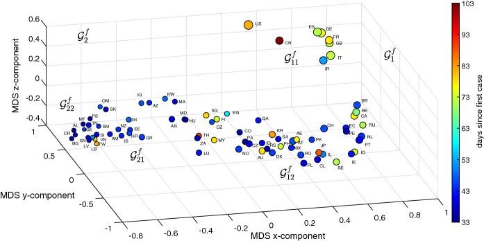
Figures 7 and 8 depict the 3D MDS maps for and , respectively, for the period . As before, the size of the dots is proportional to the logarithm of the number of infections (i.e., ) and the color is proportional to the time between the first reported case in each country and T. The clusters are the same obtained with the HC, however, for their clear visualization we need to rotate the 3D maps.
Fig. 7.
The 3D MDS locus of the 79 countries using the item-to-item dissimilarities in the time-domain during the period . The size of the dots is proportional to the logarithm of the number of infections and the color is proportional to the time elapsed since the first reported case in each country up to T
Fig. 8.
The 3D MDS locus of the 79 countries using the item-to-item dissimilarities in the frequency-domain during the period . The size of the dots is proportional to the logarithm of the number of infections and the color is proportional to the time elapsed since the first reported case in each country up to T
As for the HC we verify that the time domain approach makes a better distinction of the countries with a larger number of infections, while the MDS based on the frequency domain has a more eclectic distribution, that is with a larger dispersion, and leaves some room for distinguishing the countries with a smaller number of infections. In both figures, the countries to the left (right) have a smaller (larger) number of infections and more (less) time elapsed since their first case in each country.
Figure 9 illustrates the Shepard and stress charts of the MDS obtained with the index . The diagrams obtained with are of the same type and are omitted. The limited scatter of the points around the 45 degree line in the Shepard diagram reveals a good performance of the MDS. The curve elbow in the stress diagram means that both the 2- and 3-dimensional loci are a good option. Nonetheless, as expected, the 3-dimensional locus is better at the expense of a slightly more involved visualization.
Fig. 9.
Shepard and stress diagrams of the MDS locus obtained with : a Shepard; b stress
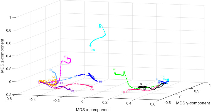
The countries with more than 12,000 cases, AT, BE, BR, CA, CN, FR, DE, IR, IT, NL, PT, KR, ES, CH, TR, GB, US, are now compared by means of a combination of MDS and Procrustes analysis when varying time [40, 45–48]. Procrustes is a statistical method that takes a collection of shapes and transforms them (using translation, rotation, and amplification/reduction of size) for maximum superposition. The comparison is performed for a shorter period of time from up to , so that there is significant non null data for the analysis.
Let , , denote the data time series representative of the countries in for periods of time starting at and increasing up to . The individual 3D MDS maps (one for each value of k) are generated using the item-to-item dissimilarities and , and processed with Procrustes. We must note that we are now using matrices of dimension . Therefore, the MDS locus produced for each k is not a magnification of the previous charts. For each index, the collection of MDS maps yields one global chart (Figs. 10, 11, respectively) that represents world recent evolution of the COVID-19. We verify different behaviors of the time and frequency domains MDS loci being, apparently, slightly more representative the first.
Fig. 10.
The 3D MDS global locus generated for the 16 countries in with the item-to-item dissimilarities and the period . The squares and circles represent the beginning and end of the time period, respectively
Fig. 11.
The 3D MDS global locus generated for the 16 countries in with the item-to-item dissimilarities and the period . The squares and circles represent the beginning and end of the time period, respectively
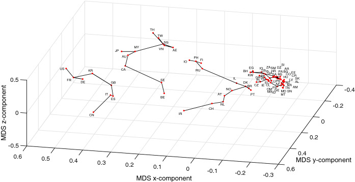
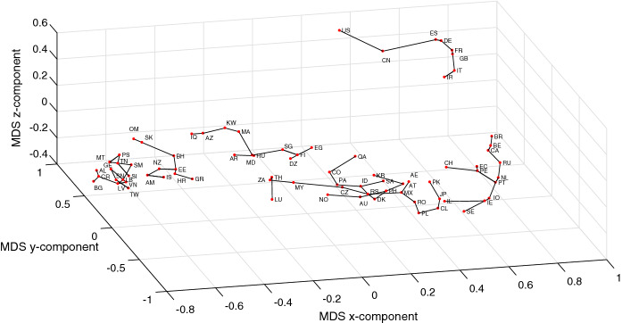
In Figs. 12 and 13, we redraw the MDS charts of Figs. 7 and 8 (for the initial period of time ) with a connection between those countries that lie close to each other in the MDS locus [49]. Therefore, the lines do not represent clusters, and, instead they indicate that in the near future the evolution of a given country will probably be similar (in the sense of the adopted distances) to the neighboring countries. We observe also some discontinuities in the lines. Again they do not represent different clusters. The discontinuities simply mean that some neighbor is closer than the other and, therefore, it is likely that its evolution is closer.
Fig. 12.
The 3D MDS locus of the 79 countries using the item-to-item dissimilarities in the time-domain during the period . The countries close to each other are connected by lines
Fig. 13.
The 3D MDS locus of the 79 countries using the item-to-item dissimilarities in the frequency-domain during the period . The countries close to each other are connected by lines
Is it possible to foresee?
It is written ‘The future belongs to God, and it is only he who reveals it, under extraordinary circumstances’ [50]. To the authors best knowledge, the HC and MDS techniques are not designed to make predictions. Indeed, they allow a better interpretation of the past and present. Nonetheless, we can take advantage of the MDS computational visualization to trace some similarities between the items represented in the loci. From Figs. 10 and 11, where time is a parametric variable, we verify that we do not obtain our intuitive feeling of time as a smooth and continuous variable embedded and synchronizing all events. In fact, we see that the time instant for the beginning and end of the trajectories vary considerably from country to country. Therefore, if we adopt a critical view we can interpret that the 1-dimensional time continuum (if exists) is not adequately represented by the two technique combination (i.e., MDS and Procrustes). However, it was already noticed in previous studies [51, 52], addressing a distinct phenomenon and applying only MDS, that datasets under the influence of social and human factors phenomena exhibit a relativistic behavior and eventually different velocities. Let us name the ‘relativistic time’ to make it distinct from the standard notion of constant speed physical time.
Let us consider the Canberra and Lorentzian distances [38] to measure the dissimilarity between the pairs and :
| 11 |
| 12 |
where represents the ith vector of N consecutive values of x(t) obtained from non-overlapping time windows. Therefore, the time series is subdivided into identical periods of time giving rise to windows, where denotes the integer part of the argument. Obviously, the larger the width of the window the better the filtering, but the weaker the notion of time ‘instant’. Now, the MDS has for input a matrix of dimension and produces a single locus that compares the set of N-dimensional R vectors, corresponding to the different time windows. The MDS with MATLAB command cmdscale was adopted.
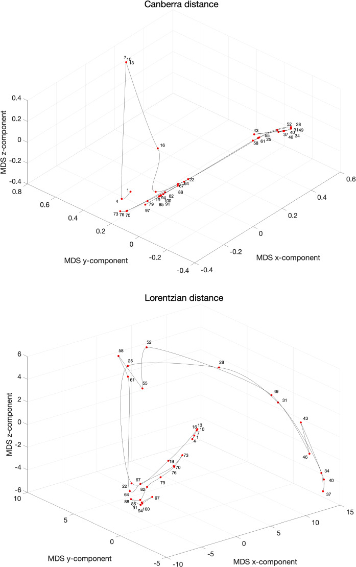
Figure 14 illustrates the concept of relativistic time for the data set of China for consecutive values and non-overlapping time windows during the time period . The point labels correspond to the first day of each time window. The acceleration/deceleration in the relativistic time is captured by the distance between consecutive points.
Fig. 14.
The 3D MDS loci of China using the item-to-item dissimilarities using and for non-overlapping vectors of consecutive values during the period . The point labels correspond to the first day of each time window
We verify again the emergence of areas involving a large variability, coincident with large transients, and zones with a smoother evolution, corresponding to a continuous dynamics. In both cases we observe clearly four phases: (i) an initial transient, (ii) a fast progress up to a peak, (iii) a return back (but not exactly to the initial state), and (iv) the emergence of a new, unclear, second wave. As usual with the MDS technique the distinct measures highlight different aspects but the overall conclusions are similar.
For estimating future outcomes we now propose a technique embedding the trendline and the MDS data-driven techniques for estimating the evolution. In what follows we adopt the case of Italy () as our test bench and we shall tackle the values of the number of daily infections . The main idea is to fit a set of trendlines to the available data and, based on them, to extrapolate the future behavior. In a second phase we adopt MDS to compare the real-world data and the estimations provided by the trendlines.
We consider four models, namely the ‘Hoerl’, ‘Reciprocal quadratic’, ‘Gaussian’ and ‘Vapor’ given by:
| 13a |
| 13b |
| 13c |
| 13d |
respectively, where are parameters and . We emphasize again that these models have no specific meaning and are just some functions that fit adequately the available data.
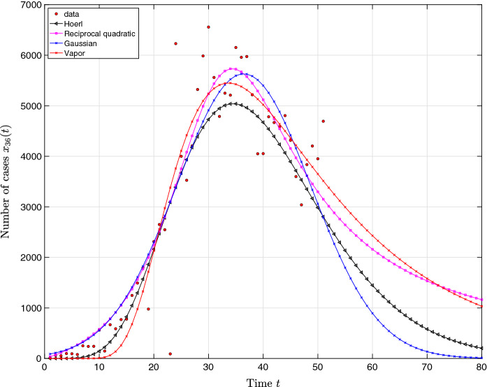
In fact, the proposed heuristic models follows the common sense that number of infections will diminish in the future. However, these trendlines are just for estimating the near future and we shall consider and as representing a ‘optimistic’ scenarios, while and stand for ‘pessimistic’ future outcomes. Moreover, models , and have an asymmetric evolution about the peak, while considers a symmetric behavior. For the data collected on April 12, we obtain the set of parameters , , and .
Figure 15 represents the curve fitting for the period and an estimation up to an extended period of time days.
Fig. 15.
Time series approximations , , and estimations based on the number of cases in Italy. Real data are collected in the period and the estimation covers the period
For assessing the quality of the estimations we compare the real data and the results provided by , , for Italy using the Canberra and the Lorentzian distances defined previously in (11)–(12). As before, the heuristic models cover an extended period of days for providing an estimation of the near future. We adopt the stress for assessing the conformity between the data and the trendlines including their estimation. The MATLAB command cmdscale and stress criterion Sammon were adopted.
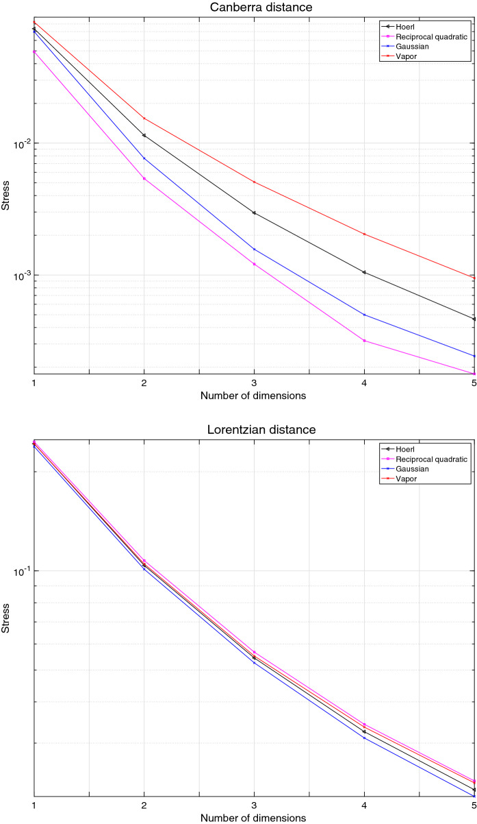
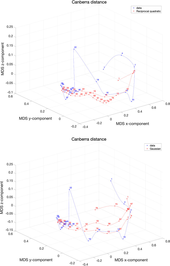
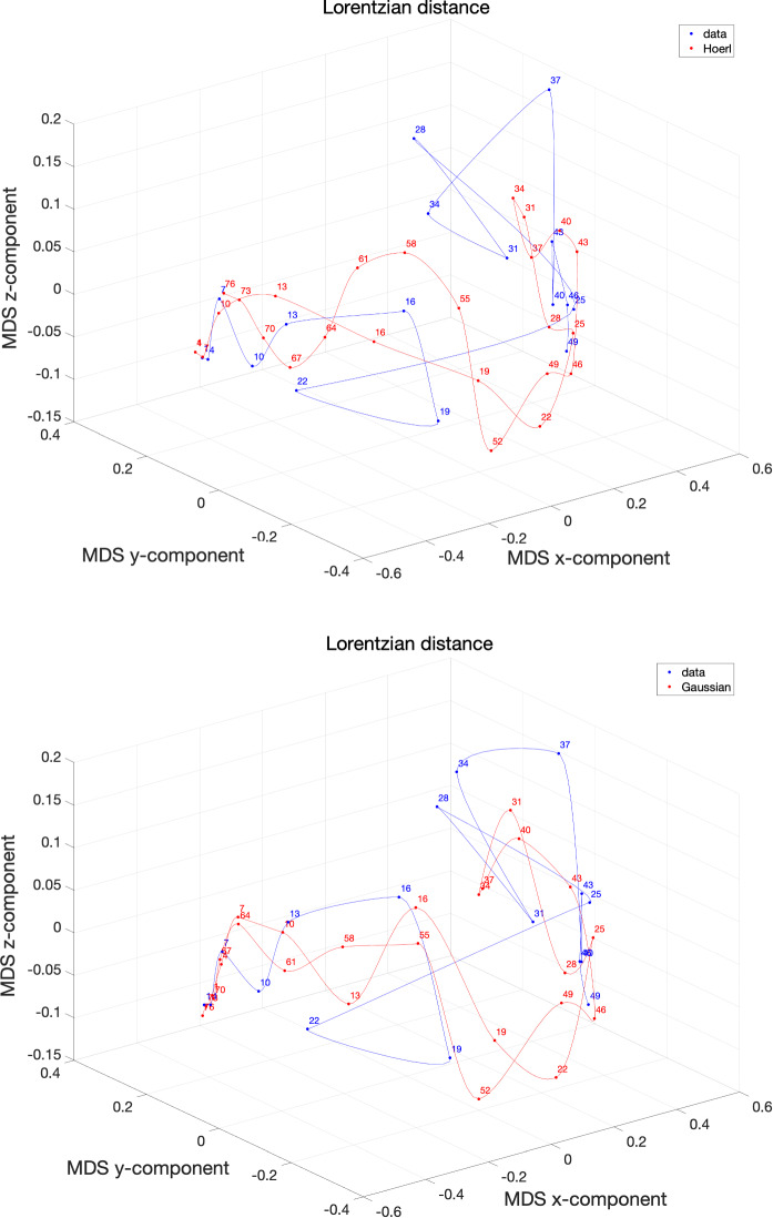
Figure 16 depicts the stress yielded by the MDS loci generated by the Canberra and the Lorentzian and the models , for the case of Italy.
Fig. 16.
Stress versus number of dimensions d of the MDS loci for Italy using the distances and for non-overlapping vectors of consecutive days. The data collects values for the period . The models , , address an extended period days
We verify that for the models and are superior when considering the Canberra distance. However, the models and are superior in the perspective of the Lorenzian distance.
Figures 17 and 18 show the resulting MDS loci for the Canberra and the Lorenzian distances for the two best models in each case.
Fig. 17.
The 3D MDS loci of Italy using the distance for non-overlapping vectors of consecutive days. The data collect values for the period . The models , , address an extended period days. The labels correspond to the first day of each time window
Fig. 18.
The 3D MDS loci of Italy using the distance for non-overlapping vectors of consecutive days. The data collects values for the period . The models , , address an extended period days. The labels correspond to the first day of each time window
The Lorentzian distance is more sensitive and gives more space to the artifact represented by the value (the neighbor values are and ), but, on the other hand, shows more clearly the recent final phase. The Gaussian model, seems a good compromise between the two distances and produces a trajectory consistent with the data series without exhibiting acceleration/deceleration time periods distinct from those available at the time of writing the paper. Nonetheless, the authors highlight that the COVID-19 evolution has an underlying plethora of phenomena going from cultural and economical up to political and geographical issues. As someone said, ‘Prediction is very difficult, especially if it’s about the future’ [53].
Conclusions
This paper investigated an example of an extreme event, namely the dynamics of the COVID-19 spreading. Two approaches were considered for the period from December 31, 2019 up to April 12, 2020. In a first phase, heuristic models were used to fit the time series of the number of infections verified in a set of 79 countries. In a second phase, two metrics were used for comparing the countries data both in the time and frequency domains, and the HC and MDS techniques were adopted for clustering and visualization. The time evolution was also considered for a group of countries exhibiting a more dramatic spread of the COVID-19. The combination of Procrustes and MDS showed that besides the number of infections, the dynamic characteristics play an important role that is not evident in standard representations. In fact, the computational and mathematical modeling lead to the emergence of patterns both highlighting the main clusters and the similarities or dissimilarities between them. Given the potential of the techniques discussed here we can think of their application in several research directions such as the subdivision of data sets according with distinct criteria such as the age, or the geographical origin of the patients. Additionally, analysis considering a large set of influential factors besides merely the casualties can be tried, such as infected people staying in general or in intensive care in hospital, or recovered based on some type of treatment. Therefore, if sufficient and assertive information is collected, then research can follow the aforementioned computational methods to unravel space and time nonlinear dynamics embedded the data.
Compliance with ethical standards
Conflict of interest
The authors declare that they have no conflict of interest.
Footnotes
Publisher's Note
Springer Nature remains neutral with regard to jurisdictional claims in published maps and institutional affiliations.
Contributor Information
J. A. Tenreiro Machado, Email: jtm@isep.ipp.pt.
António M. Lopes, Email: aml@fe.up.pt
References
- 1.Pinto C, Mendes Lopes A, Machado J. A review of power laws in real life phenomena. Commun. Nonlinear Sci. Numer. Simul. 2012;17(9):3558–3578. doi: 10.1016/j.cnsns.2012.01.013. [DOI] [Google Scholar]
- 2.Newman ME. Power laws, Pareto distributions and Zipf’s law. Contemp. Phys. 2005;46(5):323–351. doi: 10.1080/00107510500052444. [DOI] [Google Scholar]
- 3.Bak P, Tang C, Wiesenfeld K, et al. Self-organized criticality: an explanation of 1/f noise. Phys. Rev. Lett. 1987;59(4):381–384. doi: 10.1103/PhysRevLett.59.381. [DOI] [PubMed] [Google Scholar]
- 4.Jensen HJ. Self-organized Criticality: Emergent Complex Behavior in Physical and Biological Systems. Cambridge: Cambridge University Press; 1998. [Google Scholar]
- 5.Sornette, D.: Dragon-kings, black swans and the prediction of crises. arXiv preprint arXiv:0907.4290 (2009)
- 6.Pisarenko V, Sornette D. Robust statistical tests of Dragon–Kings beyond power law distributions. Eur. Phys. J. Spec. Top. 2012;205(1):95–115. doi: 10.1140/epjst/e2012-01564-8. [DOI] [Google Scholar]
- 7.Shaywitz DA. Shattering the bell curve. Wall Street J. 2007;24:D8. [Google Scholar]
- 8.Dietz, L., Horve, P.F., Coil, D., Fretz, M., Van Den Wymelenberg, K.: 2019 Novel Coronavirus (COVID-19) outbreak: a review of the current literature and built environment (BE) considerations to reduce transmission (2020) [DOI] [PMC free article] [PubMed]
- 9.Jiang F, Deng L, Zhang L, Cai Y, Cheung CW, Xia Z. Review of the clinical characteristics of coronavirus disease 2019 (COVID-19) J. Gen. Int. Med. 2020 doi: 10.1007/s11606-020-05762-w. [DOI] [PMC free article] [PubMed] [Google Scholar]
- 10.Murdoch DR, French NP. COVID-19: another infectious disease emerging at the animal-human interface. N. Z. Med. J. 2020;133(1510):12. [PubMed] [Google Scholar]
- 11.Zu ZY, Jiang MD, Xu PP, Chen W, Ni QQ, Lu GM, Zhang LJ. Coronavirus disease 2019 (COVID-19): a perspective from China. Radiology. 2020 doi: 10.1148/radiol.2020200490. [DOI] [PMC free article] [PubMed] [Google Scholar]
- 12.Chen S, Yang J, Yang W, Wang C, Bärnighausen T. COVID-19 control in China during mass population movements at new year. The Lancet. 2020;395:764. doi: 10.1016/S0140-6736(20)30421-9. [DOI] [PMC free article] [PubMed] [Google Scholar]
- 13.Leung CC, Lam TH, Cheng KK. Mass masking in the COVID-19 epidemic: people need guidance. The Lancet. 2020;395:945. doi: 10.1016/S0140-6736(20)30520-1. [DOI] [PMC free article] [PubMed] [Google Scholar]
- 14.Chinazzi M, Davis JT, Ajelli M, Gioannini C, Litvinova M, Merler S, Piontti AP, Mu K, Rossi L, Sun K, Viboud C, Xiong X, Yu H, Halloran E, Longini I, Vespignani A. The effect of travel restrictions on the spread of the 2019 novel coronavirus (COVID-19) outbreak. Science. 2020;368:395–400. doi: 10.1126/science.aba9757. [DOI] [PMC free article] [PubMed] [Google Scholar]
- 15.Moorthy V, Restrepo AMH, Preziosi MP, Swaminathan S. Data sharing for novel coronavirus (COVID-19) Bull. World Health Organ. 2020;98(3):150. doi: 10.2471/BLT.20.251561. [DOI] [PMC free article] [PubMed] [Google Scholar]
- 16.Cox CM, Blanton L, Dhara R, Brammer L, Finelli L. 2009 pandemic influenza A (H1N1) deaths among children-United States, 2009–2010. Clin. Infect. Dis. 2011;52(suppl1):S69–S74. doi: 10.1093/cid/ciq011. [DOI] [PubMed] [Google Scholar]
- 17.Liu Y, Gayle AA, Wilder-Smith A, Rocklöv J. The reproductive number of COVID-19 is higher compared to SARS coronavirus. J. Travel Med. 2020 doi: 10.1093/jtm/taaa021. [DOI] [PMC free article] [PubMed] [Google Scholar]
- 18.Kermack WD, McKendrick AG. A contribution to the mathematical theory of epidemics. Proc. R. Soc. Lond. Ser. A Math. Phys. Sci. 1927;115(772):700–721. [Google Scholar]
- 19.Bjørnstad ON, Finkenstädt BF, Grenfell BT. Dynamics of measles epidemics: estimating scaling of transmission rates using a time series SIR model. Ecol. Monogr. 2002;72(2):169–184. doi: 10.1890/0012-9615(2002)072[0169:DOMEES]2.0.CO;2. [DOI] [Google Scholar]
- 20.Huang Z, Yang Q, Cao J. Complex dynamics in a stochastic internal HIV model. Chaos Solitons Fractals. 2011;44(11):954–963. doi: 10.1016/j.chaos.2011.07.017. [DOI] [Google Scholar]
- 21.Hassouna M, Ouhadan A, El Kinani E. On the solution of fractional order SIS epidemic model. Chaos Solitons Fractals. 2018;117:168–174. doi: 10.1016/j.chaos.2018.10.023. [DOI] [PMC free article] [PubMed] [Google Scholar]
- 22.Kheiri H, Jafari M. Stability analysis of a fractional order model for the HIV/AIDS epidemic in a patchy environment. J. Comput. Appl. Math. 2019;346:323–339. doi: 10.1016/j.cam.2018.06.055. [DOI] [Google Scholar]
- 23.Yu P, Zhang W. Complex dynamics in a unified SIR and HIV disease model: a bifurcation theory approach. J. Nonlinear Sci. 2019;29(5):2447–2500. doi: 10.1007/s00332-019-09550-7. [DOI] [Google Scholar]
- 24.Kibona IE, Yang C. SIR model of spread of Zika virus infections: ZIKV linked to microcephaly simulations. Health. 2017;9(8):1190–1210. doi: 10.4236/health.2017.98086. [DOI] [Google Scholar]
- 25.Fang Y, Nie Y, Penny M. Transmission dynamics of the COVID-19 outbreak and effectiveness of government interventions: a data-driven analysis. J. Med. Virol. 2020;92(6):645–659. doi: 10.1002/jmv.25750. [DOI] [PMC free article] [PubMed] [Google Scholar]
- 26.Zhang S, Diao M, Yu W, Pei L, Lin Z, Chen D. Estimation of the reproductive number of Novel Coronavirus (COVID-19) and the probable outbreak size on the Diamond Princess cruise ship: a data-driven analysis. Int. J. Infect. Dis. 2020;93:201. doi: 10.1016/j.ijid.2020.02.033. [DOI] [PMC free article] [PubMed] [Google Scholar]
- 27.Yang S, Cao P, Du P, Wu Z, Zhuang Z, Yang L, Yu X, Zhou Q, Feng X, Wang X, et al. Early estimation of the case fatality rate of COVID-19 in mainland China: a data-driven analysis. Ann. Transl. Med. 2020;8:128. doi: 10.21037/atm.2020.02.66. [DOI] [PMC free article] [PubMed] [Google Scholar]
- 28.Kuramoto, Y.: Lecture Notes in Physics, International Symposium on Mathematical Problems in Theoretical Physics, Chap. Innovation and Intellectual Property Rights, Springer, New York, USA, pp. 420–422 (1975)
- 29.Nolan J. Stable Distributions: Models for Heavy-Tailed Data. New York: Birkhauser; 2003. [Google Scholar]
- 30.Gnedenko, B., Kolmogorov, A.: Limit Distributions for Sums of Independent Random Variables. Addison-Wesley Series in Statistics. Addison-Wesley (1968). https://books.google.pt/books?id=rYsZAQAAIAAJ
- 31.Lévy P. Calcul des Probabilités. Paris: Gauthier-Villars; 1925. [Google Scholar]
- 32.Adler R, Feldman R, Taqqu M. A Practical Guide to Heavy Tails: Statistical Techniques and Applications. Berlin: Springer; 1998. [Google Scholar]
- 33.Penson KA, Górska K. Exact and explicit probability densities for one-sided Lévy stable distributions. Phys. Rev. Lett. 2010;105:210604. doi: 10.1103/PhysRevLett.105.210604. [DOI] [PubMed] [Google Scholar]
- 34.Rachev Svetlozar T., Kim Young Shin, Bianchi Michele Leonardo, Fabozzi Frank J. Financial Models with Lévy Processes and Volatility Clustering. Hoboken, NJ, USA: John Wiley & Sons, Inc.; 2011. [Google Scholar]
- 35.Lawson CL, Hanson RJ. Solving Least Squares Problems. New Delhi: SIAM; 1974. [Google Scholar]
- 36.Draper NR, Smith H, Pownell E. Applied Regression Analysis. New York: Wiley; 1966. [Google Scholar]
- 37.Lopes A, Tenreiro Machado J, Galhano A. Empirical laws and foreseeing the future of technological progress. Entropy. 2016;18(6):217. doi: 10.3390/e18060217. [DOI] [Google Scholar]
- 38.Deza MM, Deza E. Encyclopedia of Distances. Berlin: Springer; 2009. [Google Scholar]
- 39.Hartigan JA. Clustering Algorithms. New York: Wiley; 1975. [Google Scholar]
- 40.Tenreiro Machado J, Lopes AM, Galhano AM. Multidimensional scaling visualization using parametric similarity indices. Entropy. 2015;17(4):1775–1794. doi: 10.3390/e17041775. [DOI] [Google Scholar]
- 41.Aggarwal CC, Hinneburg A, Keim DA. On the Surprising Behavior of Distance Metrics in High Dimensional Space. Berlin: Springer; 2001. [Google Scholar]
- 42.Sokal RR, Rohlf FJ. The comparison of dendrograms by objective methods. Taxon. 1962;11:33–40. doi: 10.2307/1217208. [DOI] [Google Scholar]
- 43.Felsenstein, J.: PHYLIP (phylogeny inference package), version 3.5 c. Joseph Felsenstein (1993)
- 44.Saeed N, Nam H, Haq MIU, Muhammad Saqib DB. A survey on multidimensional scaling. ACM Comput. Surv. (CSUR) 2018;51(3):47. doi: 10.1145/3178155. [DOI] [Google Scholar]
- 45.Bookstein FL. Landmark methods for forms without landmarks: morphometrics of group differences in outline shape. Med. Image Anal. 1997;1(3):225–243. doi: 10.1016/S1361-8415(97)85012-8. [DOI] [PubMed] [Google Scholar]
- 46.Gower JC, Dijksterhuis GB. Procrustes Problems. Oxford: Oxford University Press; 2004. [Google Scholar]
- 47.Stegmann, M.B., Gomez, D.D.: A brief introduction to statistical shape analysis. In: Informatics and Mathematical Modelling, Technical University of Denmark, DTU, vol. 15, p. 11 (2002)
- 48.Lopes AM, Tenreiro Machado J, Galhano AM. Multidimensional scaling visualization using parametric entropy. Int. J. Bifurc. Chaos. 2015;25(14):1540017. doi: 10.1142/S0218127415400179. [DOI] [Google Scholar]
- 49.Lopes AM, Machado JT, Mata ME. Analysis of global terrorism dynamics by means of entropy and state space portrait. Nonlinear Dyn. 2016;85(3):1547–1560. doi: 10.1007/s11071-016-2778-1. [DOI] [Google Scholar]
- 50.Coelho, P.: De alchemist. Singel Uitgeverijen (2014)
- 51.Machado JT. Complex dynamics of financial indices. Nonlinear Dyn. 2013;74(1–2):287–296. doi: 10.1007/s11071-013-0965-x. [DOI] [Google Scholar]
- 52.Machado JT. Relativistic time effects in financial dynamics. Nonlinear Dyn. 2014;75(4):735–744. doi: 10.1007/s11071-013-1100-8. [DOI] [Google Scholar]
- 53.Bohr, N.: Prediction is very difficult, especially if it’s about the future (2013)


