

Abstract
Hue-scaling functions are designed to characterize color appearance by assessing the relative strength of the red vs. green and blue vs. yellow opponent-sensations comprising different hues. However, these judgments can be non-intuitive and may pose difficulties for measurement and analysis. We explored an alternative scaling method based on positioning a dial to represent the relative similarity or distance of each hue from the labeled positions for the opponent categories. The hue-scaling and hue-similarity rating methods were compared for 28 observers. Settings on both tasks were comparable though the similarity ratings showed less inter-observer variability and weaker categorical bias, suggesting that these categorical biases may reflect properties of the task rather than the percepts. Alternatively, properties that are concordant for the two paradigms provide evidence for characteristics that do reflect color appearance. Individual differences on both tasks suggest that color appearance depends on multiple, narrowly-tuned color processes which are inconsistent with conventional color-opponent theory.
1. Introduction
Hering’s opponent process theory suggests that the perception of color is mediated by three main opponent mechanisms signaling red versus green, blue versus yellow, and black and white sensations [1]. By this account the underlying red-green and blue-yellow opponent primaries are each considered pure or unique hue sensations, and the hue of all other colors can be described by different combinations of the unique hues. For example, purple is a mixture of red and blue, while orange is a mixture of red and yellow. The response functions of the opponent processes can thus be determined by measuring the amount of red or green, or blue or yellow in different spectral stimuli [2]. While these functions may reliably map subjective color percepts, it is unclear how these are related to the actual encoding of color, for neural correlates of the postulated red-green and blue-yellow mechanisms have yet to be identified, and many aspects of color coding point to a different representation [3,4]. Nevertheless, characterization of the color-opponent responses remains important for describing the perceptual experience of color.
Different techniques have been used to measure opponent hue responses, including hue cancellation or variants of hue naming (e.g. [5–8]). One of the most common techniques is hue scaling, in which an observer mentally decomposes the hue into the component proportions of the unique hues (e.g., blue, yellow, red, green). Scaling has been done by using a rating scale or assigning percentages [9–12]. However, there are a number of potential problems with the hue-scaling task. First, it is not necessarily intuitive for naïve observers that an arbitrary color can be described in terms of the unique hues. For example, some color systems like the Munsell system assume that purple is a separate primary [13]. It is also unclear how well this task can generalize to other cultures or languages, especially when many languages lack basic terms for all or some of the unique hues (such as the common “grue” languages that do not make a distinction between blue and green [14,15]). Second, it is also unclear how well observers can apply a rating scale like percentages to directly communicate their percepts, or how the task is affected by an observer’s estimates of the magnitudes. For example, it is not obvious that a response of “60% red” maps onto an actual experience of this level of redness, or how finely observers can distinguish percentages (e.g. 62% vs. 63%). There are well-known problems of applying or analyzing percentages since variability in the values is lower near the extremes (0 and 100) compared to the middle of the range. This can require corrections such as logit or arcsine transforms, and which transforms are most appropriate remains an open question [16]. Moreover, as pointed out to us by a reviewer, the behavior of the scales resulting from these tasks are poorly understood in terms of measurement theory. Finally, hue judgments can vary depending on the specific instructions that observers are given for making the judgments [17].
All of these factors pose a problem for understanding which aspects of the responses measure the actual percepts of the observer vs. the limitations or biases imposed by the task. In this study, we explored an alternative hue-scaling method that is based on color similarity ratings. Rather than using percentages, observers moved a needle around a circle with the cardinal “compass” directions labeled with the four opponent hues. The task of the observer was thus to say how close the test hue was to an adjacent pair of unique hues. For example, a purple would be expected to fall somewhere between the labels for “red” and “blue” and its precise direction on the compass should depend on how bluish or reddish the shade appeared. These similarity judgments [18] may be more intuitive for the observer. Moreover, they also avoid some of the analytical problems associated with these percentages; and (as also pointed out by the reviewer), change the magnitude estimation task to a comparison task which could be more amenable to formal analysis of the types that have been developed for other comparison tasks [19,20]. Consistent with this, the task also requires different cognitive strategies in order to make responses, since it does not require deciphering the underlying color composition but only judging the similarities. We compared responses on this “hue-similarity” task with responses to the same stimuli and observers for a conventional “hue-scaling” task based on percentages to examine differences and commonalities between the two tasks. Differences are important because they may reveal whether one task is better than another (e.g. in the reliability or speed of the settings, or in the ease with which observers feel they can understand or perform the task), and because they may point to cases where the responses should be attributed to the nature of the task rather than the nature of the percepts. For example, if one task leads to larger categorical biases (in which observers perceive stimuli as more similar when they fall within rather than between color categories [21]) then that bias may actually reflect the constraints of the task rather than an actual perceptual bias. Conversely, results that are common across the tasks are also important, because responses that are consistent across different contexts or instructions would strengthen the inferences that one could draw from these responses about color percepts. To address these questions, in the present study we tested a large number of observers on both tasks and analyzed a number of different properties of the resulting hue-scaling functions.
2. Methods
2.1. Participants
The observers included 28 adult undergraduate and graduate students at the University of Nevada, Reno. Data from one participant were excluded due to highly variable responses between trials. Seventeen of the participants were female and 11 were male. Each was screened for normal color vision using the Cambridge Colour Test (Cambridge Research Systems). Observers were informed of the protocols and provided written consent prior to participation. All procedures followed protocols approved by the university’s Institutional Review Board.
2.2. Apparatus and stimuli
Stimuli were presented on a calibrated SONY 500PS CRT monitor controlled by a Cambridge Research System ViSaGe Stimulus Generator. The display was viewed binocularly in a darkened room from a distance of 200 cm. Stimuli were 36 chromatic angles sampled at 10° intervals around a scaled version of the MacLeod-Boynton chromaticity diagram (Figure 1a) [23]. Based on the scaling the stimuli all had a constant nominal chromatic contrast of 60 relative to the background gray (with the chromaticity of Illuminant C). The scaled coordinates were related to the MacLeod-Boynton coordinates by the following equations:
| (1) |
Fig. 1.

Angles of the chromatic stimuli within the LM and S cone-opponent space based on the nominal specified angles (top) and the recalibrated angles (bottom).
We subsequently discovered an error in the calibration file which produced small shifts in the contrast and perceived angle of the stimuli from the nominal values (Figure 1b). Results and analyses are based on the corrected values. The luminance of the stimuli and the gray background were fixed at 20 cd/m2, and the stimulus was shown within a 2° circle that was delimited from the background by narrow (0.04°) black borders. The test stimulus uniformly filled the circle and pulsed repeatedly as 500 ms on and 1500 ms off until the observer made their setting.
3. Procedure
Each observer completed each of the two tasks twice in a counterbalanced order and on separate days. Each daily session lasted less than one hour. Within each session, the same task was repeated twice, giving two measurements of the 36 angles for each day of testing. Thus, there were four measurements of each angle for each task and the results were based on the mean of the four responses. Test hues were presented in a random order. The observer completed 5 practice trials before the first session of each task in order to become familiar with the task.
3.1. Hue-scaling task
As in conventional hue-scaling tasks, observers were instructed to rate the percentage of each primary hue present in the test stimulus by using a keypad to select the value for red, green, blue, or yellow (Figure 2a). The value could be adjusted in steps of 5%. Responses were prevented for opponent pairs (i.e. subjects could not include both red and green or both blue and yellow in the response [22]), and responses were required to sum to 100%. The stimulus continued to pulse until they entered their responses, at which point the next random hue was displayed.
Fig. 2.
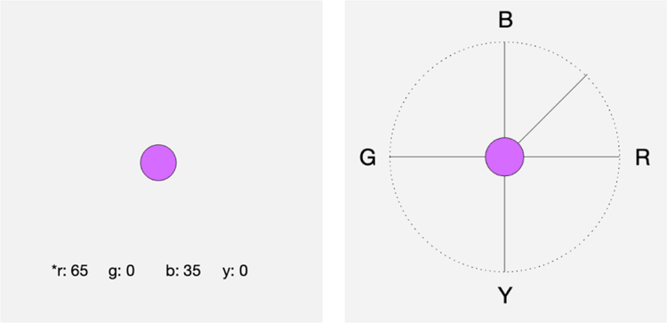
An illustration of the hue-scaling (left) and hue-similarity tasks (right). Observers viewed the same chromatic stimulus in either task and rated the hue either by selecting te percentage of the component colors or by varying the compass needle to indicate the relative similarity to the primary hues.
The percentages for each setting were converted to a “perceived angle” in the red-green and blue-yellow perceptual space by the following formula:
| (2) |
where the axes corresponded to Red-Green (0° to 180°) and Blue-Yellow (90° to 270°). For example, if a hue was given a response of 50% blue and 50% green, the perceived angle would be 135°. Each of the four trials at each stimulus angle were converted to a perceived angle and then averaged to give the mean hue-scaling function for each participant.
3.2. Hue-similarity task
For the similarity ratings, observers viewed a circular display with cardinal compass points in which the four opponent primaries were labeled along the axes, again as R-G (0° to 180° axis) and B-Y (90° to 270° axis). The test stimulus was again presented in the center of the display (Figure 2b). Observers moved a needle clockwise or counterclockwise around the compass to rate how similar the hue was to the labeled compass points. The needle moved in 1° steps. The chosen needle direction was recorded as the perceived angle. For example, if the needle was placed equidistant from the B and G cardinal directions, the perceived angle was again 135°. Again, each of the four trials at each stimulus angle were converted to a perceived angle and then averaged to give the mean hue-scaling function for each participant.
4. Results
We compared responses across the two tasks along a number of dimensions. Throughout, we use stimulus angle to refer to the stimuli: the chromatic angles of the test stimuli in terms of the LM vs. S chromatic plane of Figure 1; and perceived angle to refer to the responses: the perceived angle in the perceptual red-green and blue-yellow plane [11].
4.1. Between vs. within subject variability
The individual hue scaling functions are shown in Figure 3 for the two different tasks. It is evident that there are large variations in the individual functions. To assess the reliability and consistency between tasks, we compared the standard deviation of perceived angles between and within observers for each task. Within-subject variation was based on the standard deviation of the four repeated settings by each individual. Between-subject variation was based on the standard deviation of the average settings for each observer. Within-subject variability was marginally lower for the hue-scaling task but this difference was small and did not reach significance (t(35) = 2.01, p = .053), suggesting that observers had comparable consistency in their responses regardless of task (Figure 4a). However, the between-subject variability did differ for the two tasks, with larger overall variability in the hue-scaling task (t(35) = 2.68, p = .011) (Figure 4).
Fig. 3.

Individual hue scaling functions for the scaling task (left) and similarity task (right). Each line plots the mean of the 4 repeated settings for a single observer.
Fig. 4.

Top. Standard deviation in the settings for the hue-similarity task (red line, open circles) and hue-scaling task (blue line, filled circles) as a function of stimulus angle. The left panel plots the mean (across observers) of the within subject variation. The right panel plots the mean of between-subject variation (based on the mean settings by each individual). Bottom. Between (red line, open circles) and within (blue line, filled circles) variability compared within each task for hue scaling (left) or hue similarity (right).
On either task, between-observer variability was roughly 2 times larger than the variability in observers’ repeated settings (t(47) = 8.55, p < 0.001). This indicates that individual differences between the observers are large and reliable and not an artifact of noise in the settings. Notably these individual differences varied with stimulus angle and were lowest around stimulus angles near 135° (which appeared bluish) while highest for angles around 240° (which appeared yellow-green). A similar minimum in the variability is also evident for the bluish hues for the within-subject settings.
4.2. Average hue-scaling and hue-similarity functions
We next examined whether there were systematic differences in the hue-scaling functions across the two tasks. Overall, the average values were not reliably different (t(35) = 1.45, p = .155) (Figure 5a). However, the differences nevertheless followed a distinctive pattern, cycling with a period of approximately 90 deg (Figure 5b). As a result, the direction of the difference changed sign roughly every 45 deg. To interpret this pattern, we plotted a sinewave function of 4x the chosen hue angles so that these also varied with a period of 90 deg (in the hue angle and not the stimulus angle). These are shown by the solid and dashed lines in the figure, and are arbitrarily scaled to an amplitude of 8 to roughly match the amplitude of the observed variations. The sine functions have zero crossings every 45 deg, and these correspond to the 4 primaries (e.g. red and blue) and the 4 intermediate balanced hues (e.g. equal mixture of red and blue). These closely follow the observed differences in the hue angles for the two tasks, and suggest that the tasks differed in how much weight the observers gave to the dominant primary in their settings. Specifically, the undulations are consistent with a stronger bias toward the dominant hue in the hue-scaling task than in the hue-similarity task. For example, this predicts that the two tasks do not differ for pure red or blue (hue angles of 0 or 90 deg), or for their equal mixture (45 deg). However, stimuli that were predominantly red (<45 deg) or predominantly blue (>45 deg) were given stronger red or blue weights, respectively, when observers used percentages rather than the pointer to describe the color mixtures. As explored further below, these differences are consistent with differences in the degree of categorical bias in the responses for the two tasks.
Fig. 5.

Left. Mean functions for the hue-scaling (blueline, closed circles) or hue-similarity (red-line, open circles) tasks. Right. Differences between the mean functions (closed circles). Significant differences are denoted by asterisks (not corrected for multiple comparisons). Lines plot the function 8*sin(4*hueangle) for the hue-scaling (solid) and hue-similarity (dashed) functions.
We also assessed the magnitude of the differences at each stimulus angle, using separate t-tests at each angle. This comparison hints at a trend for the differences to be most reliable around the nominal stimulus angles ranging from 90° to 130° (a range varying in appearance from purple to blue), where observers tended to describe the hue as bluer in the hue-similarity task (p < .05) (again consistent with giving a higher weight to the dominant primary in the scaling task). Only two other stimulus angles near orange and red (330° and 360°) showed a difference. However, these comparisons are not significant when corrected for multiple comparisons, and would require confirmation by an independent experiment.
To explore these differences we examined scatter plots comparing the observers’ settings on the two tasks at each stimulus angle (see Figure 6). These did not point to an obvious basis for the mean differences in the purple settings, but instead revealed a conspicuous difference in performance across the tasks. In particular, for a number of angles there was a tendency to respond more discretely in the hue scaling task (so that the individual settings tend to be stacked vertically). This is most evident in the plots for 140° and 300°. Many observers described these stimuli as close to 100% blue or 100% yellow in the scaling task but showed more variability in the similarity task. Similar trends are suggested for the 120° and 130° stimulus angles. Moreover, the 100° stimulus is suggestive of two clusters of observers who differed in whether they classified the stimulus as a roughly balanced purple (equal red and blue) or as a much bluer purple. As discussed below, the R-B quadrant also showed the clearest difference in the magnitude of categorical bias between the tasks, with a stronger bias for the hue-scaling task.
Fig. 6.

Scatter plots of observers’ responses on the hue-scaling (percentage) and hue-similarity (compass) tasks for the 5 consecutive angles (90° – 130°) for which there was a significant difference in the responses between tasks (see Fig. 5). Note the tendency for observers to behave more discretely on the hue-scaling task (e.g. at 100° and120°). A similar trend also occurs at angles 140° and 300°, for which the mean settings did not differ between the tasks.
We also compared the scatter in the settings by assessing the correlations in the hue-scaling functions across individual subjects (Figure 7). These exhibited moderately high values (r = 0.5 to 0.8) for stimulus angles ranging from ~150° to 360° (roughly from blue to red). Thus, for these stimulus angles, individual observers tended to be consistent across the tasks in terms of the hue angles. However, this pattern also differed for purplish hues, where the correlations were substantially weaker. In particular, of the 9 stimulus angles for which responses were not significantly correlated between tasks (again without correction for multiple comparisons), 8 again occurred at nearby angles within the purple to blue region. The weaker correlations in this region are not a consequence of less consistent settings for these stimuli, because as shown in Figure 4, the variance in the repeated settings was comparable to other angles the other stimulus angles except near blue.
Fig. 7.
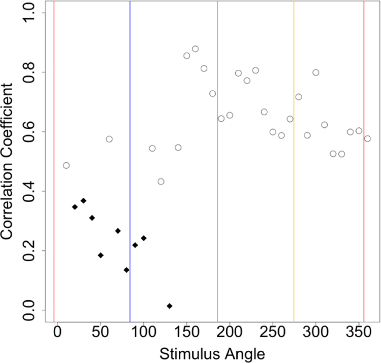
Correlations between the observers’ mean settings for each stimulus angle compared across the two tasks. Diamonds indicate the correlations that did not reach significance (r<0.37) based on the sample of 28 observers.
4.3. Categorical biases
As discussed above, the modest differences in the hue angles from the two tasks are consistent with differences in the degree of intrusion of categorical biases in the settings. Categorical effects are defined as biases in how observers perceive or respond to stimulus differences within or between a perceptual category [24]. In the absence of a categorical effect, we might expect the hue-scaling functions to change smoothly and continuously as the stimulus angle varies, and without regard to the perceived category of the color. In contrast, with complete categorical coding, the functions should instead vary in discrete steps like a staircase, so that all stimuli that appear predominantly “red” are described as 100% red. Actual responses might include a mixture of these behaviors, which would show up as different degrees of categorical bias in the hue scaling. This categorical bias quantifies the extent to which an observer tended to give more weight to the dominant perceived primary in the stimulus, or in other words, tended to rate colors within a category as more similar (Figure 8a). To further assess these biases, we followed a procedure used by Webster and Kay [21] in which the scaling functions around each category boundary were fit as a weighted sum of a linear (non-categorical) and stepwise (categorical) function. The effects were assessed separately for each transition between primaries: i.e. red-blue, blue-green, green-yellow, and yellow-red. (Note that this analysis focuses on the primaries used to scale the stimuli and not on color categories per se, which could include intermediate hue angles such as orange and purple.)
Fig. 8.

a) Hue scaling functions predicted by different degrees of categorical bias. The bias results in a sharper transition in the function at the category boundary compared to the perceived changes for stimuli within each category. b) an example the hue-scaling function for a single observer fit by a weighted combination of a step function (categorical) and linear function (non-categorical). Separate fits were estimated for the transitions between each pair of adjacent primaries. Note the fits are applied to the inverse of the scaling functions so that the categorical boundaries are invariant across the observers. Numbers indicate the strength of the categorical bias.
To compute the categorical bias in each region, we independently fitted segments of the hue-scaling and hue-similarity functions ranging between two adjacent primary hues with a weighted average of a linear and step function:
| (3) |
varying α between 0 (pure linear) and 1 (pure step change) to determine the least-squares fit to the observed settings for each individual. Note that the estimates were based on fits of the inverse scaling functions of the stimulus angle vs. the perceived angles, since this allowed us to easily identify the same location of the categorical boundaries for each observer (i.e. the transition point). For example, the boundary between pure red and pure blue was presumed to be a balanced purple (50% red and 50% blue) for all subjects, and could be estimated directly from their individual hue-scaling functions. In contrast, the stimulus that appeared a balanced purple differed for each observer. Reflecting this, note that the x and y axes have been inverted for Figures 8 and 9 since in this case we are estimating the stimulus angles from the perceived angles.
Fig. 9.

Mean hue scaling function (bold) and best-fitting categorical function for the hue-scaling task (a) and hue-similarity task (b). Numbers show the categorical bias for each color boundary.
Figure 9 shows the average hue-scaling and hue-similarity functions and fits for each task, and Table 1 provides the values for the biases at each category boundary. The mean bias across all boundaries for the scaling and similarity tasks were 0.18 and 0.09 respectively, and are comparable in magnitude to the biases reported by Webster and Kay [21]. Overall, these values indicate that observers at best showed only a weak tendency to overweight the dominant color category in their responses. However, this tendency differed for the tasks in that observers were more categorical when rating the colors in the hue-scaling task for 3 of the 4 boundaries (red-blue, blue-green, and green-yellow), while in this case the biases were comparable for the yellow-red transition (see Table 1).
Table 1.
Comparison of Categorical Bias for Each Categorical Boundary
| Boundary | Hue-Scaling Mean bias | Hue-Similarity Mean bias | p-value |
|---|---|---|---|
| R-B | .151 | .055 | .007* |
| B-G | .204 | .118 | .018* |
| G-Y | .180 | .099 | .033* |
| Y-R | .195 | .100 | .016* |
Bonferroni correction for multiple comparisons.
indicates p < .05.
To further assess these biases, we examined how they were related across different tasks or different boundaries. For example, is there a general tendency for an observer to behave categorically, such that they have a larger bias across all categories, or in both tasks? The correlation matrices in Figure 10 compare the values across the different boundaries within each task. Only the correlation between the biases at the blue-green and green-yellow boundaries reached significance, and only in the hue-similarity task (r(28) = 0.50, p = 0.01). Table 2 shows the relationship in the categorical bias between tasks, showing that only one of the boundaries (yellow-red) showed a tendency to covary across the tasks. Thus overall, categorical effects tended to be weak, and in neither task does there appear to be a general (correlated) tendency for observers to vary in how categorical their responses are, neither across boundaries nor tasks. Nevertheless, these analyses along with the differences in the mean scaling functions in the two tasks (as shown in Figure 5b), again suggest that observers behaved somewhat more categorically when describing the hues with the scaling task.
Fig. 10.

Correlation matrices of the categorical biases for different color boundaries for the hue-scaling task (a) and hue-similarity task (b). Significant correlations are indicated by an asterisk.
Table 2.
Correlation between Categorical Biases across Tasks
| Boundary | Correlation Coefficient |
|---|---|
| R-B | .074 |
| B-G | .030 |
| G-Y | .272 |
| Y-R | .574* |
4.4. Sources of variance in the hue-scaling functions
As noted in the introduction, classical color-opponent theory assumes that the appearance of all colors depends on two distinct mechanisms that signal red vs. green and blue vs. yellow sensations [1]. By that account we would expect that individual differences in hue scaling should be explained by sources of variability tuned to the underlying opponent mechanisms. However, in a recent study, we found that the variations in hue-scaling functions depended on multiple processes each tuned to a narrow range of stimulus angles [11,25]. This conclusion was based on a factor analysis of the hue-scaling functions, which extracts the latent sources of variability based on the structure of the correlations across responses to the observed variables. In our final comparison, we factor analyzed the hue-scaling data for the two tasks, following the method of Emery et al. [11,25], to reveal the nature of their underlying representational structures and whether they differed.
Similar to the procedures described in [11], we adopted the following criteria (i.e. method of estimation, rotation, number of factors) for deriving the factor pattern. Because the datasets for both tasks deviated from multivariate normality (i.e. the statistical distances were not chi-square distributed according to a one-sample Kolmogorov-Smirnov test (hue-scaling: D = 0.89, p < 0.001; hue-similarity: D = 0.89, p < 0.001)), we extracted the factors using principal component analysis as it is more robust to these deviations than other methods (e.g. maximum likelihood). (PCA differs from conventional factor analysis in that it identifies linearly independent dimensions of variation rather than modeling the latent sources of the variation, and is based on all of the variance rather than estimates of the common variance across the variables (communalities). However in our case an initial PCA extraction was also necessary because the correlation matrix was not positive definite (presumably because of very high correlations between some of the variables), and extraction failed using other methods based on the communalities.) After the extraction we applied a Varimax rotation to the estimated factors (an orthogonal rotation that favors a sparse factor structure). An oblique solution (allowing for the factors to be correlated), yielded similar results. Specifically, the Spearman’s rank correlation between the oblique and Varimax factor patterns was r(358) = 0.56, p < 0.001 for the hue-scaling factors and r(358) = 0.49, p < 0.001 for the hue-similarity factors. Finally, the number of factors were chosen based on a ‘systematic tuning’ criterion which defines meaningful factors as those with high loadings (i.e. the amount of variance in the variable that is accounted for by the factor) on multiple, consecutive stimulus angles. This criterion has been shown to be useful for identifying meaningful factors for variables that lie on a stimulus continuum, particularly for color [26]. We formulated this criterion by identifying ‘systematically-tuned’ factors as those that had at least 4 consecutive loadings higher than 0.30. These values were chosen through a bootstrapping procedure of factor analyzing the correlation matrices of random datasets with parameters matching those of the observed datasets (e.g. method of estimation, rotation, number of observers, and number of variables). This analysis revealed that a factor with at least 4 consecutive loadings higher than 0.30 emerged from the random data matrices with a frequency of 0.04. Thus factors from the scaling and similarity functions meeting this criterion were unlikely to have happened by chance, and instead reflect a meaningful latent source of variability in the observed data. The decision for the number of factors to include in each analysis was based on finding the solution where all of the rotated factors met this criterion.
Figure 11 displays the factors that emerged from the analyses for each task. The variations in the settings for each task revealed 7 systematic factors which together accounted for 72% and 73% of the total variance for the hue-scaling and hue-similarity task, respectively. These results are similar to the previous analyses of Emery et al. [11,25] and again point to multiple narrowly-tuned processes controlling the scaling judgments rather than broadly tuned underlying dimensions such as red-green or blue-yellow. Further, the factors are generally characterized by only a single narrow peak in the loadings, in contrast to loadings of opposite sign and broad span which would be predicted by variations within an opponent mechanism [11].
Figure 11.

Factors derived from individual differences in the hue scaling functions based on the hue-scaling task (solid line) or hue-similarity task (dashed line). The factors have been aligned across the tasks by choosing the pattern of loadings that was most similar between the tasks.
While the number of factors in the two tasks was similar, the specific pattern differed slightly, with a consistent shift in the location of factor peaks for the hue-similarity relative to the hue-scaling task. However, given that the location of the factor peaks can in general be susceptible to changes in the procedure chosen for the analysis, it is not clear whether these differences are due to the task (as opposed to the robustness of the solution). To assess this, we also performed a separate analysis by combining both tasks (so that there were now 72 variables). This did not produce separate factors for the two tasks, and the consistent shift between the scaling and similarity factors evident in Figure 11 disappeared (Figure 12). Thus the differences in the scaling functions between observers – and what these differences imply about the underlying representational structure of their responses – again appeared similar for the two tasks. Notably, this is different from when we previously compared color appearance tasks based on hue scaling vs. color naming (in which the subjects had to label the stimuli in terms of the 4 unique or 4 binary hues) [25]. In that case a combined analysis included a number of factors that were specific to scaling or naming. This reinforces the conclusion that the hue-scaling and hue-similarity tasks measured here are instead largely tapping a similar perceptual process.
Figure 12.

Factor loadings derived from a factor analysis of the combined settings across the two tasks. Each factor loaded on the variables for both tasks and was tuned to a very similar narrow range of angles across both tasks.
5. Discussion
Hue scaling has been widely used as a tool for measuring color appearance [2]. However, the task depends on a number of assumptions that potentially impact the ability of the task to capture the properties of color appearance. First, the task assumes that the appearance of any hue can be described as the sum of the component opponent primaries red-green and blue-yellow, and second that observers can reliably perceive and rate these components. These assumptions are difficult to verify because color appearance is inherently subjective. Thus, this raises the possibility that some aspects of the results from scaling may reflect properties of the task rather than properties of color appearance. Here we adopted an alternative procedure based on a potentially more intuitive and perceptual response that only required subjects to judge how similar the hue was to the opponent categories.
To a first approximation, the two tasks yielded very similar estimates of color appearance. This implies that both are tapping into similar aspects of color appearance and that either could be used to characterize its properties. However, this conclusion should be tempered by the fact that the tasks themselves shared many properties, and most importantly that both required judging the color relative to the same primaries and that these primaries were not shown. The comparable performance for the hue-similarity task suggests that it could offer an alternative measure that is potentially more intuitive for observers and thus easier to implement for different populations. Moreover, while we did not directly measure the response times, the starting times for the two runs within each session were recorded, and based on these the hue-similarity task on average was completed in 9 minutes compared to 12 minutes for the hu-scaling task, a difference that was significant (t(114) = 2.561, p = .012). Thus, the hue-similarity task may be not only easier to understand but also faster to implement.
However, there were also subtle but important differences in the hue functions measured by the two tasks. As noted, the hue-scaling task tended to show a stronger categorical bias. This could have resulted because of inherent difficulties in trying to assign proportions to the observed color. Similarly, Webster and Kay [21] found that categorical biases were weaker for a color grouping task (which, importantly, also required judging color similarities) than for hue scaling. Thus, interpreting the categorical biases in hue scaling is problematic because the biases could depend more on the task than the percept. Yet it should also be emphasized that even when categorical biases were observed they were weak, and thus had only a minor influence on the appearance judgments. This is true for many other tests of categorical effects in color perception [27–30]. We also found that inter-observer variability was higher with the conventional hue-scaling task. We do not know the basis for this difference, but here again it is likely that the source is due to task-specific factors affecting the responses rather than the percepts.
Another intriguing difference was in the hue-scaling functions in the purple region of the hue circle. For these stimuli, in general, the same subjects described the same stimuli as redder when scaling them with the hue-similarity task. Intriguingly, this was also the region where the correlations in the settings across the two tasks broke down and also where there was the most significant difference in the magnitude of the categorical bias between tasks. These effects may relate to the recurring suggestion that purple itself might be perceived as a unique hue (i.e. that does not appear as a mixture of blue and red). For example, the Munsell color system includes purple with the four opponent primaries as a principal color category [13,31]. Our results lend some credence to the idea that purple may differ from other binary hues (e.g. orange) in the way or degree to which it can be considered a derivative color category of the opponent primaries.
Finally, it is striking that while both tasks required explicitly evaluating color appearance relative to the Hering primaries, there was little evidence for these primaries, or for an opponent representation in the patterns of individual differences in the responses. That is, participants were either told to break the color down into red-green and blue-yellow, or to judge the similarity in terms of these anchors. Yet for neither task did these primaries emerge as the privileged basis functions underlying individual differences in the responses. Similarly, the tasks prevented observers from characterizing any stimulus as both red and green or blue and yellow, yet there was no evidence for an opponent coupling of these dimensions in the derived factors. Instead the pattern of variations pointed to multiple, narrowly tuned processes underlying the hue judgments for different regions of color space. These results replicate our previous analyses of hue scaling [11,25]. There we speculated that the pattern might reflect a population code for hue, in which the focal stimuli for each hue are learned somewhat independently, thus giving rise to variations that are independent and specific to different hue categories. While different representations could be suggested by different tasks, the present analysis suggests that this pattern is not simply an artifact of conventional hue scaling, and could instead reflect actual properties of the representations underlying of color appearance.
6. acknowledgments
We are very grateful to the reviewers for their helpful comments on the manuscript.
6.1 Funding Supported by NIH EY-010834.
Footnotes
Disclosures The authors declare no conflicts of interest.
References
- 1.Hurvich LM, Jameson D: An opponent-process theory of color vision. Psychological Review 1957, 64, Part 1:384–404. [DOI] [PubMed] [Google Scholar]
- 2.Abramov I, Gordon J: Color appearance: on seeing red--or yellow, or green, or blue. Annu Rev Psychol 1994, 45:451–485. [DOI] [PubMed] [Google Scholar]
- 3.Lee BB: Color coding in the primate visual pathway: a historical view. J Opt Soc Am A Opt Image Sci Vis 2014, 31:A103–112. [DOI] [PubMed] [Google Scholar]
- 4.Webster MA: Color vision. Stevens’ Handbook of Experimental Psychology and Cognitive Neuroscience 2 2018:1–42. [Google Scholar]
- 5.Knoblauch K, Shevell SK: Relating cone signals to color appearance: failure of monotonicity in yellow/blue. Vis Neurosci 2001, 18:901–906. [DOI] [PubMed] [Google Scholar]
- 6.Chichilnisky EJ, Wandell BA: Trichromatic opponent color classification. Vision Res 1999, 39:3444–3458. [DOI] [PubMed] [Google Scholar]
- 7.Hurvich LM, Jameson D: Some quantitative aspects of an opponent-colors theory. II. Brightness, saturation, and hue in normal and dichromatic vision. J Opt Soc Am 1955, 45:602–616. [DOI] [PubMed] [Google Scholar]
- 8.Logvinenko AD, Beattie LL: Partial hue-matching. J Vis 2011, 11:6. [DOI] [PubMed] [Google Scholar]
- 9.Sternheim CE, Boynton RM: Uniqueness of perceived hues investigated with a continuous judgmental technique. J Exp Psychol 1966, 72:770–776. [DOI] [PubMed] [Google Scholar]
- 10.Gordon J, Abramov I, Chan H: Describing color appearance: hue and saturation scaling. Percept Psychophys 1994, 56:27–41. [DOI] [PubMed] [Google Scholar]
- 11.Emery KJ, Volbrecht VJ, Peterzell DH, Webster MA: Variations in normal color vision. VI. Factors underlying individual differences in hue scaling and their implications for models of color appearance. Vision Res 2017, 141:51–65. [DOI] [PMC free article] [PubMed] [Google Scholar]
- 12.Pitts MA, Troup LJ, Volbrecht VJ, Nerger JL: Chromatic perceptive field sizes change with retinal illuminance. J Vis 2005, 5:435–443. [DOI] [PubMed] [Google Scholar]
- 13.Berns RS, Billmeyer FWJ: Development of the 1929 Munsell Book of Color: A historical review. Color Research and Application 1985, 10:246–250. [Google Scholar]
- 14.Lindsey DT, Brown AM. “Sunlight and “Blue”: the prevalence of poor lexical color discrimination within the “grue” range,” Psychol Sci 2004, 15, 291–294. [DOI] [PubMed] [Google Scholar]
- 15.Hardy JL, Frederick CM, Kay P, Werner JS: Color naming, lens aging, and grue: what the optics of the aging eye can teach us about color language. Psychol Sci 2005, 16:321–327. [DOI] [PMC free article] [PubMed] [Google Scholar]
- 16.Warton DI, Hui FK: The arcsine is asinine: the analysis of proportions in ecology. Ecology 2011, 92:3–10. [DOI] [PubMed] [Google Scholar]
- 17.Bosten JM, Boehm AE: Empirical evidence for unique hues? J Opt Soc Am A Opt Image Sci Vis 2014, 31:A385–393. [DOI] [PubMed] [Google Scholar]
- 18.Shepard RN, Cooper LA: Representation of colors in the blind, color-blind, and normally sighted. Psychol Sci 1992, 3:97–104. [Google Scholar]
- 19.Knoblauch K, Maloney LT. “MLDS: Maximum likelihood difference scaling in R,” J Statistical Software 2008. 25, 1–26. [Google Scholar]
- 20.Knoblauch K, Maloney LT. Modeling psychophysical data in R (Vol. 32) Springer; 2012. [Google Scholar]
- 21.Webster MA, Kay P: Color categories and color appearance. Cognition 2012, 122:375–392. [DOI] [PMC free article] [PubMed] [Google Scholar]
- 22.Abramov I, Gordon J, Chan H: Color appearance in the peripheral retina: effects of stimulus size. J. Opt. Soc. Am. A 1991, 8(2): 404–414. [DOI] [PubMed] [Google Scholar]
- 23.Webster MA, Miyahara E, Malkoc G, Raker VE: Variations in normal color vision. II. Unique hues. J Opt Soc Am A Opt Image Sci Vis 2000, 17:1545–1555. [DOI] [PubMed] [Google Scholar]
- 24.Harnad S (Ed): Psychophysical and cognitive aspects of categorical perception: A critical overview Cambridge: Cambridge University Press; 1987. [Google Scholar]
- 25.Emery KJ, Volbrecht VJ, Peterzell DH, Webster MA: Variations in normal color vision. VII. Relationships between color naming and hue scaling. Vision Res 2017, 141:66–75. [DOI] [PMC free article] [PubMed] [Google Scholar]
- 26.Webster MA, MacLeod DIA: Factors underlying individual differences in the color matches of normal observers. J. Opt. Soc. Am. A 1988, 5(10): 1722–173523. [DOI] [PubMed] [Google Scholar]
- 27.Witzel C, Gegenfurtner KR: Categorical sensitivity to color differences. J Vis 2013, 13:1. [DOI] [PubMed] [Google Scholar]
- 28.Brown AM, Lindsey DT, Guckes KM: Color names, color categories, and color-cued visual search: Sometimes, color perception is not categorical. Journal of Vision 2011, 11:12–12:11–20. [DOI] [PMC free article] [PubMed] [Google Scholar]
- 29.Gilbert AL, Regier T, Kay P, Ivry RB: Whorf hypothesis is supported in the right visual field but not the left. Proc Natl Acad Sci U S A 2006, 103:489–494. [DOI] [PMC free article] [PubMed] [Google Scholar]
- 30.Winawer J, Witthoft N, Frank MC, Wu L, Wade AR, Boroditsky L: Russian blues reveal effects of language on color discrimination. Proc Natl Acad Sci U S A 2007, 104:7780–7785. [DOI] [PMC free article] [PubMed] [Google Scholar]
- 31.Fairchild MD: Unique hues and principal hues. Color Research & Application 2018, 43:804–809. [Google Scholar]