Abstract
In the first half of the twentieth century, the rate of death from infectious disease in the United States fell precipitously. Although this decline is well-known and well-documented, there is surprisingly little evidence about whether it took place uniformly across the regions of the U.S. We use data on infectious disease deaths from all reporting U.S. cities to describe regional patterns in the decline of urban infectious mortality from 1900 to 1948. We report three main results: First, urban infectious mortality was higher in the South in every year from 1900 to 1948. Second, infectious mortality declined later in southern cities than in cities in the other regions. Third, comparatively high infectious mortality in southern cities was driven primarily by extremely high infectious mortality among African Americans. From 1906 to 1920, African Americans in cities experienced a rate of death from infectious disease greater than what urban whites experienced during the 1918 flu pandemic.
In the first half of the twentieth century, the rate of death from infectious disease in the United States (U.S.) fell precipitously. Although this decline is well-known and well-documented (Armstrong et al. 1999; Haines 2001; Cutler et al. 2006), there is surprisingly little evidence about whether it took place uniformly across the regions of the U.S. In this article, we use data on infectious disease deaths from all reporting U.S. cities to describe regional patterns in the decline of urban infectious mortality from 1900 to 1948.
The fall in infectious mortality in the first half of the twentieth century was one of the last phases of what public health scholars call the epidemiological transition. Starting in the eighteenth century, mortality rates in the U.S. and Europe began to fall and life expectancy began to rise. Life expectancy in the United States increased by nearly 20 years between 1900 and 1948 alone (Carter et al. 2006, p. 1–440–1–441). Some scholars attribute the initial drop in mortality to improved nutrition (McKeown and Record 1962, p. 115; Fogel 2004), but others emphasize the introduction of public health initiatives instead (Szreter 1988). Improvement in public health has been the leading explanation for the decline in mortality after 1870 (Cutler et al. 2006; Haines 2001, p. 45; but see Anderson et al. 2018). Cutler et al. (2006, p. 102) divide public health interventions into large public works projects like water filtration and chlorination (Cutler and Miller 2005), sanitation infrastructure (Alsan and Goldin 2018; Melosi 1999), milk pasteurization (Lee 2007), and mass vaccinations, on the one hand, and changes in behavior promoted by the public sector, such as “boiling bottles and milk, protecting food from insects, washing hands, ventilating rooms and keeping children’s vaccinations up to date,” on the other. After 1930, the introduction of antibiotics played an important role (Smith and Bradshaw 2008).
Cities led the way in the fight against death from infectious disease. In 1900, mortality rates were higher in cities than in rural areas. By midcentury, the opposite was true (Haines 2001). As deaths from infectious disease fell, they made up a smaller proportion of total urban deaths. In 1900, a median 37% of urban deaths were due to infectious causes; by 1948, this figure had fallen to 6%.
A small number of studies have used city-level data to study mortality in the first half of the twentieth century.1 Crimmins and Condran (1983) report regional differences in deaths from several diseases in 1900 using data from 129 cities. They find that southern cities had the highest mortality rates at the turn of the century. Condran and Crimmins-Gardner (1978) show that the extent of sewers and waterworks in 28 cities in 1900 was negatively correlated with mortality rates in middle to old age groups, although these results varied by region. The correlations between cities’ use of sewers and waterworks and their death rates from typhoid and diarrheal diseases, moreover, were weak. Cutler and Miller (2005), in contrast, find that the introduction of clean-water technologies was responsible for nearly half of the total mortality decline in thirteen cities from 1900 to 1936.2 Ferrie and Troesken (2008) report similar results using data from Chicago from 1850 to 1925. Anderson et al. (2017) show that municipal reporting requirements and the opening of state-run sanatoriums reduced the rate of death from pulmonary tuberculosis, although other aspects of the tuberculosis movement had no discernible effect.
Although some previous research has used samples of cities to study declines in total, infant, and cause-specific mortality, none has documented regional variation in infectious mortality over time using data on all cities for which it is available. Consequently, we know very little about how much the urban infectious mortality decline varied across regions. Studying regional variation in deaths from infectious disease may help to direct research on the causes of the decline. The regions of the U.S. varied in the compositions and densities of their populations, their climates and disease environments, and the extent of the public health interventions they introduced. Observing variation in infectious mortality over space gives researchers a warrant to search for causes of the decline that vary from city to city and region to region. In an influential review essay on the urban mortality transition in the United States, Haines (2001, p. 47) concludes, “There is a need to look at more disaggregated data (e.g., states, counties, and specific cities).”
There are two common ways to measure the decline in infectious mortality. One is to examine year-to-year volatility in life expectancy and mortality. When deaths from infectious disease make up a large proportion of all deaths, waves of infectious disease influence the total mortality rate (Deaton 2013, p. 63; Meeker 1971, p. 359). Smith and Bradshaw (2006, 2008) take this approach, showing that yearly variation in period life expectancy narrowed substantially in the 1940s. The second approach, which we use here, is to measure mortality from infectious diseases directly. We use historical data on deaths by cause to estimate the rate of infectious mortality in all reporting U.S. cities. To construct the data set we use for this analysis, we digitized 49 years of death-by-cause data for all reporting cities, classified causes as infectious or not, and indirectly age-standardized the data using a separate series of death-by-ause-and-age data and newly-available complete-count census data (Ruggles et al. 2018).3
We restrict our analysis to cities to ensure that we compare like with like. There was a clear urban penalty in mortality at the beginning of the twentieth century (Higgs 1973; Condran and Crimmins 1980; Haines 2001; Cain and Hong 2009). Using other units of analysis, such as states, could lead us to mistake differences in the urbanization of regions for other regional differences.4 Condran and Crimmins (1980, p. 202) argue that “differentiation of space by rural and urban characteristics is essential to understanding the decline in mortality.” States also varied in the completeness of death registration within them (Condran and Crimmins 1980, p. 186).
We report three main results. First, urban infectious mortality was higher in the South in every year from 1900 to 1948. The higher rate of death from infectious disease in southern cities in 1900, originally documented by Crimmins and Condran (1983), lasted at least through mid-century. Second, urban infectious mortality declined later in the South than in the other regions: deaths from infectious disease fell at an accelerated pace in cities outside the South in the early 1930s; a steeper decline in the South began instead in the late 1930s. Finally, the regional differences we document were driven mainly by the extremely high risk of infectious mortality among African Americans, who made up a far larger share of the southern urban population than the urban population of other regions throughout this period.
Research in history, economic history, and demography has documented how barriers that African Americans faced in acquiring safe housing (Du Bois 1908; Galishoff 1985; Acevedo-Garcia 2000; Collins and Thomasson 2004; Roberts 2009; Boustan and Margo 2016; Eriksson and Niemesh 2016; Zelner et al. 2017), accessing urban social programs (Preston and Haines 1991) and medical innovations (Jayachandran et al. 2010), and establishing economic security (Ewbank 1987) put them at greater risk of death from infectious disease (Sen 1998). Our results point to a need for more research in this area. The risk of death from infectious disease among urban African Americans was so high that it was primarily responsible for regional differences in the infectious mortality of all residents of U.S. cities.
Data
To measure regional and city-level mortality from infectious disease, we digitized and standardized a variety of historical records. In this section, we describe the data we collected, how we classified causes of death, and how we age standardized the data.
We digitized city-level data on the number of deaths by cause from published volumes of the Vital Statistics of the United States.5 States and cities were not legally required to register deaths until 1933 (Haines 2006, p. 381). However, starting in 1900, ten states and the District of Columbia made up an official Death Registration Area (DRA), which grew to cover the entire country by 1933 (Haines 2006, p. 381). Between 1900 and 1933, cities gradually enter our dataset as they entered the DRA, often before their entire state entered. In 1900, the DRA contained 332 cities; by 1948, that number had grown to 1,044.6
The DRA data enable us to study in fine detail the decline in deaths from infectious disease in U.S. cities. However, the urban mortality decline should not be considered representative of the national mortality decline. In 1900, child mortality was much higher in the DRA than it was in the entire nation (Preston and Haines 1991, p. 86). Moreover, regional differences in total mortality in 1900 differed from regional differences in urban mortality. For instance, the South as a whole had a relatively low child mortality rate in 1900, but this rate was pushed up by the high child mortality rate of its black population and pushed down by its rurality (Preston and Haines 1991, p. 111). The urban child mortality rate of the South—excluding the region’s rural areas—was much higher.
Reporting infectious mortality rates entails classifying causes of death as infectious or not. This is more complicated than it may first appear. In some cases, such as “childbirth deaths,” the cause-of-death categories used in the Vital Statistics leave ambiguous whether the cause was infectious or not. We code causes conservatively, excluding from our infectious counts categories that mix infectious and non-infectious causes.7 Wherever possible, we follow the infectious classifications used in Armstrong et al. (1999).8
There are two additional challenges to constructing a consistent series of infectious mortality. The first is that the Vital Statistics updated its cause-of-death reporting with each new International List of Causes of Death (ICD).9 Some ICD changes were more extensive than others. Fortunately, the ICD revisions made from 1900 to 1948 are relatively small: the earliest extensive change was the sixth revision in 1948, which was adopted in the 1949 Vital Statistics (Moriyama et al. 2011; International Institute for Vital Registration and Statistics 1993). For this reason, we end our series in 1948. The second challenge is the coarseness of cause-of-death categories in the city-level Vital Statistics data. Often, specific causes of death listed in the ICD codes are grouped into coarser categories at the city level. Usually the Vital Statistics changed its coarser categories only when the ICD codes changed. This magnifies the differences between ICD coding regimes in our data. In most of our analysis, we are concerned with differences in the rate of infectious mortality across regions within years. In those parts of our analysis where we focus instead on the pace of the infectious mortality decline, we break the data into periods corresponding to the ICD coding regimes to minimize the effect of changes in the classification of deaths on our results. In these parts of the analysis, we also exclude 1918–1920, the flu pandemic years. This yields five periods corresponding roughly to decades: 1900–1909; 1910–1917; 1921–1929; 1930–1938; and 1939–1948.
In some cases, the Vital Statistics changed the way it grouped causes even within ICD regimes. This occurred in 1904, 1905, and each year from 1936 to 1944, excluding 1939, when a new ICD took effect. For instance, puerperal fever/puerperal septicemia is coded as a distinct cause of death from 1910 to 1942, but it is collapsed into the general “childbirth” category from 1900 to 1909 and from 1943 to 1948. The 1910 shift coincides with a shift in the ICD regime, but the 1943 shift takes place within the 1939–1948 regime. Because the Vital Statistics made so many changes to the coarse categories of death it reported from 1936 to 1944, it is impossible to create periods with no changes in the categories. But dividing the data at the ICD changes ensures that the most consequential changes in the classification of death occurred between intervals.
Because infectious mortality is almost always highest at very young and very old ages, it is possible that differences in infectious mortality across regions or time periods actually reflect differences in how much of a region’s population is very young or very old. To estimate regional differences in infectious mortality over and above regional differences in the age distribution, we report infectious mortality rates that are indirectly age-standardized. We construct a standard age structure of infectious mortality based on urban age-specific mortality data in the years 1922–1933 and use that schedule to predict the “expected” infectious mortality of each city-year based on its age schedule. This procedure is described in detail in Appendix A.1. The main outcome in the figures and regressions below is the log of the ratio of actual to expected infectious mortality in each city-year, a ratio known as the “comparative mortality ratio.” An unlogged comparative mortality ratio of 1.5, for example, reflects infectious mortality 50% above what we would expect given a city’s age distribution and a standardized mortality schedule. For simplicity, we refer to the logged comparative mortality ratio as “infectious mortality.”
Results
Southern cities differed from cities in other regions in both their rate of infectious mortality and in when that rate declined. But the South’s distinctiveness had less to do with causes affecting all residents of southern cities than with the fact that southern cities were populated by greater proportions of black residents, who suffered extreme risks of death from infectious disease in cities in all regions.
Urban infectious mortality was higher in the South every year from 1900 to 1948
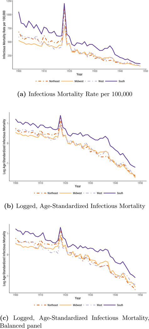
In Figure 1, we plot median infectious mortality in the four census regions. The first panel, Figure 1a, shows the raw infectious mortality rate per 100,000 people. The most notable feature of the plot is that the urban South’s infectious mortality rate exceeded that of the other regions for the entire period. Only in the 1940s were there signs of convergence.
Figure 1:
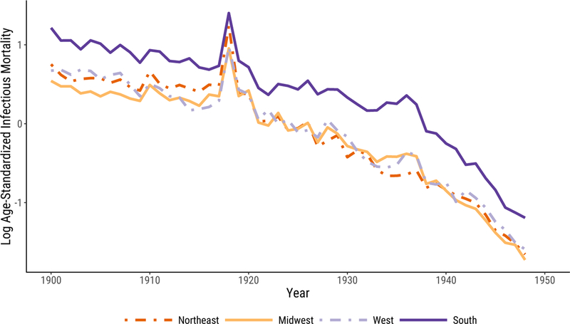
Infectious Mortality, Standardized and Unstandardized, in U.S. Cities by Region. In 1a, we report regional medians of mortality rates per 100,000. In 1b and 1c, infectious mortality is standardized to eliminate variation in the age distributions of cities; the trend lines depict the logged ratio of actual to expected infectious mortality, based on the city’s age distribution.
In 1900, the beginning of our series, the median infectious death rate in southern cities was 1,053 per 100,000—almost twice that of midwestern cities (529 per 100,000). It took at least twenty years for the urban South to cut its rate of death from infectious disease to what the urban Midwest’s was at the beginning of the twentieth century.10 To make the South’s infectious mortality rate in 1900 comparable to that of the Midwest in the same year, we would have to remove all southern deaths from tuberculosis (the top killer in 1900), menigitis, and malaria combined.
In 1948, the urban South still had a higher infectious mortality rate than the other regions, with a median death rate of 102 per 100,000, compared to 58, 61, and 72 in the Northeast, Midwest, and West, respectively. Infectious mortality in southern cities could be made comparable to infectious mortality in midwestern cities only by excluding southern deaths from tuberculosis (the second-biggest killer in 1948) and diarrhea. But the general convergence across regions, and the greater pace of decline in the 1940s, meant that the urban South was many fewer years behind in 1948 than it had been at the beginning of the twentieth century. The burden of infectious mortality in southern cities in 1948 is very similar to that of midwestern cities just seven years earlier. The lag between southern and midwestern cities’ infectious mortality declined by about one third of one year per year between the beginning and the endpoint of our series.
To check that our results do not simply reflect regional differences in the age distribution, the logged comparative mortality ratios shown in Figure 1b describe, in a proportional scale, age-standardized mortality. The comparative mortality ratios (unlogged) in 1900 range from a median of 1.7 in the Midwest, reflecting infectious mortality 70% above what we would expect given midwestern cities’ age distributions and a standardized mortality schedule derived from age-specific mortality in 1925, to 3.4 in southern cities, or infectious mortality nearly three and a half times what southern cities’ age structures would predict. In 1900, southern cities’ standardized infectious mortality, like their raw infectious mortality rate, was about double that of midwestern cities. By 1948, midwestern cities had infectious mortality only 18% of what their age structures would predict from the standardized mortality schedule, and southern cities’ infectious mortality had fallen to 30% of what their age structures would predict, about 1.7 times the standardized midwestern rate.
Does the fact that our sample changes as new cities entered the DRA affect our results? Figure 1c addresses this question. Instead of using an unbalanced panel of cities, as in Figure 1b, here we reproduce our results using a balanced panel of cities for which we have data in all years.11 Despite the smaller sample size, including just fourteen southern cities, the broad pattern of our results remains very similar: southern urban infectious mortality continues to be higher than that of the other regions, but converges considerably by 1948.
Infectious mortality declined later in southern cities than in cities in the other regions
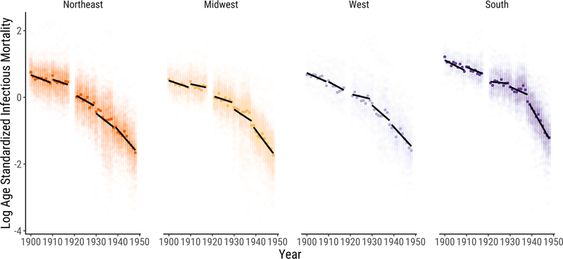
The urban South differed from the other regions not only it its level of infectious mortality, but also in the timing of its infectious mortality decline. The pace of the infectious mortality decline in cities in the other three regions was gradual and constant from 1900 to 1930, accelerating from 1930 through the end of the series. The urban South’s decline, in contrast, stayed gradual until the late 1930s, when it became much sharper than that of the other regions.
Figure 2 gives a more detailed look at the data, allowing us to see more clearly how the pace of the infectious mortality decline varied across regions. Each dot represents one city-year observation, with darker dots indicating the median city in each year. Here we divide the data into the five periods described above, each corresponding to an ICD regime. We draw linear trends within each period. The figure makes especially apparent the sharp discontinuity in the fall of infectious mortality in southern cities after the late 1930s.
Figure 2:
Logged, Age-Standardized Infectious Mortality in U.S. Cities by Region. Infectious mortality is standardized to eliminate variation in the age distributions of cities. Each dot represents the logged ratio of actual to expected infectious mortality in one city in one year, based on the city’s age distribution. We plot the median city in each year using darker dots. We draw linear trends within five periods. Each period is defined as a set of years during which the cause of death categories are relatively stable. We omit 1918–1920 to avoid distortions from the flu pandemic.
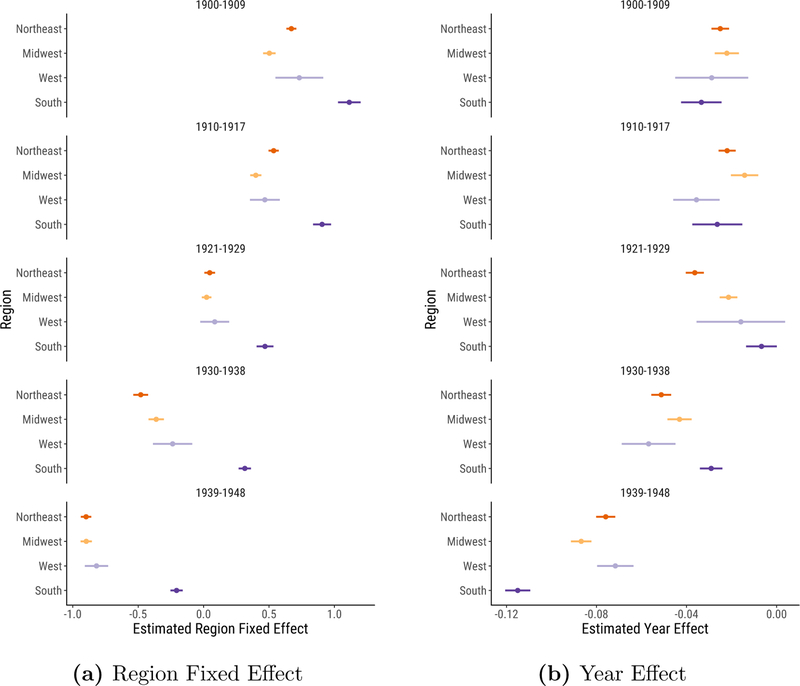
To examine the timing of the decline more formally, we fit a simple regression model, regressing log age-standardized infectious mortality on region indicators and the interaction of region and year trends, clustering the standard errors at the city level.12 Figure 3a plots the region indicators. Dots represent the mean infectious mortality in each region in each period. Bars plot 95% confidence intervals. Looking down the figure, the regional means move gradually to the left, indicating the infectious mortality decline across all regions. The urban South’s distinctively high infectious mortality stands out in this figure: despite the dramatic decline in infectious mortality in the South in the 1939–1948 period, southern cities still lagged behind cities in other regions at midcentury.
Figure 3:
Estimated Region Fixed Effect and Year Effect Coefficients. We fit separate regressions for each time period, allowing the year effect to differ across regions. The regression outcome is logged, age-standardized infectious mortality, representing the logged ratio of actual to expected infectious mortality, based on the city’s age distribution. We plot 95% confidence intervals from the regressions around each coefficient, clustering standard errors at the city level.
Figure 3b plots the slope coefficients, measuring the pace of the decline within each region and ICD regime. Here, the gradual infectious mortality decline through the late 1920s is particularly salient. Across all periods from 1900 to 1929, the (unlogged) annual declines in the mean comparative mortality ratio ranged from 0.7% in the 1920s urban South to 3.6% in the 1920s urban Northeast. The northeastern, midwestern, and western slopes grew sharper in the 1930s. But most notable is the distinctive pattern of the decline in southern cities: compared to the other regions, infectious mortality in the urban South fell most gradually in the 1930–1938 period, but most sharply in the 1939–1948 period, with an annual decline in the comparative mortality ratio of 10.1%.
The broad timing of the 1930s decline across all regions in our data is consistent with previous studies. Catillon et al. (2018), for instance, document a trend break in 1936 using national data on influenza and pneumonia mortality. Jayachandran et al. (2010) find that sulfa drugs reduced maternal mortality by 24–36 percent, pneumonia mortality by 17–32 percent, and scarlet fever mortality by 52–65 percent from 1937 to 1943. These diseases accounted for about 12 percent of total mortality in the pre-sulfa period.
High infectious mortality in southern cities was driven primarily by extremely high infectious mortality among African Americans
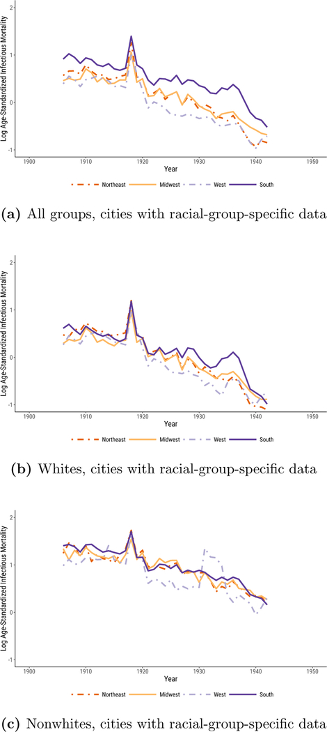
In Figure 4, we show that the regional differences documented in Figures 1, 2, and 3 primarily reflect differences in the urban infectious mortality of African Americans and whites.13 African Americans in cities across the United States often lived in segregated and crowded housing (Du Bois 1908; Galishoff 1985; Acevedo-Garcia 2000; Collins and Thomasson 2004; Roberts 2009; Grigoryeva and Ruef 2015; Eriksson and Niemesh 2016; Zelner et al. 2017), had high poverty rates (Ewbank 1987), and were prevented from accessing many urban social programs (Preston and Haines 1991) and medical innovations (Jayachandran et al. 2010), all of which increased their susceptibility to death from infectious disease (Sen 1998).
Figure 4:
Logged, Age-Standardized Infectious Mortality in U.S. Cities by Region. Infectious mortality is standardized to eliminate variation in the age distributions of cities. The trend lines depict the logged ratio of actual to expected infectious mortality, based on the city’s age distribution.
The sample of cities for which the Vital Statistics reports deaths by cause separately for whites and nonwhites is smaller than the full sample we used to generate Figures 1, 2, and 3. These data span the years 1906 to 1942, excluding 1938. Black urban mortality remained high throughout the period; it took until 1939 for it to fall to the median infectious mortality of urban whites in 1906. Figure 4a plots logged comparative mortality ratios for all groups in this smaller sample. As in Figure 1, southern mortality exceeds that of the other regions and sharply declines in the late 1930s. In Figures 4b and 4c, we examine infectious mortality among whites and nonwhites separately. The regional differences reported in Figures 1,2, and 3 are much less pronounced when we examine infectious mortality among whites and nonwhites alone. The lagging decline in urban infectious mortality in the South appears to be less a consequence of causes of death that affected all urban southerners than of causes that especially threatened the life chances of black city dwellers, irrespective of what region they lived in.14 In the non-southern regions, the median percent nonwhite in cities in our full panel ranged from half a percent to 4%; in the South, it fell from 37% in 1900 to 22% in 1940. Still, it is notable that white urban infectious mortality in the South exceeded that of the other regions from the late 1920s to the late 1930s. This may reflect the relative poverty of the region’s white residents.
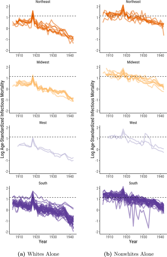
Most striking, however, is how much higher infectious mortality was among urban African Americans than it was among urban whites. Nationally, the (unlogged) median comparative mortality ratio for whites from 1906 to 1920 ranged from 1.4 to a peak of 3.0 at the height of the flu pandemic. The (unlogged) median comparative mortality ratio for nonwhites, in contrast, never fell below 3.1. African Americans in cities faced such a high risk of death from infectious disease that it is as if they lived through the flu pandemic experienced by urban whites in every year from 1906 to 1920.15
National medians smooth over volatility in infectious mortality that is more apparent at lower levels of aggregation. Median urban nonwhite mortality between 1906 and 1920 exceeded median urban white mortality in 1918 in 15 of 15 years in the Midwest, 9 of 15 years in the Northeast, 15 of 15 years in the West, and 13 of 15 years in the South.
How much of the regional disparity in urban infectious mortality is driven by the racial composition of each region? To quantify this, we decompose the difference between infectious mortality in the South and in the non-South, , into two components, given in Equation (1) (Preston et al. 2000, p. 28–30):
| (1) |
The first term reflects the contribution that regional differences in the racial composition of the population make to the regional difference in infectious mortality. This term represents the difference between racial group i’s share of the population in southern cities and its share of the population in non-southern cities, , weighted by racial group i’s average infectious mortality across cities in the South and non-South, .16 The second term reflects the contribution that regional differences in racial-group-specific mortality make to the regional difference in infectious mortality. This term represents the difference between the average city’s infectious mortality in the South and the average city’s infectious morality in the non-South for each racial group i, , weighted by racial group i’s average share of the population in the South and non-South, .
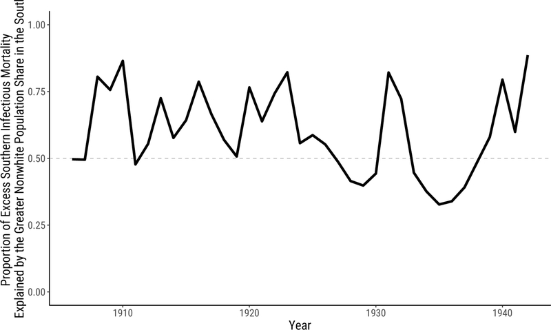
The difference between the racial composition of cities in the South and the non-South is responsible for most of the difference between infectious mortality in the South and the non-South over our period. Figure 5 shows these results, plotting the compositional component (the first decomposition term) as a proportion of the total southern excess.17 When this proportion exceeds .5, compositional differences account for most of the difference between infectious mortality in the South and the non-South. Across years, the racial composition of the population contributes a median proportion of .58 of the total southern excess mortality and more than half of the total in two-thirds of the years we study.
Figure 5:
Proportion of Excess Southern Infectious Mortality Explained by the Greater Nonwhite Population Share in the South.
Like Figures 1a and 1b, Figures 4 and 5 are based on an unbalanced panel of cities. The sample of cities for which we have data for whites and nonwhites in every year from 1906 to 1942, excluding 1938, is small and predominantly southern. In Figure 6, we plot city-specific trends in infectious mortality in the cities for which we have data for whites and nonwhites in at least 30 years. The dashed line indicates median infectious mortality during the 1918 flu pandemic among urban whites in cities present in the data for at least 30 years. As shown in the right panel, in many cities, infectious mortality among nonwhites from 1906 to 1920 was comparable to median urban white infectious mortality during the 1918 flu pandemic.18
Figure 6:
Logged Age-Standardized Infectious Mortality in U.S. Cities by Region. The dashed line indicates median infectious mortality during the 1918 flu pandemic among urban whites in cities present in the data for at least 30 years (1.156). Because there are an even 52 cities in this sample, the median is the midpoint between 1918 white infectious mortality in Memphis, TN (1.149) and in Mobile, AL (1.163). Each line represents a city in our sample. We limit the sample to cities reporting mortality for whites and nonwhites in at least 30 years.
Conclusion
In this article, we document regional variation in the decline in urban infectious mortality in the United States. The decline in total mortality in the United States in the first half of the twentieth century is well known, but regional variation in both the level of infectious mortality and changes in it is not. Our results point to three main conclusions.
First, the level of infectious mortality in southern cities exceeded that of cities in other regions for the entirety of our study period. Previous research documented that southern cities had comparatively high rates of death in 1900 (Crimmins and Condran 1983). We show that these differences lasted at least until midcentury. Second, southern cities differed from cities in other regions not only in their levels of infectious mortality, but also in the timing of their infectious mortality decline. Infectious mortality in northeastern, midwestern, and western cities gradually declined until the early 1930s, then declined more steeply. In southern cities, a sharper fall in infectious mortality did not take place until the late 1930s.
Third, and most strikingly, southern cities’ distinctiveness can be explained primarily by the fact that African Americans, who suffered extremely high risks of death from infectious disease in cities in all regions, made up a comparatively large share of their populations. Until 1920, median infectious mortality among African Americans in cities was higher than that of urban whites at the peak of the flu pandemic.
Our objective in this article has been to document regional differences in the fall of urban infectious mortality. Future research should attempt to explain these differences. Roberts (2009) and Zelner et al. (2017) present evidence linking African Americans’ high rate of death from tuberculosis in the early twentieth century to segregation and crowded housing. Other well-known causes of black infectious mortality, in contrast, are unlikely to explain the gap in the infectious mortality rates of black and white city dwellers. For instance, by 1900, malaria, a common cause of death in the South (Kitchens 2013), was rare in southern cities (Humphreys 2009; Boustan and Margo 2016, p. 742). Research by Black et al. (2015) and Eriksson and Niemesh (2016) has shown that the great migration increased mortality among African Americans at young and old ages. But a large part of this effect was due to the fact that migrants left rural areas for cities, where the risk of death from infectious disease was comparatively high at the beginning of the twentieth century (Eriksson and Niemesh 2016).19 The great migration may have accounted for some portion of the regional convergence in urban infectious mortality for all groups, as black migrants, with comparatively high risks of death from infectious disease, left southern cities for cities in the other regions. But it should account for a smaller portion of the difference in infectious mortality between urban whites and urban African Americans because black infectious mortality rates in southern cities were similar to black infectious mortality rates in cities in the other regions. In future work, we plan to study infectious mortality among urban African Americans in closer detail, focusing especially on which causes of death were primarily responsible for their extreme mortality rates.
Acknowledgments
Authorship is alphabetical to reect equal contributions. We thank Magali Barbieri, Douglas Ewbank, Evan Roberts, Melissa Thomasson, and Jon Zelner for helpful comments and Hero Ashman, Gianluca Russo, and jim saliba for excellent research assistance. This research was supported by the Robert Wood Johnson Foundation Health & Society Scholars program; the Regents’ Junior Faculty Fellowship at the University of California, Berkeley; and the Minnesota Population Center at the University of Minnesota, Twin Cities, which is funded by a grant from the Eunice Kennedy Shriver National Institute for Child Health and Human Development (P2C HD041023).
A. Appendix
A.1. Age-standardization
For the large group of cities we study, the historical Vital Statistics report only total cause-specific mortality, not age- and cause-specific mortality.20 If we had age-specific infectious mortality rates for each city in our dataset, we could construct directly age-standardized mortality rates, analyze the resulting counterfactual infectious mortality a city would be estimated to have given a standard age distribution, and decompose differences in infectious mortality across cities into differences in their age structures and differences in their age-specific infectious mortality. Unfortunately, the city-level data available in the historical Vital Statistics make that impossible.
However, using data described below, we are able to construct indirectly age-standardized rates. Instead of applying a standard age structure to each city’s actual age-specific infectious death rates, we apply a standard set of age-specific infectious death rates to each city’s actual age structure and compare the resulting “expected” total infectious mortality rate to the actual infectious mortality rate (Preston et al. 2000, p. 24–28).
Estimating the age-standardized rates entails estimating two quantities: an age distribution for each city-year and a “standard” schedule of infectious mortality over age. We estimate the age-specific population of each city and each racial group using the complete-count censuses of 1900–1940. For 1950, when the complete-count census is unavailable (and the 1% sample is insufficient for generating age-specific population counts in individual cities), we estimate age structures for urban populations at the state level using the 1% sample.21 We interpolate the logged age-specific populations to the intercensal years.22 This interpolation will work well when a city’s age distribution changes gradually and less well when it experiences sudden shocks, such as when a disproportionate number of people in their 20s died in the 1918 flu.23 The proportion under 5 (a group particularly vulnerable to death from infectious causes) declines over time until the Baby Boom, ranging in Census years from 10% in 1900 in the Midwest, Northeast, and South to a low of 6.5% in the Northeast in 1940, before rising as high as 12.6% in the South in 1950. Conversely, the proportion over 65 grows over time until the Baby Boom, ranging from a low of 3% in the West in 1900 to a high of 8% in the West and Midwest in 1940. These variations motivate the standardization. Age distributions vary more by region and year than by racial group.
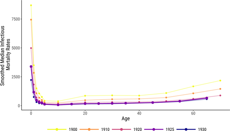
To estimate the standard age schedule of infectious mortality, we use age- and cause-specific death counts, as reported in the Vital Statistics. These death counts were collected on selected cities from 1900 to 1933, but the age categories changed in 1922. We use the 1922–1933 series because its age categories are smaller and extend to an older age (75) than the earlier series. The number of cities in this series increases over time, ranging from 72 to 98. Using these counts of death and age-specific populations derived from the census, we estimate age-specific infectious mortality rates for each year in each city included in this smaller series. Then we take the median infectious mortality rate in each year at each age to construct annual mortality schedules by age. Finally, we smooth these schedules over years using a lowess tricube-weighted smoother with a bandwidth of 10 years (essentially the full series). As our standard, we use the smoothed schedule for 1925, because it is close to the midpoint of our full time series and is not near an endpoint (where smoothers can behave differently) of the age-schedule series. Figure A.1 shows this age schedule of mortality compared to other years, with infectious death rates reported in deaths per 100,000.24
Figure A.1:
Standard Age Schedule of Infectious Mortality Used to Indirectly Standardize Mortality Rates, in Bold, Shown with the Schedules for Other Years for Comparison. Infectious rates are shown in deaths per 100,000.
Although the age- and cause-specific data include far fewer cities and a slightly different list of causes of death than the main data, neither difference significantly distorts total infectious mortality rates. The cities included in the age-specific data and the much longer list of cities in our main analysis have a similar mean and median infectious mortality rate in each year.25 Likewise, the total infectious mortality rate estimated for cities in both the age-specific and the full dataset are similar in the two sources.26 Because the purpose of the age standard is to apply a consistent standard to purge total mortality of the age composition—not to provide an ideal estimate of age-specific mortality in any given year—these small differences need not concern us.
With the 1925 mortality schedule and the estimated age-specific population in each city, we estimate an “expected” total infectious mortality rate for each city in each year in the full dataset. The ratio of actual infectious mortality in that city to this “expected” mortality—dubbed the Comparative Mortality Ratio by Preston et al. (2000, p. 28)—reflects how high or low infectious mortality is, given the age distribution in that city. This ratio allows us to compare infectious mortality across regions and years even when the age distributions differ. The Comparative Mortality Ratio is given in Equation (A.1.1):
| (A.1.1) |
for city x in year t, where c(x, t, i) represents the share of the city’s population in that is in age group i and μ*(x, t, i) represents infectious mortality at age group i in the standard mortality schedule.
A.2. Death Classification Robustness Checks
A particularly important change in the cause of death codes during our series concerns the handling of rheumatic fever, which typically resulted from strep throat or scarlet fever, but in our series is often conflated with the broader inflammatory category of rheumatism. Rheumatic fever is collapsed into “all other causes” in 1900–1909, reported as “rheumatism,” which might be infectious or chronic, from 1910–1929 and “rheumatism and gout” from 1930–1936, and reported separately as “acute rheumatic fever” from 1937–1948 (alongside separate categories for “chronic rheumatism,” with some other diseases, until 1942).
Rheumatic fever is likely a consequential cause of death. For example, in 1910, the general category “Rheumatism” had a median death rate, in each region, of around 7 per 100,000. By the time acute rheumatic fever was reported separately in 1937, median deaths from that cause were zero per 100,000 in each region, while chronic rheumatism still killed a median of 4–7 per 100,000 in each region. “Chronic rheumatic diseases of the heart” killed 11–22 per 100,000 in each region from 1939 to 1942, the only years it was reported. Unfortunately, acute rheumatic fever began to be reported separately as a cause in exactly the same period when sulfa drugs likely made rheumatic fever recede in importance.
In our analysis, we omit every variation on rheumatic fever and rheumatism because of the inconsistent handling of this category of death over the course of the series. Figure A.2 shows the infectious mortality rates by region, re-classifying infectious deaths to include every variation on rheumatism and rheumatic fever in both the city rates and the standard age schedule of mortality. Including rheumatism and rheumatic fever does not change any of our main results: the relatively flat infectious mortality before the 1918 flu, the steep decline in the 1940s, the exceptionally high southern mortality across the series, and the partial southern convergence with other regions during the 1940s all remain.
Figure A.2:
Logged, Age-Standardized Mortality in U.S. Cities by Region, Classifying Rheumatism and Rheumatic fever as Infectious. Infectious mortality is standardized to eliminate variation in the age distributions of cities. The trend lines depict the logged ratio of actual to expected infectious mortality, based on the city’s age distribution.
A.3. City Samples
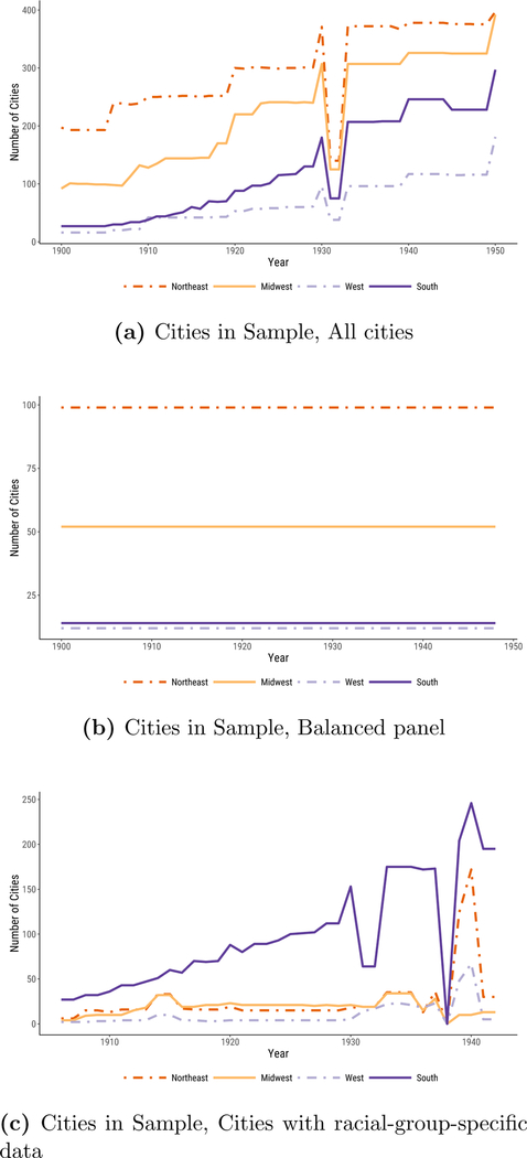
The sizes of each data panel, by region and year, are shown in figure A.3. The full panel ranges from minimums of 91, 140, 16, and 27 for the Midwest, Northeast, West, and South, respectively, to highs of 321, 364, 117, and 244. The balanced panel includes 52 midwestern, 99 northeastern, 12 western, and 14 southern cities. The panel with data on specific racial groups ranges from lows of 4, 6, 2, and 27 in the Midwest, Northeast, West, and South, respectively, to highs of 34, 150, 67, and 244, in years between 1906 and 1942 (excluding 1938, when data on specific racial groups were not collected).
Figure A.3:
Number of cities, by year and region, in each data panel.
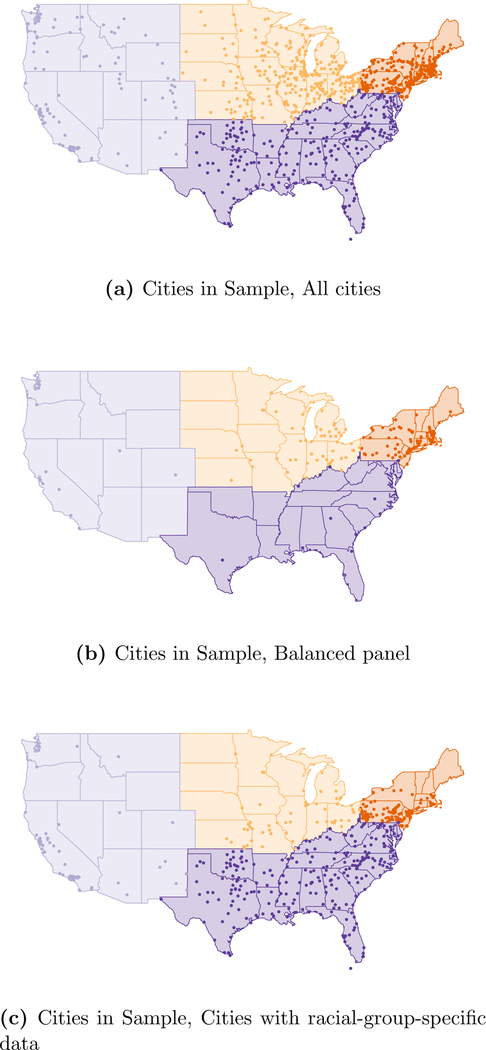
The cities included in our sample are mapped in Figure A.4.
Figure A.4:
Location of Cities in Sample by Region, in Each Data Panel.
Footnotes
Using state-level Vital Statistics, Moehling and Thomasson (2014) find that home nurse visits, spending on health and sanitation, and the establishment of health centers reduced infant mortality from 1924 to 1929.
Using a larger sample of cities, Anderson et al. (2018) find that these technologies reduced typhoid mortality, as reported by Cutler and Miller (2005), but had a much smaller effect on total mortality.
The complete-count census data cover the decennial censuses from 1900 to 1940 and come from IPUMS-USA at the University of Minnesota. Without the very recent release of complete-count census data with clean city and age variables, our analysis would not have been possible.
For instance, Boustan and Margo (2016, p. 734) point out that national black life expectancy estimates derived from Vital Statistics data in the early twentieth century are likely understated because they are based primarily on northern states, whose black residents predominantly lived in cities (see also Logan and Parman 2014, p. 303).
We were able to minimize errors in our digitization by checking that cause-specific deaths sum to total deaths in each city and each year.
Our own panel ranges from 329 to 982 cities due to data restrictions described below and in Appendix A.1. In Figure A.4, we map the cities in our sample within their corresponding regions.
The most consequential of these categories is rheumatism and rheumatic fever. In our main results, we exclude these causes, but in Figure A.2 in the Appendix we reproduce our results with both causes classified as infectious. Reassuringly, Figure A.2 is nearly indistinguishable from our main result reported in Figure 1b. Acute rheumatic fever is the only infectious cause that we exclude even when it is reported separately from non-infectious diseases (chronic rheumatism and gout) because rheumatism and rheumatic fever move back and forth between being reported separately and in a combined category and because deaths from these causes combined made up a relatively large share of total deaths. The median death rate from “rheumatism” in 1910, when the category first appears, was 7 per 100,000.
Specifically, we classify the following causes of death as infectious: Appendicitis, Assorted infectious, epidemic, or parasitic causes, Bronchitis, Diarrhea, Diphtheria, Erysipelas, Influenza, Malaria, Measles, Meningitis, Pneumonia, Polio, Puerperal fever, Scarlet fever, Septicemia, Smallpox, Syphilis, Tuberculosis, and Whooping Cough. Not all of these causes appeared in every year of the Vital Statistics we used, and many appeared in multiple variants (e.g., specific forms of tuberculosis).
The ICD provides standardized guidelines for coding causes of death. The first ICD was developed by Jacques Bertillon in 1893 and adopted by many countries. Now called the International Classification of Diseases, it has subsequently been revised many times to incorporate changes in terminology and medical knowledge (Anderson 2011, p. 472–473). ICD revisions were implemented uniformly across cities in the Vital Statistics.
In our series, the southern median urban infectious death rate exceeded the 1900 urban midwestern median in every year from 1900 to 1920. However, there is a sharp break between 1920 and 1921, in which infectious mortality appeared to fall in all regions, coincident with a change in ICD codes. (For example, meningitis was reported separately before 1921 but collapsed into “all other causes” afterward.) Some of this apparent mortality decline likely reflected the ICD change, although some likely reflected the resurgence of influenza in 1920. We say that the regional difference in 1900 represented “at least” twenty years of the southern mortality decline to come because mortality in all regions might have been higher in years after 1920 absent the ICD change.
We report the sample sizes for all panels in Appendix A.3. Some cities exit and re-enter the full panel over the period.
We center years relative to the beginning of each period to simplify interpretation of the coefficients. We saturate the regression model with four region fixed effects rather than include an intercept or the linear trend in year.
The Vital Statistics report mortality for whites and nonwhites, but in this period nonwhites overwhelmingly were African American. In all years except 1930–1934, “Mexicans” were classified as white (United States Department of Commerce 1941, p. 2). The change in the classification of “Mexicans” had a minimal effect on the nonwhite mortality rates of the North, Midwest, and South. In the West, it causes a spike in nonwhite infectious mortality from 1930 to 1934, visible in Figure 4c.
According to Troesken (2004, p. 39), northern and southern cities had similar rates of public water and sewer connections in the early twentieth century.
Although median infectious mortality among African Americans from 1906 to 1920 was higher than that among whites during the flu pandemic, the age pattern in deaths during the flu pandemic was unique. Infectious mortality is usually highest among the very young and the very old, but the flu pandemic killed many people in the prime of their life (Noymer 2009). As discussed above, between 1920 and 1921, a change in the cause of death coding made infectious mortality appear to fall in all groups; median nonwhite comparative mortality ratios are 3.3 in 1920 but 2.4 in 1921 and remain below 2.8 for the remainder of the series. Some of the infectious mortality decline between 1920 and 1921 likely also reflects the resurgence of influenza in 1920.
Both the racial population shares, and , and the race-specific mortality rates, and , are calculated as unweighted means across cities.
The racial composition measures are generated from IPUMS population measures, which in some cases generate city population totals that differ from published city population totals. In each city in our racial-group-specific sample, these discrepancies never exceed 2.5% in either direction. When we generate the proportions shown in Figure 5, we estimate the total regional difference as the sum of the two decomposition terms so that a consistent population size is used in the numerator and denominator of this proportion.
Three cities had infectious mortality among whites in some years from 1906 to 1920 that exceeded median urban white infectious mortality in 1918: Key West, FL (two years), San Antonio, TX (5 years), and Asheville, NC (7 years).
Eriksson and Niemesh (2016) find that moving North increased the infant mortality rates of African Americans in 1920, but that this effect had disappeared by 1940, due mostly to the disappearance of the urban mortality penalty.
A handful of cities report age-by-cause mortality statistics in some years, but these cities are highly selected: they are mostly very large cities that vary little by region.
In some cases from 1900 to 1940, the age-specific populations do not add up to the published total populations of each city. This is driven by data digitization errors in the complete-count census, including under- or over-enumeration or incorrect city coding. We drop cities in which the two sources disagree by more than 5% in either direction. This removes 45 cities from one or more census years, for a total of 70 dropped city-years. The raw infectious mortality rates we report use the published total city populations. To construct indirectly standardized infectious mortality, we estimate cities’ proportionate age distribution for each racial group as the age-specific population divided by the total population, both derived from the complete-count census. We then scale this proportionate distribution by the published total city population to estimate age-specific population counts to match the age-specific death counts in the numerator. In subsequently using those age schedules to derive the “expected” total infectious mortality for each city, we simply use the proportionate age distribution in each city with the standard age-specific rate and need not commit to any population size estimate.
Seventy cities do not appear in the 1940 IPUMS. To avoid interpolating age distributions over long periods, in the case of those 70 cities and the 70 dropped observations described above, we extrapolate the IPUMS data that remain only to the end of the ICD period. For this purpose, we treat 1920 as included in the 1921–1929 ICD period. Thus, a city with good IPUMS data for 1920 but IPUMS data dropped in 1930 due to data error would have its 1920 age distribution extrapolated to the 1921–1929 ICD period, but would be missing from the 1930–1938 period. Additionally, for all populations, we can interpolate age distributions only for cities present, without data error, in IPUMS data for at least two Census years.
For racial-group-specific data, which are collected only through 1942, we extrapolate from 1940, rather than interpolating using data from 1950, to avoid drawing age distributions from the Baby Boom that begins in 1946.
In constructing the 1900–1921 schedules, which were estimated separately because of their different age categories, we omitted 1918 and 1919 from the smoothed rates to avoid distortions from the flu pandemic.
In 1925, the main year we draw on in constructing our standard mortality distribution, cities in the full dataset have a mean infectious mortality rate of .0034 and cities in the age-specific dataset have a mean infectious mortality rate of .0032. Both have a median rate of .0031.
In 1925, the cities included in the age-specific dataset have a mean infectious mortality rate of .0031 in that dataset and .0032 in the full dataset. The corresponding medians are .0029 and .0031, respectively.
References
- Acevedo-Garcia Dolores. 2000. “Residential Segregation and the Epidemiology of Infectious Diseases.” Social Science & Medicine 51:1143–1161. [DOI] [PubMed] [Google Scholar]
- Alsan Marcella and Goldin Claudia. 2018. “Watersheds in Child Mortality: The Role of Effective Water and Sewerage Infrastructure, 1880 to 1920.” Journal of Political Economy . [DOI] [PMC free article] [PubMed] [Google Scholar]
- Anderson D. Mark Kerwin Kofi Charles, Olivares Claudio Las Heras, and Rees Daniel. 2017. “Was The First Public Health Campaign Successful? The Tuberculosis Movement and Its Effect on Mortality.” National Bureau of Economic Research Working Paper 23219:1–66. [Google Scholar]
- Anderson D. Mark Kerwin Kofi Charles, and Rees Daniel. 2018. “Public Health Efforts and the Decline in Urban Mortality.” National Bureau of Economic Research Working Paper 25027:1–60. [Google Scholar]
- Anderson Robert N. 2011. “Coding and Classifying Causes of Death: Trends and International Differences” In International Handbook of Adult Mortality, edited by Rogers Richard G. and Crimmins Eileen M., pp. 467–489. Dordrecht: Springer. [Google Scholar]
- Armstrong Gregory L., Conn Laura A., and Pinner Robert W. 1999. “Trends in Infectious Disease Mortality in the United States During the 20th Century” JAMA 281:61–66. [DOI] [PubMed] [Google Scholar]
- Black Dan A., Sanders Seth G., Taylor Evan J., and Taylor Lowell J. 2015. “The Impact of the Great Migration on Mortality of African Americans: Evidence from the Deep South.” American Economic Review 105:477–503. [DOI] [PMC free article] [PubMed] [Google Scholar]
- Boustan Leah and Margo Robert A. 2016. “Racial Differences in Health in the United States: A Long-Run Perspective” In The Oxford Handbook of Economics and Human Biology, edited by Komlos John and Kelly Inas R., pp. 730–750. Oxford: Oxford University Press. [Google Scholar]
- Cain Louis and Chul Hong Sok. 2009. “Survival in 19th Century Cities: The Larger the City, the Smaller Your Chances.” Explorations in Economic History 46:450–463. [DOI] [PMC free article] [PubMed] [Google Scholar]
- Carter Susan B., Gartner Scott S., Haines Michael R., Olmstead Alan L., Sutch Richard, and Wright Gavin. 2006. Historical Statistics of the United States: Millennial Edition, volume 3 Cambridge: Cambridge University Press. [Google Scholar]
- Catillon Maryaline, Cutler David, and Getzen Thomas. 2018. “Two Hundred Years of Health and Medical Care: The Importance of Medical Care for Life Expectancy Gains.” National Bureau of Economic Research Working Paper 25330:1–80. [Google Scholar]
- Collins William J. and Thomasson Melissa A. 2004. “The Declining Contribution of Socioeconomic Disparities to the Racial Gap in Infant Mortality.” Southern Economic Journal 70:746–776. [Google Scholar]
- Condran Gretchen A. and Crimmins Eileen. 1980. “Mortality Differentials Between Rural and Urban Areas of States in the Northeast United States, 1890–1900.” Journal of Historical Geography 6:179–202. [DOI] [PubMed] [Google Scholar]
- Condran Gretchen A. and Crimmins-Gardner Eileen. 1978. “Public Health Measures and Mortality in U.S. Cities in the Late Nineteenth Century.” Human Ecology 6:27–54. [DOI] [PubMed] [Google Scholar]
- Crimmins Eileen M. and Condran Gretchen A. 1983. “Mortality Variation in U.S. Cities in 1900: A Two-Level Explanation by Cause of Death and Underlying Factors.” Social Science History 7:31–59. [PubMed] [Google Scholar]
- Cutler David, Deaton Angus, and Lleras-Muney Adriana. 2006. “The Determinants of Mortality.” Journal of Economic Perspectives 20:97–120. [Google Scholar]
- Cutler David and Miller Grant. 2005. “The Role of Public Health Improvements in Health Advances: The Twentieth-Century United States.” Demography 42:1–22. [DOI] [PubMed] [Google Scholar]
- Angus Deaton. 2013. The Great Escape: Health, Wealth, and the Origins of Inequality . Princeton: Princeton University Press. [Google Scholar]
- Du Bois WEB 1908. The Negro American Family. Atlanta: Atlanta University Press. [Google Scholar]
- Eriksson Katherine and Niemesh Gregory T. 2016. “Death in the Promised Land: The Great Migration and Black Infant Mortality.” Working Paper pp. 1–59. [Google Scholar]
- Ewbank Douglas C. 1987. “History of Black Mortality and Health before 1940.” The Milbank Quarterly 65:100–128. [PubMed] [Google Scholar]
- Ferrie Joseph P. and Troesken Werner. 2008. “Water and Chicago’s Mortality Transition, 1850–1925.” Explorations in Economic History 45:1–16. [Google Scholar]
- Fogel Robert W. 2004. The Escape from Hunger and Premature Death, 1700–2100: Europe, America, and the Third World. Cambridge: Cambridge University Press. [Google Scholar]
- Galishoff Stuart. 1985. “Germs Know No Color Line: Black Health and Public Policy in Atlanta, 1900–1918.” Journal of the History of Medicine 40:22–41. [DOI] [PubMed] [Google Scholar]
- Grigoryeva Angelina and Ruef Martin. 2015. “The Historical Demography of Racial Segregation.” American Sociological Review 80:814–842. [Google Scholar]
- Haines Michael R. 2001. “The Urban Mortality Transition in the United States, 1800–1940.” Annales de Démographie Historique 101:33–64. [Google Scholar]
- Haines Michael R. 2006. “Vital Statistics” In Historical Statistics of the United States, Millennial Edition, edited by Carter Susan B., Scott Sigmund Gartner Michael R. Haines, Olmstead Alan L., Sutch Richard, and Wright Gavin, pp. 1381–1390. Oxford: Cambridge University Press. [Google Scholar]
- Higgs Robert. 1973. “Mortality in Rural America, 1870–1920: Estimates and Conjectures.” Explorations in Economic History 10:177–193. [DOI] [PubMed] [Google Scholar]
- Humphreys Margaret. 2009. “How Four Once Common Diseases Were Eliminated From the American South.” Health Affairs 28:1734–1744. [DOI] [PubMed] [Google Scholar]
- International Institute for Vital Registration and Statistics. 1993. “Historical Development of Cause of Death Statistics.” Technical Papers 55:1–10. [Google Scholar]
- Jayachandran Seema, Lleras-Muney Adriana, and Smith Kimberly V. 2010. “Modern Medicine and the Twentieth Century Decline in Mortality: Evidence on the Impact of Sulfa Drugs.” American Economic Journal: Applied Economics 2:118–146. [Google Scholar]
- Kitchens Carl. 2013. “A Dam Problem: TVA’s Fight Against Malaria, 1926–1951.” Journal of Economic History 73:694–724. [Google Scholar]
- Lee Kwang-Sun. 2007. “Infant Mortality Decline in the Late 19th and Early 20th Centuries: The Role of Market Milk.” Perspectives in Biology and Medicine 50:585–602. [DOI] [PubMed] [Google Scholar]
- Logan Trevon D. and Parman John M. 2014. “The Dynamics of African-American Health: A Historical Perspective.” Review of Black Political Economy 41:299–318. [Google Scholar]
- McKeown Thomas and Record RG 1962. “Reasons for the Decline of Mortality in England and Wales During the Nineteenth Century.” Population Studies 16:94–122. [PubMed] [Google Scholar]
- Meeker Edward. 1971. “The Improving Health of the United States, 1850–1915.” Explorations in Economic History 9:353–373. [PubMed] [Google Scholar]
- Melosi Martin V. 1999. The Sanitary City: Urban Infrastructure in America from Colonial Times to the Present. The Johns Hopkins University Press. [Google Scholar]
- Moehling Carolyn M. and Thomasson Melissa A. 2014. “Saving Babies: The Impact of Public Education Programs on Infant Mortality.” Demography 51:367–386. [DOI] [PubMed] [Google Scholar]
- Moriyama Iwao M., Loy Ruth M., and Robb-Smith Alastair Hamish Tearloch. 2011. History of the Statistical Classification of Diseases and Causes of Death. Hyattsville, MD: National Center for Health Statistics. [Google Scholar]
- Noymer Andrew. 2009. “Testing the Influenza-Tuberculosis Selective Mortality Hypothesis with Union Army Data.” Social Science & Medicine 68:1599–1608. [DOI] [PMC free article] [PubMed] [Google Scholar]
- Preston Samuel, Heuveline Patrick, and Guillot Michel. 2000. Demography: Measuring and Modeling Population Processes. Oxford: Blackwell. [Google Scholar]
- Preston Samuel H. and Haines Michael R. 1991. Fatal Years: Child Mortality in Late Nineteenth-Century America. Princeton: Princeton University Press. [Google Scholar]
- Roberts Samuel. 2009. Infectious Fear: Politics, Disease, and the Health Effects of Segregation. Chapel Hill: University of North Carolina Press. [Google Scholar]
- Ruggles Steven, Flood Sarah, Goeken Ronald, Grover Josiah, Meyer Erin, Pacas Jose, and Sobek Matthew. 2018. IPUMS USA: Version 8.0 [dataset]. Minneapolis, MN: IPUMS. [Google Scholar]
- Sen Amartya. 1998. “Mortality as an Indicator of Economic Success and Failure.” Economic Journal 108:1–25. [Google Scholar]
- Smith David W. and Bradshaw Benjamin S. 2006. “Variation in Life Expectancy During the Twentieth Century in the United States.” Demography 43:647–657. [DOI] [PubMed] [Google Scholar]
- Smith David W. and Bradshaw Benjamin S. 2008. “Reduced Variation in Death Rates After Introduction of Antimicrobial Agents.” Population Research and Policy Review 27:343–351. [Google Scholar]
- Szreter Simon. 1988. “The Importance of Social Intervention in Britain’s Mortality Decline c. 1850–1914: a Re-interpretation of the Role of Public Health.” Social History of Medicine 1:1–38. [Google Scholar]
- Troesken Werner. 2004. Water, Race, and Disease. Cambridge: MIT Press. [Google Scholar]
- United States Department of Commerce. 1941. Vital Statistics of the United States, 1939 Part I: Natality and Mortality Data for the United States Tabulated by Place of Occurrence with Supplemental Tables for Hawaii, Puerto Rico, and the Virgin Islands. Washington, D.C.: United States Government Printing Office. [Google Scholar]
- Zelner Jon L., Muller Christopher, and Feigenbaum James J. 2017. “Racial Inequality in the Annual Risk of Tuberculosis Infection in the United States, 1910–1933.” Epidemiology & Infection 145:1797–1804. [DOI] [PMC free article] [PubMed] [Google Scholar]


