

Abstract
This article describes two spatially explicit models created to allow experimentation with different societal responses to the COVID‐19 pandemic. We outline the work to date on modeling spatially explicit infective diseases and show that there are gaps that remain important to fill. We demonstrate how geographical regions, rather than a single, national approach, are likely to lead to better outcomes for the population. We provide a full account of how our models function, and how they can be used to explore many different aspects of contagion, including: experimenting with different lockdown measures, with connectivity between places, with the tracing of disease clusters, and the use of improved contact tracing and isolation. We provide comprehensive results showing the use of these models in given scenarios, and conclude that explicitly regionalized models for mitigation provide significant advantages over a “one‐size‐fits‐all” approach. We have made our models, and their data, publicly available for others to use in their own locales, with the hope of providing the tools needed for geographers to have a voice during this difficult time.
1. INTRODUCTION
The COVID‐19 pandemic has brought into sharp relief the complexities of managing a coordinated strategy to minimize human health impacts whilst at the same time minimizing disruption to economic and other social systems. Most responses to date have been applied uniformly, without consideration of the variance in risk or in case numbers that occurs regionally. Our hypothesis here is that geography not only matters, but using it can give a distinct advantage of allowing a tailored response that is more effective at minimizing harmful side‐effects.
In this article, we aim to provide geographers with the tools needed to contribute to the challenge of managing a pandemic through various stages of lockdown, or societal isolation. As our own country (New Zealand) began to consider how to move progressively out of lockdown, it seemed important to us to find a way to bring some geography into epidemiological models, so we responded by experimenting with spatially explicit (regional) models that include information on the connectedness of places, as well as the usual disease parameters such as the reinfection rate, asymptomatic rate, and incubation period. We describe these models below.
Rather than dwelling on the theory of explicitly spatial disease models, we choose instead here to give a more practical account of the software we developed to experiment with: lockdown strategy, regionalization, interaction between regions, disease parameters, test and isolation strategies, and exploring disease clusters. We believe that such models may be useful in other places at the time of writing, and being spatially explicit, they allow other aspects of geography to be included in the planning, thus giving geography (and geographers) a voice at this critical time.
The models and data we have used here have been placed in the public domain so that they can be reused in other locales, and customized to meet the needs experienced by other countries. They can be accessed from the following URLs 1 :
https://southosullivan.com/misc/distributed‐seir‐RC‐web.html
https://southosullivan.com/misc/distributed‐branching‐process‐RC‐web.html
Further details about the modeling environment, and how to customize the models with different geography, are given in the Appendix.
In response to the COVID‐19 pandemic, most countries have employed some kind of lockdown strategy, in an effort to reduce social interactions to only those necessary for essential services such as food delivery and acute health services to continue. These strategies have met with varying degrees of success, such that most countries are faced with the difficult task of needing to reduce lockdown to help revive their economies and restore “normality,” whilst still battling the disease (Kupferschmidt, 2020). It has been remarked many times that it is easier to enter lockdown than it is to leave it. An excellent tool for studying the effectiveness of repression on a per‐country basis is the CovidTrends 2 tracker (https://aatishb.com/covidtrends/), shown in Figure 1. Using this application shows the large number of countries that are now faced with pressure to ease lockdown whilst still struggling to repress the reproduction rate (R 0) below 1.0, hence the need for some very specific modeling of this aspect of the pandemic.
FIGURE 1.

Image captured from the CovidTrends website showing the state of contagion in a selection of nations. The plot graphs the number of confirmed cases against the total number of cases over the past week. All the countries shown have had some success with slowing down the pandemic, but only Italy displays a strategy that is headed toward eradication
The modeling of infectious disease is a central focus of mathematical epidemiology, with a variety of mathematical approaches to epidemic modeling explored in some detail over the years (Bailey, 1975). The dominant approach is compartment modeling of the susceptible–infected–recovered (SIR) type. In this article we present one model of this type, and a second based on a stochastic branching process (Allen, 2017; Jacob, 2010), which could be readily extended to an individual‐based model. The former type of model is more suited to established epidemics and modeling their overall evolution, while the latter approach is better suited to the initial stages of an epidemic when the numbers of cases are small, and, we surmise, during the latter stages when an epidemic is more or less under control. Our SIR and branching process models are based on two models developed in New Zealand in the context of a rapidly changing situation (see James, Hendy, Plank, & Steyn, 2020; Plank, Binny, Hendy, Lustig, & James, 2020, respectively).
Our primary focus throughout has been to extend these models to include a spatial dimension. A literature search reveals limited consensus on best practice for spatially explicit SIR models (although see Bartlett, 1957), and “in contrast to the widespread use of other types of models [i.e., SIR], models based on branching processes are seldom used in practice for infectious disease control” (Farrington, Kanaan, & Gay, 2003), so there is scant work on spatially explicit versions of such models. Our branching process model is continuous‐time‐based and readily extensible to a more thoroughly individual‐based approach by the addition of individual attributes (such as demography) to disease cases. True individual‐based models of epidemics remain a rarity (see Willem, Verelst, Bilcke, Hens, & Beutels, 2017). In any case it is not productive to get lost in the semantics of model types. Regardless of the epidemic modeling approach adopted, we know that many regionalized variables will affect both the spread of the virus and our attempts to minimize it—for example, population density, overcrowding of public transport, distance to essential services, age profile, and many more (see Beam‐Dowd et al., 2020). It appears evident to us that smaller spatial units, with limited connections between them, might lead to more success in coming out of lockdown, and managing disease outbreaks that accompany the easing of restrictions on personal movement. We demonstrate later in Section 4 how our results back up these intuitions, while suggesting that much more work is required on this aspect of epidemic control.
2. CORE EPIDEMIC MODELS AND ADDING IN GEOGRAPHY
In this section we briefly describe two approaches to epidemic modeling and provide some details of the specific instances of these adopted in our work. We also describe previous work on making epidemic models geographical, which is our primary focus in this work. 3 We describe platform‐specific aspects of model implementation, and details of the incorporation of spatial aspects in Section 3.
2.1. SIR models
First introduced by Kermack and McKendrick (1927), SIR (also called “removed”) models are compartment models in which the population transitions between different states over time. Initially, the entire population at risk (N) is considered susceptible (S), and the rate of progression toward the infectious (I) then recovered (R) states over time is defined by differential equations governing the transition rates:
| (1) |
| (2) |
| (3) |
The parameters β and γ are respectively rates of infection and recovery per unit of time (in our case per day). These parameters control the dynamics of an epidemic (Kermack & McKendrick, 1927, 1932, 1933). The ratio of the two gives us the basic reproduction number:
| (4) |
Additional insight is gained here if we consider that the expected number of time steps spent in the infectious state is given by 1/γ and since β is the rate of infections per time step, R 0 may be interpreted as the expected number of secondary infections due to each infectious case. Given Equation (4), we can rewrite Equation (2) as:
| (5) |
Thus if
| (6) |
then
| (7) |
meaning that there will be an epidemic until such time as S and/or R are significantly reduced.
The SIR model is readily extended to include additional compartments that might relate to stages of the disease progression or perhaps to different population subgroups. The SIR‐style model we have implemented is based on a five‐compartment model developed for the New Zealand context (see Gatto et al., 2020; James, Hendy, et al., 2020), and influential on the government's decision to go into an early lockdown. This model introduces an exposed (E) compartment and a pre‐symptomatic (P) compartment, as well as the traditional SIR compartments. So technically we could call this an SEPIR model, but since it is a variant of a well‐established class of models, we will stick with the SIR abbreviation here. Future refinements of the compartment model to better fit the observed dynamics of the COVID‐19 pandemic could be substituted into this model as needed at a later date.
In the exposed state cases are not infectious, while in the pre‐symptomatic state they are not yet symptomatic, but are infectious at a lower rate than when they become fully infectious. Using these five compartments allows us to separate the pre‐symptomatic population, which is useful because those who have symptoms are likely to seek medical advice and may well be tested, but those who are pre‐symptomatic will likely not be tested, unless as part of some random background testing. 4 The equations governing this model are extended accordingly, with some minor elaboration to include deaths and hospitalization, which we omit for clarity:
| (8) |
| (9) |
| (10) |
| (11) |
| (12) |
The additional parameters α and β denote, respectively, the per‐time‐step rates of transition from exposed to pre‐symptomatic, and from pre‐symptomatic to infectious, while ε is infectiousness in the pre‐symptomatic relative to the infectious state.
For this model, the relationship between the rate of infection β and R 0 is given by:
| (13) |
which can again be interpreted as spreading the expected number of secondary infections from each case evenly across the expected period of infectiousness.
It is important to note that in many SIR implementations, the model is deterministic and compartment values are real‐valued (i.e., fractional values are allowed). In our implementation we make the model stochastic by treating compartment totals as integers, and the per‐time‐step rates of change as probabilities for drawing random binomial variates from the compartment totals. Thus, for example, the number of cases progressing from exposed (E) to pre‐symptomatic (P) is given in our model, not by αE but by Bin(E, α). This is a departure from mathematical epidemiological theory, where stochastic versions of SIR models are considered Markov processes with a time step sufficiently short that no more than one infection or recovery event may occur in a single time step (see Allen, 2017). Our approach is a good approximation to the Markov model and is a pragmatic choice that allows our model to operate on daily time steps, and reflects a focus on understanding potential variation in outcomes over time and space rather than longer‐term evolution of equilibrium model states.
2.2. Branching process and individual‐based models
SIR models are inherently aggregate based as they simulate overall transition rates in a population among disease states. By contrast, branching process and individual‐based models focus attention more closely on individual exposure or infection events. The terminology here is confusing, as many models referred to as branching process models in epidemiology are principally concerned still with the trajectory through time of aggregate counts (S, I, and R), but considered one event at a time (see Allen, 2017; Jacob, 2010).
Zooming in closer still, we can focus on individual cases and their time of occurrence, tracking those individual events over time and aggregating back up to total cases in various stages of disease progression, to provide similar outcome variables as SIR models. This is the approach adopted in our second model. Here, an individual case i is initiated either exogenously or by exposure to a previous case, at exposure time ti . A statistical model of the evolution of disease infectiousness—and hence the probability of secondary infections over time from exposure—deploys a probability density function W(t) to generate new exposure times subsequent to an existing case. The number of secondary infections that each case gives rise to is directly parameterized in the model by setting R 0 as a model parameter. In our model, following Plank et al. (2020), the infectiousness progression is represented by a Weibull distribution with peak infectiousness around 5 days after initial exposure, and infectiousness decreasing rapidly after 10 days. In aggregate, this model is effectively the summation over time of many probability density functions each with different initial exposure times t 0.
This approach allows us to model individual case progressions and potentially to incorporate effects such as individual levels of infectivity. This might extend to considering aspects such as an individual case's age, ethnicity, or occupation, or simply stochastic variability between cases. In the present version of the model (reflecting Plank et al., 2020), the significant variation in infectivity is that cases are considered either clinical—in which case they have maximum R c, or subclinical—when infectivity Ri of individual i is suppressed by some factor k sub. Based on each case's individual Ri value, in our model, when a case is initialized, it generates Poisson(Ri ) additional exposures set to occur at times tj = ti + tx , where tx is drawn from the infectiousness probability density function. This is the maximum number of secondary exposures that case i may give rise to in the absence of any controls. Lockdown and other controls are discussed in Section 3 and the Appendix, where we describe the implementation of our models in more detail.
It is instructive to consider the relationship between the branching process and SIR representations of infectiousness (see Figure 2). The smooth curve shows the distribution Weibull (2.83, 5.67) used in the branching process model, with peak infectivity at around 5 days after exposure. The stepped line shows the transmission coefficients εβ and β associated with cases in the P and I compartments, and the time periods that cases are expected to spend in these states, as a result of our chosen settings of α (= 1), δ (= 0.66667), and γ (= 0.2). The effective infectiousness profile of our SIR model is shown by the bar chart based on simulating 1,000 individual cases progressing through the states in our model. Note that our SIR model is parameterized differently than the model by James, Plank, et al. (2020) on which it is based, to produce a reasonable match between these profiles to assist in model comparisons. The relevant parameters in the SIR model are, however, user configurable to potentially produce very different outcomes, though the versions made available for download have our parameter choices as default. During the SIR model development and validation, we found that parameter combinations that extend the period of infectiousness of cases (i.e., their time spent in the I compartment—easily accomplished by reducing γ) make simulated epidemics much harder to control. However, having high infectiousness persist over prolonged periods does not reflect the situation prevailing in New Zealand during model development, where case identification and isolation has been highly effective, hence our decision to make adjustments in the SIR model parameters relative to the model on which it is based. A more complex SIR model with additional compartments to represent hospitalized and isolated states would allow for a more robust solution of this problem (see e.g., Legrand, Grais, Boelle, Valleron, & Flahault, 2007).
FIGURE 2.

Comparison of the infectiousness profiles over time in the two models. The compartment SIR model is shown by the stepped blue line, the branching model by the continuous red line
We recognize that there are many other approaches to epidemic modeling than the two broad classes of model presented here. Of particular interest to the GIS community are agent‐ or individual‐based models (see Hunter, MacNamee, & Kelleher, 2018; Willem et al., 2017), which may incorporate richly detailed representations of economic, social, and other activities in addition to centrally representing the progress of an epidemic through the population. Our focus on epidemic control has led to our emphasis here on more “epidemic‐centered” approaches. The specifics of the development of our models also owe a great deal to the evolving crisis response in New Zealand in March–April 2020, when the two models we have highlighted here (James, Hendy et al., 2020; Plank et al., 2020) were deployed in advising the government on pandemic decision‐making.
2.3. Adding geography to epidemic models
If the population and the disease were distributed evenly through a region, there would be no value in a geographical approach. However, since the distribution of both vary a great deal with place, we can leverage this to change the lockdown strategy so that areas free from infection can also be free of restrictions as soon as it is deemed safe to do so. Lockdown strategies harm the economy and reduce access to healthcare services for other medical conditions, both of which are also causes of suffering and death, so minimizing this harm where it can safely be done is vital.
To facilitate a geographical approach to lockdown, we need to decompose the affected area into regions, and then limit non‐essential travel between them. Then we can tailor the management strategy to a more specific risk: a local mean for the infective population will be much more accurate than a global one, and thus will allow a more targeted approach.
Given that the mobility of the susceptible population and their interaction with infected people is vital for any infectious disease to spread, it is perhaps surprising that fundamental geographic processes have largely been excluded from SIR models and their variants (Allen, 1994; James, Plank et al., 2020; Kermack & McKendrick, 1927, 1932, 1933; Plank et al., 2020). By convention, these compartment models assume that the population is homogenous, and that the risk of a susceptible individual becoming infectious is a function of the probability of being a contact and the effective R at a given time. Elaborations of SIR models to handle “meta‐populations” categorized by age, ethnicity, or other characteristics commonly become mathematically complex rather quickly.
While SIR models are ubiquitous in the epidemic modeling literature, there appears to be no consistency in how best to develop spatially explicit epidemic models. For example, cellular automata (CA) models have been used to extend some of the grid‐based epidemic analyses proposed by Bartlett (1957) and Hagerstrand's (1953/1967) diffusion of innovation theory to infectious diseases. Munshi, Roy, and Balasubramanian (2020) used CA models to model the spread of COVID‐19 in New York City and to demonstrate how various control measures can potentially mitigate the epidemic. They developed a spatially explicit susceptible, latent, quarantine, infectious, isolated, recovered (CA‐SLQIIR) model that factored in measures such as social distancing and population mobility. Results suggested that prolonged (e.g., 180‐day) periods of lockdown, localized rather than regionalized mobility, and ensuring 95% of the population were tested for COVID‐19 would reduce the number of cases and fatalities substantially.
One potential limitation of grid‐based models such as Bartlett's or Munshi et al.’s is that modeling hierarchical connectivities, such as high‐volume transportation routes between cities, or arterial roads within cities, is challenging. However, network‐based approaches can overcome this limitation. Cliff, Haggert, and Versey (1981) proposed network‐based models of disease diffusion in an attempt to add spatial structure into disease modeling, focusing particularly on measles in island settings. Gould (1993), Gog et al. (2014), and Kissler et al. (2019) describe approaches to pandemic modeling based on gravitationally weighted diffusion over a transportation network, but with no local epidemic mechanism per se. Saito et al. (2013) used two sets of SIR models, coupled with a parameter representing the migration between two regions, to model the spread of the H1/N1 pandemic in Japan during 2009. 5 Bertuzzo, Casagrandi, Gatto, Rodriguez‐Iturbe, and Rinaldo (2010) tested different network configurations representing hydrological connections between communities and implemented SIR models in which the spread of cholera was modeled through a biased random‐walk process on the network.
Stochastic spatial SIR models are another form of spatially explicit model that enable individuals to be “tracked” through the four stages of disease over discrete time and across discrete space. Brown, Porter, Oleson, and Hinman (2018) used an approximate Bayesian computing (ABC) approach to stochastic spatial susceptible, exposed, infectious, recovered (SEIR) modeling to simulate the spread of Chikungunya, a virus transmitted by mosquitoes with a typical incubation/latent period of 3–7 days. In their spatial SIR models, the authors use two approaches to calculate the transition probabilities representing disease latency (E to I) and infectious period (I to R), respectively. First, they use an exponentially distributed approach, which is very common in Bayesian SIR models, and then, as an alternative, a path‐specific SEIR (PS‐SEIR) approach that models individual paths through exposed and infectious compartments. The strength of the PS‐SEIR method is that the transitions need not be exponential.
Balcan et al. (2010) developed the global epidemic and mobility (GLEaM) computational model to simulate global pandemics. GLEaM is one of the few examples that leverage population mobility and sociodemographic data at the sub‐national level, combined with disease modeling parameters to simulate the spatial diffusion of infectious disease on a global scale. For population mobility they used air travel networks with origin–destination matrices of commuting patterns to ensure comparability between and within countries for their models. Their spatial disease model uses a susceptible–latent–infectious–recovered (SLIR) compartment approach, which is estimated for each geographic census area, and can be modified to account for age structure or seasonal variation, for example. The progression between states in the SLIR model is governed by transition probabilities similar to those for conventional SIR models, with additional probabilities included to account for the inclusion of national or international air travel. Thus, for each geographic census area, the disease is transmitted between adjacent areas when people commute locally, whereas the air travel component dictates the rate of spread nationally and internationally. The GLEaM models are also available as an online tool—GLEAMviz (http://www.gleamviz.org/model/), which allows users to re‐configure the models and simulate disease dispersion.
Klepac, Kissler, and Gog (2018) describe the implementation of an outbreak model using data obtained from a mobile phone app over a 1‐month period in the UK, as part of a BBC documentary to mark the 100th anniversary of the 1918 influenza epidemic. They captured user characteristics (age, gender, max‐distance‐traveled) and location coordinates for each hour during a 24‐h period. For most analytical purposes they restricted the sample to distances traveled below 100 km, however they used larger commuting distances (>200 km, with population density> 100,000/km2), with a small trickle effect to spread their contagion further afield. Age‐specific transmission rates were calculated and the authors combined geographic boundary data from Scotland, England, Wales, and Northern Ireland to create their geographical base—known as “patches.” They modeled within‐patch variations as a discrete‐time SIR‐style model with a realistic infectious profile, based on the age‐structured transmission rates. In addition, they used a gravity‐style model, with a stochastic implementation using the real movement data to model between‐patch patterns.
Initially, Klepac et al.'s model simulates a classic contagion pattern, in which the spread of an influenza‐like illness (ILI) encompasses the country in concentric waves over 14+ weeks, although the impact of London's long‐distance connectivity becomes obvious reasonably early in the epidemic. A subsequent model emulated the effect an increased rate of hand washing had on the dispersion of disease. Whereas the initial model took around 7 weeks to cover the length of Britain, washing hands reduced the rate of spread by about 4–5 weeks. While the control measures did not eliminate the pandemic, there were an estimated 10 million fewer cases.
The current COVID‐19 pandemic has highlighted a need to extend the SIR models to incorporate different levels of disease severity and disease management/recovery. To explore the impact of control measures on the spread of COVID‐19 through communities in Italy, Gatto et al. (2020) therefore proposed a spatially explicit model that comprised susceptible (S), exposed (E), pre‐symptomatic (P), infected with heavy symptoms (I), asymptomatic/mildly symptomatic (A), hospitalized (H), quarantined at home (Q), recovered (R), and deceased (D) individuals. Geographic relationships between communities were represented as a network of 107 nodes (i.e., major cities/towns) using a bi‐directional connectivity matrix, facilitating local transmission among adjacent nodes. A particular strength of this study is its use of publicly available information relating to human mobility, confirmed COVID‐19 diffusion through Italy between February 21 and March 25, 2020, and adjustments in the models to reflect four levels of government‐imposed control to mitigate transmission. Overall, while their models tended to be underestimates of the actual hospitalizations or mortality, their results were able to demonstrate that the control measures that the sequential restrictions imposed on population mobility reduced transmission of COVID‐19 by 45%.
Despite their wide utility, there appears to be no agreement in how SIR models should be implemented in a spatially explicit context. The brief review of models here demonstrates a lack of consistency in configurations of space and spatial structure, the compartmentalization of the epidemic phases, and measuring population mobility and rates of disease transmission between compartments. This concurs with criticisms by Getz, Salter, and Mgbara (2019), who critique the adequacy of SIR models for their (in)ability to model diffusion of diseases with spatial structure. Most of the currently available applications only model specific locations, and none allow explicit and detailed experimentation with lockdown strategies, hence our efforts here to fill this gap.
3. MODELING REGIONAL EPIDEMIC CONTROL
3.1. The model interface
We implemented two epidemic models using the NetLogo platform (Tisue & Wilensky, 2004; Wilensky, 1999). More details on the platform and the models are provided in the Appendix, but we provide a brief overview of the model interface here to help readers interpret the figures in the sections that follow. Figure 3 shows the user dashboard from the SIR version of the model; the branching model has a similar, albeit simpler, user interface. We have annotated the screenshot with boxes and labels to show the position and functions of different groups of controls. Within these groups:
Green boxes indicate parameters that the user can set or change.
Yellow boxes show various working values and outcomes.
Blue buttons perform actions.
FIGURE 3.

The user dashboard for the web version of our geographically explicit SIR model. The dashboard has been annotated with outlines and labels to show the position and functions of different groups of controls. The branching model interface is largely similar. See text for more details
The map at center shows the chosen geography; the size of the population in a region is denoted by a proportional symbol (a circle). A square box surrounds each population circle, the border of which indicates the lockdown level, from most to least severe: red, orange, yellow, and green (these will be explained in more detail in Section 3.4). The color inside the circle indicates the number of recovered cases, and changes through pink and dark red to black as the numbers increase.
3.2. Setting up the model
Details of how to configure the epidemic properties, the starting conditions, the regional geography, and associated population and mobility attributes are provided in the Appendix (Sections A.2, A.3, A.4). These are important details to understand if you intend to use the model, but here we concentrate on demonstrating how a regional approach to managing an epidemic can be supported.
3.3. Regionalizing epidemics: Locales and connectivity
Central to our approach is that we implement a collection of local core epidemic models (whether SIR or branching process), across a collection of “locales,” with each locale represented as a separate unit in the model. Thus, in the SIR variant, locales hold a collection of attributes representing the total population in each compartment and manage the updating of these counts over time, with respect to a localized value of R 0, which in turn depends on a local alert‐level at each locale. These local SIR models operate exactly as a global whole‐system model might, with the exception of the geographical connectivity discussed below.
In the branching process variant, each locale maintains a collection of clinical and subclinical cases (each themselves an agent). The cases each maintain a list of initial and secondary infection exposure times used to determine whether a case has progressed to isolation, hospitalization, and so on. These in turn may affect the probability of an exposure event in that case’s list of exposures, actually resulting in a new case, when the time comes. When a case is initialized, its list of exposure times is populated with the maximum possible number of secondary infections it might cause. When an exposure time is drawn from the list, depending on the current alert‐level of the locale, and whether or not the case has been isolated in its disease progression, that infection event might not occur (for example, if the locale in which the case is located is in a high state of lockdown, the exposure will occur with relatively low probability). The possibility that a new exposure will occur not in the current locale of the case, but in another one elsewhere in the system is dependent on the connectivity among locales, to which we now turn.
A collection of entirely independent local epidemic models would not be particularly interesting. In our system, locales are connected into a network, by directed edges with associated edge weights wij . Weights can be pre‐calculated and read in, or are calculated according to the common gravity formulation, such that:
| (14) |
where pi and pj are the populations of the two locales, and dij is the distance between them. These weights are rescaled so that the total weight of the outbound links from each locale sums to 1. The wij values are used in combination with a list of alert‐levels‐flow f = {fA } values to control the degree of interaction between locales in each time step. In the SIR variant of the model, outbound flows from each locale decrease and inbound flows increase the effective population of the pre‐symptomatic compartment in the locale‐specific model, according to:
| (15) |
where denotes the lower (i.e., more restricted) of the alert‐level flow levels between the two locales, and Pois(∙) is a Poisson‐distributed random deviate. In the branching process variant, the local alert‐level control fA is the probability that a new infection arising from a case in this locale will give rise to a new case non‐locally (i.e., in another locale). When a non‐local infection occurs, the target locale is chosen randomly weighted by the relative outbound weights of the connections to other locales wij . These approaches are not identical, but produce qualitatively similar behavior across the two model variants, and do not require populating with detailed empirical data about actual rates of movement between locations. In future work this aspect of the model can be refined to allow for initializing connections with average number of daily trips between locales, and the mechanics of how this is implemented in each model variant will be adjusted accordingly.
In New Zealand, health services are provided by 20 district health boards (DHBs), which are overseen by the national Ministry of Health. Since each DHB is tasked with managing the resources for their district, from an administrative perspective, one potential partitioning of New Zealand for regional management of COVID‐19 is by DHB. For the sub‐national government, New Zealand is also divided into 67 territorial authorities (TAs). These TAs serve as an alternative way of organizing regional management of COVID‐19, and are a particularly attractive solution because they correspond closely to the areas managed by local civil defense groups, which are responsible for emergency management. In most cases the TAs cover smaller areas than the DHBs, but not always. For example, the Auckland supercity region comprises a single TA, though it is served by three different DHBs: Waitemata, Auckland, and Counties Manukau. GIS data representing the geographic boundaries for the DHBs and TAs is supplied by Statistics NZ Tatauranga Aotearoa (https://www.stats.govt.nz/topics/population) (see Figure 4).
FIGURE 4.

New Zealand DHBs (left) and TAs (right), used to evaluate our lockdown strategies. The populations in each region are represented by the size of the white circles. The three overlapping large circles in the left image represent the three DHBs serving Auckland. The blue arrows show connectivity, calculated as described in the text. Both depictions have the max‐connections‐dist control set to 300 km
3.4. Simulating different lockdown strategies
On March 21, 2020 the New Zealand government introduced a four‐level alert system to communicate different degrees of lockdown on the mobility of people in the country (https://web.archive.org/web/20200505213339/https://covid19.govt.nz/alert‐system/covid‐19‐alert‐system/). Level 1 indicates that the disease is contained in New Zealand but uncontrolled overseas. At level 2 it is still contained but risk of community transmission is present. There is “high risk” that the disease is not contained at level 3 (community transmission might be occurring), and it is “likely” that it is not contained at level 4 (community transmission is occurring). Progressive measures of lockdown are implemented at each level, starting with social distancing measures in public places and leading to the closing of most businesses and schools, and strong restrictions on movement outside of home bubbles and local areas. Some countries (such as France) have implemented a three‐level alert system, but the principles are common—reduce infection by progressively removing or redefining the social interactions between people (Chinazzi et al., 2020; Kraemer et al., 2020).
To model these alert‐levels, we must make assumptions about how these progressive restrictions of social interactions work to modify R 0. Since this is the key epidemic parameter common to both models, this is done by setting up vectors of R modifiers, c = {c 1, c 2, c 3, c 4} for four different scenarios for each lockdown:
pessimistic [1 0.8 0.6 0.36]
realistic [1 0.72 0.52 0.32]
optimistic [1 0.64 0.44 0.28]
other [1 0.7 0.4 0.16]
The first three scenarios are estimates taken from the work of Plank et al. (2020). The “other” scenario represents our ongoing “model experiential” estimate of what best reflects the observed performance of the lockdown levels in New Zealand, which were particularly restrictive. 6 The values are ordered from level 1 to level 4 lockdown (which gives the biggest reduction in R). Thus, if R 0 is set at 2.5, the modified R value for level 4 in an optimistic lockdown strategy is c 4 R 0 (i.e., 0.28 × 2.5 = 0.7), and this value displays in the R‐eff (ective) box, at model initialization (subsequently this value may change as local lockdown levels change to reflect a population‐weighted average of local R values). Different scenarios are needed because at this stage of the pandemic we are still unsure what effect different lockdown rules will ultimately have on transmission: it depends how much social interaction still persists in delivery of priority services, and how diligently the population adheres to the rules.
R values in these scenarios should be modified as relevant data become available, for example the Google COVID‐19 Community Mobility Reports (https://www.google.com/covid19/mobility/), or by carefully observing how R behaves under lockdown. The user can choose a scenario via the control‐scenario drop‐down.
To simulate changing lockdown levels, we need rules that activate different alert‐levels when various conditions are met. We have chosen to use threshold values for positive test results set in the alert‐level‐triggers control (one for each lockdown level). The testing component of the model is straightforward (and probably optimistic in many settings). The number of tests conducted is calculated from a baseline overall rate of testing pop‐test‐rate (in model runs reported here set to 0.001) and a higher probability of testing of infectious cases. In the SIR variant, the probability that cases in the infectious stage will be tested is set by the inf‐test‐rate parameter, while in the branching process model it is controlled by the time‐to‐detection parameter. After infection, a case determines a random time to isolation from the sum of two random number draws: t 1 = Gamma(5.5, 0.95) and t 2 = Exp(td ) (again based on Plank et al., 2020). The first of these, t 1, is the time to onset of symptoms from exposure in clinical cases, while the second is the further time taken for detection (i.e., testing and isolation) of the case. In the day during which the time since exposure reaches t 1 + t 2, a test is assumed to have occurred (results reported in Section 4.3 show how important this setting can be and reflect the significance attached to effective testing and contact tracing). With some probability in both models a false negative test is possible, and occurs with probability false‐negative‐rate . Calculations of the positive test rate are determined for every locale and can be aggregated up to overall global values.
Depending on the alert‐policy , the positive test rate triggers changes to the alert‐level based on the trigger levels. A variety of alert policies have been implemented:
-
●
“static” results in all locales have their alert‐level set to that specified by the initial‐alert‐level setting;
-
●
“global‐max” means that the highest locally calculated positive rate triggers the corresponding alert‐level for all locales. This is a conservative approach where a single outbreak in only one locale will lead to increasing the lockdown level across all locales;
-
●
“global‐mean” sets the alert‐level in all locales based on the population‐weighted mean positive test rate across the whole system. This is a lax policy that may reduce alert‐levels in locales with current outbreaks, because there are few outbreaks elsewhere;
-
●
the “local” policy causes the alert‐level setting in each locale to be changed based on the positive test rate specific to the locale;
-
●
a “scripted” policy causes alert‐levels globally to be changed at the specified number of days after model initialization listed in the script input textbox. This enables approximate matching of actual policies enacted in particular places to be simulated.
Figure 5 contrasts the results of a local and global lockdown strategy. Note how the epidemic outcomes (total infections, recovered, and so on) are very similar, but the lockdown levels are very different. Section 4.1 provides more detail on these differences and particularly on the lighter restrictions resulting from a regional approach.
FIGURE 5.

Two approaches to lockdown. Both screenshots show progress after 170 days from the start of a 2,000‐case outbreak, using population data from New Zealand's TAs. The top image shows a static, global lockdown strategy using the highest level of lockdown. The bottom image shows an adaptive, local strategy where lockdown changes in response to the local infection count. In terms of containment, both approaches perform similarly, and the epidemic outcomes are similar. But notice how much more of the country has moved to lower lockdown levels in the bottom image, shown by the color of the square outline around the population centers (red = level 4, orange = level 3, yellow = level 2, green = level 1)
The frequency and onset time of changes between alert‐levels are controlled by the start‐lifting‐quarantine and time‐horizon settings. The former dictates the first day after model initialization when changing alert‐levels is even considered, while the latter controls both the frequency with which alert‐levels may be changed, and the time period over which test results are aggregated to trigger potential changes. It is assumed that it would be bad policy to change alert‐levels on a daily basis, and that weekly or less frequent updating is likely. When alert‐levels change they are “sticky” downwards, meaning that they only move down one level at a time, even if testing suggests a lower level might be viable. Thus, a locale at level 4 will move to level 3 even if testing suggests level 2 would be okay, and another cycle of duration given by time‐horizon will be required before the level might move down to level 2. Moving up levels is “responsive”: if testing dictates level 4 is appropriate, the alert‐level moves immediately to that setting. Setting alert‐levels is one thing, having the population respond is another, and this is controlled by the response‐time setting. The actual control setting of locales is based on a moving average window over the previous number of days specified by this setting. This means that when the alert‐level is changed, it will take this length of time for the lockdown change to be reflected in the local control levels. When we look at the data from implemented lockdowns, there seems to be a smoothing that occurs during transitions, hence the potential need for this control. One possible reason when moving to higher levels is that within isolation bubbles, new infections can still happen if one or more members carry the virus, so R is reduced more slowly. We have seen with horror how disastrous this can be in retirement communities and nursing homes. When moving down lockdown levels, there may similarly be a reticence to exploit all the new freedoms immediately. 7 When set to zero, changes in R happen instantaneously.
3.5. Measuring disruption caused by lockdown
Like it or not, countries need to balance their epidemic response with other needs relating to the economy and the social interactions between people. So, as well as the usual outcome measures relating to infection, hospitalization, and death, we can also add in measures that describe the amount of time spent in a given lockdown level, and also the number of transitions that occur between different lockdown levels, since these are both indicators of the likely social and economic disruption. For example, we might decide to trade additional freedom of movement for a willingness to move back up to harsher lockdowns if the disease flares up again. The pop‐lev‐* and n‐lev‐* displays show the number of people at a given lockdown level and the number of regions at a given lockdown level. The effective mean ( eff‐mean‐R0 ) score also provides a sense of the relative freedom that the population experiences. This score is a population‐weighted sum of the R values for every step in the simulation. For the top image, this value remains fixed at 0.4 throughout the simulation, because the R‐modifier under this scenario for level 4 is 0.16 (0.16 * 2.5 = 0.4). For the bottom image, it changes as different regions move to lower lockdown levels as the outbreak becomes locally contained. The value of 1.228 shown in the bottom image reflects the fact that time is being spent at lower lockdown levels, with more activities restored.
Of course, should a flare‐up occur because of inter‐region movement, the lockdown level may need to respond by moving higher again, and this happens automatically in the simulation. This of course offers an increased risk of additional new cases, but appears to be more than offset by the more targeted use of local rates, since a global mean may be quite out of step with local conditions. The alert‐activity score gives a convenient measure of how many times (on average) a region changes level. A local adaptive strategy will usually lead to more changes, but also to more time at lower levels. In the adaptive strategy used in Figure 5, the average number of alert‐level changes per region is 2.576 as opposed to 0 for the static strategy. This disruption, and the need to manage communicating and enforcing different alert‐levels in different regions, are the downside of a locally adaptive strategy.
A large population center is problematic since it cannot easily be divided into regions that can effectively be isolated. Auckland, with its population of 1.5 million, is often the last TA region to clear in a local simulation. A different approach may be needed here (such as isolating particularly susceptible sub‐communities such as retirement villages inside an internal “bubble”), but is beyond our current scope.
New Zealand was fortunate to have begun lockdown early, and to have used a very stringent lockdown policy (described above). If we had waited until we had 5,000 cases in progress (that equates to about 1,800 known cases, assuming perfect testing), then the same lockdown strategy would have led to a resurgence as soon as we moved to level 2, as shown in Figure 6.
FIGURE 6.

A simulation of the current New Zealand lockdown strategy of 5 weeks at level 4, followed by 3 weeks at level 3, and then down to level 2. In this case the strategy was applied later in the progression of the epidemic, assuming 5,000 infections in progress before beginning, then played out for an additional 8 weeks. The resulting surge is stronger than the initial outbreak.
More detailed results and findings pertaining to lockdown strategies and their effects are presented in Section 4.
4. DETAILED EXPERIMENTAL RESULTS
4.1. Lifting lockdown and controlling epidemic spread
A primary focus of this model is to explore the feasibility of localized lockdowns as a way to maintain control over epidemic spread while reducing the impact of disruptive lockdowns on the population.
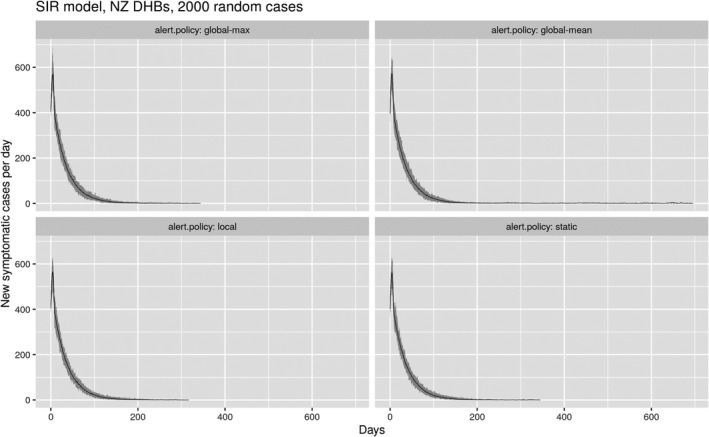
Figure 7 shows a time series of the outworking of different lockdown levels under different alert‐policy settings for the total population. These results are from SIR variant model runs in the New Zealand setting, initialized with 2,000 cases, simulated 30 times, with regionalization by DHBs (n = 20). Under a strict “static” policy, the whole population remains in level 4 lockdown until eradication, and this takes almost an entire year. The “global‐max” policy yields a similar result, so that even though the option to reduce lockdowns is in place in these model runs, positive testing rates did not indicate such changes were desirable. The “global‐mean” policy not only takes longer (sometimes much longer) to eradicate the epidemic, it also sees many changes in alert‐levels. By contrast, under the “local” policy, many people are able to move into lower lockdown levels relatively early and there is general progress toward widespread lowering of lockdown restrictions while retaining similar or better levels of control over the epidemic. The results in this figure and the next one are based on “realistic” alert‐level control settings [1, 0.72, 0.52, 0.32]. These settings are probably pessimistic relative to apparent outcomes in New Zealand, but may be more realistic in other contexts.
FIGURE 7.

Population counts in different lockdown levels over time, as a 2,000‐case outbreak is brought under control under different alert‐policy settings. The graphs show 30 different realizations, to show the degree of variation experienced from one run to the next with no parameter changes, due to stochastic variation
Figure 8 shows the temporal changes to the daily number of infections for the same set of runs shown in Figure 7, confirming that the “local” policy is similar in effectiveness to both the “static” and “global‐max” policies. Again, the results show 30 different realizations of the same settings, to avoid false results caused by minor stochastic variations. It is important here to note that none of the policies differ greatly in terms of control of the epidemic. The long‐duration tail on the “global‐mean” plot sees the number of new cases per day persist at levels as low as one or two cases, with no new major outbreak ever establishing across the 30 simulated runs.
FIGURE 8.
Time series of daily reported new infections for the same set of model runs shown in Figure 7. The mean result is shown by the thin black line, the variance by the shaded gray area
A possibly more useful summary of these results is seen in Figure 9, which compares times to eradication across the same 30 realizations under different alert‐policy settings and different regionalizations, either DHBs (n = 20) or TAs (n = 67). Based on these results, it is not possible to say anything with certainty about the relative effectiveness of managing lockdown at different regional scales. However, it is again clear that a policy based on regional control (“local”) can perform on a par with the more conservative strategies (“static” and “global‐max”), albeit perhaps with more variance, but also (as seen in Figure 7) while allowing more freedom of movement.
FIGURE 9.

Boxplots comparing times to eradicate a 2,000‐case COVID‐19 outbreak in the New Zealand context under a range of lockdown (alert‐level) policies across 30 different stochastic realizations of the SEIR model, and for two different regionalizations, by DHBs (n = 20) and TAs (n = 67)
It is important to be clear that the results of various experiments run to investigate trade‐offs between lockdown and epidemic control are highly complex and demand considerably more investigation. We consider the more optimistic alert‐levels‐control settings, specifically the other setting [1, 0.7, 0.4, 0.16] to probably be more representative of New Zealand’s lockdown regime. Using such settings, the differences in the success of different alert‐level policies are less marked, with even the “global‐mean” policy working relatively well. Of course, under those settings both levels 3 and 4 imply stringent controls on social interaction, and there is likely to be less scope for local departures from the general lockdown level across the system globally. Similar results were obtained by running similar experiments on the branching process variant of the model.
4.2. Modeling disease clusters
Since the branching version of the model represents individual cases rather than totals for the disease stage compartments they are in, we can explore the clusters that emerge as the virus moves through the population and from region to region.
Figure 10 shows disease clusters after 2 weeks of (ineffective) control at alert‐level 2 of an outbreak initialized with 100 cases. The left‐hand panel shows the clusters in their geographical context and emphasizes instances of inter‐regional transmission that have occurred. The right‐hand panel shows clusters detached from their geographical locations to emphasize the distribution of cluster sizes and structure.
FIGURE 10.

Clusters that form during an outbreak, viewed in two different ways in the model interface
The views shown in Figure 10 are experimental but provide insight into the details of disease transmission that the branching process model simulates. For a more complete picture of disease clusters, we can examine the logs the model produces, to extract cluster information and reorganize it into a graph. Figure 11 shows how a single‐origin case (1923) leads to a cluster of over 200 additional cases in one simulation using the TA regions. The color of each node indicates the region where a case resides, so this cluster starts in the blue region but spreads over time to four other regions: green, orange, purple, and red. The spatial interaction in the model leads to the disease bouncing back and forth between regions: note how the disease jumps to the green region and back to the blue region at a later time, and then back to green once again (cases 2,046, 3,024, and 5,571, for example).
FIGURE 11.

Graphing the paths of contagion by post‐processing log data into a D3.js radial tidy tree (https://observablehq.com/@d3/radial‐tidy‐tree). The graph shows the cluster originating from case number 1923, and how it jumps to new regions (see text for more details)
The ability to model the path of infection from any individual back to the initial infection helps us to understand the kinds of infection chains that form, and how different lockdown and suppression measures affect them.
This feature of the branching process variant of the epidemic model demonstrates the potential for more detailed simulation of contact tracing and isolation as methods of epidemic control. In the present models, the epidemic R parameter is directly modified whether system‐wide or locally as a proxy for a wide range of non‐medical interventions, such as restrictions on movement and large gatherings, working from home, school closures, masking, public education about handwashing and hygiene, and so on. Contact tracing as a public health measure has the potential to provide more targeted control that is less disruptive. With the branching process model explicitly generating an emergent sequence of connected cases, adding case progress status variables related to whether or not a case has been tested and isolated, and whether or not as‐yet‐undetected related cases have been detected, could be modeled and related to the effectiveness of the testing and contact‐tracing regime.
In the current branching process model we do this in a limited way, based on the time‐to‐detection model setting, which determines how long the delay is from infection to when a clinical case is isolated and its probability of causing subsequent exposures is reduced. We show the importance of this in the next section, but note that for now the model does not include more details of contact tracing. The current implementation thus crudely represents the effect that testing has on reducing R by slowing further spread from a known case, but does not include the possibility that a newly detected case might enable detection and isolation of previously unknown predecessor cases in disease clusters.
4.3. The impact of improved testing and contact tracing
As we have just noted, the branching process model crudely simulates the effects of contact tracing and case isolation. The graph in Figure 12 demonstrates the effect that the time‐to‐detection control has on reducing new outbreaks at various alert‐level settings. This control effectively allows detected cases to be isolated after a given time delay, so they cause no further infection. These results were obtained using the branching model with the optimistic setting for the alert‐levels‐control and, as above, they use 30 different simulations with the same parameter settings. We assume that there is capacity to perform contact tracing at the rate it is required by new cases being generated, but this too could be simulated with minor extensions. When the time to detection and isolation is low, simulated epidemics are more rapidly brought under control, signified by the rapid transition of the whole population to alert‐level 1 with very few recurrent outbreaks (top‐left panel). By contrast, in the top‐right and bottom‐right panels, with long detection delays, even in the best‐case scenarios it takes longer for the whole population to move into alert‐level 1, and there are numerous recurrent outbreaks, requiring frequent returns to higher alert‐levels. Even this simple example shows the importance of effective testing and contact tracing to any system of localized epidemic control.
FIGURE 12.

The effects of early testing and isolation on the effectiveness of different lockdown strategies, illustrated using 30 simulations of DHB‐level data using 300 cases and a variety of time‐to‐detection measures, from 0 to 10 days
4.4. Simulating an insecure border
The arrival of exogenous cases is problematic, and a challenge for many countries and regions. But it is likely a fact of life, so it must be modeled. Figure 13 shows a simulation of New Zealand DHBs beginning with only 100 cases, but with 5 new cases arriving at random locations in the model each day. Some of these new cases will likely infect others, leading to a simulation that never terminates but oscillates around a mean daily count of around 10 new infections into the future. Note that at this point even a strict static lockdown cannot clear the infection. The new‐exposures‐arriving control allows the number of new extraneous cases per day to form part of the simulation.
FIGURE 13.

Introducing even a small number of external cases per day will usually lead to an ongoing epidemic, with several new cases reported each day into the foreseeable future
5. CONCLUSIONS
We have developed two spatially explicit models for simulating and addressing the evolution of the COVID‐19 pandemic on a regional basis. Results show that the application of a regionally varying series of lockdown policies is likely to be just as effective at minimizing contagion, while offering advantages of less restrictive rules for part of the population.
Trading off some additional complexity in the mitigation for a more liberal lockdown may be important. Bear in mind that to clear a large number of infections (thousands or tens of thousands) requires considerable time; our models show at least 3–4 months being needed in a high‐lockdown state for scenarios with high case numbers (see Appendix, Section A.6) before it is safe to reduce the alert‐level and instead rely on contact tracing and isolation. This assumes that the lockdown strategy is adhered to for the duration. During this time, the population may suffer from loss of income, reduced access to healthcare and education, and the stresses of being apart from family and other social networks. All these have negative effects on wellbeing, even if we set aside all economic concerns.
At the time of writing, New Zealand sits on the cusp of an (initial) eradication of COVID‐19, with only 3 cases reported in the last 2 weeks. We do not yet know if a regional lockdown policy will be needed here, it may well be that the 8 weeks of progressive lockdown we have experienced will be sufficient, given that our case numbers have been small. If not, we may need to use this model in anger. Other places are not so fortunate, and have a pressing need now.
Our main findings are summarized as follows:
Explicitly spatial models are needed to address the complexities of managing the response to pandemics—they can offer similar performance in terms of case suppression, but with the potential for significantly less disruption to other important activities, as demonstrated in Section 4.
Our results confirm that eradicating the virus is challenging, and we see many simulations where persistent small outbreaks oscillate between regions for many months, potentially causing a lot of social and economic upheaval.
Results indicate that a regional approach could lead to less illness, because one can use a lower threshold to respond locally than makes sense globally. Although more research would be required to tune lockdown strategies to make such outcomes likely.
Using spatially explicit models of lockdown also facilitates the inclusion of other important geographical dimensions into models (see discussion in Section 5.2). We have shown how the connectivity between regions can be used to simulate likely spread of the disease and how this connectivity can be constrained to simulate various aspects of lockdown.
At lower lockdown levels, just a small number of regular external cases, say from international travel, can cause new clusters to form that need to be contained. Unless we operate regionally, the response to address this will mean imposing strict lockdown measures country‐wide, with associated negative impacts on social, economic, and medical systems. We believe this can be avoided.
Large metropolitan areas present a real challenge to manage, and are likely to experience the most disruption because they cannot easily be broken down into separately managed regions. In the New Zealand case the largest city, Auckland, with 1.5 million people, is problematic to resolve. The three DHBs that comprise Auckland effectively behave as one big region and trying to halt most travel between them would not be a realistic option.
5.1. Future work
Perhaps the most immediate need is for better configuration data for the COVID‐19 pandemic (e.g., Chen, 2020). There is still a good deal of uncertainty around the major epidemic parameters, hence they can be changed in our model as better estimates come to light. Despite these uncertainties, it is possible to still run simulations using a variety of model settings and then perform a sensitivity analysis on the results. Since all the intermediate steps in each experiment can be logged and then analyzed (we use R scripts for this), it is possible to study which results hold across a range of parameter settings and plan accordingly.
More data is urgently needed on inter‐regional movement to improve the accuracy of the model. Although we know in broad measure how personal movement has been curtailed by lockdown, we do not know important details regarding the shipping of goods and food around the country, and specifically how much interaction and related disease transmission this produces. Such data does not need to wait for the next epidemic before being gathered. We will need to modify our settings as more accurate estimates come to light. None of these parameters could have been known in advance, which is perhaps the main reason why modeling this pandemic is so difficult, although models such as these could inform planning, even without parameters tuned for a specific virus.
5.2. Extending the model into other geographic dimensions
Our models simulate the progression of COVID‐19 within New Zealand using a population of 5 million residents. However, our models do not fully represent the age–sex structure or composition of the population nationally or regionally, which would better reflect exposure, risk, and transmission patterns, particularly among at‐risk populations (James, Plank, et al., 2020; New Zealand Ministry of Health, 2020; Steyn et al., 2020; van Dorn, Cooney, & Sabin, 2020).
Within an SIR modeling framework, population structure and composition would involve the addition of more compartments, while the transition rates between I or R could be modified using accurate regional flow data. For example, Towers and Feng (2012) extended their SIR model with age heterogeneity and a contact matrix to explore the impact social distancing had on the occurrence of influenza among the elderly. Their results demonstrated that a reduction in grandparent/grandchild interactions can reduce influenza among the elderly by up to 60%. Sattenspiel and Dietz (1995) improve SIR models with regard to their ability to model population mobility, with modifications that simulate no mobility to complete, permanent migration between all regions. The variants of the SIR models mentioned above, such as those by Balcan et al. (2010) and Gatto et al. (2020), highlight more contemporary implementations that introduce the complex nature of sub‐national population structure and mobility.
Adding spatio‐demographic complexity to SIR models essentially increases the number of containers to compartmentalize the population. However, regardless of the complexities introduced, the model is dependent on an aggregation of the population, and the number of conventional assumptions remain (Getz et al., 2019; Huppert & Katriel, 2013), such as the independence of the transmission probabilities. The addition of complex population structure, or better representation of mobility at different levels of lockdown, is better suited to the stochastic branching process models, which have the potential to be extended to individual‐based models (Jacob, 2010).
ACKNOWLEDGMENTS
This article was fast‐tracked through the review and production process so that it might appear whilst it is still immediately relevant. For this we are very grateful to the anonymous reviewers, the TGIS editor—John Wilson, and the journal production staff at Wiley. The authors would like to acknowledge funding from the New Zealand Ministry of Business, Innovation and Employment (MBIE), grants UOAX1908 and UOAX1909 to support this research.
APPENDIX 1. MODEL IMPLEMENTATION DETAILS
A.1. About the NetLogo modeling environment
NetLogo is an ideal tool for the early stages of dynamic spatial models as it combines agent‐centered spatial primitives, a query language, and a built‐in visualization framework (Tisue & Wilensky, 2004; Wilensky, 1999). NetLogo is a superset of the well‐known “turtle graphics” of the Logo programming language, where instead of only one turtle a programmer may instruct many turtles to act and interact with one another (Resnick, 1994). Turtles are a key primitive of the language with spatial location, and with the capability to store and manipulate data, and also interact with one another, and with the environment. While NetLogo is a non‐mainstream programming language, it is fully featured and surprisingly powerful for small to medium‐scale models (see Railsback, Lytinen, & Jackson, 2006 for a comparison with other platforms). In particular, it provides native support for software agents, networks, and raster grids, all in an interface that makes building a user interface particularly easy. It is reminiscent in some ways of PCRaster (Karssenberg, Burrough, Sluiter, & de Jong, 2001), but with greater expressivity, and a multi‐paradigm approach that extends beyond spatial grids.
Also useful in the context of this work is that models can easily be shared in the browser through a HTML5/JS output, making sharing of models very straightforward. An indication of the power of the platform is provided by noting that the working code for each of the models described in this article is around 1,500 lines exclusive of the embedded datasets, with much of this codebase dedicated to model initialization and data maintenance rather than the core dynamic features model. The speed with which ideas can be prototyped in NetLogo is a major advantage. We discuss the limits of these models in terms of the size of the problem they can address in Section A.6.
A.2. Epidemic control parameters
Estimates of R 0 for COVID‐19 vary widely, from 2.2 to 5.7 (e.g., Imai et al., 2020; Sanche et al., 2020) and are highly dependent on the degree of social contact within the population. The baseline setting of R 0 (without any lockdown) in the SIR variant of the model is set using the R0 parameter (in the “Disease progression and mortality” part of the model interface shown in Figure 3). As the model progresses, at every timestep an estimate of the effective overall R of the model due to local variations arising from different levels of lockdown, or differences in the history of individual cases, is recalculated and reported. Lockdown strategies effectively reduce R 0. To be successful, they need to reduce R 0 to less than 1, and keep it there (Glass, Glass, Beyeler, & Min, 2006). Any lesser reduction leads to continuous uncontrolled outbreaks of illness and disruption.
The various epidemic results (exposed, pre‐symptomatic, infected, recovered, died) are shown in two graphs on the right of the dashboard, and summarized in the Epidemic results, also shown in Figure A1.
FIGURE A1.

A close‐up of the cumulative and daily plots of the disease variables, along with their numeric values (yellow boxes), produced during the burn‐in stage of an epidemic simulation (over 33 days). The Epidemic results and the Disease progression and mortality controls (green boxes) appear on the right (see text for more details)
The top graph shows current totals across all locales in the system of cases in each compartment or disease stage, while the bottom graph shows the daily counts. A log scale is used in the top graph, as the discrepancies in the parameters can be large when an outbreak is severe. The green boxes at far right control the Disease progression and mortality. Disease progression parameters correspond to model parameters discussed in Section 2, namely α exp‐to‐presymp , δ presymp‐to‐inf , γ inf‐to‐rec , and ε rel‐inf‐presymp (see Equations (1), (2), (3), (4), (5), (6), (7), (8), (9), (10), (11), (12), (13)). Additional parameters not discussed above relate to the per‐unit time rate at which cases may require hospitalization ( p‐hosp ), intensive care—ICU ( p‐icu ), and whether ICU is available ( icu‐cap (acity)). Two controls govern the probability of actual mortality, depending on whether ICU capacity has been exceeded or not ( cfr‐0 and cfr‐1 ). Thus the model can react to an overloading of ICU facilities, at which point the probability of a death outcome increases. These aspects of the model reflect similar implementation in the model from which ours is derived (see James, Hendy, et al., 2020), but are not emphasized in our discussion of results, so for brevity we do not discuss them further here.
In the branching process variant of the model, the parameters controlling the disease are simpler, including R‐clin —the R 0 value for clinical cases (set to R c = 3.0 in all cases) and p‐clinical —the proportion of cases that are clinical (i.e., serious). The latter has been set to 0.667 in all model runs reported here, and in combination with the reduction in infectivity to R sub = 0.5R c produces an overall R 0 = 0.667R c + (1 − 0.667)R sub = 2.5, aligned with the SIR variant of the model, and again following the New Zealand modeling by Plank et al. (2020) from which our model is derived. We also provide an R‐sd setting, which could be used to explore variation in individual case‐level infectiousness, but have not made use of this option in runs reported here. This points to the future possibility in the case‐based model of varying infectiousness cases based on a range of attributes specific to individual cases such as age, gender, ethnicity, occupation, and so on.
A.3. Initializing a dynamic infection model from data
An outbreak is a dynamic process, so modeling it requires careful initialization to ensure that all the relevant variables are configured reasonably. We can start the model using specific case numbers, but this is only part of the picture. Firstly, reported numbers are almost always a lower bound, rather than an accurate assessment, because testing has been slow to ramp up in almost every country. Secondly, asymptomatic cases are unlikely to be tested, yet they remain infectious. Thirdly, because of the longer incubation period with this virus, there may be many exposed cases that have yet to become symptomatic. The lockdown at level 4 in New Zealand has been widely successful at reducing infections, but when it was introduced on March 25th, there were only 205 reported cases. Yet this number rose to over 1,200 during the lockdown period, before the numbers dropped significantly. Combined with the lockdown, those unknown and pre‐symptomatic cases led to a period of about 9 days with essentially flat growth of around 500 cases per week: double the number of cases reported prior to lockdown, despite a large reduction in R (certainly R < 1 during level 4 of lockdown).
To ensure the model is sensitive to this issue, it should be initialized not only with the number of known cases, but also with an estimate of the number of pre‐symptomatic cases that we should reasonably expect with these known cases. Bear in mind that an unconstrained COVID‐19 epidemic will double the number of cases roughly every 2 days (so if we have 200 cases reported now, then we should expect 400 in the next 2 days). To get this right, in both variants of the model we perform a “burn‐in” phase, which essentially back‐casts from a small number of seed infections, moving forward in time until the requisite number of initial infections is reached. From there the user can begin to simulate how to manage the outbreak. The initialize‐by‐burn‐in control supports this option (and should usually be turned on). Models initialized in this way will typically show initial growth in cases after lockdown is imposed, followed by a sharp decline as the effect of lockdown control kicks in. During burn‐in the model sets alert‐level controls to their least restrictive (c = 1), and also sets the new‐exposures‐arriving to a daily rate of five new cases. These are assigned to a locale at random, weighted by local populations. In the New Zealand case this results in most new cases being assigned to Auckland or the other major centers, and as the burn‐in process proceeds these locations are more likely than remote locations to have a significant number of cases. In both model variants the burn‐in process should produce model initializations with plausible relative numbers of cases at various disease stages. In the branching process variant, it will also result in an initial distribution of plausible disease clusters.
Figure A1 shows initialization by burning in until the current number of infected cases passes 5,000 (with no disease management). Note that these cases are made up of total‐infected , total‐pre‐symptomatic , and total‐exposed . This initialization process will also typically lead to some cases having recovered and some deaths, because we simulate the outbreak from its origins to get to the point in the process where the desired number of cases are in progress. This burn‐in required 33 simulated days.
A.4. Setting up the geography
Our models can be used in one of two ways: to evaluate lockdown strategies in abstract, away from the specifics of an individual country, or to evaluate very specific lockdown plans, using actual places, population data, and connectivity between regions.
In the former case, randomly generated maps of countries and their population centers, along with gravity‐based connectivity between places, can be used to create a simulation landscape. The Region & population controls at top left in Figure 3 are used for this purpose.
Select setup‐method : Random landscape, choose the size of the population , the number of regions ( num‐locales ), and the standard deviation ( pop‐sd‐multiplier ) for distributing the population. When you press the blue setup button, the model then generates a landscape that meets your needs, such as the one shown in Figure A2. The population centers will have randomly assigned population counts, summing to your chosen population size, and will be connected via gravity‐based weights between these centers. This uses a connectivity matrix with an origin‐based gravity model using mass = population and straight‐line distance between the regions' centroids. A max‐connections‐dist control is included to allow weighted connections over a certain distance to be removed (useful if long‐distance travel has been suspended).
FIGURE A2.

A random landscape constructed with 30 population centers (white spheres) showing gravity‐based connectivity between neighbors (blue arrows—the thickness of the arrow denotes the weight of the connection)
There are several methods for quantifying the connectivity of these regions for the purposes of modeling. Since there is little information on how these regions are connected in terms of the flow of essential services under the higher lockdown conditions (levels 3 and 4), we began with a simple connectivity measure based on the road network linking the regions. We created a (cleaned‐up) version of the OpenStreetMap road network for New Zealand with a link added between Wellington (on the North Island) and Picton (on the South Island), and calculated the network distance pairs between the population‐weighted centroid of each region using the QGIS Network Analysis Toolbox 3 (QNEAT3). From this we derived a matrix of simple connectivity measures equal to the inverse distance on this network. This option is available by turning the gravity‐weight? option to off .
We did not include air travel links in the network, as nearly all domestic air travel was suspended within New Zealand under levels 3 and 4 of lockdown. However, this could simply be added back in by increasing the flow rates between cities with direct flight connections, by an amount equivalent to the additional movement of air passengers. A more comprehensive, and undoubtedly better, approach to this issue is provided by Balcan et al. (2010) and discussed in Section 2.3.
Additionally, there is a configuration option for the New Zealand DHB data that also loads in actual case data from April 15th, to allow experimentation with real case numbers. We also included a map of Costa Rica, along with population centers and data, since we had some early users from there. It is also possible to load in your own map, population, and connectivity data, as discussed in the following section.
A.5. Changing the underlying regions and associated population data
The geography and connectivity of the locales can be entered into the system by copying two space‐delimited text files into the Input Windows in the user interface. The first input window defines the point location of each locale along with other demographic attributes, such as population. The first line is a header line with each subsequent line indicating a different locale in the model. Five fields are currently used:
(1) ID—a unique integer identifier for the location;
(2) name—a string value representing the name of the locale, used for the label on the map;
(3) and (4) x and y values—indicating the point location of the locale (any coordinate system is allowed); and
(5) pop—an integer value indicating the population of the locale.
The second input window is used to enter the spatial connections between the locales as a table containing three columns (defined in the first‐line header): ID1, ID2, cost. The cost is a real number between 0 and 1, and the connectivity weight is measured in the model as 1/cost. The connectivity data is only necessary if the user wants to use a different formulation from the one provided by the population‐based gravity model.
A.6. Scaling the models
The desktop version of the NetLogo application can be downloaded from https://ccl.northwestern.edu/netlogo/download.shtml. Each of our models can also be downloaded via the Export: NetLogo button at top right of the web version. Once downloaded, a model will usually run faster and be able to tackle bigger numbers of cases when running locally.
Using a local version of the models, it is easy to edit the user interface parameters, change default settings, or expand the range of numbers that the controls will take. Simply right‐click on a control and choose the “edit” option. It takes a couple of minutes to adapt the SEIR model so that it can represent a population of 330 million with 1.4 million cases, for example (see Figure A3). The individual‐based model obviously requires a lot more memory and CPU cycles to run, so will not scale to millions of cases. Its default controls are set accordingly.
FIGURE A3.

A simulation of a country with 50 regions and a population of 328 million people, using the desktop version of the SEIR model with randomly generated geography. It reflects the mortality reported in the U.S. for March 31st (5,360), April 30th (63,000), and May 15th (84,000). It assumes a global lockdown strategy from April 1st with a modified R value of 0.625 (by experimentation, this is what seems to fit the data best). The lockdown is clearly effective but shows that about 40,000 people remain infected, pre‐symptomatic, or exposed. A major epidemic takes much longer to clear, 6 weeks is not enough
SIR models are very effective for large populations and for gaining rapid insight into the overall expected dynamics of an epidemic. They are less useful in the early and (hopefully) later stages of managing lockdown, when we wish to understand individual behavior, the formation and dynamics of disease clusters, or to extend simulation to include contact tracing. Also, the compartmentalization of SIR models can become problematic as we begin to add in places and other demographic characteristics such as age structure: it is easy to end up with very large numbers of model compartments and associated challenges in parameterizing rates of flow among them.
Conversely, branching models do not scale well to large numbers of cases, since the computational resources required scale linearly (or worse) in the number of cases, and once an epidemic is established, the growth in the number of cases itself may be exponential. Given the aggregated nature of compartment models, the scale of an outbreak makes little or no difference to the computational costs. Only modeling cases partly offsets this issue by modeling only the infected population, not the background from which they are drawn, but again, once epidemic growth is established, computational loads increase rapidly. In our implementation, the model running in the browser will scale to 1,000 or 2,000 individual cases, but not higher; the downloaded model will likely enable bigger simulations, depending on the memory configuration of the computer in use.
A.7. Calibrating the models
We have calibrated the epidemic aspects of the models using COVID‐19 data from New Zealand, the U.S., and the UK, and can match the trajectory of disease we see there with reasonable accuracy. From this experience we believe that the SIR model is most effective for larger outbreaks, but less so during the “mopping up” phase when the case numbers get small, where it appears to be a little too pessimistic in its predictions. Both models seem to work well at the beginning of an outbreak, and appear to match conditions on the ground if the “burn‐in” option is used.
It probably goes without saying, but configuring a model against published case data is likely to lead to an underestimate of severity in many countries, simply because testing is not well developed and widely available. This is especially true when configuring a model on data from early in the pandemic, when the reported case numbers are likely to significantly underestimate the extent of contagion. Bear in mind also that for a given number of clinical cases, there will be similar numbers of (currently hidden) pre‐symptomatic and exposed cases.
The two biggest unknowns (apart from the actual number of cases) are the effectiveness of lockdown strategies on reducing R 0 and the effect these strategies will have on reducing travel between regions. It is important to experiment with these parameters, and to use emerging data to revise estimates. The values we use for lockdown effectiveness were taken from the research done by Plank et al. (2020), and specifically tied to the New Zealand context. Even so, the modified R value for lockdown was found to be too pessimistic when compared with actual data, hence our modified values in the “other” alert‐levels‐control setting.
O'Sullivan D, Gahegan M, Exeter DJ, Adams B. Spatially explicit models for exploring COVID‐19 lockdown strategies. Transactions in GIS. 2020;24:967–1000. 10.1111/tgis.12660
ENDNOTES
The reader is encouraged to download one or other of the models and to experiment with them whilst reading the article.
CovidTrends application created by Aatish Bhatia in collaboration with Minute Physics. World data provided by Johns Hopkins University (updated daily around 00:00 UTC/20:00 ET). US state data provided by NYTimes (updated daily around 16:00 UTC/12:00 ET). Shortcuts: +/− for daily changes, space to play/pause. Credits and source: Stay safe!
While spatial aspects were our primary concern, epidemic models are complicated enough that we had to spend considerable time calibrating our models against the available data.
Accordingly, the models allow rates to be set for the testing of cases and of the background population. Furthermore, we must separately initialize each of these compartments when starting the model, a full description of which is given in the Appendix, Sections A.2 and A.3.
Incidentally, Japan is currently pursuing a spatially explicit strategy against COVID‐19, with the lockdown strategy being operated by prefecture.
New Zealanders were not allowed to fly, get KFC, or have haircuts during level 4!
This post‐lockdown effect has been referred to in some media coverage as FOGO or “fear of going out.”
REFERENCES
- Allen, L. J. S. (1994). Some discrete‐time SI, SIR, and SIS epidemic models. Mathematical Biosciences, 124, 83–105. [DOI] [PubMed] [Google Scholar]
- Allen, L. J. S. (2017). A primer on stochastic epidemic models: Formulation, numerical simulation, and analysis. Infectious Disease Modelling, 2, 128–142. [DOI] [PMC free article] [PubMed] [Google Scholar]
- Bailey, N. T. J. (1975). The mathematical theory of infectious diseases and its applications (2nd ed.). London, UK: Griffin. [Google Scholar]
- Balcan, D. , Gonçalves, B. , Hu, H. , Ramasco, J. J. , Colizza, V. , & Vespignani, A. (2010). Modeling the spatial spread of infectious diseases: The GLobal Epidemic and Mobility computational model. Journal of Computational Science, 1, 132–145. [DOI] [PMC free article] [PubMed] [Google Scholar]
- Bartlett, M. S. (1957). Measles periodicity and community size. Journal of the Royal Statistical Society. Series A (General), 120, 48–70. [Google Scholar]
- Bertuzzo, E. , Casagrandi, R. , Gatto, M. , Rodriguez‐Iturbe, I. , & Rinaldo, A. (2010). On spatially explicit models of cholera epidemics. Journal of the Royal Society Interface, 7, 321–333. [DOI] [PMC free article] [PubMed] [Google Scholar]
- Brown, G. D. , Porter, A. T. , Oleson, J. J. , & Hinman, J. A. (2018). Approximate Bayesian computation for spatial SEIR (S) epidemic models. Spatial & Spatio‐Temporal Epidemiology, 24, 27–37. [DOI] [PMC free article] [PubMed] [Google Scholar]
- Chen, J. (2020). Pathogenicity and transmissibility of 2019‐nCoV: A quick overview and comparison with other emerging viruses. Microbes & Infection, 22(2), 69–71. [DOI] [PMC free article] [PubMed] [Google Scholar]
- Chinazzi, M. , Davis, J. T. , Ajelli, M. , Gioannini, C. , Litvinova, M. , Merler, S. , … Vespignani, A . (2020). The effect of travel restrictions on the spread of the 2019 novel coronavirus (COVID‐19) outbreak. Science, 368, 395–400. [DOI] [PMC free article] [PubMed] [Google Scholar]
- Cliff, A. D. , Haggert, J. K. , & Versey, G. (1981). Spatial diffusion: An historical geography of epidemics in an island community. Cambridge, UK: Cambridge University Press. [Google Scholar]
- Dowd, J. B. , Andriano, L. , Brazel, D. M. , Rotondi, V. , Block, P. , Ding, X. , … Mills, M. C. (2020). Demographic science aids in understanding the spread and fatality rates of COVID‐19. Proceedings of the National Academy of Sciences of the USA, 117(18), 9696–9698. [DOI] [PMC free article] [PubMed] [Google Scholar]
- Farrington, C. P. , Kanaan, M. N. , & Gay, N. J. (2003). Branching process models for surveillance of infectious diseases controlled by mass vaccination. Biostatistics, 4, 279–295. [DOI] [PubMed] [Google Scholar]
- Gatto, M. , Bertuzzo, E. , Mari, L. , Miccoli, S. , Carraro, L. , Casagrandi, R. , & Rinaldo, A. (2020). Spread and dynamics of the COVID‐19 epidemic in Italy: Effects of emergency containment measures. Proceedings of the National Academy of Sciences of the USA, 117, 10484–10491. [DOI] [PMC free article] [PubMed] [Google Scholar]
- Getz, W. M. , Salter, R. , & Mgbara, W. (2019). Adequacy of SEIR models when epidemics have spatial structure: Ebola in Sierra Leone. Philosophical Transactions of the Royal Society B, 374, 20180282. [DOI] [PMC free article] [PubMed] [Google Scholar]
- Glass, R. J. , Glass, L. M. , Beyeler, W. E. , & Min, H. J. (2006). Targeted social distancing designs for pandemic influenza. Emerging Infectious Diseases, 12, 1671–1681. [DOI] [PMC free article] [PubMed] [Google Scholar]
- Gog, J. R. , Ballesteros, S. , Viboud, C. , Simonsen, L. , Bjornstad, O. N. , Shaman, J. , … Grenfell, B. T. (2014). Spatial transmission of 2009 pandemic influenza in the U.S. PLoS Computational Biology, 10, e1003635. [DOI] [PMC free article] [PubMed] [Google Scholar]
- Gould, P. (1993). The slow plague: A geography of the AIDS pandemic. Oxford, UK: Blackwell. [Google Scholar]
- Hagerstrand, T. (1953). Innovationsförloppet ur korologisk synpunkt. Lund, Sweden: Gleerup; (Translated by Pred, A. [1967]. Innovation diffusion as a spatial process. Chicago, IL: University of Chicago Press). [Google Scholar]
- Hunter, E. , MacNamee, B. , & Kelleher, J. (2018). An open‐data‐driven agent‐based model to simulate infectious disease outbreaks. PLoS ONE, 13(12), e0208775. [DOI] [PMC free article] [PubMed] [Google Scholar]
- Huppert, A. , & Katriel, G. (2013). Mathematical modelling and prediction in infectious disease epidemiology. Clinical Microbiology & Infection, 19, 999–1005. [DOI] [PubMed] [Google Scholar]
- Imai, N. , Cori, A. , Dorigatti, I. , Baguelin, M. , Donnelly, C. A. , Riley, S. , & Ferguson, N. M. (2020). Transmissibility of 2019‐nCoV (Imperial College London Working Paper). 10.25561/77148 [DOI]
- Jacob, C. (2010). Branching processes: Their role in epidemiology. International Journal of Environmental Research & Public Health, 7, 1186–1204. [DOI] [PMC free article] [PubMed] [Google Scholar]
- James, A. , Hendy, S. C. , Plank, M. J. , & Steyn, N. (2020). Suppression and mitigation strategies for control of COVID‐19 in New Zealand. Retrieved from http://medrxiv.org/lookup/doi/10.1101/2020.03.26.20044677
- James, A. , Plank, M. J. , Binny, R. A. , Hannah, K. , Hendy, S. C. , Lustig, A. , & Steyn, N. (2020). A structured model for COVID‐19 spread: Modelling age and healthcare inequities. Retrieved from https://www.tepunahamatatini.ac.nz/2020/05/15/a‐structured‐model‐for‐covid‐19‐spreadmodelling‐age‐and‐healthcare‐inequities/ [DOI] [PMC free article] [PubMed]
- Karssenberg, D. , Burrough, P. A. , Sluiter, R. , & de Jong, K. (2001). The PCRaster software and course materials for teaching numerical modelling in the environmental sciences. Transactions in GIS, 5(2), 99–110. [Google Scholar]
- Kermack, W. , & McKendrick, A. (1927). A contribution to the mathematical theory of epidemics. Proceedings of the Royal Society, London, 115, 700–721. [Google Scholar]
- Kermack, W. , & McKendrick, A. (1932). Contributions to the mathematical theory of epidemics: II—The problem of endemicity. Proceedings of the Royal Society of London, Series A, 138(834), 55–83. [Google Scholar]
- Kermack, W. , & McKendrick, A. (1933). Contributions to the mathematical theory of epidemics: III—Further studies of the problem of endemicity. Proceedings of the Royal Society of London, Series A, 141(843), 94–122. [Google Scholar]
- Kissler, S. M. , Gog, J. R. , Viboud, C. , Charu, V. , Bjørnstad, O. N. , Simonsen, L. , & Grenfell, B. T. (2019). Geographic transmission hubs of the 2009 influenza pandemic in the United States. Epidemics, 26, 86–94. [DOI] [PubMed] [Google Scholar]
- Klepac, P. , Kissler, S. , & Gog, J. (2018). Contagion! The BBC Four pandemic: The model behind the documentary. Epidemics, 24, 49–59. [DOI] [PubMed] [Google Scholar]
- Kraemer, M. U. G. , Yang, C.‐H. , Gutierrez, B. , Wu, C.‐H. , Klein, B. , Pigott, D. M. , … Scarpino, S. V. (2020). The effect of human mobility and control measures on the COVID‐19 epidemic in China. Science, 368, 493–497. [DOI] [PMC free article] [PubMed] [Google Scholar]
- Kupferschmidt, K. (2020). The lockdowns worked—But what comes next? Science, 368, 218–219. [DOI] [PubMed] [Google Scholar]
- Legrand, J. , Grais, R. F. , Boelle, P. Y. , Valleron, A. J. , & Flahault, A. (2007). Understanding the dynamics of Ebola epidemics. Epidemiology & Infection, 135, 610–621. [DOI] [PMC free article] [PubMed] [Google Scholar]
- Munshi, J. , Roy, I. , & Balasubramanian, G. (2020). Spatiotemporal dynamics in demography‐sensitive disease transmission: COVID‐19 spread in NY as a case study. Retrieved from, https://arxiv.org/ftp/arxiv/papers/2005/2005.01001.pdf
- New Zealand Ministry of Health . (2020). COVID‐19 advice for higher‐risk people. Retrieved from https://www.health.govt.nz/our‐work/diseases‐and‐conditions/covid‐19‐novel‐coronavirus/covid‐19‐information‐specific‐audiences/covid‐19‐advice‐higher‐risk‐people [Google Scholar]
- Plank, M. J. , Binny, R. N. , Hendy, S. C. , Lustig, A. , & James, A. (2020). A stochastic model for COVID‐19 spread and the effects of Alert Level 4 in Aotearoa New Zealand. Retrieved from https://cpb‐ap‐se2.wpmucdn.com/blogs.auckland.ac.nz/dist/d/75/files/2017/01/StochasticModel‐FINAL‐RELEASE.pdf
- Railsback, S. F. , Lytinen, S. L. , & Jackson, S. K. (2006). Agent‐based simulation platforms: Review and development recommendations. Simulation, 82, 609–623. [Google Scholar]
- Resnick, M. (1994). Turtles, termites, and traffic jams: Explorations in massively parallel microworlds. Cambridge, MA: MIT Press. [Google Scholar]
- Saito, M. M. , Imoto, S. , Yamaguchi, R. , Sato, H. , Nakada, H. , Kami, M. , … Higuchi, T. (2013). Extension and verification of the SEIR model on the 2009 influenza A (H1N1) pandemic in Japan. Mathematical Biosciences, 246(1), 47–54. [DOI] [PubMed] [Google Scholar]
- Sanche, S. , Lin, Y. T. , Xu, C. , Romero‐Severson, E. , Hengartner, N. , & Ke, R. (in press). High contagiousness and rapid spread of severe acute respiratory syndrome coronavirus 2. Emerging Infectious Diseases, 26(7). [DOI] [PMC free article] [PubMed] [Google Scholar]
- Sattenspiel, L. , & Dietz, K. (1995). A structured epidemic model incorporating geographic mobility among regions. Mathematical Biosciences, 128, 71–91. [DOI] [PubMed] [Google Scholar]
- Steyn, N. , Binny, R. A. , Hannah, K. , Hendy, S. C. , James, A. , Kukutai, T. , … Sporle, A. (2020). Estimated inequities in COVID‐19 infection fatality rates by ethnicity for Aotearoa New Zealand. Retrieved from https://www.tepunahamatatini.ac.nz/2020/04/17/estimated‐inequities‐in‐covid‐19‐infection‐fatality‐rates‐by‐ethnicity‐for‐aotearoa‐new‐zealand/ [PubMed] [Google Scholar]
- Tisue, S. , & Wilensky, U. (2004). NetLogo: A simple environment for modeling complexity. In Proceedings of the Fifth International Conference on Complex Systems, Boston, MA (pp. 16–21). Cambridge, MA: New England Complex Systems Institute. [Google Scholar]
- Towers, S. , & Feng, Z. (2012). Social contact patterns and control strategies for influenza in the elderly. Mathematical Biosciences, 240, 241–249. [DOI] [PubMed] [Google Scholar]
- van Dorn, A. , Cooney, R. E. , & Sabin, M. L. (2020). COVID‐19 exacerbating inequalities in the U.S. Lancet, 395(10232), 1243–1244. [DOI] [PMC free article] [PubMed] [Google Scholar]
- Wilensky, U. (1999). NetLogo. Evanston, IL: Center for Connected Learning and Computer‐Based Modeling, Northwestern University. Retrieved from http://ccl.northwestern.edu/netlogo/ [Google Scholar]
- Willem, L. , Verelst, F. , Bilcke, J. , Hens, N. , & Beutels, P. (2017). Lessons from a decade of individual‐based models for infectious disease transmission: A systematic review (2006–2015). BMC Infectious Diseases, 17, 612. [DOI] [PMC free article] [PubMed] [Google Scholar]