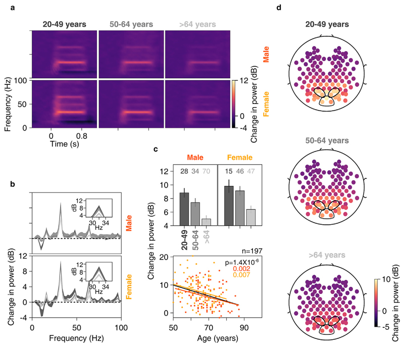
Fig. 8. Change in SSVEP power vs age for anterolateral group of electrodes.
Time-frequency change in power spectrograms (8a) and change in power spectra vs frequency (8b) for three age-groups separately for males (top row) and females (bottom row). Thickness of traces in 8b indicates SEM. Insets in 8b display zoomed-in images of respective main plots, showing clear SSVEP peaks at 32 Hz. c) Top row: bar plots showing mean change in SSVEP power for three age-groups separately for males and females; numbers of subjects in each age-group is indicated on top. Error bars indicate SEM. Bottom row: scatter plot for change in SSVEP power vs age for all elderly subjects (>49 years age-group, n = 197), plotted separately for males (in orange) and females (in yellow). Orange, yellow and black solid lines indicate regression fits for males, females and data pooled across gender respectively. p-values of the regression fits are indicated in respective colors. d) Scalp maps for 112 electrodes (disks) averaged across all subjects separately for three age-groups. Color indicates change in SSVEP power at 32 Hz for each electrode.

