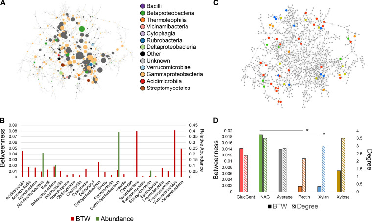
FIG 7.
Network analysis of metatranscriptomic data. (a) Gene coexpression network of metatranscriptomic data. Circles represent genes, and lines instances of high mutual information (Z-score above 13.35). Genes are sized by betweenness centrality, with a larger size indicating higher betweenness. Genes are colored by the class of the species expressing them (see inset). (b) Bar chart showing average betweenness (red bars, left y axis) and abundance (green bars, right y axis) for each taxonomic class in the network. Certain species could not be detected by 16S and have no abundance bar. (c) Network with genes colored by which functional module perturbation they are uniquely associated with (red, glucose with gentamicin; green, NAG; orange, pectin; blue, xylan; yellow, xylose). (d) Bar chart showing average betweenness (filled bars, left y axis) and degree (hashed bars, right y axis) for each set of genes uniquely associated with each perturbation. Gray bars represent the average betweenness or degree of all genes in the network. Asterisks indicate statistically significantly higher betweenness values determined by a Student t test (P > 0.03).

