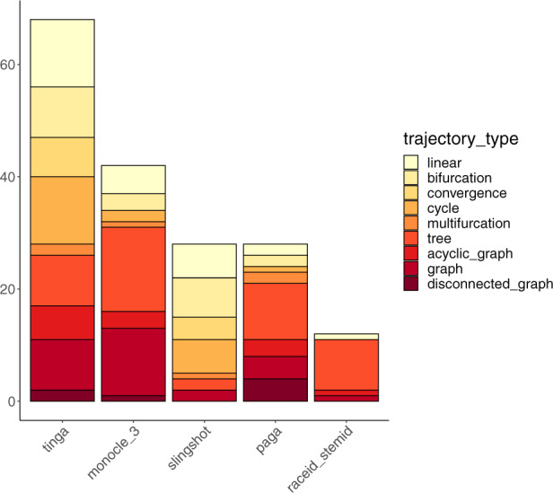
Fig. 7.

Methods on the x-axis are ordered by the number of datasets on which they outperformed the others. The y-axis represents the number of datasets on which each method had the best mean score across all methods. For each method, bars represent the different trajectory types for which the method performed best. These bars are ordered and coloured from most simple (in light yellow) to most complex trajectory type (in dark red)
