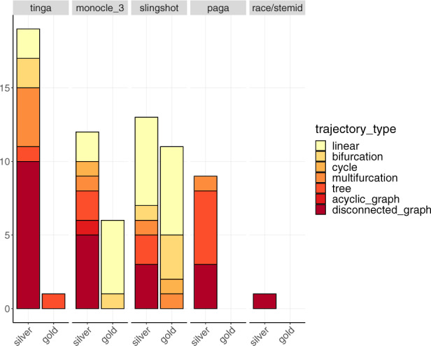
Fig. 9.

The results for the five methods are represented in separate plots along the x-axis. The y-axis represents the number of datasets on which each method had the best mean score on real datasets across all methods. These results are split into two bars, representing the results on real datasets with a silver and a gold standard separately. For each method, bars represent the different trajectory types for which the method performed best. These bars are ordered and coloured from most simple (in light yellow) to most complex trajectory type (in dark red)
