Abstract
On March 11, 2020, the World Health Organization declared COVID-19 as a pandemic. Since then, many countries have experienced the rapid transmission of this respiratory disease among their populations and have exercised many strategies to mitigate the spread of this disease. The prediction of the transmission dynamics serves important roles in designing mitigation strategies. However, due to the unknown characteristics of this disease, as well as the geographical and political factors, building efficient models of the dynamics for many countries is difficult. The objective of this study is to develop a transmission dynamics predictor that takes advantage of the time differences among many countries with respect to transmission of this disease, in that some countries experienced earlier outbreaks than others. The primary novelty of the proposed method is that, unlike many existing transmission predictors that require parameters based on prior knowledge of the epidemiology of past viruses, the proposed method only requires the transmission similarities between countries in the publicly available data for this current disease. In this paper, the viability and limitations of the proposed method are reported and discussed.
Keywords: COVID-19, Transmission dynamics, Neural network, Long short-term memory, Time series prediction, Topological representations
1. Introduction
At the end of 2019, China reported some cases of pneumonia of an unknown cause that rapidly became an outbreak [1]. On January 30, 2020, the World Health Organization (WHO) declared the outbreak as a public health emergency of international concern, and on February 11, 2020, the name for the coronavirus disease was announced as COVID-19. On March 11, COVID-19, the human respiratory disease caused by the new coronavirus, SARS-CoV-2, was declared as a pandemic by the WHO, with more than 100,000 cases in 114 countries as of that date. As of April 19, the completion date of this paper, there were more than 2.4 million cumulative cases in total.
As the possibility of a prolonged pandemic is imminent [2], it is urgent to understand the transmission dynamics of this disease for the prediction of future cases in various areas and, accordingly, the design of mitigation strategies.
Data from this outbreak have already been compiled and made available for research communities [[3], [4], [5]], which are rapidly studying various aspects of the transmission of this disease.
There are rich data collections for the study of the transmission of infectious diseases through populations. For example [6,7], and [8] are the seminal studies that have become the basis for the compartmental SIR model which is often used at the present time. The SIR model divides a population into three compartments, namely, susceptible (S), infected (I), recovered or removed (R), and expresses the dynamics of the compartments with a series of ordinary differential equations, in which the analytical solutions are explained in Ref. [9]. Modifications to the basic SIR model have also been presented, for example, the SEIR Model in which one additional compartment, namely, exposed (E), is added to the SIR model [[10], [11], [12], [13]].
In the wake of the current outbreak, some new models for transmission dynamics of this disease have been proposed [[14], [15], [16], [17]]. The analysis of the correlation between the effectiveness of government interventions and the transmission dynamics has also been provided [18].
Artificial intelligence communities have been starting to approach many aspects of the COVID-19 crisis, as effectively reviewed in Ref. [19]. The proposed work utilizes a new neural network for transmission dynamics mapping, and further uses it for predicting the future cases in many countries. The proposed method takes advantage of the time variance with respect to the occurrences of the outbreaks in different countries, in that some countries or territories observed earlier outbreaks than others. However, while the transmission dynamics of many countries may start at different times, they often share similarities. In this preliminary study, a recently proposed topological neural network, named the topological autoencoder (TA) [20], is utilized to map the transmission dynamics for more than 250 countries and territories. Given the time series of the confirmed cases in many countries as input, the TA produces a two-dimensional, and thus visible, map that projects the topological structures of those dynamics, in that similar dynamics are located adjacently, while dissimilar dynamics are separated by large spaces on the map. By setting a target country to be predicted, this map can then be used to locate a reference country with similar dynamics which started earlier, and can use the reference dynamics to train a neural network predictor, namely, long short-term memory (LSTM) [21,22], which is a deep recurrent neural network known to perform strongly with respect to modeling time series. Due to the lack of prior knowledge in the transmission dynamics for this disease and the relatively short period for the available time series data, predicting target dynamics using similar but longer dynamics can be efficient. The LSTM has also been applied in predicting the transmission dynamics of this disease in Ref. [23,24], although they differ significantly from the proposed work in that the LSTMs in the previous study were not utilized in a pairwise manner. In this paper, the efficiency and limitations of this pairwise prediction method are empirically evaluated.
The paper is structured as follows. Section 2 explains the mathematical concept of the topological autoencoder in the context of COVID-19 transmission dynamics data. Section 3 explains the experiments, in which the initial characteristics of the topological transmission dynamics maps are explained in detail, while in the latter part, the pairwise predictions are explained. The conclusions are presented in the final section.
2. Topological autoencoder
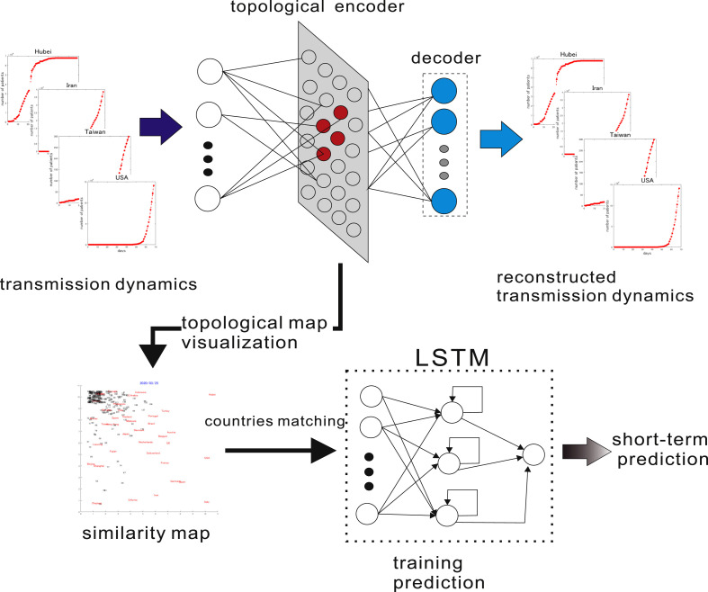
The outline of the topological autoencoder (TA) with the framework for short-term prediction of transmission dynamics is illustrated in Fig. 1 . The TA is a hierarchical neural network having a low-dimensional topological hidden layer that is a simplified version of the soft-supervised topological autoencoder (STA) proposed in Refs. [20], in which the basic mathematical properties were proposed in Ref. [25]. Originally, the STA can be trained in a supervised manner, an unsupervised manner or the mix of both, and produces a two-dimensional topological map that allows human users to visualize not only the structure of high-dimensional data but also their given concepts. The TA is a simplified version of the STA in that it is only trained as an autoencoder, which is a neural network that is trained to reproduce the given input in its output layer and thus encodes inherent structures of the inputs in its hidden layer. The TA here is different from the conventional autoencoder in that it has a two-dimensional topological layer than can be visibly observed by a human user.
Fig. 1.
Topological autoencoder and the framework for short-term prediction The TA is trained using transmission dynamics of more than 250 countries. During the learning process, a low-dimensional topological representation is organized in the hidden layer of the STA, resulting in a displayable similarity map. Given a target country, a country with similar but longer dynamics is chosen to be used to train an LSTM. The LSTM is then utilized for short-term prediction for the target country.
Here, the inputs to the TA are the transmission dynamics of COVID-19 for more than 250 countries or territories that are characterized by their daily numbers of confirmed cases as compiled by the Center for Systems Science and Engineering (CSSE) at Johns Hopkins University [5] and are made available in a GitHub repository [4].
The hidden layer of the TA is a two-dimensional topological map similar to Kohonen's self-organizing maps (SOM) [26,27], where hidden neurons are arranged in a two-dimensional grid, and each neuron is associated with a reference vector that has the same dimensionality as the input. The TA is then trained to reproduce the given input in its output layer, and hence is expected to extract the inherent structure of the inputs in its hidden layer. Since the hidden layer is a two-dimensional grid, the extracted structure of the inputs can be visualized. Through this visualization, human users can gain intuitive insights regarding the similarities and dissimilarities among many countries' transmission dynamics.
The mathematical explanations for the TA's learning mechanism are as follows.
Here, the transmission dynamics for country k, characterized by the daily confirmed cases in that country, recorded from January 22, 2020 for d days, are denoted by . Observing as an input at time t, the TA selects the best matching unit, , among all of the reference vectors associated with the hidden units of the TA as in Eq. (1), where is the reference vector associated with the j-th hidden unit at time t. Here, becomes the internal representation for the input at time t.
The output of the j-th hidden neuron, at time t, is shown in Eq. (2), where is the neighborhood function defined in Eq. (3). Here, are the initial and the final values of the annealing term, is the termination time, while σ is an empirically defined constant.
| (1) |
| (2) |
| (3) |
| (4) |
In Eq. (4), is the coordinate of the j-th neuron in the two-dimensional hidden layer.
This neighborhood function ensures locality in the activation of hidden neurons in that the winning neuron generates the maximum output, while the outputs of other neurons are exponentially decreased along with their distance to the winning neuron on the two-dimensional grid of the hidden layer.
The values of the l-th output neuron, , are defined in Eq. (5), where .
Here, denotes the weight vector leading from the hidden layer to the l-th output neuron, and is the hidden layer output vector, in which is the number of hidden neurons, and T indicates transposition.
Because the objective of the TA is to reconstruct the input in the output layer, the loss function for this neural network can be defined as in Eq. (5).
| (5) |
Here, is the l-th component of the input .
The TA is then trained to minimize the loss function with the standard stochastic gradient descent by modifying the weight vectors and the reference vectors.
The connection weights leading to the l-th output neuron are modified as follows.
| (6) |
| (7) |
| (8) |
Similarly, the modification of the j-th reference vector is modified as follows.
| (9) |
| (10) |
| (11) |
.In Eq. (6) and Eq. (9), is an empirically set learning rate, while in Eq. (11) is the j-th component of weight vector connecting the l-th neuron to the hidden layer.
The elaborations for the loss function derivations and the difference in reference vector modifications with respect to SOM are explained in detail in Ref. [20,25,28].
2.1. Experiments
In the first half of this section, the characteristics of the topological maps produced by the TA are explained, while in the later part, the utilization of these maps to run pairwise prediction, the evaluation and the limitations of the proposed pairwise prediction are explained.
2.2. Topological maps for COVID-19 transmission
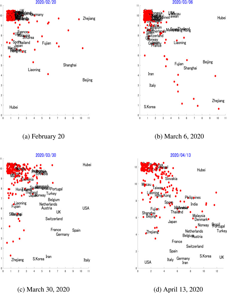
Fig. 2 shows the topological maps for transmission dynamics for more than 250 countries or regions on February 20, 2020, March 6, 2020, March 30, 2020, and on April 13, 2020. It can be determined that the appearances of the maps change over time, in that on February 20 only a few countries or regions observed the transmission of this disease in their populations, while almost two months later, on April 13, most countries or regions had developed their unique transmission dynamics. The TA produces topological maps that project similar dynamics into adjacent regions on the map, while separating dissimilar dynamics. Hence, given a target country to be predicted, some countries that have similar dynamics can be selected for pairwise-prediction, which will be explained in the next subsection of this paper.
Fig. 2.
Topological transmission dynamics mapThese figures show the topological transmission dynamics maps using the time series of the number of cases in over 250 countries or regions collected from Jan 22, 2020, until the specified date on each map. These maps show the development of the similarities of the transmission dynamics between countries or regions over the period from February 20 to April 13, 2020.
It must be noted that the topological maps here are produced during the learning process of the TA, in which the transmission dynamics of each country or region are treated as high-dimensional vectors, and thus the TA reduces their dimensions in its two-dimensional topological hidden layer. Here, the TA executes a nonlinear dimensionality-reduction process that, unlike the conventional principal component analysis (PCA), where the reduced dimensions are the linear combinations of the original ones, the dimensions cannot be easily interpreted. Hence, no unit is assigned to the axes in the map, which is common to nonlinear dimensionality reduction methods such as kernel PCA [29], Isomap [30], stochastic neighborhood embedding (SNE) [31] and its variant t-SNE [32], and the recently proposed UMAP [33].
The topological maps in Fig. 2a show the transmission dynamics up until February 20, 2020, the early stage when very few COVID-19 cases were detected outside China. From this map, it can be observed that many countries or regions occupied the upper left area on the map. The overlapping was due to their dynamics, in that most of them had identified zero or very few cases at the time. At this time, Hubei, the epicenter for the outbreak, was already an outlier on the map, as the number of cases in Hubei was of a different magnitude compared to other areas. It can also be observed here that the USA, France, South Korea, and many Asian countries or regions such as Malaysia, South Korea, Singapore, Thailand, Taiwan and Hong Kong were adjacently positioned due to their similar dynamics, while many of China's provinces such as Zhejiang, Shanghai, Liaoning and, naturally, Hubei, were outliers due to their early outbreaks. From Fig. 2b, it can be observed that the upper left area of the map was still crowded, but many countries can be seen to escape from this overlapping area. This is because those countries or regions were beginning to develop different transmission dynamics. It is notable that Italy and Iran moved considerably from the crowded cluster due to the beginning of their outbreaks, while the USA still shared the space, and thus exhibits similar dynamics with Macau and Taiwan. The topological map in 2c shows the map until March 30, when there were already massive outbreaks in the USA and Italy that were directly reflected by their positions on the map. As of April 13, the world has observed more than 2 million confirmed cases, with the USA becoming the center of these outbreaks. The map shown in Fig. 2d has developed a new structure, on which the USA and many European countries with the largest numbers of cases are clustered within the left bottom area on the map, while Hubei, the initial epicenter which has since flattened the dynamics, occupies the top right corner by itself, due to the lack of other similar dynamics.
Detailed explanations of the topological characteristics of the map are given as follows, with the objective of elaborating the connections between countries’ dynamics with their representations on the map. The explanations are given for the March 30 map.
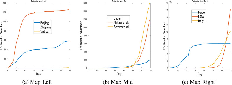
Fig. 3 shows the actual transmission dynamics until March 30 for some countries or regions that were grouped based on the regions they occupied on the map in Fig. 2c. From the left area, as shown in Fig. 3a, Beijing, Zhejiang and Vatican City exhibited dissimilar dynamics that were reflected by their large distances on the map. Beijing and Zhejiang have both contained the outbreaks but had different dynamics and cumulative patient numbers, while Vatican City had very few patients. In the middle of the map, Japan, the Netherlands and Switzerland can each be observed with considerably different dynamics, as shown in Fig. 3b. From the right side of the map, Hubei, the USA and Italy are shown in Fig. 3c. It is obvious that Hubei had stabilized, while patient numbers were growing steeply in the USA and Italy.
Fig. 3.
Transmission dynamics: March 30These figures show the time series of the number of cases for some countries or regions until March 30. It can be observed that countries or regions that are positioned adjacently on the map share similar dynamics, while dissimilar dynamics are associated with large distances on the map.
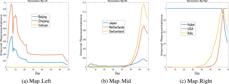
Fig. 4 shows the relation between the transmission dynamics and their representation on the map. Here, the representation of the particular dynamics of a particular country or region is the reference vector for the winning neurons for that country. Fig. 4a shows the representations for the dynamics of Beijing, Zhejiang and Vatican City, Fig. 4b shows the representations for Japan, the Netherlands and Switzerland, while Fig. 4c shows those of Hubei, the USA and Italy. It is important to notice here that different dynamics are represented with different representations, and the similarity and dissimilarity of the dynamics are reflected in the positions of the representations on the map.
Fig. 4.
Internal Representations: March 30These figures show the representations of the transmission dynamics in Fig. 3. It can be observed here that similar dynamics are represented similarly, while dissimilar dynamics are represented differently.
To further explain the internal representation characteristics, the dynamics of South Korea and the UK are shown in Fig. 5 b. These two countries are deliberately chosen because of their contrasting transmission dynamics, which are reflected by their largest distance on the map. South Korea is known for success in containing the spread of this disease after an early outbreak, while the UK was still struggling on March 30. Their internal representations are shown in Fig. 5b, which clearly shows the difference between these two countries.
Fig. 5.
S. Korea vs. UK: March 30These figures show the contrasting transmission dynamics and their representations for South Korea and the UK up until March 30. It is obvious that the differences between the dynamics are directly represented in the representations.
In contrast, Fig. 6 a shows the similar dynamics for Belgium and the Netherlands that were naturally placed adjacently on the map in Fig. 2c. The similarity in the transmissions dynamics was reflected in the similar representations in Fig. 6b, as well as their positions on the map.
Fig. 6.
Belgium vs. the Netherlands: March 30These figures further emphasize the strong relation between the shapes of the dynamics and their representations. Here, the similarities between Belgium and the Netherlands dynamics are directly reflected by the similarity of their representations.
Through these preliminary examples, it can be empirically shown that the hidden representation of the TA is able to capture the topological relations in different dynamics, and thus can be utilized for selecting a pair of countries with similar dynamics to be used as in the pairwise prediction mechanism.
2.3. Short-term pairwise prediction
In this part of the paper, the pairwise prediction based on the dynamics similarity on the map is explained. Here, because of the relatively short length in time series, only short time prediction for three days is explained. However, since the data are updated daily, the extension of the prediction period can be performed without changing the proposed method.
For the short time prediction, daily numbers of confirmed cases in approximately 250 countries or regions from January 22 until April 15 are utilized. Here, the time series of confirmed cases until April 12 were utilized to build a predictor, while the data for the remaining three days were used for testing the predictor.
In this method, given a target country to be predicted, a reference country, which is another country with similar dynamics but longer time series, must be chosen by visually observing the transmission dynamics map generated by TA, as follows.
Here, let be the transmission dynamics of a target country, where is the time when the target country exceeded a specified number of cases, . is then a truncated , starting at and terminating on April 12, the end of the time series. Setting the value for and finding , is the truncated time series of country j that reached the earlier than the target country. starts from and is arranged to have the same length as . Using the collections of the truncated transmission dynamics of some countries that are ahead of the target countries with respect to reaching a certain number of cases, a new topological map can be generated. Similarly to the previous map, this map also reflects the topological structure of the truncated time series, only this time, the maps are limited to the target country and the countries that were ahead of it.
By visually observing the generated map, a reference country can be manually chosen. The dynamics of the reference country, starting from until April 12, are then used to train a deep recurrent neural network, long short-term memory (LSTM) [21,22], to build a short time predictor for the target country. If a number of candidates for a reference country were found, the one that started the earliest, and thus had the longest time series, was chosen. The reference country is ensured to have a longer time series than the target country, since the dynamics began earlier, but ended on the same day, April 12, as those of the target country. The idea here is to run a pairwise prediction, using similar but longer dynamics, to predict a shorter time series. In the COVID-19 crisis, this idea can be useful since past dynamics to train a predictor may not be available, and many countries still have a relatively short time series containing nonzero components.
Some of the experiments for 3 days of predictions are as follows.
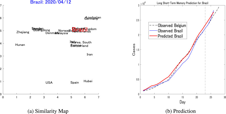
In the first prediction, Brazil is the target country. Brazil recorded its first few cases on February 26, and as of April 15 had recorded 28,320 cases. As the dynamics of this country are relatively long, and the patient number is relatively large, a was set to search for similar dynamics. The TA-generated map of dynamics is shown in Fig. 7 a, from which Belgium is hand-chosen as a reference country. While Brazil exceeded 1000 cases on March 21, Belgium exceeded that threshold on March 16 and was thus 5 days ahead of Brazil. Fig. 7b shows the prediction graph, in which the horizontal axis shows the number of days since the two countries exceeded the threshold. The prediction error, defined in Eq. (12), is calculated for the three days from April 13–15, as shown on the right-hand side of the vertical dotted line.
| (12) |
Fig. 7.
Pairwise prediction: Brazil-Belgium(a) Shows the similarity map considering the dynamics of Brazil (threshold = 1000, up to April 12) as the target, while Belgium is one of the nearest neighbors that is chosen to be the reference for the LSTM's pairwise prediction. (b) Shows the short-term pairwise prediction between Brazil and Belgium.
In Eq. (12), denotes the prediction for the target country at time t.
The prediction error for Brazil was . This prediction was then compared against a different LSTM that was trained only on the target country dynamics up to April 12 and was then used to predict the next three days, for which the prediction error was .
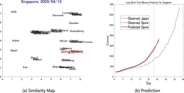
The second target country was Singapore. For this country, a was set and resulted in a similarity map as shown in Fig. 8 a. The reference country chosen for Singapore was Japan. While Singapore reached the threshold on March 21, Japan reached this point on March 6. The prediction was depicted in Fig. 8b and resulted in a prediction error of , which is significantly superior compared to the LSTM trained only on Singapore dynamics that generated a prediction error.
Fig. 8.
Pairwise prediction: Singapore-Japan(a) Shows the similarity map considering the dynamics of Singapore (threshold = 400, up to April 12) as the target, while Japan is one of the nearest neighbors and is chosen to be the reference for the LSTM's pairwise prediction. (b) Shows the short-term pairwise prediction between Singapore and Japan.
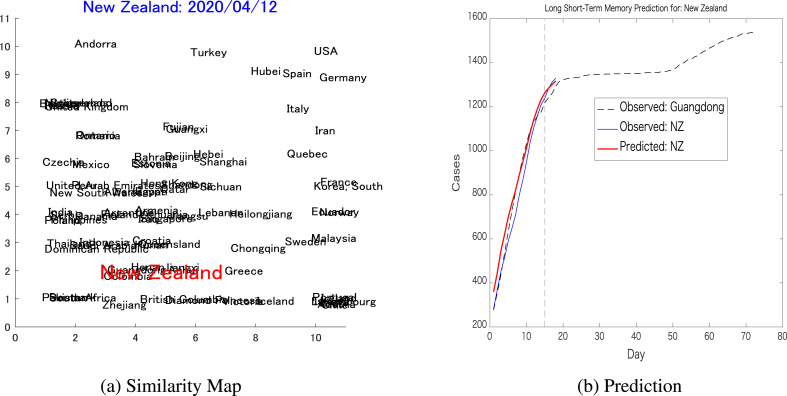
The next prediction was for New Zealand, in which a was set and resulted in a similarity map as shown in Fig. 9 a, from which Guangdong was chosen as a reference. New Zealand reached the threshold on March 27, while Guangdong reached it on January 30, almost two months ahead. The pairwise prediction for New Zealand resulted in prediction error, while the LSTM trained only on New Zealand dynamics generated a prediction error.
Fig. 9.
Pairwise prediction: New Zealand-Guangdong(a) Shows the similarity map considering the dynamics of New Zealand (threshold = 300, up to April 12) as the target, while Guangdong is one of the nearest neighbors that is chosen to be part of the pair for the LSTM's pairwise prediction. (b) Shows the short-term pairwise prediction between New Zealand and Guangdong.
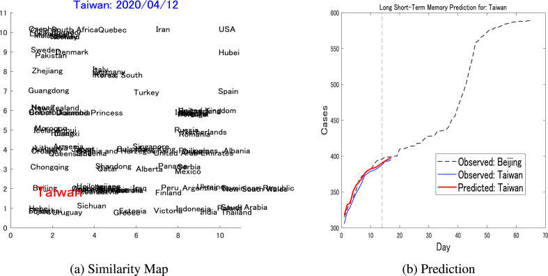
The final prediction is for Taiwan, which is known to successfully mitigate the spread of the disease before the outbreak. Setting a resulted in a similarity map in Fig. 10 a, which paired Taiwan with Beijing. Taiwan reached the threshold on March 30, while Beijing reached the same threshold on February 8. The pairwise prediction is depicted in Fig. 10b, which generates a result of compared against the LSTM trained only on Taiwan's dynamics, which generated a prediction error of .
Fig. 10.
Pairwise prediction: Taiwan-Beijinga) Shows the similarity map considering the dynamics of Taiwan (threshold = 300, up to April 12) as the target, where Beijing is one of the nearest neighbors and is chosen to be the reference for the LSTM's pairwise prediction. (b) Shows the short-term pairwise prediction between Taiwan and Beijing.
Some experiments in many areas of the world with various geographical, political and environmental factors empirically indicate the validity of the pairwise prediction mechanism. In the absence of any prior knowledge of the transmission dynamics that can be influenced by many factors, utilizing similar dynamics of other countries is one reasonable approach.
2.4. Limitations
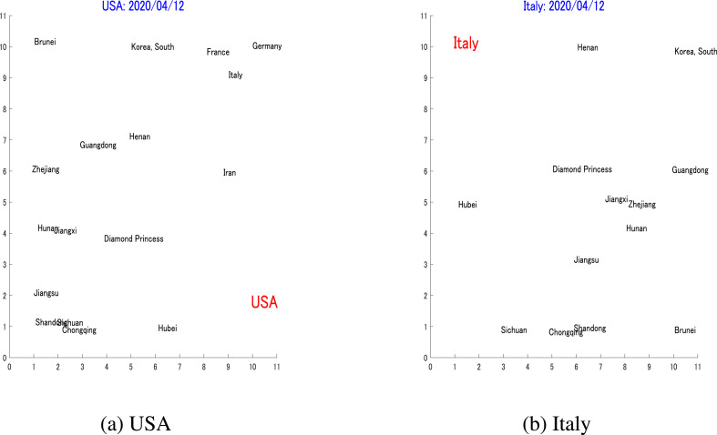
As the proposed pairwise prediction depends on the similarity between a target country's dynamics and those of its reference countries, naturally it is possible that a suitable reference for a target area cannot be found. For example, Hubei, which experienced the first outbreak, did not have any counterpart, as there was no geographical location that preceded it with a certain number of cases. Some other countries did not have any counterparts due to their unique dynamics, for example the USA and Italy. The similarity maps, both with , are shown in Fig. 11 , in which it is obvious that the two countries do not have any pair that can be used to predict their future dynamics.
Fig. 11.
LimitationsThese two maps illustrate the limitation for the proposed pairwise prediction. It is obvious from (a) and (b) that as of April 12, the USA and Italy developed unique dynamics that have no neighbors on the map, and no reference was found for their pairwise predictions.
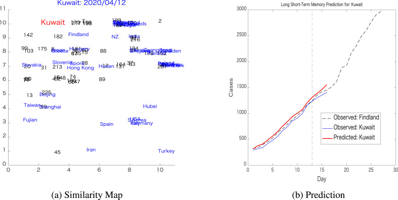
The next example shows a target country that has a reference located relatively far from it. The target country in this example was Kuwait, and the reference country is Finland, whose relative positions can be observed in Fig. 12 a, while the prediction was depicted in Fig. 12b. Here, the pairwise prediction error was , while the LSTM trained on Kuwait's dynamics generates a prediction error of . It can be observed here that the pairwise prediction error of these two relatively distant countries is significantly worse compared to the previous cases when close pairs of the target countries were found.
Fig. 12.
Pairwise prediction: Kuwait-FinlandThese figures further illustrate the limitation of the proposed pairwise prediction by showing that choosing a distant country on the map for reference results in large prediction error, as is the case for Kuwait-Finland pairwise prediction.
It should also be mentioned that the value of for a country x that is required for searching a reference country must be empirically decided, since it depends on the shape and length of its transmission dynamics. However, as a rule of thumb, the threshold is set to be - from the number of cases on the last day of the time series to be used for training the LSTM.
3. Conclusion
In this paper, a recently proposed topological neural network is utilized for generating a transmission dynamics map on which similarities and dissimilarities of the dynamics among many countries can be visually observed. For this preliminary study, the reference country is manually chosen, although automatic selection of the references country can easily be executed. After finding the pair, the longer dynamics of the reference country can then be used to train a neural network predictor, namely, LSTM. The primary novelty of the proposed pairwise prediction method is in its simplicity, in that if a target country follows the transmission dynamics of a reference country that generated its dynamics earlier and thus included a longer time series, then it is reasonable to expect the target country to follow the dynamics further, at least during the short-term. In the absence of other information, such as epidemiological prior knowledge, geographical and demographical characteristics and governmental intervention information, the proposed method for pairwise prediction can be one of the reasonable choices to predict further transmission dynamics in many countries. This approach will be potentially better in the future, especially as of the time this paper is completed; many countries and territories have started to stabilize their dynamics, and thus can potentially provide strong references for many countries that have yet to contain the spread of this disease.
The efficiency and the limitations of the proposed method are discussed in this paper. In this preliminary study, only three days of predictions were evaluated, but with the increase of the time series over time, longer predictions can be accomplished without any change in the proposed method. Continuous prediction is also made possible by repeating the map generation and LSTM training every few days.
Declaration of competing interest
None declared under financial, general, and institutional competing interests.
Footnotes
Supplementary data to this article can be found online at https://doi.org/10.1016/j.imu.2020.100386.
Appendix A. Supplementary data
The following is the Supplementary data to this article:
References
- 1.Tian J.-H., Pei Y.-Y., Yuan M.-L. A new coronavirus associated with human respiratory disease in China. Nature. 2020;579:265–269. doi: 10.1038/s41586-020-2008-3. [DOI] [PMC free article] [PubMed] [Google Scholar]
- 2.Kissler S.M., Tedijanto C., Goldstein E., Grad Y.H., Lipsitch M. Projecting the transmission dynamics of sars-cov-2 through the postpandemic period. Science. 2020;368(6493):860–868. doi: 10.1126/science.abb5793. [DOI] [PMC free article] [PubMed] [Google Scholar]
- 3.Xu B., Gutierrez B., Mekaru S. Epidemiological data from the covid-19 outbreak, real-time case information. Scientific Data. 2020;7(106) doi: 10.1038/s41597-020-0448-0. [DOI] [PMC free article] [PubMed] [Google Scholar]
- 4.‘‘2019 novel coronavirus covid-19 (2019-ncov) data repository by johns hopkins csse. 2020. https://github.com/CSSEGISandData/COVID-19
- 5.Dong E., Du H., Gardner L. An interactive web-based dashboard to track covid-19 in real time. Lancet Infect Dis. 2020;20(5):533–534. doi: 10.1016/S1473-3099(20)30120-1. [DOI] [PMC free article] [PubMed] [Google Scholar]
- 6.Kermack W.O., McKendrick A.G., Walker G.T. A contribution to the mathematical theory of epidemics. Proc R Soc Lond - Ser A Contain Pap a Math Phys Character. 1927;115(772):700–721. [Google Scholar]
- 7.Kermack W.O., McKendrick A.G. Contributions to the mathematical theory of epidemics ii. the problem of endemicity. Bull Math Biol. Mar 1991;53:57–87. doi: 10.1007/BF02464424. [DOI] [PubMed] [Google Scholar]
- 8.Kermack W.O., McKendrick A.G. Contributions to the mathematical theory of epidemics iii. further studies of the problem of endemicity. Bull Math Biol. Mar 1991;53:89–118. doi: 10.1007/BF02464425. [DOI] [PubMed] [Google Scholar]
- 9.Harko T., Lobo F.S., Mak M. Exact analytical solutions of the susceptible-infected-recovered (sir) epidemic model and of the sir model with equal death and birth rates. Appl Math Comput. 2014;236:184–194. [Google Scholar]
- 10.Fang Haiping, Chen Jixiu, Hu Jun. 2005 IEEE engineering in medicine and biology 27th annual conference. 2005. Modelling the sars epidemic by a lattice-based monte-carlo simulation; pp. 7470–7473. [DOI] [PubMed] [Google Scholar]
- 11.Saito M.M., Imoto S., Yamaguchi R., Sato H., Nakada H., Kami M., Miyano S., Higuchi T. Extension and verification of the seir model on the 2009 influenza a (h1n1) pandemic in Japan. Math Biosci. 2013;246(1):47–54. doi: 10.1016/j.mbs.2013.08.009. [DOI] [PubMed] [Google Scholar]
- 12.Smirnova A., deCamp L., Chowell G. Forecasting epidemics through nonparametric estimation of time-dependent transmission rates using the seir model. Bull Math Biol. Nov 2019;81:4343–4365. doi: 10.1007/s11538-017-0284-3. [DOI] [PubMed] [Google Scholar]
- 13.Yang Z., Zeng Z., Wang K., Wong S.-S. Modified seir and ai prediction of the epidemics trend of covid-19 in China under public health interventions. J Thorac Dis. 2020;12(3) doi: 10.21037/jtd.2020.02.64. [DOI] [PMC free article] [PubMed] [Google Scholar]
- 14.Giordano G., Blanchini F., Bruno R., Colaneri P., Di Filippo A., Di Matteo A. Modelling the covid-19 epidemic and implementation of population-wide interventions in Italy. Nat Med. Apr 2020;26:855–860. doi: 10.1038/s41591-020-0883-7. [DOI] [PMC free article] [PubMed] [Google Scholar]
- 15.Kucharski A.J., Russell T.W., Diamond C. Early dynamics of transmission and control of covid-19: a mathematical modelling study. Lancet Infect Dis. 2020/04/18;20(5):553–558. doi: 10.1016/S1473-3099(20)30144-4. [DOI] [PMC free article] [PubMed] [Google Scholar]
- 16.Perc M., Gorišek Miksić N., Slavinec M., Stožer A. Forecasting covid-19. Frontiers in Physics. 2020;8:127. [Google Scholar]
- 17.Zhang J., Litvinova M., Wang W., Wang Y., Deng X. Evolving epidemiology and transmission dynamics of coronavirus disease 2019 outside hubei province, China: a descriptive and modelling study. Lancet Infect Dis. 2020;20(7):793–802. doi: 10.1016/S1473-3099(20)30230-9. [DOI] [PMC free article] [PubMed] [Google Scholar]
- 18.Y. Fang, Y. Nie, and M. Penny, ‘‘Transmission dynamics of the covid-19 outbreak and effectiveness of government interventions: a data-driven analysis,’’ J Med Virol, vol. 92, no. 6, pp. 645–659. [DOI] [PMC free article] [PubMed]
- 19.Bullock J., Alexandra Luccioni, Pham K.H., Lam C.S.N., Luengo-Oroz M. 2020. Mapping the landscape of artificial intelligence applications against covid-19. [Google Scholar]
- 20.Hartono P. Mixing autoencoder with classifier: conceptual data visualization. IEEE Access. 2020;8:105301–105310. [Google Scholar]
- 21.Hochreiter S., Schmidhuber J. Long short-term memory. Neural Comput. 1997;9(8):1735–1780. doi: 10.1162/neco.1997.9.8.1735. [DOI] [PubMed] [Google Scholar]
- 22.Sherstinsky A. Fundamentals of recurrent neural network (rnn) and long short-term memory (lstm) network. Phys Nonlinear Phenom. 2020;404:132306. [Google Scholar]
- 23.Tomar A., Gupta N. Prediction for the spread of covid-19 in India and effectiveness of preventive measures. Sci Total Environ. 2020;728:138762. doi: 10.1016/j.scitotenv.2020.138762. [DOI] [PMC free article] [PubMed] [Google Scholar]
- 24.Chimmula V.K.R., Zhang L. Time series forecasting of covid-19 transmission in Canada using lstm networks. Chaos, Solit Fractals. May 2020;135 doi: 10.1016/j.chaos.2020.109864. 109864–109864. 32390691[pmid] [DOI] [PMC free article] [PubMed] [Google Scholar]
- 25.Hartono P., Hollensen P., Trappenberg T. Learning-regulated context relevant topographical map. IEEE Trans. on Neural Networks and Learning Systems. 2015;26(10):2323–2335. doi: 10.1109/TNNLS.2014.2379275. [DOI] [PubMed] [Google Scholar]
- 26.Kohonen T. Self-organized formation of topologically correct feature maps. Biol Cybern. 1982;43:59–69. [Google Scholar]
- 27.Kohonen T. Essential of self-organizing map. Neural Network. 2013;37:52–65. doi: 10.1016/j.neunet.2012.09.018. [DOI] [PubMed] [Google Scholar]
- 28.Hartono P. Classification and dimensional reduction using restricted radial basis function networks. Neural Comput Appl. 2018;30(3):905–915. [Google Scholar]
- 29.Schölkopf B., Smola A., Müller K.-R. Nonlinear component analysis as a kernel eigenvalue problem. Neural Comput. 1998;10(5):1299–1319. [Google Scholar]
- 30.Tenenbaum J.B., Silva V.d., Langford J.C. A global geometric framework for nonlinear dimensionality reduction. Science. 2000;290(5500):2319–2323. doi: 10.1126/science.290.5500.2319. [DOI] [PubMed] [Google Scholar]
- 31.Hinton G.E., Roweis S.T. Stochastic neighbor embedding. In: Becker S., Thrun S., Obermayer K., editors. vol. 15. MIT Press; 2003. pp. 857–864. (Advances in neural information processing Systems). [Google Scholar]
- 32.van der Maaten L. Visualizing high-dimensional data using t-sne. J Mach Learn Res. 2008;9:2579–2605. [Google Scholar]
- 33.McInnes L., Healy J., Melville J. 2018. Umap: uniform manifold approximation and projection for dimension reduction. [Google Scholar]
Associated Data
This section collects any data citations, data availability statements, or supplementary materials included in this article.


