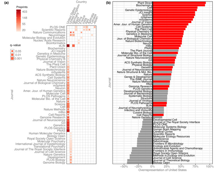
Figure 5. Overrepresentation of US preprints.
(a) A heat map indicating all disproportionately strong (q < 0.05) links between countries and journals, for journals that have published at least 15 preprints from that country. Columns each represent a single country, and rows each represent a single journal. Colors indicate the raw number of preprints published, and the size of each square indicates the statistical significance of that link—larger squares represent smaller q-values. See Figure 5—source data 1 for the results of each statistical test. (b) A bar plot indicating the degree to which US preprints are over- or under-represented in a journal’s published bioRxiv preprints. The y-axis lists all the journals that published at least 15 preprints with a US senior author. The x-axis indicates the overrepresentation of US preprints compared to the expected number: for example, a value of ‘0%’ would indicate the journal published the same proportion of US preprints as all journals combined. A value of ‘100%’ would indicate the journal published twice as many U. preprints as expected, based on the overall representation of the US among published preprints. Journals for which the difference in representation was less than 15% in either direction are not displayed. The red bars indicate which of these relationships were significant using the Benjamini–Hochberg-adjusted results from χ² tests shown in panel A.

