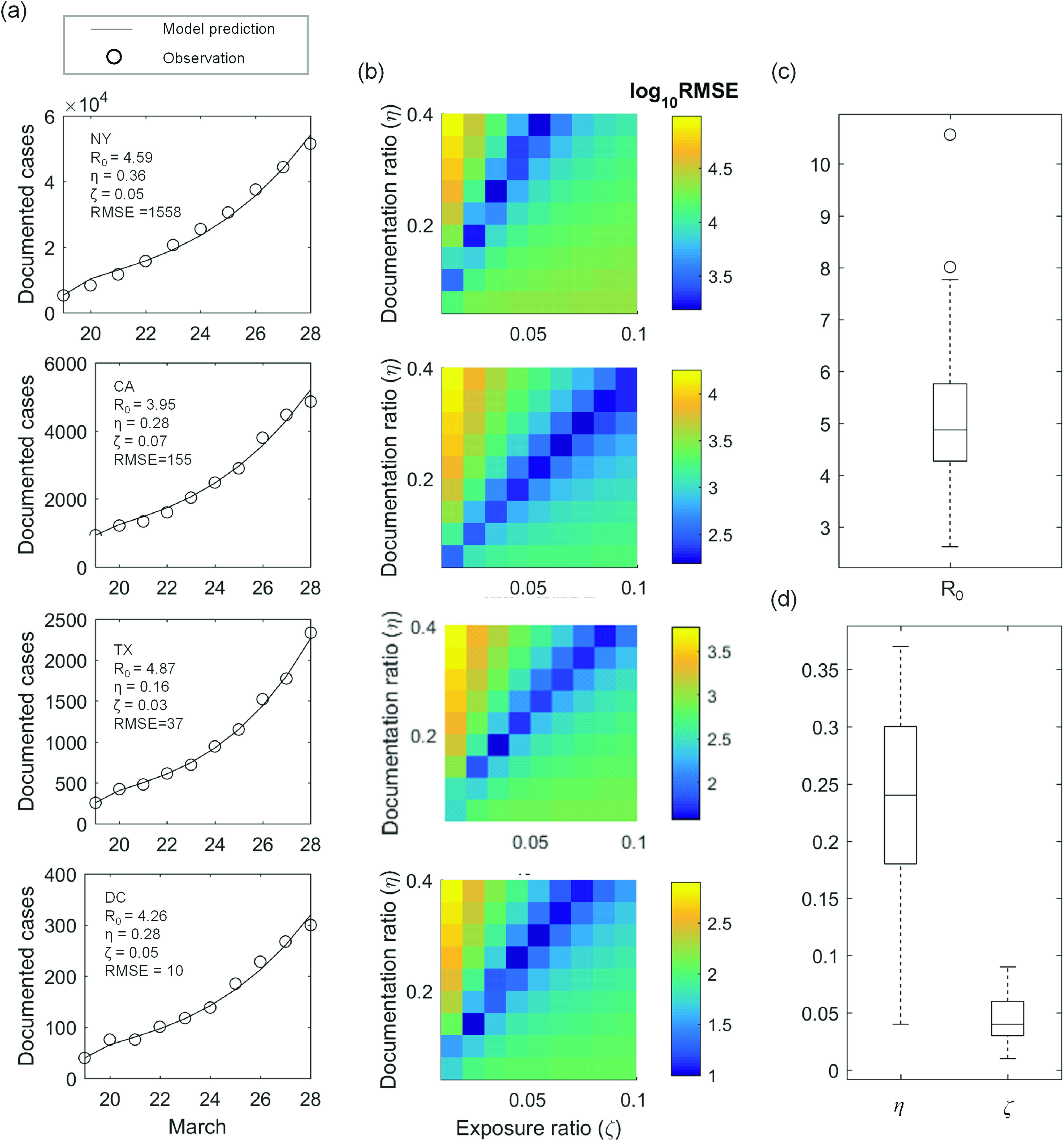
FIG. 2.

Model calibration between March 19 and 28. (a) Daily observation of documented active COVID-19 cases (circle) is compared with the best-fit model (line). The parameter combination leading to the best fit is outlined in each subpanel. (b) Root-mean-square-error (RMSE) between observation and model prediction is plotted as a function of documentation ratio and initial exposure ratio for each corresponding state. The basic reproduction ratio is held constant here, taking the values outlined in the respective subpanels in (a). (c) Distribution of across the 52 locations. (d) Distribution of across the 52 locations. In (c) and (d), center of the box represents state-wise median values. Edges of the box represent the 25th and 75th percentile. Whiskers extend to the extreme data points not considered outliers, and outliers are represented by a circle symbol.
