This tutorial on the display of data in the “Focus on Data” series deals with principles for the effective and transparent display of data.
Scientific advancements happen when theory and data interact. Scientists confirm research theories empirically by checking them against information from empirical studies. The design of empirical studies must reflect all current theory, and empirical experiments must be planned carefully and efficiently. Experimental data must be analyzed with appropriate methods that reflect the way the experiment was carried out. Data from experiments confirm or refute research hypotheses but must also suggest modifications to existing theory if existing theory does not fit the experimental data. Thus, experiments must not be too narrow. The continual interaction of theory and data sharpens our understanding. The optimal display of data is vital to an accurate understanding of the results of an experiment, as the improper display of data can lead to erroneous interpretation and conclusions.
In this tutorial of the series, the following principles are important for the effective and transparent display of data:
-
•
If possible, show all observations. For datasets that are not too large, show individual observations instead of summaries.
-
•
Investigate causes and implications of outliers in order to treat outliers appropriately.
-
•
Choose appropriate data summaries, and understand the difference between the standard deviation of the measurements and the standard error of summary statistics.
-
•
Investigate the distribution of your measurements. Many statistical techniques assume a normal (Gaussian) distribution, so normality must be checked.
-
•
If the distribution is not normal, investigate whether there are transformations of the measurements that make them normal, or nearly normal, to enable parametric statistics to be used, which may be more revealing than non-parametric statistics used when data (or its transformation) are not normal.
-
•
Display and summarize the relationship between two continuous measurement variables through scatterplots and correlation coefficients. Be aware of the limitations of the correlation coefficient.
-
•
Stratify scatterplots for relevant categorical covariates.
The Data
We use the results of an animal study on multiple sclerosis (MS) that investigates optic neuritis and retinal ganglion cell functional and structural loss in mice with myelin oligodendrocyte glycoprotein (MOG)-induced experimental autoimmune encephalomyelitis (EAE) (see Supplementary Data sets). The purpose of the study is to test the effectiveness of a neuroprotective compound. We compare the eyes of three groups of mice: 15 controls (healthy animals), 15 untreated EAE mice (afflicted but untreated animals), and six treated EAE mice (afflicted animals treated with what is hoped will be a beneficial compound). The main outcome measurements include daily clinical EAE scores on motor–sensory impairment and parameters of functional and structural changes in the visual system. We study changes in the pattern electroretinogram (PERG) recordings, amplitude and implicit time of the P1 peak reflecting retinal ganglion cell (RGC) function, RGC layer imaged by optical coherence tomography (OCT), RGC density by immunohistochemical analysis of whole mount retina, and the grade of cell infiltration and demyelination of the optic nerve. The hypotheses to be tested center around whether the compound lessens clinical severity as expressed by EAE scores, improves PERG, and reduces structural neural loss in the retina.
Each of the 36 mice contributes two eyes. For this first tutorial paper, we look at the OCT thickness of the RGC complex (retinal nerve fiber layer, RGC layer, and inner plexiform layer) of the 72 eyes, ignoring the fact that measurement made from each eye of the same mouse are related. We will address in a later tutorial how intra-class (eye) correlation can be incorporated into the analysis to account for measurements made in each eye of an animal or subject. Also note that four OCT thickness measurements are missing from the EAE group.
Show All Observations
For small and moderately sized studies such as the one we have here, our recommendation is to show all individual observations. One can add summary statistics to the graph of individual observations, such as the median, and draw a box around the first and third quartiles. The plots in Figure 1 draw attention to the shape of the distribution of the observations and to possible outlying observations that must be scrutinized. Figure 1A, produced by the R statistical software (The R Project for Statistical Computing; see Supplementary Material), visualizes the distribution for each group. Figure 1B, produced by GraphPad Prism (San Diego, CA, USA), adds random jitter to the data in order to prevent overplotting observations with the same value. For large studies, with hundreds of data points, the distribution of data can still be depicted using violin plots with superimposed median and first and third quartiles. Box and whisker plots also provide a graphical summary of quartiles and extremes, but they are not as informative as showing all of the data points, which should be done whenever feasible. Discussion on how to check for normality of the distribution and when to classify an observation as an outlier is given below.
Figure 1.
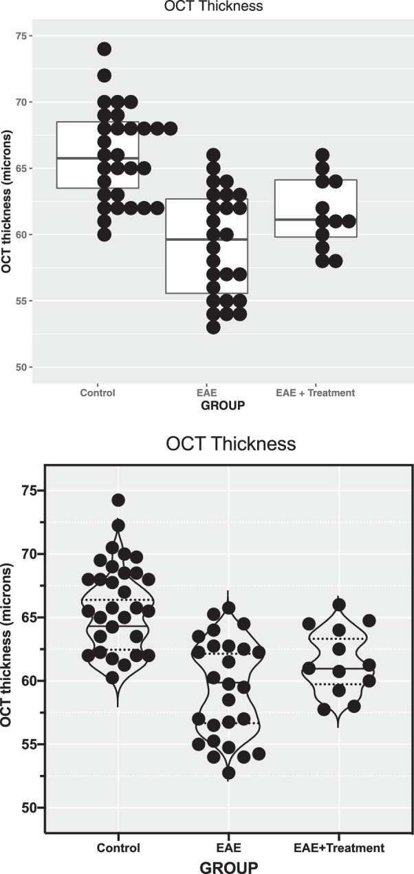
OCT of the inner retinal layer thickness displayed by categorical groups. The raw data for OCT thickness represent the thickness of the RGC complex in microns. (A) Produced with software program R. Individual data points with the same value are stacked laterally to accurately depict a distribution, and a box plot with median and first and third quartiles is superimposed. Note that in the EAE group there are more points at the upper and lower portions of the distribution than expected for a Gaussian distribution (“heavy” tails). (B) Produced with GraphPad Prism software with the same data as in A. Random noise was added to the scatterplot data (“jittering”) to prevent overplotting observations with the same value. In the “standard” scatterplot from Prism, the width of the distribution of points is proportionate to the number of points at that y value. In this example, a violin plot was superimposed, in contrast to the box plot in A. Violin plots are sometimes used to display the smoothed shape of the frequency distribution of the data. Median values and quartiles are indicated with horizontal lines in both plots.
We recommend against visualizing data with only a bar chart that shows group averages with their standard deviation. The bar chart in Figure 2A does not visualize the raw data and does not show their distribution and whether outliers are present. A bar chart with added standard errors (shown in Fig. 2B) should also be avoided. The standard error of a sample average (calculated as the standard deviation of individual observations divided by the square root of the sample size) reflects the reliability of the sample mean as an estimate of the mean of the population from which the random sample is selected. It does not show the variability of the data.
Figure 2.
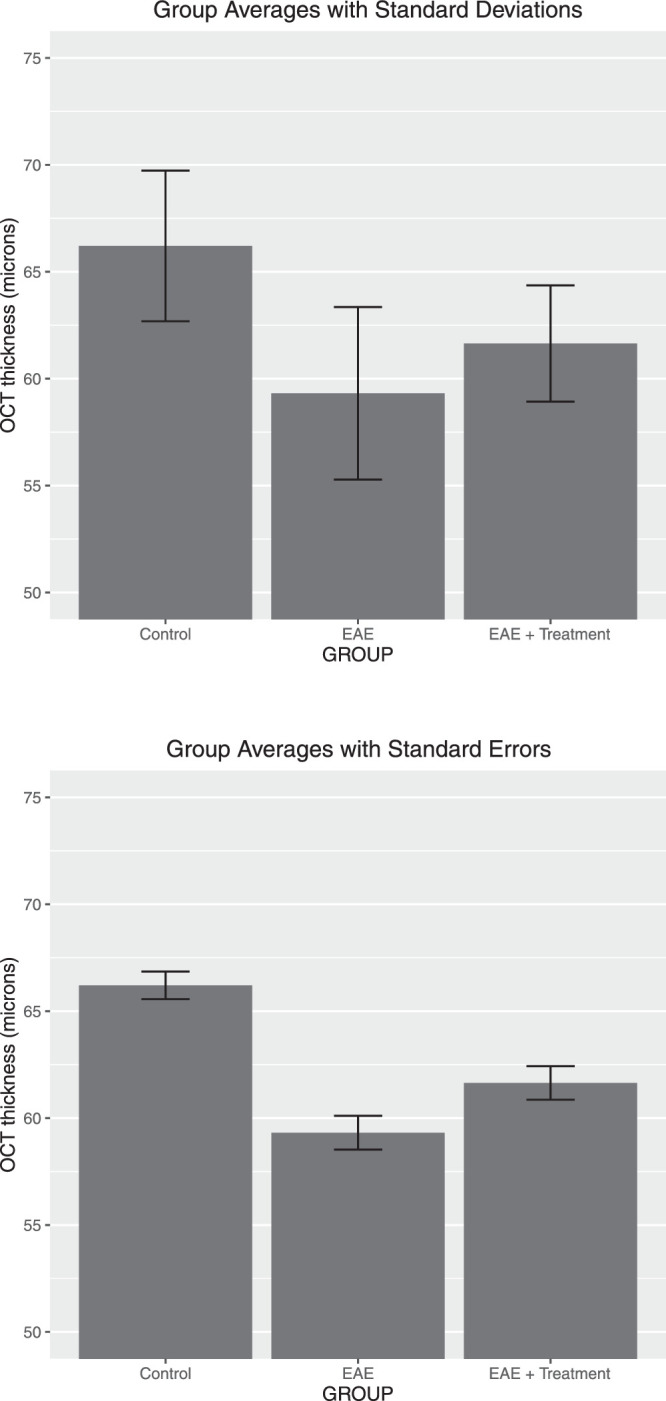
Suboptimal data presentation: bar chart of OCT thickness of the RGC complex group in microns. Averages with ±1 SD added (top plot) and ±1 SE (bottom plot) are shown for the same data as in Figure 1. The distribution and number of data points are not shown.
There are a number of publications1–4 that provide useful guidelines for the visualization of biomedical data, and additional references5–11 provide general guidance on how to design useful and informative graphs. Tufte7–10 views excellence in graphics as the well-designed truthful presentation of interesting data. Excellence in graphics involves communicating complex ideas with clarity, precision, and efficiency. Graphs must be effective, and they must be truthful to the data. Good graphs give viewers the greatest number of ideas in the shortest time, with the least complexity, and in the smallest space. Cleveland5,6 and Tufte7–10 have much to say about the principles of good graph construction, and their books contain much useful practical advice: Make data stand out and avoid complexity. Show the data, but avoid unneeded “chart junk” such as unnecessary ornamental hatching and three-dimensional perspectives. Use visually prominent graphical elements to show the data. Do not overdo the number of tick marks, and have tick marks point to the outside of the chart. Avoid too many data labels in the interior of the graph, so that they do not interfere with the data shown. Add reference grids if you want to draw attention to certain values.
Choose appropriate scales, as visual perception is affected by proportions and scale. For ease of comparison, use the same scale in comparing data from different groups or panels. Be aware of the effect of “zero”; the way the zero is located on a graph may change your perception of the data. Incorrect and non-uniform scales and unclear labeling can create impressions that are not truthful to the data. Cutting off the bottom part of bars and graphs in a comparative chart can create a wrong impression. Color used well can enhance and clarify the presentation; color used poorly can obscure and confuse. Intensity and choice of color matter. Avoid using red and green in the same graph, as 5% of males have inherited red–green color blindness. Adopt a “colorblind-safe” color scheme, using colors designed to be distinguishable even by individuals with a variety of color vision deficiencies.
In today's computer age, virtually all statistical software packages include many different options for graphical displays. Although computers have changed the way we present the graphics, they have not affected the goals of the analysis. Modern computer software makes it easy to produce graphics, but not all displays that a user creates with software tools are necessarily good, and extra considerations are needed to optimize the display of one's data for presentations and publications.
Treatment of Outliers
Observations outside the 99.7% prediction interval are certainly unusual, as one would expect such observations to come up rarely; only 0.3% of all observations should be outside such an interval. Under normality, an approximate 99.7% prediction interval is given by ± 3s, where and s are the mean and the standard deviation of the sample, respectively, and the constant 3 is the appropriate factor from the standard normal distribution. All observations in each group in Figure 1 are inside the 99.7% prediction interval.
If there are outliers, one must find explanations for the unusual observation. Outliers can be safely omitted if there is clear evidence that something went wrong with a particular measurement or particular experiment, and if it is known what happened. In the absence of any evidence of why an outlier has occurred, the observation cannot be swept under the rug and omitted from the analysis. A transparent, rigorous strategy is to report the results of two analyses—one with and one without the questionable measurement. This quantifies the influence of a suspect observation on one's conclusion. If the suspect observation has no influence on the conclusion, even better—because then there is no issue. If there is an issue, then alternative non-parametric statistical analysis methods based on ranks can be used, which decreases the influence of outliers. If an observation is hugely influential in reaching a certain finding, one needs to be careful about the statistical methods applied and one's interpretation and conclusion.
Checking the Normality of Distributions
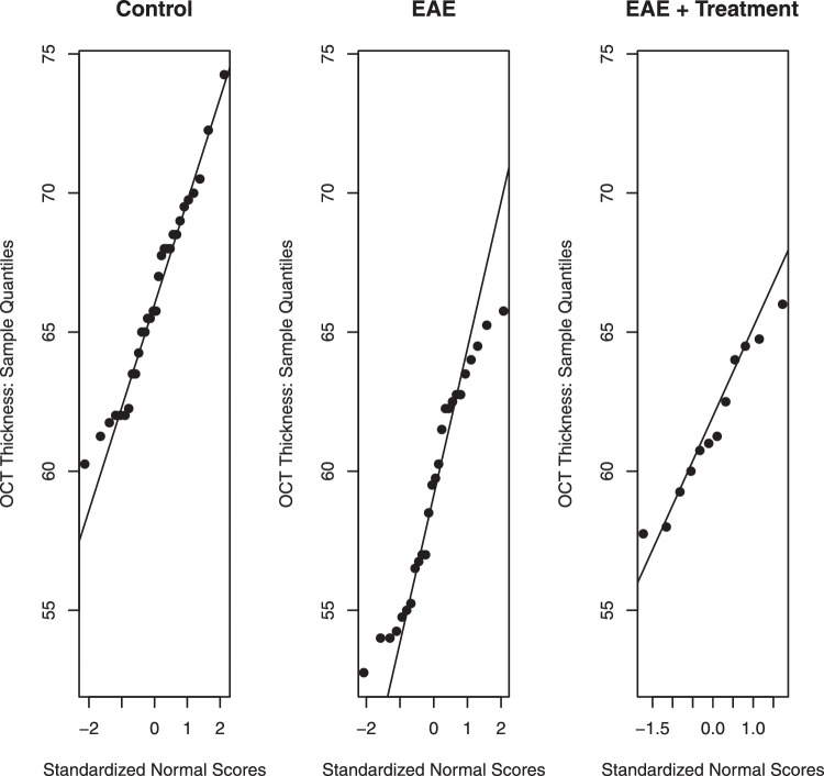
Normality should be checked, because many statistical methods used and discussed later in subsequent tutorials assume normality, meaning that the data sample comes from a Gaussian data population. Normality should be checked both visually and numerically. Visually, normality can be assessed with a q–q plot that plots observed values (observed quantiles) against their quantiles that are implied by a normal distribution. Instead of plotting observed quantiles against implied normal quantiles, one can also plot them directly against their implied standardized normal scores; see Figure 3. If the data are normally distributed, points on a q–q plot will exhibit linearity. Furthermore, the slope of the plotted line reflects the standard deviation, and the value where the line intersects with the vertical line at zero provides the mean. In summary, for normal distributions the normal q–q plots should be linear. Deviations from the linear pattern provide evidence that the underlying distribution is not normal. A q–q plot is effective because the human eye is quite good at recognizing linear tendencies. For further discussion, see Chapter 2 of Box et al.12 Widely used programs such as R and Prism provide q–q plots along with the various tests for deciding how well a data distribution follows a normal, Gaussian distribution.
Figure 3.
Normality assessed by q–q plots. Observations on the y-axis are plotted against their standardized normal scores. For normally distributed data, the points should scatter around the reference line. Deviations from linearity are a sign of non-normality.
Numerically, normality can tested through one of the numerous significance tests for normality, such as the Anderson–Darling normality test, Shapiro–Francia normality test, Lilliefors (Kolmogorov–Smirnov) normality test, Cramer–von Mises normality test, Pearson χ2 normality test, Shapiro–Wilk test for normality, Jarque–Bera normality test, and D’Agostino normality test. Some tests require a minimum number of data points. A probability value is given for how likely the distribution is normally distributed; for example, a probability value of less than 0.05 would mean that there is a significant chance that the distribution is not normal. It should be mentioned that a probability value of 0.05 is commonly used as a criterion level for statistical significance, but this is arbitrary and is, in reality, an oversimplification. Examination of the data distribution using the q–q plot gives one a much better idea of how well the data distribution follows a normal distribution.
Unfortunately, for small samples the visual checks are typically not very informative, and the normal probability tests are not very powerful. Furthermore, because tests quantify deviations from normality using different methods, it is not surprising that they lead to somewhat different results. Not every test is equally sensitive to one or the other violations of normality. Although there is only one normality, there are certainly many different ways of violating normality. For an evaluation of normal probability tests, see Yap and Sim.13 Prism prefers the D'Agostino omnibus test among the three tests (Kolmogorov–Smirnov, Shapiro–Wilk, and D'Agostino) that it considers.14
Figure 3 illustrates normal q–q plots for the data from our illustrative example. Normality must be checked separately for each of the three groups, as groups have different means and variances. Minor deviations from linearity can be noticed in the plot for the EAE group, with points in the lower and upper tail suggesting a distribution with “heavier” tails than the normal. This can be visualized in the dot plot for the EAE group shown in Figure 1, where there are more points at the upper and lower portions of the distribution than expected for a Gaussian distribution. The probability values of the normal probability tests in the Table show that the deviations from normality are only borderline significant.
Table.
Results (P Values) of the Tests for Normality
| Probability Value | |||
|---|---|---|---|
| Normality Test | Control Group | EAE Group | EAE + Treatment Group |
| Anderson–Darling | 0.4851 | 0.0954 | 0.7102 |
| Shapiro–Francia | 0.5694 | 0.1937 | 0.8207 |
| Lilliefors | 0.5787 | 0.1327 | 0.7313 |
| Cramer–vonMises | 0.4975 | 0.0998 | 0.7208 |
| Pearson | 0.3920 | 0.3062 | 0.5724 |
| Shapiro–Wilk | 0.5220 | 0.0944 | 0.6643 |
| Jarque–Bera | 0.6766 | 0.3582 | 0.6946 |
| D'Agostino (omnibus) | 0.6911 | 0.0176 | Sample too small |
For the EAE group, some of the normality tests have probability values that are borderline significant or significant (e.g., D'Agostino test), indicating that the distribution may not be normal.
One needs to keep in mind that no natural distribution is actually normal. As George Box12 pointed out: “All models are wrong, but some are useful.” If the sample size is big enough, one will always fail a normality test. This is the reason why we encourage researchers to actually look at plots rather than just relying on a probability value. Graphs can tell whether the deviation from normality is substantial enough to cause worry and whether transformations can make a distribution closer to normal.
Transforming a Non-Normal Distribution to a Normal Distribution
Certain aspects of non-normality can be overcome with transformations of the response variable. Box and Cox15 discussed why and when transformations such as the logarithm, the square root, and the reciprocal can transform a non-normal variable into a normal one. Changes in measurements are often interpreted in terms of percentage changes, which makes a logarithmic transformation useful. A logarithmic transformation is indicated when the standard deviation is proportional to the average; a square root transformation is indicated when the variance is proportional to the average. Reciprocal transformations are useful if one studies the time from the onset of a disease (or of a treatment) to a certain failure event such as death or blindness. Distributions for time to death tend to be skewed to the right. Therefore, the distribution of the reciprocal of the time to death, which expresses the rate of dying, can often be a better approximation of a normal distribution. For details, see Box et al.12
The analyst should explore transformations of the data and check whether histograms and normal-probability plots of the transformed data look (more) normal than those of the original data. For non-normal distributions that can be transformed to a normal distribution, a parametric statistical analysis can then be applied to the appropriately transformed measurements. However, if no reasonable transformation to normality can be found, non-parametric procedures, which do not assume normality, should be used. Why not just use non-parametric tests in all datasets so one doesn't have to worry about normality? Non-parametric procedures order or rank data and test difference in the rank order. They are not as sensitive (less powerful) for detecting differences in distributions, if they really exist, compared to parametric tests, providing the data are distributed normally. Conversely, wrongly applying a parametric test to non-normal data can produce false-positive significance. Parametric and non-parametric statistical procedures are discussed in a follow-up tutorial.
Summarizing the Relationship Between Two Continuous Measurement Variables Through Scatterplots and Correlation Coefficients
Figure 4 shows the scatterplots of OCT thickness against PERG amplitude and of PERG amplitude against thickness. The two plots use the same two variables but differ with respect to the variable that is being plotted on the y-axis.
Figure 4.
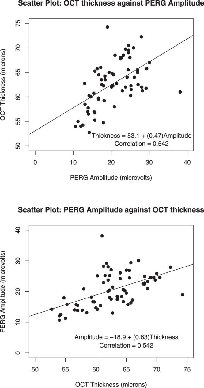
Scatterplots of OCT thickness and PERG amplitude, with fitted least-squares lines added. Axes are reversed in the second plot. PERG amplitudes are given in microvolts and were calculated from the P1 peak to the N2 trough from the evoked potentials. The OCT thickness of the inner retinal layer is given in microns.
Scatterplots reveal the relationship between two variables. In this example, each variable has a healthy amount of variability (wide range). Projecting each variable onto its axis, one notices quite some spread among the y and x values. This is advantageous, as a larger range variability among the x and y measurements is more likely to reveal a significant pair-wise relationship when one exists. Conversely, significant correlations are less likely to be discovered when there is little spread in the x and y values.
In this example, the relationship is approximately linear. One sees no curvature or an even more complicated functional relationship.
Drawing fitted least-squares lines through the data clouds of each of the two graphs, we notice quite some variability of data points around the fitted lines. The (linear) relationship is far from perfect.
The correlation coefficient is a measure of the linear association among two variables. For the (Pearson) correlation coefficient,
with means and , and standard deviations and . It does not matter which variable is drawn on the y-axis. The correlation coefficient between x and y is the same as the correlation coefficient between y and x. The correlation coefficient is standardized to always be between –1 and +1. The correlation between OCT thickness and PERG amplitude is 0.542.
Also, it does not matter if one linearly transforms a variable (multiplying by a constant and/or adding a constant). A correlation between thickness and amplitude does not depend on the units of measurement. The correlation coefficient does not change if thickness is measured in microns or inches.
The sign of the correlation coefficient expresses the direction of the linear relationship. A positive value indicates a direct relationship—positive (negative) deviations from the mean in one variable tend to occur together with positive (negative) deviations from the mean of the other. A negative value indicates an inverse relationship—positive (negative) deviations from the mean in one variable tend to occur together with negative (positive) deviations from the mean of the other.
The absolute magnitude of the correlation coefficient expresses the strength of the relationship. The association is perfect when the correlation coefficient is –1 or +1, as then all points lie on a straight line with a negative (positive) slope. For a correlation coefficient of 0, there is no linear association among the variables.
Keep in mind that the correlation measures only the linear part of the association. If the association is nonlinear, the correlation coefficient will not faithfully reflect how well the x and y values correlate. For an extreme example, when all points are on a circle of given radius the correlation is 0, even though there is a strong but nonlinear relationship between the two variables.
Theory may tell you that one of the two variables is influenced by the other. In such a case, you know the response is given by one of the variables, and this variable should be plotted on the y-axis. The best-fitting (least squares) regression line that goes through the data on that scatterplot is informative, as its slope (by|x) expresses the magnitude of the effect on the response (y) when changing the explanatory variable (x) by one unit. The slope of the least-squares regression line is related to the correlation coefficient through by|x = (sy/sx)r and r = (sx/sy)by|x, and the R2 in this simplest of all regression models is the square of the correlation coefficient. The R2 expresses the proportion of the response variability that is explained by the model's explanatory variable; an R2 of 0.75 conveys that 75% of the response variability (y) is explained by the x variable. Switching variables, the slope of the regression of x on y is given by bx|y = (sx/sy)r = (sx/sy)2by|x.
For the example in Figure 4B, the amount of electrical response from the retina elicited by a pattern stimulus is influenced by how many retinal neurons in the inner retina are present, which, in this case, is measured by the OCT inner layer thickness. So, it would make more sense to regress the PERG amplitude on the y-axis against the retinal thickness on the x-axis.
Correlation coefficients are sensitive to some (but not all) outliers. The assessment of outliers becomes much more difficult if there are two (or more) variables involved. Take an outlier right at the center of the data cloud. Shifting the value of the response variable up and down while leaving the other variable at its center has very little impact on the slope of the fitted line or on the correlation. However, a data pair far from the center of the data cloud can have a very large pull on the fitted line and on the correlation coefficient. In other words, beware of apparently large correlations that are heavily biased by a data point or a small cluster of points that are far from the median. Keep in mind that the correlation coefficient is a single summary measure, and there is no substitute for plotting the data.
Remember that a correlation does not necessarily imply causality. Variables may be highly correlated, but not causally related; for example, the yearly number of storks and the yearly number of babies are often highly positively correlated. But, this isn't because of causality; it is due to a third variable, “economic development,” which adversely impacts the environment and nudges people to have fewer babies. Beware of “lurking variables” before jumping to quick conclusions on causality! Causality is only revealed by well-designed experiments.
For details on correlation and regression, see Abraham and Ledolter.16
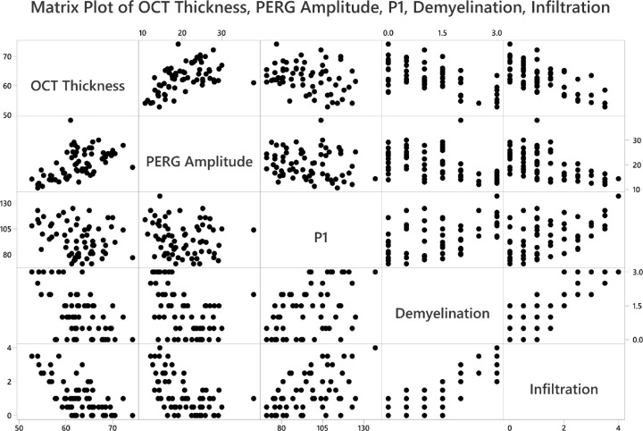
Finally, most software packages can produce all possible pairwise scatterplots; software packages refer to such graphs as matrix plots. The scatterplot of demyelination against infiltration of immune cells into the optic nerve is shown in Figure 5 as the entry in row 4 and column 5. The scatterplot of demyelination on PERG amplitude is shown in row 4 and column 2. This is a convenient tool for showing all possible data correlations in one figure, and correlation values can be provided in each box, if desired.
Figure 5.
Pairwise scatterplots to display the relationships among different measurements, such as thickness of the RGC complex (OCT thickness), PERG amplitude, implicit time of the P1 peak, and grade of demyelination and magnitude of cell infiltration in optic nerves. Each row of figures has the labeled box as the y-axis (e.g., first row y-axis is OCT thickness; second row y-axis is PERG amplitude).
Stratifying Scatterplots for Categorical Covariates
The relationship between PERG amplitude and OCT thickness may depend on treatment group, which is a categorical variable (in this example, with Control, EAE, and EAE + Treatment groups). Bivariate scatterplots are easily stratified, resulting in three different scatterplots. These can be put on a single graph, distinguishing them by three different colors (Fig. 6); least-squares lines (and correlation coefficients) can be added, as well. For the two EAE groups, the fitted regression lines are roughly parallel; for the control group, there is not much of a relationship.
Figure 6.
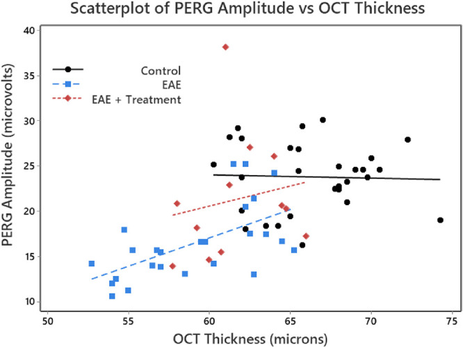
Scatterplots of OCT thickness against PERG amplitude for each eye, stratified for the three treatment groups. A linear regression was performed for each of the three groups. PERG amplitudes are given in microvolts and were calculated from the P1 peak to the N2 trough from the evoked potentials. The OCT thickness of the inner retinal layer is given in microns. Note that we used a color scheme that would accommodate a reader with red–green color blindness.
Supplementary Material
Acknowledgments
Supported by a VA merit grant (C2978-R), by the Center for the Prevention and Treatment of Visual Loss, Iowa City VA Health Care Center (RR&D C9251-C; RX003002), and by an endowment from the Pomerantz Family Chair in Ophthalmology (RK).
Disclosure: J. Ledolter, None; O.W. Gramlich, None; R.H. Kardon, None
References
- 1. Allen M, Poggiali D, Whitaker K, et al.. Raincloud plots: a multi-platform tool for robust data visualization. Welcome Open Res. 2019; 4: 63. [DOI] [PMC free article] [PubMed] [Google Scholar]
- 2. P'ng C, Green J, Chong LC, et al.. BPG: seamless, automated and interactive visualization of scientific data. BMC Bioinform. 2019; 20: 42. [DOI] [PMC free article] [PubMed] [Google Scholar]
- 3. Weissgerber TL, Milic NM, Winham SJ, Garovic VD. Beyond bar and line graphs: time for a new data presentation paradigm. PLoS Biol. 2015; 13: e1002128. [DOI] [PMC free article] [PubMed] [Google Scholar]
- 4. Weissgerber TL, Winham SJ, Heinzen EP, et al.. Reveal, don't conceal, transforming data visualization to improve transparency. Circulation. 2019; 140: 1506–1518. [DOI] [PMC free article] [PubMed] [Google Scholar]
- 5. Cleveland WS. Visualizing Data. Summit, NJ: Hobart Press; 1993. [Google Scholar]
- 6. Cleveland WS. Elements of Graphing Data. Summit, NJ: Hobart Press; 1994. [Google Scholar]
- 7. Tufte ER. Visual Display of Quantitative Information. Cheshire, CT: Graphics Press; 1986. [Google Scholar]
- 8. Tufte ER. Envisioning Information. Cheshire, CT: Graphics Press; 1990. [Google Scholar]
- 9. Tufte ER. Visual Explanations. Cheshire, CT: Graphics Press; 1997. [Google Scholar]
- 10. Tufte ER. Beautiful Evidence. Cheshire, CT: Graphics Press; 2006. [Google Scholar]
- 11. Gillan DJ, Wickens CD, Hollands JG, Carswell CM. Guidelines for presenting quantitative data in HFES publications. Hum Factors. 1998; 40: 28–41. [Google Scholar]
- 12. Box GEP, Hunter S, Hunter WG. Statistics for Experimenters: Design, Innovation, and Discovery. 2nd ed New York: John Wiley & Sons; 2005. [Google Scholar]
- 13. Yap BW, Sim CH. Comparisons of various types of normality tests. J Stat Comput Simul. 2011; 81: 2141–2155. [Google Scholar]
- 14. GraphPad. Choosing a normality test. Available at: https://www.graphpad.com/guides/prism/8/statistics/stat_choosing_a_normality_test.htm. Accessed June 1, 2020.
- 15. Box GEP, Cox DR. An analysis of transformations. J R Stat Soc Series B Stat Methodol. 1964; 26: 211–243. [Google Scholar]
- 16. Abraham B, Ledolter J. Introduction to Regression Modeling. Boston, MA: Cengage Learning; 2006. [Google Scholar]
Associated Data
This section collects any data citations, data availability statements, or supplementary materials included in this article.


