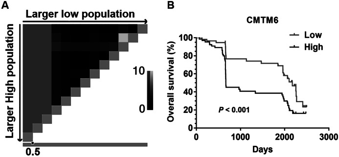
Figure 2. The prognostic value of CMTM6 expression in patients with GC.
(A) X-tile plots Pattern diagram. The vertical axis represents all possible “high” populations, with the size of the high population increasing from top to bottom. The horizontal axis represents all possible “low” populations, with the size of the low population increasing from left to right. Coloration of the plot represents the strength of the association at each division, ranging from low (black) to high (gray or white). 0.5 is the best cutoff value of CMTM6 expression for this set of samples by X-title software. (B) Kapla–Meier analysis of overall survival (OS) with variable CMTM6 expression in GC patients. The black curve represents CMTM6 high expression group, and the gray curve represents CMTM6 low expression group.

