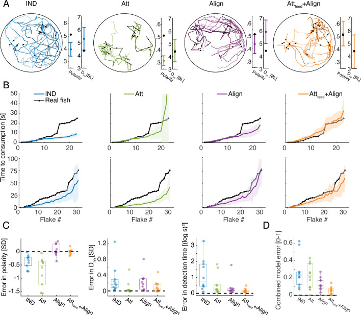
Figure 4. Social models incorporating attraction to neighbors’ flake consumptions give the best fit to real foraging groups.
(A) Example trajectories from simulations of foraging of a group of six fish, for the IND, Att, Align, and the Attfeed+Align models that use the parameters that gave the best fit to real group foraging. Colored lines show different individual fish and black dots are flake positions. Next to the simulated trajectories, we plot the average group polarity and nearest neighbor distance in the simulations (colored dots), and the experimental values of the real foraging group (black dots); Error bars represent standard deviation (SD) in the simulation. (B) Flake consumption times (black dots) of two groups of six fish (Top row shows the group whose trajectories are shown in A) and the average and standard deviation of the best-fit models (bold colored lines represent averages; shaded areas represent SD). (C) Errors of best fit models for groups of six fish are shown for three statistics of interest: the polarity of the group , the nearest neighbor distance , and the consumption times where N is the number of flakes consumed. Dots represent different experimental groups; horizontal lines are median values and boxes represent the 1st and 3rd quartiles. Dotted line represents 0 error in prediction or a perfect fit to the data. (D) Combined error of each of the models presented in C. , where all error measures were scaled to be between 0 and 1, by dividing by the largest observed error for that measure. The Attfeed+Align model is significantly more accurate than the IND, Att, and Align models (p<0.005 for all, Wilcoxson’s signed rank test, N = 10 groups, Materials and methods). Each dot represents one group; horizontal lines are median values and boxes represent the 1st and 3rd quartiles.


