

Abstract
Despite the widespread implementation of public health measures, COVID-19 continues to spread in the United States. To facilitate an agile response to the pandemic, we developed How We Feel, a web and mobile application that collects longitudinal self-reported survey responses on health, behavior, and demographics. Here we report results from over 500,000 users in the United States from April 2, 2020 to May 12, 2020. We show that self-reported surveys can be used to build predictive models to identify likely COVID-19 positive individuals. We find evidence among our users for asymptomatic or presymptomatic presentation, show a variety of exposure, occupation, and demographic risk factors for COVID-19 beyond symptoms, reveal factors for which users have been SARS-CoV-2 PCR tested, and highlight the temporal dynamics of symptoms and self-isolation behavior. These results highlight the utility of collecting a diverse set of symptomatic, demographic, exposure, and behavioral self-reported data to fight the COVID-19 pandemic.
Introduction
The rapid global spread of severe acute respiratory syndrome coronavirus 2 (SARS-CoV-2), the novel virus causing coronavirus disease 2019 (COVID-19)1–3, has created an unprecedented public health emergency. In the United States, efforts to slow the spread of disease have included, to varying extents, social distancing, home-quarantine and treating infected patients, mandatory facial covering, closure of schools and non-essential businesses, and testing-trace-isolate measures4,5. The COVID-19 pandemic and ensuing response has produced a concurrent economic crisis of a scale not seen for nearly a century6, exacerbating the effect of the pandemic on different socioeconomic groups and producing adverse health outcomes beyond COVID-19. As a result, there is currently intense pressure to safely wind down these measures. Yet, in spite of widespread lockdowns and social distancing throughout the US, many states continue to exhibit steady increases in the number of cases7. In order to understand where and why the disease continues to spread, there is a pressing need for real-time individual-level data on COVID-19 infections and tests, as well as on the behavior, exposure, and demographics of individuals at the population scale with granular location information. These data will allow medical professionals, public health officials, and policy makers to understand the effects of the pandemic on society, tailor intervention measures, efficiently allocate testing resources, and address disparities.
One approach to collecting this type of data on a population scale is to use web- and mobile-phone based surveys that enable large-scale collection of self-reported data. Previous studies, such as FluNearYou, have demonstrated the potential for using online surveys for disease surveillance8. Since the start of the COVID-19 pandemic, several different applications have been launched throughout the world to collect COVID-19 symptoms, testing, and contact-tracing information9. Studies in the US and Canada (CovidNearYou10,11), UK (Covid Symptom Study12,13, also in US) and Israel (PredictCorona14), have reported large cohorts of users drawn from the general population with a goal towards capturing information about COVID-19 along a variety of dimensions, from symptoms to behavior, and have demonstrated some ability to detect and predict the spread of disease12–14. This field has rapidly evolved since the beginning of the pandemic, with many analyses of these datasets focusing on COVID-19 diagnostics (i.e., symptoms, test results, medical background)11, care-seeking15, contact-tracing16, patient care17, effects on healthcare workers18, hospital attendance19, cancer20, primary care21, clinical symptoms22, and triage23. Here we perform a comprehensive analysis of a new source of COVID-19-related information spanning diagnostic and behavioral factors sampled from the general population during the beginning of the pandemic in the United States. We consider exposure, demographic, and behavioral factors that affect the chain of transmission, understand the factors for who have been tested, and study the degree of presence of asymptomatic, presymptomatic, mildly symptomatic cases24.
To overcome these limitations, we developed How We Feel (HWF, http://www.howwefeel.org) (Fig. 1a–d), a web and mobile-phone application for collecting de-identified self-reported COVID-19-related data. Rather than targeting suspected COVID-19 patients or existing study cohorts, HWF aims to collect data from users representing the population at large. By drawing from a large user base across the US that learn about the study through word of mouth and government partnerships, these results are complementary to other studies such as the Covid Symptom Study and CovidNearYou that also include sizable US populations and are targeted towards the general public. Users are asked to share information on demographics (gender, age, race/ethnicity, household structure, ZIP code), COVID-19 exposure, and pre-existing medical conditions. They then self-report daily how they feel (well or not well), any symptoms they may be experiencing, test results, behavior (e.g., use of face coverings), and sentiment (e.g., feeling safe to go to work) (Fig. 1c, Extended Data Fig. 1). To protect privacy, users are not identifiable beyond a randomly-generated number that links repeated logins on the same device. A key feature of the app is the ability to rapidly release revised versions of the survey as the pandemic evolves. In the first month of operation, we released three iterations of the survey with increasingly expanded sets of questions (Fig. 1b).
Figure 1: The How We Feel Application and User Base.
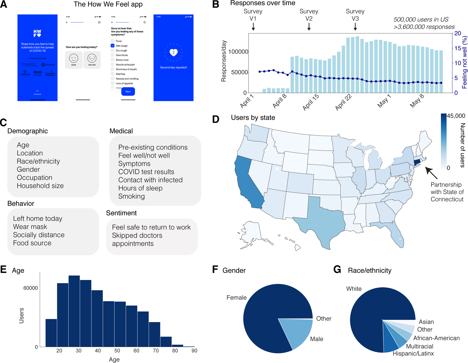
a, The How We Feel (HWF) app: longitudinal tracking of self-reported COVID-19-related data. b, Responses over time, as well as percentage of users reporting feeling unwell, with releases of major updates to survey indicated. c, Information collected by the HWF app. d, Users by state across the United States. e, Age distribution of users. Note: users had to be older than 18 to use the app. f, Distribution of self-reported sex. g, Distribution of self-reported race or ethnicity. Users were allowed to report multiple races. “Multiracial” = the user indicated more than one category. “Other” includes American Indian/Alaskan Native and Hawaiian/Pacific Islander, as well as users who selected “Other”.
We find symptomatic subjects and health care workers and essential workers are more likely to be tested. Due to asymptomatic and mildly symptomatic individuals and heterogeneous symptom presentation, our results show that commonly used symptoms may not be sufficient criteria for evaluating COVID-19 infection. Further, we find that exposure both outside and within the household are major risk factors for users testing positive and build a predictive model to identify likely COVID positive users. African-American users, Hispanic/Latinx users, and health care workers and essential workers are at a higher risk of infection, after accounting for the effects of pre-existing medical conditions. Finally, we find that even at the height of lockdowns throughout the U.S., the majority of users were leaving their homes, and a large fraction were not engaging in social distancing or face protection.
Results
The app was launched on April 2, 2020 in the United States. As of May 12, 2020, the app had 502,731 users in the United States, with 3,661,716 total responses (Fig. 1b) (Supplementary Table 1). 74% of users responded on multiple days, with an average of 7 responses per user (Extended Data Fig. 2). Each day, ~5% of users who accessed the app reported feeling unwell (Fig. 1b). The user base was distributed across all 50 states and several US territories, with the largest numbers of users in more populous states such as California, Texas, Florida, and New York (Fig. 1d). Connecticut had the largest number of users per state, as the result of a partnership with the Connecticut state government (Fig. 1d). Users were required to be 18 years of age or older and were 42 years old on average (mean: 42.0; SD: 16.3), including 18.4% in the bracket of 60+, which has experienced the highest mortality rate from COVID-19 (Fig. 1e)25,26. Users were primarily female (82.7%) (Fig. 1f) and white (75.5%, excluding 20.3% with missing data) (Fig. 1g). Although the survey ran from April 2 through May 12, users could report test results from earlier than April 2.
A major ongoing problem in the US is the overall lack of testing across the country27 and disparities in test accessibility, infection rates, and mortality rates in different regions and communities28,29. In the absence of population-scale testing, it will be critical during a reopening to allocate limited testing resources to the groups or individuals most likely to be infected in order to track the spread of disease and break the chain of infection. We therefore first examined who in our userbase is currently receiving testing. We analyzed 4,759 users who took the Version 3 (V3) survey and who were PCR tested for SARS-CoV-2 (out of 272,392 total users) (Fig. 2a, Extended Data Fig. 3a). Of these, 8.8% were PCR positive. The number of tests reported by test date displays a similar trend to the estimated number of tests across the US, suggesting that our sampling captures the increase in test availability (Fig. 2a). The number of PCR tests per HWF user is highly correlated with external estimates of per-capita tests by state (Fig. 2b, Extended Data Fig. 3b, Pearson correlation 0.77)30.
Figure 2: SARS-CoV-2 PCR Testing and Symptoms.
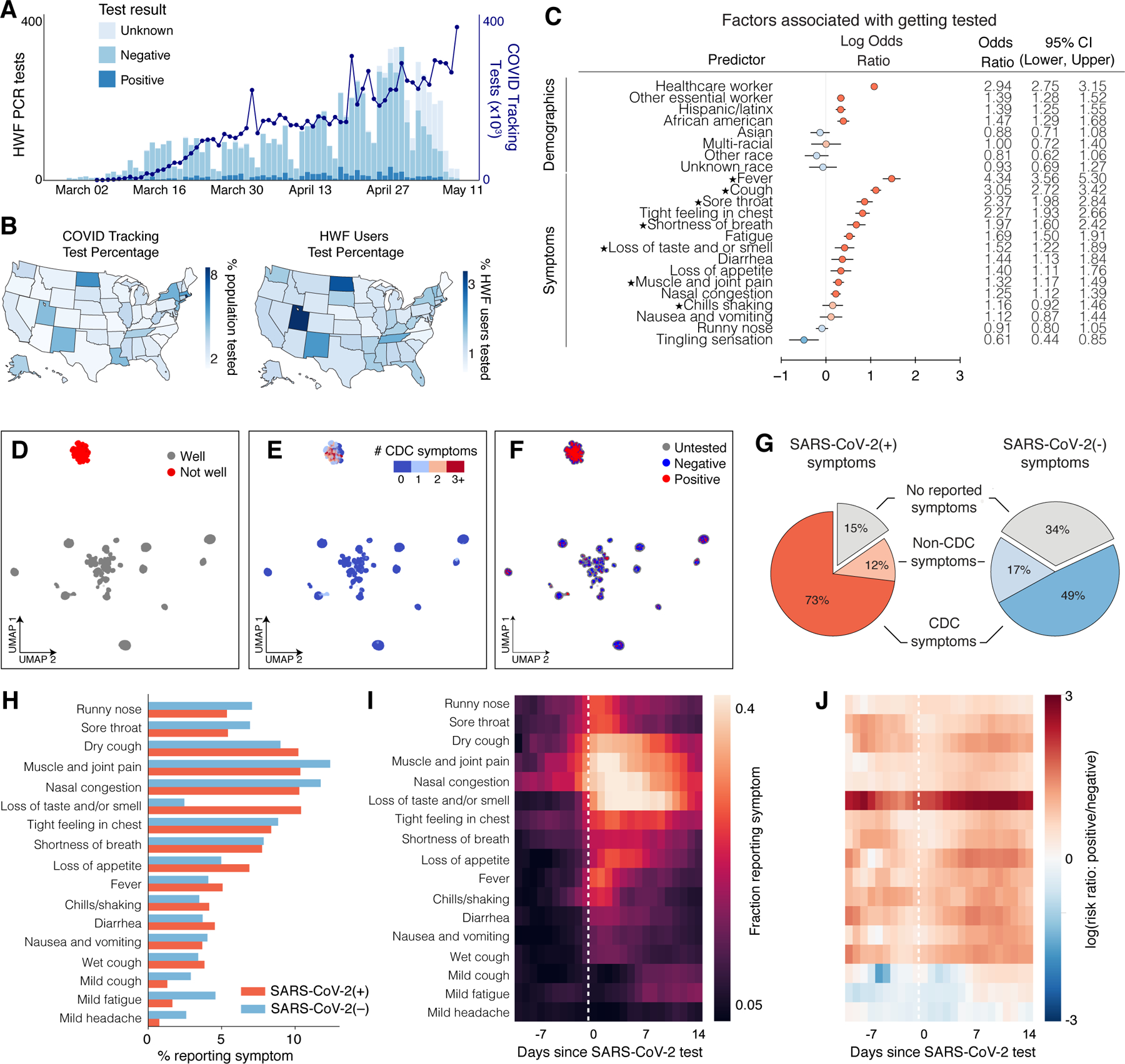
a, Stacked bar plot of user-reported test results over time, overlaid with official number of tests across US based on COVID Tracking Project data. N = 4,759 users who took the V3 survey and reported a test result, out of 277,151 users. b, Left: Map of per-capita test rates across the United States. Right: Map of COVID-19 tests per number of users by state. c, Associations of professions and symptoms with receiving a SARS-CoV-2 PCR test, adjusted for demographics and other covariates (Methods). Common symptoms listed by the CDC are starred. N = 4,759 users with a reported test within 14 days of a survey response out of 277,151 users. d-f, UMAP visualization of 667,651 multivariate symptom responses among HWF users that reported at least one symptom. Coloring indicates: d, responses according to users feeling well; e, the reported number of COVID-19 symptoms listed by the CDC; and f, the COVID-19 test result among tested users. g, Proportion of positive COVID-19 patients (red) and negative COVID-19 patients (blue) experiencing either CDC-common symptoms (dark), only non-CDC symptoms (light), or no symptoms (grey) on the day of their test. N = 1,170 positive users, 8,892 negative users who reported a test result between April 2 and May 12, 2020. h, Histogram of reported symptoms among COVID-19 tested users. i, Longitudinal self-reported symptoms from users that tested positive for COVID-19. Dates are centered on the self-reported test-date. j, Ratio of symptoms comparing users that test positive versus test negative for COVID-19.
We first examined via logistic regression which factors either collected in the survey or inferred from US Census data by user ZIP code were associated with receiving a SARS-CoV-2 PCR test, regardless of test result. As expected, we observed that a higher fraction of tested users from states with higher per-capita test numbers, according to the COVID Tracking Project30 (Extended Data Fig. 3b). Healthcare workers (OR: 2.94; 95% CI: [2.75, 3.15]; p <0.001) and other essential workers (OR: 1.39; 95% CI: [1.28, 1.52]; p<0.001) were more likely to have received a PCR test compared to users who did not report those professions (Fig. 2c). Users who reported experiencing fever, cough, or loss of taste/smell (among other symptoms) had higher odds of being tested compared to users who never reported these symptoms (Fig. 2c). The majority of these symptoms are listed as common for COVID-19 cases by the Centers for Disease Control and Prevention (CDC) (Fig. 2c, starred)31. A less common symptom, reporting a tight feeling in one’s chest, was also associated with receiving a PCR-based test (OR: 2.27, 95% CI: [1.93, 2.66]; p<0.001). These results suggest that the most commonly reported symptoms are being used as screening criteria for determining who receives a test, potentially missing asymptomatic and mildly symptomatic individuals. This group could include those who are at high risk for infection but do not meet the testing eligibility criteria.
To obtain a global view of self-reported symptom patterns, we applied an unsupervised manifold learning algorithm to visualize how symptoms were correlated across users (Methods). As expected, we found that symptom presentation separated broadly by feeling well versus feeling unwell (Fig. 2d, Extended Data Fig. 4). Users who felt unwell were concentrated in a single cluster indicating similar overall symptom profiles, which was characterized by high proportions of common COVID-19 symptoms as defined by the CDC31 (Fig. 2e), and contained the vast majority of responses from users with both positive (+) and negative (−) SARS-CoV-2 PCR tests (Fig. 2f). Thus COVID-19 symptoms tend to overlap with symptoms for other diseases and do not necessarily predict positive test results.
This overlap suggests that commonly used symptoms may not be sufficient criteria for evaluating COVID-19 infection. It has previously been reported that many people infected with SARS-CoV-2 are asymptomatic, mildly symptomatic, or in the presymptomatic phase of their presentation32–34 and therefore unaware that they are infected. In our dataset, on the day of their test, most users (73%) that tested PCR positive for SARS-CoV-2 reported feeling unwell with the common symptoms listed by the CDC (dry cough, shortness of breath, chills/shaking, fever, muscle/joint pain, sore throat, loss of taste/smell). However, 11.5% of positive users reported feeling unwell and exclusively reported symptoms not listed as common for COVID-19 by the CDC on the day of their test and, and 15.4% reported feeling no symptoms at all (Fig. 2g). Because of the commonly used symptom and occupation based screening criteria for receiving a PCR test and under-testing, this total of 36.9% likely underestimates the true fraction of asymptomatic, presymptomatic, and mildly symptomatic cases, which in Wuhan, China was estimated to be ~87%24, and in US was estimated to be >80%. A large number of asymptomatic cases were also observed in serological studies35,36. 48.9% of users testing negative for SARS-CoV-2 reported feeling unwell with most common COVID-19 symptoms, compared to an expected false negative rate of 20–30% for PCR-based tests of symptomatic patients37, again suggesting symptom presentation overlap with other diseases (Fig. 2g).
We investigated the symptoms that were most predictive of COVID-19 by exploring the distribution and dynamics of symptoms in PCR test (+) and (−) users around the test date. PCR test (+) users reported higher rate of common COVID-19 symptoms, including dry cough, fever, loss of appetite, and loss of taste and/or smell, than PCR test (−) users (Fig. 2h). Many PCR-tested users longitudinally reported symptoms in the app in an interval extending ±2 weeks from their test date (Extended Data Fig. 5). We used these data to examine the time course of symptoms among those who tested positive. In the days preceding a test, dry cough, muscle pain, and nasal congestion were among the most commonly reported symptoms. Reported symptoms peaked in the week following a test and declined thereafter (Fig. 2i). Taking the ratio of the symptom rates at each point in time between PCR test(+) and (−) users showed that the most distinguishing feature in users who tested positive was loss of taste and/or smell, as has been previously reported13 (Fig. 2j).
We next investigated medical and demographic factors associated with testing PCR positive for acute SARS-CoV2 infection, focusing on 3,829 users who took the V3 survey within ±2 weeks of their reported PCR test date (315 positive, 3,514 negative) (Fig. 3a, Supplementary Tables 2–6). These users are a subset of all the users who reported taking a test in the V3 survey, as some reported test results were outside this time window. To correct for selection bias of receiving a PCR test when studying the risk factors of a positive test result, we incorporated probability of receiving PCR tests as inverse probability weights (IPW) into our logistic model of PCR test result status (+/–) (Methods)38. As with the analysis of who received a test, the reported symptoms, loss of taste and/or smell was most strongly associated with a positive test result (OR: 33.17, 95% CI: [17.3, 67.94]; p < 0.001). Other symptoms associated with testing positive included fever (OR: 6.27, 95% CI: [2.82, 13.70]; p < 0.001) and cough (OR: 4.45, 95% CI: [2.83, 6.99]; p < 0.001). Women were less likely to test positive than men (OR: 0.55, 95% CI: [0.38, 0.80]; p = 0.002), and both Hispanic/Latinx users (OR: 2.59, 95% CI: [1.67, 3.97]; p < 0.001) and African-American/Black users (OR: 2.35, 95% CI: [1.29, 4.18]; p = 0.004) were more likely to test positive than white users, highlighting potential racial disparities involved with COVID-19 infection risk. The odds of testing positive were also higher for those in high density neighborhoods (OR: 1.85, 95% CI: [1.15, 3.07]; p = 0.014). Healthcare workers (OR: 1.92, 95% CI: [1.36, 2.73]; p < 0.001) and other essential workers (OR: 1.69, 95% CI: [1.13, 2.52]; p = 0.01) also had higher odds of testing positive compared to non-essential workers. Pregnant women were substantially more likely to test positive (OR: 6.30, 95% CI: [2.45, 14.68]; p < 0.001). However, we note that this result is based on a small sample of 48 pregnant women included in this analysis (9 test-positive, 39 test-negative) and is unstable, subject to potentially high selection bias. Performing this analysis with and without correction for selection bias produced similar results (Fig. 3a). As a further sensitivity analysis, we reran the analyses excluding users from the states CA and CT, the state containing most users (Extended Data Figure 7a), and correcting for broader demographic differences using US Census Data (Extended Data Figure 7b), both obtaining similar results to the uncorrected model in both cases. Finally, we performed Firth-corrected logistic regression to check for bias in our testing model related to the large fraction of users testing negative, and obtained similar results to our uncorrected model (Extended Data Figure 8).
Figure 3: SARS-CoV-2 PCR Test Result Associations and Predictions.
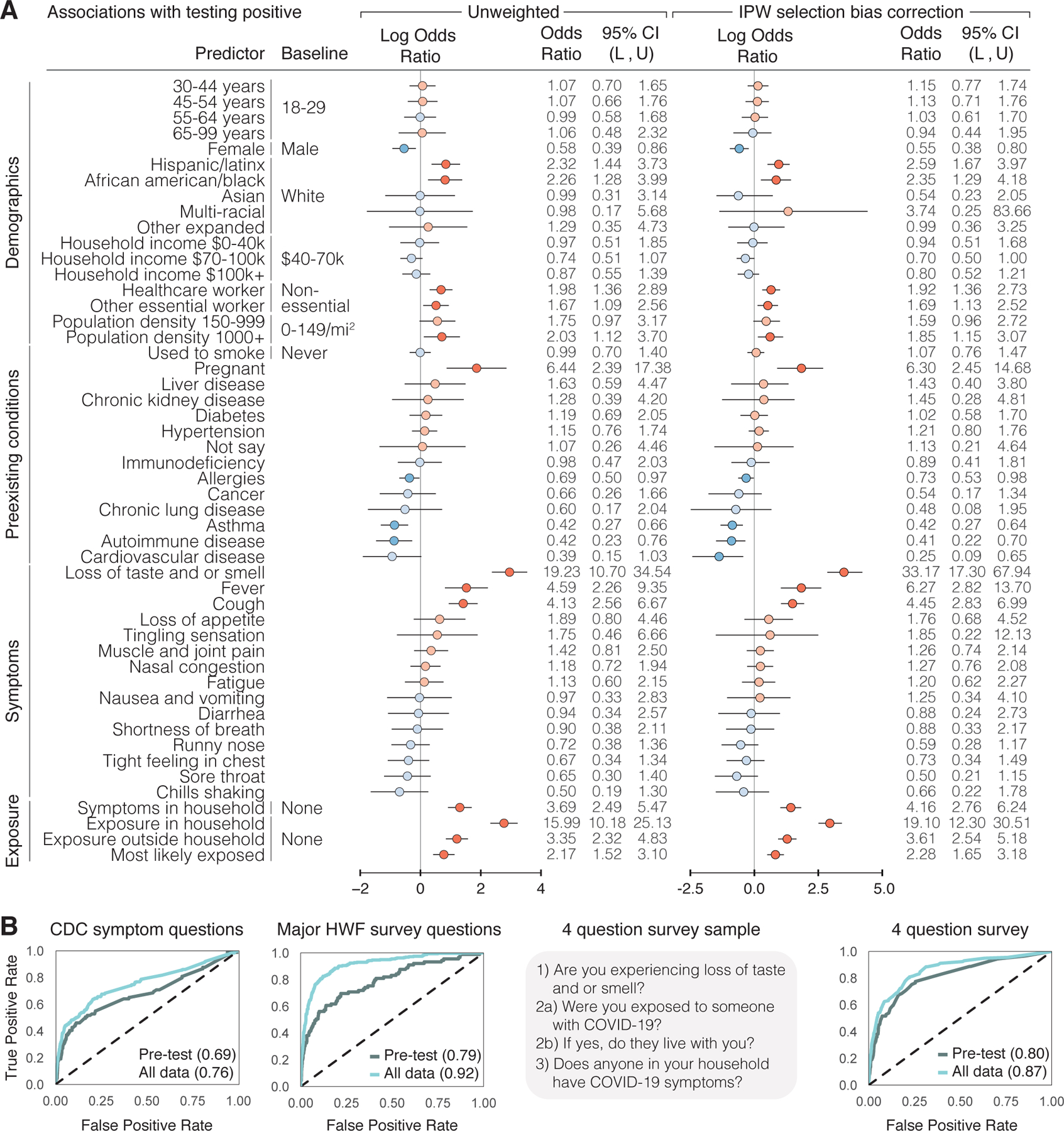
a, Factors associated with respondents receiving and reporting a positive test result, as determined through logistic regression. Left: results from unweighted model. Right: results from model incorporating selection probabilities via inverse probability weights (IPW). Reference categories are indicated where relevant, and when not indicated, the reference is not having that specific feature. Log odds ratios and their confidence intervals are plotted, with red indicating positive association and blue indicating negative association. Darker colors indicate confidence intervals that do not cover 0. Population density and neighborhood household income were approximated using the county level data. L = lower bound, U = upper bound of 95% confidence intervals. N = 3,829 users, 315 positive, 3,514 negative who took the V3 survey within ±2 weeks of receiving a test. b, Prediction of positive test results using ±2 weeks of data from test date, using 5-fold cross validation, shown as receiver operating characteristic (ROC) curves. The XGBoost model was trained on different subsets of questions: CDC Symptom Questions = using just the subset of COVID-19 symptoms listed by the CDC. All Survey Questions = using the entire survey. 4 Question survey = using a reduced set of 4 questions that were found to be highly predictive. Numerical values are AUC = area under the ROC curve. N = 3,829 users.
Motivated by previous studies that reported high cluster transmissions occurred in families in China, Korea, and Japan39–41, we explored household and community exposures as risk factors for users testing PCR positive. The odds of testing positive were much higher for those who reported within-household exposure to someone with confirmed COVID-19 than for those who reported no exposure at all (Methods) (OR: 19.10, 95% CI: [12.30, 30.51]; p < 0.001) (Fig. 3a, Supplementary Table 5). This is stronger than comparing the odds of positive among those who reported exposure outside their household versus no exposure at all (OR: 3.61, 95% CI: [2.54, 5.18]; p < 0.001). Further, the odds of testing PCR positive are much higher for those exposed in the household versus exposed outside their household or not exposed at all, after adjusting for similar factors (OR: 10.3, 95% CI: [6.7, 15.8]; p <0.001) (Supplementary Table 10). These results are consistent with previous findings that indicate a very high relative risk associated with within-household infection40,42–45. This is compatible with finding that other closed areas with high levels of congregation and close proximity, such as churches46, food processing plants47, and nursing homes48, have shown similarly high risk of transmission.
Developing models to predict who is likely to be SARS-CoV-2(+) from self-reported data has been proposed as a means to help overcome testing limitations and identify disease hotspots13,14. We used data from the 3,829 users who used the app within ±2 weeks of their reported PCR test results to develop a set of prediction models that were able to distinguish positive and negative results with a high degree of predictive accuracy on cross-validated data (Fig. 3b). We used the machine learning method XGBoost, which outperformed other classification methods (Extended Data Fig. 6). For each user, we predicted their test results using either data before the test (“Pre-test”), which would be most useful in predicting COVID-19 cases in the absence of molecular testing, and using data before and after the test (“All data”) as a benchmark for the best possible prediction we could make using all available data. We considered: (1) a symptoms-only model, which included only the most common COVID-19 symptoms listed by the CDC; (2) an expanded model, which further incorporated other features observed in the survey; and (3) a minimal-features model, which retained only the four most predictive features (loss of taste and/or smell, exposure to someone with COVID-19, exposure in the household to someone with confirmed COVID-19, and exposure to household members with COVID-19 symptoms) (Methods, Supplementary Tables 11–14). The symptoms-only model achieved a cross validated AUC (area under the ROC curve) of 0.76 using data before and after a test, and AUC 0.69 using just the pre-test data. Expanding the set of features to include other survey questions substantially improved performance (cross-validated AUC 0.92 all data, 0.79 pre-test). In the minimal-features model, we were able to retain high accuracy (cross-validated AUC 0.87 all data, AUC 0.80 pre-test) despite only including 4 questions, one of which was a symptom and three referring to potential contact with known infected individuals. Restricting the observed inputs to the 1,613 users (89 positive, 1,524 negative) who answered the survey in the 14 days prior to being tested limited the sample size and reduced the overall accuracy, but the relative performance of the models was similar (Fig. 3b).
The fact that a fraction of SARS-CoV-2(+) users report no symptoms or only less common symptoms (Fig. 2g) raises the possibility that many infected users might behave in ways that could spread disease, such as leaving home while unaware that they are infectious. In spite of widespread shelter-in-place orders during the sample period, we found extensive heterogeneity across the US in the fraction of users reporting leaving home each day, with 61% of the responses from April 24 – May 12 indicating the user had left home that day (Fig. 4a). The majority (77%) of these users reported leaving for non-work reasons, including exercising; 19% left for work (Fig. 4b). Of people who left home, a majority but not all users reported social distancing and using face protection (Fig. 4c). Different states had persistently different levels of people wearing masks and leaving home (Extended Data Figure 9). This incomplete shutdown with partial adherence, and lack of total social and physical protective measures, coupled with insufficient isolation of infected cases, may contribute to continued disease spread.
Figure 4: Behavioral Factors Potentially Contributing to COVID-19 Spread.
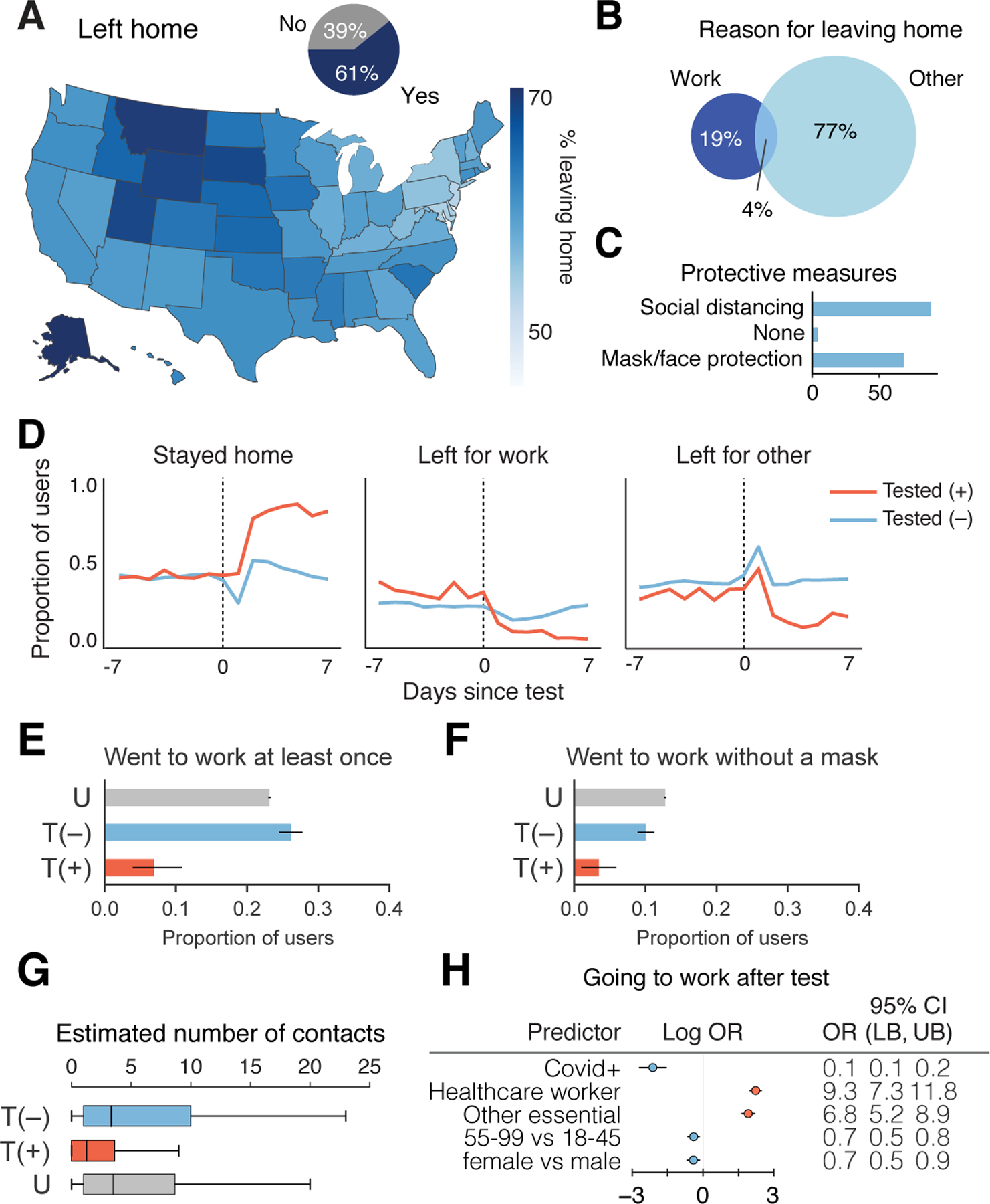
a, Proportion of responses indicated users leaving home across US (map) or overall (inset pie chart). N = 1,934,719 responses from 279,481 users. b, Percentage of responses of users reporting work or other reason for leaving home. N = 1,176,360 responses from 244,175 users. c, Reported protective measures taken per response taken by users upon leaving home. N = 1,176,360 responses from 244,175 users. d, Time course of proportion of SARS-CoV-2 PCR tested positive (+) or negative (−) users staying home, leaving for work, and leaving for other reasons. N=4,396 total users who reported being tested positive or negative in the V3 survey and responded on at least one day within ±1 week of being tested. e–f, Proportion SARS-CoV-2 PCR tested (+) or (−), or untested (U), going to work (e) (N=14 out of 203 positive, 664 out of 2,533 negative, 62,483 out of 269,833 untested), going to work without a mask (f) (N=7 out of 203 positive, 255 out of 2,533 negative, 34,481 out of 269,833 untested) who responded within the 2–7 days post test for T = tested, or 3 weeks since last check in for U = untested. Healthcare workers and other essential workers are compared to non-essential workers as the baseline. g, Average reported number of contacts per 3 days in the 2–7 days after their test date. T(+), N=138 users; T(−), N=2,269 users; U, N=254,751 users. OR = odds ratio, LB = lower bound, UB = upper bound, CI = confidence interval, T = tested, P = positive, U = untested. h, Logistic regression analysis of factors contributing to users going to work in the 2–7 days after their COVID-19 test N=678 users going to work out of 2,736 users with definitive test outcome and survey responses in the 2–7 days after their test date.
Given the large number of people leaving home each day, it is important to understand the behavior of people who are potentially infectious and therefore likely to spread SARS-CoV-2. To this end, we further analyzed the behavior of people both reporting to be PCR test (+) or (−). There was an abrupt large increase in users reporting staying home after receiving a positive test result (Fig. 4d,e). Many, but not all, PCR test(+) users reported staying home in the 2–7 days after their test date (7% still went to work, N=14 out of 203 users), whereas 23% (N=62,483 out of 269,833 users) of untested and 26% (N=664 out of 2, 533 users) of PCR test(−) left for work (Fig. 4d,e). Similarly, 3% of PCR test(+) (N=7 out of 203 users) users reported going to work without a mask, in contrast with untested (12.7%, N=34,481 out of 269,833 users) and PCR test(−) (10%, N=255 out of 2,533 users) users (Fig. 4f). Positive individuals reported coming into close contact with a median of 1 individual over 3 days in contrast to individuals who tested negative or were untested, who typically came in close contact with a median of 4 people within 3 days (Fig. 4g). Regression analysis suggested that healthcare workers (OR: 9.3, 95% CI: [7.3, 11.8]; p <0.001 ) and other essential workers (OR: 6.8, 95% CI: [5.2, 8.9]; p < 0.001) were much more likely to go to work after taking a positive or negative test, and PCR positive users were more likely to stay home (OR: 0.1, 95% CI: [0.1, 0.2]; p <0.001) (Fig. 4h, Supplementary Table 15).
Discussion
Using individual level data collected from the How We Feel app, we showed that incorporating information beyond symptoms — in particular, household and community exposure — is vital for identifying infected individuals from self-reported data. This finding is particularly important for risk assessment at the early stage of transmission, e.g., during the latent and presymptomatic periods when subjects have not developed symptoms yet, so high risk subjects can have priorities for being tested and quarantined and close contacts can be traced, in order to block the transmission chain early on. Our results show that vulnerable groups include subjects with household and community exposure, health care workers and essential workers, and African-American and Hispanic/Latinx users. They are at higher risk of infection and should have priorities for being tested and protected. Our finding also show significant racial disparity after adjusting for the effects of pre-existing medical conditions, and needs to be addressed.
We find evidence among our users for several factors that could contribute to continued COVID-19 spread despite widespread implementation of public health measures. These include a substantial fraction of users leaving their homes on a daily basis across the US, users who claim to not socially isolate or return to work after receiving a PCR test(+), self-reports of asymptomatic, mildly symptomatic, or presymptomatic presentation, and a much higher risk of infection for people with within-household exposure.
That said, we note several limitations of this study. The HWF user base is inherently a non-random sample of voluntary users of a smartphone app, and hence our results may not fully generalize to the broader US population. In particular, the study may be subject to selection bias by not capturing populations without internet access, such as low-income or minority populations, who may be at elevated risk and over-representation of females. Our results are based on self-reported survey data, hence may suffer from misclassification bias—particularly those based on self-reported behaviors. Moreover, a relatively small percentage of subjects received PCR testing. As shown in Figure 2, the subjects who were tested were more likely to be symptomatic, health care workers and essential workers and people of color. Naïve regression analysis of test results using responses of subjects who were tested could be subject to selection bias. To mitigate this, we have attempted to correct for these selection biases via the inverse probability weighting approach by estimating the selection probability, the probably of receiving tests, using the observed covariates (Methods). Some residual bias may persist if there remain some unobserved factors related to underlying disease status and receiving a test, or if the selection model is in misspecified. What’s more, the HWF user base may not be representative of the broader US population. Although our regression analysis conditioned on a wide range of covariates in order to account for possible selection bias, if any unobserved factors associated with underlying disease status are also related to using the app—e.g., health literacy, access to the internet, particularly vulnerable groups such as low income families—the results may be subject to additional selection bias.
Although there is enormous economic pressure on states, businesses, and individuals to be able to return to work as quickly as possible, our findings highlight the ongoing importance of social distancing, mask wearing, large-scale testing of symptomatic, asymptomatic and mildly symptomatic people, and potentially even more rigorous ‘test-trace-isolate’ approaches49–52 as implemented in several states, such as Massachusetts, New York, New Jersey and Connecticut, which have bended the infection curve49–52. Applying predictive models on a population scale will be vitally important to provide an “early warning” system for timely detection of a second wave of infections in the US and for guiding an effective public policy response.
As testing resources are expected to continue to be limited, HWF results could be used to identify which groups should be prioritized, or potentially to triage individuals for molecular testing based on predicted risk. HWF’s integration of behavioral, symptom, exposure, and demographic data provides a powerful platform to address emerging problems in controlling infection chains, rapidly assist public health officials and governments with developing evidence-based guidelines in real time, and stop the spread of COVID-19.
Methods
Ethics Statement
The How We Feel application was approved as exempt by the Ethical & Independent Review Services LLP IRB (Study ID: 20049 – 01). The analysis of HWF data was also approved as exempt by Harvard University Longwood Medical Area IRB (Protocol #: IRB20–0514) and the Broad Institute of MIT and Harvard IRB (Protocol #: EX-1653). Informed consent was obtained from all users and the data were collected in de-identified form.
Open-Source Software:
We used the following open-source software in the analysis:
- Numpy: https://www.numpy.org
- Stéfan van der Walt, S. Chris Colbert and Gaël Varoquaux. The NumPy Array: A Structure for Efficient Numerical Computation, Computing in Science & Engineering, 13, 22–30 (2011)
- Matplotlib: https://www.matplotlib.org
- John D. Hunter. Matplotlib: A 2D Graphics Environment, Computing in Science & Engineering, 9, 90–95 (2007),
- Pandas: https://pandas.pydata.org/
- Wes McKinney. Data Structures for Statistical Computing in Python, Proceedings of the 9th Python in Science Conference, 51–56 (2010)
- Scikit-learn: https://scikit-learn.org/stable/index.html
- Fabian Pedregosa, Gaël Varoquaux, Alexandre Gramfort, Vincent Michel, Bertrand Thirion, Olivier Grisel, Mathieu Blondel, Peter Prettenhofer, Ron Weiss, Vincent Dubourg, Jake Vanderplas, Alexandre Passos, David Cournapeau, Matthieu Brucher, Matthieu Perrot, Édouard Duchesnay. Scikit-learn: Machine Learning in Python, Journal of Machine Learning Research, 12, 2825–2830 (2011)
- SciPy: https://www.scipy.org
- Pauli Virtanen, Ralf Gommers, Travis E. Oliphant, Matt Haberland, Tyler Reddy, David Cournapeau, Evgeni Burovski, Pearu Peterson, Warren Weckesser, Jonathan Bright, Stéfan J. van der Walt, Matthew Brett, Joshua Wilson, K. Jarrod Millman, Nikolay Mayorov, Andrew R. J. Nelson, Eric Jones, Robert Kern, Eric Larson, CJ Carey, İlhan Polat, Yu Feng, Eric W. Moore, Jake VanderPlas, Denis Laxalde, Josef Perktold, Robert Cimrman, Ian Henriksen, E.A. Quintero, Charles R Harris, Anne M. Archibald, Antônio H. Ribeiro, Fabian Pedregosa, Paul van Mulbregt, and SciPy 1.0 Contributors. (2020) SciPy 1.0: Fundamental Algorithms for Scientific Computing in Python. Nature Methods, in press.
- Statsmodels: https://www.statsmodels.org/stable/index.html
- Seabold, Skipper, and Josef Perktold. “Statsmodels: Econometric and statistical modeling with python.” Proceedings of the 9th Python in Science Conference. 2010.
- R: http://www.r-project.org
- R Core Team (2020). R: A language and environment for statistical computing. R Foundation for Statistical Computing, Vienna, Austria. URL https://www.R-project.org/.
- Yihui Xie (2015) Dynamic Documents with R and knitr. 2nd edition. Chapman and Hall/CRC. ISBN 978–1498716963
- Tidyverse: http://www.tidyverse.org
- Wickham et al., (2019). Welcome to the tidyverse. Journal of Open Source Software, 4(43), 1686, https://doi.org/10.21105/joss.01686
- Data.table: https://CRAN.R-project.org/package=data.table
- Matt Dowle and Arun Srinivasan (2019). data.table: Extension of `data.framè. R package version 1.12.8.
- sampleSelection
- Arne Henningsen, Ott Toomet, Sebastian Peterson. Sample Selection Models.
Application
The How We Feel application was developed in React Native (https://reactnative.dev/), using Google App Engine (https://cloud.google.com/appengine) and Google BigQuery (https://cloud.google.com/bigquery) for the backend, and launched on the Android and iOS platforms. Users were identified only with a device-specific randomly generated number. Users below the age of 18 were not allowed to use the application.
Inclusion Criteria
If a user logged in multiple times in a day, only the first was retained. We excluded any users who responded to a survey version on one day and then on a later day responded to an older survey version. We excluded any users who reported different genders on different days, and we excluded any observations with missing feeling, gender, or smoking history.
Prior to survey version 3, users responded only whether or not they received a COVID-19 test, and we assumed that they received a PCR test. In survey version 3, users reported the type of test they received, and we excluded antibodies tests from analyses.
Logistic regression: receiving a test (Fig. 2)
The How We Feel app allows users to report prior COVID-19 test information, including test date, type (swab vs. antibody), result (positive, negative, or unknown), location of test, and reason for receiving the test. A user may report that the test result is not yet known, and then update this information in future check-ins. A test was considered to be ‘unique’ if it was reported by the same user with the same test date (including ‘NA’, n=11) and type. For this analysis, ‘swab’ tests were assumed to be PCR-based tests for SARS-CoV-2. Tests with a reported test date prior to January 1, 2020 were excluded. Prior to Version 3, users were not asked about their test type. Tests from the same user with the same test date may have been missing a reported test type in earlier check-ins, but the user may have filled in this information at later check-ins; in this case, we consider this to be the same test and assign the reported test type. For each unique test, all test information (including result) from the user’s most recent check-in was used.
We compared testing data from How We Feel to the COVID Tracking Project (https://covidtracking.com/) for all 50 states and the District of Columbia. For comparison with How We Feel data used in this analysis, we extracted COVID Tracking Project data through May 11, 2020. Tests with a “not yet known” test result were excluded from this analysis. In Extended Data Fig. 6, the left panel compares the number of unique swab tests divided by the number of unique users in How We Feel to the total tests per state (‘totalTestResults’) reported by the COVID Tracking Project divided by the state population as estimated by the 2010 Census (https://pypi.org/project/CensusData/). The right panel compares the proportion of unique swab tests in How We Feel with a positive result to the proportion of tests in the COVID Tracking Project with a positive result (‘positive’).
For the analysis of who received a test, the outcome was 1 if a user reported a swab test 0 otherwise. We fit a logistic regression model using demographics, professions, exposure, symptoms, among other covariates. Time-varying measures (e.g. symptoms) were averaged over their V3 survey responses. Analysis was conducted with the statsmodel package (v0.11.1) in Python. We reported the log odds ratios and odds ratios, along with corresponding 95% confidence intervals. Supplementary Table 3 lists the covariates used in the selection (who received a test) regression model, as well as the estimated coefficients, 95% confidence intervals, and p-values.
UMAP (Fig. 2d–f)
Of the 3,661,716 survey responses collected by HWF up until May 12, 2020, 667,651 reported having at least one symptom (excluding ‘feeling_not_well’) from the set of 25 symptom questions asked across all surveys. Only these responses were used for UMAP analysis. Each of the 25 queried symptoms was treated as a binary variable. The input data was therefore a matrix of 667,651 survey responses with 25 binary symptom variables. UMAP was applied to this matrix following McInnes and Healy (UMAP: Uniform Manifold Approximation and Projection for Dimension Reduction, ArXiv e-prints 1802.03426, 2018) using the Python package umap-learn with parameters: n_neighbors=1000, min_dist=0.5, metric=‘hamming’. The resulting two-dimensional embedding was plotted with different colormaps for each response in Fig3. The distribution of all 25 symptoms are shown individually in FigS3.1. See notebook ‘HWF_UMAP_final.py’ for full implementation.
Asymptomatic Analysis (Fig. 2g):
Each of the symptoms were categorized as either a CDC symptom, a non-CDC symptom or asymptomatic. The CDC symptoms were defined as patients that reported feeling well or unwell with either a dry cough, shortness of breath, chills/shaking, fever, muscle/joint pain, sore throat, or loss of taste/smell. The Non-CDC symptoms were defined as patients that reported feeling well or unwell with any symptoms that were not defined by the CDC, including abdominal pain, confusion, diarrhea, facial numbness, headache, irregular heartbeat, loss of appetite, nasal congestion, nausea/vomiting, tinnitus, wet cough, runny nose, etc.
We restricted analysis to the subset of patients for which we observed symptom data on their test date. For each user that tested positive or negative, we categorized participants into three groups: {CDC symptoms, Non-CDC symptoms, Asymptomatic}. Participants were grouped into CDC symptoms if they reported any CDC symptoms and participants that reported only non-CDC symptoms were grouped in the Non-CDC symptoms category. Participants were considered asymptomatic if they reported none of the above symptoms. Proportions were reported and graphically represented for each group in Figure 2g.
COVID-19 symptoms and dynamics (Fig. 2h–j)
In the HWF survey data up to May 12, 2020, a total of 8,429 unique users reported the result of a qPCR COVID-19 test (1,067 positive, 7,362 negative). For surveys v1–2 we assumed that all tests were qPCR tests since antibody tests were rare before April 24. In the v3 survey (April 24 – May 12) the test type was explicitly asked. Among qPCR tested users, each response was assigned a date in days relative to the self-reported test date. The aggregate fraction of responses reporting each symptom was visualized in a histogram in Fig 2h. The aggregate fraction of responses reporting each symptom at each timepoint among users that tested positive was visualized in a heatmap in Fig 2i. Fig 2j shows the element-wise log ratio of the positive-test and negative-test heatmaps. I.e. each element = log(fraction positive responses reporting symptom at time t / fraction negative responses reporting symptom at time t). The heatmaps were smoothed by taking the average for each symptom within a sliding window of +/− 1 day for visualization.
Logistic regression: test results (Fig. 3a)
A large number of risk factors survey questions were added in V3 of the survey, so we restricted analysis to V3 survey data for the purposes of identifying risk factors associated with SARS-CoV-2(+) test results. User responses were selected using a symmetric 28 day window around the last reported COVID-19 swab test date for any given user. Users that had no reported test outcome, or reported both positive and negative outcomes in different responses were removed. Users who identified as “other” in the gender response were dropped due to small sample size. Median neighborhood household income was estimated by mapping user’s ZIP codes to corresponding ZCTAs from the census, and then using the American Community Survey 5-year average results from 2018 to infer a neighborhood household income (B19013_001E). Population density was calculated at the county level for each user based on data from the Yu Group at UC Berkeley (https://github.com/Yu-Group/covid19-severity-prediction)
Race was a categorical variable, with distinct groups: “white”, “African-American”, “Hispanic/Latinx”, “Asian”, “multi-racial” for those who marked two or more race categories, “other” for those who marked “other”, “Native American,” or “Hawaiian/pacific islander,” and “unknown” for those who did not disclose their race. A given food source was marked as True if the user had indicated the use of that food source over any response within the given time window.
Because the HWF app asks for a separate set of symptoms depending whether or not the user reported feeling “well,” there is not a 1 to 1 correspondence between symptoms reported by those feeling “well” and “not well.” We excluded symptoms that were only present among those feeling “well” or only among those feeling “not well”. For symptoms reported by both those who were “well” and “not well”, we combined them into single symptoms. Supplementary Table 2 shows the variables merged using the “any” function. Each symptom’s responses were then averaged over all available responses over the 28 day window. Similarly, distribution of sleep was averaged across the time window.
Multiple logistic regression was performed using statsmodels with the binary response outcome being the swab test outcome (positive coded as 1, negative as 0) to obtain unadjusted coefficients, which were converted to odds ratios using exponentiation. Supplementary Table 4 lists the covariates used in the unadjusted outcome regression model, as well as the estimated coefficients, 95% confidence intervals, and P-values.
To mitigate selection bias inherent in restricting the analysis to those who have received a test, we used several inverse probability weighting (IPW) adjustments. The probability of selection was estimated via the logistic regression analysis of who received a test described above. They were incorporated into the outcome model via inverse probability weighting, and we reported confidence intervals based on robust (sandwich-form) standard errors and bootstrap standard errors. As IPW can be sensitive to very small selection probability, we truncated them at several different values, using 0.1 and 0.9; and 0.05 and 0.95. The results using the truncated IPW selection probabilities at 0.1 and 0.9 were reported in Figure 3. The result using truncated IPW selection probabilities at 0.05 and 0.95 were similar. Supplementary Table 5 lists the covariates used in the outcome regression model with IPW truncation at 0.1 and 0.9, as well as the estimated coefficients, and 95% confidence intervals. Confidence intervals were obtained by bootstrapping the entire model selection process with 2000 replicates. Specifically, for each bootstrap replicate, the entire dataset was resampled with replacement, a new selection/propensity model was fitted for who gets a test, followed by a new IPW model fit using the inferred propensities from the bootstrap sample. Coefficients for the IPW models across the bootstrap samples were used to generate the confidence intervals and mean value of the coefficient.
For additional sensitivity analysis, we used the bivariate probit model with sample selection used in econometrics to simultaneously estimate a selection (who gets tested) equation and an outcome (who tests positive) equation incorporating the selection probability as an additional covariate. Due to possible collinearities, not all features could be used in both the selection model and the outcome model. Specifically, profession could only be included in the selection model, and thus should be interpreted with caution. Supplementary Table 6 lists the covariates used in the full information maximum likelihood estimates of the selection and outcome regression model, as well as the estimated coefficients, 95% confidence intervals, and p-values. Qualitatively, the trends observed in the simultaneous selection/outcome model fitting are similar to those found in the 2step selection + IPW outcome logistic models.
To address sample bias in the user distribution in comparison to the distribution of individuals in the US, we employed a post-stratification correction for non-probability sampling models as an additional analysis. Post-stratification using age, gender, ethnicity, and location, was performed on the testing selection model which generates the IPW weights for the testing positive model. The US was subdivided into the 9 major census regions (see Supplementary Table 7). A joint distribution of estimated population over age, gender, ethnicity, and region was obtained from the American Community Survey 5-year estimates from 2018. The corresponding distribution of users was generated across the same variables, and the ratio between each cell in the census distribution and the user distribution was used as the corresponding inverse probability weight in the testing selection model. The testing selection model thus should represent a user’s probability of getting tested from a corrected user base distribution matching major US census demographics. The census-corrected testing selection model was used to generate IPW weights for the subsequent testing positive model and was otherwise performed as before. Bootstrapping was performed on the entire process. The model coefficients for the post-stratification testing model are shown in Supplementary Table 8 , while coefficients and confidence intervals for the subsequent post-stratified IPW test outcome model are shown in Supplementary Table 9. A comparison of model coefficients with and without post-stratification can be found in Extended Data Figure 9. A comparison of the census based post-stratification corrected models to the uncorrected models can be found in Fig. S7a. Performing census based post-stratification correction yields model coefficients and confidence intervals that are similar compared to when no census based post-stratification is performed.
To assess whether or not the states with the largest number of users bias the results, we also performed a comparison between the selection and outcome models with IPW correction with and without users from CA and CT (see Fig. S7b). When removing CA and CT data, coefficients from the selection and outcome model remain largely similar, suggesting limited bias due to CA and CT. Moreover, there is an overall increase in confidence interval widths of the outcome model, reflecting an overall increase in variance. Together, this comparison suggests that the CA and CT userbase add additional datapoints without adding substantial bias that may make the overall sample and corresponding analyses unrepresentative of the entire US population.
Household Transmission Analysis
In the HWF survey version 3, users were first asked if they were exposed to someone with confirmed COVID-19. If they answered yes, then they were asked if that person lived in their household. We removed users who answered something other than “yes” to the first question and who answered the second question. Additionally, we restricted the analysis to users who reported a negative or positive COVID-19 swab test and those who reported 2 or more household members. The outcome of interest was the binary outcome of testing positive on the COVID-19 swab test. The exposure of interest was the binary variable of having a household member test positive for COVID-19; we grouped respondents who answered no with those who did not answer the question regarding household members together.
The rest of the analysis proceeded similarly to the analysis for Fig. 3a, including the covariates used and the symptom collapsing strategy for each user across their responses within the two-week window before the test and two-week window after the test. We also performed sensitivity analysis using symptoms prior to the test. The difference between this analysis and that in Fig. 3a is that the reference group for household exposure was any other exposure or no exposure, whereas the reference group for household exposure and for other exposure in Fig. 3a is no exposure.
For both the unadjusted and adjusted analysis, we performed logistic regression without and with the covariates. Supplementary Table 10 shows the 95% confidence intervals were calculated on the log odds ratio scale and then exponentiated to obtain odds ratios.
Sensitivity analysis: Firth Regression
Because of the small number of users in the user base who received a SARS-Cov2 PCR test (1.7%) and the small number of tested users who received a positive test (8.2%), it is possible for standard logistic regression to be biased. To address this issue, we performed sensitivity analysis with Firth regression (Firth, D., 1993. Bias reduction of maximum likelihood estimates. Biometrika, pp.27–38.), as implemented in the logistf R package (https://cran.r-project.org/package=logistf). We found very little difference between the Firth regression results and the logistic regression results presented in the paper (Extended Data Figure 8), indicating the imbalance of tested users or users who tested positive was not so severe as to bias the results.
Prediction models (Fig. 3c)
XGBoost was compared across different featurizations and subsets of the data to assess the predictiveness of the algorithm on the HWF test result data. Two datasets were generated according to the data selection and featurization used in the regression analysis of Covid-19 swab test outcomes, with the difference between the two sets being the time span used for the window, and the inclusion of additional features not used for inference. In the “pre-test” dataset, the window was selected such that only responses from 14 days before the test up until the day before the last reported test were included for analysis. The post-test dataset, on the other hand, is identical to the regression analysis dataset, using data from 14 days before and after the last reported test. The features for the different feature sets are shown in Supplementary Tables 11–13. Mask wearing and social isolation were computed as time averages of the responses to these questions. Models were trained and tested using 5-fold cross-validation over the datasets. Within each fold, an additional 3-fold cross validation was performed on the training set to optimize model hyperparameters before testing on the test set of that fold (see Supplementary Table 14 for grid search coordinates). Test set AUCs from each fold were averaged to form a final AUC estimate. Final ROC curves were computed using the combined test set scoring and test set labels from each fold.
In addition to the models shown in the main text, we tested a range of classifiers, feature sets, and data aggregation strategies for their performance at predicting COVID-19 test results from HWF survey data (shown in Extended Data Fig. 4). Input data was restricted to v3 survey data collected between 04–24 and 05–12, and to qPCR tested users who responded within −10 and +14 days of their test: total of 3,514 negative tests and 315 positive tests. Three different feature sets, each consisting of a series of binary input variables from the HWF survey, were used: 56 symptoms, 77 additional features, or all 133 features together (see ‘HWF_model_comparison_final.py’ for full feature lists). Note that this featurization differs slightly from the featurization used in the logistic regression described above, the goal of which was inference rather than prediction. Each of the 3,829 qPCR tested users responded between 1 and 25 times within the time window of analysis. To account for time and sparse response rates we binned data across time in four different ways: i) average response for each feature in the 9 days preceding the test data (‘pre-test’); ii) average response from −10 to +14 days (‘average’); iii) bin the data into three weeks ([−10,−1], [0,7], [8,14]) and average each separately, creating a separate time indexed feature label for each time bin (‘week_bins_avg’); or iv) imputing the response for days with no data by backfilling, then forward filling, then proceeding as in iii (‘week_bins_imp’). The classifiers were implemented from the scikit-learn and XGBoost Python packages with the following parameter choices: LogisticRegression(), LassoCV(max_iter=2000), ElasticNetCV(max_iter=2000), RandomForestClassifier(n_estimators=100), MLPClassifier(max_iter=2000), XGBClassifier(). Hyperparameters for CV methods were automatically optimized by grid-search using 5-fold cross-validation. Mean AUC was calculated for each classifier using 5-fold cross-validation. See FigS4.1 for results and ‘HWF_model_comparison_final.py’ for full implementation.
Post-Test Behavior Analysis (Fig. 4d–g)
Users with post test information (in the 2–7 days) after their test date (or hypothetical test date for untested users) were collected and analyzed. All featurization on this post test window was identical to that of the selection/test outcome models. For computing if a user went to work at least once, all responses for which users either leaving the house or not from version 3 were used, and if any response for a user contained a yes answer to leaving the house for work, the user was marked as leaving the home for work. Similar analysis was performed for leaving to work without a mask by marking the user as a yes if they reported they were going to work and separately reported not using a mask when leaving the house that day. Proportions of each behavior across the three populations (tested positive, tested negative, and untested) were computed, and were bootstrapped with 2000 replicates to generate confidence intervals. Estimated number of contacts was performed similarly, except using the average value over individual user responses across the 2–7 days after their test.
Logistic analysis was performed to understand the effect of PCR test result on user behavior in the 2–7 days after test, adjusting for other potential covariates. Supplementary Table 15 lists the covariates used in the unadjusted outcome regression model, as well as the estimated coefficients, 95% confidence intervals, and P-values.
Extended Data
Extended Data Fig. 1. HWF Survey Structure.
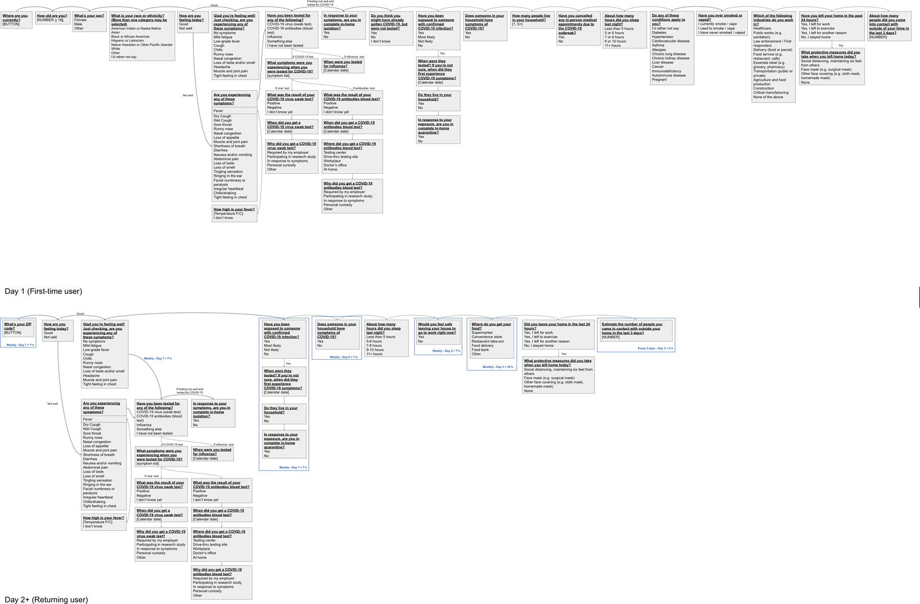
Flow of questions through the HWF survey V3 for both first time users and returning users.
Extended Data Fig. 2. Number of Repeat Uses Per HWF User.
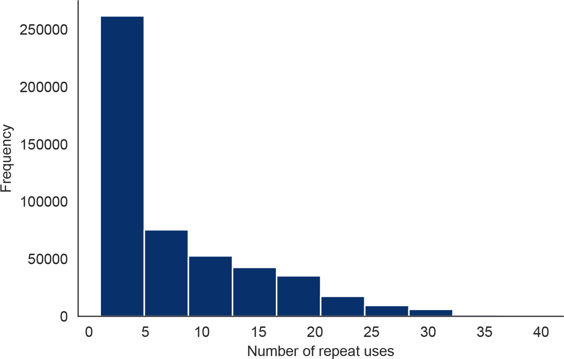
The number of times each HWF user checked into the app.
Extended Data Fig. 3. Analyses Regarding Receiving PCR-based Viral Tests.
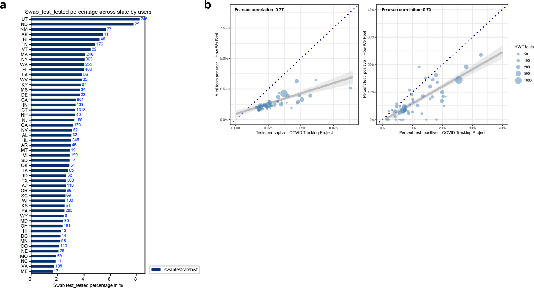
a, A univariate plot of the frequency of people receiving a PCR-based viral test in each state. b, Correlations of viral tests per person (left) and percent of tests with positive results (right) comparing state-level data from How We Feel to testing data collected by the COVID Tracking Project. Each point represents a state, and the size of the point scales continuously with the total number of viral tests reported to How We Feel. Tests with an unresolved result at time of analysis were excluded. Several sizes shown in legend for reference. The dark blue dotted line is the x=y line and represents the expectation if sampling was random with respect to testing and test-positive results. The gray line is the best-fit linear regression line (and 95% CI) weighted by the number of viral tests reported to How We Feel.
Extended Data Fig. 4. UMAP Visualization of Multivariate Self-Reported Symptom Structure.
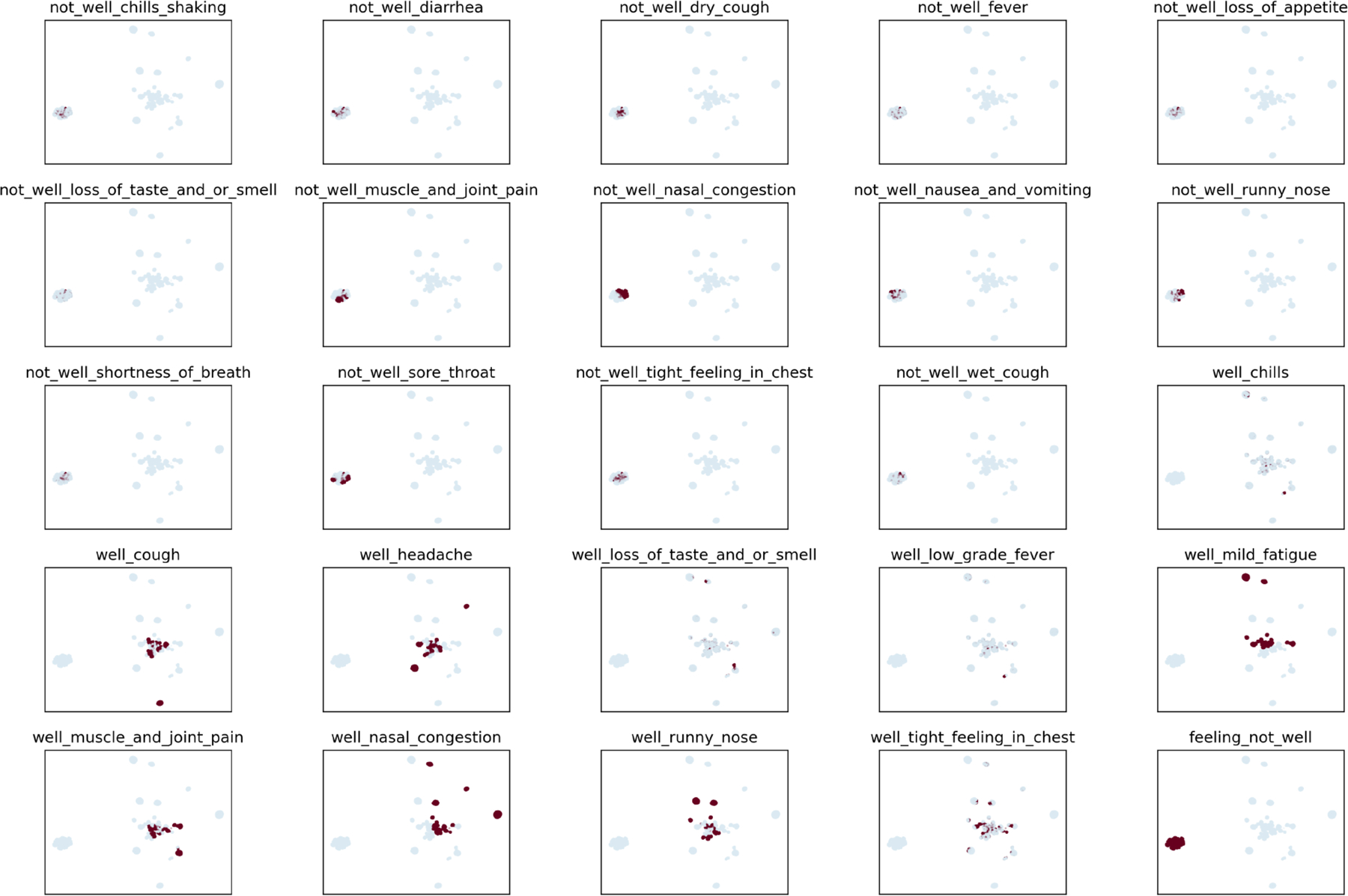
Plots show individual distributions for 25 self-reported symptoms on the UMAP embedding shown in main text Fig. 2.
Extended Data Fig. 5. HWF Usage Over Time Per COVID-19 Tested User.
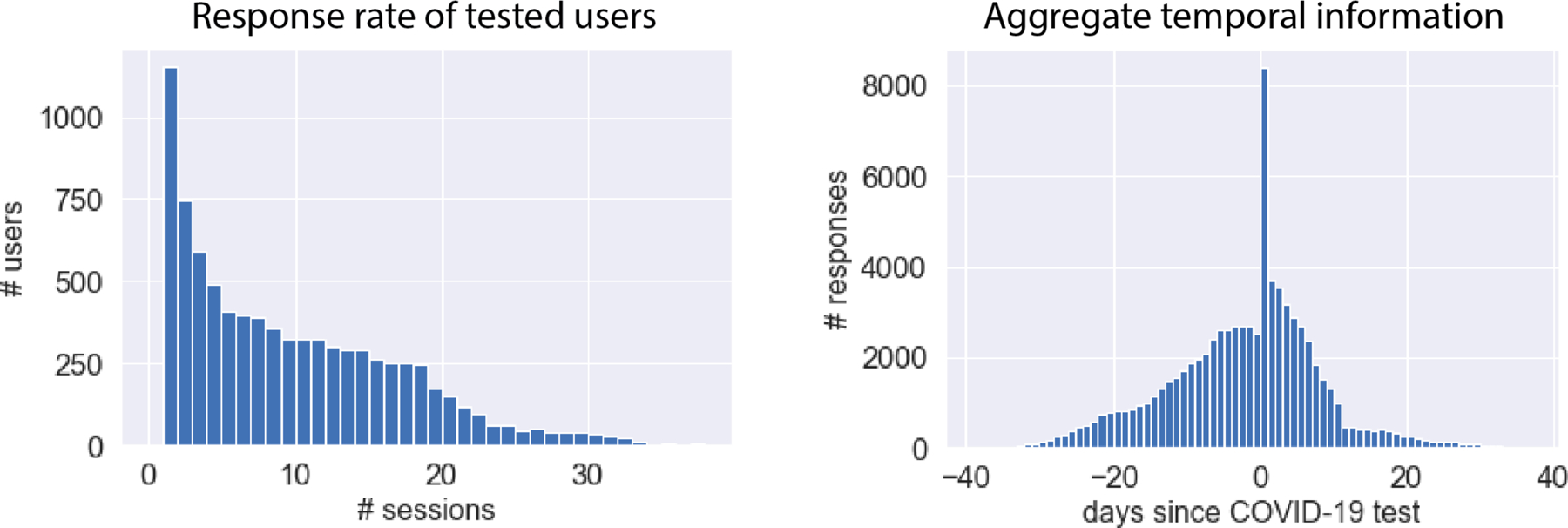
Left: Response rate of tested users. COVID-19 HWF users provided between 1 and 39 responses each, with a mean of 9 responses per user. Right: Aggregate temporal information showing number of responses relative to COVID-19 test date. In aggregate, we obtains > 1,843 survey responses each day within a window of 7 days of the COVID-19 test.
Extended Data Fig. 6. COVID-19 Test-Result Prediction Model Comparisons.
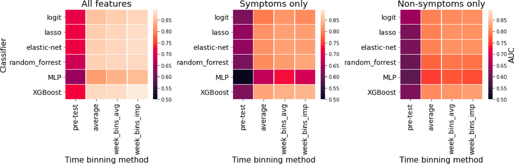
Six classified models (heatmap rows) were trained to predict COVID-19 test results from survey data among users tested within the V3 survey (N=3,829; 315 positive; April 24 - May 12), as assessed by cross-validation AUC measurement. Hyperparameters were optimized by grid search. The input survey data was treated in a variety of ways with models trained on either: the average of responses provided before the test (pre-test), the average of responses provided from 10 days before to 14 days after the test (average), the weekly average in this window (week_bins_avg), or the weekly average after imputing missing responses by back-filling (week_bins_imp). The analysis was performed on three different feature sets: all survey features (N=133), symptoms only (N=56) or non-symptoms only (N=77). The overall most accurate classifier was XGBoost, which was used for the analysis in Fig. 3.
Extended Data Fig. 7. Results of Sensitivity Analyses for Biased Geographic Locations of Users and Demographics.
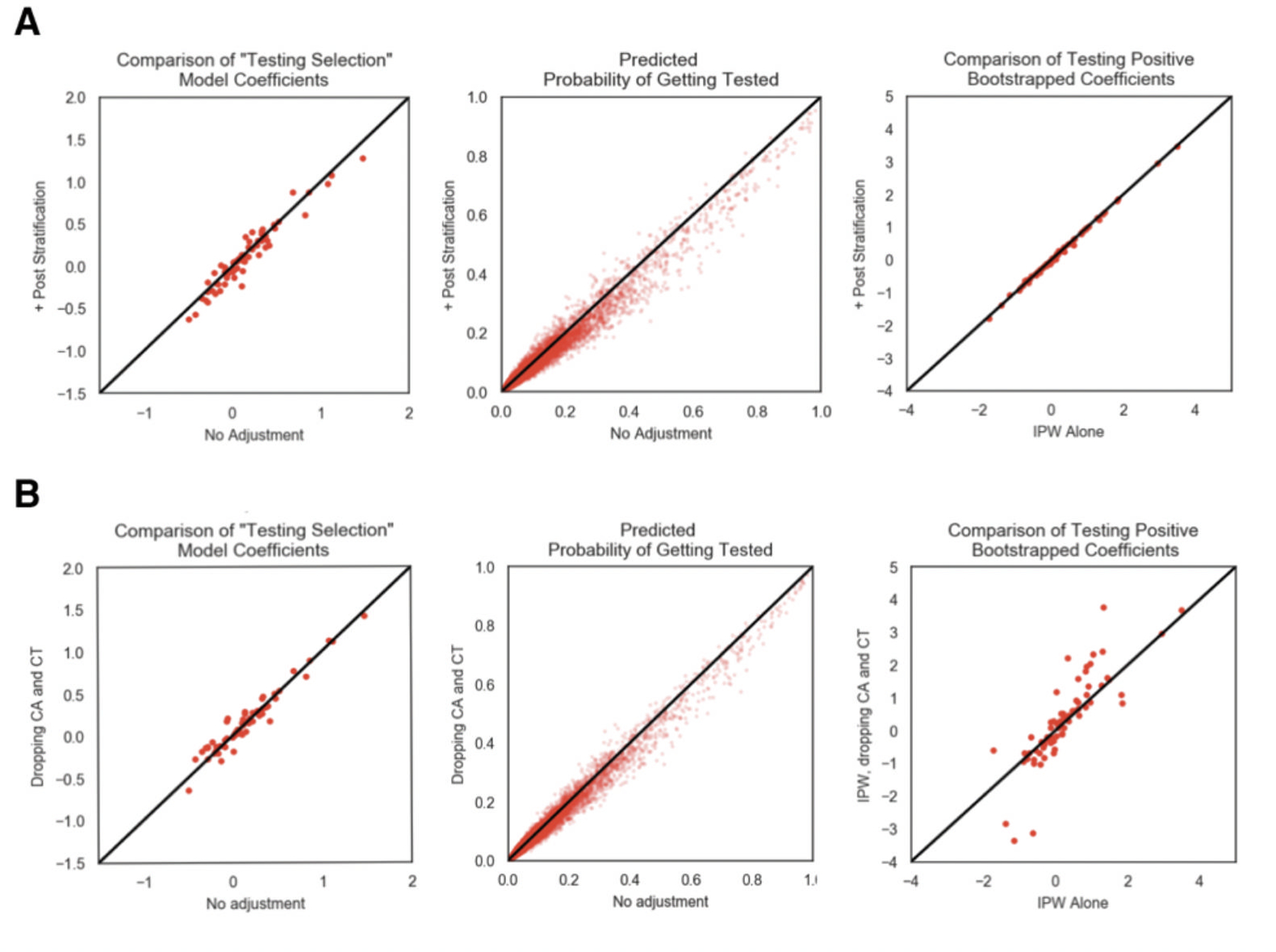
Comparison of testing outcome regression analysis between IPW corre ction alone and a, census based post-stratification + IPW correction and b, IPW correction on dataset with CT and CA users removed from the analysis. From left to right is 1) the comparison of the testing selection logistic regression model, 2) comparison of the predicted probability of getting tested using the testing selection logistic regression model, 3) comparison of the bootstrapped mean model coefficient from the testing outcome model, 4) comparison of the bootstrapped 95% confidence interval widths from the testing outcome model.
Extended Data Fig. 8. Firth regression sensitivity analysis.
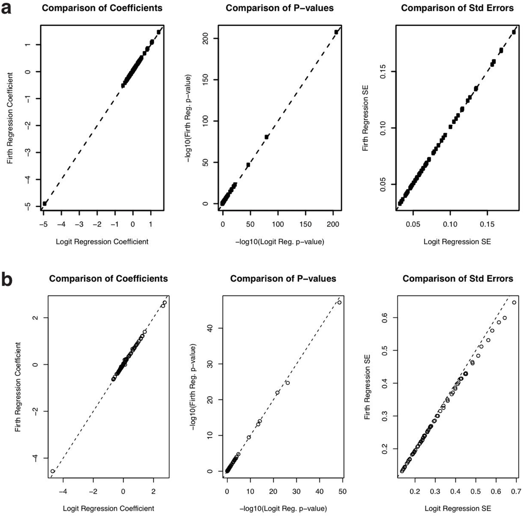
a, Comparison of regression coefficients (left), p-values (center) and standard errors (right) from Firth regression (y-axis) vs. logistic regression from Fig. 2c in the manuscript (x-axis) for the model predicting which users would be tested. The dotted line is the identity (y = x) line. b, Comparison of regression coefficients (left), p-values (center) and standard errors (right) from Firth regression (y-axis) vs. unweighted logistic regression from Fig. 3a in the manuscript (x-axis) for the model predicting which users among the tested users would test positive. The dotted line is the identity (y = x) line.
Extended Data Fig. 9. Timecourse of User Behavior in Different States.
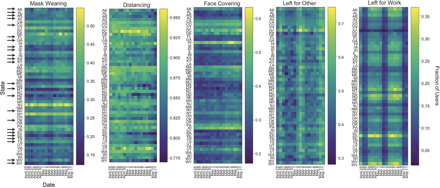
Time course of fraction of users in each state reporting wearing masks, socially distancing, covering their faces when leaving home, as well as leaving home for other reasons or for work from April 25 through May 11. Arrows indicate states that reopened before May 10. The wide dark bands in “Left for Work” and “Left for Other” correspond to weekends. Users per state: AK 487, AL 2590, AR 1858, AZ 5302, CA 28860, CO 6373, CT 45295, DC 749, DE 752, FL 12621, GA 6803, HI 702, IA 2797, ID 1483, IL 9799, IN 4882, KS 2476, KY 2879, LA 1882, MA 7174, MD 4696, ME 1242, MI 8157, MN 5269, MO 4544, MS 1176, MT 784, NC 7314, ND 451, NE 1508, NH 1425, NJ 5758, NM 1667, NV 2057, NY 11072, OH 8244, OK 2608, OR 4371, PA 9804, RI 1051, SC 3298, SD 551, TN 4513, TX 17088, UT 3755, VA 7239, VT 587, WA 7560, WI 4711, WV 1153, WY 440.
Supplementary Material
Acknowledgements:
The How We Feel Project would like to thank operational volunteers Ari Simon, Ricki Seidman, Arun Ranganathan, Celie O’Neil-Hart, Debbie Adler, Divya Silbermann, Jack Chou, Lother Determann, Mark Terry, Rhiannon Macrae, Robert Barretto, Ron Conway, Sid Shenai, Tony Falzone, and Yurie Shimabukuro. We would also like to thank Andrew Tang for graphic design support. We are grateful to the HWF participants who took our survey and allowed us to share our analysis. The funders had no role in study design, data collection and analysis, decision to publish or preparation of the manuscript The How We Feel Project is a non-profit corporation. Funding and in-kind donations for the How We Feel Project came from Ben and Divya Silbermann, Feng Zhang and Yufen Shi, Lore Harp McGovern, David Cheng, Ari Azhir, and Kyung H. Yoon, and the Bill & Melinda Gates Foundation. X.L. acknowledges support from Harvard University and NCI R35-CA197449–05. F.Z. is supported by the Howard Hughes Medical Institute, the McGovern Foundation, and James and Patricia Poitras and the Poitras Center.
Footnotes
Data availability:
This work used data from the How We Feel project (http://www.howwefeel.org/). The data are not publicly available but researchers can apply to use the resource. Researchers with an appropriate IRB approval and data security approval to perform research involving human subjects using the HowWeFeel data can apply to obtain access to data used in the analysis.
Code availability:
The analysis code developed for this paper can be found online at: https://github.com/weallen/HWFPaper20
Competing Interests:
The authors declare no competing interests.
References
- 1.Zhou P et al. A pneumonia outbreak associated with a new coronavirus of probable bat origin. Nature 579, 270–273 (2020). [DOI] [PMC free article] [PubMed] [Google Scholar]
- 2.Wölfel R et al. Virological assessment of hospitalized patients with COVID-2019. Nature 1–10 (2020). doi: 10.1038/s41586-020-2196-x [DOI] [PubMed]
- 3.Sanche S et al. High Contagiousness and Rapid Spread of Severe Acute Respiratory Syndrome Coronavirus 2. Emerg. Infect. Dis. J 26, (2020). [DOI] [PMC free article] [PubMed] [Google Scholar]
- 4.Schuchat A Public Health Response to the Initiation and Spread of Pandemic COVID-19 in the United States, February 24–April 21, 2020. MMWR. Morb. Mortal. Wkly. Rep 69, 551–556 (2020). [DOI] [PMC free article] [PubMed] [Google Scholar]
- 5.Kraemer MUG et al. The effect of human mobility and control measures on the COVID-19 epidemic in China. Science (80-. ) (2020). doi: 10.1126/science.abb4218 [DOI] [PMC free article] [PubMed]
- 6.Chen H, Qian W & Wen Q The Impact of the COVID-19 Pandemic on Consumption: Learning from High Frequency Transaction Data. SSRN Electron. J (2020). doi: 10.2139/ssrn.3568574 [DOI]
- 7.Worldometer. Coronavirus Cases. Worldometer 1–22 (2020). doi: 10.1101/2020.01.23.20018549V2 [DOI]
- 8.Smolinski MS et al. Flu near you: Crowdsourced symptom reporting spanning 2 influenza seasons. Am. J. Public Health 105, 2124–2130 (2015). [DOI] [PMC free article] [PubMed] [Google Scholar]
- 9.Segal E et al. Building an international consortium for tracking coronavirus health status. Nature Medicine 1–4 (2020). doi: 10.1038/s41591-020-0929-x [DOI] [PubMed]
- 10.Home | Covid Near You Available at: https://covidnearyou.org/us/en-US/. (Accessed: 1st July 2020)
- 11.Lapointe-Shaw L et al. Syndromic Surveillance for COVID-19 in Canada. medrxiv 1–18 (2020). doi: 10.1101/2020.05.19.20107391 [DOI]
- 12.Drew DA et al. Rapid implementation of mobile technology for real-time epidemiology of COVID-19. Science (80-. ) eabc0473 (2020). doi: 10.1126/science.abc0473 [DOI] [PMC free article] [PubMed]
- 13.Menni C et al. Real-time tracking of self-reported symptoms to predict potential COVID-19. Nat. Med 1–4 (2020). doi: 10.1038/s41591-020-0916-2 [DOI] [PMC free article] [PubMed]
- 14.Rossman H et al. A framework for identifying regional outbreak and spread of COVID-19 from one-minute population-wide surveys. Nature Medicine 26, 634–638 (2020). [DOI] [PMC free article] [PubMed] [Google Scholar]
- 15.Lochlainn MN et al. Key predictors of attending hospital with COVID19: An association study from the COVID Symptom Tracker App in 2,618,948 individuals medRxiv (Cold Spring Harbor Laboratory Press, 2020). doi: 10.1101/2020.04.25.20079251 [DOI] [Google Scholar]
- 16.Azad MA et al. A First Look at Contact Tracing Apps (2020).
- 17.Krausz M, Westenberg JN, Vigo D, Spence RT & Ramsey D Emergency Response to COVID-19 in Canada: Platform Development and Implementation for eHealth in Crisis Management. JMIR Public Heal. Surveill 6, e18995 (2020). [DOI] [PMC free article] [PubMed] [Google Scholar]
- 18.Nguyen LH et al. Risk of symptomatic Covid-19 among frontline healthcare workers. medRxiv 2020.04.29.20084111 (2020). doi: 10.1101/2020.04.29.20084111 [DOI]
- 19.Lochlainn MN et al. Key predictors of attending hospital with COVID19: An association study from the COVID Symptom Tracker App in 2,618,948 individuals medRxiv (Cold Spring Harbor Laboratory Press, 2020). doi: 10.1101/2020.04.25.20079251 [DOI] [Google Scholar]
- 20.Lee KA et al. Cancer and risk of COVID-19 through a general community survey. medRxiv 2020.05.20.20103762 (2020). doi: 10.1101/2020.05.20.20103762 [DOI] [PMC free article] [PubMed]
- 21.Mizrahi B, Longitudinal symptom dynamics of COVID-19 infection in primary care. [DOI] [PMC free article] [PubMed]
- 22.Keshet A et al. The effect of a national lockdown in response to COVID-19 pandemic on the prevalence of clinical symptoms in the population. medRxiv 2020.04.27.20076000 (2020). doi: 10.1101/2020.04.27.20076000 [DOI]
- 23.Shoer S et al. Who should we test for COVID-19A triage model built from national symptom surveys. Medrxiv 2020.05.18.20105569 (2020). doi: 10.1101/2020.05.18.20105569 [DOI]
- 24.Hao X et al. Full-spectrum dynamics of the coronavirus disease outbreak in Wuhan, China: a 2 modeling study of 32,583 laboratory-confirmed cases. medRxiv (2020).
- 25.Verity R et al. Estimates of the severity of coronavirus disease 2019: a model-based analysis. Lancet Infect. Dis 0, (2020). [DOI] [PMC free article] [PubMed] [Google Scholar]
- 26.Onder G, Rezza G & Brusaferro S Case-Fatality Rate and Characteristics of Patients Dying in Relation to COVID-19 in Italy. JAMA - Journal of the American Medical Association 323, 1775–1776 (2020). [DOI] [PubMed] [Google Scholar]
- 27.Maxmen A Thousands of coronavirus tests are going unused in US labs. Nature 580, 312–313 (2020). [DOI] [PubMed] [Google Scholar]
- 28.COVID-19 and the Potential Devastation of Rural Communities: Concern from the Southeastern Belts Available at: https://deepblue.lib.umich.edu/handle/2027.42/154715. (Accessed: 17th May 2020)
- 29.Rader B et al. Geographic access to United States SARS-CoV-2 testing sites highlights healthcare disparities and may bias transmission estimates. J. Travel Med taaa076, (2020). [DOI] [PMC free article] [PubMed]
- 30.How to Use the Data | The COVID Tracking Project Available at: https://covidtracking.com/about-data. (Accessed: 17th May 2020)
- 31.Coronavirus Disease 2019 (COVID-19) Available at: https://www.cdc.gov/coronavirus/2019-ncov/symptoms-testing/symptoms.html.
- 32.Wei WE et al. Presymptomatic Transmission of SARS-CoV-2 — Singapore, January 23–March 16, 2020. MMWR Morb Mortal Wkly Rep 69, 411–415 (2020). [DOI] [PMC free article] [PubMed] [Google Scholar]
- 33.Linton NM et al. Incubation Period and Other Epidemiological Characteristics of 2019 Novel Coronavirus Infections with Right Truncation: A Statistical Analysis of Publicly Available Case Data. J. Clin. Med 9, 538 (2020). [DOI] [PMC free article] [PubMed] [Google Scholar]
- 34.Li R et al. Substantial undocumented infection facilitates the rapid dissemination of novel coronavirus (SARS-CoV2). Science 368, 489–493 (2020). [DOI] [PMC free article] [PubMed] [Google Scholar]
- 35.Sutton D, Fuchs K, D’Alton M & Goffman D Universal Screening for SARS-CoV-2 in Women Admitted for Delivery. N. Engl. J. Med 1–2 (2020). doi: 10.1056/nejmc2009316 [DOI] [PMC free article] [PubMed]
- 36.Baggett TP, Keyes H, Sporn P-CN & Gaeta JM Prevalence of SARS-CoV-2 Infection in Residents of a Large Homeless Shelter in Boston. JAMA - J. Am. Med. Assoc E1–E2 (2020). doi: 10.1001/jama.2020.6887 [DOI] [PMC free article] [PubMed]
- 37.Kucirka LM, Lauer SA, Laeyendecker O, Boon D & Lessler J Variation in False-Negative Rate of Reverse Transcriptase Polymerase Chain Reaction–Based SARS-CoV-2 Tests by Time Since Exposure. Ann. Intern. Med (2020). doi: 10.7326/m20-1495 [DOI] [PMC free article] [PubMed]
- 38.Griffith G, Morris TT, Tudball M, Herbert A & Mancano G Collider bias undermines our understanding of COVID-19 disease risk and severity Affiliations 1–29 (2020). [DOI] [PMC free article] [PubMed]
- 39.Aylward B & Liang W Report of the WHO-China Joint Mission on Coronavirus Disease 2019 (COVID-19). WHO-China Jt. Mission Coronavirus Dis 2019 2019, 16–24 (2020). [Google Scholar]
- 40.Nishiura H et al. Closed environments facilitate secondary transmission of coronavirus disease 2019 (COVID-19). medRxiv 2–3 (2020).
- 41.Park YJ et al. Contact Tracing during Coronavirus Disease Outbreak, South Korea, 2020. Emerg. Infect. Dis. J 26, (2020). [DOI] [PMC free article] [PubMed] [Google Scholar]
- 42.He X et al. Temporal dynamics in viral shedding and transmissibility of COVID-19. Nat. Med 26, 672–675 (2020). [DOI] [PubMed] [Google Scholar]
- 43.Wang Z, Ma W, Zheng X, Wu G & Zhang R Household transmission of SARS-CoV-2. J. Infect (2020). doi: 10.1016/j.jinf.2020.03.040 [DOI] [PMC free article] [PubMed]
- 44.Jing Q-L et al. Household Secondary Attack Rate of COVID-19 and Associated Determinants. medRxiv 2020.04.11.20056010 (2020). doi: 10.1101/2020.04.11.20056010 [DOI] [PMC free article] [PubMed]
- 45.Bi Q et al. Epidemiology and transmission of COVID-19 in 391 cases and 1286 of their close contacts in Shenzhen, China: a retrospective cohort study. Lancet Infect. Dis 3099, 1–9 (2020). [DOI] [PMC free article] [PubMed] [Google Scholar]
- 46.County S et al. High SARS-CoV-2 Attack Rate Following Exposure at a Choir Practice — 69, 606–610 (2020). [DOI] [PubMed] [Google Scholar]
- 47.Gibbins JD et al. COVID-19 Among Workers in Meat and Poultry Processing Facilities — 69, 557–561 (2020). [DOI] [PubMed] [Google Scholar]
- 48.McMichael TM et al. Epidemiology of Covid-19 in a Long-Term Care Facility in King County, Washington. N. Engl. J. Med 1–7 (2020). doi: 10.1056/NEJMoa2005412 [DOI] [PMC free article] [PubMed]
- 49.Pan A et al. Association of Public Health Interventions with the Epidemiology of the COVID-19 Outbreak in Wuhan, China. JAMA - J. Am. Med. Assoc 02115, 1915–1923 (2020). [DOI] [PMC free article] [PubMed] [Google Scholar]
- 50.Clark G et al. COVID-19 pandemic: some lessons learned so far (UK House of Commons Science and Technology Committee, 2020). [Google Scholar]
- 51.Finberg HV Ten Weeks to Crush the Curve. N. Engl. J. Med 382, e37 (2020). [DOI] [PubMed] [Google Scholar]
- 52.Kim JY It’s Not Too Late to Go on Offense Against the Coronavirus. New Yorker (2020). Available at: https://www.newyorker.com/science/medical-dispatch/its-not-too-late-to-go-on-offense-against-the-coronavirus. (Accessed: 27th May 2020)
Associated Data
This section collects any data citations, data availability statements, or supplementary materials included in this article.