
Figure 2.
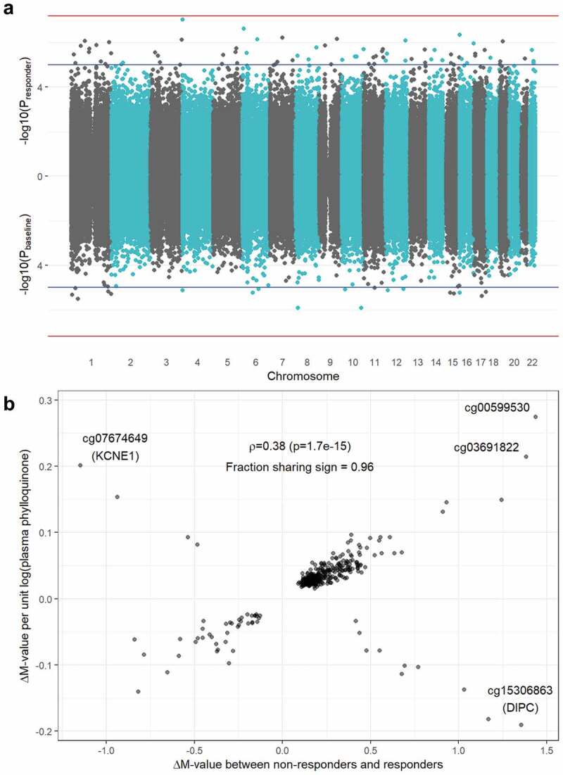
Overlap between responder and baseline EWAS results. a) Miami plot showing -log10(p-value) on the y-axis for the responder analysis (top) and the baseline analysis (bottom). Blue horizontal lines denote suggestive significance (p = 1x10⁻⁵) while red horizontal lines denote a genome-wide Bonferroni threshold (p = 6.37 x 10⁻⁸). b) Comparison of effect sizes (i.e., regression coefficients) between the responder (x-axis) and baseline (y-axis) results. Estimates shown are from fully adjusted models, thus including adjustment for dietary phylloquinone intake for the baseline analysis. The annotated value is a Pearson correlation (ρ) coefficient between the set of results shown in the plot.