Abstract
The pandemic of SARS-CoV-2 made many countries impose restrictions in order to control its dangerous effect on the citizens. These restrictions classify the population into the states of a flow network where people are coming and going according to pandemic evolution. A new dynamical model based on flow networks is proposed. The model fits well with the well-known SIR family model and add a new perspective of the evolution of the infected people among the states. This perspective allows to model different scenarios and illustrates the evolution and trends of the pandemic because it is based on the open data daily provided by the governments. To measure the severity of the pandemic along the time, a danger index (DI) is proposed in addition to the well-known R0 index. This index is a function of infected cases, number of deaths and recover cases while the transmission index R0 depends only on the infected cases. These two indexes are compared in relation to data from Spain and the Netherlands and additionally, it is shown the relation of the danger index with the policy applied by the governments.
Keywords: Covid-19, SARS-CoV-2, Flow networks, Risk, Mathematical modelling
1. Introduction and state of art
Since its start in China in last quarter of 2019, the severe acute respiratory syndrome Corona-virus 2 (SARS-CoV-2) which is causing the disease (COVID-19) spread all over the world in the last months (World Health Organization, 2020). The first patient in Spain was confirmed on January 31st in La Gomera while in the Netherlands the first patient was confirmed on February 27th. Although the level of infections in the Netherlands has been much less than in Spain, the evolution of the virus spreading presents similarities in both countries as this paper shows in the following sections. Besides the data provided by the countries, there are numerous sources of data. John Hopkins University repository (Coronavirus Resource Center, 2020) is one of the best references: data on the number of infected, deceased and hospitalized persons in many affected countries are updated daily.
Many research groups are publishing articles related to pandemic. For instance, (Varotsos and Krapivin, 2020) developed a new method for diagnosing and predicting de virus spread and analysis that introduces an instability indicator to the pandemic dynamics. In (Friston et al., 2020) authors present a study of the effects of self-isolation consequent to tracking and tracing including a quarantine state. Their study is based on time series of new cases, daily deaths, and tests in the UK. They conclude that the emergence of a second wave depends almost exclusively on the rate at which immunity works and that it is necessary to track the 20% of asymptomatic contagious cases in order to implement a solution. They use a comparative analysis of the United Kingdom and Germany. Other works have been developed among the international researchers (Moran et al., 2020, van den Bergh, et al., 2020, Prem, et al., 2020, Moghadas, 2020, Wang, 2020, Wu, 2020, Shereenab et al., 2020) helping to understand the pandemic situation in the present and in the future.
Although different countries adopted different approaches to solving the problem of massive infections (mainly by social distancing and lockdown) it can be seen that similar patterns are present. Modelling a dynamic system that improves those patterns has been one of the goals of the present work. We started with the epidemiological compartments family model (SIR, SEIR, etc.) originated from work of Kermack and McKendrick in 1927 (see (Shereenab et al., 2020, Kermark, 1927, Duffey and Zio, 2020, Satsuma et al., 2004, Kim et al., 2013, Capasso and Serio, 1978, Mikler et al., 2005, Bettencourt et al., 2006) and then we developed a flow network where all the states for a person are represented and which fits perfectly with the SIR model. The SIR compartmental model and some other models related are explained as follows.
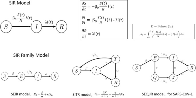
Compartmental model is a technique which simplifies the mathematical modelling of infectious disease. The simplest compartment model is SIR (Susceptible, Infected, Recovered) model. It presumes that all the members of the population are going through the three states (or compartments): those who are susceptible (S), those who are infected (I), and eventually those who recovered (R). The number of people within these states is a function of time: S(t), I(t) and R(t) and the time unit is a day (24 h). The model utilizes ordinary differential equations (ODE) which are deterministic, but the dynamics of the flow can become nonlinear, and therefore can be understood in the stochastic framework.
The SIR model is deductive. Within the differential equation system, t (time unit) is the variable and coefficients are a list of parameters. These parameters are not easy to infer because they are fuzzy, noisy and dependent on the same data from which the model is done. Fig. 1 shows the state graphs and details on the different perspectives (SIR, SEIR, SITR and SEQIJR). The models show improvements in the relationships of the increasingly numerous nodes (up to 6). The SEIR model differentiates between people exposed to the virus and infected people, in the SITR model, the split is made between infected people and people under medical treatment. Finally, in the SEQIJR system, used in the previous SARS-CoV-1 pandemic, the Q node represents quarantined people. In addition, the same figure shows the distribution of the arrival data to every state (which is a Poisson distribution), the calculation of its estimated parameter (λ) and the system of derivative equations that models the SIR system.
Fig. 1.
SIR Model and SIR Family Model.
The SEQIJR model was used by the researchers for SAR-COV-1 (predecessor of SAR-COV-2). This model includes nodes for Susceptible (S), Latent (E), Infected (I), Quarantine (Q) Isolation (J) and Recovered (R). The model of our work extends to 10 nodes in order to fit with the flow transactional network requirements as Section 3 shows. Recently, some papers have been published papers on this model with related results. For example, (Gatto et al., 2020, Giordano et al., 2020) propose models on the dynamics of Covid-19 in Italy using the measurements of the aforementioned containers. In (Gevertz et al., 2020) an explicit distinction between susceptible and asymptomatic population is proposed and the consequences of social distancing are analysed. (Russo et al., 2020) is an interesting piece of work comparing the data from China with those from Italy in the first phase of the pandemic. Although all these works include some additional nodes to distinguish the asymptomatic population or patients in intensive care, all of them are based on the initial dynamic model. The present work has many similarities but presents an advantage: the perspective of the model based on flow networks. The analysis of the network allows describing the transported flow as a linear programming problem where it is a matter of optimizing some functions under the restrictions imposed by the capacity of the system. Another advantage is the scalability of the system and its adaptability to different subpopulations.
This manuscript is organized as follows. After this brief introduction where state of art is included, Section 2 is dedicated to the data and method: datasets description and details of the flow network model proposed. Results and discussion of the application of the model can be read in Section 3. Finally, Section 4 contains the conclusions and future work.
2. Data and method
2.1. Data sources
Apart from the data provided by John’s Hopkins University, open data from Spain and the Netherlands governments have been used to get most of the information: the total number of inhabitants of Spain /the Netherlands, rates about essential workers, healthcare personnel or older people, etc. In Spain December 2019, the population was 47,100,396 (according to the Spanish National Institute of Statistics, www.ine.es) of which 17% were people older than 60 years (of whom 25% were over 80). For the Nederland, Centraal Bureau voor de Statistiek (CBS, www.cbs.nl) stated that the number of population (Nov- 2019) was 17,424,978 and that 14.9% of them were persons older than 65. The National Institute for Public Health and the Environment (https://www.rivm.nl) in the Netherlands has a section where some models for the spread of the virus are public and accessible. In the same line the Carlos III Health Institute in Spain (https://covid19.isciii.es) publish everyday official data and reports on the Covid19 spreading. From these resources we collected the daily following variables to feed the model: the information about the daily reported number of infected persons (INF/I), persons admitted to the hospital (H), people who deceased (Lost/F), people who recovered (R), active healthcare personnel (HP) and Healthcare workers infected (HPI).
We indirectly found the data about the number of people who are working even in this situation (EW) of the lockdown (beside healthcare workers, like drivers, those who deliver food and other necessities, police etc.). The number of people who are in lockdown (CONF) varies not too much from one day to another since self-isolation in both countries was mandatory. Latent persons (L) are people who are infected but asymptomatic or just not registered due to the lack of massive testing during the worst period of crisis (March-May/2020). An approximation of L size can be inferred from the biological research and the R index (Shereenab et al., 2020).
Although the data have been collected from March 9 to mid-July, the first part is more useful because it represents the hardest phase of the pandemic in both countries and therefore the graphs are better interpreted. As of April 26, the data are not very significant because in both countries very strict measures had already been applied to control the pandemic, therefore, the graphs are flat and are not very informative.
The study uses 46 observations corresponding to the first days of the pandemic. The results in both countries are compared as well as the evolution indicators of the nodes in the flow network. In addition to the country and the date, the database contains 5 absolute daily variables provided daily by the official media: number of infected people, number of people hospitalized, number of intensive care admissions, number of recovered people and number of deceased people. It also contains calculated variables: DI (index of danger), R0_7 and R0_14 (estimates of the R0 value for two comparisons in time of 7 and 14 days respectively). Some additional variables such as HP (active health personnel), HPI (infected health personnel), CONF (people in confinement) and EW (essential active workers) have been used. These last variables have been calculated using the percentages provided by the media, but they have not been used to calculate the DI or R0 indicators because they have not been included in the databases of the official websites, although they are data published in official government reports.
Table 1 shows the original structure of the downloaded official databases. The number of observations is higher in the Netherlands because they report one item per day and per municipality. In Spain, the number reported is one per day and autonomous community. Also the period is different. That is because in the case of Spain, they have change several times the type of dataset with a different structure. Due to our study only requires the first part of the pandemic (March 9 – April 26) the indicated dataset is enough for the analytics. These datasets as well as all the information developed for this study can be download at (GitHub Repository, 2020).
Table 1.
Official data structure used for the study.
| Country | Dataset name | Dataset website |
|---|---|---|
| The Netherlands | COVID-19_aantallen_gemeente_cumulatief.csv | https://data.rivm.nl/covid-19/ |
| Size | 50,280 observations | |
| Variable name | description | Descriptive data |
| Date_of_report | Date – time | 13/3/2020 – 27/7/2020 |
| Municipality | Name of the city | |
| Province | Name of the province | 17 provinces in total |
| Total_reported | Daily number of cases reported | |
| Hospital_admission | Daily number of hospital admission | |
| Deceased | Daily number of deceased | |
| Country | Dataset name | Dataset website |
| Spain | Agregados.csv | https://cnecovid.isciii.es/covid19/ |
| Size | 1521 observations | |
| Variable name | description | Descriptive data |
| Fecha | Date | 20/2/2020 – 9/5/2020 |
| CCAA | Autonomous community | 17 autonomous communities and 2 autonomous cities |
| Casos | Daily number of cases reported | |
| Hospitalizados | Daily number of hospital admission | |
| UCI | Daily number of intensive care admission | |
| PRC+ | Daily number of positive PRC reported | |
| TestAC+ | Daily number of positive TestAC reported | |
| Recuperados | Daily recovered persons | |
| Fallecidos | Daily number of deceased |
Both databases have been merged after a suitable renaming of variables. Then the outliers have been located and wrangled (eliminated or smoothed) to avoid deformation of the curves. The accumulated data have been recalculated to obtain the non-accumulated absolute frequencies, and the absence of data has been resolved through interpolation operations (in isolated cases) or sample reduction (in periods without data). The data of recovered persons has been published daily in Spain until May 5. For its part, in the Netherlands, the data on recovered has only been published on very specific occasions. As consequence, the evolution of the recovered curve in the Netherlands can only be estimated from other factors.
2.2. The flow network model
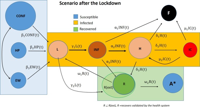
In graph theory, a flow network (or transportation network) (Ahuja et al., 1993) is a directed graph where each edge has a capacity (c > 0) and each edge transports a flow (f>=0). There are some restrictions to make the network working correctly. For instance, the amount of flow on an edge cannot exceed the capacity of the edge (f<=c). The vertices are service stations nodes to which arrival/departure the flow from arcs. Each station must satisfy the restriction that the amount of flow coming into it equals the amount of flow out of it unless it is a source, which has only outgoing flow or sink, which has only incoming flow. In this work, the network is used to model the traffic of the people through the SARS-CoV-2 nodes. Fig. 2 shows two flow network scenarios: before (left) and after (right) the lockdown. In Spain, the lockdown was on March, 16th 2020 and in the Netherlands a week later (March, 23th 2020). In both cases, people are classified into a node. The first scenario split the healthy people (in blue) into two nodes: the general population (GP) and the health personnel (HP). That is because health personnel are more at risk of infection than people confined to their homes. The second scenario split the healthy people into three nodes: confined (Conf), health personnel (HP) and essential workers (EW). That is because essential workers (EW) are also more exposed than the non-essential workers especially after the lockdown when non-essentials are confined at home (Conf). The rest of the nodes are for people that belong to one of the stages of the illness Covid-19: Latent (L), infected (INF, mild), in-hospital (H), in Intensive Care (IC), passed away (F), recovered (R), and finally immune (A).
Fig. 2.
Flow Network Model for the two scenarios: before (left graph) and after (the right graph) of the lockdown.
Due to the first stages of the Covid19, the number of deaths was not reported as well as other data, the first scenario has fewer nodes. In Fig. 2, there is also indicated a timeline with the incubation, symptomatic, latent and ability to infect to facilitate the understanding with other related models (Varotsos and Krapivin, 2020, Friston et al., 2020, Moran et al., 2020, van den Bergh, et al., 2020, Prem, et al., 2020, Moghadas, 2020, Wang, 2020, Wu, 2020, Shereenab et al., 2020).
Blue nodes on the right are sets of healthy people. Some of them move into in the compartment L (Latent) and then to INF (Infected). Arrows are labelled with the transition function that measures the percentage of persons that travel from one point to another according to a probability calculated. There are more details about these functions in the following subsection. One person in state infected (INF) can go directly to recovered (R), but also those infected can die at home or die after admittance to the hospital (H) or even after being helped in intensive care (IC). Those people who do recover (R) are coming from two different compartments, namely INF and H. Those who are treated in hospitals can develop life-threatening problems and be transferred to IC; those from IC can eventually become better after which they can be transferred to a rehabilitation centre or another department in hospital (H). The people who die go to the deceased node (F). They come from three different nodes: INF (those who die at home), H (those who die in the hospitals) and ICU (those who die in intensive care unit). The symbol A* represents those who, after being infected, recover and develop the immunity on the coronavirus SARS-CoV-2. This node A* is coloured in blue despite the fact it is still not clear whether the COVID-19 patients develop partial or full immunity, and whether re-infection is possible after recovery. That is why we did not further specify this possible development in the present work. Thus, in a first approach of the model, only the nodes R and F are working as sinks in the flow network. Also, node L can work as the only source since all the cases come to it from the blue nodes and blue nodes receive no flow.
Fig. 3 shows how the nodes of the network can also be classified into the three SIR compartmental model: blue nodes (C, EW, S) are together in the S (susceptible) compartmental; L, INF, H, IC are yellow coloured and go into I (infected) compartmental and R and A* are into R (recovered) green compartmental. Fig. 3 shows this classification. Some studies include F together with R and A because they consider the third compartment “Removed” instead of “Recovered” (Daunizeau et al., 2020, Kucharski, 2020). However, in our work this last node F doesn’t belong to the latter compartmental because while R and A* are nodes to maximize, F is a node to minimize and this point is important to make the optimization correctly. Therefore, the problem we face is a variant of classic combinatorial optimization problems in which you maximize a flow while minimizing a cost. Fig. 3 also includes a dotted arrow from L to R representing people who overcome the disease unconsciously. However, these people are not included in the model due to lack of data. This is also the case of immunes (A* node).
-
•
Flow Equations
Fig. 3.
The 10 nodes of flow network with extensions and fitting to SIR compartment model.
The model is then a double linear program problem: minimize the number of persons that goes to INF or to F (Eq. (1)) and maximize the number of persons that goes to R (Eq. (2)), subject to (Eq. (3)).
| (1) |
| (2) |
| (3) |
where V is the set of nodes and fx,y and cx,y indicate respectively the flow and the capacity that arc (x,y) transports between nodes x and y.
In an ideal network, the total flow of input coincides with the total flow of output at each node, which is known as the balanced flow hypothesis. However, in a few models, this hypothesis can be guaranteed and, in addition, those responsible for the network must dedicate their attention to optimizing the objective functions, controlling the flow and avoiding bottlenecks. Bottlenecks are those nodes that collapse their capacity or are close to collapse. H, IC and F are candidates of bottlenecks in the network of this study.
In this model, it is essential to distinguish the “recovered” state (R) from the “deceased” state (F). This is one of the fundamental differences with other models where the “remove” state encompasses both. In this flow network model, it is important to account for this difference precisely because the flow to “deceased” must be minimized while the flow to “recovered” must be maximized. Taking into account that the flow to the “infected” node must also be minimized and that only these three nodes are a source or a sink in the network, we can determine an indicator of balance (in the sense of flow network) which is also an indicator of danger (Eq. (4)). This indicator is based on the comparison between the optimization functions and an easy way to calculate it is by means of the difference:
| (4) |
where t is the unit of time: a day on the calendar. Inf(t) is the number of persons that comes to node INF on day t, that is the flow ; F(t) is the number of persons that comes to node F on day t or the flow and Rec(t) is the number of persons that comes to node R on day t, the flow. This equation does not depend on the saturation of the bottlenecks but can reveal the severity of the situation in a simple and intuitive way. The application of these index and equations is in Section 4.
-
•
Dynamic Equations
Fig. 1 shows the system of equations that explains the transition in the states and the variability of the data within the SIR model. Similarly, the flow network model is also associated with a system of equations as seen below. Equation (Eq. (5)) shows the consistency of the model as a partition of the total constant population (N). It is an invariant condition.
| (5) |
The following equations (Eqs. (6), (7), (8), (9), (10), (11), (12), (13), (14), (15)) explain the variability per each node in the model:
| (6) |
| (7) |
| (8) |
| (9) |
| (10) |
| (11) |
| (12) |
| (13) |
| (14) |
| (15) |
As public administrations provide these data daily, we can infer the value of the differences and make estimates of the parameters from the data. A proposal for parameter inference is shown below.
| (16) |
| (17) |
| (18) |
| (19) |
| (20) |
Δt is an incremental that depends on the time that the virus is latent before became an illness. To compute the equations in (Eqs. (16), (17), (18), (19), (20)) it is necessary to know personal data of the patients.
Although these data can be easily obtained by the public administration, it is out of the scope of this study. However, as daily data is published, it is possible to infer the popular R0 number, which represents the power of virus transmission. Despite of being named number, R0 is in fact a function of t and and its inference is given by (Eq. (21)) where R0 is inferred to and incremental Δt which permits to select it according to the research of the healthcare personnel. In this article, Section 4, we compare some of these ratios respect to different incrementals.
| (21) |
3. Results and discussion
Although differential equations can be used to describe the dynamics of infections in a closed population of N individuals, the model is only useful for short periods and without external actions that disturb the described functioning. In the case of the Covid-19 disease, the number of infections also depends on the policies adopted by the governments (confinement, phases, protocols, etc.), on people's behaviour (complying with the regulations of social distance and personal hygiene) and of the sanitary conditions of each country or region (access to water, poverty level, population density). All these factors impede the usefulness of predictive models based on differential equations. As an alternative, this work proposes the direct analysis of the daily data registered by the health authorities referring to absolute amounts: number of infected people, number of people who are discharged from hospitals (or recovered from homes, but included in medical records), number of people admitted to hospitals, number of people admitted to intensive care and, finally, number of people who died each day. These data can be recorded with some ease since they are part of the usual records in health centres. There is a percentage of people who become ill and are not part of the registries for various reasons: mild illness, asymptomatic, saturation of health systems. However, the sample of recorded data is sufficient to analyse the network flow model.
Based on the above-described model (Fig. 3), a code in the R language is developed and fed by the data from official sources mentioned in the previous sections. In addition to the native code used for outlier detection and cleaning, Rstudio's dplyr library (www.rstudio.com) has been used for data processing. To facilitate the graphic visualization of the results, the representation with regression curves generated using the ggplot2 library (also from Rstudio) has been chosen. The code is available in a GitHub repository (https://github.com/vlopezlo/Covid_19).
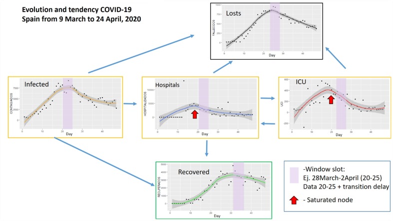
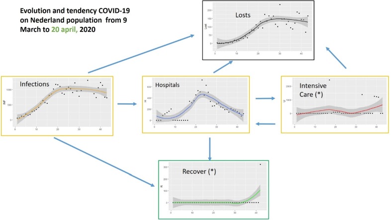
First, we have studied the evolution of the pandemic in terms of the variables published by each government. In the case of Spain, the number of infected, number of deceased, number of recovered (9th March-5th May), number of hospitalized and number of necessary intensive care units were published daily. Very little data has been published in the Netherlands on people who have overcome the disease. The rest of the variables have been published. Fig. 4, Fig. 5 show respectively the evolution of these variables in the periods indicated. These periods have been chosen because they are more significant for the regression curves obtained since they represent the period with the most cases in both countries.
Fig. 4.
Evolution and tendencies of COVID-19 for Spain from 9 March to 24 April 2020 (46 days).
Fig. 5.
Evolution and tendencies of COVID-19 for the Netherlands from 9 March to 20 April 2020 (42 days).
Fig. 4 shows the data for Spain in the period March 9 to April 24. The evolution of the data and its trend are shown. The relationship between the nodes can be seen and a 5-day time window (March 28-April 2) is highlighted corresponding to the Infected node, where the highest number of cases occurred. The windows indicated in the other nodes are moved a few days to facilitate the visualization of the relationship. For example, concerning node H (Hospitals), a couple of days is enough to consider the effect caused by the increase in cases. However, regarding node R (Recovered) the period is longer, in this case, 12 days later. The same happens with the other nodes. The bottlenecks, that is, the moments when the nodes are saturated, are also indicated by red arrows. Taking into account that these graphs can be generated daily, the visualization could be useful to facilitate decision-making in the distribution of resources, for example. Data from the Netherlands is not so complete so Fig. 5 does not remark a window slot example. Comparison between these two flow networks shows the importance of the information. However, only a few countries provide data over recovered people. Spain stopped providing them on 5 May. Some dashboards and apps for tracking are useful to understand this evolution, for example (Dong et al., 2020), that is based on the provided raw daily data.
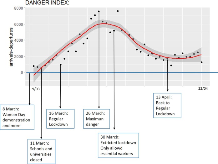
Next, DI (danger index) is applied to obtain a point cloud and a regression curve. A DI equal or less than 0 means no danger in the sense that the system can deal with the number of infections. On the contrary, the greater DI means a more dangerous system. The result relates to action policies as shown in the case of Spain in Fig. 6 . Although the data is collected after March 8 (Women's Day), when demonstrations occurred throughout the country, growth in dangerousness is evident from that date. The danger continues to grow until the end of the first period of confinement (March 26) and decreases during the strict confinement thereafter. As of April 13, when there is a relaxation of the confinement restrictions, there is a new rise, this time more moderate though.
Fig. 6.
Danger index evolution for Spain with references to specific dates (March 9-April 22).
Fig. 7 shows a bit different interpretation of the indicator of danger for the Netherlands. In this case, the lack of data on recovered cases forces us to make a comparison with an estimated average (Y) of recovered cases. To do this, Rec(t) = 0 for all t in equation (3) and then a DI greater than Y means system in danger. In Fig. 7, this average value is represented by the horizontal line Y = 400 as a possible scenario. This value Y can be varied depending on the results obtained by estimation of the competent authorities. The results are also related with the action policies in the Netherlands, however, that is not so easy to identify for two reasons: First, because there have not been many cases and, therefore, the curves are flatter than in the case of Spain. Second, because the Dutch government has not provided the data of people recovered.
Fig. 7.
Danger index evolution for the Netherlands (March 9-April 24).
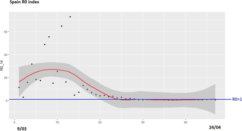
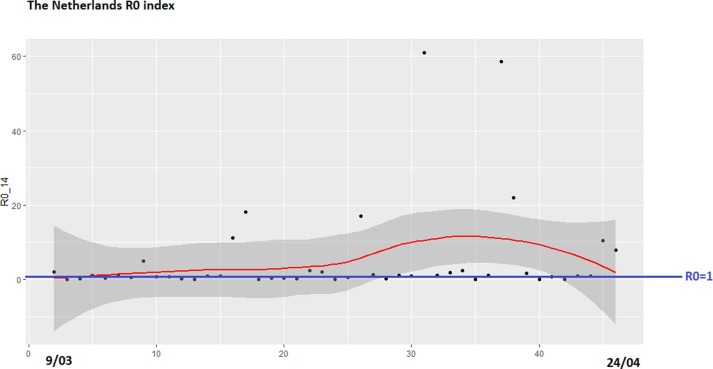
Finally, we have obtained an estimation of the R0 indicator in each country. Due to the lack of consensus on the time required to obtain evidence of transmission of infection between people, this work uses two possible values: 7 days and 14 days. Fig. 8 shows the data and the regression curves for Spain. R0 is a ratio that must be compared with the line y = 1, as shown in Fig. 8, Fig. 9 in blue. In terms of visualization, 14 days’ curve illustrates better the evolution of the ratio, especially to be compared to the Danger Index. Fig. 9 shows the estimation R0 data for the Netherlands for 14 days’ period. Comparing Fig. 7 (Danger Index) and 9 (R0 Index) on the data from the Netherlands, the regression curves have a similar evolution. In fact, Fig. 7 shows a shift to the left of the evolution compared to Fig. 8. For predicting and interpreting data, we can conclude that the first one is sufficient for prediction. Also the graph in Fig. 7 is more visual because the number of deaths is included in the formula while in Fig. 8, R0 only takes into account the number of infected. In this sense, the severity of the situation is best measured visually with Fig. 7.
Fig. 8.
R0 Index for Spain (March 9-April 24), for period of 14 days.
Fig. 9.
R0 Index for the Netherlands (March 9-April 24), slot of 14 days.
4. Conclusions
In this work, a transmission model of the SARS-CoV-2 virus based on human flow networks has been presented. The model presented constitutes an additional proposal to the models presented by other authors in the past (with respect to other viruses) and in the present. As a novelty, a danger index obtained from the flow optimization equations in the network is proposed, that is, maximizing the flow to the desirable nodes (recovered people) and minimizing the flow to the danger nodes (infected and deceased). The system does not consider negative weights to other danger nodes such as hospitalized or intensive care, as they are internal nodes in the flow network, unlike the source and sink nodes where attention is focused. However, this type of weighting could lead to future work. In addition, the shape and evolution of the danger index have been compared with other known indices, specifically the R0 index. In the comparison, both the Ro and DI indices present a similar evolution, however, the DI index proposed in this work is easier to interpret by presenting curves with steeper slopes.
The results have been obtained from the data provided by the governments of Spain and the Netherlands, which has allowed their comparison, despite the difference in the structures of the datasets published by the two administrations. Precisely one of the difficulties of this work has been the processing and integration of data, detection of outliers, cleaning and inference operations.
As a consequence, a clean database has been achieved that facilitates the comparison of data from both countries directly and through the indexes presented. The work includes graphs that allow the temporal relationship with the phases of growth and decline of the cases in each of the nodes of the flow network. The effectiveness of the containment measures applied by the governments can be verified throughout the period.
As future work, the adaptation of the model to specific regions and states is proposed, where the nodes of interest will be developed according to reality. For example, node H can be divided into as many nodes as there are hospitals in a region or country. Another improvement is the inclusion of a node for the elderly who are in nursing homes, given the special vulnerability of this population.
Declaration of Competing Interest
The authors declare that they have no known competing financial interests or personal relationships that could have appeared to influence the work reported in this paper.
Acknowledgements
The authors would like to thank RISEWISE (H2020-MSCA-RISE-2015-690874) which has supported this research.
References
- Ahuja R.K., Magnanti T.L., Orlin J.B. Prentice Hall; 1993. Network Flows: Theory, Algorithms and Applications. [Google Scholar]
- Bettencourt L.M.A., Cintrón-Arias A., Kaiser D.I., Castillo-Chávez C. The power of a good idea: quantitative modeling of the spread of ideas from epidemiological models. Physica A. 2006;364:513–536. [Google Scholar]
- Capasso V., Serio G. A generalization of the Kermack–McKendrick deterministic epidemic model. Math. Biosci. Eng. 1978;42:43–61. [Google Scholar]
- Coronavirus Resource Center, 2020, John Hopkins University (https://coronavirus.jhu.edu/data) Last access Oct. 2020.
- Daunizeau J., Moran R., Brochard J. Modelling lockdown-induced 2nd COVID waves in France. MedRxiv. 2020 doi: 10.1101/2020.06.24.20139444. [DOI] [Google Scholar]
- Dong, Ensheng, Du, Hongru, Gardner, Lauren, 2020. An interactive web-based dashboard to track COVID-19 in real time. Doi: 10.1016/S1473-3099(20)30120-1 PlumX Metrics. [DOI] [PMC free article] [PubMed]
- Duffey R.B., Zio E. CoVid-19 pandemic trend modeling and analysis to support resilience decision-making. Biology. 2020;9:156. doi: 10.3390/biology9070156. [DOI] [PMC free article] [PubMed] [Google Scholar]
- Friston, K.J., Parr, T., Zeidman, P., et al., 2020. Testing and tracking in the UK: A dynamic causal modelling study [version 1; peer review: awaiting peer review]. Wellcome Open Res 2020, 5:144. 10.12688/wellcomeopenres.16004.1. [DOI]
- Gatto M., Bertuzzo E., Mari L., Miccoli S., Carraro L., Casagrandi R., Rinaldo A. Spread and dynamics of the COVID-19 epidemic in Italy: effects of emergency containment measures. PNAS. 2020;117(19):10484–10491. doi: 10.1073/pnas.2004978117. [DOI] [PMC free article] [PubMed] [Google Scholar]
- Gevertz, J.L., Greene, J.M., Sanchez-Tapia, C., Sontag, E.D., 2020. A novel COVID-19 epidemiological model with explicit susceptible and asymptomatic isolation compartments reveals unexpected consequences of timing social distancing. 10.1101/2020.05.11.20098335. [DOI] [PMC free article] [PubMed]
- Giordano G., Blanchini F., Bruno R., Colaneri P., Di Filippo A., Di Matteo A., Colaneri M. Modelling the COVID-19 epidemic and implementation of population-wide interventions in Italy. Nat. Med. 2020 doi: 10.1038/s41591-020-0883-7. [DOI] [PMC free article] [PubMed] [Google Scholar]
- GitHub Repository, 2020. https://github.com/vlopezlo/Covid_19.
- Kermark M., McKendrick A. Contributions to the mathematical theory of epidemics. Part I. Proc. R. Soc. A. 1927 doi: 10.1007/BF02464423. [DOI] [PubMed] [Google Scholar]
- Kim K.I., Lin Z., Zhang Q. An SIR epidemic model with free boundary. Nonlinear Anal. RWA. 2013;14:1992–2001. [Google Scholar]
- Kucharski Adam J. Early dynamics of transmission and control of COVID-19: a mathematical modelling study. Lancet Infect. Dis. 2020;20(5):553–558. doi: 10.1016/S1473-3099(20)30144-4. [DOI] [PMC free article] [PubMed] [Google Scholar]
- Mikler A.R., Venkatachalam S., Abbas K. Modeling infectious diseases using global stochastic cellular automata. J. Biol. Syst. 2005;13:421–439. [Google Scholar]
- Moghadas S.M. Projecting hospital utilization during the COVID-19 outbreaks in the United States. Proc. Natl. Acad. Sci. 2020 doi: 10.1073/pnas.2004064117. [DOI] [PMC free article] [PubMed] [Google Scholar]
- Moran, R.J., Fagerholm, E.D., Cullen, M., et al., 2020. Estimating required ‘lockdown’ cycles before immunity to SARS-CoV-2: Model-based analyses of susceptible population sizes, ‘S0’, in seven European countries including the UK and Ireland. Arxiv Preprint (ArXiv).
- Prem K. The effect of control strategies to reduce social mixing on outcomes of the COVID-19 epidemic in Wuhan, China: a modelling study. The Lancet Public Health. 2020 doi: 10.1016/S2468-2667(20)30073-6. [DOI] [PMC free article] [PubMed] [Google Scholar]
- Russo, L., Anastassopoulou, C., Tsakris, A., Bifulco, G.N., Campana, E.F., Toraldo, G., Siettos, C., 2020. Modelling, tracing day-zero and forecasting the fade out of the COVID-19 outbreak: experiences from China and Lombardy studies. 10.1101/2020.03.17.20037689. [DOI] [PMC free article] [PubMed]
- Satsuma J., Willox R., Ramani A., Grammaticos B., Carstea A.S. Extending the SIR epidemic model. Physica A. 2004;336:369–375. [Google Scholar]
- Shereenab N.A., Khana S., Kazmi A. COVID-19 infection: origin, transmission, and characteristics of human coronaviruses. J. Adv. Res. 2020;24:91–98. doi: 10.1016/j.jare.2020.03.005. [DOI] [PMC free article] [PubMed] [Google Scholar]
- Kluytmans van den Bergh, et al., 2020. SARS-COV-2 infection in 86 healthcare workers in two Dutch hospitals in March. medRxiv preprint doi: 10.1101/2020.03.23.20041913. [DOI]
- Varotsos C.A., Krapivin V.F. A new model for the spread of COVID-19 and the improvement of safety. Saf. Sci. 2020;132(104962) doi: 10.1016/j.ssci.2020.104962. [DOI] [PMC free article] [PubMed] [Google Scholar]
- Wang C. Evolving Epidemiology and Impact of Non-pharmaceutical Interventions on the Outbreak of Coronavirus Disease 2019 in Wuhan, China. medRxiv. 2020 [Google Scholar]
- World Health Organization, 2020. Coronavirus disease (COVID-19) Situation Report– 173, 11 July 2020 (https://www.who.int/docs/default-source/coronaviruse/situation-reports).
- Wu J.T. Nowcasting and forecasting the potential domestic and international spread of the 2019-nCoV outbreak originating in Wuhan, China: a modelling study. The Lancet. 2020;395(10225):689–697. doi: 10.1016/S0140-6736(20)30260-9. [DOI] [PMC free article] [PubMed] [Google Scholar]


