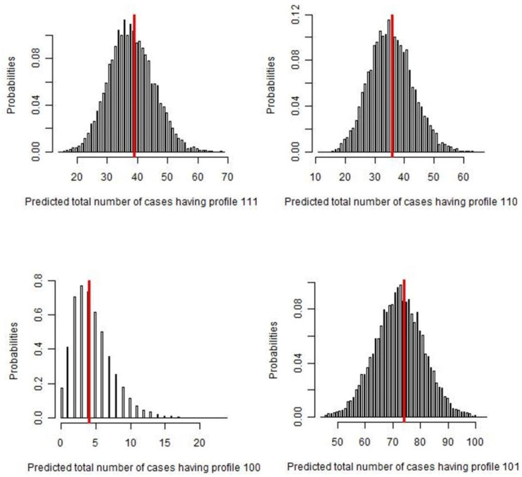
Figure 2.
Number of cases predicted by the Bayesian latent-class analysis, for each GP profile (111, 110, 100, 101). The red line represents the observed frequency of each test result profile, while the histograms illustrate the predictive posterior distribution of predicted frequency. In each of the figures, the dataset was replicated 50,000 times and selected only 5000 times (thin sampling equals to 10) to assess the probability of observed frequencies, assuming the model was true.

