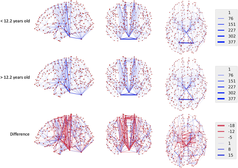
FIGURE 2.
Mean networks (first and second rows) for subjects younger than the median age (12.2 years) compared to older subjects. Regions are represented as red dots, and connections are shown as blue lines. Thicker lines indicate stronger connections on average between regions, and the legend indicates the number of streamline connections estimated. In the third row, the differences between the maps are shown with blue lines indicating stronger connections in older subjects, and red lines indicating weaker connections in these groups

