Abstract
Uniform manifold approximation and projection (UMAP) has been rapidly adopted by the population genetics community to study population structure. It has become common in visualizing the ancestral composition of human genetic datasets, as well as searching for unique clusters of data, and for identifying geographic patterns. Here we give an overview of applications of UMAP in population genetics, provide recommendations for best practices, and offer insights on optimal uses for the technique.
Subject terms: Genome informatics, Genetic variation
Introduction
One of the primary challenges of genomic data analysis is high dimensionality. The human genome has over three billion base pairs, and many biobanks contain hundreds of thousands of individuals and above. Relationships among individuals are relevant for historical studies as well as for studies that seek to identify genetic roots of diseases. These relationships can be influenced by demography, sampling strategies, and technical variation. A first step in many genomic analyses is dimensionality reduction to visualize the data to identify relevant relatedness patterns.
One of the most common methods of dimensionality reduction is principal component analysis (PCA). PCA identifies directions, in the high-dimensional space, along which data are most variable. The projection of genomic data along these directions provides a low-dimensional representation that captures as much variance as possible. Because PCA projection is a linear operation, it has a relatively straightforward interpretation in terms of demographic events (i.e., distances between populations can be interpreted in terms of times to the most recent common ancestors) [1]. It is also well-suited to the correction of population structure in genome-wide association studies (GWAS) [2], and is therefore widely used.
Dimensionality reduction requires tradeoffs. Because PCA projection identifies directions of maximal variance in the data and ignores variation along other directions, it tends to obscure finer-scale patterns of population structure. Many nonlinear neighbour graph-based dimension reduction algorithms, such as t-SNE [3], have been developed over the years to overcome this limitation. Here we focus on uniform manifold approximation and projection (UMAP) [4], a method developed in 2018 that has seen widespread use across fields (e.g., single-cell genomics [5]).
Rather than trying to preserve large-scale structure, UMAP seeks to preserve local neighbourhoods in a dataset. For each individual in a genetic dataset, UMAP identifies a pre-set number of nearest neighbours and represents distances to these neighbours as a weighted graph where the nearest neighbours are weighted more heavily. The goal is then to find a low-dimensional representation of the data that preserves these neighbourhoods as much as possible. By focusing on preserving neighborhood topology rather than absolute distances, UMAP allows for data-dense regions to be “stretched out” in the representation. This can have the benefit of reducing overcrowding of the low-dimensional representation, but comes at the cost of a more challenging interpretation of distances. This is an important distinction relative to algorithms such as PHATE [6] that allow nonlinear transformations of the data while seeking to preserve meaningful distances.
A consequence of the focus on topology is that the meaning of distances in the reduced space is difficult to interpret. Even though most nonlinear dimension reduction methods allow for some stretching of distances to improve visualization of local structure, UMAP can be thought of as particularly permissive, as it does not penalize uniform stretching. Because of this, UMAP representations can also contain arbitrarily small distances between points. Though such small distances might be a faithful representation of the original data topology, they are not ideal for visualization. UMAP allows for specification of a minimum distance between nearest neighbours in low-dimensional space: higher values are useful for visualization, but values near or equal to zero can be used for downstream analyses, such as clustering.
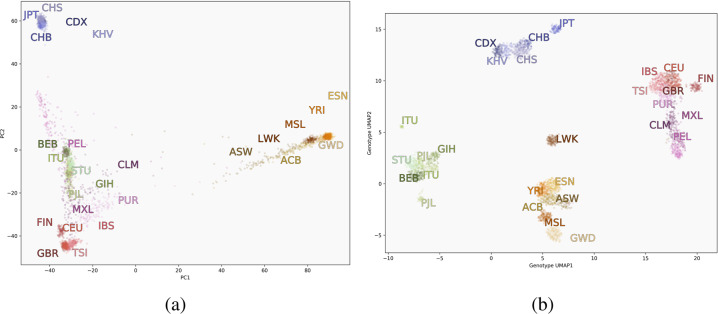
In the context of genetic data, UMAP finds the nearest genetic neighbours for each individual and creates low-dimensional representations that group more closely-related individuals together, and partially preserves longer-range relatedness through intermediary individuals. When used in visualizations, UMAP embeddings uncover many subtle features of data, such as distinct demographic histories and covariation between genetics, geography, and phenotypes [7]. Figure 2 compares visualizations of PCA to UMAP using genotype data from the Thousand Genomes Project (1000GP) [8]. PCA flattens the third dimension, obscuring the distinction between South Asian and Central/South American population clusters, whereas UMAP places them in more clearly visible clusters. UMAP has become widely used to study population structure in humans and other species, in conjunction with existing methods. Here we will describe the current state of the use of UMAP in population genetics.
Fig. 2.
Visualizations of data from the 1000GP. The first two principal components (left) versus a two-dimensional UMAP embedding (right). ACB African Caribbean in Barbados, ASW Americans of African Ancestry in Southwest US, BEB Bengali from Bangladesh, CDX Chinese Dai in Xishuangbanna, China, CEU Utah residents with Northern/Western European ancestry, CHB Han Chinese in Beijing, CHS Southern Han Chinese, CLM Colombian in Medellin, Colombia, ESN Esan in Nigeria, FIN Finnish in Finland, GBR British in England and Scotland, GWD Gambian in Western Divisions in the Gambia, GIH Gujarati Indian in Houston, Texas, IBS Iberian in Spain, ITU Indian Telugu in the UK, JPT Japanese in Tokyo, KHV Kinh in Vietnam, LWK Luhya in Kenya, MSL Mende in Sierra Leone, MXL Mexican in Los Angeles, California, PEL Peruvian in Lima, PJL Punjabi in Lahore, Pakistan, PUR Puerto Rican, STU Sri Lankan Tamil in the UK, TSI Tuscani in Italy, YRI, Yoruba in Nigeria
Visualizing genomic cohorts
The most straightforward and common use of UMAP is for visualization. This has proven useful for data composed of relatively homogeneous populations as well as those with considerable diversity in ancestries. UMAP will dedicate more visual space to larger populations within a cohort, and consequently can illustrate the ancestral composition of a cohort in the context of its population structure as well as the size of the data. Often these data are combined with reference panels such as the 1000GP or the Human Genome Diversity Project (HGDP) [9]. As with PCA, researchers can either perform the dimensionality reduction jointly or project one dataset onto UMAP embeddings of reference data. In most surveyed literature, data are restricted to common variants with a minor allele frequency (MAF) greater than some threshold, e.g., 0.01. This has the benefit of increasing computational speed and reduces possible confounding by false-positive variants. Given sufficient power and high-quality data, however, UMAP can be run on unfiltered data.
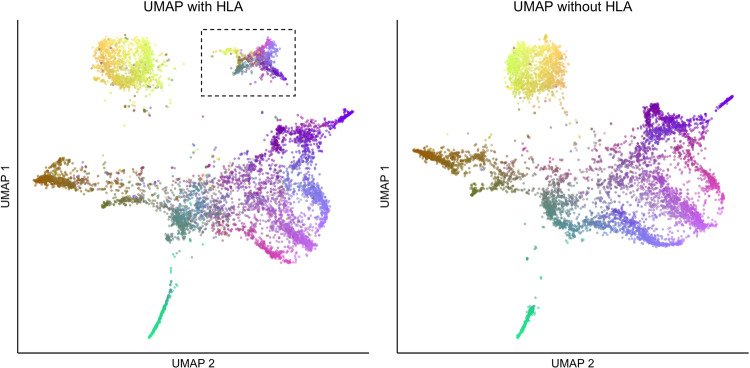
Data cleaning, including LD thinning, is important when performing UMAP. Certain regions, such as the human leukocyte antigen (HLA) region in the genome, can unduly influence clustering and visualization results—whereas the influence of HLA might be only observed in a higher-order PC, UMAP can identify the clustering of haplotypes at a single, densely typed locus and represent carriers of that haplotype as a distinct cluster (Fig. 1). LD thinning addresses this issue. Thus careful data preparation is necessary for UMAP, and researchers should resist the tendency to assign a demographic explanation to each cluster without careful analysis.
Fig. 1.
UMAP with (left) and without (right) HLA regions used on the Genizon database. The cluster in the dotted lines disappears when filtering for HLA and linkage disequilibrium
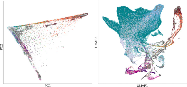
Comparing PCA and UMAP on the 1000GP and UKB datasets shows how the sampling scheme influences UMAP representation. PCA for both datasets presents aspects of genetic variation related to the out-of-Africa expansion, forming a triangle shape with African, East Asian, and European populations at the vertices and admixed populations falling between (Figs. 2 and 3). Since continental ancestry is expected to be the largest source of differences in population structure, PCA will put these populations far apart, and this is useful as a sanity check. In the 1000GP, which sampled individuals from geographically or culturally distinct groups, UMAP forms clusters corresponding to the different groups. By contrast, the UKB performed population-based sampling, and UMAP captures individuals with different levels of admixture from different ancestries. UMAP identifies admixture “bridges” between the different clusters and arguably provides a more detailed representation of the relationships among study participants.
Fig. 3.
PCA (left) and UMAP (right) projections of the UKB data, coloured by self-identified ethnic background. Unlike PCA, UMAP focuses on preserving local relationships and emphasizes fine-scale patterns in data. Groups in the UMAP projection are less compressed showing, for example, the relative size of the British and Irish populations in the UKB, alongside populations of other ancestries, while simultaneously showing the population structure between and within groups
Since its strength is in revealing fine-scale population structure, UMAP is well-suited to data with a high number of significant PCs, and can also extract population structure signal from the collection of high-order PCs [7]. Figure 4a and b visualize, respectively, the Genome Aggregation Database (gnomAD v3) from the Broad Institute [10] and Biobank Japan (BBJ) [11, 12], each of which contains over 100, 000 individuals. When applied to ethnically diverse groups such as the UKB, BioMe [13], and the Million Veterans Program (MVP) [14], UMAP tends to highlight groups with different international migration and admixture histories. In relatively more homogeneous populations such as BBJ, it highlights clusters related to geographic features such as island populations.
Fig. 4.
The Genome Aggregation Database (gnomAD, left) and Biobank Japan (BBJ, right) visualized using UMAP. UMAP illustrates the ancestral diversity of gnomAD, showing many the relationships between populations on continental and subcontinental levels. For the relatively more homogeneous BBJ data, it splits data geographically into the large mainland cluster (consisting of Hokkaido, Tohoku, Kanto-Koshinetsu, Chubu-Hokuriku, Kinki, and Kyushu regions), and smaller non-mainland clusters. The gnomAD image is reproduced from [10], and the BBJ image is reproduced from [12]
UMAP has also been successfully used with ancient DNA samples combined with modern and contemporary populations to identify shared population structure [15], as well as animal populations to study spatial introgression in mussels [16], genetic bottlenecks in the white rhino population [17], and the geographic origin of disease-carrying mosquitoes [18, 19].
In all these applications, data points were colored using categorical variables such as geographic origin or self-reported ancestry to help with interpretation. We have also found it informative to colour visualizations by continuous variables such as geographical coordinates, phenotype values, or global admixture proportions as in [7, 20, 21].
Supporting analyses: what do I do with a UMAP projection?
Within Tukey’s paradigm of exploratory data analysis, visualization with UMAP can be one of the first steps to the interrogation of complex data [22]. UMAP is useful for identifying clusters in genetic data when the number of clusters is not known in advance [23], and when there are a high number of significant PCs [7]. One straightforward approach is to run UMAP again on a cluster itself to examine subcontinental population structure, as in the National Geographic Genographic Project [20]. One may run UMAP on several types of genetic data; this was the case with Almarri et al’s study of structural variants, where they found population stratification in all classes of genetic variants, with Oceanian populations consistently forming their own clusters [24]. In Spear et al., we identified several clusters of Hispanic/Latinx populations using UMAP on the top PCs — despite these groups having overlapping proportions of continental ancestry proportions — and further studied the Mexican-American population to identify temporal and demographic patterns in their admixture histories [21]. In each case, these projections were combined with traditional statistical approaches such as FST, ADMIXTURE [25], or fineSTRUCTURE [26].
One promising application is the use of clusters as covariates in GWAS and polygenic scores (PGS). Fine-scale population structure continues to confound studies of polygenic traits whether in studies of ancestrally diverse or relatively homogeneous populations (e.g., [27–29]), making it an important area of research. Sakaue et al. used UMAP to identify substructure within the Japanese population, separating it into a mainland population and Hokkaido-Ainu with surrounding islands, reflecting known demographic history in Japan [12]. They identified systematic shifts in PGS for multiple traits across UMAP clusters.
The capacity of UMAP to identify haplotype structure was used by Yamamoto et al to visualize mitochondrial DNA (mtDNA). Though UMAP correctly identified sub-haplogroup clusters of mitchondrial DNA, it did not identify parent clusters as readily as PCA or phylogenetic analysis, and is not particularly advantageous for single-locus analysis [30].
Discussion
UMAP is now used regularly to visualize the ancestral composition of cohorts as well as to examine fine-scale population structure and subtle patterns in biobanks of all compositions. In this sense, UMAP—and dimensionality reduction at large—is to data what a microscope is to biological samples: an effective tool to scientifically examine a subject and provoke deeper investigation. In both cases, calibration is an important factor, as is understanding the tool’s limitations. The main parameters to calibrate in UMAP are the number of nearest neighbours (NN) and the minimum distance (MD). Studies varied in their parameter selection, but generally chose NN close to 15; setting NN < 10 can result in disjoint clusters made up of closely-related individuals, such as families. The minimum distance was usually 0.1 < MD < 0.5; values of MD close to 0 create very tight clusters, which can be appropriate for downstream processes such as cluster analysis but less pleasing visually. We recommend running multiple parametrizations and to combine UMAP plots with PCA plots and methods like fineSTRUCTURE [26], ADMIXTURE [25], or traditional statistics such as FST to make inferences. As with PCA and other dimensionality reduction methods, genetically defined clusters represent some degree of shared ancestry. While genetic clusters correlate with variables like self-identified ethnicity or race, they are distinct concepts and not interchangeable [31].
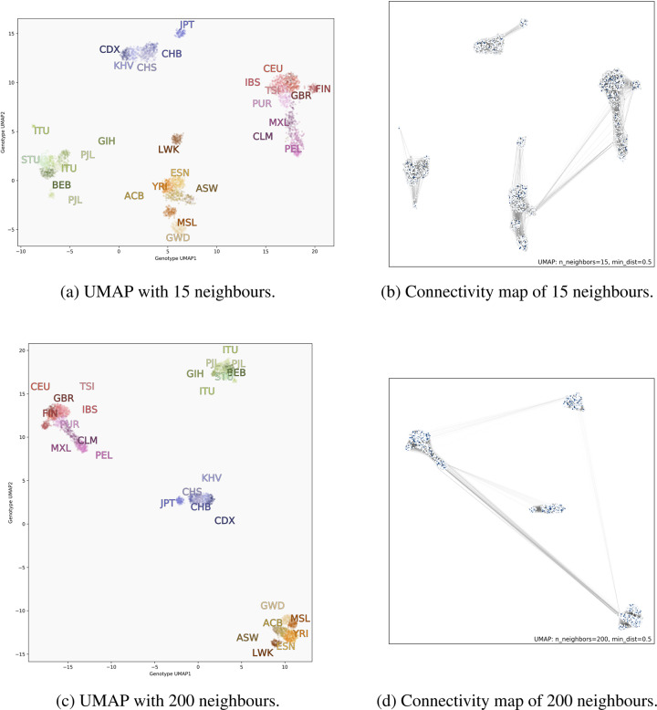
The reference implementation of UMAP is regularly updated with new features [32]. A recent update enabled visualization of the simplicial complex underlying the algorithm, which can highlight how input data and parameterization impact the formation and placement of clusters relative to one another. We demonstrate this using genotype data from the 1000GP in Fig. 5. Increasing the value of NN increases the size of the complex (at a higher computational cost), but clusters that are completely disjoint from the rest of the data when NN = 15 become connected as NN is increased to 200. In Fig. 5a and b the simplicial complexes of South Asian and East Asian populations do not connect to other populations; that is, for these continental clusters, every individual’s 15 closest genetic neighbours fall within the cluster. In Fig. 5c and d, where NN = 200, all continental populations become connected. Some populations, such as the Luhya (LWK) and Japanese (JPT), become more closely connected to their continental groups, and the embedding with NN = 200 places their subclusters closer to their respective continental populations. These visualizations also clarify that since UMAP preserves these topological connections, the positions of connected clusters may be flipped or rotated relative to each other when carrying out multiple runs with identical parameters.
Fig. 5.
UMAP projection of the same genotype data from the 1000GP comparing parametrization with a small (top) and large (bottom) number of nearest neighbours. Left images are coloured by population; right images are the same points but with the simplicial complex drawn. When adding more neighbours, subclusters become less separated, as with the LWK population, for example. Looking at the connectivity maps, we see new connections between continental groups, such as the Central/South American clusters and East Asian clusters. Darker lines indicate that individuals are closer to each other in genotype space
Conclusion
With its effective performance and widespread use in under 2 years, UMAP shows considerable promise as part of the toolbox of a population geneticist, especially in the case of large cohorts. Beyond its capacity to visualize data, it holds promise for downstream methods such as clustering, correction for fine-scale population structure in GWAS and PGS, and identifying unique demographic histories. We anticipate that UMAP and/or related methods of dimensionality reduction will continue to find applications in the field, bolstering our exploration and understanding of human genomic data and the study of complex polygenic traits.
Materials and methods
All code used to process 1000GP data and generate images is available at https://github.com/diazale/umap_review. We used genotype data from 3450 individuals from the 1000GP using Affy 6.0 genotyping [8]. Genotype data from the 1000GP is available at http://ftp.1000genomes.ebi.ac.uk/vol1/ftp/release/20130502/supporting/hd_genotype_chip/ and http://ftp.1000genomes.ebi.ac.uk/vol1/ftp/phase3/. The Genizon cohort is comprised of 7843 genotyped individuals from Quebec. The genotype data from this cohort was compiled from four different chips (HumanHap375, HumanHap550, Illumina1M, and Human610-Quad). The missing data from the merging of these datasets were imputed using the Michigan Imputation Server. The UKB provides genotype data and principal components on 488,377 individuals. Visualizations were done with matplotlib [33] and PCA was done using sklearn [34].
Compliance with ethical standards
Conflict of interest
The authors declare that they have no conflict of interest.
Footnotes
Publisher’s note Springer Nature remains neutral with regard to jurisdictional claims in published maps and institutional affiliations.
References
- 1.McVean G. A genealogical interpretation of principal components analysis. PLoS Gen. 2009;5:e1000686. doi: 10.1371/journal.pgen.1000686. [DOI] [PMC free article] [PubMed] [Google Scholar]
- 2.Patterson N, Price AL, Reich D. Population structure and eigenanalysis. PLoS Gen. 2006;2:e190. doi: 10.1371/journal.pgen.0020190. [DOI] [PMC free article] [PubMed] [Google Scholar]
- 3.Maaten Lvd, Hinton G. Visualizing data using t-sne. J Mach Learn Res. 2008;9:2579–2605. [Google Scholar]
- 4.McInnes L, Healy J, Melville J. UMAP: uniform manifold approximation and projection for dimension reduction. arXiv 2018. http://arxiv.org/abs/1802.03426.
- 5.Becht E, McInnes L, Healy J, Dutertre C, Kwok IWH, Newel EW, et al. Dimensionality reduction for visualizing single-cell data using UMAP. Nat Biotechnol. 2019;37:38–44. doi: 10.1038/nbt.4314. [DOI] [PubMed] [Google Scholar]
- 6.Moon KR, Dijk Dv, Wang Z, Gigante S, Burkhardt DB, Coifman RR, et al. Visualizing structure and transitions in high-dimensional biological data. Nat Biotechnol. 2019;37:1482–92. doi: 10.1038/s41587-019-0336-3. [DOI] [PMC free article] [PubMed] [Google Scholar]
- 7.Diaz-Papkovich A, Anderson-Trocmé L, Ben-Eghan C, Gravel S. UMAP reveals cryptic population structure and phenotype heterogeneity in large genomic cohorts. PLoS Gen. 2019;15. https://www.ncbi.nlm.nih.gov/pmc/articles/PMC6853336/. [DOI] [PMC free article] [PubMed]
- 8.The 1000 Genomes Project Consortium A global reference for human genetic variation. Nature. 2015;526:68–74. doi: 10.1038/nature15393. [DOI] [PMC free article] [PubMed] [Google Scholar]
- 9.Cann HM, Toma Cd, Cazes L, Legrand MF, Morel V, Cambon-Thomsen A, et al. A human genome diversity cell line panel. Science. 2002;296:261–2. doi: 10.1126/science.296.5566.261b. [DOI] [PubMed] [Google Scholar]
- 10.Karczewski KJ, Francioli LC, Tiao G, Cummings BB, Alföldi J, MacArthur DG, et al. The mutational constraint spectrum quantified from variation in 141,456 humans. Nature. 2020;581:434–43. doi: 10.1038/s41586-020-2308-7. [DOI] [PMC free article] [PubMed] [Google Scholar]
- 11.Nagai A, Hirata M, Kamatani Y, Muto K, Matsuda K, Mushiroda T, et al. Overview of the BioBank Japan Project: study design and profile. Journal of epidemiology. 2017;27:S2–S8. doi: 10.1016/j.je.2016.12.005. [DOI] [PMC free article] [PubMed] [Google Scholar]
- 12.Sakaue S, Hirata J, Kanai M, Suzuki K, Akiyama M, Okada Y, et al. Dimensionality reduction reveals fine-scale structure in the Japanese population with consequences for polygenic risk prediction. Nat Commun. 2020;11:1569. doi: 10.1038/s41467-020-15194-z. [DOI] [PMC free article] [PubMed] [Google Scholar]
- 13.Belbin GM, Wenric S, Cullina S, Glicksberg BS, Moscati A, Kenny EE, et al. Towards a fine-scale population health monitoring system. bioRxiv780668. 2019. https://www.biorxiv.org/content/10.1101/780668v1. [DOI] [PubMed]
- 14.Hunter-Zinck H, Shi Y, Li M, Gorman BR, Ji SG, Pyarajan S, et al. Genotyping array design and data quality control in the million veteran program. Am J Human Gen. 2020;106:535–48. doi: 10.1016/j.ajhg.2020.03.004. [DOI] [PMC free article] [PubMed] [Google Scholar]
- 15.Margaryan A, Lawson D, Sikora M, Racimo F, Rasmussen S, Willerslev E, et al. Population genomics of the Viking world. bioRxiv703405. 2019. https://www.biorxiv.org/content/10.1101/703405v1.
- 16.Simon A, Fraïsse C, El Ayari T, Liautard-Haag C, Strelkov P, Bierne N, et al. Local introgression at two spatial scales in mosaic hybrid zones of mussels. bioRxiv818559. 2019. https://www.biorxiv.org/content/10.1101/818559v1. [DOI] [PubMed]
- 17.Sánchez-Barreiro F, Gopalakrishnan S, Ramos-Madrigal J, Westbury MV, Manuel Mde, Gilbert MTP, et al. Historical population declines prompted significant genomic erosion in the northern and southern white rhinoceros (Ceratotherium simum). bioRxiv2020.05.10.086686. 2020. https://www.biorxiv.org/content/10.1101/2020.05.10.086686v1. [DOI] [PMC free article] [PubMed]
- 18.The Anopheles Gambiae 1000 Genomes Consortium. Genome variation and population structure among 1142 mosquitoes of the African malaria vector species Anopheles gambiae and Anopheles coluzzii. bioRxiv864314. 2020. https://www.biorxiv.org/content/10.1101/864314v2. [DOI] [PMC free article] [PubMed]
- 19.Schmidt TL, Chung J, Honnen A-C, Weeks AR, Hoffmann A A. Population genomics of two invasive mosquitoes (aedes aegypti and aedes albopictus) from the indo-pacific. bioRxiv. 2020. [DOI] [PMC free article] [PubMed]
- 20.Dai CL, Vazifeh MM, Yeang CH, Tachet R, Wells RS, Martin AR, et al. Population histories of the United States revealed through fine-scale migration and haplotype analysis. Am J Hum Gen. 2020;106:371–88. doi: 10.1016/j.ajhg.2020.02.002. [DOI] [PMC free article] [PubMed] [Google Scholar]
- 21.Spear ML, Diaz-Papkovich A, Ziv E, Gravel S, Torgerson DG, Hernandez R. Recent fluctuations in Mexican American genomes have altered the genetic architecture of biomedical traits. bioRxiv. 2020. [DOI] [PMC free article] [PubMed]
- 22.Holmes S, Huber W. Modern statistics for modern biology (Cambridge University Press, 2018).
- 23.Tonkin-Hill G, Lees JA, Bentley SD, Frost SDW, Corander J. Fast hierarchical Bayesian analysis of population structure. Nucleic Acids Research. 2019;47:5539–49. doi: 10.1093/nar/gkz361. [DOI] [PMC free article] [PubMed] [Google Scholar]
- 24.Almarri MA, Bergström A, Prado-Martinez J, Yang F, Fu B, Xue Y, et al. Population structure, stratification, and introgression of human structural variation. Cell. 2020;182:189–199.e15. doi: 10.1016/j.cell.2020.05.024. [DOI] [PMC free article] [PubMed] [Google Scholar]
- 25.Alexander DH, Novembre J, Lange K. Fast model-based estimation of ancestry in unrelated individuals. Gen Res. 2009;19:1655–1664. doi: 10.1101/gr.094052.109. [DOI] [PMC free article] [PubMed] [Google Scholar]
- 26.Lawson DJ, Hellenthal G, Myers S, Falush D. Inference of population structure using dense haplotype data. PLoS Gen. 2012;8:e1002453. doi: 10.1371/journal.pgen.1002453. [DOI] [PMC free article] [PubMed] [Google Scholar]
- 27.Kerminen S, Martin AR, Koskela J, Ruotsalainen SE, Havulinna AS, Daly MJ, et al. Geographic variation and bias in the polygenic scores of complex diseases and traits in Finland. Am J Hum Gen. 2019;104:1169–81. doi: 10.1016/j.ajhg.2019.05.001. [DOI] [PMC free article] [PubMed] [Google Scholar]
- 28.Berg JJ, Harpak A, Sinnott-Armstrong N, Joergensen AM, Mostafavi H, Coop G, et al. Reduced signal for polygenic adaptation of height in UK Biobank. eLife. 2019;8:e39725. doi: 10.7554/eLife.39725. [DOI] [PMC free article] [PubMed] [Google Scholar]
- 29.Sohail M, Maier RM, Ganna A, Bloemendal A, Martin AR, Sunyaev SR, et al. Polygenic adaptation on height is overestimated due to uncorrected stratification in genome-wide association studies. eLife. 2019;8:e39702. doi: 10.7554/eLife.39702. [DOI] [PMC free article] [PubMed] [Google Scholar]
- 30.Yamamoto K, Sakaue S, Matsuda K, Murakami Y, Kamatani Y, Okada Y, et al. Genetic and phenotypic landscape of the mitochondrial genome in the Japanese population. Commun Biol. 2020;3:1–11. doi: 10.1038/s42003-019-0734-6. [DOI] [PMC free article] [PubMed] [Google Scholar]
- 31.Mathieson I, Scally A. What is ancestry? PLoS Genetics. 2020;16:e1008624. doi: 10.1371/journal.pgen.1008624. [DOI] [PMC free article] [PubMed] [Google Scholar]
- 32.McInnes L, Healy J, Saul N, Grossberger L. UMAP: uniform manifold approximation and projection. J Open Source Softw. 2018;3:861. doi: 10.21105/joss.00861. [DOI] [Google Scholar]
- 33.Hunter JD. Matplotlib: a 2d graphics environment. Comput Sci Eng. 2007;9:90–5. doi: 10.1109/MCSE.2007.55. [DOI] [Google Scholar]
- 34.Pedregosa F, Varoquaux G, Gramfort A, Michel V, Thirion B, Duchesnay E, et al. Scikit-learn: machine learning in Python. J Mach Learn Res. 2011;12:2825–30. [Google Scholar]


