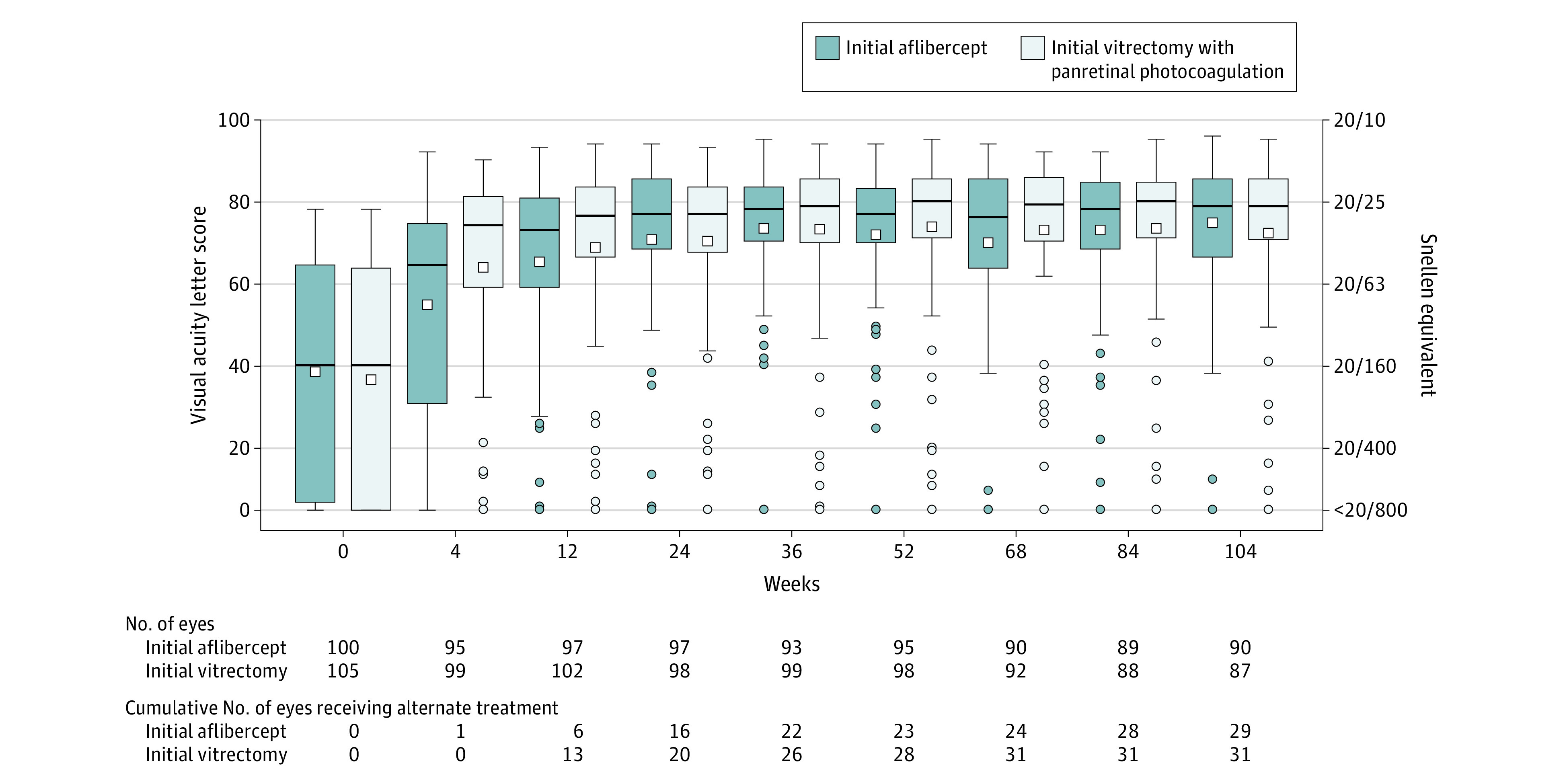
Figure 2. Visual Acuity Letter Score Through 2 Years.

Within each box and whisker plot, the horizontal bar represents the median and the white square represents the mean. The top of the box is the third quartile (75th percentile) and the bottom of the box is the first quartile (25th percentile). Whiskers extend from the nearest quartile to the most extreme data point within 1.5 times the interquartile range; values beyond these limits are plotted as circles. The number of eyes completing each visit and the cumulative number of eyes that received alternative treatment through the visit (eg, aflibercept in the vitrectomy group or vitrectomy in the aflibercept group) appear below the plot. The best-corrected visual acuity was collected after protocol-defined refraction. Visual acuity was measured using electronic Early Treatment for Diabetic Retinopathy Study visual acuity testing on a scale from 100 letters (Snellen equivalent, 20/10) to 0 letters (Snellen equivalent, <20/800); higher scores indicate better vision.
