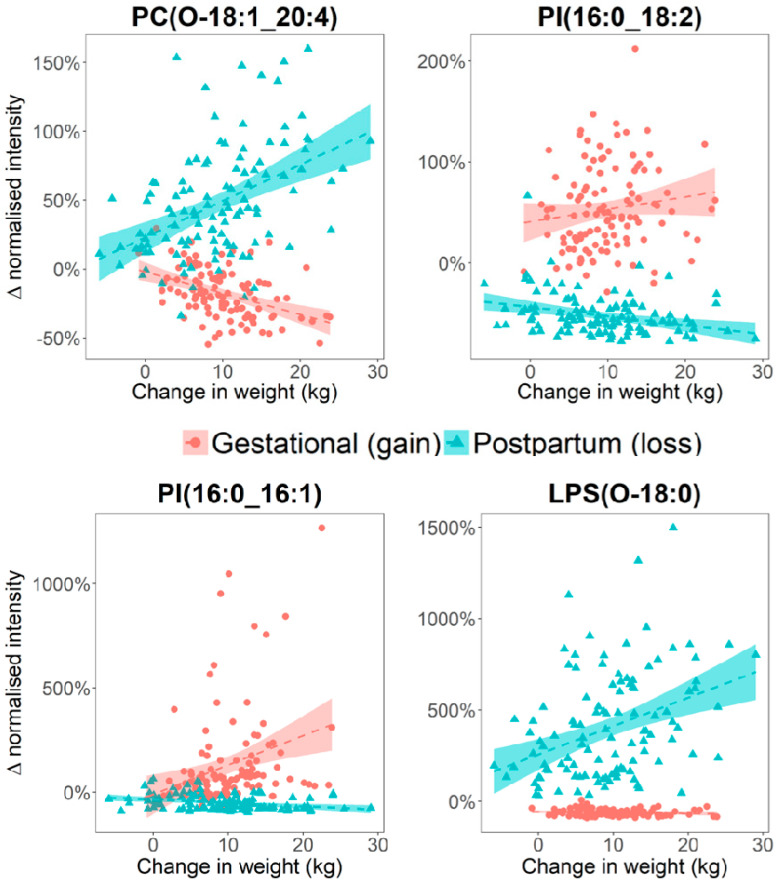
Figure 3.
Scatter plots illustrating opposite direction of associations are observed between metabolite level, and GWG or WL. The Y-axes represent the change in metabolite intensity between the Baseline and WK35 (for GWG) or between the 1Y and W35 (for WL) samples, and these were calculated per-participant and expressed in percentage change.

