

Introduction
Expert groups have coalesced around a roadmap to address the current COVID-19 pandemic centered on social distancing, monitoring case counts and health care capacity, and, eventually, moving to pharmaceutical interventions. However, responsibility for navigating the pandemic response falls largely on state and local officials. To make equitable decisions on allocating resources, caring for vulnerable subpopulations, and implementing local- and state-level interventions, access to current pandemic data and key vulnerabilities at the community level are essential (National Academies of Sciences, Engineering, and Medicine 2020). Although numerous predictive models and interactive monitoring applications have been developed using pandemic-related data sets (Wynants et al. 2020), their capacity to aid in dynamic, community-level decision-making is limited. We developed the interactive COVID-19 Pandemic Vulnerability Index (PVI) Dashboard (https://covid19pvi.niehs.nih.gov/) to address this need by presenting a visual synthesis of dynamic information at the county level to monitor disease trajectories, communicate local vulnerabilities, forecast key outcomes, and guide informed responses (Figure 1).
Figure 1.
![Figure 1 is a dashboard titled COVID-19 Pandemic Vulnerability Index (P V I). The dashboard displays P V I profiles on a choropleth map layer of Clarendon County, South Carolina, showing a PVI score of 0.59 (90 of 3,142); HClust is 9; KMeans is 3; and Model is P V I Model (17 November 2020), and a 1 to 12 color key showing Infection Rate Transmissible Cases equals 0.48, Infection Rate Disease Spread equals 0.08, Population concentration Population Mobility equals 0.49, Population concentration Residential Density equals 0.96, Intervention Social Distancing equals 1.00, Intervention Testing equals 0.64, Health and Environment Population Demographics equals 0.63, Health and Environment Air Pollution equals 0.43, Health and Environment Age Distribution equals 0.65, Health and Environment Co-morbidities equals 0.50, Health and Environment Health Disparities equals 0.60, and Health and Environment Hospital Beds equals 0.44. On the left, there are five options, namely, Zoom to County (having an option to select a county), P V I model layers [comprising options to select date, Rank (namely, greater than 80 percent, 80 to 60 percent, 60 to 40 percent, 40 to 20 percent, and top 20 percent), Slices (namely, low risk, medium, and high risk, counties shown are 3,142 of 3,142), and a size scale to adjust the size of the map], Covid-19 Layers [comprising options to select date, Cases (namely, 60, 4,000, and greater than 60,000), and deaths (namely, 15, 500, and greater than 8,000)], P V I Slice Legend, and P V I Slice Distributions (comprising graphs, namely, P V I Overall Score, Infection Rate: Transmissible Cases, and Infection rate: Disease spread). At the bottom, there are five representations, namely, Clarendon, South Carolina (comprising a tabular representation having three columns, namely, New, 3-day average, and Declining Days question mark. Row 1: Cases, 4.3, and 7 of 14. Row 2: Deaths, 0, and 13 of 14), County numbers on 16 November 2020 (namely, cases equals 1,298, deaths equals 69, deaths per cases equals 5.32 percent, population equals 33,700, Cases per 100 thousand equals 3,851.6, and Deaths per 100 thousand equals 204.7), Timelines [comprising a line graph, with options to view cases, deaths, P V I, and P V I rank, ranging from 0 to 1,400 in increments of 200 (y-axis) across 15 March to 4 November (x-axis)], Daily Change [comprising a bar graph, with options to view Cases and Deaths, ranging from 0 to 18 in increments of 2 (y-axis) across 2 November to 16 November in unit increments (x-axis)], and Predictions [comprising a line graph with options to view cases and deaths, ranging from 0 to 16 increments of 2 (y-axis) across today to plus 13 in unit increments (x-axis)]. There is an option named Quick Start Guide at the top-right corner of the screen.](https://cdn.ncbi.nlm.nih.gov/pmc/blobs/6906/7785295/5d8515064d27/ehp8690_f1.jpg)
COVID-19 PVI Dashboard. Dashboard screenshot displaying PVI profiles atop a choropleth map layer indicating overall COVID-19 PVI rank. The PVI Scorecard and associated data for Clarendon County, South Carolina, has been selected. The scorecard summarizes the overall PVI score and rank compared with all 3,142 U.S. counties on each indicator slice. The scrollable score distributions at left compare the selected county PVI to the distributions of overall and slice-wise scores across the United States. The panels below the map are populated with county-specific information on observed trends in cases and deaths, cumulative numbers for the county, historical timelines (for cumulative cases, cumulative deaths, PVI, and PVI rank), daily case and death counts for the most recent 14-d period, and a 14-d forecast of predicted cases and deaths. The information displayed for both observed COVID-19 data and PVI layers is scrollable back through March 2020. Documentation of additional features and usage, including advanced options (accessible via the collapsed menu at the upper left), is provided in a Quick Start Guide (linked at the upper right corner). Note: Pop, population; PVI, Pandemic Vulnerability Index.
Methods
The current PVI model integrates multiple data streams into an overall score derived from 12 key indicators—including well-established, general vulnerability factors for public health, plus emerging factors relevant to the pandemic—distributed across four domains: current infection rates, baseline population concentration, current interventions, and health and environmental vulnerabilities. The PVI profiles translate numerical results into visual representations, with each vulnerability factor represented as a component slice of a radar chart (Figure 2). The PVI profile for each county is calculated using the Toxicological Prioritization Index (ToxPi) framework for data integration within a geospatial context (Marvel et al. 2018; Bhandari et al. 2020). Data sources in the current model (version 11.2.1) include the Social Vulnerability Index (SVI) of the Centers for Disease Control and Prevention (CDC) for emergency response and hazard mitigation planning (Horney et al. 2017), testing rates from the COVID Tracking Project (Atlantic Monthly Group 2020), social distancing metrics from mobile device data (https://www.unacast.com/covid19/social-distancing-scoreboard), and dynamic measures of disease spread and case numbers (https://usafacts.org/issues/coronavirus/). Methodological details concerning the integration of data streams—plus the complete, daily time series of all source data since February 2020 and resultant PVI scores—are maintained on the public Github project page (COVID19PVI 2020). Over this period, the PVI has been strongly associated with key vulnerability-related outcome metrics (by rank-correlation), with updates of its performance assessment posted with model updates alongside data at the Github project page (COVID19PVI 2020).
Figure 2.
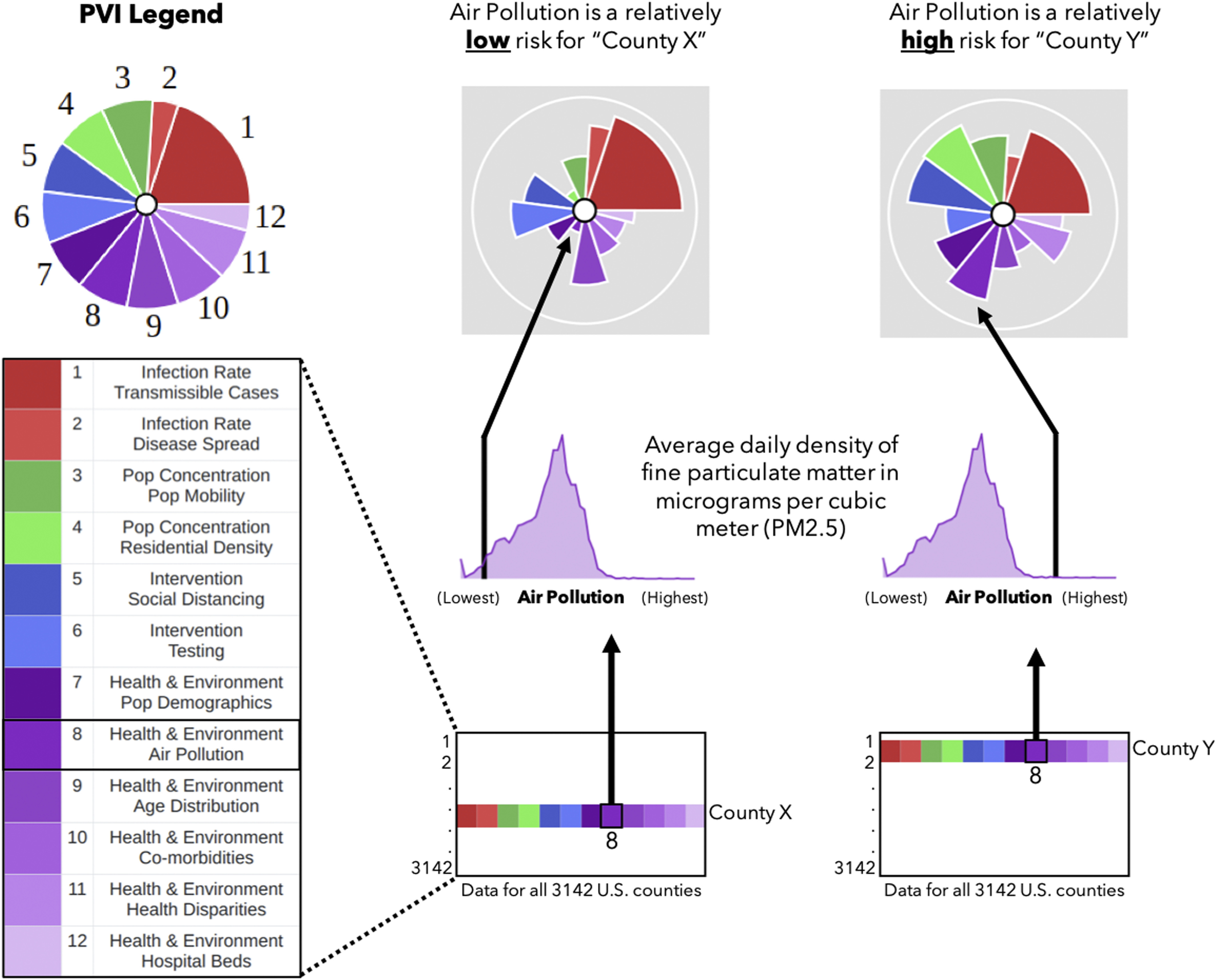
Translation of data into COVID-19 PVI profiles. Information from all 3,142 U.S. counties is translated into PVI slices. The illustration shows how air pollution data (average density of per county) are compared for two example counties. The county with the higher relative measurement (County Y) has a longer air pollution slice than the county with a lower measurement (County X). This procedure is repeated for all slices, resulting in an integrated, overall PVI profile. Note: pop, population; PVI, Pandemic Vulnerability Index.
In addition to the PVI itself—which is a summary, human-centric visualization of relative vulnerability drivers—the dashboard is supported by rigorous statistical modeling of the underlying data to enable quantitative analysis and provide short-term, local predictions of cases and deaths [complete methodological details are maintained at the Github project page (COVID19PVI 2020)]. Generalized linear models of cumulative outcome data indicated that, after population size, the most significant predictors were the proportion of Black residents, mean fine particulate matter [particulate matter in diameter ()], percentage of population with insurance coverage (which was positively associated), and proportion of Hispanic residents. The local predictions of cases and deaths (see the “Predictions” panel in Figure 1) are updated daily using a Bayesian spatiotemporal random-effects model to build forecasts up to 2 weeks out.
Discussion
The PVI Dashboard supports decision-making and dynamic monitoring in several ways. The display can be tailored to add or remove layers of information, filtered by region (e.g., all counties within a state) or clustered by profile shape similarity. The timelines for both PVI models and observed COVID-19 outcomes facilitate tracking the impact of interventions and directing local resource allocations. The “Predictions” panel (Figure 1) connects these historical numbers to local forecasts of cases and deaths. By communicating an integrated concept of vulnerability that considers both dynamic (infection rate and interventions) and static (community population and health care characteristics) drivers, the interactive dashboard can promote buy-in from diverse audiences, which is necessary for effective public health interventions. This messaging can assist in addressing known racial disparities in COVID-19 case and death rates (Tan et al. 2020) or populations, and the PVI Dashboard is part of the “Unique Populations” tab of the CDC’s COVID-19 Data Tracker (https://covid.cdc.gov/covid-data-tracker). By filtering the display to highlight vulnerability drivers within an overall score context, the dashboard can inform targeted interventions for specific localities.
Unfortunately, the pandemic endures across the United States, with broad disparities based on the local environment (Tan et al. 2020). We present the PVI Dashboard as a dynamic container for contextualizing these disparities. It is a modular tool that will evolve to incorporate new data sources and analytics as they emerge (e.g., concurrent flu infections, school and business reopening statistics, heterogeneous public health practices). This flexibility positions it well as a resource for integrated prioritization of eventual vaccine distribution and monitoring its local impact. The PVI Dashboard can empower local and state officials to take informed action to combat the pandemic by communicating interactive, visual profiles of vulnerability atop an underlying statistical framework that enables the comparison of counties and the evaluation of the PVI’s component data.
Acknowledgments
We thank the information technology and web services staff at the National Institute of Environmental Health Sciences (NIEHS)/National Institutes of Health (NIH) for their help and support, as well as J.K. Cetina and D.J. Reif for their useful technical input and advice. This work was supported by NIEHS/NIH grants (P42 ES027704, P30 ES029067, P42 ES031009, and P30 ES025128) and NIEHS/NIH intramural funds (Z ES103352-01).
References
- Atlantic Monthly Group. 2020. The COVID Tracking Project. https://covidtracking.com/ [accessed 15 November 2020].
- Bhandari S, Lewis PGT, Craft E, Marvel SW, Reif DM, Chiu WA. 2020. HGBEnviroScreen: enabling community action through data integration in the Houston–Galveston–Brazoria region. Int J Environ Res Public Health 17(4):1130, PMID: 32053902, 10.3390/ijerph17041130. [DOI] [PMC free article] [PubMed] [Google Scholar]
- COVID19PVI. 2020. COVID19PVI/data. https://github.com/COVID19PVI/data [accessed 15 November 2020].
- Horney J, Nguyen M, Salvesen D, Dwyer C, Cooper J, Berke P. 2017. Assessing the quality of rural hazard mitigation plans in the southeastern United States. J Plan Educ Res 37(1):56–65, 10.1177/0739456X16628605. [DOI] [Google Scholar]
- Marvel SW, To K, Grimm FA, Wright FA, Rusyn I, Reif DM. 2018. ToxPi Graphical User Interface 2.0: dynamic exploration, visualization, and sharing of integrated data models. BMC Bioinformatics 19(1):80, PMID: 29506467, 10.1186/s12859-018-2089-2. [DOI] [PMC free article] [PubMed] [Google Scholar]
- National Academies of Sciences, Engineering, and Medicine. 2020. Framework for Equitable Allocation of COVID-19 Vaccine. Gayle H, Foege W, Brown L, Kahn B, eds. Washington, DC: National Academies Press. [PubMed] [Google Scholar]
- Tan TQ, Kullar R, Swartz TH, Mathew TA, Piggott DA, Berthaud V. 2020. Location matters: geographic disparities and impact of coronavirus disease 2019. J Infect Dis 222(12):1951–1954, PMID: 32942299, 10.1093/infdis/jiaa583. [DOI] [PMC free article] [PubMed] [Google Scholar]
- Wynants L, Van Calster B, Collins GS, Riley RD, Heinze G, Schuit E, et al. 2020. Prediction models for diagnosis and prognosis of covid-19: systematic review and critical appraisal. BMJ 369:m1328, PMID: 32265220, 10.1136/bmj.m1328. [DOI] [PMC free article] [PubMed] [Google Scholar]