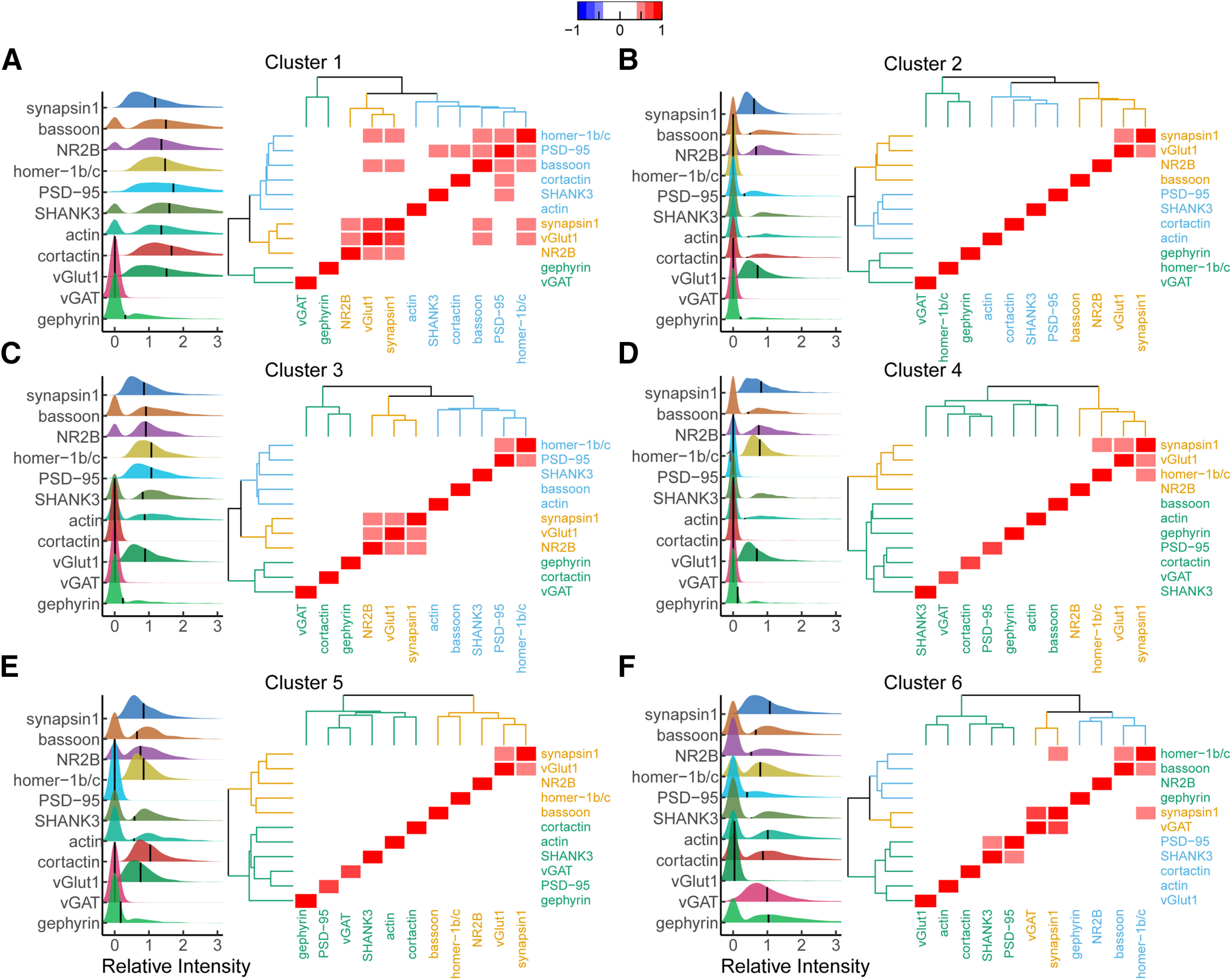
Figure 3.

Comparison of synaptic intensity and protein relationships among all proteins within each cluster. Ridgeline plots of relative synaptic intensity for each cluster group (A–F) using HDBSCAN. Horizontal black line represents cluster mean intensity. All values are normalized to untreated mean integrated intensity. The first peak indicates synapses with integrated intensity of zero. Heatmap indicates the correlation coefficient between each protein. Correlation values between −0.4 and 0.4 obscured to highlight strong correlations. Dendrograms surrounding heatmap show hierarchical clustering of proteins within each cluster.
