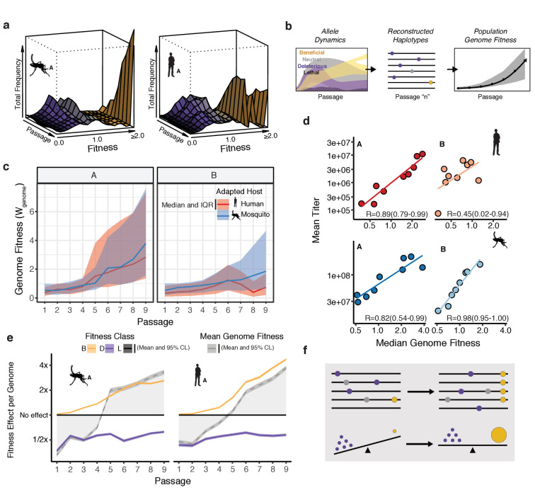
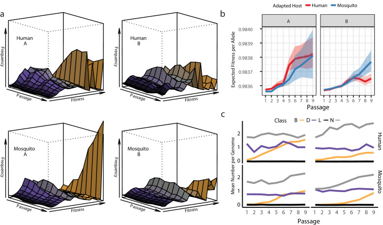
Figure 4. Connecting global evolutionary dynamics and population fitness.
(a) Surface plot of the 'fitness wave' illustrating the change in frequency of alleles, colored by fitness bin, throughout a passage experiment. The height of the surface represents the sum of frequencies of alleles in a given bin. Deleterious and neutral mutations (purple and gray regions) make up a large proportion of the population early in the experiment. They are largely, but not entirely, driven out in later passages as beneficial mutations (yellow) increase in frequency. (b) The shift in allele fitness effects circulating in the population suggests a net increase in the fitness of genotypes within the adapting populations. To estimate the population-level change in fitness during adaptation, we used the allele frequencies in each passage (left panel) to reconstruct haplotypes for that passage (e.g. passage 'n', middle panel). The potential genotypes from each sequenced population were inferred based on empirical allele frequencies to determine the probability of a sequence identity at each site for each estimated genotype. We then computed the fitness of the resulting genotype as the product of the fitness effects across the genome. Sampling a large population of representative genotypes from the populations, we were able to generate a distribution of genome fitness values for each sequenced population (right panel). (c) Median and interquartile range of genotypic fitness () of 50,000 reconstructed genotypes sampled from the empirical allele frequencies in each sequenced population. (d) Correlation plots comparing the median genotypic fitness () of the reconstructed populations versus mean virus titer from focus forming assays (N=4). (e) Line plots showing the mean effect of beneficial (yellow), deleterious (purple), and lethal (black) mutations on mean fitness of the population (gray line). The shaded area represents the 95% confidence interval of the mean from 50,000 reconstructed genomes.


