

Abstract
Single-cell RNA sequencing (scRNA-seq) provides a new approach to an old problem: how to study cellular diversity in complex biological systems. This powerful tool has been instrumental in profiling different cell types and investigating, at the single-cell level, cell states, functions and responses. However, mining these data requires new analytical and statistical methods for high-dimensional analyses that must be customized and adapted to specific goals. Here we present a custom multistage analysis pipeline which integrates modules contained in different R packages to ensure flexible, high-quality RNA-seq data analysis. We describe this workflow step by step, providing the codes and explaining the rationale for each function and discussing the results and the limitations. We apply this pipeline to analyze different datasets of Drosophila larval ventral cords, identifying and describing rare cell types, such as astrocytes and neuroendocrine cells. This multistage analysis pipeline can be easily implemented by both novice and experienced scientists interested in neuronal and/or cellular diversity beyond the Drosophila model system.
Keywords: scRNA-seq, R pipeline, multisample integration, clustering, dimensionality reduction, cell type identification
Introduction
Single-cell RNA sequencing (scRNA-seq) methods are extensively used to characterize gene expression profiles at cellular resolution. Several droplet-based microfluidic systems have been developed to accomplish this goal, including Drop-seq (Macosko et al., 2015), InDrop (Klein et al., 2015) or 10x Genomics Chromium (Zheng et al., 2017). These systems are based on the encapsulation of single cells and barcoded beads in nanoliter droplets containing cell lysis buffer, followed by generation of cDNA libraries. The cell/bead barcode is covalently associated with all transcripts amplified from an individual cell/bead and becomes a cell identifier, allowing for recognition of all transcripts from an individual cell. In addition, a second series of variable nucleotides, called Unique Molecular Identifiers (UMIs), are designed to differentially mark each poly-adenylated sequence captured in each cell, enabling a precise estimation of the numbers of individual transcripts within each cell. A high-throughput sequencer generates millions of reads for each Drop-seq library. These reads are first aligned to a reference genome to identify genes corresponding to the cDNAs. The reads are then grouped based on their barcodes and individual UMIs are counted for each gene in each cell.
To fully exploit the structure and complexity of scRNA-seq data, many new analytical and statistical methods for high-dimensional data mining are required (Stegle et al., 2015). The scRNA-seq analyses must overcome a high level of technical and biological noise derived for example from a low efficiency of mRNA capture and/or cDNA amplification (Brennecke et al., 2013; Marinov et al., 2014) and a continuum of transitions in cell states and types. Various informatics tools have been developed to deal with these problems. They include the R packages DropletUtils, scran, scater, pheatmap (developed by Bioconductor, an opensource software project based on the R programming language) (Amezquita et al., 2020; Huber et al., 2015) and the very popular R package Seurat, designed for analysis and exploration of scRNA-seq data (Butler et al., 2018; Satija et al., 2015; Stuart et al., 2019). Also, the scRNA-seq data analysis requires specific modular steps including quality control, normalization, dimensionality reduction, clustering and identification of specific markers for specific cell types. Ideally, each particular biological problem should have a customized workflow for data analysis and interpretation that will exploit various software module of any given package to maximum advantage.
Different modules within these various packages offer distinct capabilities and advantages. For example, the emptyDrops function in DropletUtils package allows for identification and removal empty droplets from the raw count matrix (Lun et al., 2019). Normalization by deconvolution in scran package represents an attractive method to normalize the differences in coverage between cells because it takes into consideration that different cells can have a different total mRNA amount (Lun et al., 2016a). The Seurat package offers exceptionally efficient methods for batch integration and graphical clustering for multiple datasets (Luecken et al., 2020; Tran et al., 2020). However, we found it simpler and more powerful to build an optimized R workflow of Drop-seq data analysis using a filtering step performed with DropletUtils followed by integration and clustering steps carried out with Seurat. At this time, Seurat uses the filter count matrix (data after removal empty droplets) generated by CellRanger pipeline, which introduces a Unix-based module. It is possible to create Seurat objects directly from the raw count matrix (data with empty droplets), but this option does not have sophisticated filtering function. Since Seurat and Bioconductor packages have different data structures, every workflow that plans to integrate different packages must also include the interconversion between different classes of files. We took advantage of the possibility offered by the Seurat version 3.1 that permits conversion of SingleCellExperiment (sce) objects to Seurat objects (and vice versa) and assembled our own custom multistage analysis pipeline.
The current protocol describes this custom multistage workflow, providing the codes and explaining the rationale for choosing each function. We have assembled and run this workflow on Mac OS 10.14.6 using R version 3.6.2 and RStudio version 1.1.463; however, this custom pipeline can be run on any other platform. The software packages required are indicated throughout the text and summarized in Table 1. Software versions are constantly changing to improve analysis and to address challenges faced by users. During the assembly of this protocol, a newer version of Seurat (Seurat v4.0) has been released (https://satijalab.org/seurat/). Seurat v4.0 includes new functions, for example simultaneous measurements in the same cells of RNA and protein levels or RNA and ATAC (accessible DNA regions) profiles. Nonetheless, workflows using Seurat v4.0 or higher will have to address the same problems as the ones described in this protocol.
Table 1.
List of the software and algorithms utilized in this protocol
To provide examples of outputs, we analyze data obtained from three different runs of scRNA-seq performed on 10X Genomics Chromium on Ventral Nerve Cords (VNCs) of Drosophila third instar larvae (as detailed in the accompanying protocol). The VNC datasets are used to illustrate each step in the custom workflow, starting from the raw counting matrices, the output from Cell Ranger, to the integrated dataset analysis. We further apply this custom workflow to identify and profile rare cell types, such as astrocytes and neuroendocrine cells.
Though developed for Drosophila data analysis, this workflow ensures a flexible and high-quality analysis of any scRNA-seq data. Basic knowledge of R language is required for an optimal application of this custom multistage analysis workflow. At the minimum, the naïve user should access the RStudio Cloud (https://rstudio.cloud/) and use the free tutorials to familiarize themselves with exploring large datasets. For the more experienced user, the websites of Bioconductor (https://osca.bioconductor.org/) and Seurat (https://satijalab.org/seurat/) offer more information and examples on single cell data analysis. We also recommend the “R for data science” introductory book by Hadley Wickham and Garrett Grolemund (Wickham and Grolemund, 2016). The software and algorithms utilized in this protocol are listed in Table 1.
Strategic plan
A diagram of the multistage analysis pipeline utilized here is presented in Figure 1.
Figure 1.

Workflow diagram showing the experimental steps (first row) followed by the different computation steps (second and third row).
This custom multistage analysis pipeline includes the following key steps:
Import data in R: from biological sample to sce objects
Filter empty droplets
Remove low quality cells
Identify highly expressed genes
Normalization
Conversion from sce objects to Seurat objects
Identify the most variable genes
Integrate samples using shared highly variable genes
Scaling
Principal components analysis (PCA)
Non-linear dimensional reduction (UMAP/TSNE)
Cluster the cells
Deal with unexpected differences in samples
Remove cells that generate an odd cluster
Identify specific cell types
Identify rare cell types
Each of these computation steps is detailed below in a dedicated section. Within each section, we discuss the purpose and the rationale for each function, include the code, and present examples from our own analyses, discussing the results and the limitations of each algorithm.
BASIC PROTOCOL 1: Customized scRNA-seq data analysis using interoperability among different R packages
Introduction:
As described in the accompanying protocol (REF), we dissected ventral nerve cords (VNCs) from Drosophila third instar wandering larvae and dissociated them (mechanically and enzymatically) into single cell suspensions. We performed three different experiments on separate days using 30 larval VNCs for each sample. The cell suspensions were loaded into the 10X Genomics Chromium microfluidics device to generate single cell libraries in which each barcode identifies a single cell. The libraries were then sequenced on Illumina platform and the reads were aligned to the Drosophila genome using Cell Ranger pipelines. These steps are summarized in the first row of the workflow diagram (Figure 1).
Materials
Cell Ranger output data (which was generated from accompanying manuscript, REF)
Software packages (see Table 1)
Computer workstation (MacOS Mojave, 2.2 GHz Intel Core i7 Processor, 16 GB 1600 MHz DDR3 Memory, Macintosh HD Startup Disk)
Import data in R: from biological sample to sce objects
- Use the read10xCounts function from DropletUtils package to import raw Cell Ranger output data into R.
- The CellRanger output is a folder containing 3 files: features.tsv (or genes.tsv), barcodes.tsv and matrix.mtx. These output data must be first imported into R. This step allows you to create a SingleCellExperiment (sce) object.
- A sce object is a S4 class file for storing data compatible with all Bioconductor packages (Amezquita et al., 2020; Chambers, 2014). In this type of file, the primary data, such as counts (number of UMI for a particular gene) and log-transformed counts, are stored in the assay components as matrices where columns represent the cells and rows represent the genes. The metadata and low-dimensional representation are stored in other positions in the file (int_ColData and metadata). A S4 file can contain many links between primary data and metadata.
- As an example, we show the code applied to our first dataset derived from wild type larvae (w1118). We called this dataset “VNC1”.
# procedure to install DropletUtils package
if (!requireNamespace("BiocManager", quietly = TRUE))
  + install.packages("BiocManager")
BiocManager::install("DropletUtils")
library(DropletUtils)

# read the raw data
dir.name <- " ∼Desktop/raw_feature_bc_matrix"
list.files(dir.name)

# create an sce object (S4 class)
sce_VNC1<-read10xCounts(dir.name)
sce_VNC1
my.counts_VNC1<-counts(sce_VNC1)
class(my.counts_VNC1)
Filter empty droplets
An important step for scRNA-seq data analysis is to distinguish between empty and cell-containing droplets. The empty droplets contain no reads or a low number of reads due to “ambient RNA”, that is mRNA molecules that have been released in the cell suspension (likely from cells that are stressed or are undergoing apoptosis), and have been incorporated into the droplets, barcoded and amplified. Such droplets must be removed using the emptyDrops function in R package DropletUtils.
-
2.
Determine the dimension of the raw sce object using the dim function in R.
# dimension of sce object
dim(sce_VNC1)
# 17739 737280
Our raw sce object contains a sparse matrix with 17739 rows (genes) and 737280 columns (barcodes).
-
3.
Use the barcodeRanks function (in DropletUtils package) to compute the ranks for all barcodes.
-
4.
Plot the log-total count against the log-rank of each barcode; identify the inflection and knee points (example in Figure 2).
-
5.Apply emptyDrops function (Lun et al., 2019) to remove drops containing only ambient RNA, considering them empty. Since the emptyDrops function computes p-values performing Monte Carlo simulations, set a seed (number of iterations) equal to 100 to obtain reproducible results.
- For the subsequent analyses, maintain all barcodes with a profile significantly different from the ambient RNA profiles at a false discovery rate (FDR) of 0.1%. This ensures that, on average, no more than 0.1% of the retained barcodes are empty droplets.
Figure 2. Barcode rank plot showing the fitted data used for detection of the knee point and the inflection point in emptyDrops.

The Y axis displays the number of distinct UMIs for each barcode of the VNC1 dataset. High quality barcodes are located above the knee point (blue line). Low quality barcodes are located below the inflection point (green line). The low-quality barcodes have relatively low numbers of reads probably derived from ambient RNA. Barcodes between the knee and the inflection points may have a small False Discovery Rate, suggesting that their UMI count is different from the ambient RNA.
# barcode rank
bcrank = barcodeRanks(counts(sce_VNC1)

# Only show unique points for plotting; identify knee and inflection
uniq <- !duplicated(bcrank$rank)
plot(bcrank$rank[uniq], bcrank$total[uniq], log="xy",
     xlab="log10(Rank)", ylab="log10(Total UMI count)", cex.lab=1.2)
abline(h=metadata(bcrank)$inflection, col="darkgreen", lty=2)
abline(h=metadata(bcrank)$knee, col="dodgerblue", lty=2)
legend("bottomleft", legend=c("Inflection", "Knee"),
       col=c("darkgreen", "dodgerblue"), lty=2, cex=1.2)

set.seed(100)
e.out <- emptyDrops(counts(sce_VNC1))
summary(e.out$FDR <= 0.001)
table(Sig=e.out$FDR <= 0.001, Limited=e.out$Limited)

set.seed(100)
limit <- 100
all.out <- emptyDrops(counts(sce_ VNC1), lower=limit, test.ambient=TRUE)
hist(all.out$PValue[all.out$Total <= limit & all.out$Total > 0],
     xlab="P-value", main="", col="grey80")

sce_VNC1 <- sce_VNC1[,which(e.out$FDR <= 0.001)]
-
6.
Use the dim function to confirm the filtering of empty droplets.
# dimension of sce object after filtering empty droplets
dim(sce_VCN1)
#17739 6170
After the removal of empty drops our matrix retained 17739 genes and 6170 barcodes/cells.
Remove low quality cells
The previous step removed barcodes with a statistically different profile than the ambient RNA. Next, you need to identify barcodes/cells with low-quality libraries. A low-quality library can be due to cell damage or stress during the dissociation procedure or to inefficient reverse transcription reaction and/or PCR amplification. Barcodes/cells with low-quality library are recognized using the following criteria: (i) high proportion of mitochondrial genes, (ii) low proportion of ribosomal genes, (iii) low total count number and/or (iv) low number of detected genes.
-
7.To calculate the proportion of mitochondrial and ribosomal genes, first define the group of mitochondrial and ribosomal genes based on their name (starting with “^mt” or “^Rp[S/L]”).
- Please note that these definitions are specific for the Drosophila genome. For other species (genomes) you must use the appropriate nomenclature for mitochondrial and ribosomal genes.
-
8.
Use the calculateQCMetrics function from R package scater (McCarthy et al., 2017) to evaluate the percentage of mitochondrial and ribosomal transcripts in each library.
-
9.Calculate the percentage of heat shock proteins (HSPs) mRNAs to estimate cellular stress still using the calculateQCMetrics function.
- The function calculateQCMetrics will add important values to the colData position in the sce objects, including:
- total number of counts for each barcode/cell (and log10-tranformed of total number of counts);
- total number of genes (and log10-transformed number of genes) for each barcode/cell;
- the ratio (total number of genes/total number of counts) for each barcode/cell;
- the percentage of specific features such as the percentage of the mitochondrial (pct_count_Mt), heat shock proteins (pct_count_Hs) and ribosomal (pct_count_Ri) genes.
# procedure to install ggplot2 and scater packages
install.packages(“ggplot2”)
library(ggplot2)
BiocManager::install("scater")
library(scater)

# definition of mitochondrial and ribosomal groups of genes as features of
interest
is.mito <- grep("^mt:", rowData(sce_VNC1)$Symbol)
is.heatshock <- grep("Ĥsp", rowData(sce_VNC1)$Symbol)
is.ribo <- grep("^Rp[SL]", rowData(sce_VNC1)$Symbol)
length(is.mito)
length(is.heatshock)
length(is.ribo)

# calculateQCMetrics to evaluate % of mitochondrial or ribosomal genes for
each cell
sce_VNC1 = calculateQCMetrics(sce_VNC1, feature_controls=list(Mt=is.mito,
Hs=is.heatshock,
           Ri=is.ribo))
colnames(colData(sce_VNC1))
-
10.Use the ggplot2 package (Wickham and Grolemund, 2016) to plot the distributions of the total counts (Figure 3A), the log10-transformed total counts (Figure 3B), the number of detected genes (Figure 3C), the log10-transformed of total number of genes (Figure 3D) and the log10-transformed of total number of genes per UMI (Figure 3E).
- For subsequent analyses, we consider that it is sensible to remove (i) the barcodes/cells with a total number of detected genes lower than 500 and (ii) the barcodes/cells with a log10-transformed number of genes per UMI lower than 0.8.
-
11.For each library, plot the distributions of mitochondrial genes (% of mitochondrial genes/ total UMI) (Figure 3F) and ribosomal genes (Figure 3G). Analyze scatterplots of “ribosomal proportion” versus “mitochondrial proportion” (Figure 3 H).
- Low quality libraries are enriched in mitochondrial gene expression and deprived of ribosomal transcripts. We considered low-quality libraries those with a mitochondrial fraction (“mitochondrial proportion”) higher than 18% and a ribosomal fraction lower than 5%.
Figure 3. Histogram of quality control metrics for the VNC1 dataset.

(A-D) Distribution of number of cells relative to total number of counts (A), log10(total number of counts) (B), log10(total detected genes) (C), and total number of genes detected (D) in each cell. Cells with less than 500 genes (left of the red vertical line, panel D) should be filtered out. (E) Distribution of log10(total number of detected genes)/log10(total number of counts). Cells with a ratio lower than 0.8 (left of the red vertical line) should be removed. (F) Distribution of number of cells relative to mitochondrial (F) and ribosomal (G) fraction in each cell. (H) Cells with a mitochondrial fraction higher than 18% (above the red horizontal line) and a ribosomal fraction lower than 5% (left of the red vertical line) should be removed from subsequent analyses.
# plot the distribution of the number of total counts
qplot(sce_VNC1$total_counts, geom="histogram", binwidth = 500, xlab = "# of
counts", ylab = "# of cells",
      fill=I("#00ABFD"), col=I("black"))+ theme_light(base_size = 22)

# plot the distribution of the log10-transformed number of total counts
qplot(log10(sce_VNC1$total_counts), geom="histogram", binwidth = 0.05, xlab =
"log10(# of counts)", ylab = "# of
      cells", fill=I("#00ABFD"), col=I("black"))+ theme_light(base_size = 22)

# plot the distribution of the total number of genes
qplot(sce_VNC1$total_features_by_counts, geom="histogram", binwidth = 75, xlab
= "# of genes", ylab = "# of cells",
    fill=I("#00ABFD"), col=I("black"))+ theme_light(base_size = 22)+
geom_vline(xintercept=500, color="red", size=1)

# plot the distribution of the log10-transformed of total number of genes
qplot(log10(sce_VNC1$total_features_by_counts), geom="histogram", binwidth =
0.01, xlab = "log10(# of genes)", ylab =
       "# of cells", fill=I("#00ABFD"), col=I("black"))+ theme_light(base_size
= 22)

# plot the distribution of the log10-transformed total number of genes per UMI
sce_VNC1$log10GenesPerUMI <- log10(sce_VNC1$total_features_by_counts) /
log10(sce_VNC1$total_counts)
qplot(sce_VNC1$log10GenesPerUMI, geom="density", binwidth = 0.005, xlab =
"log10(# ofgenes/# of counts)", ylab =
       "density", fill=I("#00ABFD"), col=I("black"))+ theme_light(base_size =
22)+ geom_vline(xintercept=0.8,
       color="red", size=1)

# removal barcodes/cells with total number genes<500 and log10(Genes/UMI)<0.8
total_features_by_counts.drop <- sce_VNC1$total_features_by_counts >=500
total_features_by_counts.remove <- sce_VNC1$total_features_by_counts <500
sce_VNC1 <- sce_VNC1[, total_features_by_counts.drop]
log10GenesPerUMI.drop <- sce_VNC1$log10GenesPerUMI >=0.8
log10GenesPerUMI.remove <- sce_VNC1$log10GenesPerUMI < 0.8
sce_VNC1 <- sce_VNC1[, log10GenesPerUMI.drop]

# plot the distribution of the mitochondrial proportion
qplot(sce_VNC1$pct_counts_Mt, geom="histogram", binwidth = 0.5, xlab =
"Mitochondrial prop. (%)", ylab = "# of cells",
      fill=I("#00ABFD"), col=I("black"))+ theme_light(base_size = 22)

# plot the distribution of the ribosomal proportion
qplot(sce_VNC1$pct_counts_Ri, geom="histogram", binwidth = 0.5, xlab =
"Ribosome prop. (%)",ylab = "# of cells", fill=I("#00ABFD"), col=I("black"))+
theme_light(base_size = 22)

# plot the ribosomal proportion vs mitochondrial proportion
smoothScatter(sce_VNC1$pct_counts_Ri, sce_VNC1$pct_counts_Mt,xlab="Ribosome
prop. (%)", ylab="Mitochondrial prop. (%)",
           nrpoints=500, cex.axis = 1.5, cex.lab = 1.8)
abline(h=18, lty=1, col="red")
abline(v=5, lty=1, col="red")

# removal barcodes/cells with a mitochondrial % fraction >18 and a ribosomal %
fraction <5
mito.drop <- sce_VNC1$pct_counts_Mt <=18
mito.remove <- sce_VNC1$pct_counts_Mt > 18
sce_VNC1 <- sce_VNC1[, mito.drop]
Please note that the “mito”, “ribo” and “hsp” descriptors are Drosophila-specific and the command line is inappropriate for other species. An example of how a mouse or human command line would look like is shown below:
# is for mouse or human
is.mito <- grep("^MT-", rownames(sce_object))
is.ribo<-grep("^Rps∣^Rpl", rownames(sce_object))
is.hsp <- grep("ĤSP-", rownames(sce_object))
Identify highly expressed genes
The previous section removed barcodes/cells with low-quality libraries. Next, for the practicality and speed of the computation, you need to remove genes expressed only in a couple of cells. The result will be a high-quality sparse matrix.
-
12.
Summarize gene-level information and set a cut-off for genes expressed in fewer than 0.1% of the total number of cells.
-
13.
Plot the top 20 highly expressed genes. An example is provided in Figure 4.
Figure 4.

Histogram of the top 20 highly expressed genes ordered by average number of counts.
# summarize gene-level information
min(rowData(sce_VNC1)$mean_counts)
min(rowData(sce_VNC1)$mean_counts[rowData(sce_VNC1)$mean_counts>0])
min(rowData(sce_VNC1)$n_cells_by_counts)

par(mfrow=c(1,3), mar=c(5,4,1,1))
hist(log10(rowData(sce_VNC1)$mean_counts+1e-6), col="grey80", main="",
     breaks=40, xlab="log10(ave # of UMI + 1e-6)")
hist(log10(rowData(sce_VNC1)$n_cells_by_counts+1), col="grey80", main="",
     breaks=40, xlab="log10(# of expressed cells + 1)")
smoothScatter(log10(rowData(sce_VNC1)$mean_counts+1e-6),
              log10(rowData(sce_VNC1)$n_cells_by_counts + 1),
              xlab="log10(ave # of UMI + 1e-6)",
              ylab="log10(# of expressed cells + 1)")
tb1 = table(rowData(sce_VNC1)$n_cells_counts)
tb1[1:11]

# remove genes expressed in fewer than 0.1% of total cells
sce_VNC1 = sce_VNC1[which(rowData(sce_VNC1)$n_cells_by_counts > 6),]
dim(sce_ VNC1)

# identify highly expressed genes
par(mar=c(6,6,6,6))
od1 = order(rowData(sce_VNC1)$mean_counts, decreasing = TRUE)
      barplot(rowData(sce_VNC1)$mean_counts[od1[20:1]], las=1, \
      names.arg=rowData(sce_VNC1)$Symbol[od1[20:1]], horiz=TRUE,
col="steelblue", cex.names=1,
      cex.axis=1, xlab="ave # of UMI")

min(rowData(sce_RP2)$mean_counts)
min(rowData(sce_RP2)$mean_counts[rowData(sce_RP2)$mean_counts>0])
min(rowData(sce_RP2)$n_cells_by_counts)
As expected, some of the highly expressed genes include actin, ribosomal components and cell cycle regulators, such as prospero (pros). But even if you have no knowledge about the biology of your system, this is the place where you start to gain some insights. In the VNC1 sample, we noted that two non-coding RNAs (MRE16 and noe) were top expressing genes. Consistent with our findings, previous modENCODE RNA-Seq analyses identified high level of expression for these non-coding RNAs in the nervous system. At this time, the function of these genes remains unknown.
Normalization
As mentioned above, scRNA-seq data exhibit a significant amount of technical noise derived from a low efficiency of RNA capture and/or from suboptimal reverse transcription reaction and PCR amplification step. This noise causes differences in sequencing coverage between cells (Stegle et al., 2015). Such differences must be removed so that they do not obscure the relevant biological variability between cells. The normalization step aims to eliminate the differences in coverage between different cells.
To stabilize variance across genes, the normalization methods simply transform the raw count into .
There are two widely used types of algorithm to address normalization. The first algorithm is the library size normalization. This method considers a size factor equal to the total number of counts and assumes that all cells have the same total expression level, that is the same number of transcripts. A second algorithm available in the scran package is normalization by deconvolution (Lun et al., 2016a). This method considers different size factors for different cell types. Since in our system different cell types have widely different levels of expression, for this multistage pipeline we opted for normalization by deconvolution.
-
14.
Use the quickCluster function from the scater package. This function will define different pools of cells based on the similarity of the expression profiles.
-
15.
Apply computeSumFactors function to estimate the size factor. This function (i) sums expression values across all cells in the dataset and (ii) estimates the size factor for all pools by normalizing the summed expression values for each specific pool to an average reference.
-
16.
Deconvolute the size factor for each pool to determine the size factor for individual cells. An example showing different size factors for different cells is shown in Figure 5.
Figure 5.

Scatter plot of size factor values versus log10(total counts) for each cell within the VNC1 dataset.
# normalization by deconvolution
set.seed(100)
clust.sce_VNC1<- quickCluster(sce_RP2)
sce_VNC1 <- computeSumFactors(sce_VNC1, cluster=clust.sce_VNC1, min.mean=0.1)
par(mar=c(6,6,6,6))
plot(sce_VNC1$total_counts, sizeFactors(sce_VNC1), log="xy",
     xlab="total counts", ylab="size factors", cex.axis = 1.2, cex.lab = 1.2,
cex=0.8, pch=20,
     col=rgb(0.1,0.2,0.7,0.3))
sce_VNC1 <- logNormCounts(sce_VNC1)
assayNames(sce_VNC1)
After this normalization (by deconvolution) step, you may want to assign the gene names in a user-friendly format. This step ensures that, later on during analysis, you can easily recall a gene of interest based on its symbol and not on its formal ID. For example, we prefer to plot the expression profile of gene “ID FBgn0032895” simply by referring to it by its symbol, “twit”.
-
17.
Enter gene rownames from the initial Cell Ranger alignment in the position called “Symbol” in the sce file.
-
18.
Save analysis.
# assignment gene symbol from rowname
rownames(sce_VNC1) <- rowData(sce_VNC1)$Symbol
head(rownames(sce_VNC1))

#save file
save.image("~/Desktop/my_analysis/sce_VNC1_normalized.RData")
The rownames assignment completes the first part of our pipeline.
Since you will probably want to merge duplicate datasets or compare different conditions, the next steps of this protocol will describe how to integrate different datasets.
We saved the file for this first experiment and proceeded to repeat the scRNA-Seq and all the computation steps above for two more genotypes. When completed, these analyses generated 3 sce objects: sce_VNC1, sce_VNC2 and sce_VNC3. Up to this point, we worked primarily with Bioconductor packages (DropetUtils and scater). Next we need to convert the files to work with Seurat.
Conversion from sce objects to Seurat objects
Once normalization is completed, you could compare data across multiple experiments (different batches). This is where you will encounter one of the main challenges of the scRNA-seq data analysis, the batch effects (Eisenstein, 2020; Lahnemann et al., 2020). The batch effects represent unwanted technical variations that interfere with the alignments of multiple samples. Many R algorithms have been developed to integrate multiple experiments and conditions; they include Seurat (Stuart et al., 2019), Harmony (Korsunsky et al., 2019), Combat (Johnson, 2007), Scanorama (Hie et al., 2019), MNN (Haghverdi et al., 2018), Conos (Barkas et al., 2019), and LIGER (Welch et al., 2019). Many groups are currently engaged in efforts to evaluate these different methods according to scalability, usability and ability to remove batch effects while retaining biological variation.
Seurat version 3 provides a highly recommended method for batch integration that performs well on simple tasks with distinct biological signals (Luecken et al., 2020; Tran et al., 2020). Seurat is a popular R package not only for dataset integration, but also for the exploration and the graphical representation of scRNA-seq data (Butler et al., 2018; Stuart et al., 2019). For these reasons, we choose Seurat for the subsequent analyses.
Seurat version 3.1.5 contains a function to convert from a sce object to a Seurat object (and viceversa) (https://satijalab.org/seurat/v3.1/conversion_vignette.html).
-
19.
Install Seurat and dplyr packages.
-
20.
Load sce objects.
-
21.
Convert sce objects into Seurat objects.
# Install Seurat and dplyr
Install.packages("dplyr")
library(dplyr)
Install.packages("Seurat")
library(Seurat)

# Loading sce objects
load("~/Desktop/my_analysis/sce_VNC1_normalized/RData")
load("~/Desktop/my_analysis/sce_VNC2_normalized/RData ")
load("~/Desktop/my_analysis/sce_VNC3_normalized/RData ")

#Conversion from sce to Seurat objects
sce_VNC1<- as.Seurat(sce_VNC1, counts = "counts", data = "logcounts")
sce_VNC2<- as.Seurat(sce_VNC2, counts = "counts", data = "logcounts")
sce_VNC3 <- as.Seurat(sce_VNC3, counts = "counts", data = "logcounts")
As with any sce object, the main data of a Seurat object can be linked to metadata that occupies another slot in the file. However, a Seurat object has a different structure. For example, in a sce object the raw count matrix is contained in the assays@data@listData[["counts"]] slot, while in a Seurat object the same matrix occupies the assays[["RNA"]]@counts slot.
Figure 6 shows the structure of our Seurat_VNC1 object successfully converted from the sce_VNC1 object.
Figure 6.

Structure of the sce_VNC1 and Seurat_VNC1 (converted from sce) objects.
Add sample ID column into Seurat metadata
-
22.
Once you created Seurat objects, use stringr package to add sample ID column into metadata position. This will allow you to trace back which cell came from which sample.
# Add sample ID column into metadata
install.packages("stringr")
library(stringr)
Seurat_VNC1@meta.data$sample[which(str_detect(Seurat_VNC1@meta.data$Barcode,
"−1"))] <- "VNC1"
Seurat_VNC2@meta.data$sample[which(str_detect(Seurat_VNC2@meta.data$Barcode,
"−1"))] <- "VNC2"
Seurat_VNC3@meta.data$sample[which(str_detect(Seurat_VNC3@meta.data$Barcode,
"−1"))] <- "VNC3"
Identify the most variable genes
In scRNA-Seq experiments, the heterogeneity across cells represents biological variability. This provides useful information about the biology of the system that you are studying. A simple approach to explore the heterogeneity across cells is to select the highly variable genes.
-
23.Use FindVariableFeatures function in Seurat v3 (selection.method = ‘‘vst’’) to identify the most variable genes in each Seurat object (Butler et al., 2018).
- This function will compute the relationship between log(variance) and log(mean) of each gene using local polynomial regression and will fit the results to a line. These values will be then standardized for each gene using the observed mean and the expected variance across all cells (evaluated from the fitted line). Finally, the feature variance (a measure of the dispersion across the cells) for each gene will be calculated based on the standardized values.
- Usually, 2000 genes with highest standardized variance should be sufficient to generate an informative “highly variable” gene set.
# Identify Highly Variable genes
Seurat_VNC1 <- FindVariableFeatures(Seurat_VNC1, selection.method = "vst", nfeatures = 2000)
top30 <- head(VariableFeatures(Seurat_VNC1), 30)
plot1 <- VariableFeaturePlot(Seurat_VNC1)
LabelPoints(plot = plot1, points = top30, repel = TRUE, xnudge = 0, ynudge =
0)
Figure 7 highlights the top 30 highly variable genes of the VNC1 sample.
Figure 7. Standardized variance plotted against average expression in the VNC1 dataset.

Each point represents the relationship between standardized variance and average expression of each gene.
Integrate samples using shared highly variable genes
Identification of highly variable genes (HVGs) is a crucial step for defining the biological variability of the tissue/organism of interest but also for integrating multiple datasets. Highly variable genes that are shared across datasets can be used as reference during the integration step. The integration step relies on the identification of “anchors” common between pairs of datasets.
-
24.
Use the FindIntegrationAnchors function in Seurat v3 (which utilizes HGVs) to identify the matching cell pairs across dataset (called “anchors”). These anchors represent a similar biological state, weighted based on the overlap in their nearest neighbors.
# Perform integration sample
VNC.anchors <- FindIntegrationAnchors(object.list = list(Seurat_VNC1,
Seurat_VNC2, Seurat_VNC3), dims = 1:30)
Highly variable genes (HVGs) that are not common for all datasets should not contribute to the anchors during this integration step. The next line of code actively enforces this constraint and maintains only the shared highly variable genes. Note that the HVGs that are not shared are retained in the sparse matrix and could be accessed for comparison at any later time.
# create list of common genes to keep
to_integrate <- Reduce(intersect, lapply(VNC.anchors@object.list, rownames))
-
25.
Run the IntegrateData function in Seurat to merge the datasets. The resulting Seurat object will contain a new slot under “assays” with the integrated (or “batch-corrected”) expression matrix.
# integrate data and keep full geneset
Seurat_VNCs <- IntegrateData(anchorset = VNC.anchors, features.to.integrate =
to_integrate, dims = 1:30)
We refer to our merged dataset as Seurat_VNCs.
Scaling
Scaling addresses the technical variability between different batches. For instance, different samples may have very different cDNA library yields, which may confound the comparison of gene expression levels between samples.
-
26.
Use the ScaleData function in Seurat to scale and center features (genes) in the dataset. These results are stored in the scale.data slot and will be used as input for the principal components analysis (PCA).
# Scaling the data
DefaultAssay(Seurat_VNCs) <- "integrated"
Seurat_VNCs <- ScaleData(Seurat_VNCs, features = rownames(Seurat_VNCs))
Principal components analysis (PCA)
PCA is used as a dimensionality reduction technique. Cells and genes will be ordered according to their PCA scores. Each PC represents a “metagene” that combines information across correlated genes. Earlier PCs (that is, PCs with high scores) capture most of the variations across the cells, the biologically meaningful differences. The later PCs (that is, PCs with low scores) tend to concentrate random technical or biological noise.
To decide how many PCs to include in the subsequent clustering analyses one of the two following strategies is usually applied:
First approach is to consider that the random noise follows a Poisson distribution. In this case you will want to maintain those PCs with a variability significantly higher than the noise.
Secondly, if you have some knowledge about your datasets, you may want to decide how many PCs to retain by probing/interrogating your intermediate results and establishing whether a certain number of PCs captures the expected heterogeneity of your sample.
The second strategy is utilized below.
-
27.
Run the RunPCA function to define ~40 PCs.
-
28.
Plot them based on the standard deviation using the ElbowPlot function.
-
29.
Visualize the PCs using the VizDimLoading and DimHeatmap functions. Inspect the metagenes and make sure they could capture enough biological variability to identify the different cell types that you anticipate will find in your system.
-
30.
Once you choose a satisfying number of PCs, run the JackStrawPlot function to establish whether the selected PCs have a strong enrichment of low p-value genes (that is, whether they represent significant PCs).
# Principal Components Analysis
Seurat_VNCs <- RunPCA(Seurat_VNCs, npcs = 40, verbose = FALSE)
ElbowPlot(Seurat_VNCs, ndims = 40)
VizDimLoadings(Seurat_VNCs, dims = 1:21, reduction = "pca")
DimPlot(Seurat_VNCs, reduction = "pca")
DimHeatmap(Seurat_VNCs, dims = 1:21, cells = 100, balanced = TRUE)
Seurat_VNCs <- JackStraw(Seurat_VNCs, num.replicate = 100)
Seurat_VNCs <- ScoreJackStraw(Seurat_VNCs, dims = 1:20)
JackStrawPlot(Seurat_VNCs, dims = 1:20)
For example, we run the RunPCA function to define 40 PCs and plotted them based on the standard deviation, a measure of the variability that they capture (Figure 8). We then examined the metagenes individually using the VizDimLoading and DimHeatmap functions and found that the first 19 PCs are sufficient to capture enough biological variability to identify different cell types in our system (Figure 9).
Figure 8.
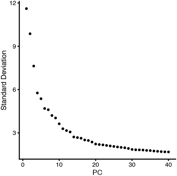
Elbow plot showing the standard deviation of each of the 40 PCs arbitrarily defined in the merged Seurat_VNCs dataset.
Figure 9.

Heatmaps showing the top eight driving genes of the first 21 PCs in the merged Seurat_VNCs dataset. Genes (rows) and cells (columns) are ordered based on their PCA scores. Warm colors (gold/yellow) represent high PCA scores while cold colors (magenta/black) represent low PCA scores. To plot multiple PCs in one figure (in our case 21), we used the Dimheatmap function and set the cells argument to 100 (100 cells) and the nfeatures argument to 8 (8 genes). The cells shown are selected from both ends of the spectrum (50 + 50). This selection speeds up the plotting of a very large dataset and captures discrete differences within each PC.
Non-linear dimensional reduction (UMAP/TSNE)
PCA moves the datapoints, the cells order, from a high-dimensional space to a multiple dimensional space. For a graphical visualization of the data, one needs to further reduce the order of the cells to a 2D or 3D space. This can be accomplished using two dimensionality reduction techniques:
t-Distributed stochastic neighbor embedding (tSNE) (L.J.P. van der Maaten, 2008);
uniform manifold approximation and projection (UMAP) (Becht et al., 2018).
Both methods aim to order cells within the 2D (or 3D) space based on their similar gene expression profiles. The codes for both methods and for visualization of the data are as follows:
# 2D dimensionality reduction
Seurat_VNCs <- RunTSNE(Seurat_VNCs, reduction = "pca", dims = 1:19)
DimPlot(Seurat_VNCs, reduction = "tsne", label = FALSE, group.by = "sample")
Seurat_VNCs <- RunUMAP(Seurat_VNCs, reduction = "pca", dims = 1:19)
DimPlot(Seurat_VNCs, reduction = "umap", label = FALSE, group.by = "sample")
Figure 10 illustrates the t-SNE and UMAP plots where each cell is color-coded by sample.
Figure 10.

t-SNE (A) and UMAP (B) plots color-coded for individual VNC samples. Each point represents a cell.
Cluster the cells
Previously selected PCs will be used as input for the subsequent graph-based clustering.
-
31.
Run the FindNeighbors function. This step will first determine the K-nearest neighbors (KNN) for each cell based on Euclidean distances within the multi-dimensional space. Secondly, the edge weights between any two cells will be refined based on the shared overlap in their local neighborhoods (Jaccard similarity).
-
32.Next, apply modularity optimization techniques (Ludo Waltman and Nees Jan van Eck 2013) to iteratively group cells together. This protocol uses the Louvain algorithm to cluster cells in datasets. Run the FindCluster function to implement this step. Set up the resolution at a value within the 0.2 - 2.0 range.
- Resolution is an important parameter that determines the granularity of downstream clustering and will have to be optimized for your experiment. We find that setting the resolution at 0.3 typically returns good results for our datasets. One should explore different resolutions (within the 0.2 - 2.0 range) in analyzing different datasets with the goal of bringing the number of identified clusters near the range of expected number of cell types/ cells with specific features.
# Determine the K-nearest neighbor graph
Seurat_VNCs <- FindNeighbors(Seurat_VNCs, reduction = "pca", dims = 1:19)
Seurat_VNCs <- FindClusters(Seurat_VNCs, resolution = 0.3)
DimPlot(Seurat_VNCs, reduction = "umap", label=TRUE)
DimPlot(Seurat_VNCs, reduction = "umap", label = TRUE, split.by = "sample")
Using a resolution of 0.3, we have identified 20 clusters (numbered 0 to 19) (Figure 11).
Figure 11.

UMAP plot of merged VNCs dataset colored by cluster (A) and split by individual VNC sample (B). Each point represents a cell.
Deal with unexpected differences in samples
Inspection of the 20 clusters generated above revealed that the merge of our three samples was generally successful, with many clusters equally represented in each of the three samples. However, cluster #14 appears to be composed almost exclusively of cells derived from the sample VNC_3.
To examine the biological relevance of such unexpected cluster(s), one needs to search for specific markers enriched in these cells. This can be accomplished using the findMarker function from scran package as follows:
-
33.
Install scran package.
-
34.
Use Seurat to convert unique Seurat_VNCs object to a sce object.
# conversion from Seurat to sce
sce_VNCs <- as.SingleCellExperiment(Seurat_VNCs)
plotReducedDim(sce_VNCs, "UMAP", colour_by = "ident", shape_by = "sample",
text_by = "ident", theme_size=16)
An example of this conversion is shown in Figure 12.
Figure 12.

UMAP plot of the three sce_VNC objects colored by clusters. Each datapoint represents a cell. Different VNC samples are indicated by different shapes.
-
35.
Install and run the plotHeatmap function from scater to plot a heatmap with all possible pairwise comparisons between your odd cluster(s) (in our case #14) and each of the other single clusters.
We recommend using the Wilcox test because it is not dependent on the size of the clusters.
# install and load phetmap package
BiocManager::install("pheatmap")
library(pheatmap)

# find markers and plot heatmap for cluster 14
markers <- findMarkers(sce_VNCs, sce_VNCs$ident, assay.type="logcounts",
test="wilcox", direction="up", pval.type="all")
marker.set <- markers[["14"]]
head(marker.set, 10)
top.markers <- rownames(marker.set)[marker.set$Top <= 3]
markers.ref<-findMarkers(sce_VNCs, sce_VNCs$ident, assay.type="logcounts",
test="wilcox", direction="up")
markers.set.ref<-markers.ref[["14"]]
top.markers.final <- rownames(marker.set)[markers.set.ref$Top <= 3]
plotHeatmap(sce_VNCs,                               features=top.markers.final,
columns=order(sce_VNCs$ident),
         colour_columns_by=c("ident","sample"),       exprs_values="logcounts"
cluster_cols=FALSE,
            center=TRUE, symmetric=TRUE, zlim=c(−5, 5))
In our example, the cells comprising cluster #14 are particularly enriched in three heat shock transcripts (Hsp26, Hsp27, Hsp68) and snRNA:7sk, a small nuclear RNA that appears to regulate growth and differentiation via association with transcription factors (Nguyen et al., 2012) (Figure 13A).
Figure 13.

Heatmap (A) and UMAP (B) plots illustrating genes highly expressed in cluster #14. Each column is an individual cell (A). Enrichment of expression for the top four genes indicated in the heatmap (A) is examined individually in the UMAP plots (B).
-
36.
To verify that the top genes derived from the Wilcox test are indeed transcriptionally enriched in specific cluster(s), generate UMAP plots that illustrate the expression levels for each top gene.
# UMAP plots colored by Hsp26, Hsp27, Hsp68 and snRNA:7SK
gridExtra::grid.arrange(
      plotReducedDim(sce_VNCs, "UMAP", colour_by =c("Hsp26"), text_by =
"ident", theme_size=12, text_size = 3, point_alpha=1/10) ,
      plotReducedDim(sce_VNCs, "UMAP", colour_by =c("Hsp27"), text_by =
"ident", theme_size=12, text_size = 3, point_alpha=1/10),
      plotReducedDim(sce_VNCs, "UMAP", colour_by =c("Hsp68"), text_by =
"ident", theme_size=12, text_size = 3, point_alpha=1/10),
      plotReducedDim(sce_VNCs, "UMAP", colour_by =c("snRNA:7SK"), text_by =
"ident", theme_size=12, text_size =3, point_alpha=1/10),
       ncol=2
)
-
37.
To analyze the distributions of top genes in each sample, generate violin plots for each of these genes separated by cluster and color-coded by sample.
# violin plots for Hsp26, Hsp27, Hsp68 and snRNA:7SK expression level colored
by sample
plotExpression(sce_VNCs, x="ident", features =c("Hsp26", "Hsp27", "Hsp68",
"snRNA:7SK"), ncol=1, theme_size= 14, colour_by = "sample", shape_by
="sample",       point_alpha=1/4, point_size=0.4)+ guides(colour =
guide_legend(override.aes = list(alpha = 1, size=2)))

# violin plots for Hsp26, Hsp27, Hsp68 and snRNA:7SK expression level in
cluster 14 separated by sample
subset <- sce_VNCs[,sce_VNCs$ident %in% c("14")]
plotExpression(subset, x="sample", colour_by="sample", shape_by="sample",
features=c("Hsp26", "Hsp27", "Hsp68", "snRNA:7SK"), theme_size=14)
In our example, we plotted the expression levels for Hsp26, Hsp27, Hsp68 and snRNA:7sk RNAs in each of the 20 clusters, color-coding each VNC sample (Figure 14A), or only in the cluster #14 of each sample (Figure 14B).
Figure 14.

Violin plots illustrating the expression levels for specific genes (Hsp26, Hsp27, Hsp68 and snRNA:7sk) in each of the 20 clusters (A) and in cluster #14 (B). The VNC samples are color-coded and are superimposed in panel A but separated in panel B, to emphasize the overwhelming contribution of VNC3 sample to cluster #14.
To establish whether the increase in distinct transcripts is specific to a particular cluster or represents a more general phenomenon, you need to evaluate the distribution of subsets of transcripts in each library.
- In our example, we wondered whether the increase in heat shock transcripts is specific to cluster #14 or may reflect stress induced mostly in the VNC3 sample. To address these possibilities, we evaluated the distribution of all heat shock transcripts in each library.
-
38.Plot the distribution of the pct_count_Hs values (percentage of Heat shock transcripts) in each cluster.
-
39.Plot the distribution of the Hsp proportion for each library.
-
38.
# plot the distribution of the Hsp proportion in each cluster
df_colData_sce_VNCs<- as.data.frame(colData(sce_VNCs))
ggplot(df_colData_sce_VNCs, aes(x=ident,y=pct_counts_Hs, fill=ident)) +
geom_violin()+geom_jitter(aes(colour= sample), shape=20, size=0.5,
position=position_jitter(0.2)) +theme_classic() + geom_hline(yintercept=6.5,
linetype="dashed", color = "red", size=0.5)+ guides(colour =
guide_legend(override.aes = list(alpha = 1, size=2)))
We found that (i) cluster #14 contains cells with high values of pct_count_Hs, and that (ii) these cells are mainly derived from the VNC3 sample (Figure 15A). Other samples do not show a similar enrichment in heat shock transcripts (the distribution of heat shock transcripts in sample VNC1 is shown in Figure 15B)
Figure 15. Distribution of Heat shock transcripts in various clusters and datasets.

(A) Violin plots showing the distribution of Heat shock transcripts in each of the 20 clusters. Each point represents a cell (color-coded by samples) that is superimposed on the area of distribution of Heat shock transcripts in each cluster. The dotted line marks a threshold of 6.5% for the fraction of Heat shock transcripts (see below). Note that cells in cluster #14 are mostly blue (that is, derived from sample VNC3) and show a much higher percentage of Heat shock transcripts than cells in other clusters. (B) Most cells within a sample show a relatively small percentage of Heat shock transcripts (VNC1 dataset is shown here). (C) Relative distribution of the percentages of Heat shock and mitochondrial transcripts in each cell of the VNC1 sample. The cells with a fraction of Heat shock transcripts higher than 6.5% (above the red horizontal line) and a mitochondrial fraction higher than 18% (right red vertical line) are probably technical artefacts and were removed.
The enrichment of VNC3-derived cells in cluster #14 may be specifically caused by this particular genetic background or may be an artefact following the series of technically demanding steps, such as tissue dissociation. Nonetheless, this cluster appears to include cells with an extremely active stress response program.
Remove cells that generate an odd cluster
If you suspect that a cluster of cells represents a technical artefact, you may consider removing them.
In our example, we could not determine a logical reason for the excessive expression of heat shock transcripts in primarily one of the samples. Since these cells seem stressed for reasons outside the scope of our study, it would be prudent to discard them.
To remove such cells (i.e. cells with high pct_count_Hs), you will need to cut these cells across all datasets using the same criteria that you used when filtering the matrices and removing cells with high mitochondria- or low ribosomal percentages.
-
40.
Start by analyzing the scatterplot of mitochondrial proportion versus Heat shock proportion.
# plot the distribution of the Hs proportion
qplot(sce_VNC1$pct_counts_Hs, geom="histogram", binwidth = 0.5, xlab =
"Heatshock prop. (%)",ylab = "# of cells",
       fill=I("#00ABFD"), col=I("black"))+ theme_light(base_size = 22)

# plot the Hs proportion vs mitochondrial proportion (H)
smoothScatter(sce_VNC1$pct_counts_Mt,
sce_VNC1$pct_counts_Hs,xlab="Mitochondrial prop. (%)", ylab="Heatshock prop.
(%)", nrpoints=500, cex.axis = 1.4, cex.lab = 1.8)
abline(h=6.5, lty=1, col="red")
abline(v=18, lty=1, col="red")

dim(sce_VNC1)
- An example is provided in Figure 15C, which shows the scatter plot for sample VNC1; this sample has low levels of total Heat shock transcripts overall. We found that it is reasonable to remove barcodes/cells with pct_counts_Hs > 6.5%.
-
41.To remove the cells with pct_counts_Hs higher than 6.5%, simply repeat the workflow described in the “Low quality cells removal” section. (This section describes the removal of cells with mitochondrial fraction >18% and ribosomal fraction < 5%.)
-
42.Add one more line of code to also remove the cells with the percentage Heat shock transcripts > 6.5%.
-
41.
# definition of mitochondrial, ribosomal and heat shock groups of genes as
features of interest
is.mito <- grep("^mt:", rowData(sce_VNC1)$Symbol)
is.heatshock <- grep("^sp", rowData(sce_VNC1)$Symbol)
is.ribo <- grep("^Rp[SL]", rowData(sce_VNC1)$Symbol)
length(is.mito)
length(is.heatshock)
length(is.ribo)

# calculateQCMetrics to evaluate % of mitochondrial, ribosomal and Heat shock
transcripts for each cell
sce_VNC1 = calculateQCMetrics(sce_VNC1, feature_controls=list(Mt=is.mito,
Hs=is.heatshock,
           Ri=is.ribo))
colnames(colData(sce_VNC1))

# removal barcodes/cells with a mitochondrial % fraction >18, a Heat shock %
fraction >6.5 and a ribosomal % fraction <5
mito.drop <- sce_VNC1$pct_counts_Mt <=18
mito.remove <- sce_VNC1$pct_counts_Mt > 18
sce_VNC1 <- sce_VNC1[, mito.drop]
ribo.drop <- sce_VNC1$pct_counts_Ri >= 5
ribo.remove <- sce_VNC1$pct_counts_Ri < 5
sce_VNC1 <- sce_VNC1[, ribo.drop]
heatshock.drop <- sce_VNC1$pct_counts_Hs <=6.5
heatshock.remove <- sce_VNC1$pct_counts_Hs> 6.5
sce_VNC1 <- sce_VNC1[, heatshock.drop]

dim(sce_VNC1)
-
43.After implementing this additional quality control, one must repeat all previously described steps including removal of genes expressed only in few cells, normalization, conversion to Seurat objects, identification of highly variable genes, sample integration, scaling, PCA analysis, 2D visualization and clustering. Please maintain the same constraints (i.e. number of PCs retained and the resolution for clustering).
- We have repeated these steps maintaining the same parameters (19 PCs and resolution of 0.3). Interestingly, after removal of cells with high levels of heat shock transcripts, we identified only 18 clusters, two clusters fewer than before (Figure 16). There are two reasons for this result: First, note that upon removing the cells with pct_count _Hs > 6.5%, there is no longer a cluster generated almost exclusively by cells within the VNC3 sample, like the previous cluster #14. Secondly, without these (extremely stressed) cells that likely upset the cells’ order, and using the same algorithms and parameters as above, we have found that the remaining cells are better ordered in 18 instead of 19 distinct clusters, thus consolidating the final number of individual cell clusters.
- Note that none of these new 18 clusters show any particular enrichment in transcripts encoding heat shock proteins. Also, there is no cluster of cells with high expression levels for Hsp26, Hsp27, Hsp68 or snRNA:7sk RNAs (Figure 17).
Figure 16.

UMAP plot of merged VNCs (A) and individual datasets (B) after removal of stressed cells. Each datapoint represents a cell color-coded by cluster (A and B) and separated by sample (B).
Figure 17. Redistribution of specific transcripts (Hsp26, Hsp27, Hsp68 and snRNA:7sk) after the removal of stressed cells.

(A) UMAP plots illustrating the levels of expression for each of the indicated genes in the merged_VNCs dataset. (B) Violin plots of the same transcripts of interest in various cluster and VNC sample. Each datapoint represents a cell color-coded by sample.
Identify specific cell types
To assign biological meaning to each of the clusters of cells isolated above, it is important to identify differentially expressed genes that drive the clusters separation and can be used as markers for specific cell types. In some case, these markers are already well-defined and known to be associated with a particular cell type (or cell status). In other cases, differentially expressed genes may represent new transcripts that have not been previously described and/or assigned. To identify differentially expressed genes, various statistical tests implemented by several R packages could be utilized. For our pipeline we have selected the findMarker function in scran package (Bioconductor). This function finds putative marker genes for each cluster by running a pairwise test between the cluster of interest and all the other clusters.
The findMarker function utilizes (a) three different statistical tests (t-test, wilcoxon-test and binomial-test), (b) the direction of the fold change (up, down or none) and (c) the p-value significance (any, some and all). The p-value significance ensures flexibility, making it is possible to interrogate the dataset in different ways. For instance, you could ask to identify genes that are (up- or down-) regulated in a cluster of interest in comparison with another specific cluster or relative to all the other clusters. Importantly, the direction of the fold change and the p-value significance can be specified as arguments inside of the findMarker function.
a) Once you define the type of pairwise test, the findMarkers function will return a list of DataFrames containing ranked putative markers for each cluster.
We recommend the Wilcox rank sum test for identifying specific markers for individual clusters because this test evaluates the separation between different clusters independently of their size (that is, independently of the number of cells within each cluster).
b) If you specify direction="up", then you will focus your analysis on the upregulated genes (for example in each cluster compared to all the other clusters).
It is very attractive to use the upregulated genes as markers because it is much easier to observe and validate highly expressed genes than to examine the absence/reduction of gene expression.
c) If you specify pval.type="all", then you will choose the most stringent approach, which considers as putative markers genes expressed specifically in only one cluster relative to all the other clusters.
pval.type="any" – describes genes differentially regulated in at least in one pairwise comparison.
pval.type="some" – describes genes differentially regulated in ~50% of the clusters.
Below we present the code and the results for two of our clusters, cluster #11 and cluster #13.
# conversion from Seurat to sce
sce_VNCs <- as.SingleCellExperiment(Seurat_VNCs)

# install and load pheatmap package
BiocManager::install("pheatmap")
library(pheatmap)
-
44.
Use findMarkers (with test=wilcox, direction=up and pval.type=all) to obtain a list of DataFrame for all pairwise comparisons.
-
45.
Select cluster #13 as a cluster of interest and create a heatmap plot of gene expression levels for each cell using plotHeatmap function from scater package.
# find markers and plot heatmap for cluster 13
markers <- findMarkers(sce_VNCs, sce_VNCs$ident, assay.type="logcounts",
test="wilcox", direction="up", pval.type="all")
marker.set <- markers[["13"]]
head(marker.set, 10)
top.markers <- rownames(marker.set)[marker.set$Top <= 10]
markers.ref<-findMarkers(sce_VNCs, sce_VNCs$ident, assay.type="logcounts",
test="wilcox", direction="up")
markers.set.ref<-markers.ref[["13"]]
top.markers.final <- rownames(marker.set)[markers.set.ref$Top <= 10]
plotHeatmap(sce_VNCs,                                    features=top.markers.final,
columns=order(sce_VNCs$ident),
         colour_columns_by=c("ident","sample"),       exprs_values="logcounts",
cluster_cols=FALSE,
            center=TRUE, symmetric=TRUE, zlim=c(−5, 5))
Once you have identified a number of highly upregulated genes in the cluster of interest (as exemplified in Figure 18A), you will want to examine how restricted are these transcripts to this particular cluster by comparing it to every other cluster.
- The Wilcoxon test results are proportional to the area-under-the-curve (AUC), which represents the probability for a random cell from one cluster to have higher levels of gene expression than a random cell from another cluster. This parameter allows for a convenient representation of the upregulated genes in one cluster (in our case cluster #13) versus all the other clusters using a heatmap of the AUCs (Figure 18B - cluster size was normalized here). The AUC values vary from 0 to 1; a good candidate marker will typically have AUC values > 0.7.
-
46.To generate the heatmap of the AUCs, you need to define an AUCs matrix and then use the pheatmap function in the pheatmap package.
-
46.
Figure 18. Heatmaps illustrating expression levels for genes specific for cluster #13.

(A) Heatmap illustrating the level of expression in each cluster and in each sample for genes highly expressed in cluster #13. Each column is an individual cell. (B) Heatmap of AUCs for the top marker genes in cluster #13 in comparison to all the other clusters.
# heatmap of the AUCs selecting cluster 13 as reference
markers.sce_VNCs.wmw <- findMarkers(sce_VNCs, sce_VNCs$ident,
assay.type="logcounts", test="wilcox", pval.type="all", direction="up")
names(markers.sce_VNCs.wmw)
interesting.sce_VNCs.wmw <- markers.sce_VNCs.wmw[[14]]
interesting.sce_VNCs.wmw[1:10,0:20]
markers.up2 <- findMarkers(sce_VNCs, sce_VNCs$ident, assay.type="logcounts",
test="wilcox", direction="up")
interesting.up2 <- markers.up2[[14]]
best.set <- interesting.sce_VNCs.wmw[interesting.up2$Top <= 10,]
AUCs <- getMarkerEffects(best.set, prefix="AUC")
library(pheatmap)
pheatmap(AUCs, breaks=seq(0, 1, length.out=21), color
=colorRampPalette(c("blue", "white", "red"))(20))
- In both heatmaps (Figure 18A-B), we found that alrm (alarm- astrocytic leucine-rich repeat molecule) is among the highly up-regulated genes in cluster #13. As the name implies, this gene is expressed in astrocytes and is considered an unique marker for astrocytes (Stork et al., 2014).
-
47.Generate UMAP and violin plots to confirm whether the alrm expression is specifically enriched in cluster #13.
-
47.
# UMAP and violin Plots for alrm expression
plotReducedDim(sce_VNCs, "UMAP", colour_by=c("alrm"), text_by="ident",
theme_size=16, text_size=3, point_alpha=1/10)
plotExpression(sce_VNCs, x="ident", features =c("alrm"), theme_size= 14,
colour_by="ident")
Additional transcripts upregulated in cluster #13 (as illustrated in Figure 19) are:
Figure 19. Enrichment of alrm expression in cluster #13.

(A) UMAP and (B) violin plots showing that alrm transcript is indeed highly enriched in cluster #13 and is sparsely expressed in other clusters.
GABA transporter (Gat) that encodes a solute carrier (SLC6) family member required for GABA uptake and expressed primarily in astrocytes (Thimgan et al., 2006);
Excitatory amino acid transporter 1 (Eaat1), which encodes a transmembrane protein with a glutamate:sodium symporter activity, also a member of SLC1 family, expressed in glia, but also in some neurons and the adult heart (Stacey et al., 2010);
A number of enzyme coding transcripts (wun2, Treh, and Nep2) with broader expression pattern.
Examination of these upregulated genes provides further confirmation for assigning cell identity. Based on these expression profiles, in particular alrm, we are confident that cluster #13 represents astrocytes. Furthermore, such analyses reveal new molecules expressed primarily in selective cell types, and presumably required for the proper function of those cells. In our example, these analyses revealed a wealth of new molecules with remarkable cell specific expression patterns and completely unknown functions. Note that half of the genes listed in Figure 19 are represented by CG numbers, indicating that these genes are completely novel and await characterization.
We repeated the same analysis for cluster #11 and found VGlut, futsch and twit among the upregulated genes.
VGlut (vesicular glutamate transporter), encodes a glutamate transporter of the SCL family, responsible for filling synaptic vesicles with glutamate (Daniels et al., 2004). The VGlut transcript is expressed in glutamatergic motoneurons and a large number of interneurons in the Drosophila CNS.
Futsch, a homolog of the vertebrate MAP1B microtubule-associated protein, is required for dendritic and axonal development (Hummel et al., 2000), including the formation of synaptic boutons at Drosophila neuromuscular junction (NMJ).
Twit (target of wit), a downstream target of the BMP pathway receptor Wit, encodes a Ly6 neurotoxin-like molecule that regulates spontaneous neurotransmitter release and maturation of larval NMJ (Kim and Marques, 2012).
The sum of these gene expression profiles suggests that cluster #11 consists of motoneurons.
Both UMAP and violin plots in Figure 20 confirm that twit is indeed enriched in cluster #11.
Figure 20. Enrichment of twit expression in cluster #11.

(A) UMAP and (B) violin plots illustrating that twit transcript is indeed highly enriched in cluster #11 and is sparsely expressed in other clusters.
In the next step we will label these two clusters and dim the color of clusters not yet assigned.
-
48.
Use the plyr package to highlight and label the clusters you want to showcase (and remove the color of clusters you want to de-emphasize).
# copy the Seurat_clusters metadata slot in a new slot called "clusters"
sce_VNCs@colData@listData[["clusters"]]<-
sce_VNCs@colData@listData[["seurat_clusters"]]
str(sce_VNCs@colData@listData[["clusters"]])

# install and run plyr package
Install.packages("plyr")
library(plyr)

# assign new value (name) to the identified clusters
sce_VNCs@colData@listData[["clusters"]]<-
revalue(sce_VNCs@colData@listData[["clusters"]], c("0"=NA, "1"=NA, "2"=NA,
"3"=NA, "4"=NA, "5"=NA, "6" =NA, "7"=NA, "8"=NA, "9"=NA, "10"=NA, "11"="motor
neurons",, "12"=NA, "13"="astrocytes", "14"=NA, "15"=NA, "16"=NA, "17"=NA))
sce_VNCs@colData@listData[["clusters"]]
str(sce_VNCs@colData@listData[["clusters"]])

# plotUMAP labeling only the identified clusters
plotReducedDim(sce_VNCs, "UMAP", colour_by = "clusters", text_by="clusters",
theme_size= 16)
Identify rare cell types
Using unsupervised clustering algorithms (i.e. graphical clustering), one can mine various scRNAseq datasets and define different cell types. However, it remains challenging to identify and study rare cell types (<0.5 % total number of cells), especially when these populations don’t have markers that emerge within the top 2000 highly variable genes. In such cases it is very likely that the rare cell types, which otherwise share very specific features, are "scattered" among the different cell clusters identified with common clustering algorithms.
To explore the biology of selective rare cell types, first you need to isolate these cells from the total population. Next, you should examine whether these cells represent a homogenous population; if not, you may want to subdivide them as necessary. Finally, you need to identify genes expressed specifically in these rare cells; such genes will provide further biological insights and understanding. To perform such analyses and overcome the limitation of the unsupervised clustering methods, here we present an approach to manually select rare cells based on their expression of at least one known, highly specific transcript.
Take for example the neuroendocrine cells, which are rare cells within the CNS, specialized to produce, maintain and release large stores of secretory peptides. In the fly nervous system, most of the neuropeptides are produced in LEAP cells (Large cells that display Episodic release of Amidated Peptides) (Park et al., 2008). These cells owe their secretory properties to the bHLH transcription factor, Dimmed (Dimm) which controls their pro-secretory phenotypes as well as the number of cells in a pro-secretory state (Hewes et al., 2003).
We choose to apply our computation pipeline to study the dimm expressing cells because of the rich Drosophila literature on dimm cells specification and distribution in the embryonic and larval CNS (Gabilondo et al., 2016; Park et al., 2008) and the availability of the neuropeptidome for dimm cells in the brain of adult flies (Diesner et al., 2018). This wealth of knowledge could be used to validate this data mining strategy and reveal the limitations of the scRNAseq approach.
-
49.
To search for neurosecretory cells in the larval VNCs, start by examining dimm expression in available datasets.
#UMAP colored by dimm
plotReducedDim(sce_VNCs, "UMAP", colour_by ="dimm", text_by = "ident",
theme_size=18)+scale_fill_gradient2(low ="white", mid = "gray100", high =
"red", midpoint = 0, space = "Lab", na.value = "NA", guide = "colourbar",
aesthetics = "fill",name= "dimm")

# dimm expression
plotExpression(sce_VNCs, x="ident", features =c("dimm"), theme_size= 14,
colour_by = "dimm")+scale_fill_gradient2(low ="white",mid = "gray100",high =
"red", midpoint = 0, space = "Lab", na.value = "NA", guide = "colourbar",
aesthetics = "fill", name= "dimm")
Inspection of the UMAP and Violin plots (Figure 22) revealed two important points:
Figure 22. Distribution of dimm expression in the merged_VNCs dataset.

(A) UMAP and (B) violin plots illustrating the levels and distribution of dimm transcripts. Each datapoint represent a cell colored by the dimm expression levels. The dotted line in panel B marks a threshold of 0.15 for dimm expression [log10(#count)dimm].
-
A very limited number of cells from the entire VNCs dataset express dimm at detectable levels.
We set up a threshold expression value at log10(#count)dimm>0.15 and consider that this threshold provides a reasonable cut-off.
- The dimm expressing cells belong to several previously identified clusters, including clusters #4, #11 and #12.
-
50.Use the subset function in Seurat package to select rare cell types expressing a specific gene (in this case, dimm). We consider dimm positive barcodes/cells those cells with log10(#counts)dimm>0.15. The results will be a Seurat object containing only dimm positive barcode/cells.
-
50.
# create a Seurat object containing only dimm positive cells
(log10(#count)dimm>0.15)
Seurat_dimm_cell<-subset(Seurat_VNCs, subset = dimm > 0.15)
Seurat_dimm_cell
dim(Seurat_dimm_cell)
-
51.Using this Seurat object, you can perform different analyses to gain insights on the biology of these cells by simply applying all previously described computation steps including:
- Identify Highly Variable Genes
- PCA analysis
- 2D visualization and clustering
- Convert Seurat object to SingleCellExperiment object
- Find markers
- Visualize expression highly upregulated genes in the cluster of interest by heatmap, violin and UMAP plot.
Here we selected the first 10 PCs for the clustering analysis and a resolution of 0.5 for clustering the cells.
# identify HVGs for the Seurat_dimm_cell object
Seurat_dimm_cell <- FindVariableFeatures(Seurat_dimm_cell, selection.method =
"vst", nfeatures = 2000)

#Run PCA
Seurat_dimm_cell <- RunPCA(Seurat_dimm_cell, npcs = 40, verbose = FALSE)
VizDimLoadings(Seurat_dimm_cell, dims = 1:20, reduction = "pca")
DimPlot(Seurat_dimm_cell, reduction = "pca")
DimHeatmap(Seurat_dimm_cell, dims = 1:10, cells = 100, balanced = TRUE)
ElbowPlot(Seurat_dimm_cell, ndims = 40)
Seurat_dimm_cell <- JackStraw(Seurat_dimm_cell, num.replicate = 100)
Seurat_dimm_cell <- ScoreJackStraw(Seurat_dimm_cell, dims = 1:20)
JackStrawPlot(Seurat_dimm_cell, dims = 1:20)

# 2D dimensionality reduction
Seurat_dimm_cell <- RunUMAP(Seurat_dimm_cell, reduction = "pca", dims = 1:10)

# Determine the K-nearest neighbor graph
Seurat_dimm_cell <- FindNeighbors(Seurat_dimm_cell, reduction = "pca", dims =
1:10)
Seurat_dimm_cell <- FindClusters(Seurat_dimm_cell, resolution = 0.5)
DimPlot(Seurat_dimm_cell, reduction = "umap", label = FALSE, group.by =
"ident", split.by = "sample")

#conversion to sce object
sce_dimm_cell <- as.SingleCellExperiment(Seurat_dimm_cell)

# dimm expression
plotReducedDim(sce_dimm_cell, "UMAP", colour_by ="dimm", text_by = "ident",
shape_by = "sample", theme_size=18)+scale_fill_gradient2(low ="white", mid =
"gray100",high = "red",midpoint = 0, space = "Lab", na.value = "NA",guide =
"colourbar", aesthetics = "fill",
 name= "dimm"
)

plotExpression(sce_dimm_cell, x="ident", features =c("dimm"), theme_size= 14,
colour_by = "dimm", shape_by = "sample")+scale_fill_gradient2(low ="white", mid
= "gray100", high = "red",
midpoint = 0, space = "Lab", na.value = "NA", guide = "colourbar", aesthetics
= "fill", name= "dimm"
)

# findmarkers
markers <- findMarkers(sce_dimm_cell, sce_dimm_cell$ident,
assay.type="logcounts", test="wilcox")
marker.set <- markers[["0"]]
head(marker.set, 10)
top.markers <- rownames(marker.set)[marker.set$Top <= 20]
plotHeatmap(sce_dimm_cell, features=top.markers,
columns=order(sce_dimm_cell$ident),
            colour_columns_by=c("ident","sample"), exprs_values="logcounts",
cluster_cols=FALSE,
            center=TRUE, symmetric=TRUE, zlim=c(−3, 3))
Out of our merged_VNCs dataset (22,000 cells) only 81 cells are dimm positive cells (and passed the imposed expression threshold) and consequently were included in the resulted Seurat_dimm_cell object. As expected, the dimm positive cells of the larval VNCs are not a homogeneous population and could be clearly segregated into two distinct clusters, with 57 and 24 cells, respectively (Figure 23). The two clusters show a similar range of dimm expression levels, but they exhibit a set of specific features as highlighted in Figure 24.
Figure 23. Segregation of dimm cells into two distinct groups.

Violin plots illustrating the distribution of dimm expression levels in the two distinctly separated groups of cells. Each datapoint represents a barcode/cell color-coded by the dimm expression levels. Different VNC samples are indicated by different shapes.
Figure 24. Genes differentially expressed in the two clusters of dimm cells.

Each column represents a cell. The cells are separated by cluster and by VNC sample. Note the strong enrichment of Neuropeptide-like precursor 1 (Nplp1) in cluster #1.
This analysis revealed that the dimm expressing cells in our datasets can be easily separated into two very distinct clusters, one that contains the Neuropeptide-like precursor 1 (Nplp1) neurons (cluster #1), and one that contains other neuropeptidergic cells (cluster 0). The Nplp1 neurons in the Drosophila ventral nerve cord include two types of neurons: the thoracic-ventral Tv1 neurons and the dorsal-medial dAp neurons. The Tv1 and dAp neurons are born at different times during embryogenesis and from different neural progenitors, but during development they converge towards a similar cell fate with common neuropeptide expression and axonal projections. The activation of Nplp1 expression in both Tv1 and dAp neurons requires the following regulatory cascade (called terminal selector cascade): apterous (ap)/ eyes absent (eya)>dimm>Nplp1. Interestingly, the components of this cascade are all enriched in the cluster #1, indicating that cluster #1 indeed represents Tv1 and dAp neurons.
While we are confident that cluster #1 consists of Tv1 and dAp neurons, we do not think that this analysis is powerful enough to further differentiate between the two neurons and start exploring their individual features. First, this analysis does not include different time points/developmental windows and therefore is not suitable for building developmental trajectories. The differences in cell specification between Tv1 and dAp are probably not preserved until the late larval stages, when the samples were collected. Secondly, the number of cells in this cluster is very low (24). Subdividing it further may produce artificial clusters, with no biological relevance. Should you need to focus on these cells, you may want to start by enriching for this population, for example by FACS sorting dimm-Gal4>UAS-GFP cells, then sequencing a much larger set of dimm cells. Such studies could be further enriched by extending the analysis to several developmental stages.
The danger to formulate conclusions based on a small population of cells is even better illustrated by looking at cluster 0. This group of cells in not really a cluster, but rather a mixture of dimm positive, Nplp1 negative cells. MALDI-TOF mass spectrometry studies mapped several more neuropeptides to dimm positive neuroendocrine cells but also to a number of interneurons (Diesner et al., 2018). In addition, cluster 0 also contains cells expressing Bursicon (Burs), a cystine knot protein that dimerizes with the product of Pburs to form a neurohormone implicated in the sclerotization of the insect cuticle, melanization and wing spreading (Dewey et al., 2004). It is not clear whether dimm promotes secretion of neurohormones such as bursicon, or whether these cells are dimm positive because they also express Crustacean cardioactive peptide (CCAP). Nonetheless, these neuropeptidergic cells are very rare (usually 1-2 neurons for each neuropeptide per each segment of the ventral nervous system). Since neuroendocrine cells have distinct cell lineages and produce different neuropeptides, one expects to uncover strikingly different specific features in each of these cell types. As mentioned above, such studies will benefit from FACS sorting and enriching the populations of rare cells followed by scRNA-seq analyses or by deep single cell sequencing.
The workflow presented here for identification of rare cell types can be applied to any cells that express a marker of interest. In mining such datasets, one should explore different expression thresholds, number of PCs, and resolution parameters.
Commentary
Background information:
The main purpose of scRNA-seq analyses is to identify and define cellular diversity and reveal individual cell states and functions within complex biological systems. To accomplish these goals, scRNA-seq data must capture transcriptome variations at the cellular level. However, the scRNA-seq data contains a significant amount of noise, both biological and technical. For example, stochastic fluctuations in the mRNAs steady state levels are inherent to each cell population, but these fluctuations constitute non-informative biological variation. Such variation can obscure the relevant biology and even lead to incorrect interpretation of the data. For this reason, the main challenge of scRNA-seq data analysis is to capture the informative variation and isolate it away from the noise.
To achieve this goal, the raw scRNA-seq data must be filtered (by removing the counts derived from low quality cells), normalized and sorted (i.e. consider only the highly variable genes). Multiple datasets must be further integrated and compared, and the resulting observations transformed into a set of uncorrelated variables (PCs) that contain selected, informative biological variation. Finally, this information is used to identify unique transcriptional signatures for specific cell types or for distinctive cellular states.
The custom multistage analysis pipeline presented here combines different R packages to perform each of these steps. This pipeline takes advantage of the interconvertibility between Seurat and Bioconductor to switch between different available R packages and find optimal solutions to solve various problems posed by these analyses. We have employed unsupervised clustering algorithms to identify various cell types and the corresponding specific markers. We have also shown how to manually select rare cell types and elucidate their biology. We have focused our analyses on various questions that can be addressed using scRNA-seq and have selected examples to illustrate some of the most common problems in scRNA-seq studies, such as removal (or retention) of cells with specific features that are present in only one of the integrated datasets. Though customized for scRNA-seq data obtained from Drosophila VNCs, this pipeline is robust and highly flexible and can be used for Drop-seq data derived from any biological system.
Troubleshooting:
For someone with limited exposure to programming, getting started with R may be intimidating. However, there is a wealth of available courses and introductory books to ease such beginnings. To familiarize yourself with R programming, we recommend an essential book “R for Data Science” (https://r4ds.had.co.nz). Extremely useful online courses are offered by Codecademy (https://www.codecademy.com/catalog/language/r) or R Studio Cloud (https://rstudio.cloud).
Getting started with R programming:
To download R for your platform (MAC, Linus or Windows) go to https://cloud.r-project.org. It is a good idea to update R regularly since a new R version is released about once a year. We recommend installing and using the Integrated Development Environment (IDE) for R “R Studio” (http://www.rstudio.com/download). When you are ready to start R studio, we advise that you type the code into the Source Editor window instead of directly typing into the console (Figure 25). This makes it much easier to reproduce sequences of commands and re-use them. In addition, the Source Editor includes several productivity features such as syntax highlighting, code completion and find/replace.
Figure 25.

Screenshot of R studio interface showing the Source Editor, Console, Workspace and Packages-Plots-Files windows.
Several additional tips are listed below:
R can (and will) suddenly abort when running a command. Save your R scripts, R workspace and R environment often. This will allow you to look back and edit or reload the pipeline if needed.
Mac users may also want to download and install XCode before starting R because some R packages require the Mac OSX compiler (XCode) for their installation and updating.
If you have problems understanding a package or a specific function of any R package, find help inside R itself: Simply prepend the name of the package/function with a question mark to access the manual associated with a package/function. For example, run the command “?scater” for information on scater package, or “?DimHeatmap” to learn about the DimHeatmap function in Seurat. Importantly, this way you can access (in the Packages, Plots and File windows of R studio) all the information regarding that particular function, including a description of all arguments contained inside that function.
Remember that beyond the R console there are online resources for help. In particular, Stackoverflow’s R tag (https://stackoverflow.com/questions/tagged/r) is a very powerful resource for inquiring and exploring general R programming.
For further insights and improvements on the pipeline described here, please refer to “Orchestrating single-cell analysis with Bioconductor” (http://bioconductor.org/books/release/OSCA/). This book guides a new user through R basics and beyond and provides practical details on how to deal with different kinds of single cell RNA sequencing data.
Understanding results:
During single cell data analysis, sometimes it is difficult to establish the best thresholds for removal of empty droplets and for the quality control (QC) matrix. For the empty droplets, we recommend exploring multiple fdr values. For example, you could decide to retain more barcodes/cells by choosing an fdr value of 0.002 (instead of 0.001). To select reasonable threshold values for the QC matrix, you should carefully evaluate the distribution of mitochondrial and ribosomal genes, as well as the distribution of the number of detected genes and the number of total counts in each cell. Keep in mind that you can always revisit these QC thresholds if you encounter difficulties interpreting the downstream clustering results. For instance, if you cannot identify rare cell types that you know should be present in your system, you need to select different threshold values, i.e. you can try to retain those rare cells that express at least 100 genes with a total number of counts equal to 500.
Sometimes you may not be able to identify certain cell types based on the expression of already known markers. In this case, you should try to determine the optimal number of highly variable genes, the optimal number of principal components and the appropriate resolution in Seurat FindNeighbors and FindClusters function. In most cases, the best values for these parameters depend on your dataset.
Often it is difficult to assign a cluster to a specific cell type. In such cases, it helps to look at the data in different ways. For example, you should carefully evaluate highly expressed genes and visualize their expression patterns in several different plots, including heatmap, violin plot, tsne or umap plot. The genes relevant for the cell identity should stand out in the majority of cells within that cluster.
It is always possible that a cluster represents a mixture of different cell types. In this case, you should consider re-clustering all datasets using a higher resolution value. Alternatively, your analysis may benefit from sub-clustering only selected cluster(s) that appear to be heterogeneous.
If a cluster clearly expresses markers for two different cell types, then that cluster represents either a set of doublet cells or a mixed population. To parse this out, you need to perform a correlation test and establish whether distinct markers are co-expressed in the same cells. If different markers are co-expressed in the same cells, then the cluster is considered to be a doublet and must be removed from your dataset. If the markers are expressed in non-overlapping patterns, then you should further. sub-cluster that population of cells to separate the different cell types.
Expanding on the results:
The single cell sequencing community is in the midst of generating and updating many new and exciting tools. Users should reach out and learn more about these tools directly from the developers’ websites. In particular, the Seurat website (https://satijalab.org/seurat/) established and maintained by Satija lab, has been instrumental in our own laboratory getting started with scRNAseq analyses. A recently released Seurat version (v4.0) introduces new features and functionality and permits simultaneous measurements of multiple data types from the same cells and rapid mapping of query datasets to references. However, existing workflows, functions and syntax remain largely unchanged between different Seurat versions, and a Seurat v3.0 object could be analyzed with Seurat v4.0. The workflows from Seurat v1.0 to Seurat v3.0 are stored on the Seurat website.
Both the integrated Seurat and SingleCellsExperiments objects can be utilized for further analyses, such us identifying differentially expressed genes among different samples (i.e. different genotypes or treatments), computationally ordering cells along developmental trajectories, or describing developmental programs and cellular dynamic processes. Such analyses require additional R packages, including:
Slingshot, a method for inferring cell lineages and pseudotimes from single-cell gene expression data (Street et al., 2018) (https://bustools.github.io/BUS_notebooks_R/slingshot.html/),
Monocle, which increases the temporal resolution of transcriptome dynamics using data collected at multiple time points (Trapnell et al., 2014) (https://cole-trapnell-lab.github.io/monocle3/)
destiny, an R implementation of the diffusion map algorithm suitable for analyzing time-course experiments (Angerer et al., 2016) (https://www.bioconductor.org/packages/release/bioc/html/destiny.html/)
Further validation of the scRNA-seq data is facilitated by the existing high throughput datasets from bulk RNAseq, including modENCODE Consortium (mod et al., 2010) (http://www.modencode.org), the developmental transcriptome (Graveley et al., 2011), and the Drosophila gene expression atlases (Chintapalli et al., 2007) (http://flyatlas.org/atlas.cgi).
Figure 21.

UMAP plot highlighting and labeling clusters #11 as motor neurons and #13 as astrocytes. The remaining clusters are not assigned (NA) and colored in gray.
Acknowledgments
M.S. is funded by a National Institute of Child Health and Human Development (NICHD) intramural research award. The authors acknowledge Drs. Steve Coon and James R. Iben at the Molecular Genomics Core at the NICHD for RNA sequencing and primary data analyses.
References:
- Amezquita RA, Lun ATL, Becht E, Carey VJ, Carpp LN, Geistlinger L, Marini F, Rue-Albrecht K, Risso D, Soneson C, et al. (2020). Publisher Correction: Orchestrating single-cell analysis with Bioconductor. Nat Methods 17, 242. [DOI] [PubMed] [Google Scholar]
- Angerer P, Haghverdi L, Buttner M, Theis FJ, Marr C, and Buettner F (2016). destiny: diffusion maps for large-scale single-cell data in R. Bioinformatics 32, 1241–1243. [DOI] [PubMed] [Google Scholar]
- Barkas N, Petukhov V, Nikolaeva D, Lozinsky Y, Demharter S, Khodosevich K, and Kharchenko PV (2019). Joint analysis of heterogeneous single-cell RNA-seq dataset collections. Nat Methods 16, 695–698. [DOI] [PMC free article] [PubMed] [Google Scholar]
- Becht E, McInnes L, Healy J, Dutertre CA, Kwok IWH, Ng LG, Ginhoux F, and Newell EW (2018). Dimensionality reduction for visualizing single-cell data using UMAP. Nat Biotechnol. [DOI] [PubMed] [Google Scholar]
- Brennecke P, Anders S, Kim JK, Kolodziejczyk AA, Zhang X, Proserpio V, Baying B, Benes V, Teichmann SA, Marioni JC, et al. (2013). Accounting for technical noise in single-cell RNA-seq experiments. Nat Methods 10, 1093–1095. [DOI] [PubMed] [Google Scholar]
- Butler A, Hoffman P, Smibert P, Papalexi E, and Satija R (2018). Integrating single-cell transcriptomic data across different conditions, technologies, and species. Nat Biotechnol 36, 411–420. [DOI] [PMC free article] [PubMed] [Google Scholar]
- Chambers JM (2014). Object-oriented programming, functional programming and R. Statistical Science 29. [Google Scholar]
- Chintapalli VR, Wang J, and Dow JA (2007). Using FlyAtlas to identify better Drosophila melanogaster models of human disease. Nat Genet 39, 715–720. [DOI] [PubMed] [Google Scholar]
- Daniels RW, Collins CA, Gelfand MV, Dant J, Brooks ES, Krantz DE, and DiAntonio A (2004). Increased expression of the Drosophila vesicular glutamate transporter leads to excess glutamate release and a compensatory decrease in quantal content. J Neurosci 24, 10466–10474. [DOI] [PMC free article] [PubMed] [Google Scholar]
- Dewey EM, McNabb SL, Ewer J, Kuo GR, Takanishi CL, Truman JW, and Honegger HW (2004). Identification of the gene encoding bursicon, an insect neuropeptide responsible for cuticle sclerotization and wing spreading. Curr Biol 14, 1208–1213. [DOI] [PubMed] [Google Scholar]
- Diesner M, Predel R, and Neupert S (2018). Neuropeptide Mapping of Dimmed Cells of Adult Drosophila Brain. J Am Soc Mass Spectrom 29, 890–902. [DOI] [PubMed] [Google Scholar]
- Eisenstein M (2020). Publisher Correction: Single-cell RNA-seq analysis software providers scramble to offer solutions. Nat Biotechnol 38, 650. [DOI] [PubMed] [Google Scholar]
- Gabilondo H, Stratmann J, Rubio-Ferrera I, Millan-Crespo I, Contero-Garcia P, Bahrampour S, Thor S, and Benito-Sipos J (2016). Neuronal Cell Fate Specification by the Convergence of Different Spatiotemporal Cues on a Common Terminal Selector Cascade. PLoS Biol 14, e1002450. [DOI] [PMC free article] [PubMed] [Google Scholar]
- Graveley BR, Brooks AN, Carlson JW, Duff MO, Landolin JM, Yang L, Artieri CG, van Baren MJ, Boley N, Booth BW, et al. (2011). The developmental transcriptome of Drosophila melanogaster. Nature 471, 473–479. [DOI] [PMC free article] [PubMed] [Google Scholar]
- Griffiths JA, Richard AC, Bach K, Lun ATL, and Marioni JC (2018). Detection and removal of barcode swapping in single-cell RNA-seq data. Nat Commun 9, 2667. [DOI] [PMC free article] [PubMed] [Google Scholar]
- Haghverdi L, Lun ATL, Morgan MD, and Marioni JC (2018). Batch effects in single-cell RNA-sequencing data are corrected by matching mutual nearest neighbors. Nat Biotechnol 36, 421–427. [DOI] [PMC free article] [PubMed] [Google Scholar]
- Hewes RS, Park D, Gauthier SA, Schaefer AM, and Taghert PH (2003). The bHLH protein Dimmed controls neuroendocrine cell differentiation in Drosophila. Development 130, 1771–1781. [DOI] [PubMed] [Google Scholar]
- Hie B, Bryson B, and Berger B (2019). Efficient integration of heterogeneous single-cell transcriptomes using Scanorama. Nat Biotechnol 37, 685–691. [DOI] [PMC free article] [PubMed] [Google Scholar]
- Huber W, Carey VJ, Gentleman R, Anders S, Carlson M, Carvalho BS, Bravo HC, Davis S, Gatto L, Girke T, et al. (2015). Orchestrating high-throughput genomic analysis with Bioconductor. Nat Methods 12, 115–121. [DOI] [PMC free article] [PubMed] [Google Scholar]
- Hummel T, Krukkert K, Roos J, Davis G, and Klambt C (2000). Drosophila Futsch/22C10 is a MAP1B-like protein required for dendritic and axonal development. Neuron 26, 357–370. [DOI] [PubMed] [Google Scholar]
- Johnson WE, Evan Johnson W, Li C & Rabinovic A (2007). Adjusting batch effects in microarray expression data using empirical Bayes methods. Biostatistics 8, 118–127 [DOI] [PubMed] [Google Scholar]
- Kim NC, and Marques G (2012). The Ly6 neurotoxin-like molecule target of wit regulates spontaneous neurotransmitter release at the developing neuromuscular junction in Drosophila. Dev Neurobiol 72, 1541–1558. [DOI] [PubMed] [Google Scholar]
- Klein AM, Mazutis L, Akartuna I, Tallapragada N, Veres A, Li V, Peshkin L, Weitz DA, and Kirschner MW (2015). Droplet barcoding for single-cell transcriptomics applied to embryonic stem cells. Cell 161, 1187–1201. [DOI] [PMC free article] [PubMed] [Google Scholar]
- Korsunsky I, Millard N, Fan J, Slowikowski K, Zhang F, Wei K, Baglaenko Y, Brenner M, Loh PR, and Raychaudhuri S (2019). Fast, sensitive and accurate integration of single-cell data with Harmony. Nat Methods 16, 1289–1296. [DOI] [PMC free article] [PubMed] [Google Scholar]
- van der Maaten LJP, G.E.H. (2008). Visualizing High-Dimensional Data Using t-SNE. Journal of Machine Learning Research, 2579–2605. [Google Scholar]
- Lahnemann D, Koster J, Szczurek E, McCarthy DJ, Hicks SC, Robinson MD, Vallejos CA, Campbell KR, Beerenwinkel N, Mahfouz A, et al. (2020). Eleven grand challenges in single-cell data science. Genome Biol 21, 31. [DOI] [PMC free article] [PubMed] [Google Scholar]
- Luecken M, Büttner M, Chaichoompu K, Danese A, Interlandi M, Mueller M, Strobl D, Zappia L, Dugas M, Colomé-Tatché M, et al. (2020). Benchmarking atlas-level data integration in single-cell genomics. bioRxiv, 2020.2005.2022.111161. [DOI] [PMC free article] [PubMed] [Google Scholar]
- Lun AT, Bach K, and Marioni JC (2016a). Pooling across cells to normalize single-cell RNA sequencing data with many zero counts. Genome Biol 17, 75. [DOI] [PMC free article] [PubMed] [Google Scholar]
- Lun AT, McCarthy DJ, and Marioni JC (2016b). A step-by-step workflow for low-level analysis of single-cell RNA-seq data with Bioconductor. F1000Res 5, 2122. [DOI] [PMC free article] [PubMed] [Google Scholar]
- Lun ATL, Riesenfeld S, Andrews T, Dao TP, Gomes T, participants in the 1st Human Cell Atlas J, and Marioni JC (2019). EmptyDrops: distinguishing cells from empty droplets in droplet-based single-cell RNA sequencing data. Genome Biol 20, 63. [DOI] [PMC free article] [PubMed] [Google Scholar]
- Macosko EZ, Basu A, Satija R, Nemesh J, Shekhar K, Goldman M, Tirosh I, Bialas AR, Kamitaki N, Martersteck EM, et al. (2015). Highly Parallel Genome-wide Expression Profiling of Individual Cells Using Nanoliter Droplets. Cell 161, 1202–1214. [DOI] [PMC free article] [PubMed] [Google Scholar]
- Marinov GK, Williams BA, McCue K, Schroth GP, Gertz J, Myers RM, and Wold BJ (2014). From single-cell to cell-pool transcriptomes: stochasticity in gene expression and RNA splicing. Genome Res 24, 496–510. [DOI] [PMC free article] [PubMed] [Google Scholar]
- McCarthy DJ, Campbell KR, Lun AT, and Wills QF (2017). Scater: pre-processing, quality control, normalization and visualization of single-cell RNA-seq data in R. Bioinformatics 33, 1179–1186. [DOI] [PMC free article] [PubMed] [Google Scholar]
- mod EC, Roy S, Ernst J, Kharchenko PV, Kheradpour P, Negre N, Eaton ML, Landolin JM, Bristow CA, Ma L, et al. (2010). Identification of functional elements and regulatory circuits by Drosophila modENCODE. Science 330, 1787–1797. [DOI] [PMC free article] [PubMed] [Google Scholar]
- Nguyen D, Krueger BJ, Sedore SC, Brogie JE, Rogers JT, Rajendra TK, Saunders A, Matera AG, Lis JT, Uguen P, et al. (2012). The Drosophila 7SK snRNP and the essential role of dHEXIM in development. Nucleic Acids Res 40, 5283–5297. [DOI] [PMC free article] [PubMed] [Google Scholar]
- Park D, Veenstra JA, Park JH, and Taghert PH (2008). Mapping peptidergic cells in Drosophila: where DIMM fits in. PLoS One 3, e1896. [DOI] [PMC free article] [PubMed] [Google Scholar]
- Satija R, Farrell JA, Gennert D, Schier AF, and Regev A (2015). Spatial reconstruction of single-cell gene expression data. Nat Biotechnol 33, 495–502. [DOI] [PMC free article] [PubMed] [Google Scholar]
- Stacey SM, Muraro NI, Peco E, Labbe A, Thomas GB, Baines RA, and van Meyel DJ (2010). Drosophila glial glutamate transporter Eaat1 is regulated by fringe-mediated notch signaling and is essential for larval locomotion. J Neurosci 30, 14446–14457. [DOI] [PMC free article] [PubMed] [Google Scholar]
- Stegle O, Teichmann SA, and Marioni JC (2015). Computational and analytical challenges in single-cell transcriptomics. Nat Rev Genet 16, 133–145. [DOI] [PubMed] [Google Scholar]
- Stork T, Sheehan A, Tasdemir-Yilmaz OE, and Freeman MR (2014). Neuron-glia interactions through the Heartless FGF receptor signaling pathway mediate morphogenesis of Drosophila astrocytes. Neuron 83, 388–403. [DOI] [PMC free article] [PubMed] [Google Scholar]
- Street K, Risso D, Fletcher RB, Das D, Ngai J, Yosef N, Purdom E, and Dudoit S (2018). Slingshot: cell lineage and pseudotime inference for single-cell transcriptomics. BMC Genomics 19, 477. [DOI] [PMC free article] [PubMed] [Google Scholar]
- Stuart T, Butler A, Hoffman P, Hafemeister C, Papalexi E, Mauck WM 3rd, Hao Y, Stoeckius M, Smibert P, and Satija R (2019). Comprehensive Integration of Single-Cell Data. Cell 177, 1888–1902 e1821. [DOI] [PMC free article] [PubMed] [Google Scholar]
- Thimgan MS, Berg JS, and Stuart AE (2006). Comparative sequence analysis and tissue localization of members of the SLC6 family of transporters in adult Drosophila melanogaster. J Exp Biol 209, 3383–3404. [DOI] [PubMed] [Google Scholar]
- Tran HTN, Ang KS, Chevrier M, Zhang X, Lee NYS, Goh M, and Chen J (2020). A benchmark of batch-effect correction methods for single-cell RNA sequencing data. Genome Biol 21, 12. [DOI] [PMC free article] [PubMed] [Google Scholar]
- Trapnell C, Cacchiarelli D, Grimsby J, Pokharel P, Li S, Morse M, Lennon NJ, Livak KJ, Mikkelsen TS, and Rinn JL (2014). The dynamics and regulators of cell fate decisions are revealed by pseudotemporal ordering of single cells. Nat Biotechnol 32, 381–386. [DOI] [PMC free article] [PubMed] [Google Scholar]
- Welch JD, Kozareva V, Ferreira A, Vanderburg C, Martin C, and Macosko EZ (2019). Single-Cell Multi-omic Integration Compares and Contrasts Features of Brain Cell Identity. Cell 177, 1873–1887 e1817. [DOI] [PMC free article] [PubMed] [Google Scholar]
- Wickham H, and Grolemund G (2016). R for data science : import, tidy, transform, visualize, and model data, First edition. edn (Sebastopol, CA: O'Reilly; ). [Google Scholar]
- Zheng GX, Terry JM, Belgrader P, Ryvkin P, Bent ZW, Wilson R, Ziraldo SB, Wheeler TD, McDermott GP, Zhu J, et al. (2017). Massively parallel digital transcriptional profiling of single cells. Nat Commun 8, 14049. [DOI] [PMC free article] [PubMed] [Google Scholar]