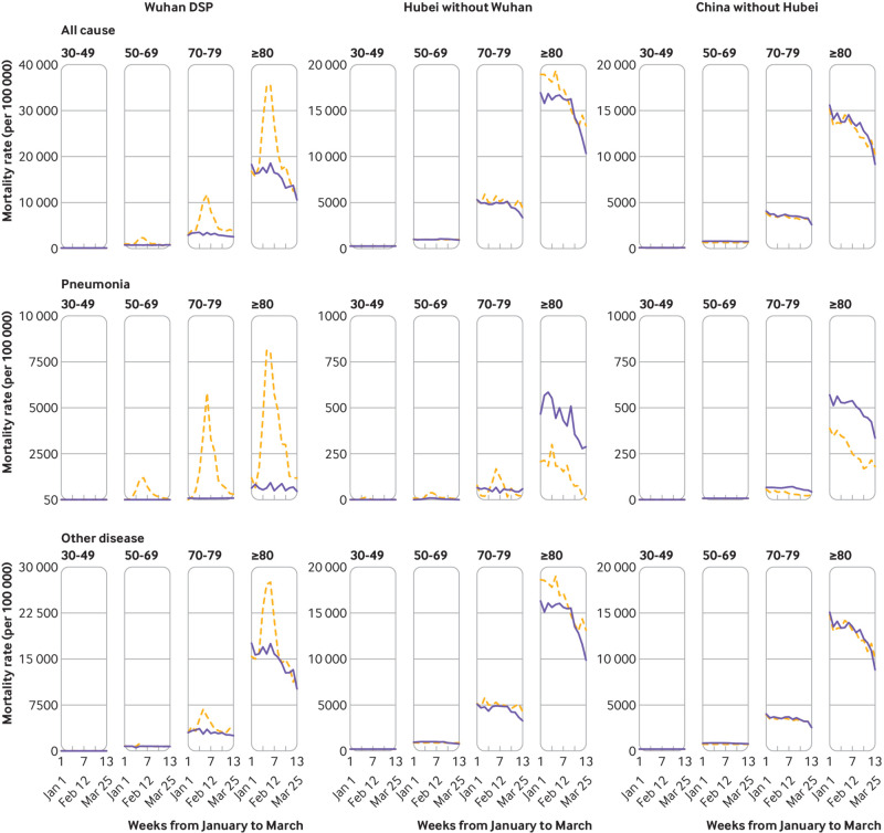
Fig 2.
Age specific trends in weekly all cause, pneumonia, and other disease mortality rates during 1 January and 31 March 2020 compared with 2015-19 in China across different Disease Surveillance Point (DSP) areas. Dashed orange lines indicate observed mortality rates in 2020 and blue solid lines indicate mean mortality rates in 2015-19. For different diseases, the ranges of mortality rates in the y axis differ between Wuhan DSP areas and elsewhere

