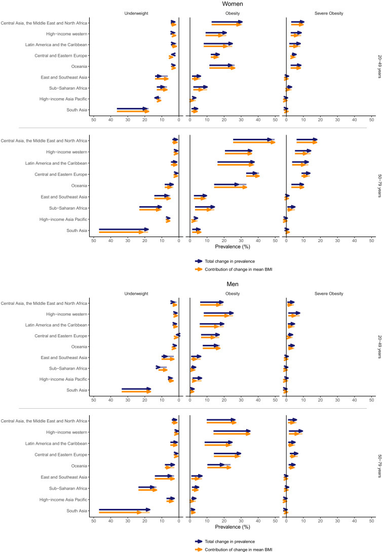
Figure 5. Contribution of change in mean body mass index (BMI) to total change from 1985 to 2016 in prevalence of underweight, obesity, or severe obesity by region, sex, and age group.
Blue arrows show the total change in prevalence of underweight, obesity, or severe obesity. Orange arrows show the contribution of change in mean BMI to the change in prevalence. The difference between these two arrows is shown with a line, whose colour follows the shorter arrow.

