Abstract
In this paper we apply a series of Machine Learning models to a recently published unique dataset on the mortality of COVID19 patients. We use a dataset consisting of blood samples of 375 patients admitted to a hospital in the region of Wuhan, China. There are 201 patients who survived hospitalisation and 174 patients who died whilst in hospital. The focus of the paper is not only on seeing which Machine Learning model is able to obtain the absolute highest accuracy but more on the interpretation of what the Machine Learning models provides. We find that age, days in hospital, Lymphocyte and Neutrophils are important and robust predictors when predicting a patients mortality. Furthermore, the algorithms we use allows us to observe the marginal impact of each variable on a case-by-case patient level, which might help practicioneers to easily detect anomalous patterns. This paper analyses the global and local interpretation of the Machine Learning models on patients with COVID19.
Keywords: Machine Learning, Shapley values, Coronavirus, COVID19
1. Introduction
The interest in COVID-19 in the academic and data science community has been growing at an unprecedented rate since its outbreak, with new datasets being released on a continuous basis.1 In this paper we use a unique dataset recently published in the supplementary material of Yan et al. (2020a). They applied a Machine Learning algorithm, Extreme Gradient Boosting (XGBoost) on blood samples from 485 infected COVID19 patients. From their sample, we downloaded patient blood sample features for 375 patients, 201 patients who survived and 174 who perished from COVID19 between January and February 2020. As far as we are aware this dataset is the only dataset publicly available which contains patient characteristics on who survived and who died from COVID19 and due to the sensitivity of such patient level information, such datasets are hard to come by.
In contrast to Yan et al. (2020a), we take a more data science approach. We compare other Machine Learning models to XGBoost. We also present a way to analyse individual patient-by-patient predictions quickly, which may be useful in high stress environments in the case another pandemic outbreak occurs in the future. Additionally this patient-by-patient analysis is potentially very relevant, as the marginal effect of a given feature might change from one patient to another depending on other feature values. Additionally, we aggregate the patient-by-patient analysis to deliver feature importance scores for the whole sample. For that, we use Shapley values, which is a concept recently taken from cooperative game theory and applied to machine learning. It measures the contribution of each feature value, abstracting away from the model specification. Finally, we apply what-if analysis from the Machine Learning model, which answers the question, how does the predicted probability of mortality change with a marginal increase (decrease) in the patients characteristics, such as, age or number of days spent in hospital when all other variables are held constant.
2. Literature review
There is an ever increasing literature in relation to COVID19 not just from medical sciences but from all angles of the scientific community. We keep this literature review specific to Machine Learning applications to the COVID19 pandemic however some other sciences have also analysed the COVID19 situation. Fernandes, 2020, Atkeson, 2020, Makridis and Hartley, 2020 analysed the economic impact of COVID19, whereas Wang, Zhang, Zhao, Zhang, and Jiang (2020) analysed the psychological impact on children during the COVID19 lock-down.
To date clinical studies have found that the majority of COVID19 patients have suffered from lung infection and therefore many academics have sought X-ray imagery for early automatic detection systems. Apostolopoulos and Mpesiana, 2020, Narin et al., 2020, Zhang et al., 2020, apply different Neural Networks on lung X-ray images in order to classify patients with and without COVID19. Wang and Wong (2020) apply deep convolutional networks on chest X-ray images to detect patients with COVID19. They released their dataset as an open source benchmark dataset which contains 13,975 chest X-ray images. Majeed, Rashid, Ali, and Asaad (2020) apply 12 convolutional neural networks on X-ray images. They use two COVID19 X-ray image datasets along with a large image dataset of non-COVID19 viral infections, bacterial infections and normal X-Rays. Shi et al. (2020) offers a comprehensive literature review of Artificial Intelligence methods applied to imagery data in relation to COVID19.
Randhawa et al. (2020) applied a decision tree approach to analyse over 5000 unique viral genomic sequences including 29 COVID19 virus sequences. Arentz et al. (2020) discuss a number of patient characteristics of 21 critically ill patients with COVID19 in Washington State. The patients they analysed has a mean age of 70 years (min 43, max 92) with being male. The characteristics of these critically ill patients related to this study were a mean absolute lymphocyte count of , mean platelet count of 215 and a mean white blood cell count of .
Wynants et al. (2020) apply a review and critical appraisal of 27 studies and 31 prediction models from the academic community. They found that the most important reported predictors for patients with COVID19 were age, sex, tomography scan features, C reactive proteins, lactic dehydrogenase and lymphocyte count. They state that all studies were at risk of high bias due to non-representative selection of control patients and high risk of model over-fitting. Salman, Abu-Naser, Alajrami, Abu-Nasser, and Alashqar (2020) achieved a sensitivity, specificity, accuracy, Positive Prediction and Negative Prediction when applying deep learning models on the detection of COVID19 from 260 X-Rays images.
Yan et al. (2020b) analysed patients with COVID19 and found that fever was the most common initial symptom, followed by a cough, fatigue and shortness of breath. They used over 300 variables and found that lactic dehydrogenase, lymphocyte and high-sensitivity C-reactive protein were key clinical features. Chen et al. (2020) analysed the clinical characteristics of COVID19 in pregnancy, they found that out of 9 patients, 7 presented a fever, 4 a cough, 3 muscle pain and 2 a sore throat.
There is a fast-growing literature proposing Machine Learning models to predict COVID19 mortality. An illustrative -though ever-expanding- list of works are the following: Chansik et al., 2020, Assaf et al., 2020, Bertsimas et al., 2020, Chowdhury et al., 2020, Di et al., 2020, Ikemura et al., 2020, Laguna-Goya et al., 2020, Lalmuanawma et al., 2020, Malki et al., 2020, Metsky et al., 2020, Osi et al., 2020, Peng and Nagata, 2020, Randhawa et al., 2020, Singh et al., 2020. In our analysis and like many of the papers listed previously, we will compare different Machine Learning models in terms of their predictive capacity. In contrast to most of these papers, we go a step further in trying to understand the models predictions by observing figures for patient-level case studies. The use of Shapley values, which is absent in all of the previous papers, will be essential for that. Our motivation is purely practical: a practitioner, a non-expert in Machine Learning, who aims to understand the prediction that the application (machine learning model) is generating for a given incoming patient at the triage room in a hospital.
3. Data
The data used in this study can be found in the supplementary material from Yan et al. (2020a).2 The original dataset was collected between the 10th January to the 18th February 2020, pregnant, breast feeding women and patients under 18 years of age, along with patients with more than 80% incomplete data were omitted from their dataset. In total there were 375 patients in the dataset, 201 patients who survived and 174 patients who died from COVID19. Fig. 1 reports the number of confirmed cases for the region Hubei, China. The shaded region indicates the time period for which we have the data which contains the most confirmed cases. See Fig. 2 .
Fig. 1.
Confirmed cases for the region Hubei, China which contains the hospital in which the data was collected from. The darker region contains the region under analysis.
Fig. 2.
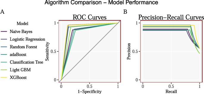
Characteristic (ROC) and Precision-Recall curves.
3.1. Summary statistics
| Survived |
Perished |
|
|---|---|---|
| name | 0 | 1 |
| Age | ||
| Mean | 50.23 | 68.75 |
| SD | 15.02 | 11.83 |
| Days in Hospital | ||
| Mean | 13.42 | 7.91 |
| SD | 6.72 | 7.36 |
| Lymphocyte Count | ||
| Mean | 1.46 | 0.62 |
| SD | 3.99 | 0.35 |
| Lymphocyte | ||
| Mean | 24.47 | 7.25 |
| SD | 11.15 | 5.43 |
| Neutrophils Count | ||
| Mean | 3.61 | 10.10 |
| SD | 2.21 | 5.92 |
| Neutrophils | ||
| Mean | 66.03 | 87.64 |
| SD | 13.64 | 8.05 |
| Gender (Percent) | ||
| Females | 51.00 | 28.00 |
| Males | 49.00 | 72.00 |
The summary statistics, reported in table on the right, show that there are distinct differences between patients who survived and passed away from COVID19. On average older patients were most likely to pass away as a result of COVID19, additionally the longer you stayed in hospital the higher the chances of survival. The blood sample data also show significant differences between the two classes. Whereas there seems to be a heavy skew of males who passed away from COVID19 in the dataset.
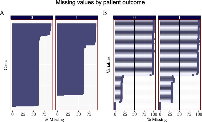
The original dataset contained a significant number of missing values. Panel (A) in Fig. 10 in the Appendix reports the percentage of missing values for each patient, by patient outcome, whereas Panel (B) in Fig. 10 reports the number of missing values for each variable, by patient outcome. For a number of patient cases the number of missing values are high – above 60% whereas the number of cases by variable is also high 100% for many variables. We therefore filter out these variables and use a cut-down version of the data. We set a cut-off percentage threshold of 50% – that is, all variables with more than 50% of NA values were removed, given by the vertical line in Fig. 10.
Fig. 10.
Panel (A) reports the number of missing values for each patient by patient outcome. Ordered by highest number of missing values. The number of missing values by case seems to be slightly higher for the patients who perished as opposed to the patients who survived. Panel (B) reports the number of missing values for each variable by patient outcome. Variable names have been removed to save on space. We remove all variables in the model whos percentage of missing values exceed 50% (as shown by the vertical line).
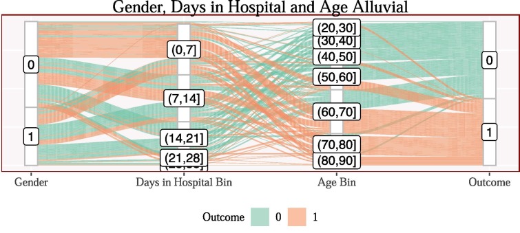
Fig. 11 plots an alluvial plot showing the distribution of patients by gender, mapped into the number of weeks that patient spent in hospital, then mapped into an age category, finally, mapped into that patients outcome. It is clear that a larger proportion of the gender 0 category who spent less than a week in hospital and was over 60 years of age died of COVID-19 related illnesses. The gender category 1 fared significantly better when following a similar path.
Fig. 11.
Alluvial plot for Gender, Days in Hospital Bins and Age Bins, coloured by mortality. A patient has gender 0 (male) may pass through to the days in hospital, bin (less than a week in hospital) and also be in the age category . These patients would be at high risk of mortality indicated by the red colour flowing through the plot. Additionally the age bind and also have a high risk of mortality for these patients. The size of the bars indicate the number of observations in each section, i.e. there appears to be slightly more males than females in the dataset.
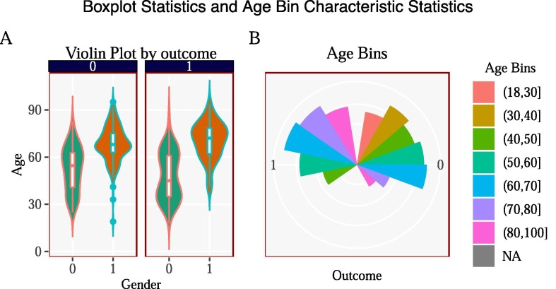
Fig. 12 in the Appendix plots the characteristics of age and age bins on the outcome variable. Panel B shows the outcome by age bins. The triangles on the left side show the outcome of mortality whereas the right side shows the outcome of survival. The size of the triangle dictates the number of patients in that outcome. For instance, we can see that for age bins there is a larger triangle on the right side than its corresponding colour on the left side (which is 180 degrees opposite). Therefore the patients in the age bin had a high success rate of survival. Moreover, contrast that with the age bin and we see an opposite trend - a higher triangle on the left side of the plot than the right side of the plot, indicating more people in this age bin perished. Panel (A) shows the violin plots for the age variable by gender and outcome. We can see that there is a distinct bump in the kernel density plot for males around the ages of 30 for the patients who died which is not seen in the sample of the patients who survived.
Fig. 12.
Panel (A) plots the Violin plot showing the distribution of patients ages and gender by survival. Pane (B) plots the distribution of patients age bins by the patients outcome.
4. Results
We next report the comparisons between different Machine Learning models and show the interpretability from the classification tree model. Moreover, we show four patient level case studies along with variable importance plots demonstrating which variables the models found most important. Additionally, we report model interpretation from a subset of co-operative game theory, SHapley Additive exPlanations (SHAP) scores from one of the models. Finally we report ceteris paribus & what-if analysis of a patients survival probability. We discuss each of the above in more detail in each of the corresponding subsections.
4.1. Machine Learning comparisons
| Metric | Naive Bayes | Logistic Regression | Random Forest | adaBoost | Classification Tree | Light GBM | XGBoost |
| Acc | 0.84 | 0.91 | 0.90 | 0.83 | 0.81 | 0.88 | 0.93 |
| Sens | 0.86 | 0.97 | 0.94 | 0.88 | 0.86 | 0.93 | 0.95 |
| Spec | 0.83 | 0.84 | 0.84 | 0.79 | 0.77 | 0.85 | 0.90 |
| Prec | 0.80 | 0.88 | 0.87 | 0.77 | 0.75 | 0.83 | 0.89 |
| F1 | 0.83 | 0.92 | 0.91 | 0.82 | 0.80 | 0.88 | 0.92 |
| MCC | 0.68 | 0.82 | 0.79 | 0.67 | 0.62 | 0.77 | 0.85 |
| AUC | 0.84 | 0.91 | 0.89 | 0.83 | 0.81 | 0.89 | 0.93 |
| AUPRC | 0.84 | 0.91 | 0.88 | 0.85 | 0.82 | 0.90 | 0.94 |
| TP | 36.00 | 35.00 | 34.00 | 37.00 | 36.00 | 39.00 | 40.00 |
| FP | 6.00 | 1.00 | 2.00 | 5.00 | 6.00 | 3.00 | 2.00 |
| FN | 9.00 | 5.00 | 5.00 | 11.00 | 12.00 | 8.00 | 5.00 |
| TN | 43.00 | 26.00 | 26.00 | 41.00 | 40.00 | 44.00 | 47.00 |
| *Note: The Logistic Regression and Random Forest model removes missing values from its final results and cannot be adequately compared with the other results. | |||||||
| †MCC: Matthew’s Correlation Coefficient AUC: Area Under the Curve AUPRC: Area Under the Precision Recall Curve TP: True Positive — FP: False Positive — FN: False Negative — TN: True Negative | |||||||
We split the sample of 375 observations up into a training and testing dataset, in which corresponds to the training data and corresponds to the testing data. The above table reports the confusion matrix statistics for a number of Machine Learning models such as Naive Bayes, Logistic Regression, Random Forest, adaBoost, Classification Tree, LightGBM and XGBoost.3 Each of the models show very similar performance metrics, with the ensemble learning models performing slightly better over the more simpler models.
4.2. Classification tree
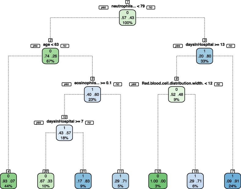
Fig. 3 plots an example of a decision tree from the Classification Tree model. Roughly, a decision tree, or simply a tree, represents a piece-wise mapping from a set of features, such as Neutrophils or age, into a response variable, which in our application is probability of mortality. Machine Learning algorithms, such as XGBoost, select the tree (or collection of trees) that minimizes some loss function.4 Naturally, to select a tree conveys to select both the order of the features as we move down the tree and the threshold values at each split.
Fig. 3.
Decision Tree from the Classification Tree Model.
In the Fig. 3, as we go downward, the first split at the first node, is made on Neutrophils which shows the predicted probabilities of being in each class along with the percentage of the observations in this split. We can see that patients who have Neutrophils levels and age fall into which contains of the total observations and has predicted probabilities of of survival and of mortality. Therefore, patients who fall into this terminal node are predicted to survive. Contrast that with a more complex non-linear node at where patients have the following characteristics Neutrophils of , age of , Eosinophils of and Days in hospital of fall into which has a predicted probability of of survival and of mortality, of the sample fell into this node. To finalise, people who followed a similar path down the decision tree but stayed in hospital for more than 7 days fell into where they had a predicted probability of survival of and probability of mortality, of the sample fell into this terminal node and thus the model found that the length of time spent in hospital has a significant impact on the probability of survival.
4.3. Case studies (local level)
A single decision tree as depicted in Fig. 3 is highly interpretable but not very good at prediction as is evidenced by the worst performing model in the column Classification Tree. In order to overcome this issue of performance, an ensemble of decision trees can be used to make a prediction. The combination of decision trees improves greatly the prediction, though interpretability becomes sa priori more complex. In this section, we show how more advanced decision tree models can be interpreted through case studies.
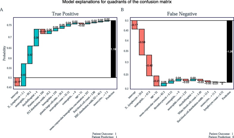
What sets the XGBoost model (along with other tree models) apart, from traditional black-box Machine Learning models is that it is possible to see how each variable contributes to the overall prediction for each observation or patient in the model. There are four possible cases, each representing a different position in the confusion matrix – or each representing one of the statistics of a True Positive (TP), False Positive (FP), True Negative (TN) and False Negative (FP). We briefly discuss the results for two of the cases, leaving the other two in Fig. ?? in the appendix.
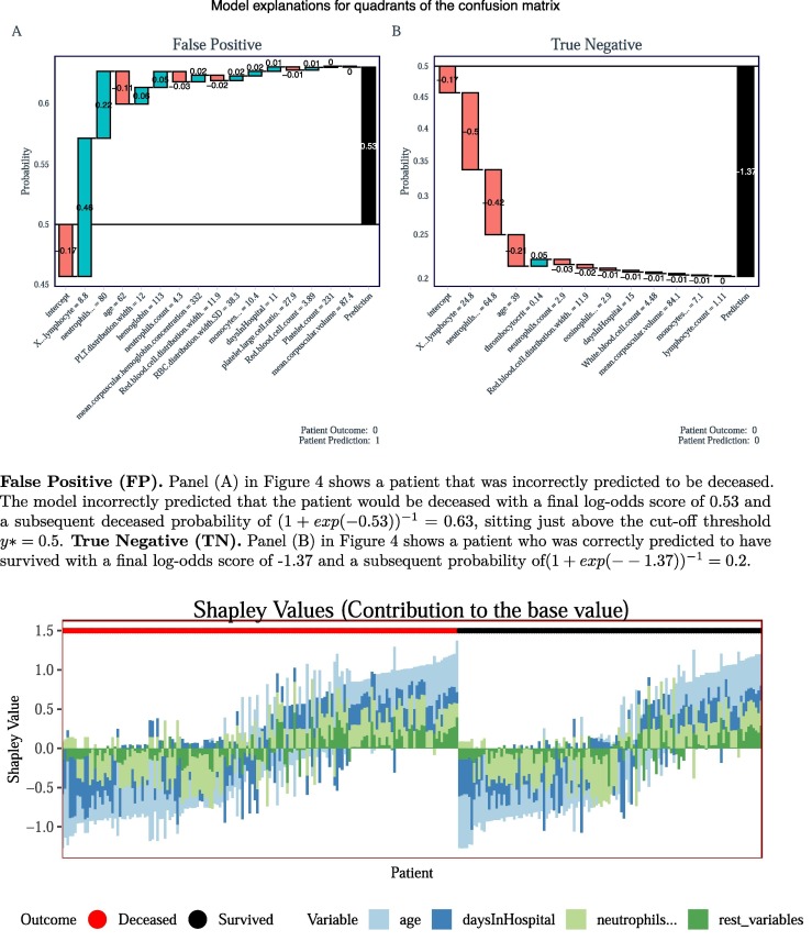
True Positive (TP). Panel (A) in Fig. 4 shows the breakdown of how a positive case (deceased) was correctly predicted. Given a particular variable, shown in the x-axis, a log-odds score is calculated (displayed inside each box), the sum of the log-odds scores are summed up in a cumulative manor and a final log-odds score is given (displayed in the final black box) and then a logistic function is applied to the final log-odds result in order to obtain a predicted probability (shown on the y-axis). The horizontal line demonstrates a probability cut-off threshold. Patients above this line are classified as deceased and patients below this line are classified as survived. Notice, that the final log-odds prediction score is , which is assigned a predicted probability of mortality . False Negative (FN). Panel (B) in Fig. 4 shows a patient who was incorrectly predicted to have survived. The model incorrectly predicted that the patient would have survied with a final log-odds score of −1.26 and a subsequent survival probability of , sitting below the cut-off threshold .
Fig. 4.
Two Case Studies, a True Positive (TP) and False Negative. Figures inside each bar represent log-odds scores with the final black bar being a summation of all preceding bars scores. A logistic function is applied to the final log-odds result and a prediction probability is obtained (shown on the y-axis). The horizontal line at point represents the y* cut-off threshold. The figures on the x-axis correspond to the variables values.
4.4. Feature importance (global level)
From the case studies presented previously in Fig. 4 we can see that certain patient characteristics are often given the largest (in absolute) values log-odds scores regardless of whether the patient survived or died. Such features include, age, daysInHospital, Lymphocyte and Neutrophils. That is, the variables presented in the summary statistics table previously.
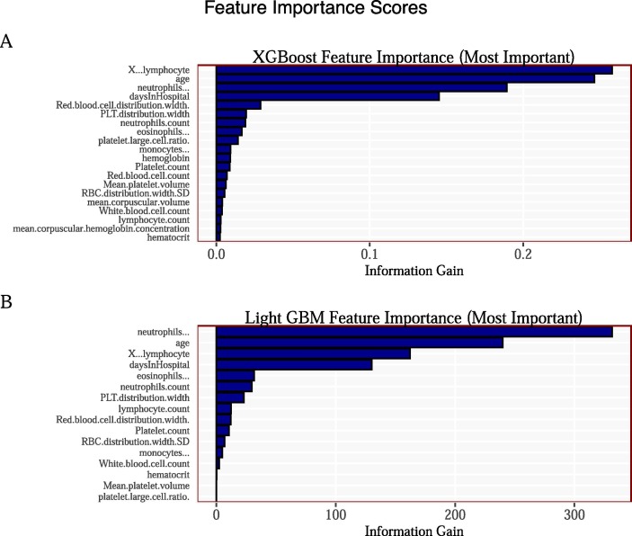
Panel (A) and Panel (B) in Fig. 5 reports the variable importance scores from both the XGBoost and LightGBM model. We can see that the most important variables are consistent across both models, with age, daysInHospital, Lymphocyte and Neutrophils being ranked in the top four in both.
Fig. 5.
Feature Importance Scores for XGBoost and Light GBM.
From Fig. 4 we can see that different individual patient characteristics are associated with different (positive & negative) prediction scores. From Fig. 5 we can also see that certain variables contribute more to the model than other variables. Moreover, Fig. 5 does not tell us whether, for example, different ages contribute more or less to the probability of mortality, just that age is important at a global level. In order to overcome this issue we turn to a subset of coalition game theory and analyse Shapley values.
4.5. Cooperative game theory (SHapley Additive exPlanations)
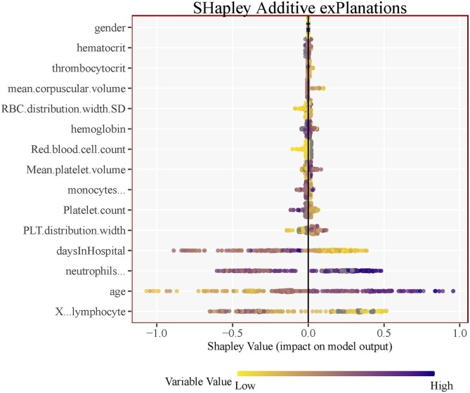
Shapley values, which is a classical concept in cooperative game theory, see Shapley (1953) has been recently applied to understanding a Machine Learning models predictions, see Lundberg and Lee, 2017, Lundberg et al., 2018. Shapley values offer a global interpretation where we can measure how patient characteristics contribute – positively or negatively to the prediction of mortality. A similar measure is shown previously in Fig. 5, however unlike the feature importance plot shown there we are now able to see the positive or negative relationship between each variable and patient mortality prediction.
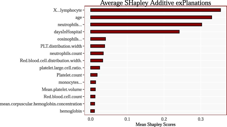
That is, given Fig. 6 on the left we can see that age has the greatest variability in Shapley values. Low values of age correspond to younger patients and more importantly are assigned negative Shapley values and thus it tends to reduce the prediction of mortality. Contrast that with high values of age which corresponds to older patients and more importantly are assigned positive Shapley values and thus it has a higher marginal impact to the prediction probability of mortality. Conversely, the variable daysInHospital has the opposite impact. The higher the number of days the patient remains in hospital is associated with a negative marginal impact on the prediction of mortality whereas, the lower the number of days the patient remained in hospital is associated with a positive marginal impact on the prediction of mortality. Other variables follow similar and very distinct patterns. Fig. 15 in the Appendix plots the mean Shapley values for each variable for the highest average Shap scores, which is a somewhat similar to Fig. 5. We note that the top four variables are consistent across models and across evaluation criteria.
Fig. 6.
SHapley Additive exPlanations.
Fig. 15.
Average Shapley scores for the top 15 variables in the model. The results are consistent with the variable importance plots from the XGBoost and LightGBM model reported previously.
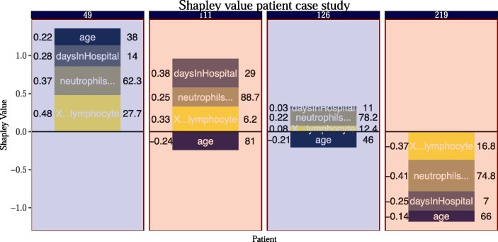
Shapley Values also give a local interpretation and each patient obtains a total Shapley value (a summation of each of the variables Shapley value). This allows us to explain why a patient receives its prediction and the corresponding contribution of each feature. Fig. 13 in the Appendix shows the breakdown of the four most important variables for all patients in the dataset, ranked by each patients total Shapley value (lowest to highest by each outcome). Fig. 7 shows four randomly sampled case studies, two from the deceased side and two from the survived side of Fig. 13 (where the background is coloured by red = deceased & blue = survived) along with that patients feature characteristic for the four most important variables in the model age, daysInHospital, Lymphocyte and Neutrophils.5 That is, we get to see the patients characteristics along with the corresponding Shapley value assigned to that feature. Note, that these plots differ significantly to those presented in Fig. 4 since the Shapley value plots are derived from the training data whereas the XGBoost case studies are obtained from the test data. Moreover, the Shapley value case studies can be thought of as why the model learned a mapping of features to a prediction whereas the XGBoost case studies can be thought of as why the model made a mapping of features to a prediction. Fig. 13 is essentially the patient observations presented in Fig. 7 but stacked more compactly side-by-side (and without the patients feature attribution characteristic).
Fig. 13.
Patient level Shapley values: Each stacked bar represents a patient and that patients total Shapley score. The accompanying colours represent the individual variable Shapley scores for the four most important variables in the model (with the result of the other variables being summed up into the category rest variables). The patients are split according to whether the patient was deceased or survived and each group is ordered by that patients total Shapley value.
Fig. 7.
Shapley values for a sample of four observations of patient characteristics for the top four variables in the model. The background colour indicates the mortality rate - red = deceased and blue = survived. The numbers in the title of the plot correspond to the patient ID in the dataset. The text on the left-hand-side of the bars contain the Shaply value whereas the text on the right-hand-side of the bars contains the feature charateristic for that patient. The y-axis contains the summation of the features Shapley values for that patient.
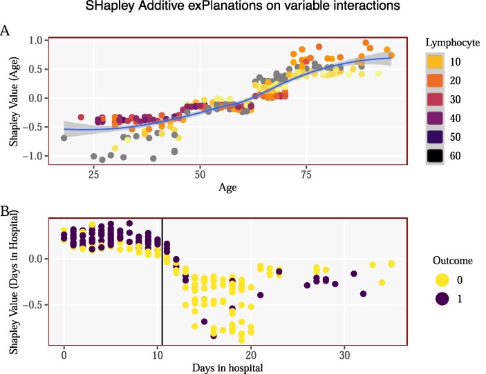
We next study the non-linear interaction effects of different variables on the positive and negative Shapley values. Panel (A) in Fig. 8 shows the interaction effects of patient age and its corresponding feature Shapley value. Each point represents a patient, colour-coded by that patients Lymphocyte value, older patients have lower Lymphocyte values and are mostly placed in the upper right hand-side of the plot in which they were given positive Shapley values. Recall, positive values to the prediction of mortality. Younger patients tended to have higher Lymphocyte values and subsequently obtain negative Shapley values. Panel (B) in Fig. 8 shows the interaction between the number of days a patient spent in hospital and that patients corresponding Shapley value, colour-coded by each patients outcome. A far higher proportion of deceased patients occur on the left hand-side of the horizontal line ( days in hospital) when compared with the survived patients. These patients are given positive Shapley values.
Fig. 8.
Non-linear variable interaction with Shapley values.
4.6. Ceteris paribus
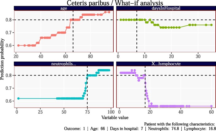
Finally, Fig. 9 plots the models what-if analysis for a single patient. We can see that when holding all other variables fixed how the models prediction probability changes with changes in the x-axis or changes in the patients feature characteristic. That is, given that this patient had an age of 66, when holding all other variables fixed an increase in that persons age increases the predicted probability of mortality. Moreover the patient also spent 7 days in hospital and thus if the patient spent more than 10 days in hospital the what-if analysis suggests that the patient would have a marginally lower predicted probability of mortality - holding all other variables constant. Similar analysis can be carried out for all patients and for all variables.
Fig. 9.
What-if analysis for the four most important variables in the model. The vertical dotted black line corresponds to the patients true characteristic (shown on the x-axis) and the horizontal dotted line corresponds to the models predicted probability of mortality. The intersection of the two lines shows where the patients true value/ predicted probability lies. The points show how the predicted probability changes with changes in the x-axis (patient characteristic) holding all other variables fixed.
5. Conclusion
This paper analyses a number of patient characteristics by applying a series of Machine Learning models in order to predict mortality of patients admitted to hospital with COVID19. There were 375 patients in the dataset with 201 patients who survived and 174 patients who died from COVID19. Ensemble tree based models obtained the highest prediction scores over more simplistic – yet easier to understand – classical models.
We focus our analysis on the interpretability of Machine Learning models. Firstly, by introducing patient case studies for each quadrant in the confusion matrix which helps understand why a model made a correct prediction or not. We also show that there is consistency in both across models and across evaluation criteria on what the four most important variables are. Moreover, we find that the variables age, daysInHospital, Lymphocyte and Neutrophils are the most important variables when making a prediction. We discuss how variations in patient characteristics have a positive and negative effect on the models prediction through the use of SHapley Additive exPlanations (Shapley values) from cooperative game theory. Moreover, we use patient-level Shapley values to understand how the model assigns Shapley scores to each patient based on each patients characteristics for four case studies. We also study the interaction between patient characteristics and its corresponding Shapley values. Finally we briefly discuss ceteris paribus analysis in order to understand how the models predictions change with what-if scenarios.
Tree based models could be useful in analysing patients during peak epidemic outbreaks when hospitals may be overloaded and quick analysis is in order, especially given the non-linear nature of patient characteristics when admitted to hospitals.
The robustness of our findings are bound by the diversity of our dataset. We take data from Yan et al. (2020a), which leverage’s a database of blood samples. It would be interesting to apply the Machine Learning algorithms used in this paper to a wider population of patients. Another relevant dimension worth exploring is to enlarge the range of potentially relevant features, this study primarily focused on blood cell data but, including other features such as, aspartate aminotransferase (AST) and alanine aminotransferase (ALT) could potentially raise more interesting analysis of patient characterises and morbidity from COVID19. To summarize, our paper shows a promising direction on how relatively standard classification trees in Machine Learning combined with Shapley values help to identify mortality factors for COVID19, however, more robust conclusions require richer datasets.
From a more operational angle, a growing branch of literature proposes the use of a number Machine Learning models, say, at a triage phase in hospitals. On this regard, our differential factor, as mentioned, is to propose patient case studies and patient-level Shapley values, that can be easily interpreted -learnt- by practitioners in the field, even those who are not so familiar with the terminology used in Machine Learning, which facilitates the real implementation.
CRediT authorship contribution statement
Both authors contributed equally. Matthew Smith: Investigation, Methodology, Visualization, Writing - original draft, Writing - review & editing. Francisco Alvarez: Investigation, Methodology, Visualization, Writing - original draft, Writing - review & editing.
Declaration of Competing Interest
The authors declare that they have no known competing financial interests or personal relationships that could have appeared to influence the work reported in this paper.
Footnotes
Note: We omit Neural Network, SVM and K-nn models since there is a substantial amount of missing values in the data and an insufficient number of data points to adequately impute the missing values.
For instance, XGBoost uses a loss function that weights prediction errors and complexity of the tree. For more details, see Chen and Guestrin (2016).
Note that Fig. 13 in the Appendix is a compressed and stacked version of Fig. 7 and therefore we are able to obtain similar figures to that of Fig. 7 for all patients along with their corresponding patient characteristics and Shapley values.
Supplementary data associated with this article can be found, in the online version, athttps://doi.org/10.1016/j.eswa.2021.114832.
Appendix A.
False Positive (FP). Panel (A) in Fig. 4 shows a patient that was incorrectly predicted to be deceased. The model incorrectly predicted that the patient would be deceased with a final log-odds score of 0.53 and a subsequent deceased probability of , sitting just above the cut-off threshold . True Negative (TN). Panel (B) in Fig. 4 shows a patient who was correctly predicted to have survived with a final log-odds score of −1.37 and a subsequent probability of.
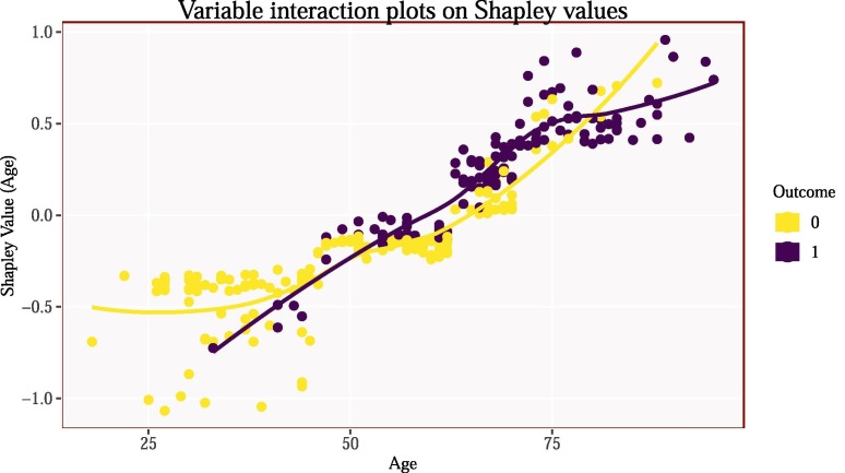
Fig. 14.
Variable interaction plot showing how the Shapley value changes with different ages, coloured by that patients outcome. Older patients are given positive Shapley values whereas younger patients are given negative Shapley values.
Supplementary data
The following are the Supplementary data to this article:
References
- An Chansik, Lim Hyunsun, Kim Dong-Wook, Chang Jung Hyun, Choi Yoon Jung, Kim Seong Woo. Machine learning prediction for mortality of patients diagnosed with COVID-19: a nationwide Korean cohort study. Nature Publishing Group. 2020;10:1–11. doi: 10.1038/s41598-020-75767-2. [DOI] [PMC free article] [PubMed] [Google Scholar]
- Apostolopoulos I.D., Mpesiana T.A. Physical and Engineering Sciences in Medicine 1. 2020. Covid-19: Automatic detection from x-ray images utilizing transfer learning with convolutional neural networks. [DOI] [PMC free article] [PubMed] [Google Scholar]
- Arentz M., Yim E., Klaff L., Lokhandwala S., Riedo F.X., Chong M., Lee M. Characteristics and outcomes of 21 critically ill patients with covid-19 in washington state. Jama. 2020;323:1612–1614. doi: 10.1001/jama.2020.4326. [DOI] [PMC free article] [PubMed] [Google Scholar]
- Assaf Dan, Gutman Ya’ara, Neuman Yair, Segal Ga.d., Amit Sharon, Gefen-Halevi Shiraz, Shilo Noya, Epstein Avi, Mor-Cohen Ronit, Biber Asaf, et al. Utilization of machine-learning models to accurately predict the risk for critical COVID-19. Internal and Emergency Medicine. 2020;15:1435–1443. doi: 10.1007/s11739-020-02475-0. [DOI] [PMC free article] [PubMed] [Google Scholar]
- Atkeson, A. (2020). What will be the economic impact of covid-19 in the us? Rough estimates of disease scenarios. National Bureau of Economic Research.
- Bertsimas, Dimitris, Lukin, Galit, Mingardi, Luca, Nohadani, Omid, Orfanoudaki, Agni, Stellato, Bartolomeo, et al. (2020). COVID-19 mortality risk assessment: an international multi-center study. [DOI] [PMC free article] [PubMed]
- Di Castelnuovo, Augusto, Bonaccio, Marialaura, Costanzo, Simona, Gialluisi, Alessandro, Antinori, Andrea, Berselli, et al. (2020). Common cardiovascular risk factors and in-hospital mortality in 3,894 patients with COVID-19: survival analysis and machine learning-based findings from the multicentre Italian CORIST Study. Nutrition, Metabolism and Cardiovascular Diseases 30, 1899–1913. [DOI] [PMC free article] [PubMed]
- Chen Tianqi, Guestrin Carlos. Proceedings of the 22nd acm sigkdd international conference on knowledge discovery and data mining. 2016. Xgboost: A scalable tree boosting system; pp. 785–794. [Google Scholar]
- Chen H., Guo J., Wang C., Luo F., Yu X., Zhang W., Li J., Zhao D., Xu D., Gong Q., et al. Clinical characteristics and intrauterine vertical transmission potential of covid-19 infection in nine pregnant women: A retrospective review of medical records. The Lancet. 2020;395:809–815. doi: 10.1016/S0140-6736(20)30360-3. [DOI] [PMC free article] [PubMed] [Google Scholar]
- Chowdhury Muhammad EH, Rahman Tawsifur, Khandakar Amith, Al-Madeed Somaya, Zughaier Susu M, Hassen Hanadi, Islam Mohammad T. An early warning tool for predicting mortality risk of COVID-19 patients using machine learning. arXiv preprint arXiv:2007.15559. 2020 doi: 10.1007/s12559-020-09812-7. [DOI] [PMC free article] [PubMed] [Google Scholar]
- Fernandes N. Economic effects of coronavirus outbreak (covid-19) on the world economy. Available at SSRN. 2020;3557504 [Google Scholar]
- Ikemura Kenji, Goldstein Doctor Y, Szymanski James, Bellin Eran, Stahl Lindsay, Yagi Yukako, Saada Mahmoud, Simone Katelyn, Gil Morayma Reyes. Using automated-machine learning to predict COVID-19 patient survival: identify influential biomarkers. Nutrition. 2020 medRxiv. [Google Scholar]
- Laguna-Goya Rocio, Utrero-Rico Alberto, Talayero Paloma, Lasa-Lazaro Maria, Ramirez-Fernandez Angel, Naranjo Laura, Segura-Tudela Alejandro, Cabrera-Marante Oscar, de Frias Edgar. Rodriguez and Garcia-Garcia, Rocio and others, IL-6–based mortality risk model for hospitalized patients with COVID-19. Journal of Allergy and Clinical Immunology. 2020;146:799–807. doi: 10.1016/j.jaci.2020.07.009. [DOI] [PMC free article] [PubMed] [Google Scholar]
- Lalmuanawma Samuel, Hussain Jamal, Chhakchhuak Lalrinfela. Applications of machine learning and artificial intelligence for Covid-19 (SARS-CoV-2) pandemic: A review. Chaos, Solitons & Fractals. 2020 doi: 10.1016/j.chaos.2020.110059. [DOI] [PMC free article] [PubMed] [Google Scholar]
- Lundberg, S. M., Erion, G. G., & Lee, S. -I. (2018). Consistent individualized feature attribution for tree ensembles. arXiv preprint arXiv:1802.03888.
- Lundberg S.M., Lee S.-I. A unified approach to interpreting model predictions. Advances in Neural Information Processing Systems. 2017:4765–4774. [Google Scholar]
- Majeed, T., Rashid, R., Ali, D., & Asaad, A. (2020). Covid-19 detection using cnn transfer learning from x-ray images. medRxiv. [DOI] [PMC free article] [PubMed]
- Makridis C., Hartley J. Special Edition Policy Brief; 2020. The cost of covid-19: A rough estimate of the 2020 us gdp impact. [Google Scholar]
- Malki Zohair, Atlam El-Sayed, Hassanien Aboul Ella, Dagnew Guesh, Elhosseini Mostafa A, Gad Ibrahim. Association between weather data and COVID-19 pandemic predicting mortality rate: Machine learning approaches. Chaos, Solitons & Fractals. 2020;138 doi: 10.1016/j.chaos.2020.110137. [DOI] [PMC free article] [PubMed] [Google Scholar]
- Metsky, Hayden C., Freije, Catherine A. Kosoko-Thoroddsen, Tinna-Solveig F., Sabeti, Pardis C., & Myhrvold, Cameron (2020). CRISPR-based COVID-19 surveillance using a genomically-comprehensive machine learning approach. bioRxiv.
- Narin, A., Kaya, C., & Pamuk, Z. (2020). Automatic detection of coronavirus disease (covid-19) using x-ray images and deep convolutional neural networks. arXiv preprint arXiv:2003.10849. [DOI] [PMC free article] [PubMed]
- Osi, Abdulhameed Ado, Dikko, Hussaini Garba, Abdu, Mannir, Ibrahim, Auwalu, Isma’il, Lawan Adamu, Sarki, Hassan, Muhammad, Usman et al. (2020). A classification approach for predicting COVID-19 patient survival outcome with machine learning techniques. medRxiv.
- Peng Yaohao, Nagata Mateus Hiro. An empirical overview of nonlinearity and overfitting in machine learning using COVID-19 data. Chaos, Solitons & Fractals. 2020;139 doi: 10.1016/j.chaos.2020.110055. [DOI] [PMC free article] [PubMed] [Google Scholar]
- Randhawa G.S., Soltysiak M.P., El Roz H., de Souza C.P., Hill K.A., Kari L. Machine learning using intrinsic genomic signatures for rapid classification of novel pathogens: COVID-19 case study. PLoS One. 2020;15 doi: 10.1371/journal.pone.0232391. [DOI] [PMC free article] [PubMed] [Google Scholar]
- Salman, F. M., Abu-Naser, S. S., Alajrami, E., Abu-Nasser, B. S., & Alashqar, B. A. (2020). Covid-19 detection using artificial intelligence.
- Shapley L.S. A value for n-person games. Contributions to the Theory of Games. 1953;2:307–317. [Google Scholar]
- Shi F., Wang J., Shi J., Wu Z., Wang Q., Tang Z., He K., Shi Y., Shen D. Review of artificial intelligence techniques in imaging data acquisition, segmentation and diagnosis for covid-19. IEEE Reviews in Biomedical Engineering. 2020 doi: 10.1109/RBME.2020.2987975. [DOI] [PubMed] [Google Scholar]
- Singh Sarbjit, Parmar Kulwinder Singh, Makkhan Singh Sidhu Jitendra, Jatinder Kaur, Shruti Peshoria, Jatinder Kumar. Study of ARIMA and least square support vector machine (LS-SVM) models for the prediction of SARS-CoV-2 confirmed cases in the most affected countries. Chaos, Solitons & Fractals. 2020;139 doi: 10.1016/j.chaos.2020.110086. [DOI] [PMC free article] [PubMed] [Google Scholar]
- Wang, L., & Wong, A. (2020). COVID-net: A tailored deep convolutional neural network design for detection of covid-19 cases from chest radiography images. arXiv arXiv-2003. [DOI] [PMC free article] [PubMed]
- Wang G., Zhang Y., Zhao J., Zhang J., Jiang F. Mitigate the effects of home confinement on children during the covid-19 outbreak. The Lancet. 2020;395:945–947. doi: 10.1016/S0140-6736(20)30547-X. [DOI] [PMC free article] [PubMed] [Google Scholar]
- Wynants, L., Van Calster, B., Bonten, M. M., Collins, G. S., Debray, T. P., De Vos, M. et al. 2020. Prediction models for diagnosis and prognosis of covid-19 infection: Systematic review and critical appraisal. bmj 369. [DOI] [PMC free article] [PubMed]
- Yan L., Zhang H.-T., Goncalves J., Xiao Y., Wang M., Guo Y., Sun C., Tang X., Jing L., Zhang M. An interpretable mortality prediction model for covid-19 patients. Nature Machine Intelligence. 2020 doi: 10.1038/s42256-020-0180-7. [DOI] [Google Scholar]
- Yan L., Zhang H.-T., Xiao Y., Wang M., Sun C., Liang J., Li S., Zhang M., Guo Y., Xiao Y., et al. Prediction of criticality in patients with severe covid-19 infection using three clinical features: A machine learning-based prognostic model with clinical data in wuhan. MedRxiv. 2020 [Google Scholar]
- Zhang, J., Xie, Y., Li, Y., Shen, C., & Xia, Y. (2020). Covid-19 screening on chest x-ray images using deep learning based anomaly detection. arXiv preprint arXiv:2003.12338.
Associated Data
This section collects any data citations, data availability statements, or supplementary materials included in this article.


