Abstract
Social distancing and stay-at-home are among the few measures that are known to be effective in checking the spread of a pandemic such as COVID-19 in a given population. The patterns of dependency between such measures and their effects on disease incidence may vary dynamically and across different populations. We described a new computational framework to measure and compare the temporal relationships between human mobility and new cases of COVID-19 across more than 150 cities of the United States with relatively high incidence of the disease. We used a novel application of Optimal Transport for computing the distance between the normalized patterns induced by bivariate time series for each pair of cities. Thus, we identified 10 clusters of cities with similar temporal dependencies, and computed the Wasserstein barycenter to describe the overall dynamic pattern for each cluster. Finally, we used city-specific socioeconomic covariates to analyze the composition of each cluster.
Keywords and phrases: Clustering, Optimal transport, Wasserstein distance, Time series, Mobility, COVID-19.
Introduction
The year 2020 marks the centenary of birth of Professor Calyampudi Radhakrishna Rao, on which we congratulate this living legend in the field of statistics, and wish him a longer, healthy life. The same year will also be remembered for the occurrence and phenomenal spread of the COVID-19 pandemic that has profoundly impacted all aspects of human life globally. In the absence of a treatment or vaccine to develop immunity against the disease, governments around the world have adopted non-pharmaceutical risk mitigation strategies such as lockdowns, shelter-in-place, school and business closures, travel bans or restrictions to limit movement and prevent contagion. The magnitude and effectiveness of such mitigation strategies in preventing contagion and reducing the number of deaths has been noted in parts of the world where such mitigation strategies have led to reduction in the Reproduction Number of the disease over time to less than 1, thus implying that the virus will gradually stop spreading. Since the beginning of the pandemic, an estimated 3.1 million deaths were averted across 11 European countries attributable to these risk mitigation strategies by May 4, 2020 (Flaxman et al. 2020).
In the United States, the adoption, and enforcement of non-pharmaceutical, risk mitigation strategies have varied by state and across time. The first confirmed COVID-19 case was reported on January 21, 2020, in Washington State (Ghinai et al.et al., 2020). While transmissions were documented since, a national emergency was declared later, on March 13 (DCPD-202000156, 2020). At that time, international travel restrictions were enforced. By March 16, six “bay area” counties declared shelter-in-place orders and on March 19, California was the first state to issue a state-wide order. Since then, several communities and states have implemented stay-at-home orders and social distancing measures. As of March 30, there were 162,600 confirmed COVID-19 cases in the U.S. DCPD-202000156 2020 and 30 states had announced shelter-in-place orders. On April 1, two additional states and the District of Columbia (DC) issued statewide shelter-in-place orders followed by 7 more states by April 6.
Historically, among the U.S. cities that were affected by the 1918 Spanish flu, social distancing played a pivotal role in flattening the pandemic curve. In fact, the cities which delayed enforcing social distancing saw the highest peaks in new cases of the disease. Policies aimed at reducing human transmission of COVID-19 included lockdown, travel restrictions, quarantine, curfew, cancellation and postponing events, and facility closures. Measuring precisely the dynamic impact of such interventions is challenging (Adiga et al. 2020; Das et al. 2020) and confounded by several factors such as differences in the specific modes and dates of the policy-driven measures adopted by or enforced across states, regions, and countries, and, of course, the actual diversity of human behaviors at these locations.
Given the current ubiquitous usage of mobile devices among the U.S. populations, social mobility as measured by aggregating the geospatial statistics of their daily movements could serve as a proxy measure to assess the impact of such policies as social distancing on disease incidence. Interestingly, in the context of the current pandemic, human mobility data could be estimated using geolocation reports from user smartphones and other mobile devices that were made available by multiple providers including Google and Apple, among others. In this study, we obtained such data from Descartes Labs, which made anonymized location-specific time series data on mobility index freely available to researchers through their GitHub site: https://github.com/descarteslabs/DL-COVID-19. Thus, we were able to analyze a location-specific bivariate time series on daily mobility index and incidence of new cases of COVID-19 in the U.S.
In this study, we are interested to (1) measure and compare the temporal dependencies between mobility (M) and new cases (N) across 151 cities in the U.S. with relatively high incidence of COVID-19 by May 31, 2010. We believe that these dependency patterns vary not only over time (t) but across locations and populations. For this purpose, we proposed a novel application of Optimal Transport to compute the distance between patterns of (N, M, t) and its variants for each pair of cities. This allowed us to (2) group the cities into different hierarchical clusterings, and (3) compute the Wasserstein barycenter to describe the overall dynamic pattern of each identified cluster. Finally, (4) we used city-specific socioeconomic covariates to analyze the composition of each cluster. A pipeline for our analytical framework is described in the following section.
Data and Methods
Datasets
COVID-19 incidence and population data
Based on cumulative COVID-19 cases data from the Johns Hopkins Coronavirus Resource Center (https://coronavirus.jhu.edu/), for this study, we compiled time series data on daily new cases of the disease for more than 300 U.S. counties from 32 states and the District of Columbia and matched by unique five-digit FIPS code or county name to dynamic and static variables as collected from additional data sources described below. Since a single county may consist of multiple individual cities, we include the list of all city labels within each aggregate group to represent a greater metropolitan area. A total of 151 of such metropolitan areas that had at least 1,000 reported cases of COVID-19 by May 31, 2020, were selected for this study. Population covariates for these areas were collected from the online resources of the U.S. Census Bureau and the U.S. Centers for Disease Control and Prevention (CDC) (https://www.census.gov/quickfacts/, https://svi.cdc.gov/).
Human mobility index data
Anonymized geolocated mobile phone data from several providers including Google and Apple, timestamped with local time, were made available for analysis of human mobility patterns during the pandemic. Based on geolocation pings from a collection of mobile devices reporting consistently throughout the day, anonymous aggregated mobility indices were calculated for each county at Descartes Lab. Mobility traces are aggregated as nodes representing typical members of a given population. The maximum distance moved by each node, after excluding outliers, from the first reported location was calculated. Using this value, the median across all devices in the sample is computed to generate a mobility metric for select locations at county level. Descartes Labs further defines a normalized mobility index as a proportion of the median of the maximum distance mobility to the “normal” median during an earlier time-period multiplied by a factor of 100. Thus, the mobility index provides a baseline comparison to evaluate relative changes in population behavior during COVID-19 pandemic (Warren and Skillman, 2020).
Methods
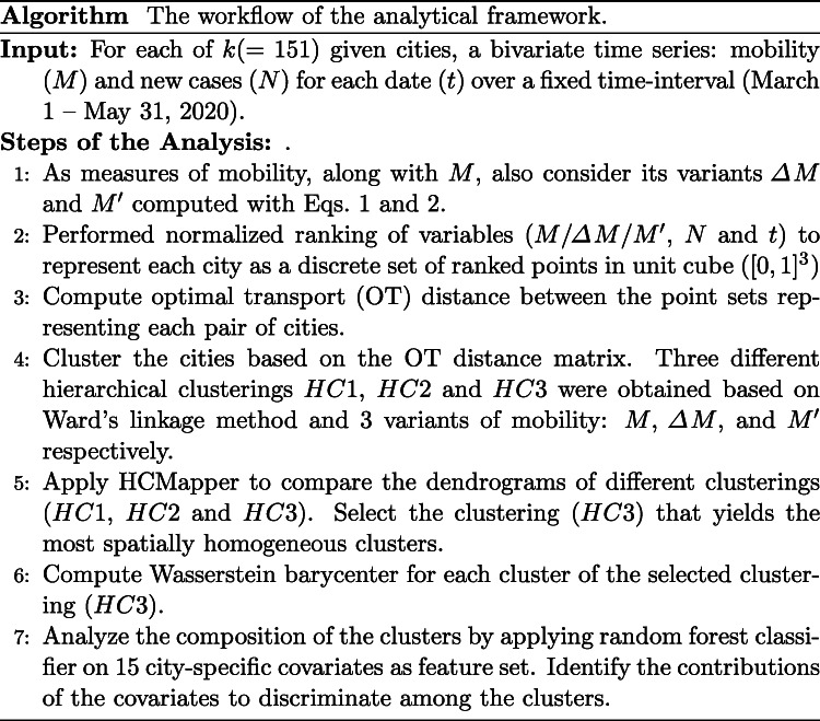
Below, we list the steps of the overall workflow of our framework, and briefly describe each in the following paragraphs of this section.
Temporal patterns of mobility
To better understand the temporal patterns of mobility, in addition to the given non-negative mobility index M, we also use two variants: delta mobility ΔM and local derivative defined as follows:
| 1 |
and
| 2 |
Here ΔM is the first difference, and approximately the local derivative (Keogh and Pazzani, 2001), of the time series M, and yet, unlike M, these variants are not restricted to be non-negative.
Representing a city as discrete set of points
With the above definitions, the temporal relationship between mobility (and its variants) and new cases of each city in our data can be depicted as triplets (, N, t). We represent the time series by performing a normalized ranking of the variables so as to represent each city by a discrete set of points in unit cube [0,1]3. This normalized ranking is frequently used as a estimator for empirical copulas with good convergence properties (Deheuvels, 1980). The cities can have different representations by considering the three definitions of mobility metrics, and in each case, we can have different groupings of cities. A comparative analysis of all groupings can provide a correlation structure between groups of cities from different perspectives.
Comparing cities using optimal transport
To distinguish between the temporal dependence between mobility and new cases of a given pair of cities, we used Wasserstein distance from optimal transport theory. We computed Wasserstein distance between two discrete sets of points in unit cube, corresponding to two cities, as the minimum cost of transforming the discrete distribution of one set of points to the other set. It can be computed without the need of such steps as fitting kernel densities or arbitrary binning that can introduce noise and artefacts to data.
Wasserstein distance between two distributions on a given metric space M is conceptualized by the minimum “cost” to transport or morph one pile of dirt into another – the so-called ‘earth mover’s distance’. This “global” minimization over all possible ways to morph takes into consideration the “local” cost of morphing each grain of dirt across the piles (Peyré et al. 2019).
Given a metric space , the distance optimally transports the probability μ defined over to turn it into ν:
| 3 |
where p ≥ 1, τ(μ,ν) denotes the collection of all measures on with marginals μ and ν. The intuition and motivation of this metric came from optimal transport problem, a classical problem in mathematics, which was first introduced by the French mathematician Gaspard Monge in 1781 and later formalized in a relaxed form by L. Kantorovitch in 1942. More recently, the use of Wasserstein distances in machine learning (also known as Earth Mover Distances) highlighted the advantages of cross-bin distances between histograms especially in computer vision (Rubner et al. 2000). Here, we used Wasserstein distance to cluster temporal dynamics as it preserves the overall geometry of the compared distributions without being sensitive to small variations or “wiggles” therein.
Clustering the cities
Upon computing optimal transport based distances for each pair of cities, hierarchical clustering of the cities was performed using Ward’s minimum variance method (Nielsen, 2016). For the 3 variants of mobility (), we obtained 3 different hierarchical clusterings: HC1, HC2 and HC3 respectively. Given a dendrogram and a prescribed number of k clusters, we can “extract” from the dendrogram a flat partition of the data into k clusters by using dynamic programming (Nielsen, 2016). The dendrogram is drawn on the plane using the height function arising from the linkage function. A typical cut consists in finding the height h so that a line y = h cuts the dendrogram into k tree edges. A “best cut” (e.g., minimizing the sum of cluster variances like in k-means) can be calculated efficiently from dynamic programming. Then we get a x-monotone polyline cutting the embedded dendrogram into k locations (Nielsen, 2016).
Comparing the clusterings
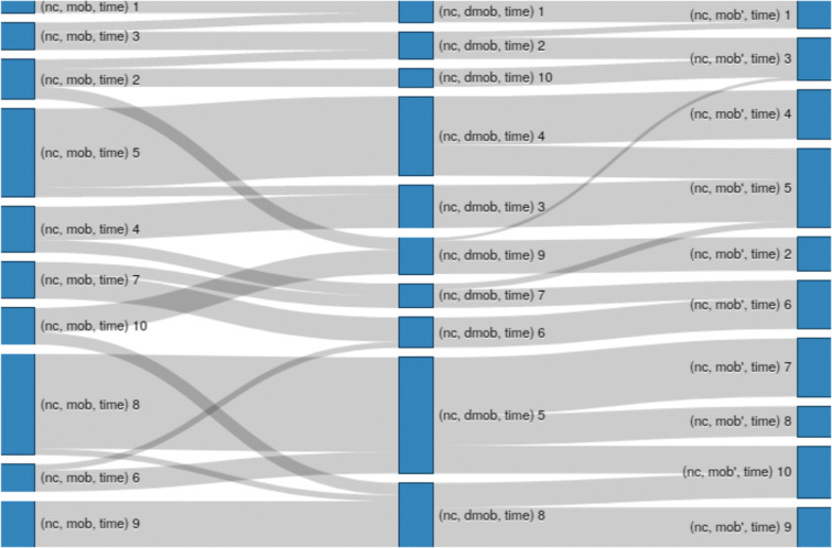
The resulting clusters are compared using a visualization tool called HCMapper (Marti et al. 2015). HCMapper can compare a pair of dendrograms of two different hierarchical clusterings computed on the same dataset. It aims to find clustering singularities between two models by displaying multiscale partition-based layered structures. The three different clustering results are compared with HCMapper to sought out the structural instabilities of clustering hierarchies. In particular, the display graph of HCMapper has n columns, where n represents the number of hierarchies we want to compare (here n = 3). Each column consists of the same number of flat clusters, which are depicted as rectangles within the column. The rectangle size is proportional to the number of cities within the clusters, while an edge between two clusters depicts the number of shared cities between them. Thus, a one-to-one mapping between the clusters of two columns likely depicts a perfectly similar clustering whereas too many edges crossing between two columns describe a dissimilar structure.
We also checked the spatial homogeneity of a clustering in terms of the average number of clusters in which the cities of each state were assigned to, over all states that are represented in our data. Moran’s I statistic to assess the spatial correlation among the cluster labels was also computed.
Summarizing the distinctive cluster patterns
We summarize the overall pattern of each identified cluster by computing its barycenter in Wasserstein space. It efficiently describes the underlying temporal dependence between the measures of mobility (here we use ) and disease incidence within each cluster. Wasserstein distances have several important theoretical and practical properties (Pele and Werman, 2009; Villani, 2008). Among these, a barycenter in Wasserstein space is an appealing concept which already shows a high potential in different applications such as, in artificial intelligence, machine learning and statistics (Benamou et al. 2015; Carlier et al. 2015; Cuturi and Doucet, 2014; LeGouic and Loubes, 2017).
A Wasserstein barycenter (Agueh and Carlier, 2011; Cuturi and Doucet, 2014) of n measures ν1…νn in is defined as a minimizer of the function f over , where
| 4 |
A fast algorithm (Cuturi and Doucet, 2014) was proposed to minimize the sum of optimal transport distances from one measure (the variable μ) to a set of fixed measures using gradient descent. These gradients are computed using matrix scaling algorithms in a considerable lower computational cost. We have used the method proposed in Cuturi and Doucet (2014) and implemented in the POT library (https://pythonot.github.io/) to compute the barycenter of each cluster.
Analysis of the clusters using static covariates
To characterize the composition of the identified clusters, i.e., what could explain the similarity in the temporal dependence between mobility and new cases of the cities that belong to a cluster, we used different city-specific population covariates from the U.S. census and CDC data, while checking their relative contributions to discriminating the clusters. These covariates include (a) date of Stay-at-home order, (b) population size, (c) persons per household, (d) senior percentage, (e) Black percentage, (f) Hispanic percentage, (g) poor percentage, (h) population density in 2010, (i) SVI ses (j) SVI minority, (k) SVI overall, and (l) Gini index of income inequality (Farris, 2010). Here SVI stands for Social Vulnerability Index of CDC, and “ses” socioeconomic status. In addition, we also compute the ‘reaction time’ (RT) of each city as the number of days between the stay-at-home-order at a given city and a common reference starting point date, which was taken as March, 15, 2020.
This step also provided a form of external validation of the clustering results as none of the covariates were used for our unsupervised clustering. We demonstrated this step with the clustering results of HC3.
Using the covariates as features of the cities, a random forest classifier is trained to learn the cluster labels. The aim is to see how the clustering could be explained by the covariates. To find which of the features contribute most to discriminate the clusters of cities we computed the mean Shapley values (Lundberg and Lee, 2017). A Shapley value quantifies the magnitude of the impact of the features on the classification task. The ranking of the covariates/features based on the mean Shapley values determines the most relevant features in this regard.
Results
In this study, we analyzed a bivariate time series on daily values of mobility index and COVID-19 incidence over a 3-month time-period (March 1 to May 31, 2020) for 151 U.S. cities that had reported at least 1,000 cases by the end of this period. By transforming the data of each city to a corresponding discrete set of ranked points on the unit cube, we computed the Optimal Transport distance as measure of temporal dependency between mobility and new cases for each pair of cities. Three variants of mobility (M/ΔM/) allowed us to generate 3 hierarchical clusterings: (a) HC1, (b) HC2 and (c) HC3, as shown in Fig. 1. Each clustering yielded 10 clusters of cities, which were compared for their sizes, singularities and divergences by the tool HCMapper, as shown in Fig. 2.
Figure 1.
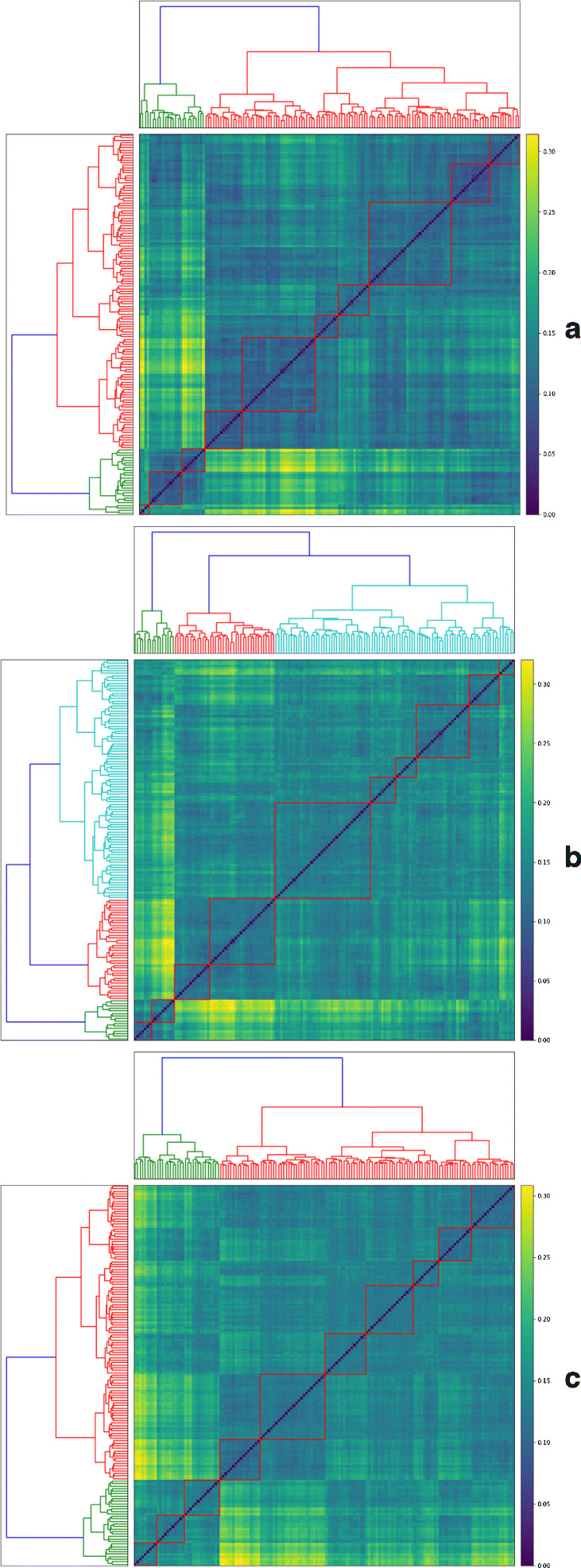
The dendrograms show 3 hierarchical clusterings of cities aHC1 (N, M, t), b HC2 (N, ΔM, t), and c HC3 (N, , t) using Ward’s linkage. Based on visual inspection of the seriated distance matrix, 10 clusters were identified in each case, as shown on the heatmaps
Figure 2.
HCMapper is used for comparing 3 hierarchical clusterings: HC1(N, M, t), HC2(N, ΔM, t) and HC3(N, , t). The cluster sizes and divergences across the clusterings are shown with blue rectangles and grey edges respectively
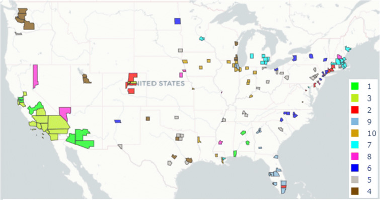
Among the clusterings, HC3 appeared to have clusters of consistent sizes, and also the fewest singularities and divergences. Further, when we mapped the counties representing the cities with cluster-specific colors, as shown in Fig. 3, we observed that the HC3 clusters showed high spatial correlation (Moran’s I giving p-value of 0). They also showed the least disagreements among the cluster assignments of cities with each state, although some states like California and Florida contained cities from more than one cluster (see all clusters in Table 1). We looked into possible explanations of such cluster-specific differences using local covariates, as shown in the boxplots of Fig. 4.
Figure 3.
The geographic distribution of the 10 clusters of COVID-19 affected U.S. cities as identified by HC3 are shown. The county corresponding to each city is mapped in its cluster-specific color
Table 1.
Details of the 10 clusters of COVID-19 affected U.S. cities as identified by HC3
| Id | Size | Members (FIPS code of the corresponding counties) |
|---|---|---|
| 1 | 9 | 4027, 6001, 6013, 6019, 1073, 4019, 1097, 1101, 4013 |
| 2 | 11 | 12011, 10003, 11001, 9003, 9009, 9001, 8059, 8123, 8005, 8031, 8041 |
| 3 | 14 | 6029, 6037, 6059, 6065, 6073, 6067, 6071, 6075, 6081, 6083, 6085, 8001, 6107, 6111 |
| 4 | 16 | 55101, 55059, 55079, 53053, 55009, 53061, 53077, 49035, 49049, 53033, 51510, 51760, 48201, 48375, 48439, 48453 |
| 5 | 26 | 39153, 40109, 41051, 39095, 39099, 39049, 39061, 46099, 47037, 47149, 47157, 42101, 44003, 44007, 45079, 42095, 42069, 42077, 42003, 42011, 48157, 48113, 48121, 48141, 48029, 48085 |
| 6 | 16 | 34021, 34031, 34039, 35001, 36001, 36029, 36061, 39035, 37183, 38017, 37119, 37067, 37081, 36067, 36119, 37063 |
| 7 | 19 | 22071, 23005, 24510, 25005, 25009, 25013, 25017, 25021, 25023, 26049, 25025, 25027, 27123, 26163, 27053, 26125, 26161, 26081, 26099 |
| 8 | 10 | 33011, 34007, 34013, 34017, 28049, 29510, 31055, 31109, 32003, 32031 |
| 9 | 13 | 12031, 12057, 12095, 12099, 12071, 12086, 12103, 12105, 17043, 13089, 13095, 13121, 17031 |
| 10 | 17 | 22033, 22051, 19153, 19193, 20209, 21111, 22017, 17089, 17201, 17097, 17197, 18003, 18057, 18089, 18097, 18141, 19013 |
Figure 4.
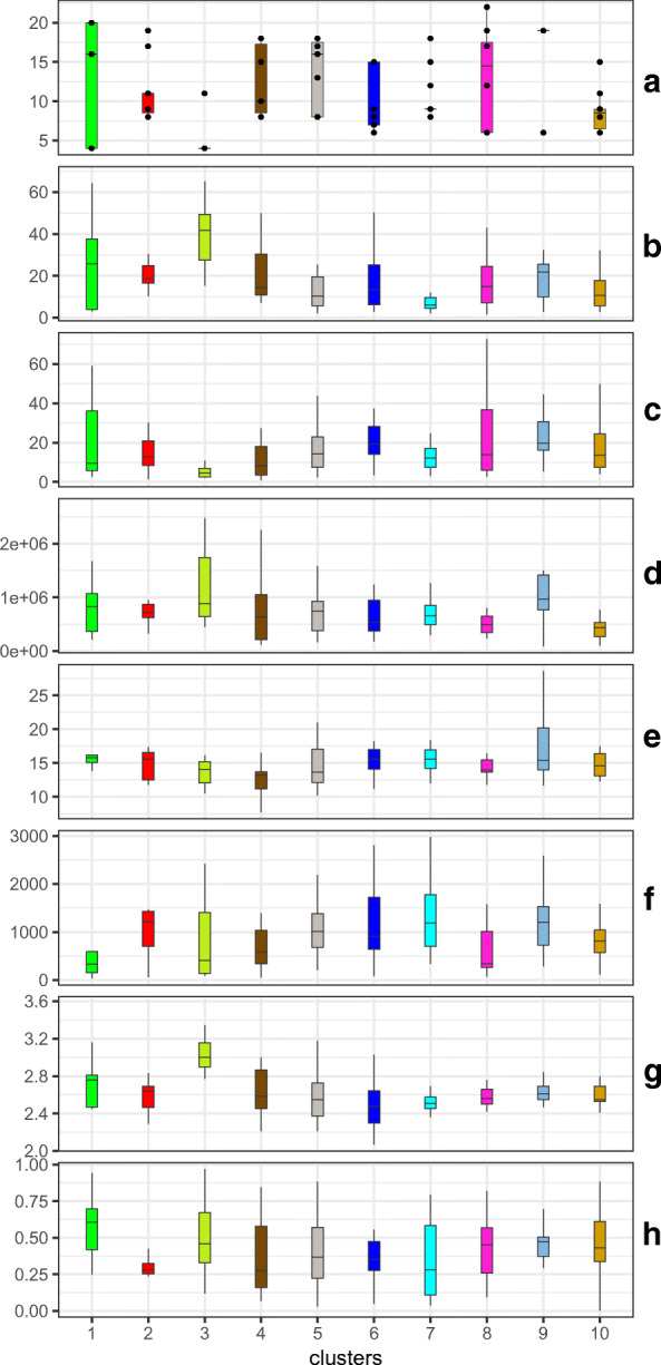
The boxplots show the differences across the identified 10 clusters of cities identified by HC3 in terms of the values of the 8 most significant covariates: a Reaction Time (RT), b Hispanic percent, c Black percent, d population size, e senior percent, f population density 2010, g persons per household, and h SVI ses. We jittered the overlapping RT points for easy visualization
Given a cluster C consisting of n cities’ temporal relationships, how does one determine its “typical” relationship? A Wasserstein barycenter allows us to summarize n distributions, or the points sets corresponding to the cities in C, essentially by converting them to quantiles and averaging. Given the assumption of this study is that there are dynamic relationships between mobility and COVID-19 incidence that changed not only over time but also across locations and populations, we computed Wasserstein barycenters of the 10 identified clusters, as shown in Fig. 5, to describe the overall dependency structure that is specific to each cluster. The temporal changes in the dependencies are shown in 3-dimensional plots, as the shading changes from light (early points) to dark green (later points) along the z-axis (time).
Figure 5.
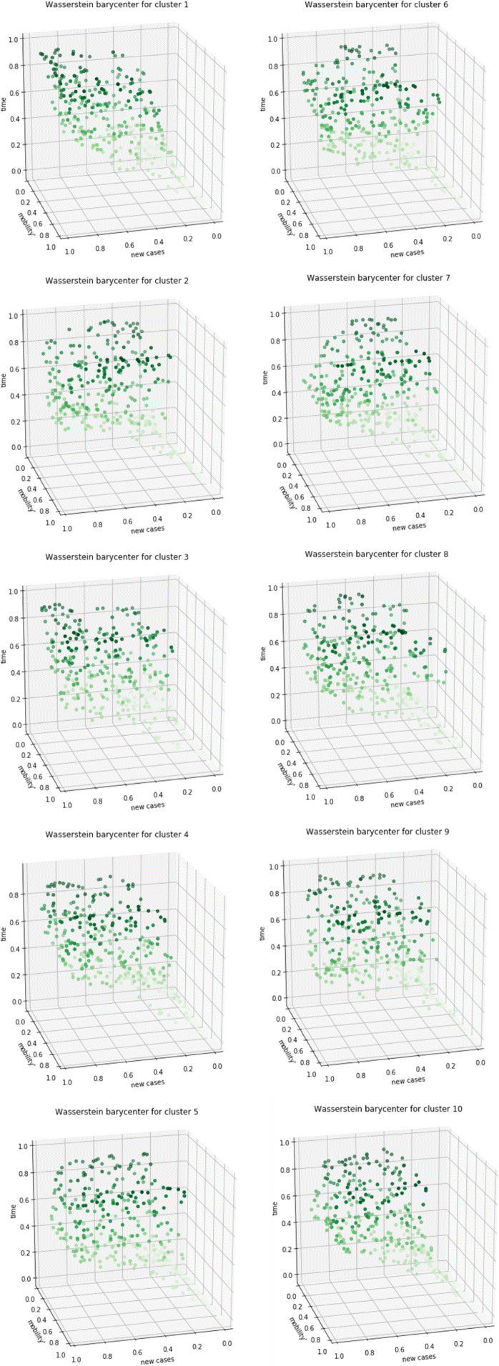
The overall temporal pattern of dependency between normalized measures of mobility and COVID-19 incidence for each cluster of cities identified by HC3 is shown along 3 dimensions (N, , t). The Wasserstein barycenters of the 10 clusters are depicted within the unit cube with the darker dots representing later points in time (z-axis)
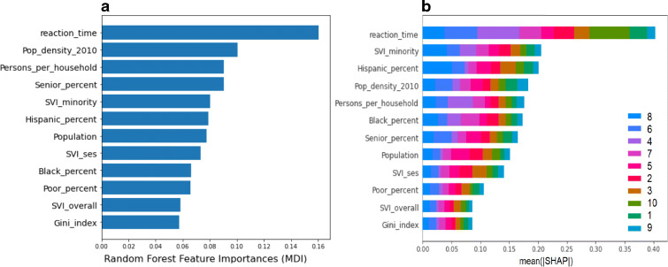
Finally, to understand potential factors underlying the dynamic patterns of each cluster, we used the local covariates, as described above. Using Random Forest (RF) classification, we identified socioeconomic characteristics (based on the covariates) of each of the cities that could discriminate among the assigned cluster labels. The most significantly discriminating covariates are shown in Fig. 6, along with their cluster-specific contributions of each covariate. We performed sensitivity analysis using the Mean Decrease in Impurity (MDI) feature importance measure embedded in RF (Louppe et al. 2013), and the results are shown in Panel (a). In addition, we also computed the mean Shapley values (SHAP) to measure the relative cluster-specific contributions to identify the most discriminating features, as shown in Panel (b). While these two approaches do not measure the exact same effect, the results are nonetheless quite consistent. For example: reaction_time is the most significant feature in both, and the 3 least significant features also appear in the same order. The ranks hardly change for most features, and some like Hispanic_percent and persons_per_household are highly correlated. Thus, despite the minor differences in the two measures, we find the feature selection results to be quite consistent. Importantly, none of these covariates were used to guide our clustering, and yet, are able to discriminate among the clusters. Indeed, Fig. 4 shows the distinctive distributions of the 8 most significant of these covariates across the 10 clusters identified by HC3. Reaction time is robustly the first and major contributor, which is indicative of the effects of stay-at-home on the different patterns of COVID-19 dynamics.
Figure 6.
The most significant of the static city-specific covariates in discrimination of the 10 clusters identified by HC3. The contributions towards each cluster are measured by a the embedded method of RF classifier (MDI), and b the mean Shapley values for each covariate
Discussion
Wasserstein metrics are useful in machine learning and computer vision because they allow us to compute dissimilarity between two empirical distributions usually with non-matching supports, or between a continuous distribution and an empirical distribution (see Peyré et al. (2019) for several examples). In contrast, the common distances between discrete distributions such as Kullback-Leibler (KL) divergence (and more generally Csiszár f -divergences) on normalized histograms require aligned bins, and are invariant to permutations of the sample space. Further, the KL divergence becomes infinite when the distribution supports do not match. For computational purposes, an entropy-regularization of the Wasserstein distance known as Sinkhorn divergence allows fast calculation of an upper bound of the Wasserstein distance (Cuturi, 2013). In fact, Wasserstein distances belong to the wider family of Integral Probability Metrics (Amari et al. 2019; Sriperumbudur et al. 2010). The present study is a novel application of this metric to identify patterns of infectious disease dynamics.
The U.S. was alone among the countries in the industrialized world where the expected “flattening of the curve” did not take place by mid-2020. Yet, 45 states in the U.S. were in various phases of re-opening and 5 states did not have shelter-in-place orders. By mid-June, a “second wave” of cases had started to rise in the U.S. with the weekly average exceeding 20 infections per 100,000 inhabitants for the first time. By June 26, there were 2.5 million confirmed cases and over 120,000 deaths. Some states that had begun to re-open parts of their economy paused or delayed opening in the face of a surge of new cases.
Estimating the impact of mitigation strategies on cases and deaths in the U.S. is challenging particularly due to the lack of uniformity in their timing, implementation, enforcement, and adherence across states. Nevertheless, early observations point to the utility of such measures, particularly shelter-in-place orders in reducing infection spread and deaths (as per data from California and Washington State) (COVID-19 projections ). Counties implementing shelter-in-place orders were associated with a 30.2% reduction in weekly cases after 1 week, 40% reduction after 2 weeks, and 48.6% reduction after 3 weeks (Fowler et al. 2020) Conversely, model projections estimated a steady rise in cases and over 181,000 deaths if such mitigation strategies were to be eased and not re-enforced before October 1 (COVID-19 projections 2020).
As a result, many researchers worldwide are currently investigating the changes in social and individual behaviors in response to the sudden yet prolonged outbreaks of COVID-19, e.g., Adiga et al. (2020), Badr et al. (2020), Das et al. (2020), Warren and Skillman (2020), and Xiong et al. (2020). As the pandemic progresses, and until medical treatments or vaccination are commonly available, new and diverse patterns of human mobility, be they voluntary or via policy interventions, may emerge in different societies. It is, therefore, of great importance to epidemiologists and policy-makers to understand the dynamic yet location-specific patterns of dependency between human mobility and COVID-19 incidence in order to evaluate the impact of such measures as precisely as possible. In this study, we have shown that such dependencies not only change over time but across locations and populations, and are likely to be determined by underlying socioeconomic characteristics. Our analytical approach is particularly relevant considering the high socioeconomic costs of such measures.
We understand that our study has some limitations. We note that each step of our framework could be improved in isolation or as a pipeline, which we aim to do in our future work. We also draw attention to the so-called ecological fallacy in inferring about individual health outcomes based on data or results that are obtained at either city or county levels. Such inference may suffer from incorrect assumptions and biases, which, however unintentional, must be avoided. Any views that might have reflected on the analysis or results of our study are those of the authors only, and not the organizations they are associated with.
Footnotes
Publisher’s Note
Springer Nature remains neutral with regard to jurisdictional claims in published maps and institutional affiliations.
References
- Adiga, A., Wang, L., Sadilek, A., Tendulkar, A., Venkatramanan, S., Vullikanti, A., Aggarwal, G., Talekar, A., Ben, X., Chen, J. et al. (2020). Interplay of global multi-scale human mobility, social distancing, government interventions, and COVID-19 dynamics. medRxiv, 10.1101/2020.06.05.20123760.
- Agueh M, Carlier G. Barycenters in the Wasserstein space. SIAM J. Math. Anal. 2011;43:904–924. doi: 10.1137/100805741. [DOI] [Google Scholar]
- Amari S, Karakida R, Oizumi M, Cuturi M. Information geometry for regularized optimal transport and barycenters of patterns. Neural Comput. 2019;31:827–848. doi: 10.1162/neco_a_01178. [DOI] [PubMed] [Google Scholar]
- Badr HS, Du H, Marshall M, Dong E, Squire MM, Gardner LM. Association between mobility patterns and covid-19 transmission in the USA: a mathematical modelling study. Lancet Infec. Dis. 2020;20:1247–1254. doi: 10.1016/S1473-3099(20)30553-3. [DOI] [PMC free article] [PubMed] [Google Scholar]
- Benamou J-D, Carlier G, Cuturi M, Nenna L, Peyré G. Iterative Bregman projections for regularized transportation problems. SIAM J. Scie. Comp. 2015;37:A1111–A1138. doi: 10.1137/141000439. [DOI] [Google Scholar]
- Carlier G, Oberman A, Oudet E. Numerical methods for matching for teams and Wasserstein barycenters. ESAIM: Math. Mod. Num. Anal. 2015;49:1621–1642. doi: 10.1051/m2an/2015033. [DOI] [Google Scholar]
- COVID-19 projections (2020). Institute for Health Metrics and Evaluation. Website. https://covid19.healthdata.org/united-states-of-america.
- Cuturi M. Sinkhorn distances: Lightspeed computation of optimal transport. Adv. Neur. Proc. Syst. 2013;26:2292–2300. [Google Scholar]
- Cuturi, M. and Doucet, A. (2014). Fast computation of Wasserstein barycenters. 31st Int. Conf. Mach. Learn. (PMLR), 685–693.
- Das S, Ghosh P, Sen B, Pyne S, Mukhopadhyay I. Critical community size for COVID-19: A model based approach for strategic lockdown policy. Stat. & App. 2020;18:181–196. [Google Scholar]
- DCPD-202000156 - Proclamation 9994-Declaring a National Emergency Concerning the Novel Coronavirus Disease (COVID-19) Outbreak. (2020). Website. https://www.govinfo.gov/app/details/DCPD-202000156.
- Deheuvels, P. (1980). Non parametric tests of independence. In Raoult JP. (ed). Statistique non Paramétrique Asymptotique. Lecture Notes in Mathematics, Springer, 821, 95–107.
- Farris FA. The Gini index and measures of inequality. American Math. Monthly. 2010;117:851–864. doi: 10.4169/000298910x523344. [DOI] [Google Scholar]
- Flaxman S, Mishra S, Gandy A, Unwin HJT, Mellan TA, Coupland H, Whittaker C, Zhu H, Berah T, Eaton JW, et al. Estimating the effects of non-pharmaceutical interventions on COVID-19 in Europe. Nature, 2020;584:257–261. doi: 10.1038/s41586-020-2405-7. [DOI] [PubMed] [Google Scholar]
- Fowler, J. H., Hill, S. J., Obradovich, N. and Levin, R. (2020). The effect of stay-at-home orders on COVID-19 cases and fatalities in the United States. medRxiv, 2020.04.13.20063628. [DOI] [PMC free article] [PubMed]
- Ghinai I, McPherson TD, Hunter JC, Kirking HL, Christiansen D, Joshi K, Rubin R, Morales-Estrada S, Black SR, Pacilli M, et al. First known person-to-person transmission of severe acute respiratory syndrome coronavirus 2 (SARS-CoV-2) in the USA. Lancet. 2020;395:1137–1144. doi: 10.1016/S0140-6736(20)30607-3. [DOI] [PMC free article] [PubMed] [Google Scholar]
- Keogh, E. J. and Pazzani, M. J. (2001). Derivative dynamic time warping. Proc. 2001 SIAM Int. Conf. on Data Mining, 1-11.
- LeGouic T, Loubes J-M. Existence and consistency of Wasserstein barycenters. Prob. Theory Rel. Fields. 2017;168:901–917. doi: 10.1007/s00440-016-0727-z. [DOI] [Google Scholar]
- Louppe G, Wehenkel L, Sutera A, Geurts P. Understanding variable importances in forests of randomized trees. Adv. Neu. Info. Pro. Syst. 2013;26:431–439. [Google Scholar]
- Lundberg SM, Lee S-I. A unified approach to interpreting model predictions. Adv. Neur. Inf. Proc. Syst. 2017;30:4765–4774. [Google Scholar]
- Marti, G., Donnat, P., Nielsen, F. and Very, P. (2015). HCMapper: An interactive visualization tool to compare partition-based flat clustering extracted from pairs of dendrograms. arXiv:1507.08137.
- Nielsen, F. (2016). Hierarchical clustering. In Introduction to HPC with MPI for Data Science, Springer, 195-211.
- Pele, O. and Werman, M. (2009). Fast and robust earth mover’s distances. In. 2009 IEEE 12th Int. Conf. Comput. Vis. p. 460–467. 10.1109/ICCV.2009.5459199.
- Peyré G, Cuturi M, et al. Computational optimal transport: With applications to data science. Found. Trend. Mach. Learn. 2019;11:355–607. doi: 10.1561/2200000073. [DOI] [Google Scholar]
- Rubner Y, Tomasi C, Guibas LJ. The earth mover’s distance as a metric for image retrieval. Int. J. Comp. Vis. 2000;40:99–121. doi: 10.1023/A:1026543900054. [DOI] [Google Scholar]
- Sriperumbudur, B. K., Fukumizu, K., Gretton, A., Schölkopf, B. and Lanckriet, G. RG (2010). Non-parametric estimation of integral probability metrics. In. 2010 IEEE International Symposium on Information Theory, 1428–1432.
- Social distancing for coronavirus is flattening the curve, California and Washington data show – The Washington Post (2020) Website. https://www.washingtonpost.com/nation/2020/04/01/lockdown-coronavirus-california-data/.
- Villani, C. (2008). Optimal Transport. A Series of Comprehensive Studies in Mathematics, 338. Springer.
- Warren, M. S. and Skillman, S. W. (2020). Mobility changes in response to COVID-19. arXiv:2003.14228.
- Xiong C, Hu S, Yang M, Luo W, Zhang L. Mobile device data reveal the dynamics in a positive relationship between human mobility and COVID-19 infections. Proc. Nat. Acad. Sci. . 2020;117:27087–27089. doi: 10.1073/pnas.2010836117. [DOI] [PMC free article] [PubMed] [Google Scholar]


