Abstract
We demonstrate a selection of network and machine learning techniques useful in the analysis of complex datasets, including 2-way similarity networks, Markov clustering, enrichment statistical networks, FCROS differential analysis and random forests. We demonstrate each of these techniques on the Populus trichocarpa gene expression atlas.
Keywords: Differential Analysis, FCROS, Fisher Exact Test, Enrichment, Similarity Network, Random Forests, Machine Learning
1. Introduction
1.1. Basic Network Theory
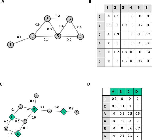
Networks are useful tools for the representation and analysis of complex biological datasets. A single network represents a system as a collection of objects (nodes) connected by links (edges) representing relationships between the objects [1] (see Figure 1A). A node can represent any biological object (gene, protein, sample, phenotype, metabolite, etc) and edges can represent any qualitative or quantitative relationship between pairs of objects, for example the co-expression between genes, or the similarity between the microbial species content of two soil samples.
Fig. 1. Networks and Adjacency Matrices.
(A) Network (B) Adjacency Matrix, respective entries in the adjacency matrix indicate the edge weight of an edge that is between nodes which are given by the respective row/column pairs. A weight of zero indicates the absence of an edge, while in an unweighted network the default edge weight is 1. (C) Bipartite Network (D) Adjacency matrix for bipartite network.
Networks in which each node is of the same type can be represented by a standard adjacency matrix, which is simply a table in which rows and columns represent nodes, and each entry ij is 1 if node i is connected to node j, or zero otherwise [2]. Alternatively, one can set each entry ij to the the strength of the relationship between nodes i and j, called the edge weight [2]. For example, nodes can represent genes within an organism, and edges can represent the co-expression between those genes across various tissues. A simple example of a network and its adjacency matrix are shown in Figures 1A and 1B respectively.
One can also have networks in which the nodes fall into one of two classes. Such networks are called bipartite networks [2]. For example, each node in a bipartite network can represent either a sample or a species, and we connect a species node to a sample node if the species occurs within that sample. A small example bipartite network and its adjacency matrix are shown in Figures 1C and 1D respectively.
1.2. Data Matrix and Overview
Data can usually be structured into a matrix (table) in which columns represent samples and rows represent variables measured across the samples. Thinking abstractly about such a data structure, there are various ways in which we can probe the data. We can compare the rows pairwise in order to gain understanding of the relationships between variables, we can compare the columns pairwise in order to gain understanding of the relationships between samples, we can relate particular rows to particular columns in order to understand which variables are particularly important in which samples and we can perform differential analysis to identify which variables have significant differences across samples.
In this chapter, we describe a protocol for the probing and unpacking of a complex biological dataset which involves each of these different types of analyses, and we demonstrate the outcomes of these analyses on the Populus trichocarpa gene expression atlas dataset. In particular we will outline approaches for the following:
Enrichment Networks
Sample-variable enrichment allows for the statistical association between samples and variables. Given a matrix in which rows represent variables and columns represent samples, the right-tailed Fisher Exact Test can be used to answer the question “is variable x enriched in sample y. This is similar to the concept of determining if an ontology term is enriched in a set of genes, as done by Gene Ontology enrichment software such as GOEAST [3]. Applying matrix-wide Fisher Exact Tests to the gene atlas expression matrix will determine which samples each gene is enriched in.
Sample similarity, gene co-expression and clustering
Pairwise comparison of the expression profiles of genes across tissues and subsequent thresholding allows for the construction of a gene co-expression network (see for example [4,5]). Clustering of the co-expression network with a clustering algorithm such as Markov Clustering (MCL) [6,7] allows one to extract groups of genes which have similar expression relationships across tissues. One can also perform pairwise comparison of sample vectors to identify which samples have similar overall gene expression patterns.
DUO Similarity Networks
DUO is a similarity metric developed by Sharlee Climer, [8]. It categorizes values in an expression matrix into high, medium and low values, and then for each pair of objects, it calculates a scaled co-occurrence of all 4 possible combinations of high values and low values. Thus, unlike most similarity metrics, the comparison of the expression profiles of two genes will result in 4 comparisons: high values in gene A vs high values in gene B, high values in gene A vs low values in gene B, low values in gene A vs high values in gene B, and low values in gene A vs low values in gene B. The structure of the DUO similarity metric is similar to the SNP (Single Nucleotide Polymorphism) correlation metric, CCC, also developed by Sharlee Climer et. al [9,10].
FCROS Differential Analysis
We can investigate the difference between parts of a variable vector, where the variable vector is partitioned based on some sample characterization. The Fold Change Rank Order Statistic (FCROS), from [11], is a method that allows us to obtain statistically significant estimates of the degree of difference of observations (variables) measured under a set of conditions. In our case we can view sets of samples (columns), as representing these respective conditions, and can therefore answer the question of whether or not a variable’s measurements are higher/lower in one condition versus another.
Random Forests
Random Forest is a machine learning method originally developed by [12]. It uses an ensemble approach for classification and or regression. This involves the construction and growing of multiple decision trees followed by the aggregation of the results from the respective trees. It is therefore essentially a bagging approach. The out-of-bag error for each variable, over all trees, can be used to assess the respective variable’s importance in the overall classification or regression. It is worth noting that this approach is robust to overfitting and noisy data [13].
2. Materials
2.1. Data
The Populus trichocarpa gene atlas expression dataset was analyzed on the Oak Ridge National Laboratory’s OLCF (Oak Ridge Leadership Computing Facility) supercomputer platform. The RNASeq dataset consisted of Illumina paired-end sequencing reads for 81 samples representing various tree components, including roots, root tips, buds, stems, leaves, etc. at different growth and developmental stages.
2.2. Software/packages
Table 1 provides a list of publicly available software packages/libraries used in this analysis. Basic custom Perl and R scripts were also used.
Table 1.
Packages, libraries and resources used.
| Resource | Reference |
|---|---|
| Perl libraries | Available from http://www.cpan.org/ |
| Text::NSP::Measures::2D::Fisher Perl module | [22] |
| Graph::Undirected | Jarkko Hietaniemi |
| R libraries/resources | |
| R | [24] |
| RStudio | [25] |
| data.table | [33] |
| fcros | [11] |
| ggplot2 | [26] |
| ggthemes | [27] |
| pbdMPI | [34] |
| randomforest | [19] |
| reshape | [28] |
| Other | |
| MCL-Edge | [6,7] |
| Cytoscape | [17] |
3. Methods
3.1. Data Preparation
Quality trimming the paired end reads using Skewer software [14].
Mapping the reads to the Populus trichocarpa reference genome using Star [15], (see Note 1).
- Calculate Transcripts per killobase million (TPMs), as follows:
- Divide the read counts by the length of the gene in kilobases. This gives the reads per kilobase (RPK).
- Count up all the RPK values in a sample and divide this number by 1,000,000. This gives the “per million” scaling factor.
- Divide the RPK values by the “per million” scaling factor. This gives the TPM.
3.2. Matrix-Wide Fisher Exact Test and Enrichment Networks
Construct the m × n gene expression matrix M in which rows represent genes, columns represent samples and each entry represents the expression (TPM) value of gene i in tissue j.
Scale each entry xij in each row i as follows: (see Note 2).
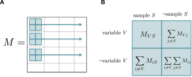
For each entry xij in the matrix M, construct the contingency table shown in Figure 2B and calculate the right-tailed Fisher exact test on that contingency table (see Note 3).
Perform the Benjamini-Hochberg procedure [16] for controlling the false discovery rate across all N = m×n p-values in order to determine which sample-variable associations are statistically significant as follows: Let P1, P2, …PN be the N p-values in ascending order, and their corresponding hypotheses H1, H2, ···, HN. Sequentially for each p-value, determine whether where i ∈ {1…N} for a chosen FDR level of α. Find the largest i = L for which the inequality holds, and reject null hypotheses H1…HL (see Note 4). If there are p-values which tie with the p-value of the last rejected hypothesis, we reject those as well.
Represent the resulting rejected hypotheses (associations between genes and samples) as a bipartite network in which each node represents either a gene or a sample, and each edge represents a rejected null hypothesis, statistically associating a gene with a sample, in sif format (see Note 5).
Visualize the resulting network by loading the sif file into Cytoscape [17] and applying the desired color schemes (see Note 6, Figure 3).
Fig. 2. Matrix Fisher Exact Test:
(A) The Fisher Exact Test is calculated for every entry in the expression matrix M. (B) Contingency table constructed for each entry in the expression matrix M.
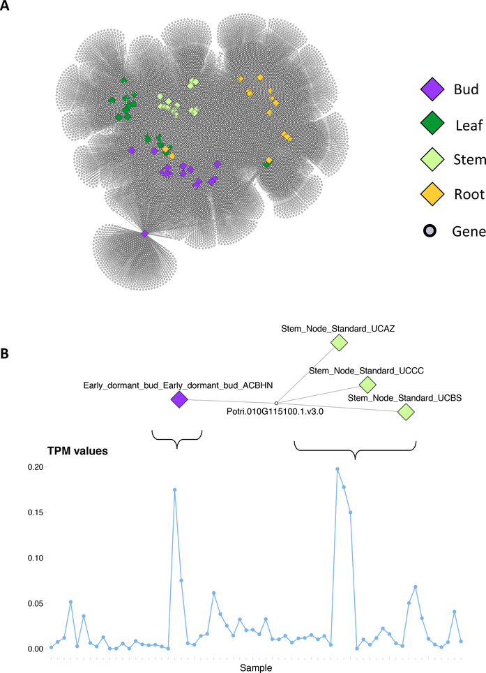
Fig. 3. Enrichment Network:
(A) Enrichment network for the P. trichocarpa gene atlas. Large diamond nodes represent samples, colored according to source tissue. Small grey nodes represent genes. An edge connects a gene to a sample if that gene’s expression is significantly expressed in that sample, as determined using the right-tailed Fisher exact test and FDR correction. (B) An example of a gene enriched in 4 of the samples and the expression profile (TPM values) of the gene.
3.3. Variable Similarity Networks and Clustering
Construct the m × n gene expression matrix M in which rows represent genes, columns represent samples and each entry represents the expression (TPM) value of gene i in tissue j.
Calculate the Pearson correlation coefficient between all pairs of genes (rows) using the mcxarray program from the MCL-Edge software package [6,7] available from http://micans.org/mcl/ (see Notes 7 and 8).
Convert the resulting output in mcl matrix format to line-based format using the mcxdump program in the MCL-Edge software package, and then convert the line-based format to sif format. (see Note 9).
Choose a threshold t, and remove all edges (lines in the sif file) for which |w| ≥ t where w is the Pearson correlation edge weight (see Note 10).
Load the sif file into Cytoscape for visualization.
Use MCL [6,7] to cluster the thresholded similarity network into modules of co-expressed genes (see Note 11).
3.4. Sample Similarity Networks and Maximum Spanning Trees
Construct the m × n gene expression matrix M in which rows represent genes, columns represent samples and each entry represents the expression (TPM) value of gene i in tissue j.
Calculate the Pearson correlation between all pairs of samples (columns).
Transform each Pearson edge weight wij between samples i and j as follows: (see Note 12).
Construct a Minimum Spanning Tree from the transformed network making use of Dijkstra’s algorithm (see Note 13).
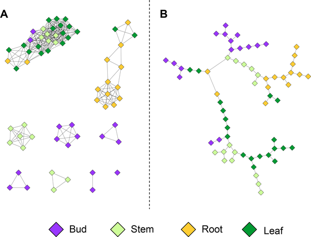
Visualize the network in Cytoscape (see Figure 4).
Fig. 4. Sample Similarity Networks.
(A) Pearson sample similarity network at a threshold of 0.8. (B) Pearson sample similarity MST.
3.5. DUO Similarity Networks
Given our expression matrix M in which rows represent genes and columns represent samples, scale each entry xij as follows: (see Note 14).
Determine upper and lower thresholds U and L respectively such that 25% of the values in the scaled expression matrix lie above U and 25% of the values in the scaled expression matrix lie below L. Values above the upper threshold are marked as “high”, values below the lower threshold are marked as “low”, and the remaining values are marked as neutral.
For each pair of genes A and B, denote the high values of A and B as AH and BH respectively, and the low values of A and B as AL and BL respectively. For each pair ij where i ∈ {AH,AL} and j ∈ {BH,BL}, calculate the DUO similarity metric as where Dij represents the fraction of the vector length in which i and j co-occur, fi and fj represent the fraction of i and j in genes A and B respectively (see Note 15).
Convert the resulting DUO network to sif format.
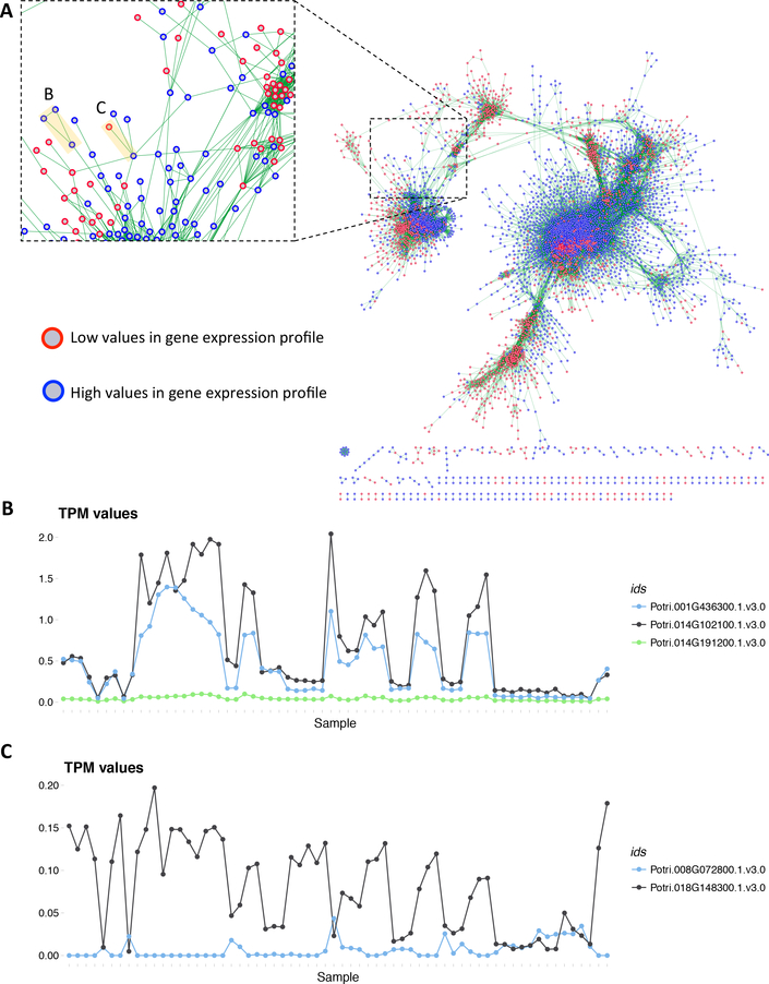
Threshold the resulting DUO network (this analysis used a threshold of 0.8), represent the network in sif format and load it into Cytoscape for visualization (see Figure 5, Note 16).
Fig. 5. DUO Network.
(A) DUO co-expression network for the P. trichocarpa gene expression atlas. Blue bordered nodes represent high expression values for a given gene, red-bordered nodes represent low expression values for a given gene. An edge (green) between two nodes represents the co-occurrence between the expression values of the two genes it connects, calculated using the DUO metric. (B) Expression profiles (TPM values) for the three genes highlighted B in panel A. (C) Expression profiles (TPM values) for the two genes highlighted C in panel A.
3.6. Fold Change Rank Order Statistic differential analysis
Load an expression matrix into R, here the rows represents genes, columns represent samples and the values represent expression values (TPM) of the given gene in the respective sample (see Note 17).
Create a model matrix, where the original samples (columns of the expression matrix) are the rows and the sample groups that will be compared are the columns. Values in the matrix are binary, indicating association between sample and sample groups, respectively (see Note 18).
Use voom [18], to perform mean-variance stabilization of the expression matrix, given the model matrix (see Note 19).
Determine valid pairs of sample groups for the differential analysis (see Note 20).
For each of the respective pairs, sub-select the expression matrix to only contains those respective columns (samples). Obtaining a list of sub-matrices.
Run the fcros function on the respective sub-matrices, assigning one sample group in the pair as the control, and the other as the case. (Notes 21)
Filter the respective results by p-value (say, for an α = 0.01). Remove results that have a f-value between a given probability bound (say, 0.1 < f-value < 0.9). Reporting for each gene, the sample group labels used in the comparison and the log2 transform of the applicable robust fold change estimate, in a 3-column tab delimited format (Notes 22).
Visualize the result as a network in Cytoscape, were nodes are given by the comparison labels and genes respectively (see Notes 23).
3.7. Random Forests sample importance
Load an expression matrix into R, here the rows represents genes, columns represent samples and the values represent expression values (TPM) of the given gene in the respective sample (see Note 17). Transpose the data, thus making the samples the rows and the genes the columns.
From meta-data regarding the samples, create meaningful groupings. This can be as simple as grouping replicates, or more involved such as grouping by tissue.
For each possible paired combination of groups, create a subset of the data. Filter out all rows that do not belong to the respective groups and add a label column, containing the respective group labels. (see Note 24).
Use the randomForest function that is in the randomForest package in R [19], ensure that the number of trees is larger than the number of columns of the data subset. Set the importance flag to TRUE. (see Note 25).
Extract the variable importance from the resultant object by using the importance function and convert it to a dataframe or data.table.
Sort by the Mean Decrease In Accuracy column in a descending order. Plot the results and choose an appropriate cutoff. Alternatively select the top N genes based on a high MeanDecreaseInAccuracy value. (Notes 26)
Collect the results from all sample pairs, recording which sample comparison was performed. Save the results in sif format. (see Notes 27)
Visualize the result as a network in Cytoscape, were nodes are given by the comparison group labels and genes respectively (see Notes 28).
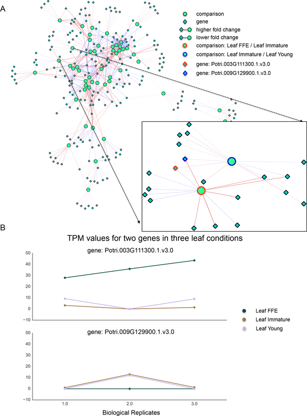
Fig. 6. FCROS Network.
(A) Network visualization of the differential results from the P. trichocarpa gene atlas gene expression data. Round light green nodes indicate comparisons between sample groups against which differential genes, the dark green diamond nodes, were tested. An edge between a gene node and a comparison node indicates that the given gene was significantly differentially expressed in the respective comparison. The color of the edge indicates whether not not then gene was over (red) or under expressed (blue) in the comparison. The over/under association is determined relative to the sample name that appears first in the comparison node label. The color intensity of the edge correlates with the absolute log fold change of expression. The box depicts the genes connected to the indicated leaf comparison nodes, here two genes are highlighted. (B) Lines plot for the two highlighted genes under the three conditions described by the two comparison nodes. The x-axis indicates replication, y-axis the TPM value and each line represents a particular sample. Here we see that the algorithm reveals both dramatic differences between conditions as well as more subtle differences.
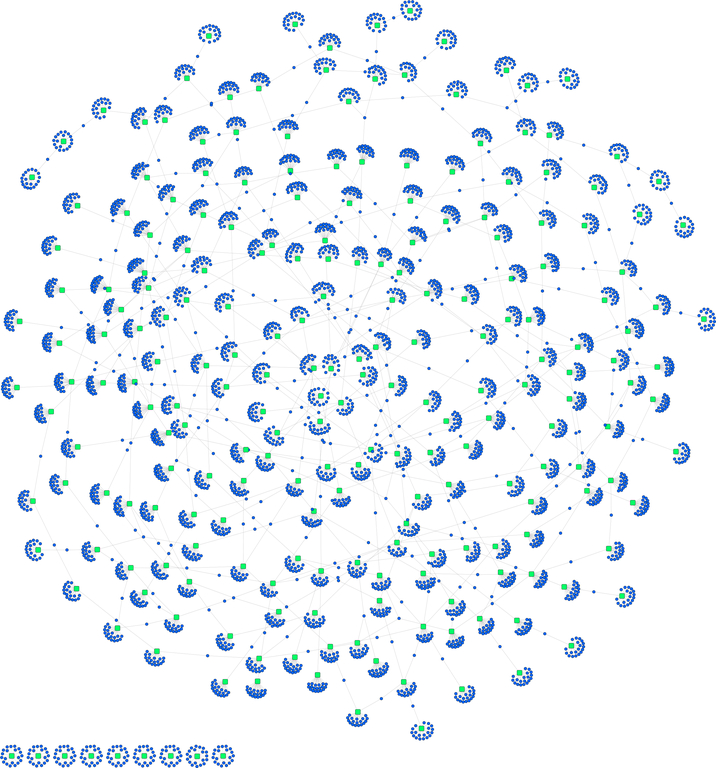
Fig. 7. Random Forest Network.
Network visualization of the top 20 important variables in an all pairs comparison of samples, grouped by replicates. The underlying data is from the P. trichocarpa gene atlas gene expression data set. Round purple nodes indicate genes, while square green nodes indicate the group comparisons that was performed. The network is mostly connected by means of one or two shared genes between certain groups comparisons. Though, as expected there are some disjoint groupings as well.
6. Acknowledgements
We would like to acknowledge the Joint Genome Institute (JGI) for the sequencing of the Populus trichocarpa transcriptomes. The work conducted by the U.S. Department of Energy Joint Genome Institute is supported by the Office of Science of the U.S. Department of Energy under Contract No. DE-AC02–05CH11231.
This research was funded by the BioEnergy Science Center (BESC) at the Oak Ridge National Laboratory (contract DE-PS02–06ER64304). BESC is a U.S. Department of Energy Bioenergy Research Center supported by the Office of Biological and Environmental Research in the DOE Office of Science. In addition this research was supported by the Center for Bioenery Innovation (http://cbi.ornl.gov), the Plant-Microbe Interfaces Scientific Focus Area (http://pmi.ornl.gov) in the Genomic Science Program, the Office of Biological and Environmental Research (BER) in the U.S. Department of Energy Office of Science, and by the Department of Energy, Laboratory Directed Research and Development funding (7758), at the Oak Ridge National Laboratory. Oak Ridge National Laboratory is managed by UT-Battelle, LLC, for the US DOE under contract DE-AC05–00OR22725.
This research used resources of the Oak Ridge Leadership Computing Facility (OLCF) and the Compute and Data Environment for Science (CADES) at the Oak Ridge National Laboratory, which is supported by the Office of Science of the U.S. Department of Energy under Contract No. DE- AC05–00OR22725.
This manuscript has been authored by UT-Battelle, LLC under Contract No. DE-AC05–00OR22725 with the U.S. Department of Energy. The United States Government retains and the publisher, by accepting the article for publication, acknowledges that the United States Government retains a non-exclusive, paid-up, irrevocable, worldwide license to publish or reproduce the published form of this manuscript, or allow others to do so, for United States Government purposes. The Department of Energy will provide public access to these results of federally sponsored research in accordance with the DOE Public Access Plan (http://energy.gov/downloads/doe-public-access-plan). The work conducted by the U.S. Department of Energy Joint Genome Institute is supported by the Office of Science of the U.S. Department of Energy under Contract No. DE-AC02–05CH11231.
Footnotes
The reference sequence that we used for alignment purposes, was version 3 of the Populus Trichocarpa genome, [20], which was obtained from Phytozome [21].
The standard Fisher Exact Test is defined for integer values. We scale the expression values of each gene to take an integer value between 0 and 100.
The Fisher exact test can be calculated on a contingency table using a Perl script making use of the Text::NSP::Measures::2D::Fisher Perl module [22] available from the Comprehensive Perl Archive Network (CPAN) at http://search.cpan.org/dist/Text-NSP/lib/Text/NSP/Measures/2D/Fisher.pm.
Applying the FDR procedure can be seen as a thresholding procedure for the raw bipartite network connecting all genes to all samples, maintaining only edges which show some level of enrichment. Each rejected hypothesis becomes an edge in the resulting network, connecting a gene to a sample. A similar approach was used previously by Weighill and Jacobson [23].
sif format is a 3-column table format in which the first and third columns represent nodes, the second column represents an edge annotation. In the case of the enrichment network, the first column will consist of genes, the third column will consist of samples and the second column will represent the p-value of the association between the sample and gene in question. The number of lines in the sif file should be equal to the number of rejected hypotheses (number of edges in the network).
Nodes and edges in Cytoscape [17] can be formatted with various visual attributes. In this example, we color the sample nodes according to tissue type. Figure 3 shows the resulting significant associations between genes and samples, represented as a bipartite network. Large, diamond nodes represent samples, small grey nodes represent genes and each edge represents a significant enrichment of the expression of a particular gene in a particular sample. Figure 3B shows an example of a gene which is enriched in 4 samples - one bud sample and 3 stem samples. The line plot shows the TPM values for this gene across all samples, and clearly indicates the enrichment pattern which is recognized by the Fisher exact test. Line plots were constructed using R and various R resources [24,25,26,27,28].
Co-expression networks are widely used and can be seen in various publications. For example, see [4,5].
Pearson is one example of a similarity metric which measures the extent to which two variables co-vary. Other similarity metrics can be used to construct similarity networks, a selection of which are discussed in reference [29] and various others [30,31]. When the data contains missing values in the form of “NA” entries, we recommend using the R cor function for calculating correlation coefficients, as it has a variety of options for the handling of missing values.
The mcxarray program outputs the resulting correlation matrix in MCL matrix format. The mcxdump program converts this to a line-based format, with one edge per line. The first two columns represent the source and target nodes respectively, and the third column represents the edge weight (in this case Pearson correlation value). Converting to sif format simply involves swapping the second and third column of the line-based format.
The Pearson correlation coefficient produces similarity values between −1 and 1. A Pearson correlation of 1 means that the two vectors follow the same pattern of variation (i.e. when the one vector increases, the other one increases). A Pearson correlation of −1 means that the two vectors have opposite patterns of variation, in that if one vector increases, the other decreases. A Pearson correlation of 0 means that there is no association between the two vectors. In many cases, such as gene co-expression, one is interested in large positive and large negative Pearson correlation values. Thus we apply an absolute threshold, keeping edges for which the absolute value of the Pearson correlation is greater than a set threshold. This analysis used an absolute threshold of 0.8.
MCL clusters a similarity network into modules of similar nodes. In this case, where edges represent the similarity (Pearson correlation) between the expression profiles of genes, MCL clusters the co-expression network into groups of co-expressed genes. MCL requires an inflation parameter, which controls the granularity of clusters produced. A high inflation value produces a larger number of smaller clusters, whereas a low inflation parameter produces a smaller number of larger clusters [6,7]. This analysis used an inflation value of 2. The output of MCL consists of a multi-line file. Each line is a list of genes in a particular cluster, with one line per cluster.
This transformation converts the Pearson correlations from a similarity measure to a distance measure.
Applying a minimum spanning tree algorithm to the transformed edges, and then replacing the original edge weights gives us a maximum spanning tree. Construction of the MST was done with a custom Perl script which made use of Dijkstra’s algorithm in the Graph Perl module (Jarkko Hietaniemi, http://www.cpan.org/). The Perl script outputs the MST in sif format.
This transformation scales each value xij in M by dividing it by the maximum value in the row, and thus scales the values in the matrix to range between 0 and 1. This also forces the genes to vary on the same scale, and thus gives each gene an equal chance to obtain high and low values in the next step.
Intuitively, the DUO metric is a form of correlation/similarity metric between two manifestations of each gene - high and low. For example, a high DUO value might tell you that the high values of gene A co-occur with the low values of gene B, or that the low values of gene C co-occur with the low-values of gene D. The DUO metric also scales the resulting values according to the fraction of high/low values in the vectors being compared in order to adjust the values to account for the effect of frequency. DUO outputs networks in gml format.
Figure 5A shows the resulting DUO co-expression network for the P. trichocarpa gene atlas, visualized in Cytoscape. Each gene is represented by two nodes, high (blue) and low (red) respectively. For example, an edge between a blue-bordered gene A and a red-bordered gene B means that the high values of gene A co-occur with the low-values of gene B. Figures 5B and 5C show the expression profiles of the marked genes in the DUO network. One can clearly see the co-occurrence between high values in Figure 5B and the co-occurrence between high and low values in Figure 5C. Line plots were constructed using R and various R resources [24,25,26,27,28].
Here we use transcripts per million (TPM) as we are interested in modeling relative abundance. Alternatively, if a TPM matrix is not available a raw count matrix of expression values can be used, after applying TMM normalization from the edgeR package [32] to the raw count matrix.
The sample groups can be any biological significant grouping of samples. In most cases a sample group will be a grouping of biological replicates of a given sample. It is important that these sample groups consists of a large enough number of samples, a common number used is 3.
The voom adjustment procedure is used to allow methods that were originally developed for microarray data, to be applicable to RNA-seq data. It is important to note that the output of the procedure are log2 values.
We define valid pairs as those that are of biological interest given the experiment. This is classically built in to the sampling design and should be apparent from the sample labels. Though there may be some sample group pairs that may not make sense to compare, such as Root with Nitrogen treatment vs Mature Leaf. FCROS assumes a case versus control comparison. Where control is a reference sample group. Therefore one member of the comparison pair is the case, while the other serves as the control. This choice of case/control group can be done randomly or more in line with the sample design, it will merely effect the interpretation of estimates such as fold-change and f-value (described in 22).
When applying the fcros function it is important to set the appropriate option to indicate to the function that the input is log-transformed. As the results from the voom adjustments are log2 values.
Here the f-value is an estimate of the probability of over/under expression. Values closer to 1 for a given comparison indicates that the gene has a higher probability of over expression in the case. Alternatively, a value closer to 0 indicates a higher probability of under-expression in the case given the comparison. The element of the sample group pair that is assigned as the case or control will determine the interpretation of the f-value.
In the network visualization we have two different types of nodes, gene and comparison, respectively. The comparison nodes summarize the case and control that was used to test for differential genes. Thus a gene node is connected to a comparison node if it was found significantly over/under expressed in that given comparison. The edges can be colored to indicate if the gene is either over-expressed (say, red) or under-expressed (say, blue). This information is encoded in the log value of the robust fold change estimate. A negative value indicates under expression, while a positive value indicates over expression. Furthermore, the log fold change can be used to weight the edges, with higher absolute values representing a darker shade and lower values a lighter shade. As an example see Figure 6.
This way of generating groups answer the question: which genes best discriminate between these two respective groups? Instead of taking all pairs of groups, we can also assign the same label to members that are not in a target group. This answers the question: which genes best discriminate between our target group and everything else?
The default parameters, apart from the number of trees and the importance parameters, should be sufficient for most datasets.
The MeanDecreaseInAccuracy is one measure of the contribution that a given gene has to the classification accuracy, should that gene be removed. There are alternative measures that can be used, each answering a slighly different hypothesis. For our purposes the MeanDecreaseInAccuracy is more appropriate. Plotting the curve allows us to identify an appropriate threshold.
The sif format is preferred as it is easy to important into Cytoscape. In this case we should have the first column as the genes that were deemed important based on the cutoff, the second column should be the MeanDecreaseInAccuracy value and the last column should be the name of the two groups that were compared.
After loading the network into Cytoscape, assigning different colors to different classes of variables or nodes will make it easier to uncover patterns. An example can be seen in Figure 7.
References
- 1.Barabasi Albert-Laszlo and Oltvai Zoltan N. Network biology: understanding the cell’s functional organization. Nature reviews. Genetics, 5(2):101, 2004. [DOI] [PubMed] [Google Scholar]
- 2.Balakrishnan Rangaswami and Ranganathan Kanna. A textbook of graph theory. Springer Science & Business Media, 2012. [Google Scholar]
- 3.Zheng Qi and Wang Xiu-Jie. Goeast: a web-based software toolkit for gene ontology enrichment analysis. Nucleic acids research, 36(suppl_2):W358–W363, 2008. [DOI] [PMC free article] [PubMed] [Google Scholar]
- 4.Langfelder Peter and Horvath Steve. Wgcna: an r package for weighted correlation network analysis. BMC bioinformatics, 9(1):559, 2008. [DOI] [PMC free article] [PubMed] [Google Scholar]
- 5.Movahedi Sara, Van Bel Michiel, Heyndrickx Ken S, and Vandepoele Klaas. Comparative co-expression analysis in plant biology. Plant, cell & environment, 35(10):1787–1798, 2012. [DOI] [PubMed] [Google Scholar]
- 6.Marinus Van Dongen Stijn. Graph clustering by flow simulation. 2001.
- 7.Van Dongen Stijn. Graph clustering via a discrete uncoupling process. SIAM Journal on Matrix Analysis and Applications, 30(1):121–141, 2008. [Google Scholar]
- 8.Climer Sharlee et al. Discovery of synchronized gene expression modules using a vector-based correlation coefficient.
- 9.Climer Sharlee, Yang Wei, Fuentes Lisa, Dávila-Román Victor G, and Charles C Gu A Custom Correlation Coefficient (CCC) Approach for Fast Identification of Multi-SNP Association Patterns in Genome-Wide SNPs Data. Genetic Epidemiology, 38(7):610–621, 2014. [DOI] [PMC free article] [PubMed] [Google Scholar]
- 10.Climer Sharlee, Templeton Alan R, and Zhang Weixiong. Allele-Specific Network Reveals Combinatorial Interaction that Transcends Small Effects in Psoriasis GWAS. PLoS Comput Biol, 10(9):e1003766, 2014. [DOI] [PMC free article] [PubMed] [Google Scholar]
- 11.Dembélé Doulaye and Kastner Philippe. Fold change rank ordering statistics: a new method for detecting differentially expressed genes. BMC bioinformatics, 15(1):14, 2014. [DOI] [PMC free article] [PubMed] [Google Scholar]
- 12.Breiman Leo. Random forests. Machine learning, 45(1):5–32, 2001. [Google Scholar]
- 13.Dietterich Thomas G. An experimental comparison of three methods for constructing ensembles of decision trees: Bagging, boosting, and randomization. Machine learning, 40(2):139–157, 2000. [Google Scholar]
- 14.Jiang Hongshan, Lei Rong, Ding Shou-Wei, and Zhu Shuifang. Skewer: a fast and accurate adapter trimmer for next-generation sequencing paired-end reads. BMC bioinformatics, 15(1):182, 2014. [DOI] [PMC free article] [PubMed] [Google Scholar]
- 15.Dobin Alexander, Carrie A Davis Felix Schlesinger, Drenkow Jorg, Zaleski Chris, Jha Sonali, Batut Philippe, Chaisson Mark, and Gingeras Thomas R. Star: ultrafast universal rna-seq aligner. Bioinformatics, 29(1):15–21, 2013. [DOI] [PMC free article] [PubMed] [Google Scholar]
- 16.Benjamini Yoav and Hochberg Yosef. Controlling the false discovery rate: a practical and powerful approach to multiple testing. Journal of the royal statistical society. Series B (Methodological), pages 289–300, 1995. [Google Scholar]
- 17.Shannon Paul, Markiel Andrew, Ozier Owen, Baliga Nitin S, Wang Jonathan T, Ramage Daniel, Amin Nada, Schwikowski Benno, and Ideker Trey. Cytoscape: a software environment for integrated models of biomolecular interaction networks. Genome research, 13(11):2498–2504, 2003. [DOI] [PMC free article] [PubMed] [Google Scholar]
- 18.Charity W Law Yunshun Chen, Shi Wei, and Smyth Gordon K. Voom: precision weights unlock linear model analysis tools for rna-seq read counts. Genome biology, 15(2):R29, 2014. [DOI] [PMC free article] [PubMed] [Google Scholar]
- 19.Liaw Andy and Wiener Matthew. Classification and regression by randomforest. R News, 2(3):18–22, 2002. [Google Scholar]
- 20.Tuskan Gerald A, Difazio S, Jansson Stefan, Bohlmann J, Grigoriev I, Hellsten U, Putnam N, Ralph S, Rombauts Stephane, Salamov A, et al. The genome of black cottonwood, populus trichocarpa (torr. & gray). science, 313(5793):1596–1604, 2006. [DOI] [PubMed] [Google Scholar]
- 21.David M Goodstein Shengqiang Shu, Howson Russell, Neupane Rochak, Richard D Hayes Joni Fazo, Mitros Therese, Dirks William, Hellsten Uffe, Putnam Nicholas, et al. Phytozome: a comparative platform for green plant genomics. Nucleic Acids Research, 40(D1):D1178–D1186, 2012. [DOI] [PMC free article] [PubMed] [Google Scholar]
- 22.Banerjee Satanjeev and Pedersen Ted. The Design, Implementation, and Use of the Ngram Statistics Package. In Gelbukh A (eds) Computational Linguistics and Intelligent Text Processing. CICLing 2003. Lecture Notes in Computer Science, volume 2588, pages 370–381. Springer, 2003. [Google Scholar]
- 23.Weighill Deborah A and Jacobson Daniel A. 3-way networks: application of hypergraphs for modelling increased complexity in comparative genomics. PLoS Comput Biol, 11(3):e1004079, 2015. [DOI] [PMC free article] [PubMed] [Google Scholar]
- 24.R Core Team. R: A Language and Environment for Statistical Computing. R Foundation for Statistical Computing, Vienna, Austria, 2015. [Google Scholar]
- 25.RStudio Team. RStudio: Integrated Development Environment for R. RStudio, Inc., Boston, MA, 2016. [Google Scholar]
- 26.Wickham Hadley. ggplot2: Elegant Graphics for Data Analysis. Springer-Verlag; New York, 2009. [Google Scholar]
- 27.Arnold Jeffrey B.. ggthemes: Extra Themes, Scales and Geoms for ‘ggplot2’, 2017. R package version 3.4.0. [Google Scholar]
- 28.Wickham Hadley. Reshaping data with the reshape package. Journal of Statistical Software, 21(12), 2007. [Google Scholar]
- 29.Weighill Deborah A and Jacobson Daniel. Network metamodeling: Effect of correlation metric choice on phylogenomic and transcriptomic network topology. 2016. [DOI] [PubMed]
- 30.Fujita AndrE, João Ricardo Sato Marcos Angelo Almeida Demasi, Mari Cleide Sogayar Carlos Eduardo Ferreira, and Miyano Satoru. Comparing pearson, spearman and hoeffding’s d measure for gene expression association analysis. Journal of bioinformatics and computational biology, 7(04):663–684, 2009. [DOI] [PubMed] [Google Scholar]
- 31.Bloom Stephen A. Similarity indices in community studies: potential pitfalls. Marine Ecology Progress Series, pages 125–128, 1981. [Google Scholar]
- 32.Chen Yunshun and McCarthy Davis. edger: differential expression analysis of digital gene expression data user’s guide. [DOI] [PMC free article] [PubMed]
- 33.Dowle Matt and Srinivasan Arun. data.table: Extension of ‘data.frame’, 2017. R package version 1.10.4. [Google Scholar]
- 34.Chen WC, Ostrouchov G, Schmidt D, Patel P, and Yu H. pbdmpi: Programming with big data–interface to mpi. R Package , URL http://cran.r-project.org/package=pbdMPI, 2012. [Google Scholar]


