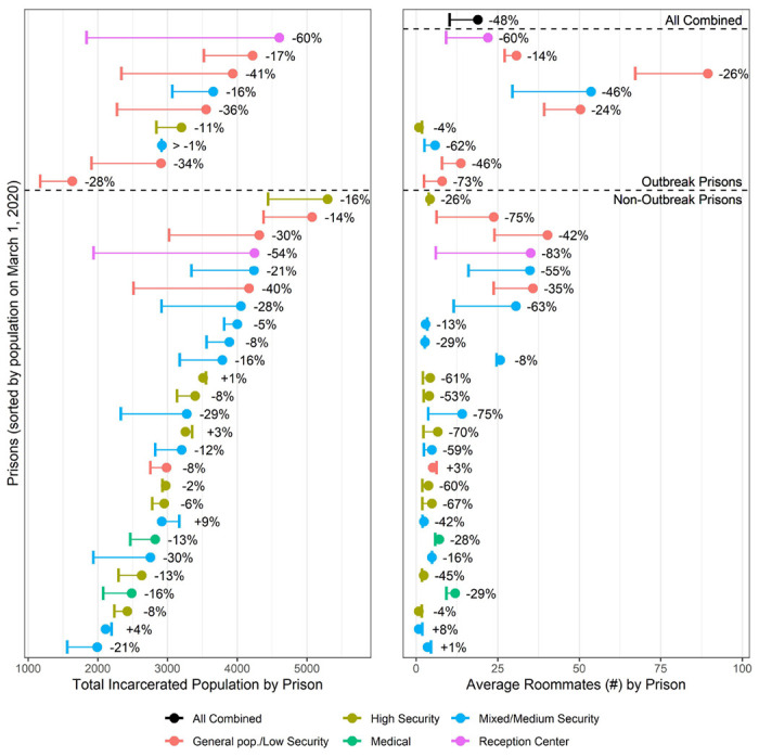
Figure 1: CDCR incarcerated population size and average room occupancy over time:

Graph shows the change in total prison population size (left) and change in the average number of roommates an individual in that prison has (right), for each of the 35 prisons, color-coded by prison type, and for all prisons combined in black (only right panel), from March 1, 2020 (filled circle) to October 10, 2020 (vertical bar). The outbreak prisons used in the multivariate risk analysis are shown above the dashed line, and remaining prisons are shown below the dashed line.
