
Extended Data Figure 4|. ADMIXTURE plot at K=15 using the Human Origin dataset.
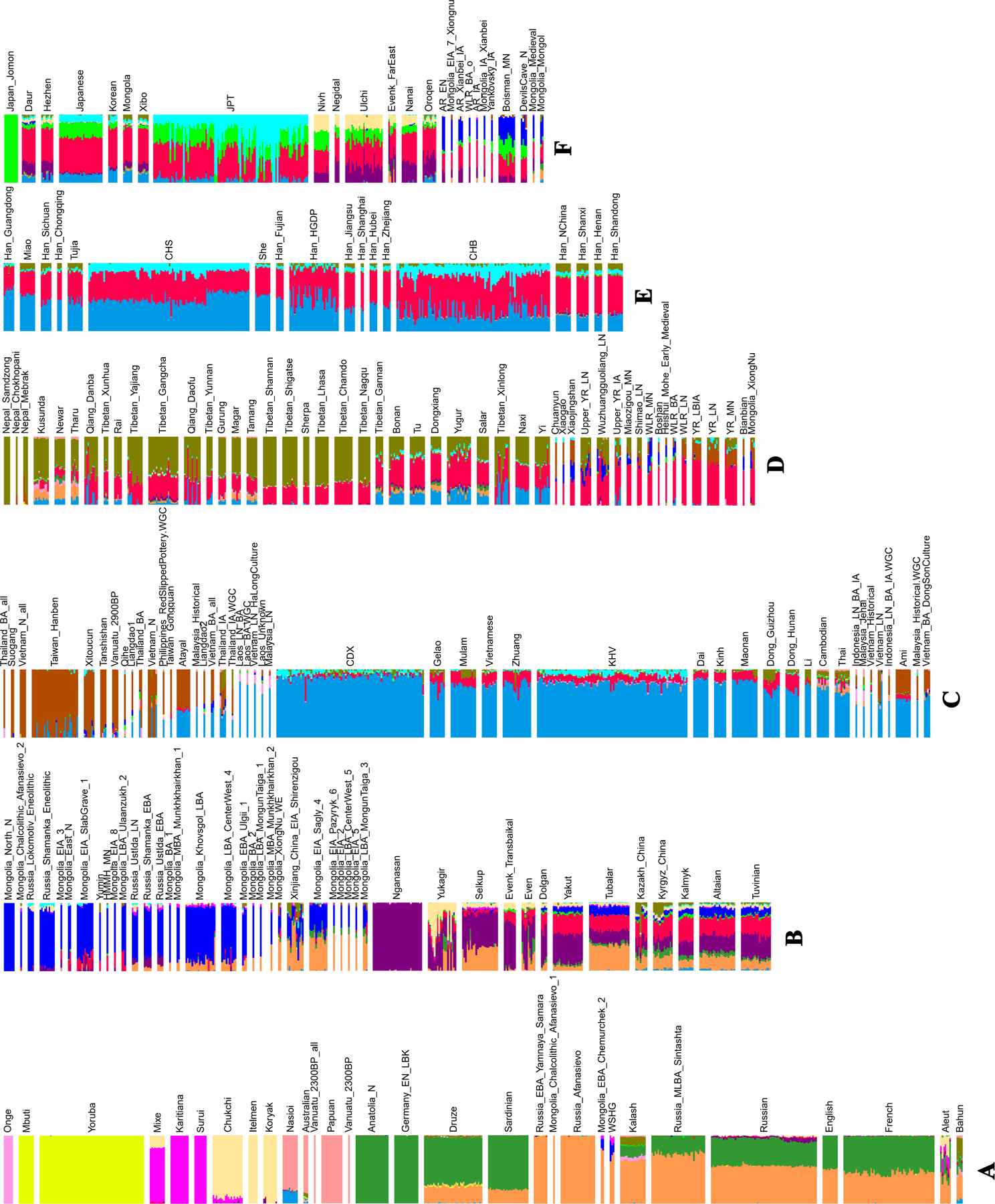
We grouped the populations roughly into six groups from A to F based on geographic and genetic affinity. (A) populations mainly from Africa (yellow), America (magenta), West Eurasia (dark green and light brown) and Oceania (light magenta); (B) populations mainly from Mongolia (blue) and Siberia (purple); (C) populations mainly from southern China and Southeast Asia (light blue); (D) populations mainly from the Tibetan Plateau (olive) and Neolithic Yellow River Basin (red); (E) mainly Han Chinese around China (light blue and red); (F) populations mainly from the Amur River Basin (blue and red) and northeast Asia.