Abstract
Objective
To compare the inference regarding the effectiveness of the various non-pharmaceutical interventions (NPIs) for COVID-19 obtained from different SIR models.
Study design and setting
We explored two models developed by Imperial College that considered only NPIs without accounting for mobility (model 1) or only mobility (model 2), and a model accounting for the combination of mobility and NPIs (model 3). Imperial College applied models 1 and 2 to 11 European countries and to the USA, respectively. We applied these models to 14 European countries (original 11 plus another 3), over two different time horizons.
Results
While model 1 found that lockdown was the most effective measure in the original 11 countries, model 2 showed that lockdown had little or no benefit as it was typically introduced at a point when the time-varying reproduction number was already very low. Model 3 found that the simple banning of public events was beneficial, while lockdown had no consistent impact. Based on Bayesian metrics, model 2 was better supported by the data than either model 1 or model 3 for both time horizons.
Conclusion
Inferences on effects of NPIs are non-robust and highly sensitive to model specification. In the SIR modeling framework, the impacts of lockdown are uncertain and highly model-dependent.
Keywords: COVID-19, Non-pharmaceutical interventions, SIR models, Bayesian statistics, Model comparison, Information criteria
1. Introduction
Until effective and safe vaccines can become widely available, the levers of policy makers to manage COVID-19 have included non-pharmaceutical interventions (NPIs), such as social distancing mandates, travel restrictions, self-isolation, banning of public events, closure of schools, and ultimately complete lockdown. These measures aim to reduce infections by decreasing contact between individuals. Given that multiple NPIs are often introduced in quick succession, it is difficult to separate their effects.
Here, we compare the inferences regarding the effectiveness of various NPIs obtained from different SIR (susceptible-infected-removed) models. The first model (model 1) was produced by the Imperial College COVID-19 Response Team and led to arguably the most influential publication to-date in support of large benefits from total lockdown [1]. Its publication in Nature [1], concluded that complete lockdown was responsible for 80% of the reduction in the time-varying reproduction number, , and that 3.1 million deaths were avoided in 11 European countries due to lockdown.
The Imperial College team also developed and applied a different model (model 2) to the USA [2], which assumes varies as a function of mobility. In model 2, there is no explicit causal link between an NPI and –NPIs enter the model indirectly via their effects on mobility. Inference regarding the (complex) impact of NPIs is possible by observing the trajectory at the time of intervention/s.
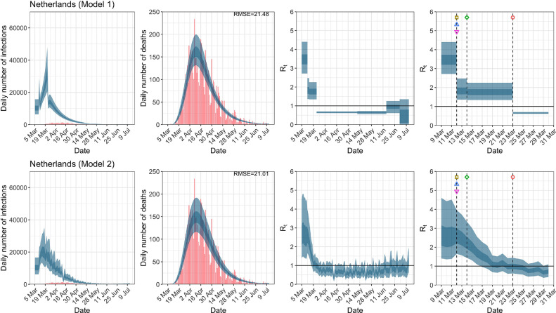
This work tries to make the point that one has to resolve uncertainty not only about fundamental epidemiological variables such as the time-varying reproduction number, but also about the form or structure of the model used to estimate these variables. In Bayesian statistics this is known as model comparison, while in other fields it is known as structure learning. We emphasize the potential importance of model comparison in the context of quantitative epidemiology using a worked example to show that conclusions about the efficacy of various interventions depend sensitively on the ability to compare one model with another. We illustrate this point with a worked example based upon an early assessment of NPIs during the first wave of the current coronavirus outbreak.
In particular, we compare the results and performance (fit to the data) of models 1 and 2, when applied to the original 11 countries, plus another 3 European countries for which data were available but had not been included in the original publication. We also consider a third model (model 3), a hybrid of the first two, that considers both mobility and various NPIs together. We aim to understand if inferences are robust to model specification and whether some model provides a better fit than others. It is important to note that all three models were proposed (and in the case of the first two models) implemented by the Imperial College team.
2. Methods
2.1. Data
We compare the impact of NPIs and mobility on for three models, two time horizons and two sets of European countries. Specifically,
-
1.
For all models, we examine the evolution of for two time horizons: up to May 5th (the end date chosen by Flaxman et al. [1]), and July 12th to allow investigating both the imposition and lifting of various NPIs.
-
2.
The original publication by Flaxman et al. [1] had included 11 European countries (Austria, Belgium, Denmark, France, Germany, Italy, Norway, Spain, Sweden, Switzerland, United Kingdom). However, suitable data were also available for the Netherlands, Portugal, and Greece; therefore we also consider 14 countries.
Seeding of new infections in all models is chosen to be 10 days before the day a given country has cumulatively observed 10 deaths so that mobility data are available for all countries examined and thus allowing a fair comparison between models. Flaxman et al. [1] chose the seeding of new infections to be 30 days before a country has cumulatively observed 10 deaths. We alter the prior for the initial infection count, which is a model parameter inferred from the posterior distribution, to reflect this modification. Seeding dates appear in Table A.1.
For mobility data we follow Unwin et al. [2], and use Google’s COVID-19 Community Mobility Report [3], which provides data measuring the percentage change in mobility compared to a baseline level for visits to: retailers and recreation venues, grocery markets and pharmacies, parks, transit stations, workplaces and residential places. We use the average change in mobility across all locations, excluding residential places and parks. Mobility indicators are proxies for changes in human behavior and of exposure risk — the number of close contacts and duration of contact. Behavior change could be due to one or more centrally imposed interventions or the product of individuals responding to the epidemic on their own initiative.
2.2. Model 1 (all NPIs considered)
In model 1, the evolution of is given by,
| (1) |
where is the effective reproduction rate for country at time and is an indicator variable, where if NPI is in place at time for country and otherwise, for . The subscript refers to the various NPIs (Table A.2) whose timeline and definition are given in Supplementary Table 2 of Flaxman et al. [1]. The covariate is an indicator variable for the last imposed intervention allowing for country-specific random effects given by . In all countries except Sweden, this was lockdown, see Flaxman et al. [1] for details. For the analysis up to July 12th when some of the NPIs have been lifted, we allow the impact of lifting an NPI on to be different in magnitude from the impact of imposing that NPI in the first place. The timing of lifting NPIs in different countries appears in Table A.3.
In Equation (1), the proportional variation of from the initial is modeled as a step function and only allowed to change, immediately so, in response to an intervention. Therefore, any decrease in (even if this decrease is a result of the increasing proportion of the population who are infected, changes in human behavior, clustered contact structures and/or pre-existing immunity [4]) must, by construction, be attributed to interventions; the impact of a new intervention is immediate without time lag or gradual change. This assumption is clearly made for simplicity but is unrealistic.
2.3. Model 2 (Mobility Only Considered)
In model 2, the proportional variation of from is allowed to vary with mobility. Model 2 does not presume follows a step function and is therefore capable of capturing more gradual changes over time. The impact of mobility on is allowed to vary across countries by use of country-specific random effects terms. Specifically,
| (2) |
where is twice the inverse of the logit function, is the average change in mobility, excluding residential places and parks, at time for country and is a weekly AR(2) process centered around zero. In Equation (2), is a measure of the impact of the average change in mobility on which is common to all countries, while measures country-specific deviations from this common value. The advantage of model 2 is that it gives a more flexible estimate of allowing it to change with mobility trends. Although NPIs are not explicitly included in the model, the impact of an NPI can be measured by observing the value of and its subsequent change, when specific interventions were imposed.
2.4. Model 3 (Mobility and NPIs jointly considered)
After communication with the Imperial College team, we also consider a third model (model 3) which jointly includes mobility and NPIs. The motivation behind the formulation of model 3 is to attempt to untangle the impacts of mobility, lockdown and other NPIs. In our communication, the Imperial College team proposed a similar model but only included mobility and a single NPI – lockdown – in their model. Given that our goal is to quantify the relative contributions of several NPIs, we consider all NPIs, and mobility.
However, we caution against using model 3 as a tool for inference. NPIs may impact mobility in possibly non-linear, non-additive, lagged and interactive fashions, with possibly complex feedback. We include this model here to compare its performance against models 1 and 2. The functional form of in model 3 is:
| (3) |
In brief, we use Bayesian model inversion to evaluate the evidence for a particular model and the posterior density over the parameters of that model. The models in question generate new confirmed cases and daily deaths reported from a series of countries. We use a conventional SIR (susceptible-infected-removed) model that, given initial conditions and a time-varying reproduction number, enables us to generate the expected incidence of new cases and fatalities over a specified time period. In these models, the time-varying reproduction number is parameterized in terms of known events or fluctuations (here, the onset and offset of NPIs or fluctuations in mobility using proxy measures). The functional form relating these known fluctuations to the time-varying reproduction number defines the structure of various models. Once that form has been specified, one can then use standard sampling procedures (e.g., Stan) to evaluate the posterior over the model parameters that best explain the incidence of new cases and deaths. Finally, the quality of the model can be assessed with the model evidence (also know as marginal likelihood). Here, we approximate model evidence with standard information criteria, acknowledging their limitations (please see discussion in Appendix B.2).
For a more technical discussion of prior specification and Bayesian measures of model fit for all models, see Appendix B.
3. Results
3.1. Mobility
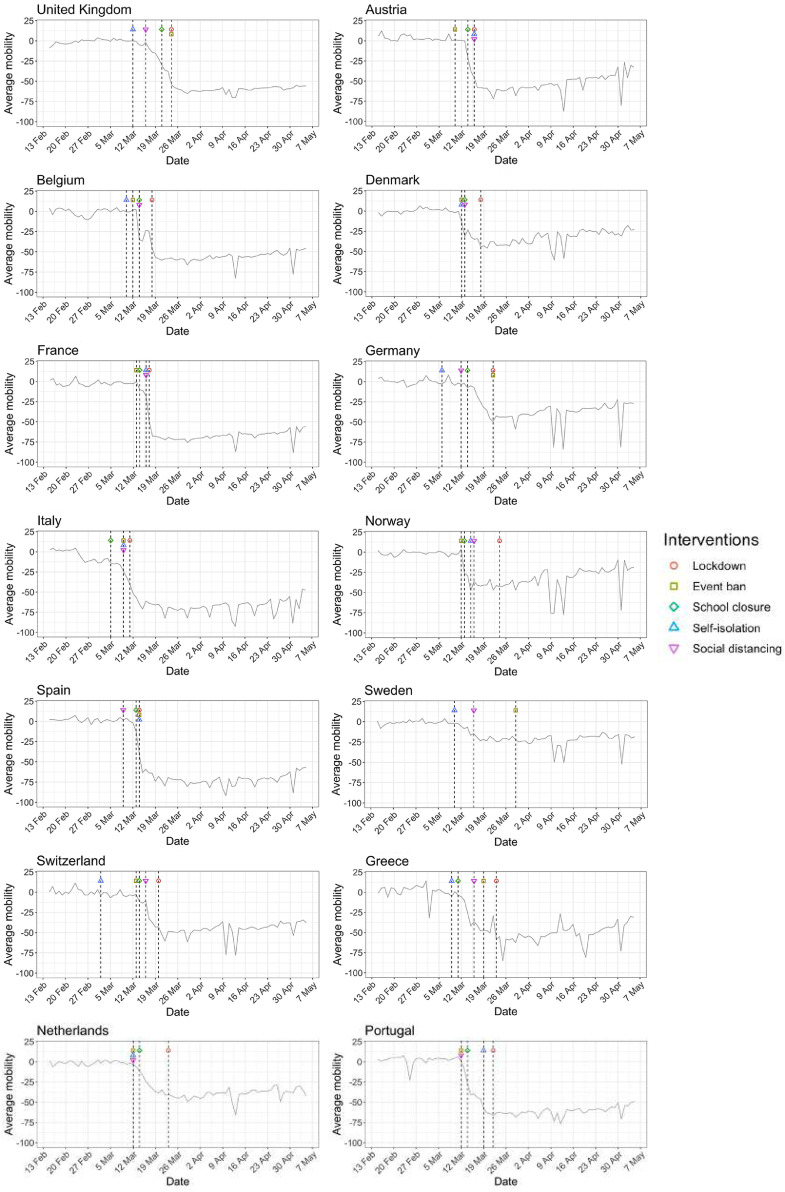
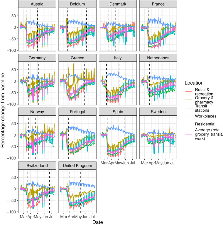
Figs. 1 and A.1 show that for most countries the initial reduction in mobility preceded the date of the first lockdown. This suggests that people’s behavior changed in response to earlier, less severe interventions such as banning of public events and social distancing, and/or as a result of individual choices in the face of an unknown, but potentially catastrophic, pandemic.
Fig. 1.
Percentage change in average mobility from baseline level from February 15th to May 5th in each of the European countries examined in Flaxman et al. [1], as well as an additional three countries consisting of Greece, the Netherlands and Portugal.
Fig. A.1.
Percentage change in mobility from baseline level from February 15th to July 12th, by locations in each of the European countries examined in Flaxman et al. [1], as well as an additional three countries consisting of Greece, the Netherlands and Portugal. Average mobility is computed based on the trends in retailers and recreation venues, grocery markets and pharmacy, transit stations and workplaces. Black dashed lines in each plot indicate the lockdown start and end dates.
3.2. Convergence diagnostics
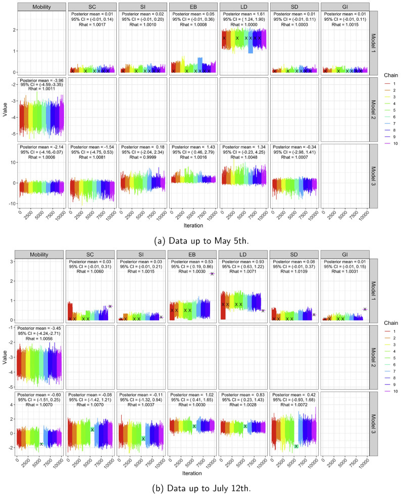
Convergence diagnostics (trace plots and [5] based on 10 chains — see also[6]) for all three models and both time horizons appear in Fig. A.2, providing strong evidence that the Markov chains have converged.
Fig. A.2.
Trace plots, posterior means, 95% CIs and of regression coefficients in for all three models based on 10 MCMC chains, for both time horizons. All our analyses use the iterates from chains which had no more than 5% of divergent transitions. Black crosses denote chains with more than 5% of divergent transitions.
3.3. Comparison of models up to May 5th
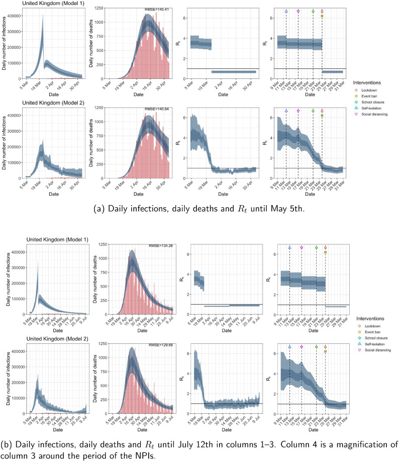
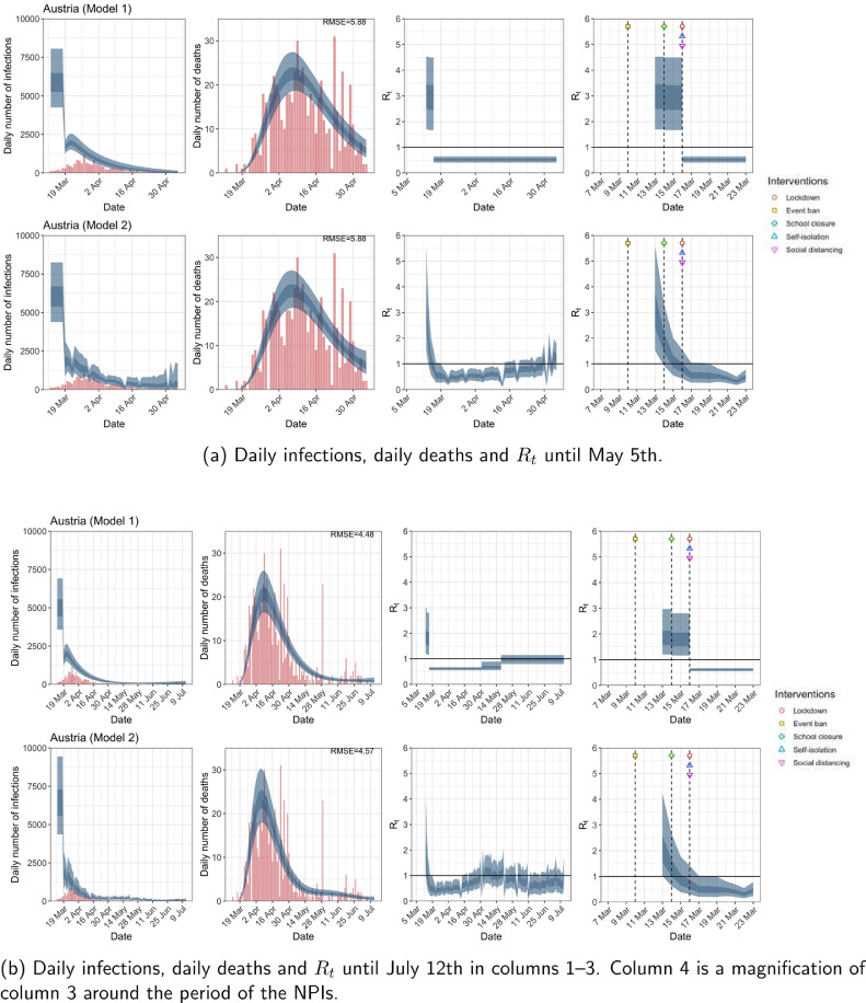
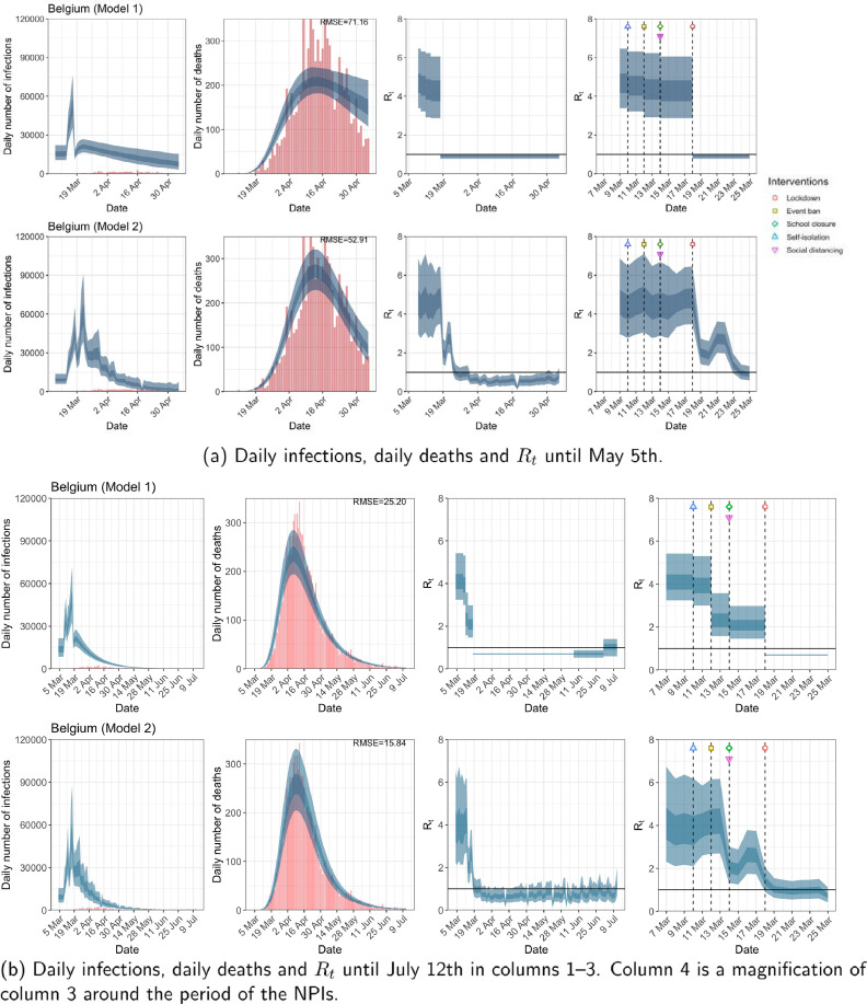
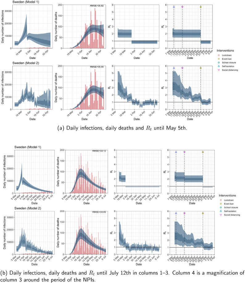
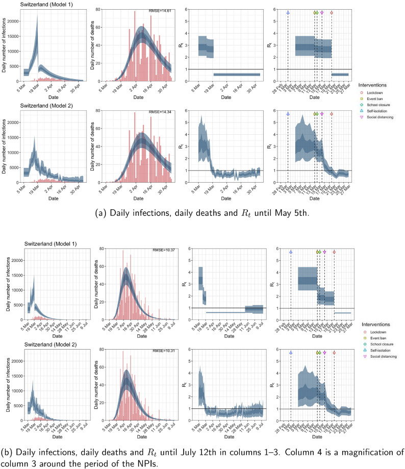
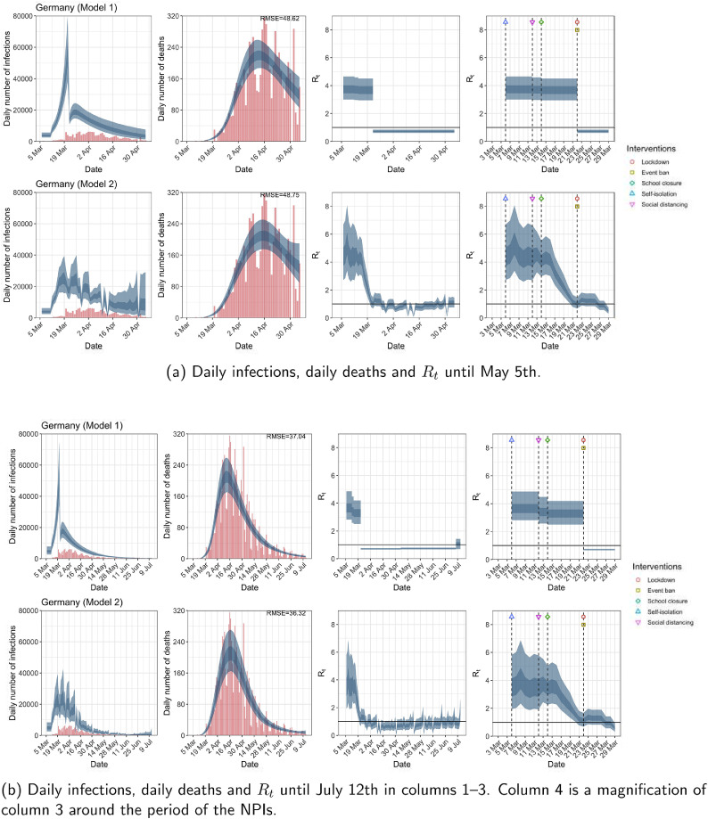
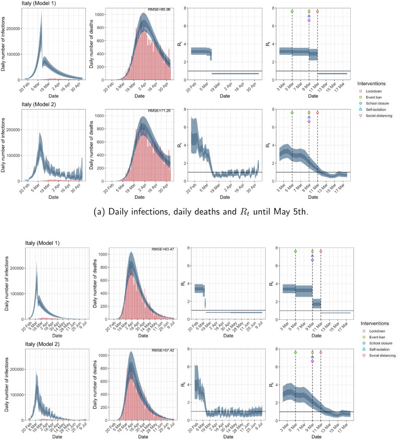
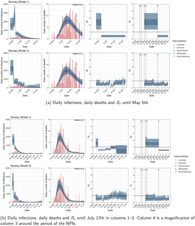
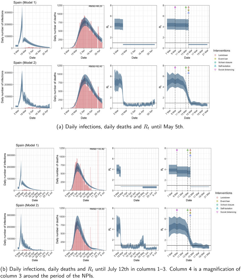
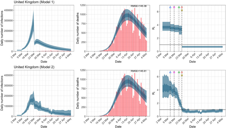
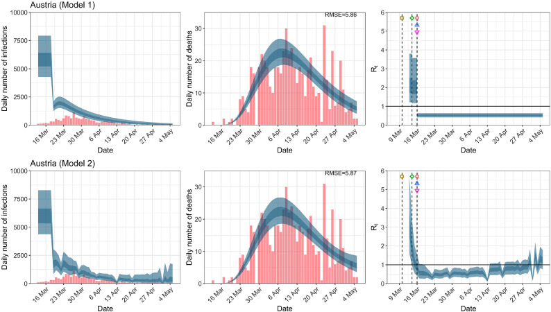
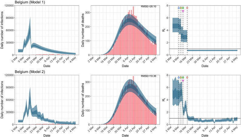
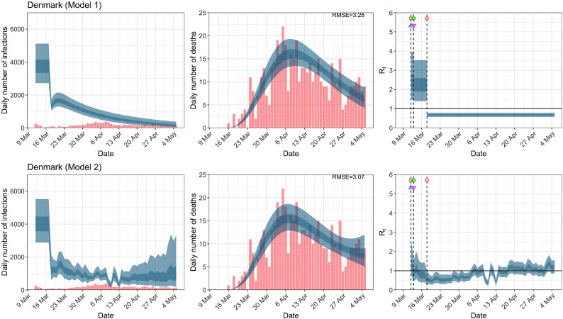
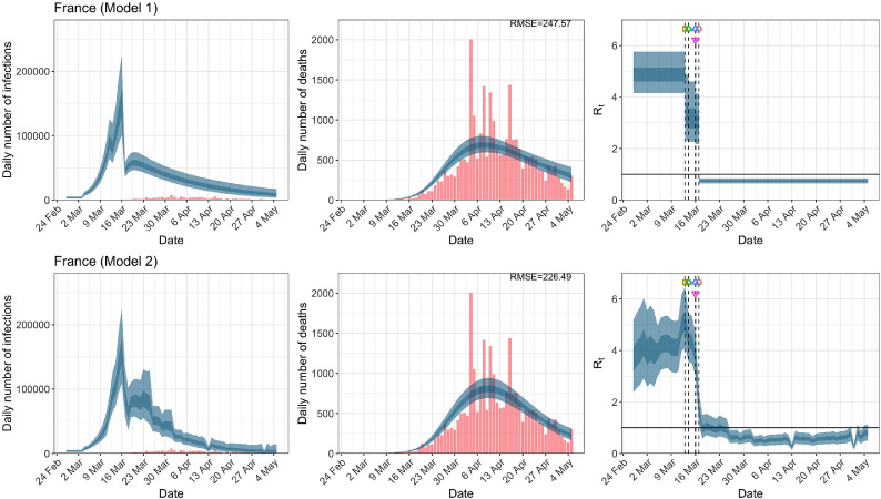
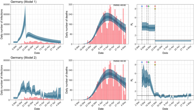
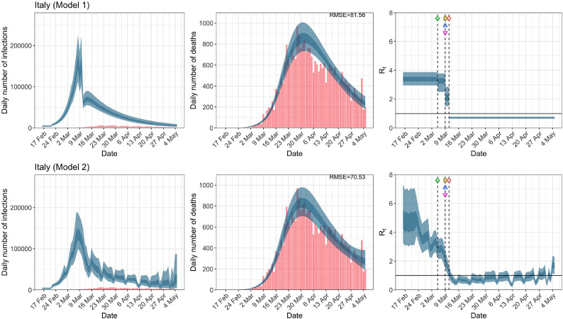
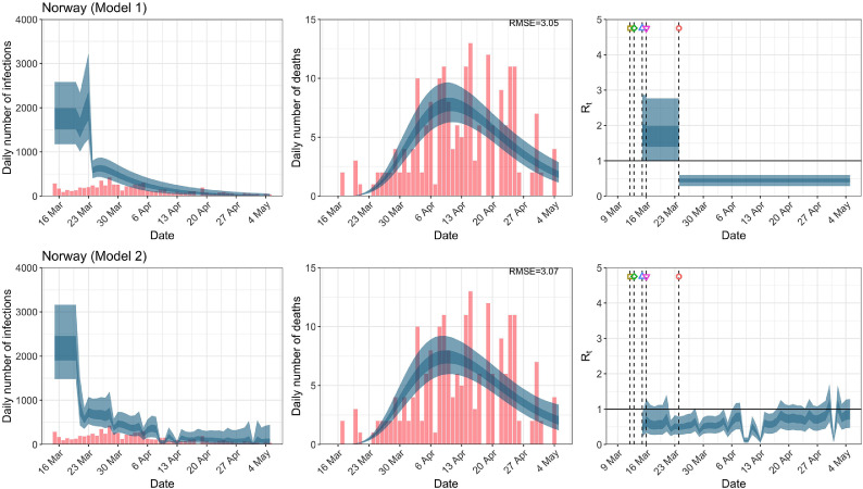
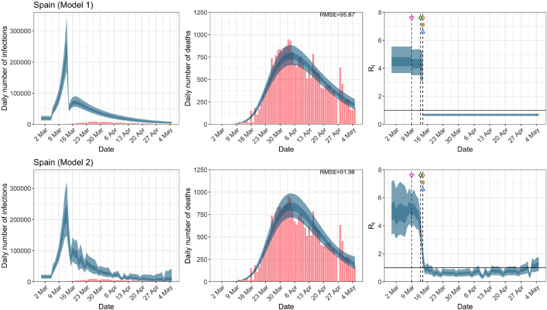
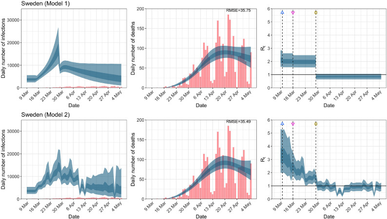
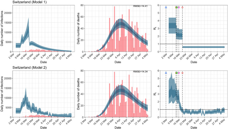
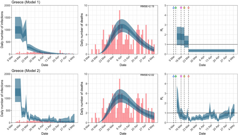
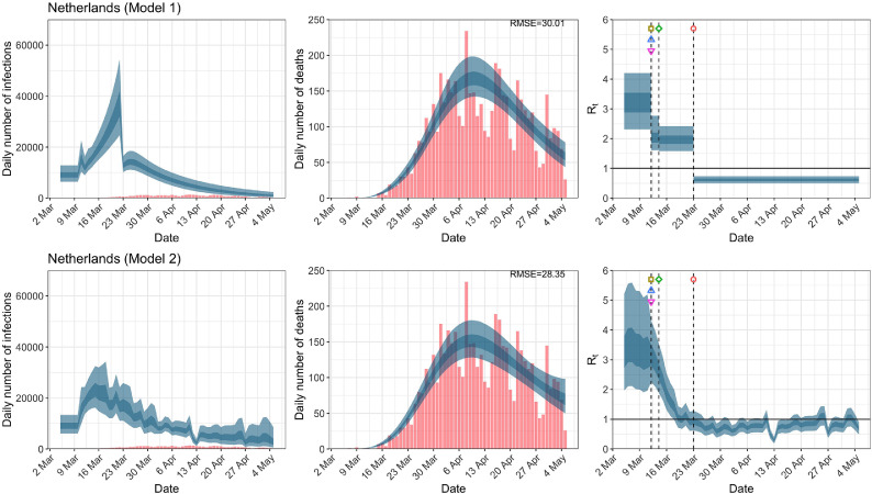
While model 1 and model 2 give very different trajectories of (Figs. 2 a, Fig. A.3, Fig. A.4, Fig. A.11, Fig. A.12, Appendix C), both models produce visually similar fits to the observed daily death counts, i.e., different trajectories of may give rise to the same data and hence different inference surrounding the impact of various NPIs. As pointed out in Flaxman et al. [1], the disparity between the observed and predicted number of cases is due to asymptomatic and non-documented infections and limited testing capacities.
Fig. 2.
United Kingdom. The start time for the plots is 10 days before 10 deaths are recorded. Observed counts of daily infections and daily deaths are shown in red, and their corresponding 50% and 95% CIs are shown in dark blue and light blue respectively. (For interpretation of the references to color in this figure legend, the reader is referred to the web version of this article.)
Fig. A.3.
Austria. The start time for the plots is 10 days before 10 deaths are recorded. Observed counts of daily infections and daily deaths are shown in red, and their corresponding 50% and 95% CIs are shown in dark blue and light blue, respectively. (For interpretation of the references to color in this figure legend, the reader is referred to the web version of this article.)
Fig. A.4.
Belgium. The start time for the plots is 10 days before 10 deaths are recorded. Observed counts of daily infections and daily deaths are shown in red, and their corresponding 50% and 95% CIs are shown in dark blue and light blue, respectively. (For interpretation of the references to color in this figure legend, the reader is referred to the web version of this article.)
Fig. A.11.
Sweden. The start time for the plots is 10 days before 10 deaths are recorded. Observed counts of daily infections and daily deaths are shown in red, and their corresponding 50% and 95% CIs are shown in dark blue and light blue, respectively. (For interpretation of the references to color in this figure legend, the reader is referred to the web version of this article.)
Fig. A.12.
Switzerland. The start time for the plots is 10 days before 10 deaths are recorded. Observed counts of daily infections and daily deaths are shown in red, and their corresponding 50% and 95% CIs are shown in dark blue and light blue, respectively. (For interpretation of the references to color in this figure legend, the reader is referred to the web version of this article.)
For the 11 countries (Table 1 ), the inference from model 1 indicates that lockdown had the biggest impact of all the interventions in all countries with an average reduction in of 80%. In contrast, model 2 shows clearly that was falling well before lockdown, excluding Sweden that had no lockdown. In the other 10 countries, at the time of lockdown in 4 countries and only in another 3 countries (all three 95% CIs contained 1.0).
Table 1.
Comparison of the value of at lockdown (LD) and its 95% CIs between models 1 and 2 for all eleven countries analyzed in Flaxman et al. [1] for the time horizon March 4th to May 5th. Values of basic reproduction number and immediately after the introduction of other NPIs for both models are given in Table A.5 in the Appendix.
| Country | Model 1 |
Model 2 |
||
|---|---|---|---|---|
| one day before LD | at LD | % change | at LD | |
| UK | 3.39 | 0.68 | 79.67 | 1.11 |
| (2.84, 3.94) | (0.55, 0.81) | ( 85.29, 72.96) | (0.75, 1.60) | |
| Austria | 2.96 | 0.52 | 81.42 | 0.87 |
| (1.67, 4.50) | (0.40, 0.64) | ( 88.80, 69.47) | (0.42, 1.55) | |
| Belgium | 4.30 | 0.90 | 78.31 | 4.83 |
| (2.87, 6.06) | (0.78, 1.02) | ( 85.99, 67.26) | (3.47, 6.45) | |
| Denmark | 3.25 | 0.68 | 78.11 | 0.58 |
| (1.98, 4.81) | (0.57, 0.80) | ( 86.01, 65.70) | (0.28, 1.05) | |
| France | 4.06 | 0.71 | 82.08 | 1.69 |
| (2.98, 4.95) | (0.61, 0.82) | ( 87.07, 74.21) | (1.16, 2.39) | |
| Germany | 3.68 | 0.73 | 79.99 | 1.02 |
| (2.94, 4.51) | (0.60, 0.85) | ( 85.84, 72.48) | (0.68, 1.47) | |
| Italy | 2.90 | 0.70 | 75.35 | 1.30 |
| (2.17, 3.46) | (0.63, 0.78) | ( 80.98, 66.51) | (0.86, 1.76) | |
| Norway | 2.42 | 0.40 | 82.30 | 0.50 |
| (1.36, 3.71) | (0.25, 0.57) | ( 91.04, 69.16) | (0.27, 0.79) | |
| Spain | 4.29 | 0.67 | 84.05 | 1.78 |
| (3.35, 5.39) | (0.59, 0.75) | ( 88.43, 78.72) | (1.22, 2.42) | |
| Sweden | – | – | – | – |
| Switzerland | 2.67 | 0.55 | 78.61 | 0.93 |
| (1.93, 3.48) | (0.44, 0.68) | ( 86.43, 67.32) | (0.62, 1.31) | |
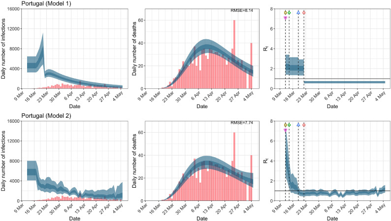
When we considered 3 additional countries (Table C.1), the average reduction in from lockdown shrank to 73% in model 1. Model 2 shows in 7 countries and in another 3 countries when lockdown was imposed. In particular, the three added countries already had at the time of lockdown. For Greece and Portugal, was already so low (0.34 and 0.67, respectively) that even the 95% CIs excluded 1.0.
Model 3 provides different inference yet again. Only the mobility and banning of public events had 95% CIs for regression coefficients which excluded zero (Fig. A.2). The impact of lockdown was not statistically significant (95% CI is -0.23, 4.25).
In comparing the models, Table A.4 shows that model 2 provides a lower RMSE for eight of the eleven original countries considered by Flaxman et al. [1], for the period March 4th to May 5th. The three countries for which model 1 had a lower RMSE are the UK, Germany and Norway.
Table 2 demonstrates that model 2 is the best supported by the data for all three information criteria: WAIC1, WAIC2 and DIC (see Appendix B.2). Model 3 is the next best supported by the data, while model 1 published in Nature is the least supported.
Table 2.
Estimates and standard errors of the differences of various information criteria against model 1; the Watanabe-Akaike information criterion, and which uses as a measure of fit with and as the effective number of parameters to penalize the fit respectively; the Deviance information criterion which uses as the measure of fit, and as the penalty. Note that a negative value implies a better predictive model compared to model 1, and the preferred model for each criteria and time period is shown in bold. See Appendix B for computational details.
| Model | Time period | |||
|---|---|---|---|---|
| 2 | Up to May 5th | 29.95 0.34 | 0.28 | |
| 3 | Up to May 5th | 24.03 0.31 | 22.49 0.36 | 23.29 0.29 |
| 2 | Up to July 12th | 54.27 1.78 | 49.93 3.42 | 51.95 0.37 |
| 3 | Up to July 12th | 36.74 1.30 | 32.24 3.22 | 34.97 0.37 |
3.4. Comparison of models up to July 12th
The analysis of the time horizon March 4th to July 12th, leads to very similar conclusions (Figs. 2b, A.3b–A.12b, A.13–A.15). Table 3 indicates that the impact of lockdown on the relative reduction in was 64% for model 1, while in model 2, seven countries already had 1.0 and only two countries had 95% CIs for exceeding 1.0 at the time of lockdown. In model 3, in contrast to the period until May 5th, with longer follow-up lockdown was statistically significant (95% CI is 0.23,1.43).
Fig. A.13.
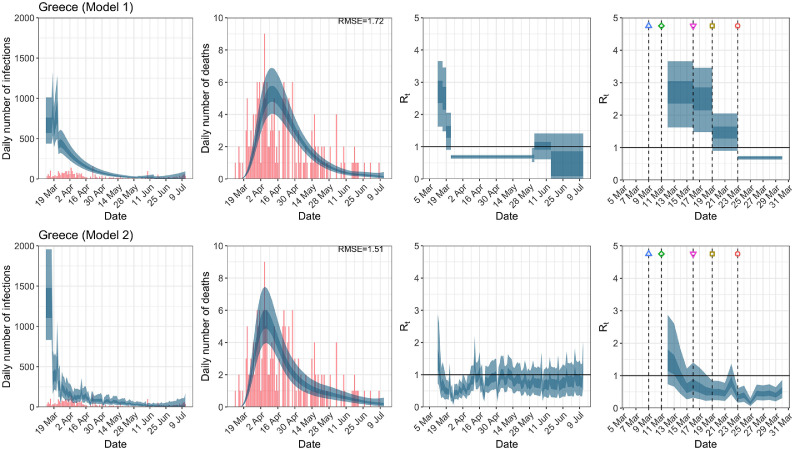
Greece. The start time for the plots is 10 days before 10 deaths are recorded. Observed counts of daily infections and daily deaths until July 12th are shown in red, and their corresponding 50% and 95% CIs are shown in dark blue and light blue, respectively. Column 4 is a magnification of column 3 showing the changes in around the period of the NPIs. (For interpretation of the references to color in this figure legend, the reader is referred to the web version of this article.)
Fig. A.15.
Portugal. The start time for the plots is 10 days before 10 deaths are recorded. Observed counts of daily infections and daily deaths until July 12th are shown in red, and their corresponding 50% and 95% CIs are shown in dark blue and light blue, respectively. Column 4 is a magnification of column 3 showing the changes in around the period of the NPIs. (For interpretation of the references to color in this figure legend, the reader is referred to the web version of this article.)
Table 3.
Comparison of the value of at lockdown (LD) and its 95% CIs between models 1 and 2 for all eleven countries analyzed in Flaxman et al. [1] and an additional three countries of Greece, Netherlands and Portugal, for the time horizon March 4th to July 12th.
| Country | Model 1 |
Model 2 |
||
|---|---|---|---|---|
| one day before LD | at LD | % change | at LD | |
| UK | 3.08 | 0.81 | 73.25 | 1.20 |
| (2.32, 3.78) | (0.76, 0.86) | ( 79.28, 64.03) | (0.72, 1.82) | |
| Austria | 1.82 | 0.61 | 64.58 | 0.72 |
| (1.16, 2.81) | (0.55, 0.67) | ( 78.02, 47.53) | (0.30, 1.42) | |
| Belgium | 2.10 | 0.70 | 65.58 | 1.43 |
| (1.46, 2.98) | (0.67, 0.73) | ( 76.83, 51.27) | (0.90, 2.05) | |
| Denmark | 1.73 | 0.68 | 59.12 | 0.56 |
| (1.16, 2.48) | (0.60, 0.76) | ( 72.79, 41.89) | (0.25, 1.05) | |
| France | 2.26 | 0.71 | 67.37 | 1.77 |
| (1.59, 3.12) | (0.67, 0.75) | ( 77.65, 53.86) | (1.11, 2.60) | |
| Germany | 3.31 | 0.71 | 78.13 | 1.12 |
| (2.51, 4.19) | (0.66, 0.76) | ( 83.73, 70.87) | (0.69, 1.67) | |
| Italy | 1.74 | 0.75 | 55.66 | 1.41 |
| (1.26, 2.32) | (0.71, 0.79) | ( 68.31, 39.35) | (0.88, 2.03) | |
| Norway | 1.52 | 0.57 | 60.72 | 0.53 |
| (0.97, 2.22) | (0.48, 0.66) | ( 74.83, 40.59) | (0.27, 0.88) | |
| Spain | 3.47 | 0.75 | 77.74 | 1.74 |
| (2.51, 4.46) | (0.72, 0.79) | ( 83.34, 69.56) | (1.07, 2.49) | |
| Sweden | – | – | – | – |
| Switzerland | 1.76 | 0.61 | 64.49 | 0.96 |
| (1.25, 2.41) | (0.57, 0.64) | ( 75.75, 50.23) | (0.58, 1.39) | |
| Greece | 1.46 | 0.69 | 51.03 | 0.35 |
| (0.90, 2.05) | (0.63, 0.74) | ( 67.21, 22.64) | (0.16, 0.61) | |
| Netherlands | 1.77 | 0.66 | 62.14 | 1.00 |
| (1.34, 2.25) | (0.61, 0.70) | ( 72.27, 49.34) | (0.61, 1.44) | |
| Portugal | 1.74 | 0.83 | 50.31 | 0.66 |
| (1.12, 2.39) | (0.80, 0.86) | ( 65.50, 25.24) | (0.36, 1.07) | |
In comparing the models, Table A.4 shows that model 2 provides a lower RMSE than model 1 for all countries for the period March 4th to July 12th, except Austria and Norway. Similarly, Table 2 again demonstrates that model 2 is the best supported by the data for all three information criteria: WAIC1, WAIC2 and DIC.
3.5. Change of start date
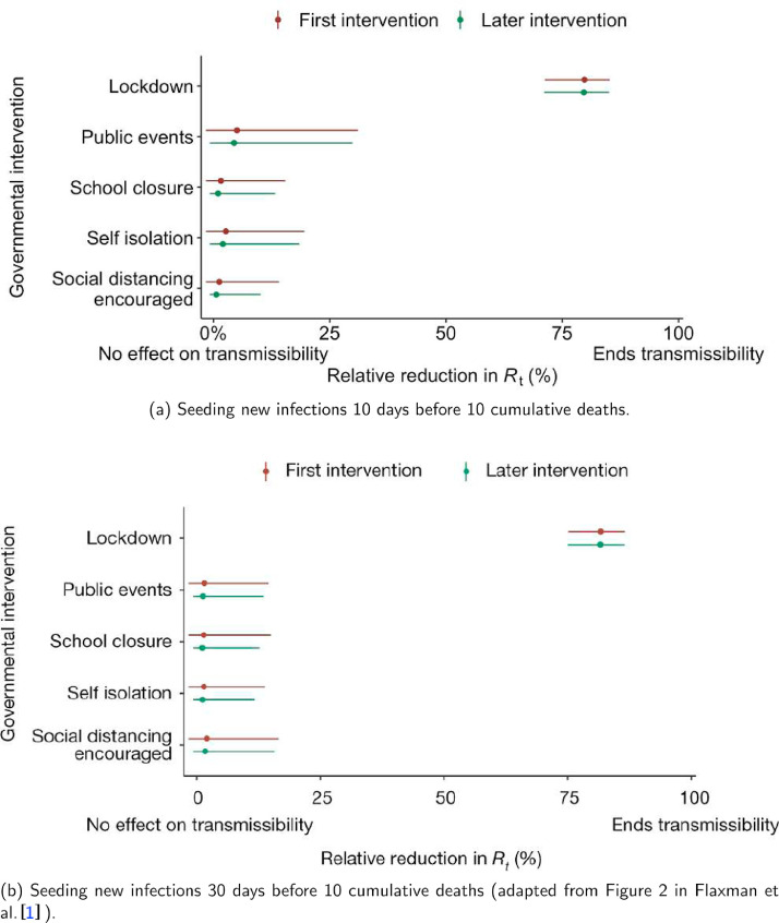
Inferences regarding the impact of the imposition of NPIs are not substantially affected by the start date nor the priors for the initial infection count (Fig. A.16).
Fig. A.16.
Comparison of the effectiveness of NPIs in terms of the relative percentage reduction in when assuming two different seeding periods of new infections.
4. Discussion
We demonstrate that effects of NPIs are non-robust and highly sensitive to model specification, assumptions and data employed to fit models. We obtained very different inferences regarding the effectiveness of lockdown measures in terms of curbing the epidemic wave and reducing fatalities. Lockdown appeared the most effective measure to save lives in the original analysis of 11 European countries performed by the Imperial College team through model 1. This analysis was published in Nature and has probably had a major impact to maintain a mentality among policy makers that lockdown should be used during the advent of second waves in many countries in the Fall of 2020. However, model 2 (which was also originally developed by the same team), suggested little or no benefit from lockdown in most of the same countries.
Importantly, model 2 typically outperformed model 1 in data fit. Consideration of longer follow-up that included also the lifting of many measures still suggested that the originally [1] claimed effects of lockdown were grossly overstated. Fitting yet a third model, resulted in yet further variant conclusions, with only mobility and event ban having regression coefficients with 95% CIs that did not contain 0 for the period until May 5th.
The different results and inferences of these models may be partly explained by the highly correlated structure of NPIs and mobility data, as well as the dense time clustering of the different NPIs being applied typically in close sequence. NPIs largely reduce by reducing contact among individuals. An indirect measure of the reduction in individual contact is the mobility data, and so these data will be highly correlated with NPIs, making any inference difficult by default. Moreover, as different NPIs are typically introduced in close sequence, their exact time lag before impact is difficult to model. Interaction effects between different NPIs may also exist. The effectiveness of different NPIs may also vary across locations and across time based on adherence, acceptability, and enforcement. Any collateral harms may also affect acceptability and adherence.
Given that the inference around the effectiveness of various NPIs is highly model-dependent and that more aggressive NPIs have more adverse effects on other aspects of health, society, and economy [7], [8], [9], [10], [11], [12], [13], [14], [15], [16], [17], [18], [19], [20], [21], [22], [23], [24], [25], [26], it is ill-advised to ignore the substantial model uncertainty. Failing to report this uncertainty may ultimately undermine the public’s trust in the value of policy decisions based on statistical modeling. Flaxman et al. [1] made the statement “We find that, across 11 countries, since the beginning of the epidemic, 3,100,000 [2,800,000–3,500,000] deaths have been averted due to intervention”. Both the provided estimate and the accompanying limited uncertainty are uncertain. When results vary widely based on model specification, strong inferences should be avoided. Equally careful modeling and evaluation of uncertainty needs to be performed also for the potential postulated harms of lockdown and other NPIs.
Given that modeling studies are typically not pre-registered, multiple analytical approaches and model specifications may be used on the same data [27], and data and results may be filtered by modelers according to whether they fit their prior beliefs. Clearly, an important issue in model comparison is the selection of the models to be compared [28]. In one sense, this selection can be cast in terms of priors over models. For example, investigators who just report one model may have prior beliefs that this is the only plausible model. The key argument made in this paper is that there are formal procedures for evaluating these prior assumptions that may lead to very different conclusions. Similarly, one can use Bayesian model comparison to optimize the priors over the parameters of any given structural form. In other words, a model can be specified in terms of the priors over parameters and the priors themselves can then be optimized with respect to Bayesian model evidence. When the functional form of the posterior is known, there are procedures that can do this very quickly and efficiently. For example, Bayesian model reduction allows one to optimize priors analytically by using a generalization of the Savage-Dickey ratio.
We do not claim that lockdown measures definitely had no impact in the first wave of COVID-19. Indeed model 2 showed that was still above 1 in some countries and thus it is possible that in these locations it may have some impact on the course of the epidemic wave. Other investigators using a different analytical approach have suggested also some benefits from lockdown; however, these benefits were of a smaller magnitude (e.g., 13% relative risk reduction [29]). Small benefits of such modest size would be less likely to match complete lockdown-induced harms in a careful decision analysis. Another modeling approach has found that benefits can be reaped by simple self-imposed interventions such as washing hands, wearing masks, and some social distancing [30]. Brauner et al. [31] analyze lockdown as a continuum with various measures to restrict contacts.
Some limitations of our work should be acknowledged. Besides model fit and parsimony metrics, theoretical and subjective considerations, as well as experience from other countries should be considered in model choice. However, given the observational nature of the data and the dynamic course of epidemic waves, one should avoid strong priors about effectiveness of different NPIs. Similarly, our results should not be interpreted with a nihilistic lens, i.e., that NPIs are totally ineffective. Decreasing exposures makes sense as a way to reduce epidemic wave propagation and eventually fatalities. However, if exposures can be reduced with less aggressive measures and fewer or no harms, this would be optimal. Finally, we did not examine very long-term time horizons. In theory, even effective measures may achieve only temporary mitigation and epidemic waves may surge again, when measures are relieved. We did observe this for the uplifting of measures in the July 12th analyses and empirical data from the emergence of second waves in many European countries and the USA in the fall of 2020 validate this hypothesis [32]. Availability of effective and safe vaccines may also affect risk-benefit ratios of NPI measures of different aggressiveness and different duration of implementation. It is noted that other investigators [33], [34], [35] have raised similar concerns using alternative approaches.
Overall, observational data that are fed into complex epidemic models should be dissected very carefully and substantial uncertainty may remain despite the best efforts of modelers [27], [36]. While there has been resistance to testing NPIs with randomized trials, such trials are feasible, and more thought and effort should be devoted on how to complement the available, tenuous observational data [37]. Regardless, causal interpretations from non-robust models should be avoided. In any decision analysis the accurate quantification of the size, not just the existence, of the impact of lockdown on is also critical. This is difficult task when one considers all the confounds between NPIs and mobility, as well as the several behavioral changes such as hand washing and wearing masks. This is an interesting area for research, and crucial for the management of future pandemics.
Author Contributions
All authors contributed equally to this work. VC performed all the computations and produced all the graphics. SC wrote the initial draft. JI and MT wrote subsequent drafts. All authors discussed the results and implications and commented on the manuscript at all stages.
Code Availability
All source code for the replication of our results is available from https://github.com/dare-centre/imperial-covid19-model.
Acknowledgments
We congratulate the Imperial College Response Team for sharing openly the code for their models and for the overall transparency of their work that has allowed performing these analyses. We thank Hadi Ashfar for his suggestions to improve the computational efficiency of the HMC scheme. We also thank Jack Wood for his help in the construction of Table A.3. We especially thank the three reviewers and the Editor for their highly thoughtful and deep comments which greatly improved the quality of this paper. We acknowledge the Sydney Informatics Hub and the University of Sydney’s high performance computing cluster Artemis for providing the high performance computing resources that have contributed to the research results reported within this paper.
Footnotes
Conflicts of interest: There are no conflicts of interest.
Funding: None.
Appendix A. Additional Figures and Tables
Fig. A.5.
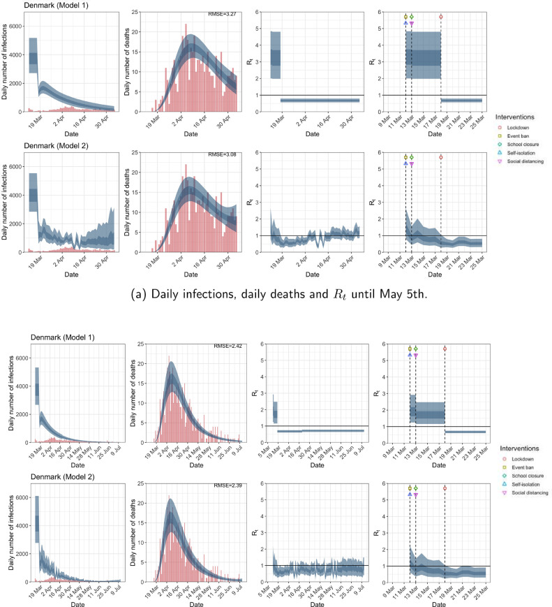
Denmark. The start time for the plots is 10 days before 10 deaths are recorded. Observed counts of daily infections and daily deaths are shown in red, and their corresponding 50% and 95% CIs are shown in dark blue and light blue, respectively. (For interpretation of the references to color in this figure legend, the reader is referred to the web version of this article.)
Fig. A.6.
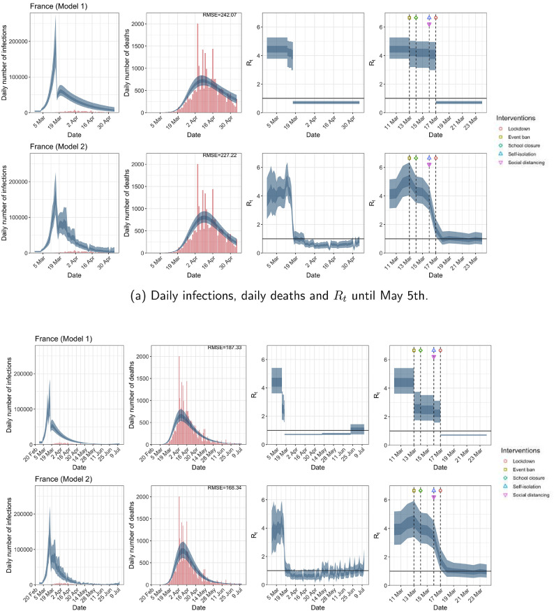
France. The start time for the plots is 10 days before 10 deaths are recorded. Observed counts of daily infections and daily deaths are shown in red, and their corresponding 50% and 95% CIs are shown in dark blue and light blue, respectively. (For interpretation of the references to color in this figure legend, the reader is referred to the web version of this article.)
Fig. A.7.
Germany. The start time for the plots is 10 days before 10 deaths are recorded. Observed counts of daily infections and daily deaths are shown in red, and their corresponding 50% and 95% CIs are shown in dark blue and light blue, respectively. (For interpretation of the references to color in this figure legend, the reader is referred to the web version of this article.)
Fig. A.8.
Italy. The start time for the plots is 10 days before 10 deaths are recorded. Observed counts of daily infections and daily deaths are shown in red, and their corresponding 50% and 95% CIs are shown in dark blue and light blue, respectively. (For interpretation of the references to color in this figure legend, the reader is referred to the web version of this article.)
Fig. A.9.
Norway. The start time for the plots is 10 days before 10 deaths are recorded. Observed counts of daily infections and daily deaths are shown in red, and their corresponding 50% and 95% CIs are shown in dark blue and light blue, respectively. (For interpretation of the references to color in this figure legend, the reader is referred to the web version of this article.)
Fig. A.10.
Spain. The start time for the plots is 10 days before 10 deaths are recorded. Observed counts of daily infections and daily deaths are shown in red, and their corresponding 50% and 95% CIs are shown in dark blue and light blue, respectively. (For interpretation of the references to color in this figure legend, the reader is referred to the web version of this article.)
Fig. A.14.
Netherlands. The start time for the plots is 10 days before 10 deaths are recorded. Observed counts of daily infections and daily deaths until July 12th are shown in red, and their corresponding 50% and 95% CIs are shown in dark blue and light blue, respectively. Column 4 is a magnification of column 3 showing the changes in around the period of the NPIs. (For interpretation of the references to color in this figure legend, the reader is referred to the web version of this article.)
Table A.1.
Seeding dates of new infections. Two seeding dates were used for Belgium – March 9th and March 4th for the data up to May 5th and July 12th respectively due to a reporting correction in the data.
| Country | Seeding date |
|---|---|
| Austria | March 13th |
| Belgium | March 9th/March 4th |
| Denmark | March 12th |
| France | February 27th |
| Germany | March 6th |
| Greece | March 12th |
| Italy | February 16th |
| Netherlands | March 5th |
| Norway | March 15th |
| Portugal | March 12th |
| Spain | February 29th |
| Sweden | March 9th |
| Switzerland | March 5th |
Table A.2.
Correspondence of subscripts for to each NPI.
| NPIs | |
|---|---|
| 1 | School closure |
| 2 | Event ban |
| 3 | Lockdown |
| 4 | Self-isolation |
| 5 | Social distancing |
| 6 | Government intervention |
Table A.3.
End dates for school closure [38], event ban [38] and lockdown in each country [39], [40], [41]. NPIs that are still in place as of July 12th are shown in while NPIs that were not implemented are shown in ✗.
| Country | School closure | Event ban | Lockdown |
|---|---|---|---|
| UK | May 13th | ||
| Austria | May 18th | May 1st | |
| Belgium | July 1st | June 7th | |
| Denmark | April 20th | ||
| France | June 22th | May 11th | |
| Germany | July 7th | May 6th | |
| Greece | June 1st | June 15th | May 30th |
| Italy | May 4th | ||
| Netherlands | June 15th | July 1st | May 11th |
| Norway | May 11th | June 2nd | April 21st |
| Portugal | July 5th | ||
| Spain | May 26th | ||
| Sweden | ✗ | ✗ | |
| Switzerland | June 6th | June 21st |
Table A.4.
RMSE of daily death counts for models 1 and 2 for the data up to May 5th and July 12th. A lower RMSE between models 1 and 2 for each country is shown in bold.
| Country | Up to May 5th |
Up to July 12th |
||
|---|---|---|---|---|
| Model 1 | Model 2 | Model 1 | Model 2 | |
| UK | 145.41 | 145.64 | 134.26 | 129.68 |
| Austria | 5.88 | 5.88 | 4.48 | 4.57 |
| Belgium | 71.16 | 52.91 | 25.20 | 15.84 |
| Denmark | 3.27 | 3.08 | 2.42 | 2.39 |
| France | 242.07 | 227.22 | 187.33 | 168.34 |
| Germany | 48.62 | 48.75 | 37.04 | 36.32 |
| Italy | 85.96 | 71.29 | 63.47 | 57.42 |
| Norway | 3.06 | 3.07 | 2.21 | 2.22 |
| Spain | 95.23 | 92.43 | 143.82 | 135.03 |
| Sweden | 35.82 | 35.55 | 33.12 | 33.09 |
| Switzerland | 14.61 | 14.34 | 10.37 | 10.31 |
| Greece | 1.72 | 1.51 | ||
| Netherlands | 21.48 | 21.01 | ||
| Portugal | 6.29 | 5.75 | ||
Table A.5.
Basic reproduction number and time-varying reproduction number immediately after the introduction of NPIs given by models 1 and 2 using data up to May 5th for all eleven countries analyzed in Flaxman et al. [1] These NPIs are self-isolation (SI), social distancing (SD), school closure (SC), event ban (EB) and lockdown (LD). 95% credible intervals are given in parentheses below the corresponding point estimates. Countries where the seeding of new infections occur after the introduction of NPIs are denoted with an asterisk.
| Country |
immediately after NPIs introduction |
|||||
|---|---|---|---|---|---|---|
| SI | SD | SC | EB | LD | ||
| Model 1. | ||||||
| UK | 3.55 | 3.45 | 3.42 | 3.39 | 0.68 | 0.68 |
| (2.99, 4.27) | (2.95, 4.00) | (2.92, 3.96) | (2.84, 3.94) | (0.55, 0.81) | (0.55, 0.81) | |
| Austria* | 3.14 | 0.52 | 0.52 | 2.96 | – | 0.52 |
| (1.91, 4.66) | (0.40, 0.64) | (0.40, 0.64) | (1.67, 4.50) | (0.40, 0.64) | ||
| Belgium | 4.72 | 4.59 | 4.30 | 4.30 | 4.38 | 0.90 |
| (3.38, 6.46) | (3.23, 6.32) | (2.87, 6.06) | (2.87, 6.06) | (2.92, 6.23) | (0.78, 1.02) | |
| Denmark | 3.56 | 3.31 | 3.25 | 3.25 | 3.31 | 0.68 |
| (2.27, 5.06) | (2.01, 4.84) | (1.98, 4.81) | (1.98, 4.81) | (2.01, 4.84) | (0.57, 0.80) | |
| France | 4.45 | 4.06 | 4.06 | 4.18 | 4.22 | 0.71 |
| (3.78, 5.27) | (2.98, 4.95) | (2.98, 4.95) | (3.14, 4.99) | (3.20, 5.03) | (0.61, 0.82) | |
| Germany | 3.86 | 3.75 | 3.72 | 3.68 | 0.73 | 0.73 |
| (3.07, 4.90) | (3.00, 4.65) | (2.97, 4.58) | (2.94, 4.51) | (0.60, 0.85) | (0.60, 0.85) | |
| Italy | 3.18 | 2.90 | 2.90 | 3.13 | 2.90 | 0.70 |
| (2.80, 3.61) | (2.17, 3.46) | (2.17, 3.46) | (2.69, 3.57) | (2.17, 3.46) | (0.63, 0.78) | |
| Norway* | 2.65 | 2.44 | 2.42 | – | – | 0.40 |
| (1.57, 3.99) | (1.36, 3.73) | (1.36, 3.71) | (0.25, 0.57) | |||
| Spain | 4.39 | 0.67 | 4.34 | 4.29 | 0.67 | 0.67 |
| (3.49, 5.50) | (0.59, 0.75) | (3.43, 5.43) | (3.35, 5.39) | (0.59, 0.75) | (0.59, 0.75) | |
| Sweden | 2.05 | 1.99 | 1.98 | – | 0.86 | – |
| (1.51, 2.74) | (1.48, 2.60) | (1.48, 2.57) | (0.63, 1.10) | |||
| Switzerland* | 2.94 | – | 2.67 | 2.69 | 2.72 | 0.55 |
| (2.18, 3.86) | (1.93, 3.48) | (1.95, 3.51) | (1.96, 3.57) | (0.44, 0.68) | ||
| Model 2. | ||||||
| UK | 4.17 | 4.26 | 4.08 | 2.34 | 1.11 | 1.11 |
| (2.62,6.39) | (3.28,5.35) | (3.13,5.11) | (1.76,3.00) | (0.75,1.60) | (0.75,1.60) | |
| Austria* | 3.34 | 0.87 | 0.87 | 1.88 | – | 0.87 |
| (1.46,6.09) | (0.42,1.55) | (0.42,1.55) | (0.92,3.33) | (0.42,1.55) | ||
| Belgium | 4.33 | 4.38 | 4.52 | 4.52 | 4.81 | 4.83 |
| (2.55,6.72) | (2.77,6.48) | (2.87,6.69) | (2.87,6.69) | (3.06,7.11) | (3.47,6.45) | |
| Denmark | 2.43 | 1.51 | 0.87 | 0.87 | 1.51 | 0.58 |
| (1.16,4.87) | (0.80,2.66) | (0.45,1.57) | (0.45,1.57) | (0.80,2.66) | (0.28,1.05) | |
| France | 4.10 | 3.77 | 3.77 | 4.36 | 5.10 | 1.69 |
| (2.66,6.11) | (3.00,4.65) | (3.00,4.65) | (3.52,5.37) | (4.04,6.35) | (1.16,2.39) | |
| Germany | 4.56 | 4.43 | 4.39 | 4.12 | 1.02 | 1.02 |
| (2.72,7.11) | (2.72,6.69) | (2.69,6.63) | (2.97,5.56) | (0.68,1.47) | (0.68,1.47) | |
| Italy | 4.55 | 2.12 | 2.12 | 2.91 | 2.12 | 1.30 |
| (2.76,6.98) | (1.47,2.80) | (1.47,2.80) | (2.20,3.65) | (1.47,2.80) | (0.86,1.76) | |
| Norway* | 2.10 | 0.46 | 0.68 | – | – | 0.50 |
| (1.06,4.39) | (0.21,0.87) | (0.33,1.26) | (0.27,0.79) | |||
| Spain | 4.68 | 1.78 | 4.97 | 3.77 | 1.78 | 1.78 |
| (2.98,6.96) | (1.22,2.42) | (3.81,6.28) | (2.85,4.80) | (1.22,2.42) | (1.22,2.42) | |
| Sweden | 3.49 | 3.25 | 2.50 | – | 1.55 | – |
| (1.91,5.96) | (1.93,5.25) | (1.73,3.51) | (1.11,2.06) | |||
| Switzerland* | 3.48 | – | 2.62 | 2.57 | 3.16 | 0.93 |
| (1.84,5.85) | (1.79,3.66) | (1.76,3.59) | (2.13,4.44) | (0.62,1.31) | ||
Appendix B. Priors and Measures of Fit
B.1. Priors
For posterior inference in model 1, we use the same priors as in Flaxman et al. [1] for the analysis up to May 5th and July 12th. For model 2, we use the same prior distributions as in Unwin et al. [2] except for and in Equation (2).
For we use a weakly informative prior of a normal distribution truncated below at 1 with mean 3.28 and standard deviation 2. This prior is chosen so that approximately 95% of the prior density is between 1 and 7 [42], and that is above the critical value of 1 at the start of the epidemic.
For we examine the sensitivity of the posterior to two priors. The first prior that we consider is that used by Unwin et al. [2]–this prior is very informative, with . That is, a priori they assume lies in the interval with probability 0.95. In contrast, the second prior we considered is an uninformative prior, and the posterior mode of in model 2 up to May 5th is found to be approximately -4. This means that the prior used by Unwin et al. [2] has almost no support over this posterior distribution. This has two consequences, first it makes convergence of the Markov chain very difficult and sensitive to starting values. Second, it shrinks the value of towards zero, underestimating the impact of mobility on . The second prior, makes the convergence of the chain more robust to poor starting values.
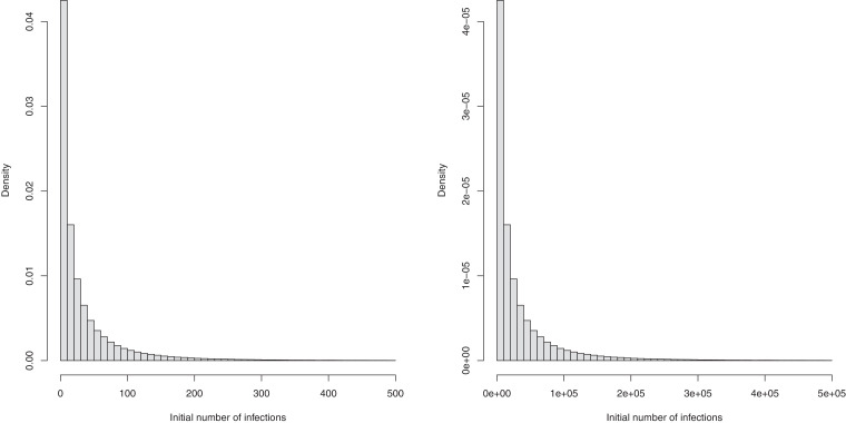
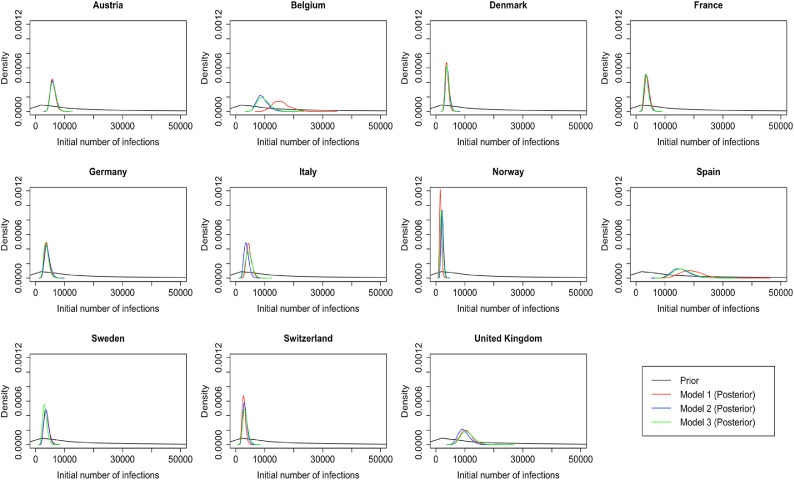
We also change the prior for the number of initial infection count at the start of the time period for two reasons. First, due to data constraints, we chose to start the seeding of infections only 10 days before the date of the 10th cumulative death. In contrast, Flaxman et al. [1] chose to start the seeding of infections 30 days prior to the date of the 10th cumulative death. Flaxman et al. [1] chose a prior for initial infection count which was relatively tight, the probability that the initial infection count was greater than 500 is . Using this prior for the number of infections 20 days later again is not realistic and again leads to convergence problems. We therefore chose a less informative prior for the initial infection count. Plots of these prior distributions can be found in Fig. B.1 , and the posterior distributions of the parameter in the 11 countries for the analysis until May 5th are shown in Fig. B.2 .
Fig. B.1.
Prior distributions of initial infection count used in Flaxman et al. [1] (left) and our analysis (right).
Fig. B.2.
Posterior distributions of initial infection count in the 11 countries for the analysis until May 5th in all three models.
Notably, Bayesian data analysts typically examine a variety of priors to gauge the sensitivity of results to the prior specification [6].
B.2. Bayesian measures of model fit
To compare the fit of the three models to the data, we consider four metrics: three estimates of various information criteria, as well as the root mean square error (RMSE). The information criteria metrics are two versions of the Watanabe-Akaike information criteria[43], denoted by WAIC1 and WAIC2 and the Deviance information criterion DIC[44]. Both WAIC1 and WAIC2 use the log pointwise predictive density (lppd) as a measure of fit.
When comparing the evidence for one model relative to another, one is effectively comparing the marginal likelihood of the data under a particular model with the likelihood of the same data under a different model. This can be taken as the relative likelihood of the two models if both models were equally likely a priori. Crucially, the log evidence can always be decomposed into accuracy and complexity, where complexity is the Kullback-Leibler divergence between the prior and the posterior. Generally, this is extremely difficult to evaluate using sampling procedures, and is usually approximated with a function of the number of free parameters. This leads to various information criteria, some of which we report in this work (i.e., the WAIC and DIC).
The differences in these information criteria can be taken as the log odds ratio of two models. For example, a difference in the DIC of three corresponds roughly to an odds ratio of 20 to one, in terms of the marginal likelihood of the two models. For completeness, we also report the accuracy in terms of the root mean square error (RMSE). A key aspect of model comparison is the evaluation of model complexity. In other words, simply maximizing accuracy will generally lead to overfitting and a failure to generalize - that goes hand-in-hand with a poor predictive validity.
To penalize the fit, WAIC1 uses
| (4) |
as an estimate of the effective number of parameters, where denotes the expectation over the posterior distribution of model parameters given the observed data . The criteria WAIC2 uses
| (5) |
where denotes the variance over the posterior distribution of . The DIC metric uses with being the posterior mean of as a measure of fit and
| (6) |
as the penalty. It is well known [45] that it is notoriously difficult to evaluate model evidence from sample distributions (especially in hierarchical Bayesian models where it is difficult to count the true number of parameters required in such metrics as AIC or BIC), both in terms of computational costs, as well as mathematically. This may be why model comparison may be generally lacking in epidemiology.
Appendix C. Analysis up to May 5th for all 14 countries
Fig. C.1.
Daily infections, daily deaths and in the United Kingdom until May 5th. The start time for the plots is 10 days before 10 deaths are recorded. Observed counts of daily infections and daily deaths are shown in red, and their corresponding 50% and 95% CIs are shown in dark blue and light blue, respectively. (For interpretation of the references to color in this figure legend, the reader is referred to the web version of this article.)
Fig. C.2.
Daily infections, daily deaths and in Austria until May 5th. The start time for the plots is 10 days before 10 deaths are recorded. Observed counts of daily infections and daily deaths are shown in red, and their corresponding 50% and 95% CIs are shown in dark blue and light blue, respectively. (For interpretation of the references to color in this figure legend, the reader is referred to the web version of this article.)
Fig. C.3.
Daily infections, daily deaths and in Belgium until May 5th. The start time for the plots is 10 days before 10 deaths are recorded. Observed counts of daily infections and daily deaths are shown in red, and their corresponding 50% and 95% CIs are shown in dark blue and light blue, respectively. (For interpretation of the references to color in this figure legend, the reader is referred to the web version of this article.)
Fig. C.4.
Daily infections, daily deaths and in Denmark until May 5th. The start time for the plots is 10 days before 10 deaths are recorded. Observed counts of daily infections and daily deaths are shown in red, and their corresponding 50% and 95% CIs are shown in dark blue and light blue, respectively. (For interpretation of the references to color in this figure legend, the reader is referred to the web version of this article.)
Fig. C.5.
Daily infections, daily deaths and in France until May 5th. The start time for the plots is 10 days before 10 deaths are recorded. Observed counts of daily infections and daily deaths are shown in red, and their corresponding 50% and 95% CIs are shown in dark blue and light blue, respectively. (For interpretation of the references to color in this figure legend, the reader is referred to the web version of this article.)
Fig. C.6.
Daily infections, daily deaths and in Germany until May 5th. The start time for the plots is 10 days before 10 deaths are recorded. Observed counts of daily infections and daily deaths are shown in red, and their corresponding 50% and 95% CIs are shown in dark blue and light blue, respectively. (For interpretation of the references to color in this figure legend, the reader is referred to the web version of this article.)
Fig. C.7.
Daily infections, daily deaths and in Italy until May 5th. The start time for the plots is 10 days before 10 deaths are recorded. Observed counts of daily infections and daily deaths are shown in red, and their corresponding 50% and 95% CIs are shown in dark blue and light blue, respectively. (For interpretation of the references to color in this figure legend, the reader is referred to the web version of this article.)
Fig. C.8.
Daily infections, daily deaths and in Norway until May 5th. The start time for the plots is 10 days before 10 deaths are recorded. Observed counts of daily infections and daily deaths are shown in red, and their corresponding 50% and 95% CIs are shown in dark blue and light blue, respectively. (For interpretation of the references to color in this figure legend, the reader is referred to the web version of this article.)
Fig. C.9.
Daily infections, daily deaths and in Spain until May 5th. The start time for the plots is 10 days before 10 deaths are recorded. Observed counts of daily infections and daily deaths are shown in red, and their corresponding 50% and 95% CIs are shown in dark blue and light blue, respectively. (For interpretation of the references to color in this figure legend, the reader is referred to the web version of this article.)
Fig. C.10.
Daily infections, daily deaths and in Sweden until May 5th. The start time for the plots is 10 days before 10 deaths are recorded. Observed counts of daily infections and daily deaths are shown in red, and their corresponding 50% and 95% CIs are shown in dark blue and light blue, respectively. (For interpretation of the references to color in this figure legend, the reader is referred to the web version of this article.)
Fig. C.11.
Daily infections, daily deaths and in Switzerland until May 5th. The start time for the plots is 10 days before 10 deaths are recorded. Observed counts of daily infections and daily deaths are shown in red, and their corresponding 50% and 95% CIs are shown in dark blue and light blue, respectively. (For interpretation of the references to color in this figure legend, the reader is referred to the web version of this article.)
Fig. C.12.
Daily infections, daily deaths and in Greece until May 5th. The start time for the plots is 10 days before 10 deaths are recorded. Observed counts of daily infections and daily deaths are shown in red, and their corresponding 50% and 95% CIs are shown in dark blue and light blue, respectively. (For interpretation of the references to color in this figure legend, the reader is referred to the web version of this article.)
Fig. C.13.
Daily infections, daily deaths and in the Netherlands until May 5th. The start time for the plots is 10 days before 10 deaths are recorded. Observed counts of daily infections and daily deaths are shown in red, and their corresponding 50% and 95% CIs are shown in dark blue and light blue, respectively. (For interpretation of the references to color in this figure legend, the reader is referred to the web version of this article.)
Fig. C.14.
Daily infections, daily deaths and in Portugal until May 5th. The start time for the plots is 10 days before 10 deaths are recorded. Observed counts of daily infections and daily deaths are shown in red, and their corresponding 50% and 95% CIs are shown in dark blue and light blue, respectively. (For interpretation of the references to color in this figure legend, the reader is referred to the web version of this article.)
Table C.1.
Comparison of the value of at lockdown (LD) and its 95% CIs between models 1 and 2 for all eleven countries analyzed in Flaxman et al. [1] and an additional three countries of Greece, Netherlands, and Portugal, for the time horizon March 4th to May 5th
| Country | Model 1 |
Model 2 |
||
|---|---|---|---|---|
| one day before LD | at LD | % change | at LD | |
| UK | 3.31 | 0.68 | −79.18 | 1.11 |
| (2.55, 3.87) | (0.57, 0.80) | (−84.65, −70.85) | (0.74, 1.60) | |
| Austria | 2.08 | 0.52 | −73.01 | 0.87 |
| (1.17, 3.57) | (0.41, 0.64) | (−85.48, −57.22) | (0.41, 1.55) | |
| Belgium | 2.90 | 0.72 | −74.14 | 1.46 |
| (2.06, 4.01) | (0.62, 0.83) | (−83.75, −61.69) | (1.00, 1.99) | |
| Denmark | 2.28 | 0.68 | 68.63 | 0.57 |
| (1.39, 3.53) | (0.57, 0.79) | ( 80.92, 51.75) | (0.28, 1.04) | |
| France | 3.03 | 0.75 | 74.61 | 1.70 |
| (2.18, 4.14) | (0.65, 0.84) | ( 83.60, 63.22) | (1.16, 2.40) | |
| Germany | 3.65 | 0.73 | 79.78 | 1.02 |
| (2.90, 4.40) | (0.62, 0.84) | ( 85.08, 72.05) | (0.68, 1.44) | |
| Italy | 2.11 | 0.71 | 65.31 | 1.28 |
| (1.51, 2.86) | (0.64, 0.78) | ( 75.81, 51.48) | (0.86, 1.73) | |
| Norway | 1.72 | 0.44 | 72.77 | 0.50 |
| (0.99, 2.77) | (0.28, 0.60) | ( 85.98, 55.88) | (0.28, 0.79) | |
| Spain | 4.19 | 0.68 | 83.53 | 1.78 |
| (3.09, 5.24) | (0.60, 0.75) | ( 87.98, 77.23) | (1.22, 2.42) | |
| Sweden | – | – | – | – |
| Switzerland | 2.15 | 0.60 | 71.14 | 0.93 |
| (1.57, 2.90) | (0.49, 0.71) | ( 82.00, 57.72) | (0.62, 1.30) | |
| Greece | 1.20 | 0.36 | 68.90 | 0.34 |
| (0.68, 1.89) | (0.21, 0.51) | ( 83.34, 48.58) | (0.18, 0.54) | |
| Netherlands | 1.97 | 0.62 | 68.09 | 0.93 |
| (1.58, 2.42) | (0.50, 0.73) | ( 78.27, 55.73) | (0.63, 1.28) | |
| Portugal | 2.04 | 0.65 | 66.93 | 0.67 |
| (1.32, 2.92) | (0.53, 0.76) | ( 79.89, 47.70) | (0.42, 0.99) | |
References
- 1.Flaxman S., Mishra S., Gandy A., Unwin H.J.T., Mellan T.A., Coupland H., et al. Estimating the effects of non-pharmaceutical interventions on COVID-19 in Europe. Nature. 2020;584:257–261. doi: 10.1038/s41586-020-2405-7. [DOI] [PubMed] [Google Scholar]; https://doi.org/10.1038/s41586-020-2405-7.
- 2.Unwin H.J.T., Mishra S., Bradley V.C., Gandy A., Mellan T.A., Coupland H., et al. State-level tracking of COVID-19 in the United States. Nat Commun. 2020;11 doi: 10.1038/s41467-020-19652-6. [DOI] [PMC free article] [PubMed] [Google Scholar]; https://doi.org/10.1038/s41467-020-19652-6.
- 3.Google LLC. Google COVID-19 Community Mobility Reports. Retrieved from: https://www.google.com/covid19/mobility/; 2020. Last accessed: July 15, 2020.
- 4.Grifoni A., Weiskopf D., Ramirez S.I., Mateus J., Dan J.M., Moderbacher C.R., et al. Targets of T cell responses to SARS-CoV-2 coronavirus in humans with COVID-19 disease and unexposed individuals. Cell. 2020;181(7):1489–1501. doi: 10.1016/j.cell.2020.05.015. [DOI] [PMC free article] [PubMed] [Google Scholar]; https://doi.org/10.1016/j.cell.2020.05.015.
- 5.Gelman A., Rubin D. Inference from iterative simulation using multiple sequences. Stat Sci. 1992;7:457–472. [Google Scholar]
- 6.Tanner M. Springer; 1996. Tools for statistical inference. [Google Scholar]
- 7.Woolf S., Chapman D., Sabo R., Weinberger D., Hill L. Excess deaths from COVID-19 and other causes, March-April 2020. JAMA. 2020;324(5):510–513. doi: 10.1001/jama.2020.11787. [DOI] [PMC free article] [PubMed] [Google Scholar]; https://doi.org/10.1001/jama.2020.11787.
- 8.VanderWeele T. Challenges estimating total lives lost in COVID-19 decisions: consideration of mortality related to unemployment, social isolation, and depression. JAMA. 2020;324:445–446. doi: 10.1001/jama.2020.12187. [DOI] [PubMed] [Google Scholar]; https://doi.org/10.1001/jama.2020.12187.
- 9.De Filippo O., D'Ascenzo F., Angelini F., Bocchino P.P., Conrotto F., Saglietto A., et al. Reduced rate of hospital admissions for ACS during Covid-19 outbreak in northern Italy. N Engl J Med. 2020;383:88–89. doi: 10.1056/NEJMc2009166. [DOI] [PMC free article] [PubMed] [Google Scholar]; https://doi.org/10.1056/NEJMc2009166.
- 10.Metzler B., Siostrzonek P., Binder R., Bauer A., Reinstadler S. Decline of acute coronary syndrome admissions in Austria since the outbreak of COVID-19: the pandemic response causes cardiac collateral damage. Eur Heart J. 2020;41:1852–1853. doi: 10.1093/eurheartj/ehaa314. [DOI] [PMC free article] [PubMed] [Google Scholar]; https://doi.org/10.1093/eurheartj/ehaa314.
- 11.Ioannidis J.P.A. Global perspective of COVID-19 epidemiology for a full-cycle pandemic. Eur J Clin Invest. 2020;50 doi: 10.1111/eci.13423. [DOI] [PMC free article] [PubMed] [Google Scholar]; https://doi.org/10.1111/eci.13423.
- 12.Czeisler M.É, Lane R.I., Petrosky E., Wiley J.F., Christensen A., Njai R., et al. Mental health, substance use, and suicidal ideation during the COVID-19 pandemic–United States, June 24-30, 2020. Morbid Mortality Weekly Rep. 2020;69:1049–1057. doi: 10.15585/mmwr.mm6932a1. [DOI] [PMC free article] [PubMed] [Google Scholar]; https://doi.org/10.15585/mmwr.mm6932a1.
- 13.Melnick E.R., Ioannidis J.P.A. Should governments continue lockdown to slow the spread of COVID-19? BMJ. 2020;369 doi: 10.1136/bmj.m1924. [DOI] [PubMed] [Google Scholar]; https://doi.org/10.1136/bmj.m1924.
- 14.Brooks S.K., Webster R.K., Smith L.E., Woodland L., Wessely S., Greenberg N., et al. The psychological impact of quarantine and how to reduce it: rapid review of the evidence. Lancet. 2020;395:912–920. doi: 10.1016/S0140-6736(20)30460-8. [DOI] [PMC free article] [PubMed] [Google Scholar]; https://doi.org/10.1016/S0140-6736(20)30460-8.
- 15.Sud A., Jones M.E., Broggio J., Loveday C., Torr B., Garrett A., et al. Collateral damage: the impact on outcomes from cancer surgery of the COVID-19 pandemic. Ann Oncol. 2020;31:1065–1074. doi: 10.1016/j.annonc.2020.05.009. [DOI] [PMC free article] [PubMed] [Google Scholar]; https://doi.org/10.1016/j.annonc.2020.05.009.
- 16.Stephenson J. Sharp drop in routine vaccinations for US children amid COVID-19 pandemic. JAMA Health Forum. 2020 doi: 10.1001/jamahealthforum.2020.0608. [DOI] [PubMed] [Google Scholar]; https://jamanetwork.com/channels/health-forum/fullarticle/2766119.
- 17.Docherty K.F., Butt J.H., de Boer R.A., Dewan P., Køber L., Maggioni A.P., et al. Deaths from COVID-19: who are the forgotten victims? medRxiv. 2020 [Google Scholar]; https://doi.org/10.1101/2020.04.21.20073114.
- 18.Moser D.A., Glaus J., Frangou S., Schechter D.S. Years of life lost due to the psychosocial consequences of COVID-19 mitigation strategies based on Swiss data. Eur Psychiat. 2020;63 doi: 10.1192/j.eurpsy.2020.56. [DOI] [PMC free article] [PubMed] [Google Scholar]; https://doi.org/10.1192/j.eurpsy.2020.56.
- 19.Roesch E., Amin A., Gupta J., Garcí-Moreno C. Violence against women during covid-19 pandemic restrictions. BMJ. 2020;369 doi: 10.1136/bmj.m1712. [DOI] [PMC free article] [PubMed] [Google Scholar]; https://doi.org/10.1136/bmj.m1712.
- 20.Boman J., Gallupe O. Has COVID-19 changed crime? Crime rates in the United States during the pandemic. American Journal of Criminal Justice. 2020;45:537–545. doi: 10.1007/s12103-020-09551-3. [DOI] [PMC free article] [PubMed] [Google Scholar]; https://doi.org/10.1007/s12103-020-09551-3.
- 21.Picheta R. Coronavirus pandemic will cause global famines of ‘biblical proportions,’ UN warns. CNN. 2020 [Google Scholar]; https://www.cnn.com/2020/04/22/africa/coronavirus-famine-un-warning-intl/index.html.
- 22.Zumla A., Marais B.J., McHugh T.D., Maeurer M., Zumla A., Kapata N., et al. COVID-19 And tuberculosis–threats and opportunities. Int J Tuberculosis Lung Dis. 2020;24:757–760. doi: 10.5588/ijtld.20.0387. [DOI] [PubMed] [Google Scholar]; https://doi.org/10.5588/ijtld.20.0387.
- 23.Ribeiro F., Leist A. Who is going to pay the price of Covid-19? Reflections about an unequal Brazil. Int J Equity Health. 2020;19 doi: 10.1186/s12939-020-01207-2. [DOI] [PMC free article] [PubMed] [Google Scholar]; https://doi.org/10.1186/s12939-020-01207-2.
- 24.Fu S., George E., Maggio P., Hawn M., Nazerali R. The consequences of delaying elective surgery: surgical perspective. Ann Surg. 2020;272 doi: 10.1097/SLA.0000000000003998. [DOI] [PMC free article] [PubMed] [Google Scholar]; https://doi.org/10.1097/SLA.0000000000003998.
- 25.Del Vecchio Blanco G., Calabrese E., Biancone L., Monteleone G., Paoluzi O.A. The impact of COVID-19 pandemic in the colorectal cancer prevention. Int J Colorectal Dis. 2020;35:1951–1954. doi: 10.1007/s00384-020-03635-6. [DOI] [PMC free article] [PubMed] [Google Scholar]; https://doi.org/10.1007/s00384-020-03635-6.
- 26.Avery C., Bossert W., Clark A., Ellison G., Ellison S.F. Policy implications of models of the spread of coronavirus: perspectives and opportunities for economists. Natl Bureau Econ Res Working PapSer. 2020;(w27007) [Google Scholar]
- 27.Ioannidis J.P.A., Cripps S., Tanner M.A. Forecasting for COVID-19 has failed. Int J Forecast. 2020 doi: 10.1016/j.ijforecast.2020.08.004. [DOI] [PMC free article] [PubMed] [Google Scholar]; https://doi.org/10.1016/j.ijforecast.2020.08.004.
- 28.Friston K.J., Parr T., Zeidman P., Razi A., Flandin G., Daunizeau J., et al. Dynamic causal modelling of COVID-19. Wellcome Open Res. 2020;5:89 doi: 10.12688/wellcomeopenres.15881.1. [DOI] [PMC free article] [PubMed] [Google Scholar]; https://doi.org/10.12688/wellcomeopenres.15881.2.
- 29.Islam N., Sharp S.J., Chowell G., Shabnam S., Kawachi I., Lacey B., et al. Physical distancing interventions and incidence of coronavirus disease 2019: natural experiment in 149 countries. BMJ. 2020;370 doi: 10.1136/bmj.m2743. [DOI] [PMC free article] [PubMed] [Google Scholar]; https://doi.org/10.1136/bmj.m2743.
- 30.Teslya A., Pham T.M., Godijk N.G., Kretzschmar M.E., Bootsma M.C.J., Rozhnova G., et al. Impact of self-imposed prevention measures and short-term government-imposed social distancing on mitigating and delaying a COVID-19 epidemic: a modelling study. PLoS Med. 2020 doi: 10.1371/journal.pmed.1003166. [DOI] [PMC free article] [PubMed] [Google Scholar]; https://doi.org/10.1371/journal.pmed.1003166.
- 31.Brauner J.M., Mindermann S., Sharma M., Johnston D., Salvatier J., Gaveniak T., et al. Inferring the effectiveness of government interventions against COVID-19. Science. 2021;371(6531) doi: 10.1126/science.abd9338. [DOI] [PMC free article] [PubMed] [Google Scholar]; https://doi.org/10.1126/science.abd9338.
- 32.Ioannidis J.P.A., Axfors C., Contopoulos-Ioannidis D.G. Second versus first wave of COVID-19 deaths: shifts in age distribution and in nursing home fatalities. Environ Res. 2021:110856. doi: 10.1016/j.envres.2021.110856. [DOI] [PMC free article] [PubMed] [Google Scholar]; https://doi.org/10.1016/j.envres.2021.110856.
- 33.Kuhbandner C., Homburg S. Commentary: estimating the effects of non-pharmaceutical interventions on COVID-19 in Europe. Front Med (Lausanne) 2020;7 doi: 10.3389/fmed.2020.580361. [DOI] [PMC free article] [PubMed] [Google Scholar]; https://doi.org/10.3389/fmed.2020.580361.
- 34.Soltesz K., Gustafsson F., Timpka T., Jaldén J., Jidling C., Heimerson A., et al. The effect of interventions on COVID-19. Nature. 2020;588:E26–E28. doi: 10.1038/s41586-020-3025-y. [DOI] [PubMed] [Google Scholar]; https://doi.org/10.1038/s41586-020-3025-y.
- 35.Wood S. Did COVID-19 infections decline before UK lockdown? 2020; https://arxiv.org/abs/2005.02090.
- 36.Jewell N.P., Lewnard J.A., Jewell B.L. Predictive mathematical models of the COVID-19 pandemic: underlying principles and value of projections. JAMA. 2020;323(19):1893–1894. doi: 10.1001/jama.2020.6585. [DOI] [PubMed] [Google Scholar]; https://doi.org/10.1001/jama.2020.6585.
- 37.Cristea I.A., Naudet F., Ioannidis J.P.A. Preserving equipoise and performing randomised trials for COVID-19 social distancing interventions. Epidemiol Psychiatr Sci. 2020;29 doi: 10.1017/S2045796020000992. [DOI] [PMC free article] [PubMed] [Google Scholar]; https://doi.org/10.1017/S2045796020000992.
- 38.Hale T., Webster S., Petherick A., Phillips T., Kira B.. Oxford COVID-19 government response tracker. Retrieved from: https://github.com/OxCGRT/covid-policy-tracker; 2020. Last accessed: July 15, 2020.
- 39.Our World in Data. Policy responses to the coronavirus pandemic. Retrieved from: https://ourworldindata.org/policy-responses-covid; 2020. Last accessed: July 15, 2020.
- 40.SBS News. Denmark reports no spike in coronavirus cases since lifting lockdown. 2020. Retrieved from: https://www.sbs.com.au/news/denmark-reports-no-spike-in-coronavirus-cases-since-lifting-lockdown; Last accessed: July 15, 2020.
- 41.The Local. AFTER LOCKDOWN: are Denmark’s and Norway’s restrictions now like Sweden’s? Retrieved from: https://www.thelocal.com/20200421/explained-are-denmark-and-norways-restrictions-still-tougher-than-swedens; 2020. Last accessed: July 15, 2020.
- 42.Liu Y., Gayle A.A., Wilder-Smith A., Rocklöv J. The reproductive number of COVID-19 is higher compared to SARS coronavirus. J Travel Med. 2020;27(2) doi: 10.1093/jtm/taaa021. [DOI] [PMC free article] [PubMed] [Google Scholar]; https://doi.org/10.1093/jtm/taaa021.
- 43.Watanabe S. A widely applicable Bayesian information criterion. J Mach Learn Res. 2013;14:867–897. [Google Scholar]
- 44.Spiegelhalter D.J., Best N.G., Carlin B.P., Van Der Linde A. Bayesian measures of model complexity and fit. J R Stat Soc B. 2002;64(4):583–639. [Google Scholar]; https://doi.org/10.1111/1467-9868.00353.
- 45.Friston K., Costello A., Pillay D. ’Dark matter’, second waves and epidemiological modelling. BMJ Global Health. 2020;5:e003978. doi: 10.1136/bmjgh-2020-003978. [DOI] [PMC free article] [PubMed] [Google Scholar]; https://doi.org/10.1136/bmjgh-2020-003978.


